04月額/年額トグル
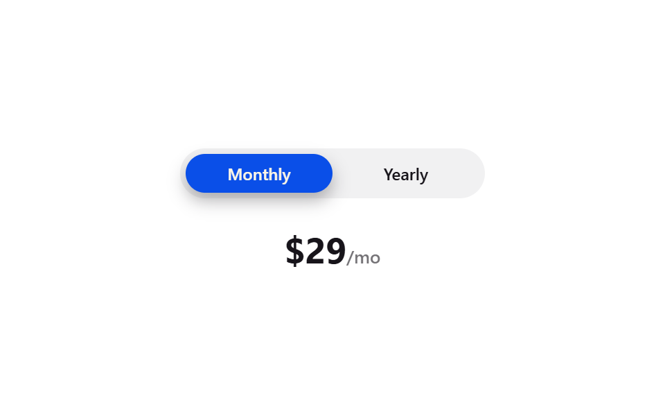
MonthlyとYearlyのボタンの間を、ピル形の背景がなめらかに移動して選択中の支払い周期を示します。
使いどころサブスクリプション料金ページの支払い周期切り替えスイッチ
:checkedtranslateX50%
<main class="stage">
  <div class="mt-wrap">
    <div class="mt-toggle is-demo">
      <input type="radio" name="mt-period" id="mt-monthly" class="mt-radio mt-radio--m" checked>
      <input type="radio" name="mt-period" id="mt-yearly" class="mt-radio mt-radio--y">
      <label class="mt-option" for="mt-monthly">Monthly</label>
      <label class="mt-option" for="mt-yearly">Yearly</label>
      <span class="mt-indicator" aria-hidden="true"></span>
    </div>
    <div class="mt-price">$29<span class="mt-price__unit">/mo</span></div>
  </div>
</main>
@use "../../../../site/static/demo-tokens" as *;
// ── 변수 3개 ──────────────────────────────────────────
$duration: $dur-base;
$easing: $ease-spring;
$color: $subject-blue-deep; // 크림 글자가 얹히므로 진한 파랑
@include stage($stage-paper);
.mt-wrap {
display: flex;
flex-direction: column;
align-items: center;
gap: $sp-6;
}
.mt-toggle {
position: relative;
display: flex;
width: min(220px, 78vw);
border-radius: $r-pill;
background: rgba(23, 20, 26, .06);
padding: $sp-1;
box-sizing: border-box;
}
.mt-radio { position: absolute; opacity: 0; pointer-events: none; }
.mt-option {
position: relative;
z-index: 1;
flex: 1 1 0;
text-align: center;
padding: $sp-2 0;
border-radius: $r-pill;
cursor: pointer;
color: $subject-ink;
font: 600 12px/1 -apple-system, "Segoe UI", sans-serif;
}
// 인디케이터는 두 옵션과 같은 50/50 분할을 쓴다 — flex 로 갈린 실제 폭을 짐작한 px 로 흉내내지 않는다 (BD19)
.mt-indicator {
position: absolute;
top: $sp-1;
left: $sp-1;
width: calc(50% - #{$sp-1});
height: calc(100% - #{$sp-1} * 2);
border-radius: $r-pill;
background: $color;
box-shadow: $shadow-press;
transition: transform $duration $easing;
}
#mt-yearly:checked ~ .mt-indicator { transform: translateX(100%); }
#mt-yearly:checked ~ .mt-option[for="mt-yearly"] { color: $subject-cream; }
#mt-monthly:checked ~ .mt-option[for="mt-monthly"] { color: $subject-cream; }
.mt-price { font: 700 26px/1 -apple-system, "Segoe UI", sans-serif; color: $subject-ink; }
.mt-price__unit { font-size: 13px; font-weight: 500; opacity: .6; }
// 데모 루프: 헤드리스는 라디오를 못 눌러 is-demo 가 같은 이동을 keyframes 로 반복한다 (캡처용)
@keyframes mt-slide {
0%, 40% { transform: translateX(0); }
60%, 100% { transform: translateX(100%); }
}
.mt-toggle.is-demo .mt-indicator { animation: mt-slide $duration * 3 $easing infinite; }
@media (prefers-reduced-motion: reduce) {
.mt-indicator,
.mt-toggle.is-demo .mt-indicator { animation: none !important; transition: none !important; }
}html, body {
margin: 0;
overflow: hidden;
}
.stage {
box-sizing: border-box;
min-height: 100vh;
display: grid;
place-items: center;
margin: 0;
background: #ffffff;
font-family: -apple-system, "Segoe UI", "Noto Sans KR", sans-serif;
padding: clamp(8px, 4vw, 24px);
}
.mt-wrap {
display: flex;
flex-direction: column;
align-items: center;
gap: 24px;
}
.mt-toggle {
position: relative;
display: flex;
width: min(220px, 78vw);
border-radius: 999px;
background: rgba(23, 20, 26, 0.06);
padding: 4px;
box-sizing: border-box;
}
.mt-radio {
position: absolute;
opacity: 0;
pointer-events: none;
}
.mt-option {
position: relative;
z-index: 1;
flex: 1 1 0;
text-align: center;
padding: 8px 0;
border-radius: 999px;
cursor: pointer;
color: #17141a;
font: 600 12px/1 -apple-system, "Segoe UI", sans-serif;
}
.mt-indicator {
position: absolute;
top: 4px;
left: 4px;
width: calc(50% - 4px);
height: calc(100% - 4px * 2);
border-radius: 999px;
background: #0a4fe8;
box-shadow: 0 6px 12px rgba(23, 20, 26, 0.32);
transition: transform 300ms cubic-bezier(0.2, 0.8, 0.2, 1);
}
#mt-yearly:checked ~ .mt-indicator {
transform: translateX(100%);
}
#mt-yearly:checked ~ .mt-option[for=mt-yearly] {
color: #fff7e6;
}
#mt-monthly:checked ~ .mt-option[for=mt-monthly] {
color: #fff7e6;
}
.mt-price {
font: 700 26px/1 -apple-system, "Segoe UI", sans-serif;
color: #17141a;
}
.mt-price__unit {
font-size: 13px;
font-weight: 500;
opacity: 0.6;
}
@keyframes mt-slide {
0%, 40% {
transform: translateX(0);
}
60%, 100% {
transform: translateX(100%);
}
}
.mt-toggle.is-demo .mt-indicator {
animation: mt-slide 900ms cubic-bezier(0.2, 0.8, 0.2, 1) infinite;
}
@media (prefers-reduced-motion: reduce) {
.mt-indicator,
.mt-toggle.is-demo .mt-indicator {
animation: none !important;
transition: none !important;
}
}import { CSSProperties } from "react";
import styles from "./MonthlyYearlyToggle.module.scss";
export interface MonthlyYearlyToggleProps {
duration?: string;
easing?: string;
color?: string;
name?: string;
}
// 실사용: 숨긴 라디오 두 개 + 일반 형제 선택자. 자바스크립트로 상태를 들지 않는다.
export default function MonthlyYearlyToggle({
duration = "300ms",
easing = "cubic-bezier(.2, .8, .2, 1)",
color = "#0a4fe8",
name = "mt-period",
}: MonthlyYearlyToggleProps) {
const monthlyId = `${name}-monthly`;
const yearlyId = `${name}-yearly`;
const style = { "--duration": duration, "--easing": easing, "--color": color } as CSSProperties;
return (
<div className={styles.wrap} style={style}>
<div className={styles.toggle}>
<input type="radio" name={name} id={monthlyId} className={styles.radio} defaultChecked />
<input type="radio" name={name} id={yearlyId} className={styles.radio} />
<label className={styles.option} htmlFor={monthlyId}>Monthly</label>
<label className={styles.option} htmlFor={yearlyId}>Yearly</label>
<span className={styles.indicator} aria-hidden="true" />
</div>
<div className={styles.price}>$29<span className={styles.unit}>/mo</span></div>
</div>
);
}04 月額/年額トグル — 計測 累積面積 5.783% · 動いたフレーム 8/23GODRICH オリジナル · SCSS と React は zip に同梱 · 【コピペOK】料金表 CSSアニメーション9選
このデモが属する記事
 【コピペOK】料金表 CSSアニメーション9選サブスクの料金プランを比較するとき、カードにマウスを乗せた瞬間にふわっと浮かんだり、金額の表示がパッと切り替わったりするページを見たことはありませんか。どのプランを選ぶか迷っているその一瞬に、こうした小さな動きが視線を誘導してくれます。この この記事のデモをすべて見る