06正規品認証シール(ギザギザ縁)
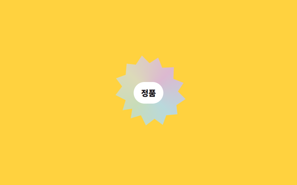
星形のギザギザ縁を clip-path で切り抜き、虹色グラデーションを重ねてゆっくり回転させます。ホバーすると回転が速くなります。
使いどころ正規品認証ステッカー、公式グッズシール、品質保証バッジ
clip-path polygon@keyframes rotateanimation-duration 전환
<main class="stage">
  <div class="seal" tabindex="0">
    <span class="seal__shape" aria-hidden="true"></span>
    <span class="seal__text">正規品</span>
  </div>
</main>
@use "../../../../site/static/demo-tokens" as *;
$duration: 700ms; // 호버 시 회전이 빨라지는 애니메이션 길이
$easing: linear;
$color: $subject-blue; // 사용 안 함(참고용)
@include stage($stage-yellow);
.seal {
position: relative;
width: min(116px, 40vw);
aspect-ratio: 1;
display: grid;
place-items: center;
outline: none;
cursor: pointer;
}
.seal__shape {
position: absolute; inset: 0;
clip-path: polygon(50% 0%, 61% 12%, 75% 6%, 78% 20%, 93% 20%, 90% 35%, 100% 43%, 90% 55%,
96% 68%, 82% 70%, 80% 85%, 65% 80%, 58% 93%, 50% 82%, 42% 93%, 35% 80%,
20% 85%, 18% 70%, 4% 68%, 10% 55%, 0% 43%, 10% 35%, 7% 20%, 22% 20%, 25% 6%, 39% 12%);
background: conic-gradient(from 0deg, #dcb9d1, #b9d9dc, #c8dcb9, #dcdab9, #dcb9d1);
animation: seal-spin $dur-loop linear infinite;
}
.seal__text {
position: relative; z-index: 1;
font-weight: 800; font-size: 13px; color: $stage-ink; font-family: inherit;
background: $stage-paper; padding: $sp-2 $sp-3; border-radius: $r-pill;
}
.seal:hover .seal__shape,
.seal:focus-visible .seal__shape,
.seal.is-demo .seal__shape { animation-duration: $duration; }
@keyframes seal-spin { to { transform: rotate(360deg); } }
@media (prefers-reduced-motion: reduce) {
.seal__shape { animation: none; }
}html, body {
margin: 0;
overflow: hidden;
}
.stage {
box-sizing: border-box;
min-height: 100vh;
display: grid;
place-items: center;
margin: 0;
background: #ffd23f;
font-family: -apple-system, "Segoe UI", "Noto Sans KR", sans-serif;
padding: clamp(8px, 4vw, 24px);
}
.seal {
position: relative;
width: min(116px, 40vw);
aspect-ratio: 1;
display: grid;
place-items: center;
outline: none;
cursor: pointer;
}
.seal__shape {
position: absolute;
inset: 0;
clip-path: polygon(50% 0%, 61% 12%, 75% 6%, 78% 20%, 93% 20%, 90% 35%, 100% 43%, 90% 55%, 96% 68%, 82% 70%, 80% 85%, 65% 80%, 58% 93%, 50% 82%, 42% 93%, 35% 80%, 20% 85%, 18% 70%, 4% 68%, 10% 55%, 0% 43%, 10% 35%, 7% 20%, 22% 20%, 25% 6%, 39% 12%);
background: conic-gradient(from 0deg, #dcb9d1, #b9d9dc, #c8dcb9, #dcdab9, #dcb9d1);
animation: seal-spin 2s linear infinite;
}
.seal__text {
position: relative;
z-index: 1;
font-weight: 800;
font-size: 13px;
color: #17141a;
font-family: inherit;
background: #ffffff;
padding: 8px 12px;
border-radius: 999px;
}
.seal:hover .seal__shape,
.seal:focus-visible .seal__shape,
.seal.is-demo .seal__shape {
animation-duration: 700ms;
}
@keyframes seal-spin {
to {
transform: rotate(360deg);
}
}
@media (prefers-reduced-motion: reduce) {
.seal__shape {
animation: none;
}
}import type { CSSProperties } from "react";
import styles from "./AuthenticitySeal.module.scss";
export type AuthenticitySealProps = {
text: string;
/** 호버 시 회전이 빨라지는 애니메이션 길이 (기본 700ms) */
duration?: number;
easing?: string;
/** 사용 안 함(참고용) */
color?: string;
};
type Vars = CSSProperties & { "--duration"?: string; "--easing"?: string; "--color"?: string };
export default function AuthenticitySeal({
text,
duration = 700,
easing = "linear",
color = "#2f6df6",
}: AuthenticitySealProps) {
const vars: Vars = { "--duration": `${duration}ms`, "--easing": easing, "--color": color };
return (
<div className={styles.seal} style={vars} tabIndex={0}>
<span className={styles.shape} aria-hidden="true" />
<span className={styles.text}>{text}</span>
</div>
);
}06 正規品認証シール(ギザギザ縁) — 計測 累積面積 6.797% · 動いたフレーム 23/23GODRICH オリジナル · SCSS と React は zip に同梱 · CSS ホログラムカード効果9選 — ステッカー・バッジ・チケット
このデモが属する記事
 CSS ホログラムカード効果9選 — ステッカー・バッジ・チケットCSS ホログラムとは、角度によって光の反射が変わる箔素材を、CSSのグラデーションとアニメーションだけで再現する技法です。ポケモンカードのような輝きは何度も画面で見かけますが、いざコードにしようとすると手が止まることが多いので、カード・ス この記事のデモをすべて見る