04折りたたみリボンの展開バッジ
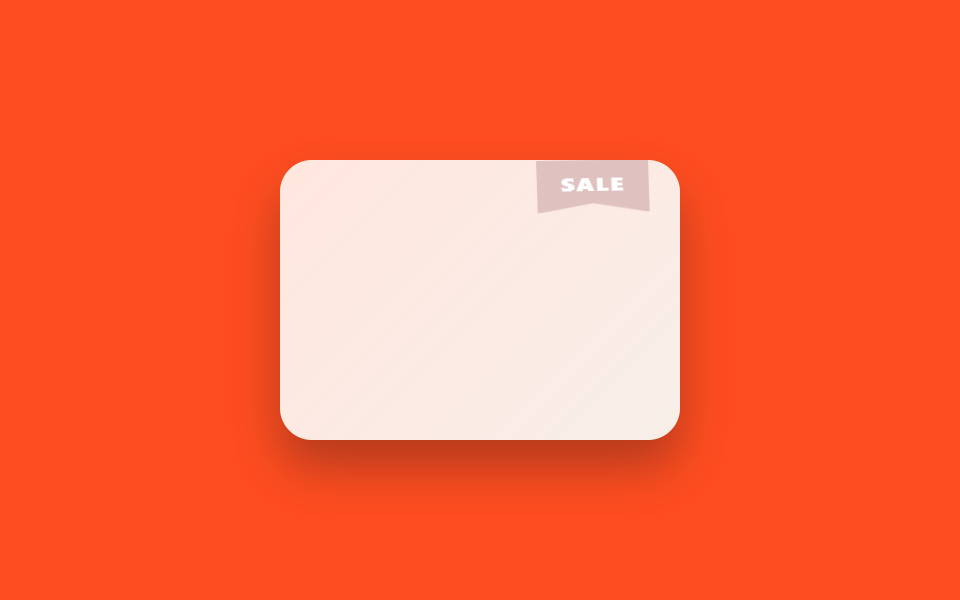
213回の-45deg固定リボンと異なり、このリボンはカード上端でtransform-origin: topを基準にscaleY(0→1.06→1)で折りたたまれた状態から下りて開き、rotate(-2deg)で少し揺れてから再び巻き上がる。
使いどころ新商品・セール商品カードの角、イベントバナーのコーナーラベル
scaleY unfurltransform-origin: topclip-path polygon
<main class="stage is-demo">
  <div class="card" aria-label="sale item">
    <div class="thumb"></div>
    <div class="ribbon-mount">
      <span class="ribbon">SALE</span>
    </div>
  </div>
</main>
@use "../../../../site/static/demo-tokens" as *;
// ── 변수 3개 ──────────────────────────────────────────
$duration: $dur-loop; // 2s — 펼쳐짐+되감김 한 주기
$easing: $ease-spring;
$color: #ddbebb; // 캔디 코럴
@include stage($stage-orange);
.card {
position: relative;
width: 200px; height: 140px;
border-radius: $r-card;
overflow: hidden;
background: $subject-cream;
box-shadow: $shadow-raised;
}
.thumb {
position: absolute; inset: 0;
background: linear-gradient(135deg, rgba($subject-pink, .18), rgba($subject-lilac, .1));
}
// 213편 리본(빛줄기 스윕)과 다른 메커니즘 — 접힌 리본이 위에서 펼쳐졌다 걷힌다
.ribbon-mount {
position: absolute;
top: 0; right: $sp-4;
width: 56px;
overflow: visible;
}
.ribbon {
display: block;
padding: $sp-2 0 $sp-3;
background: $color;
color: #fff;
font-family: -apple-system, "Segoe UI", "Noto Sans KR", sans-serif;
font-weight: 800;
font-size: 12px;
letter-spacing: .06em;
text-align: center;
clip-path: polygon(0 0, 100% 0, 100% 100%, 50% 82%, 0 100%);
box-shadow: $shadow-press;
transform: scaleY(0) rotate(0deg);
transform-origin: top center; // 규칙8: 리본 top에서 펼쳐짐
}
.stage.is-demo .ribbon {
animation: unfurl $duration $easing infinite;
}
@keyframes unfurl {
0%, 8% { transform: scaleY(0) rotate(0deg); }
30% { transform: scaleY(1.06) rotate(-2deg); }
42%, 78% { transform: scaleY(1) rotate(0deg); }
92%, 100% { transform: scaleY(0) rotate(0deg); }
}
// ── 한 겹: 펼침 안착(42%) 순간 코럴 링 파문 + 리본 색 전이 ──
// unfurl 의 transform 은 그대로 — 링은 .ribbon-mount 에(clip-path 밖이라 잘리지 않음), 색은 리본 배경에
.ribbon-mount { position: absolute; } // 기존 absolute 재확인 — ::after 기준점
.ribbon-mount::after {
content: "";
position: absolute;
inset: -2px -2px 6px;
border-radius: $r-xs $r-xs 0 0;
border: 2px solid rgba($color, 0);
transform: scale(.92);
opacity: 0;
pointer-events: none;
}
.stage.is-demo .ribbon {
animation: unfurl $duration $easing infinite, ribbon-settle $duration $ease-out infinite;
}
.stage.is-demo .ribbon-mount::after {
animation: unfurl-ring $duration $easing infinite;
}
@keyframes ribbon-settle {
0%, 8% { background-color: $color; }
42% { background-color: mix(#fff, $color, 30%); }
62%, 100% { background-color: $color; }
}
@keyframes unfurl-ring {
0%, 30% { transform: scale(.92); opacity: 0; border-color: rgba($color, 0); }
40% { transform: scale(1); opacity: .75; border-color: rgba(mix(#ffe3d1, $color, 40%), .85); }
66%, 100% { transform: scale(1.18); opacity: 0; border-color: rgba($color, 0); }
}
@media (prefers-reduced-motion: reduce) {
.stage.is-demo .ribbon { animation: none; transform: scaleY(1); }
.stage.is-demo .ribbon-mount::after { animation: none; opacity: 0; }
}html, body {
margin: 0;
overflow: hidden;
}
.stage {
box-sizing: border-box;
min-height: 100vh;
display: grid;
place-items: center;
margin: 0;
background: #ff4d1f;
font-family: -apple-system, "Segoe UI", "Noto Sans KR", sans-serif;
padding: clamp(8px, 4vw, 24px);
}
.card {
position: relative;
width: 200px;
height: 140px;
border-radius: 16px;
overflow: hidden;
background: #fff7e6;
box-shadow: 0 14px 24px rgba(23, 20, 26, 0.32);
}
.thumb {
position: absolute;
inset: 0;
background: linear-gradient(135deg, rgba(255, 158, 187, 0.18), rgba(185, 160, 255, 0.1));
}
.ribbon-mount {
position: absolute;
top: 0;
right: 16px;
width: 56px;
overflow: visible;
}
.ribbon {
display: block;
padding: 8px 0 12px;
background: #ddbebb;
color: #fff;
font-family: -apple-system, "Segoe UI", "Noto Sans KR", sans-serif;
font-weight: 800;
font-size: 12px;
letter-spacing: 0.06em;
text-align: center;
clip-path: polygon(0 0, 100% 0, 100% 100%, 50% 82%, 0 100%);
box-shadow: 0 6px 12px rgba(23, 20, 26, 0.32);
transform: scaleY(0) rotate(0deg);
transform-origin: top center;
}
.stage.is-demo .ribbon {
animation: unfurl 2s cubic-bezier(0.2, 0.8, 0.2, 1) infinite;
}
@keyframes unfurl {
0%, 8% {
transform: scaleY(0) rotate(0deg);
}
30% {
transform: scaleY(1.06) rotate(-2deg);
}
42%, 78% {
transform: scaleY(1) rotate(0deg);
}
92%, 100% {
transform: scaleY(0) rotate(0deg);
}
}
.ribbon-mount {
position: absolute;
}
.ribbon-mount::after {
content: "";
position: absolute;
inset: -2px -2px 6px;
border-radius: 4px 4px 0 0;
border: 2px solid rgba(221, 190, 187, 0);
transform: scale(0.92);
opacity: 0;
pointer-events: none;
}
.stage.is-demo .ribbon {
animation: unfurl 2s cubic-bezier(0.2, 0.8, 0.2, 1) infinite, ribbon-settle 2s ease-out infinite;
}
.stage.is-demo .ribbon-mount::after {
animation: unfurl-ring 2s cubic-bezier(0.2, 0.8, 0.2, 1) infinite;
}
@keyframes ribbon-settle {
0%, 8% {
background-color: #ddbebb;
}
42% {
background-color: rgb(90.6666666667%, 82.1568627451%, 81.3333333333%);
}
62%, 100% {
background-color: #ddbebb;
}
}
@keyframes unfurl-ring {
0%, 30% {
transform: scale(0.92);
opacity: 0;
border-color: rgba(221, 190, 187, 0);
}
40% {
transform: scale(1);
opacity: 0.75;
border-color: rgba(92%, 80.3137254902%, 76.7843137255%, 0.85);
}
66%, 100% {
transform: scale(1.18);
opacity: 0;
border-color: rgba(221, 190, 187, 0);
}
}
@media (prefers-reduced-motion: reduce) {
.stage.is-demo .ribbon {
animation: none;
transform: scaleY(1);
}
.stage.is-demo .ribbon-mount::after {
animation: none;
opacity: 0;
}
}import type { CSSProperties } from "react";
import styles from "./CornerRibbonUnfurl.module.scss";
export type CornerRibbonUnfurlProps = {
duration?: number;
easing?: string;
color?: string;
label?: string;
};
export default function CornerRibbonUnfurl({
duration = 2000,
easing = "cubic-bezier(.2,.8,.2,1)",
color = "#ff6f61",
label = "SALE",
}: CornerRibbonUnfurlProps) {
const vars: CSSProperties = { "--duration": `${duration}ms`, "--easing": easing, "--color": color } as CSSProperties;
return (
<div className={styles.card} style={vars} aria-label="sale item">
<div className={styles.thumb} />
<div className={styles.mount}>
<span className={styles.ribbon}>{label}</span>
</div>
</div>
);
}04 折りたたみリボンの展開バッジ — 計測 累積面積 1.443% · 動いたフレーム 11/23GODRICH オリジナル · SCSS と React は zip に同梱 · ステータス バッジ UI 9選 — タグ・優先度・認証バッジ
このデモが属する記事
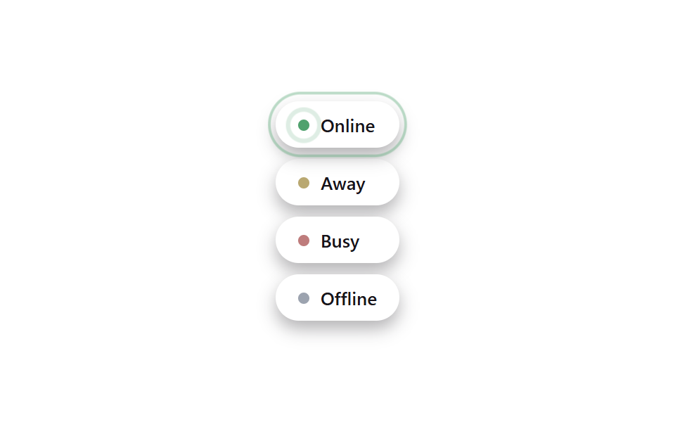 ステータス バッジ UI 9選 — タグ・優先度・認証バッジステータス バッジ ui は、オンライン・優先度・認証といった状態を小さな点やラベル一つで伝える部品です。動きを加えるとそのまま使えるほど目を引きます。ステータス バッジ ui のアイデアを9つ集めました。 この記事のデモをすべて見る