01均等2カラムグリッド
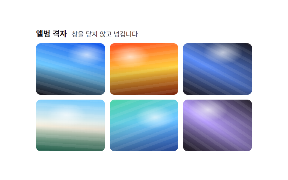
写真4枚を2×2の均等なマスに並べ、カーソルが乗ったタイルだけがわずかに浮き上がり影が濃くなって、今見ている写真がどれかを示します。
使いどころポートフォリオのサムネイル4~6枚、ブログ記事内の写真の並び
grid-template-columns:repeat(2,1fr)gaptranslateY hover

<main class="stage">
  <ul class="gallery is-demo" aria-label="写真ギャラリー">
    <li class="tile" tabindex="0"></li>
    <li class="tile" tabindex="0"></li>
    <li class="tile" tabindex="0"></li>
    <li class="tile" tabindex="0"></li>
  </ul>
</main>
@use "../../../../site/static/demo-tokens" as *;
$duration: $dur-quick; // 타일이 뜨는 시간
$easing: $ease-out;
$color: $subject-blue; // 타일 그러데이션
@include stage($stage-ink);
.stage { padding: clamp(8px, 2.4vw, 16px); }
.gallery {
display: grid;
grid-template-columns: repeat(2, 1fr);
gap: $sp-2;
list-style: none;
margin: 0;
padding: 0;
width: 188px;
max-width: 100%;
}
.tile {
aspect-ratio: 4 / 3;
border-radius: $r-sm;
outline: none;
cursor: pointer;
box-shadow: $shadow-press;
transition: transform $duration $easing, box-shadow $duration $easing;
}
.tile:nth-child(1) { background: linear-gradient(155deg, $color 0%, $stage-ink 100%); }
.tile:nth-child(2) { background: linear-gradient(205deg, $subject-cream 0%, $color 100%); }
.tile:nth-child(3) { background: linear-gradient(115deg, $color 0%, $subject-cream 60%); }
.tile:nth-child(4) { background: linear-gradient(250deg, $stage-ink 0%, $color 100%); }
.tile:hover, .tile:focus-visible, .tile:active {
transform: translateY(-4px) scale(1.03);
box-shadow: $shadow-raised;
}
.gallery.is-demo .tile { animation: lift-loop $dur-loop $easing infinite; }
.gallery.is-demo .tile:nth-child(2) { animation-delay: -0.5s; }
.gallery.is-demo .tile:nth-child(3) { animation-delay: -1.0s; }
.gallery.is-demo .tile:nth-child(4) { animation-delay: -1.5s; }
@keyframes lift-loop {
0%, 10% { transform: translateY(0) scale(1); box-shadow: $shadow-press; }
25%, 35% { transform: translateY(-4px) scale(1.03); box-shadow: $shadow-raised; }
50%, 100% { transform: translateY(0) scale(1); box-shadow: $shadow-press; }
}
@media (hover: none) {
.tile:active { transform: translateY(-4px) scale(1.03); box-shadow: $shadow-raised; }
}
@media (prefers-reduced-motion: reduce) {
.tile { transition: none; }
.gallery.is-demo .tile { animation: none; }
}html, body {
margin: 0;
overflow: hidden;
}
.stage {
box-sizing: border-box;
min-height: 100vh;
display: grid;
place-items: center;
margin: 0;
background: #17141a;
font-family: -apple-system, "Segoe UI", "Noto Sans KR", sans-serif;
padding: clamp(8px, 4vw, 24px);
}
.stage {
padding: clamp(8px, 2.4vw, 16px);
}
.gallery {
display: grid;
grid-template-columns: repeat(2, 1fr);
gap: 8px;
list-style: none;
margin: 0;
padding: 0;
width: 188px;
max-width: 100%;
}
.tile {
aspect-ratio: 4/3;
border-radius: 8px;
outline: none;
cursor: pointer;
box-shadow: 0 6px 12px rgba(23, 20, 26, 0.32);
transition: transform 220ms ease-out, box-shadow 220ms ease-out;
}
.tile:nth-child(1) {
background: linear-gradient(155deg, #2f6df6 0%, #17141a 100%);
}
.tile:nth-child(2) {
background: linear-gradient(205deg, #fff7e6 0%, #2f6df6 100%);
}
.tile:nth-child(3) {
background: linear-gradient(115deg, #2f6df6 0%, #fff7e6 60%);
}
.tile:nth-child(4) {
background: linear-gradient(250deg, #17141a 0%, #2f6df6 100%);
}
.tile:hover, .tile:focus-visible, .tile:active {
transform: translateY(-4px) scale(1.03);
box-shadow: 0 14px 24px rgba(23, 20, 26, 0.32);
}
.gallery.is-demo .tile {
animation: lift-loop 2s ease-out infinite;
}
.gallery.is-demo .tile:nth-child(2) {
animation-delay: -0.5s;
}
.gallery.is-demo .tile:nth-child(3) {
animation-delay: -1s;
}
.gallery.is-demo .tile:nth-child(4) {
animation-delay: -1.5s;
}
@keyframes lift-loop {
0%, 10% {
transform: translateY(0) scale(1);
box-shadow: 0 6px 12px rgba(23, 20, 26, 0.32);
}
25%, 35% {
transform: translateY(-4px) scale(1.03);
box-shadow: 0 14px 24px rgba(23, 20, 26, 0.32);
}
50%, 100% {
transform: translateY(0) scale(1);
box-shadow: 0 6px 12px rgba(23, 20, 26, 0.32);
}
}
@media (hover: none) {
.tile:active {
transform: translateY(-4px) scale(1.03);
box-shadow: 0 14px 24px rgba(23, 20, 26, 0.32);
}
}
@media (prefers-reduced-motion: reduce) {
.tile {
transition: none;
}
.gallery.is-demo .tile {
animation: none;
}
}import type { CSSProperties } from "react";
import styles from "./TwoColGallery.module.scss";
export type TwoColGalleryProps = {
/** 타일이 뜨는 시간 (기본 220ms) */
duration?: number;
easing?: string;
/** 타일 그러데이션 색 */
color?: string;
};
type Vars = CSSProperties & { "--duration"?: string; "--easing"?: string; "--color"?: string };
/** 사진 4장을 2×2 칸에 나누고, 커서가 올라간 칸만 떠오르며 그림자가 짙어진다 */
export default function TwoColGallery({
duration = 220,
easing = "ease-out",
color = "#2f6df6",
}: TwoColGalleryProps) {
const vars: Vars = { "--duration": `${duration}ms`, "--easing": easing, "--color": color };
return (
<ul className={styles.gallery} style={vars} aria-label="Photo gallery">
{[0, 1, 2, 3].map((i) => (
<li key={i} className={`${styles.tile} ${styles["tile" + i]}`} tabIndex={0} />
))}
</ul>
);
}01 均等2カラムグリッド — 計測 累積面積 3.564% · 動いたフレーム 15/23GODRICH オリジナル · SCSS と React は zip に同梱 · CSS フォト ギャラリー 9選 — メイソンリーからライトボックスまで
このデモが属する記事
 CSS フォト ギャラリー 9選 — メイソンリーからライトボックスまでCSS フォト ギャラリーは、複数の写真をグリッドやウォーターフォール状に並べ、ホバーやクリックに反応させるレイアウト技法です。Pinterestで保存したあのギャラリーのように見えても、実際にコードに落とすとグリッドの数式や画像のクロップ この記事のデモをすべて見る