05グリッド行スパン・ウォーターフォール
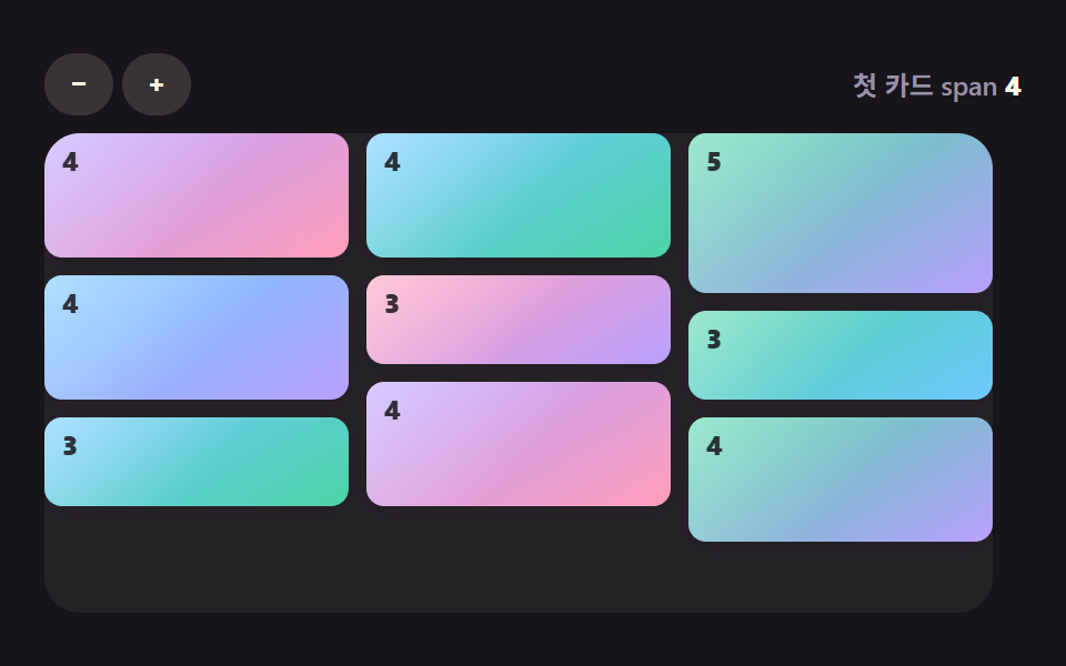
grid-auto-rows を4pxのような極小単位に刻み、写真ごとに自分の高さに合わせた grid-row-end: span N を計算しておくと、カラム方式と違って写真が上から下ではなく左から右へ読む順番どおりに並ぶウォーターフォールになります。
使いどころ掲載順が重要なニュース・ポートフォリオギャラリー、最新記事が常に左上に来るべき一覧
grid-auto-rows:4pxgrid-row-end:span N읽는 순서 유지

<main class="stage">
  <ul class="gallery is-demo" aria-label="写真ギャラリー">
    <li class="tile tile--1" tabindex="0"></li>
    <li class="tile tile--2" tabindex="0"></li>
    <li class="tile tile--3" tabindex="0"></li>
    <li class="tile tile--4" tabindex="0"></li>
    <li class="tile tile--5" tabindex="0"></li>
  </ul>
</main>
@use "../../../../site/static/demo-tokens" as *;
$duration: $dur-quick; // 타일이 나타나는 시간
$easing: $ease-out;
$color: $subject-cream; // 타일 그러데이션
@include stage($stage-ink);
.stage { padding: clamp(8px, 2.4vw, 16px); }
.gallery {
display: grid;
grid-auto-flow: row dense;
grid-template-columns: repeat(2, 1fr);
grid-auto-rows: 4px;
column-gap: $sp-2;
list-style: none;
margin: 0;
padding: 0;
width: 176px;
max-width: 100%;
}
.tile {
margin-bottom: $sp-2;
border-radius: $r-sm;
outline: none;
cursor: pointer;
box-shadow: $shadow-press;
transform: scale(1);
transition: transform $duration $easing, box-shadow $duration $easing;
}
// 사진마다 자기 높이에 맞는 span — 읽는 순서(1→2→3→4→5)대로 배치된다
.tile--1 { grid-row-end: span 10; background: linear-gradient(150deg, $color 0%, $stage-ink 100%); }
.tile--2 { grid-row-end: span 13; background: linear-gradient(210deg, $subject-blue 0%, $color 100%); }
.tile--3 { grid-row-end: span 9; background: linear-gradient(60deg, $stage-ink 0%, $color 100%); }
.tile--4 { grid-row-end: span 12; background: linear-gradient(300deg, $color 0%, $subject-blue 100%); }
.tile--5 { grid-row-end: span 10; background: linear-gradient(20deg, $subject-blue 0%, $stage-ink 100%); }
.tile:hover, .tile:focus-visible, .tile:active {
transform: scale(1.05);
box-shadow: $shadow-raised;
}
.gallery.is-demo .tile { animation: pop-loop $dur-loop $easing infinite; }
.gallery.is-demo .tile--2 { animation-delay: -0.4s; }
.gallery.is-demo .tile--3 { animation-delay: -0.8s; }
.gallery.is-demo .tile--4 { animation-delay: -1.2s; }
.gallery.is-demo .tile--5 { animation-delay: -1.6s; }
@keyframes pop-loop {
0%, 8% { transform: scale(1); box-shadow: $shadow-press; }
24%, 40% { transform: scale(1.05); box-shadow: $shadow-raised; }
56%, 100% { transform: scale(1); box-shadow: $shadow-press; }
}
@media (hover: none) {
.tile:active { transform: scale(1.05); box-shadow: $shadow-raised; }
}
@media (prefers-reduced-motion: reduce) {
.tile { transition: none; }
.gallery.is-demo .tile { animation: none; }
}html, body {
margin: 0;
overflow: hidden;
}
.stage {
box-sizing: border-box;
min-height: 100vh;
display: grid;
place-items: center;
margin: 0;
background: #17141a;
font-family: -apple-system, "Segoe UI", "Noto Sans KR", sans-serif;
padding: clamp(8px, 4vw, 24px);
}
.stage {
padding: clamp(8px, 2.4vw, 16px);
}
.gallery {
display: grid;
grid-auto-flow: row dense;
grid-template-columns: repeat(2, 1fr);
grid-auto-rows: 4px;
column-gap: 8px;
list-style: none;
margin: 0;
padding: 0;
width: 176px;
max-width: 100%;
}
.tile {
margin-bottom: 8px;
border-radius: 8px;
outline: none;
cursor: pointer;
box-shadow: 0 6px 12px rgba(23, 20, 26, 0.32);
transform: scale(1);
transition: transform 220ms ease-out, box-shadow 220ms ease-out;
}
.tile--1 {
grid-row-end: span 10;
background: linear-gradient(150deg, #fff7e6 0%, #17141a 100%);
}
.tile--2 {
grid-row-end: span 13;
background: linear-gradient(210deg, #2f6df6 0%, #fff7e6 100%);
}
.tile--3 {
grid-row-end: span 9;
background: linear-gradient(60deg, #17141a 0%, #fff7e6 100%);
}
.tile--4 {
grid-row-end: span 12;
background: linear-gradient(300deg, #fff7e6 0%, #2f6df6 100%);
}
.tile--5 {
grid-row-end: span 10;
background: linear-gradient(20deg, #2f6df6 0%, #17141a 100%);
}
.tile:hover, .tile:focus-visible, .tile:active {
transform: scale(1.05);
box-shadow: 0 14px 24px rgba(23, 20, 26, 0.32);
}
.gallery.is-demo .tile {
animation: pop-loop 2s ease-out infinite;
}
.gallery.is-demo .tile--2 {
animation-delay: -0.4s;
}
.gallery.is-demo .tile--3 {
animation-delay: -0.8s;
}
.gallery.is-demo .tile--4 {
animation-delay: -1.2s;
}
.gallery.is-demo .tile--5 {
animation-delay: -1.6s;
}
@keyframes pop-loop {
0%, 8% {
transform: scale(1);
box-shadow: 0 6px 12px rgba(23, 20, 26, 0.32);
}
24%, 40% {
transform: scale(1.05);
box-shadow: 0 14px 24px rgba(23, 20, 26, 0.32);
}
56%, 100% {
transform: scale(1);
box-shadow: 0 6px 12px rgba(23, 20, 26, 0.32);
}
}
@media (hover: none) {
.tile:active {
transform: scale(1.05);
box-shadow: 0 14px 24px rgba(23, 20, 26, 0.32);
}
}
@media (prefers-reduced-motion: reduce) {
.tile {
transition: none;
}
.gallery.is-demo .tile {
animation: none;
}
}import type { CSSProperties } from "react";
import styles from "./MasonryGridGallery.module.scss";
export type MasonryGridGalleryProps = {
/** 4px 행 단위로 각 사진이 차지할 span 수 — 자기 높이에 맞게 미리 계산한다 */
spans?: number[];
duration?: number;
easing?: string;
color?: string;
};
type Vars = CSSProperties & { "--duration"?: string; "--easing"?: string; "--color"?: string };
/** grid-auto-rows 를 작은 단위로 쪼개고 grid-row-end: span N 을 주면, 컬럼 방식과 달리 읽는 순서(왼→오)가 유지된다 */
export default function MasonryGridGallery({
spans = [10, 13, 9, 12, 10],
duration = 220,
easing = "ease-out",
color = "#fff7e6",
}: MasonryGridGalleryProps) {
const vars: Vars = { "--duration": `${duration}ms`, "--easing": easing, "--color": color };
return (
<ul className={styles.gallery} style={vars} aria-label="Photo gallery">
{spans.map((s, i) => (
<li key={i} className={styles.tile} style={{ gridRowEnd: `span ${s}` }} tabIndex={0} />
))}
</ul>
);
}05 グリッド行スパン・ウォーターフォール — 計測 累積面積 2.089% · 動いたフレーム 23/23GODRICH オリジナル · SCSS と React は zip に同梱 · CSS フォト ギャラリー 9選 — メイソンリーからライトボックスまで
このデモが属する記事
 CSS フォト ギャラリー 9選 — メイソンリーからライトボックスまでCSS フォト ギャラリーは、複数の写真をグリッドやウォーターフォール状に並べ、ホバーやクリックに反応させるレイアウト技法です。Pinterestで保存したあのギャラリーのように見えても、実際にコードに落とすとグリッドの数式や画像のクロップ この記事のデモをすべて見る