01ブラインド開閉の登場
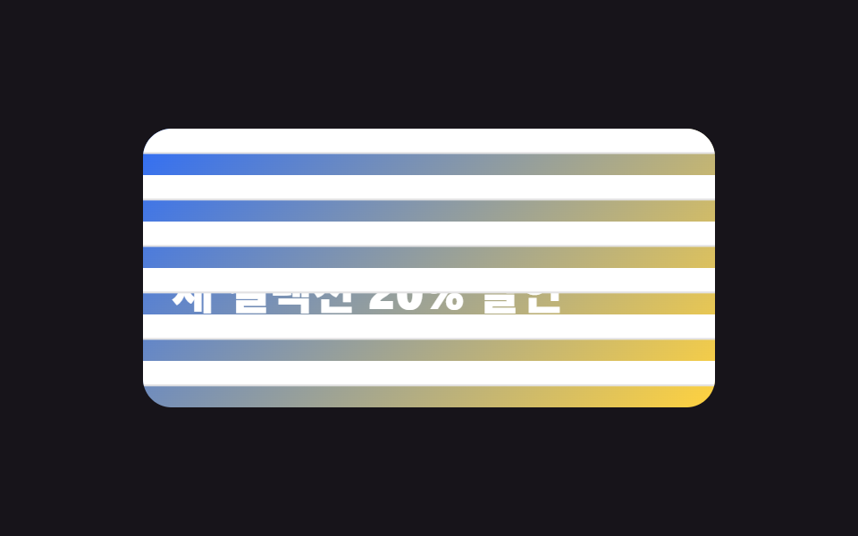
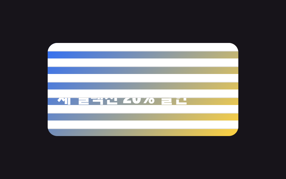
明るいグラデーションパネルを覆う横ブラインドが上から順に折りたたまれ(scaleY 1→0)、下の見出しを現す。
使いどころヒーローセクションの初回表示、イベント見出しの公開
transform: scaleY:nth-child 계단transform-origin: top
<main class="stage">
  <section class="reveal is-demo" aria-label="ブラインドが折りたたまれ春の見出しが現れる">
    <div class="reveal__panel">
      <p class="reveal__kicker">春シーズン開幕</p>
      <h2 class="reveal__headline">新コレクション 20%オフ</h2>
    </div>
    <div class="reveal__slats" aria-hidden="true">
      <span class="reveal__slat"></span>
      <span class="reveal__slat"></span>
      <span class="reveal__slat"></span>
      <span class="reveal__slat"></span>
      <span class="reveal__slat"></span>
      <span class="reveal__slat"></span>
    </div>
  </section>
</main>
@use "../../../../site/static/demo-tokens" as *;
$duration: 1.2s; // 브라인드 한 살이 접히는 시간
$easing: $ease-out;
$color: $subject-blue; // 패널 그라데이션 시작색
@include stage($stage-ink);
.reveal {
position: relative;
width: min(320px, 88vw);
height: clamp(150px, 52vh, 180px);
border-radius: $r-card;
overflow: hidden;
}
.reveal__panel {
position: absolute; inset: 0;
display: grid;
align-content: center;
gap: $sp-2;
padding: $sp-4;
background: linear-gradient(135deg, $color 0%, $stage-yellow 100%);
}
.reveal__kicker {
margin: 0;
font-weight: 700;
font-size: clamp(11px, 3vw, 13px);
font-family: inherit;
color: $stage-ink;
letter-spacing: 2px;
}
.reveal__headline {
margin: 0;
font-weight: 800;
font-size: clamp(18px, 5.4vw, 26px);
line-height: 1.25;
font-family: inherit;
color: $stage-paper;
}
.reveal__slats {
position: absolute; inset: 0;
display: flex;
flex-direction: column;
}
.reveal__slat {
flex: 1;
background: $stage-paper;
border-bottom: 2px solid rgba(23, 20, 26, .12);
transform-origin: top center; // 규칙8: 윗변서 접힘
transform: scaleY(1);
}
// 실사용: 페이지 첫 등장에 한 번 — 살마다 90ms 늦게 위→아래로 접힌다
@keyframes slat-open { from { transform: scaleY(1); } to { transform: scaleY(0); } }
@for $i from 1 through 6 {
.reveal__slat:nth-child(#{$i}) {
animation: slat-open $duration $easing (($i - 1) * 90ms) both;
}
}
// 렌더·갤러리용 자동 루프: 닫힘 → 열림 파동 → 다시 닫힘 (2초 주기 안에서 계단 재현)
@for $i from 1 through 6 {
.reveal.is-demo .reveal__slat:nth-child(#{$i}) {
animation: slat-loop-#{$i} $dur-loop $easing infinite;
}
@keyframes slat-loop-#{$i} {
0%, 8% { transform: scaleY(1); }
#{10 + $i * 6}%, 78% { transform: scaleY(0); }
92%, 100% { transform: scaleY(1); }
}
}
@media (prefers-reduced-motion: reduce) {
.reveal__slat,
.reveal.is-demo .reveal__slat {
animation: none;
transform: scaleY(0); // 접힌 최종 상태 — 문구가 바로 보인다
}
}html, body {
margin: 0;
overflow: hidden;
}
.stage {
box-sizing: border-box;
min-height: 100vh;
display: grid;
place-items: center;
margin: 0;
background: #17141a;
font-family: -apple-system, "Segoe UI", "Noto Sans KR", sans-serif;
padding: clamp(8px, 4vw, 24px);
}
.reveal {
position: relative;
width: min(320px, 88vw);
height: clamp(150px, 52vh, 180px);
border-radius: 16px;
overflow: hidden;
}
.reveal__panel {
position: absolute;
inset: 0;
display: grid;
align-content: center;
gap: 8px;
padding: 16px;
background: linear-gradient(135deg, #2f6df6 0%, #ffd23f 100%);
}
.reveal__kicker {
margin: 0;
font-weight: 700;
font-size: clamp(11px, 3vw, 13px);
font-family: inherit;
color: #17141a;
letter-spacing: 2px;
}
.reveal__headline {
margin: 0;
font-weight: 800;
font-size: clamp(18px, 5.4vw, 26px);
line-height: 1.25;
font-family: inherit;
color: #ffffff;
}
.reveal__slats {
position: absolute;
inset: 0;
display: flex;
flex-direction: column;
}
.reveal__slat {
flex: 1;
background: #ffffff;
border-bottom: 2px solid rgba(23, 20, 26, 0.12);
transform-origin: top center;
transform: scaleY(1);
}
@keyframes slat-open {
from {
transform: scaleY(1);
}
to {
transform: scaleY(0);
}
}
.reveal__slat:nth-child(1) {
animation: slat-open 1.2s ease-out 0ms both;
}
.reveal__slat:nth-child(2) {
animation: slat-open 1.2s ease-out 90ms both;
}
.reveal__slat:nth-child(3) {
animation: slat-open 1.2s ease-out 180ms both;
}
.reveal__slat:nth-child(4) {
animation: slat-open 1.2s ease-out 270ms both;
}
.reveal__slat:nth-child(5) {
animation: slat-open 1.2s ease-out 360ms both;
}
.reveal__slat:nth-child(6) {
animation: slat-open 1.2s ease-out 450ms both;
}
.reveal.is-demo .reveal__slat:nth-child(1) {
animation: slat-loop-1 2s ease-out infinite;
}
@keyframes slat-loop-1 {
0%, 8% {
transform: scaleY(1);
}
16%, 78% {
transform: scaleY(0);
}
92%, 100% {
transform: scaleY(1);
}
}
.reveal.is-demo .reveal__slat:nth-child(2) {
animation: slat-loop-2 2s ease-out infinite;
}
@keyframes slat-loop-2 {
0%, 8% {
transform: scaleY(1);
}
22%, 78% {
transform: scaleY(0);
}
92%, 100% {
transform: scaleY(1);
}
}
.reveal.is-demo .reveal__slat:nth-child(3) {
animation: slat-loop-3 2s ease-out infinite;
}
@keyframes slat-loop-3 {
0%, 8% {
transform: scaleY(1);
}
28%, 78% {
transform: scaleY(0);
}
92%, 100% {
transform: scaleY(1);
}
}
.reveal.is-demo .reveal__slat:nth-child(4) {
animation: slat-loop-4 2s ease-out infinite;
}
@keyframes slat-loop-4 {
0%, 8% {
transform: scaleY(1);
}
34%, 78% {
transform: scaleY(0);
}
92%, 100% {
transform: scaleY(1);
}
}
.reveal.is-demo .reveal__slat:nth-child(5) {
animation: slat-loop-5 2s ease-out infinite;
}
@keyframes slat-loop-5 {
0%, 8% {
transform: scaleY(1);
}
40%, 78% {
transform: scaleY(0);
}
92%, 100% {
transform: scaleY(1);
}
}
.reveal.is-demo .reveal__slat:nth-child(6) {
animation: slat-loop-6 2s ease-out infinite;
}
@keyframes slat-loop-6 {
0%, 8% {
transform: scaleY(1);
}
46%, 78% {
transform: scaleY(0);
}
92%, 100% {
transform: scaleY(1);
}
}
@media (prefers-reduced-motion: reduce) {
.reveal__slat,
.reveal.is-demo .reveal__slat {
animation: none;
transform: scaleY(0);
}
}import type { CSSProperties } from "react";
import styles from "./BlindsSlatReveal.module.scss";
export type BlindsSlatRevealProps = {
kicker: string;
headline: string;
/** 살이 전부 접히는 데 걸리는 시간 (기본 1200ms) */
duration?: number;
easing?: string;
/** 패널 그라데이션 시작색 */
color?: string;
/** 블라인드 살 개수 (기본 6) */
slats?: number;
};
type Vars = CSSProperties & { "--duration"?: string; "--easing"?: string; "--color"?: string };
export default function BlindsSlatReveal({
kicker,
headline,
duration = 1200,
easing = "ease-out",
color = "#2f6df6",
slats = 6,
}: BlindsSlatRevealProps) {
const vars: Vars = { "--duration": `${duration}ms`, "--easing": easing, "--color": color };
return (
<section className={styles.reveal} style={vars} aria-label={headline}>
<div className={styles.panel}>
<p className={styles.kicker}>{kicker}</p>
<h2 className={styles.headline}>{headline}</h2>
</div>
<div className={styles.slats} aria-hidden="true">
{Array.from({ length: slats }, (_, i) => (
<span key={i} className={styles.slat} style={{ animationDelay: `${i * 90}ms` }} />
))}
</div>
</section>
);
}01 ブラインド開閉の登場 — 計測 累積面積 33.702% · 動いたフレーム 13/23GODRICH オリジナル · SCSS と React は zip に同梱 · CSS 画面切り替え アニメーション9選
このデモが属する記事
 CSS 画面切り替え アニメーション9選CSS 画面切り替え アニメーションとは、ページを読み込み直さずに、画像が別の画像に変わったり、注文が確定したり、フォームが次の段階へ進んだりするとき、その変化を滑らかに見せる短い動きのことです。画面が切り替わる瞬間ごとにそのまま貼れる9種 この記事のデモをすべて見る