09下部タブバー
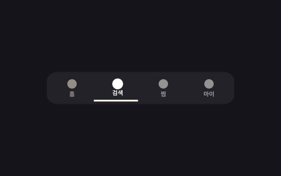
タブを押すと下線インジケーターが translateX で押されたタブの下まで滑り、アイコンが少し浮き上がる。
使いどころモバイルWebの下部タブナビゲーション — サイドバーのモバイル版
탭 인디케이터translateX 슬라이드하단 고정
<main class="stage is-demo">
  <nav class="tabbar" aria-label="下部ナビゲーション">
    <button class="tab is-active" type="button" aria-current="page"><span class="tab__ic" aria-hidden="true"></span><span class="tab__label">ホーム</span></button>
    <button class="tab" type="button"><span class="tab__ic" aria-hidden="true"></span><span class="tab__label">検索</span></button>
    <button class="tab" type="button"><span class="tab__ic" aria-hidden="true"></span><span class="tab__label">お気に入り</span></button>
    <button class="tab" type="button"><span class="tab__ic" aria-hidden="true"></span><span class="tab__label">マイページ</span></button>
    <span class="indicator" aria-hidden="true"></span>
  </nav>
</main>
@use "../../../../site/static/demo-tokens" as *;
// ── 변수 3개 ──────────────────────────────────────────
$duration: $dur-quick; // 220ms — 인디케이터가 옆 탭으로 미끄러지는 시간
$easing: $ease-spring;
$color: $subject-cream; // 활성 탭 강조색
// ── 데모 무대 ───────────────────────────────────────────
@include stage($stage-ink);
.tabbar {
position: relative;
display: flex;
width: min(92vw, 320px);
border-radius: $r-card;
background: rgba($stage-paper, .06);
padding: $sp-1;
box-sizing: border-box;
}
.tab {
flex: 1;
display: flex; flex-direction: column; align-items: center; gap: $sp-1;
border: 0; background: transparent; cursor: pointer;
padding: $sp-2 $sp-1;
color: $stage-paper;
font-family: inherit;
-webkit-tap-highlight-color: transparent;
}
.tab__ic {
width: $sp-4; height: $sp-4;
border-radius: 50%;
background: currentColor;
opacity: .5;
transform: scale(1);
transition: opacity $duration $easing, transform $duration $easing;
}
.tab__label {
font-weight: 500;
font-size: 10px;
line-height: 1;
font-family: inherit;
opacity: .55;
transform: translateY(0);
transition: opacity $duration $easing, transform $duration $easing;
}
.tab.is-active {
color: $color;
.tab__ic { opacity: 1; transform: scale(1.15); }
.tab__label { opacity: 1; transform: translateY(-2px); }
}
.indicator {
position: absolute; left: $sp-1; bottom: $sp-1;
width: calc(25% - #{$sp-1});
height: 3px;
border-radius: $r-xs;
background: $color;
transform: translateX(0);
transition: transform $duration $easing;
}
// 데모 루프: 인디케이터가 네 탭을 순서대로 돌고, 각 탭은 도착하는 구간에서만 밝아진다
.stage.is-demo .indicator { animation: indicator-loop $dur-loop $easing infinite; }
.stage.is-demo .tab:nth-child(1) .tab__ic { animation: tab-ic-loop $dur-loop $easing infinite; animation-delay: 0ms; }
.stage.is-demo .tab:nth-child(2) .tab__ic { animation: tab-ic-loop $dur-loop $easing infinite; animation-delay: 500ms; }
.stage.is-demo .tab:nth-child(3) .tab__ic { animation: tab-ic-loop $dur-loop $easing infinite; animation-delay: 1000ms; }
.stage.is-demo .tab:nth-child(4) .tab__ic { animation: tab-ic-loop $dur-loop $easing infinite; animation-delay: 1500ms; }
.stage.is-demo .tab:nth-child(1) .tab__label { animation: tab-label-loop $dur-loop $easing infinite; animation-delay: 0ms; }
.stage.is-demo .tab:nth-child(2) .tab__label { animation: tab-label-loop $dur-loop $easing infinite; animation-delay: 500ms; }
.stage.is-demo .tab:nth-child(3) .tab__label { animation: tab-label-loop $dur-loop $easing infinite; animation-delay: 1000ms; }
.stage.is-demo .tab:nth-child(4) .tab__label { animation: tab-label-loop $dur-loop $easing infinite; animation-delay: 1500ms; }
@keyframes indicator-loop {
0%, 20% { transform: translateX(0); }
25%, 45% { transform: translateX(100%); }
50%, 70% { transform: translateX(200%); }
75%, 95% { transform: translateX(300%); }
100% { transform: translateX(0); }
}
@keyframes tab-ic-loop {
0%, 20% { opacity: 1; transform: scale(1.15); }
25%, 100% { opacity: .5; transform: scale(1); }
}
@keyframes tab-label-loop {
0%, 20% { opacity: 1; transform: translateY(-2px); }
25%, 100% { opacity: .55; transform: translateY(0); }
}
@media (prefers-reduced-motion: reduce) {
.stage.is-demo .indicator,
.stage.is-demo .tab .tab__ic,
.stage.is-demo .tab .tab__label { animation: none; }
.indicator, .tab__ic, .tab__label { transition-duration: 1ms; }
}html, body {
margin: 0;
overflow: hidden;
}
.stage {
box-sizing: border-box;
min-height: 100vh;
display: grid;
place-items: center;
margin: 0;
background: #17141a;
font-family: -apple-system, "Segoe UI", "Noto Sans KR", sans-serif;
padding: clamp(8px, 4vw, 24px);
}
.tabbar {
position: relative;
display: flex;
width: min(92vw, 320px);
border-radius: 16px;
background: rgba(255, 255, 255, 0.06);
padding: 4px;
box-sizing: border-box;
}
.tab {
flex: 1;
display: flex;
flex-direction: column;
align-items: center;
gap: 4px;
border: 0;
background: transparent;
cursor: pointer;
padding: 8px 4px;
color: #ffffff;
font-family: inherit;
-webkit-tap-highlight-color: transparent;
}
.tab__ic {
width: 16px;
height: 16px;
border-radius: 50%;
background: currentColor;
opacity: 0.5;
transform: scale(1);
transition: opacity 220ms cubic-bezier(0.2, 0.8, 0.2, 1), transform 220ms cubic-bezier(0.2, 0.8, 0.2, 1);
}
.tab__label {
font-weight: 500;
font-size: 10px;
line-height: 1;
font-family: inherit;
opacity: 0.55;
transform: translateY(0);
transition: opacity 220ms cubic-bezier(0.2, 0.8, 0.2, 1), transform 220ms cubic-bezier(0.2, 0.8, 0.2, 1);
}
.tab.is-active {
color: #fff7e6;
}
.tab.is-active .tab__ic {
opacity: 1;
transform: scale(1.15);
}
.tab.is-active .tab__label {
opacity: 1;
transform: translateY(-2px);
}
.indicator {
position: absolute;
left: 4px;
bottom: 4px;
width: calc(25% - 4px);
height: 3px;
border-radius: 4px;
background: #fff7e6;
transform: translateX(0);
transition: transform 220ms cubic-bezier(0.2, 0.8, 0.2, 1);
}
.stage.is-demo .indicator {
animation: indicator-loop 2s cubic-bezier(0.2, 0.8, 0.2, 1) infinite;
}
.stage.is-demo .tab:nth-child(1) .tab__ic {
animation: tab-ic-loop 2s cubic-bezier(0.2, 0.8, 0.2, 1) infinite;
animation-delay: 0ms;
}
.stage.is-demo .tab:nth-child(2) .tab__ic {
animation: tab-ic-loop 2s cubic-bezier(0.2, 0.8, 0.2, 1) infinite;
animation-delay: 500ms;
}
.stage.is-demo .tab:nth-child(3) .tab__ic {
animation: tab-ic-loop 2s cubic-bezier(0.2, 0.8, 0.2, 1) infinite;
animation-delay: 1000ms;
}
.stage.is-demo .tab:nth-child(4) .tab__ic {
animation: tab-ic-loop 2s cubic-bezier(0.2, 0.8, 0.2, 1) infinite;
animation-delay: 1500ms;
}
.stage.is-demo .tab:nth-child(1) .tab__label {
animation: tab-label-loop 2s cubic-bezier(0.2, 0.8, 0.2, 1) infinite;
animation-delay: 0ms;
}
.stage.is-demo .tab:nth-child(2) .tab__label {
animation: tab-label-loop 2s cubic-bezier(0.2, 0.8, 0.2, 1) infinite;
animation-delay: 500ms;
}
.stage.is-demo .tab:nth-child(3) .tab__label {
animation: tab-label-loop 2s cubic-bezier(0.2, 0.8, 0.2, 1) infinite;
animation-delay: 1000ms;
}
.stage.is-demo .tab:nth-child(4) .tab__label {
animation: tab-label-loop 2s cubic-bezier(0.2, 0.8, 0.2, 1) infinite;
animation-delay: 1500ms;
}
@keyframes indicator-loop {
0%, 20% {
transform: translateX(0);
}
25%, 45% {
transform: translateX(100%);
}
50%, 70% {
transform: translateX(200%);
}
75%, 95% {
transform: translateX(300%);
}
100% {
transform: translateX(0);
}
}
@keyframes tab-ic-loop {
0%, 20% {
opacity: 1;
transform: scale(1.15);
}
25%, 100% {
opacity: 0.5;
transform: scale(1);
}
}
@keyframes tab-label-loop {
0%, 20% {
opacity: 1;
transform: translateY(-2px);
}
25%, 100% {
opacity: 0.55;
transform: translateY(0);
}
}
@media (prefers-reduced-motion: reduce) {
.stage.is-demo .indicator,
.stage.is-demo .tab .tab__ic,
.stage.is-demo .tab .tab__label {
animation: none;
}
.indicator, .tab__ic, .tab__label {
transition-duration: 1ms;
}
}(function () {
var stage = document.querySelector('.stage');
var tabs = document.querySelectorAll('.tab');
var indicator = document.querySelector('.indicator');
tabs.forEach(function (tab, i) {
tab.addEventListener('click', function () {
stage.classList.remove('is-demo');
tabs.forEach(function (t) { t.classList.remove('is-active'); t.removeAttribute('aria-current'); });
tab.classList.add('is-active'); tab.setAttribute('aria-current', 'page');
indicator.style.transform = 'translateX(' + (i * 100) + '%)';
});
});
})();import { useState } from "react";
import type { CSSProperties } from "react";
import styles from "./BottomTabBar.module.scss";
export type BottomTabBarProps = {
duration?: number;
easing?: string;
color?: string;
};
const TABS = ["홈", "검색", "찜", "마이"];
export default function BottomTabBar({
duration = 220,
easing = "cubic-bezier(.2,.8,.2,1)",
color = "#fff7e6",
}: BottomTabBarProps) {
const [active, setActive] = useState(0);
const vars: CSSProperties = {
"--duration": `${duration}ms`,
"--easing": easing,
"--color": color,
"--i": active,
};
return (
<div className={styles.stage} style={vars}>
<nav className={styles.tabbar} aria-label="하단 내비게이션">
{TABS.map((label, i) => (
<button
key={label}
className={styles.tab}
type="button"
data-active={i === active}
aria-current={i === active ? "page" : undefined}
onClick={() => setActive(i)}
>
<span className={styles.ic} aria-hidden="true" />
<span className={styles.label}>{label}</span>
</button>
))}
<span className={styles.indicator} aria-hidden="true" />
</nav>
</div>
);
}09 下部タブバー — 計測 累積面積 1.886% · 動いたフレーム 7/23GODRICH オリジナル · SCSS と React は zip に同梱 · css ドロワー メニュー スライド9選 — JS最小・CSSだけ
このデモが属する記事
 css ドロワー メニュー スライド9選 — JS最小・CSSだけcss ドロワーは、画面の端に隠れたパネルがトリガー操作で滑り出したり、位置を変えずにその場で現れたりするナビゲーションUIです。この記事はtransformとopacityを軸に9種類の開き方を集め、うち01・03・08の3つは実際にin この記事のデモをすべて見る