01シマーライン
文字行の位置をグレーの棒が占め、光が走る。
使いどころ記事一覧・コメント
1.4s느리게 2s빛 없이
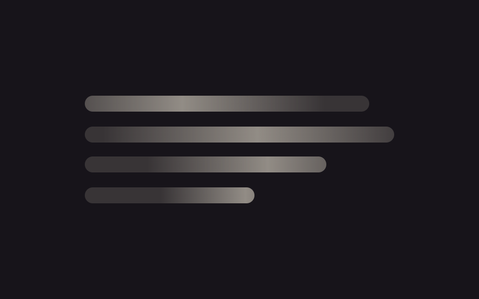
<main class="stage">
  <div class="lines">
    <div class="line"></div>
    <div class="line"></div>
    <div class="line"></div>
    <div class="line"></div>
  </div>
</main>
@use "../../../../site/static/demo-tokens" as *;
// ── 변수 3개. 변형은 이것만 바꾼다 ──────────────────────────
$duration: $dur-loop; // 빛이 줄 하나를 다 훑는 시간
$easing: $ease-out; // 시작은 빠르고 끝은 느리게
$color: $subject-cream; // 막대·빛의 바탕 색 (어두운 무대라 크림)
// ── 데모 무대 ──────────────────────────────────────────
@include stage($stage-ink);
.lines {
width: clamp(180px, 70%, 360px);
display: grid;
gap: clamp(10px, 3vw, 16px);
}
// ── 줄 막대 ──────────────────────────────────────────
.line {
position: relative;
overflow: hidden; // 빛이 막대 밖으로 안 나가게
height: clamp(12px, 4vw, 16px);
border-radius: $r-control;
background: rgba($color, .14);
&::after {
content: "";
position: absolute;
inset: 0;
background: linear-gradient(90deg, transparent, rgba($color, .45), transparent);
transform: translateX(-120%); // 위치가 아니라 transform 으로만 이동
animation: shimmer $duration $easing infinite;
}
&:nth-child(1) { width: 92%; }
&:nth-child(2) { width: 100%; }
&:nth-child(3) { width: 78%; }
&:nth-child(4) { width: 55%; }
&:nth-child(2)::after { animation-delay: -140ms; } // 줄마다 살짝 어긋나게 시작 (음수 지연 = 이미 진행 중인 상태로 시작)
&:nth-child(3)::after { animation-delay: -280ms; }
&:nth-child(4)::after { animation-delay: -420ms; }
}
@keyframes shimmer {
to { transform: translateX(120%); }
}
// ── 접근성: 움직임 줄이기 설정이면 스침 대신 옅은 밝기만 ────────
@media (prefers-reduced-motion: reduce) {
.line::after { animation: none !important; opacity: .45; transform: translateX(0); }
}html, body {
margin: 0;
overflow: hidden;
}
.stage {
box-sizing: border-box;
min-height: 100vh;
display: grid;
place-items: center;
margin: 0;
background: #17141a;
font-family: -apple-system, "Segoe UI", "Noto Sans KR", sans-serif;
padding: clamp(8px, 4vw, 24px);
}
.lines {
width: clamp(180px, 70%, 360px);
display: grid;
gap: clamp(10px, 3vw, 16px);
}
.line {
position: relative;
overflow: hidden;
height: clamp(12px, 4vw, 16px);
border-radius: 12px;
background: rgba(255, 247, 230, 0.14);
}
.line::after {
content: "";
position: absolute;
inset: 0;
background: linear-gradient(90deg, transparent, rgba(255, 247, 230, 0.45), transparent);
transform: translateX(-120%);
animation: shimmer 2s ease-out infinite;
}
.line:nth-child(1) {
width: 92%;
}
.line:nth-child(2) {
width: 100%;
}
.line:nth-child(3) {
width: 78%;
}
.line:nth-child(4) {
width: 55%;
}
.line:nth-child(2)::after {
animation-delay: -140ms;
}
.line:nth-child(3)::after {
animation-delay: -280ms;
}
.line:nth-child(4)::after {
animation-delay: -420ms;
}
@keyframes shimmer {
to {
transform: translateX(120%);
}
}
@media (prefers-reduced-motion: reduce) {
.line::after {
animation: none !important;
opacity: 0.45;
transform: translateX(0);
}
}import type { CSSProperties } from "react";
import styles from "./ShimmerLines.module.scss";
export type ShimmerLinesProps = {
/** 빛이 줄 하나를 훑는 시간 (기본 2000ms) */
duration?: number;
/** CSS easing (기본 ease-out) */
easing?: string;
/** 막대·빛의 바탕 색 */
color?: string;
/** 줄 수 (기본 4) */
lines?: number;
className?: string;
};
const WIDTHS = ["92%", "100%", "78%", "55%"];
export default function ShimmerLines({
duration = 2000,
easing = "ease-out",
color = "#fff7e6",
lines = 4,
className = "",
}: ShimmerLinesProps) {
const vars = { "--duration": `${duration}ms`, "--easing": easing, "--color": color } as CSSProperties;
return (
<div className={`${styles.lines} ${className}`} style={vars}>
{Array.from({ length: lines }).map((_, i) => (
<div
key={i}
className={styles.line}
style={{ width: WIDTHS[i % WIDTHS.length], animationDelay: `${-i * 140}ms` } as CSSProperties}
/>
))}
</div>
);
}01 シマーライン — 計測 累積面積 11.078% · 動いたフレーム 21/23GODRICH オリジナル · SCSS と React は zip に同梱 · 【コピペOK】CSS スケルトン ローディング 9選
このデモが属する記事
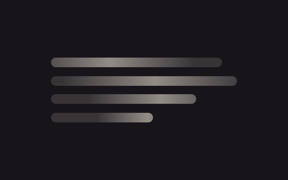 【コピペOK】CSS スケルトン ローディング 9選css スケルトンとは、本物のコンテンツが届く前に画面の形だけを灰色の板で先に見せておくローディング表現のことです。この記事ではシマーライン・カード・表・コンテナクエリまで9種類を選び、JavaScript を使わず SCSS だけで実装し この記事のデモをすべて見る