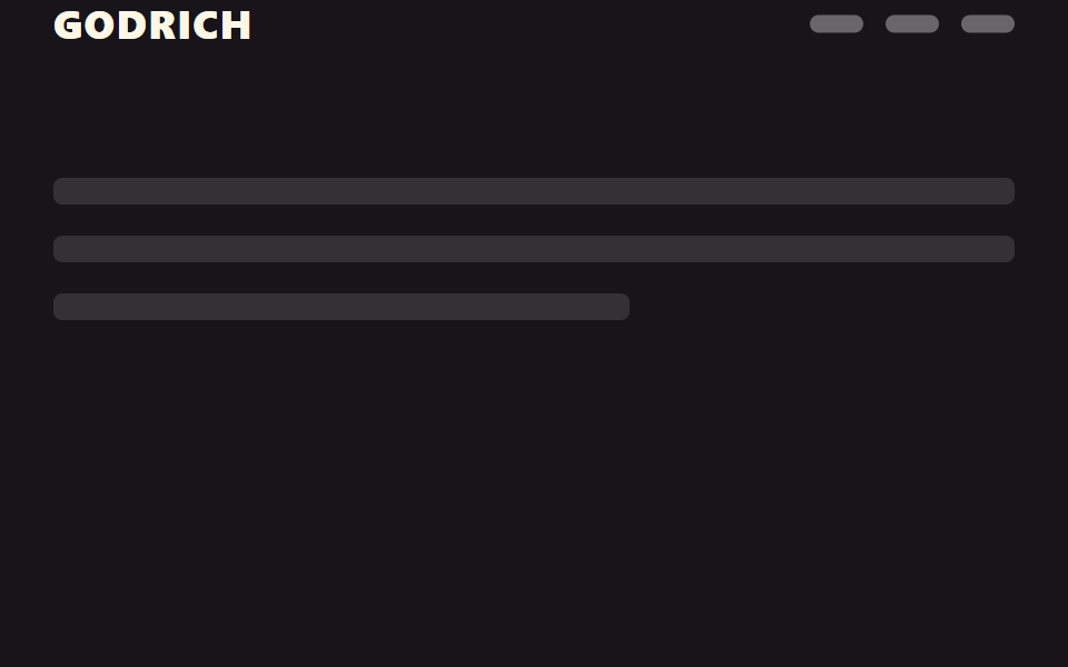
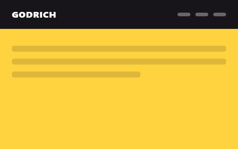
01お知らせバーの折りたたみ
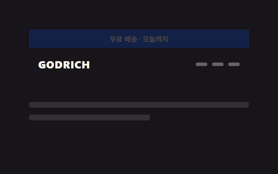
ページ最上部のお知らせバーはスクロールを始めた瞬間に高さ0まで折りたたまれ、ロゴ行だけが残る。
使いどころECの送料無料案内バー、シーズンプロモーションバナー
translateY(-100%)2단→1단scroll 임계값
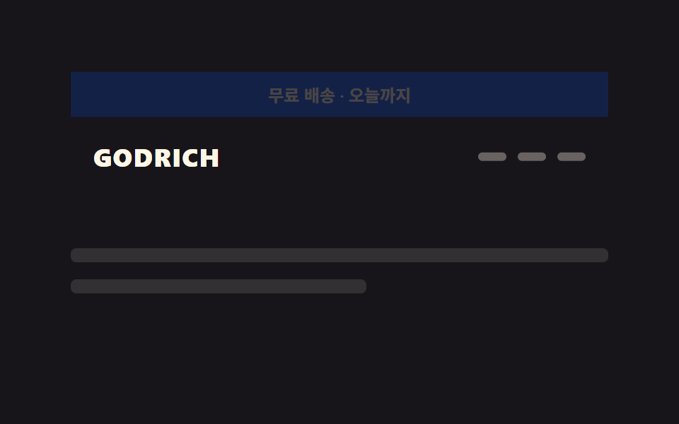
<main class="stage">
  <div class="ahc is-demo">
    <div class="ahc__slot">
      <div class="ahc__bar">送料無料・本日まで</div>
      <header class="ahc__head">
        <span class="ahc__logo">GODRICH</span>
        <nav class="ahc__nav" aria-hidden="true"><span></span><span></span><span></span></nav>
      </header>
    </div>
    <div class="ahc__page">
      <p class="ahc__line"></p>
      <p class="ahc__line short"></p>
    </div>
  </div>
</main>
@use "../../../../site/static/demo-tokens" as *;
// ── 변수 3개. 변형은 이것만 바꾼다 ──────────────────────────
$duration: $dur-base; // 배너가 접히고 헤더가 올라오는 시간
// 관성 lerp — p += (목표-p) * .32 를 20스텝 반복한 실제 계산 결과를 그대로 커브로 굽는다
// (형태 2차, 사용자 2026-09-14). ease-out 은 미리 그려둔 곡선이지만 이건 반복 계산의 산출값이다.
$easing: linear(0, .32, .538, .686, .786, .855, .901, .933, .954, .969, .979, .986, .99, .993, .995, .997, .998, .999, .999, .999, 1);
$easing-content: linear(0, .18, .328, .449, .548, .629, .696, .751, .796, .832, .863, .887, .908, .924, .938, .949, .958, .966, .972, .977, 1); // 알파 .18 — 헤더보다 느리게 목표를 따라잡아 시차가 생긴다
$dur-content: $dur-base * 1.4; // 콘텐츠가 헤더보다 늦게 도착
$color: $stage-ink; // 헤더·배너 배경
@include stage($stage-ink);
$bar-h: 32px;
$head-h: 56px;
.ahc { width: min(380px, 90vw); }
// ── 고정 높이 슬롯: 배너+헤더 두 층을 겹쳐 두고 transform 만 움직인다 (height 애니메이션 없음) ──
.ahc__slot {
position: relative;
height: $bar-h + $head-h;
}
.ahc__bar {
position: absolute; inset: 0 0 auto 0;
height: $bar-h;
display: flex; align-items: center; justify-content: center;
font-weight: 600;
font-size: clamp(10px, 2.8vw, 12px);
line-height: 1;
font-family: inherit;
color: $subject-cream;
background: $subject-blue-deep;
transform: translateY(0);
opacity: 1;
transition: transform $duration $easing, opacity $duration $easing;
}
.ahc__head {
position: absolute; left: 0; right: 0; top: $bar-h;
height: $head-h;
display: flex; align-items: center; justify-content: space-between;
padding: 0 $sp-4;
background: $color;
transform: translateY(0);
transition: transform $duration $easing;
}
.ahc__logo { color: $subject-cream; font-weight: 800; font-size: clamp(14px, 4vw, 18px); line-height: 1; font-family: inherit; letter-spacing: .04em; }
.ahc__nav { display: flex; gap: $sp-2; span { width: 20px; height: 6px; border-radius: $r-pill; background: rgba($subject-cream, .35); } }
// 실제 사용: 스크롤을 시작하면 배너가 위로 사라지고 헤더가 그 빈 자리로 올라온다
.ahc.is-scrolled {
.ahc__bar { transform: translateY(-100%); opacity: 0; }
.ahc__head { transform: translateY(-#{$bar-h}); }
// 콘텐츠는 헤더를 그대로 따라가지 않고 $easing-content 로 뒤처져 도착 — 시차 스크롤
.ahc__page { transform: translateY(-8px); }
}
// ── 데모(.is-demo): 접혔다 돌아오는 2초 루프 ──────────────
.ahc.is-demo {
.ahc__bar { animation: ahc-bar-loop $dur-loop $easing infinite; }
.ahc__head { animation: ahc-head-loop $dur-loop $easing infinite; }
.ahc__page { animation: ahc-page-loop $dur-loop $easing-content infinite; }
}
@keyframes ahc-bar-loop {
0%, 20% { transform: translateY(0); opacity: 1; }
45%, 70% { transform: translateY(-100%); opacity: 0; }
95%, 100% { transform: translateY(0); opacity: 1; }
}
@keyframes ahc-head-loop {
0%, 20% { transform: translateY(0); }
45%, 70% { transform: translateY(-#{$bar-h}); }
95%, 100% { transform: translateY(0); }
}
// 헤더보다 느린 $easing-content 로 같은 20~45%·70~95% 구간을 밟는다 — 관성이 덜 붙어 뒤처져 보인다
@keyframes ahc-page-loop {
0%, 20% { transform: translateY(0); }
45%, 70% { transform: translateY(-8px); }
95%, 100% { transform: translateY(0); }
}
// ── 배경: 문서처럼 보이는 자리 ─────────────────────────
.ahc__page {
padding: $sp-4 0 0;
transform: translateY(0);
transition: transform $dur-content $easing-content;
}
.ahc__line {
height: 10px;
margin: 0 0 $sp-3;
border-radius: $r-xs;
background: rgba($subject-cream, .12);
&.short { width: 55%; }
}
// ── 접근성: 움직임 줄이기 설정이면 즉시 상태만 바뀐다 ────────
@media (prefers-reduced-motion: reduce) {
.ahc__bar, .ahc__head, .ahc__page { transition: none; }
.ahc.is-demo {
.ahc__bar, .ahc__head, .ahc__page { animation: none !important; }
.ahc__bar { transform: translateY(0); opacity: 1; }
.ahc__head { transform: translateY(0); }
.ahc__page { transform: translateY(0); }
}
}html, body {
margin: 0;
overflow: hidden;
}
.stage {
box-sizing: border-box;
min-height: 100vh;
display: grid;
place-items: center;
margin: 0;
background: #17141a;
font-family: -apple-system, "Segoe UI", "Noto Sans KR", sans-serif;
padding: clamp(8px, 4vw, 24px);
}
.ahc {
width: min(380px, 90vw);
}
.ahc__slot {
position: relative;
height: 88px;
}
.ahc__bar {
position: absolute;
inset: 0 0 auto 0;
height: 32px;
display: flex;
align-items: center;
justify-content: center;
font-weight: 600;
font-size: clamp(10px, 2.8vw, 12px);
line-height: 1;
font-family: inherit;
color: #fff7e6;
background: #0a4fe8;
transform: translateY(0);
opacity: 1;
transition: transform 300ms linear(0, 0.32, 0.538, 0.686, 0.786, 0.855, 0.901, 0.933, 0.954, 0.969, 0.979, 0.986, 0.99, 0.993, 0.995, 0.997, 0.998, 0.999, 0.999, 0.999, 1), opacity 300ms linear(0, 0.32, 0.538, 0.686, 0.786, 0.855, 0.901, 0.933, 0.954, 0.969, 0.979, 0.986, 0.99, 0.993, 0.995, 0.997, 0.998, 0.999, 0.999, 0.999, 1);
}
.ahc__head {
position: absolute;
left: 0;
right: 0;
top: 32px;
height: 56px;
display: flex;
align-items: center;
justify-content: space-between;
padding: 0 16px;
background: #17141a;
transform: translateY(0);
transition: transform 300ms linear(0, 0.32, 0.538, 0.686, 0.786, 0.855, 0.901, 0.933, 0.954, 0.969, 0.979, 0.986, 0.99, 0.993, 0.995, 0.997, 0.998, 0.999, 0.999, 0.999, 1);
}
.ahc__logo {
color: #fff7e6;
font-weight: 800;
font-size: clamp(14px, 4vw, 18px);
line-height: 1;
font-family: inherit;
letter-spacing: 0.04em;
}
.ahc__nav {
display: flex;
gap: 8px;
}
.ahc__nav span {
width: 20px;
height: 6px;
border-radius: 999px;
background: rgba(255, 247, 230, 0.35);
}
.ahc.is-scrolled .ahc__bar {
transform: translateY(-100%);
opacity: 0;
}
.ahc.is-scrolled .ahc__head {
transform: translateY(-32px);
}
.ahc.is-scrolled .ahc__page {
transform: translateY(-8px);
}
.ahc.is-demo .ahc__bar {
animation: ahc-bar-loop 2s linear(0, 0.32, 0.538, 0.686, 0.786, 0.855, 0.901, 0.933, 0.954, 0.969, 0.979, 0.986, 0.99, 0.993, 0.995, 0.997, 0.998, 0.999, 0.999, 0.999, 1) infinite;
}
.ahc.is-demo .ahc__head {
animation: ahc-head-loop 2s linear(0, 0.32, 0.538, 0.686, 0.786, 0.855, 0.901, 0.933, 0.954, 0.969, 0.979, 0.986, 0.99, 0.993, 0.995, 0.997, 0.998, 0.999, 0.999, 0.999, 1) infinite;
}
.ahc.is-demo .ahc__page {
animation: ahc-page-loop 2s linear(0, 0.18, 0.328, 0.449, 0.548, 0.629, 0.696, 0.751, 0.796, 0.832, 0.863, 0.887, 0.908, 0.924, 0.938, 0.949, 0.958, 0.966, 0.972, 0.977, 1) infinite;
}
@keyframes ahc-bar-loop {
0%, 20% {
transform: translateY(0);
opacity: 1;
}
45%, 70% {
transform: translateY(-100%);
opacity: 0;
}
95%, 100% {
transform: translateY(0);
opacity: 1;
}
}
@keyframes ahc-head-loop {
0%, 20% {
transform: translateY(0);
}
45%, 70% {
transform: translateY(-32px);
}
95%, 100% {
transform: translateY(0);
}
}
@keyframes ahc-page-loop {
0%, 20% {
transform: translateY(0);
}
45%, 70% {
transform: translateY(-8px);
}
95%, 100% {
transform: translateY(0);
}
}
.ahc__page {
padding: 16px 0 0;
transform: translateY(0);
transition: transform 420ms linear(0, 0.18, 0.328, 0.449, 0.548, 0.629, 0.696, 0.751, 0.796, 0.832, 0.863, 0.887, 0.908, 0.924, 0.938, 0.949, 0.958, 0.966, 0.972, 0.977, 1);
}
.ahc__line {
height: 10px;
margin: 0 0 12px;
border-radius: 4px;
background: rgba(255, 247, 230, 0.12);
}
.ahc__line.short {
width: 55%;
}
@media (prefers-reduced-motion: reduce) {
.ahc__bar, .ahc__head, .ahc__page {
transition: none;
}
.ahc.is-demo .ahc__bar, .ahc.is-demo .ahc__head, .ahc.is-demo .ahc__page {
animation: none !important;
}
.ahc.is-demo .ahc__bar {
transform: translateY(0);
opacity: 1;
}
.ahc.is-demo .ahc__head {
transform: translateY(0);
}
.ahc.is-demo .ahc__page {
transform: translateY(0);
}
}// 실제 페이지: 스크롤을 시작하는 순간 공지 배너가 위로 사라지고 헤더가 그 자리로 올라온다 (7줄)
var el = document.querySelector('.ahc');
window.addEventListener('scroll', function () {
el.classList.toggle('is-scrolled', window.scrollY > 20);
}, { passive: true });import { useEffect, useRef } from "react";
import type { CSSProperties, ReactNode } from "react";
import styles from "./AnnouncementCollapseHeader.module.scss";
export type AnnouncementCollapseHeaderProps = {
logo: string;
announcement: string;
children?: ReactNode;
/** 배너가 접히고 헤더가 올라오는 시간 (기본 300ms) */
duration?: number;
/** 관성 lerp 커브(p += (목표-p)*.32 를 20스텝 반복해 구운 linear()) — 기본값이 vanilla 와 같다 */
easing?: string;
color?: string;
};
type Vars = CSSProperties & { "--duration"?: string; "--easing"?: string; "--color"?: string };
const LERP_EASING = "linear(0, .32, .538, .686, .786, .855, .901, .933, .954, .969, .979, .986, .99, .993, .995, .997, .998, .999, .999, .999, 1)";
export default function AnnouncementCollapseHeader({
logo,
announcement,
children,
duration = 300,
easing = LERP_EASING,
color = "#17141a",
}: AnnouncementCollapseHeaderProps) {
const ref = useRef<HTMLDivElement>(null);
const vars: Vars = { "--duration": `${duration}ms`, "--easing": easing, "--color": color };
useEffect(() => {
function onScroll() {
ref.current?.classList.toggle("is-scrolled", window.scrollY > 20);
}
window.addEventListener("scroll", onScroll, { passive: true });
return () => window.removeEventListener("scroll", onScroll);
}, []);
return (
<div ref={ref} className={styles.slot} style={vars}>
<div className={styles.bar}>{announcement}</div>
<header className={styles.head}>
<span className={styles.logo}>{logo}</span>
<nav className={styles.nav}>{children}</nav>
</header>
</div>
);
}01 お知らせバーの折りたたみ — 計測 累積面積 23.972% · 動いたフレーム 12/23GODRICH オリジナル · SCSS と React は zip に同梱 · CSS スティッキーヘッダー追加9選 — 検索バー・CTA・通知まで
このデモが属する記事
 CSS スティッキーヘッダー追加9選 — 検索バー・CTA・通知までcss スティッキーヘッダーとは、スクロールしてもページ上部のメニュー行が画面に貼り付いたまま残る機能で、position: stickyを一行書くだけで実現できます。ここで紹介する9個は貼り付くだけのヘッダーの一歩先で、スクロールする間に この記事のデモをすべて見る