07昼夜アイコントグル
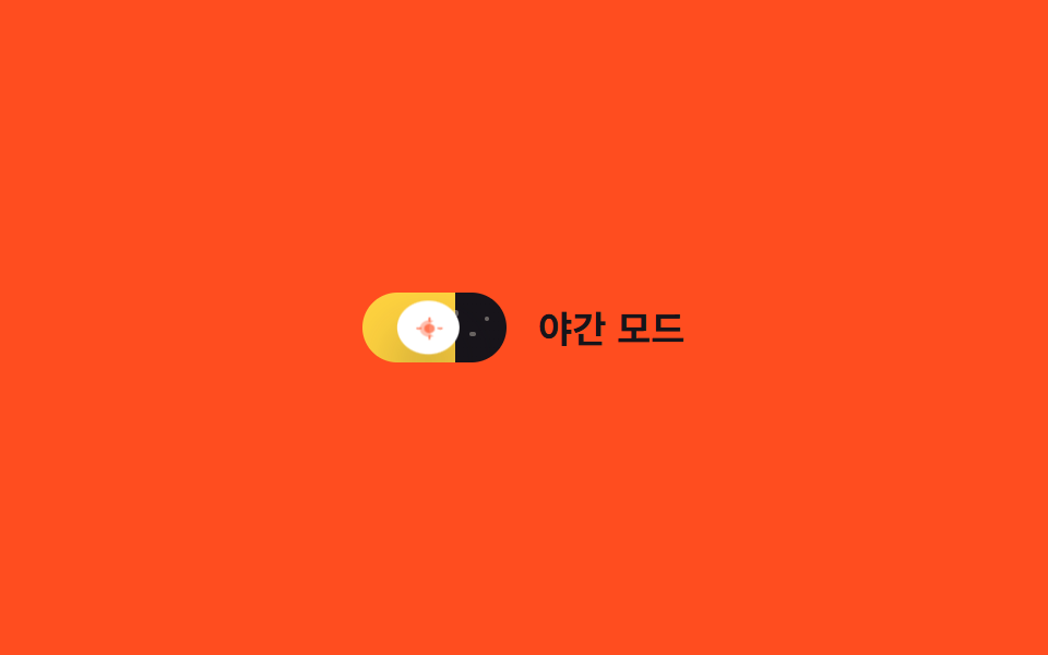
ノブが移動するトラック自体が空になり、背景グラデーションが明るい昼色から濃い夜色へ移り、小さな星の点が opacity で浮かび上がる。
使いどころテーマ切替スイッチ、天気アプリ風の設定
background-position별 opacity0.5초
<main class="stage">
  <label class="switch is-demo">
    <input type="checkbox" class="switch__input" role="switch">
    <span class="switch__track">
      <span class="switch__star switch__star--1"></span>
      <span class="switch__star switch__star--2"></span>
      <span class="switch__star switch__star--3"></span>
      <span class="switch__knob">
        <svg class="switch__icon switch__icon--sun" viewBox="0 0 16 16" width="11" height="11" aria-hidden="true">
          <circle cx="8" cy="8" r="3.2" fill="currentColor"/>
          <g stroke="currentColor" stroke-width="1.4" stroke-linecap="round">
            <line x1="8" y1="0.5" x2="8" y2="2.4"/>
            <line x1="8" y1="13.6" x2="8" y2="15.5"/>
            <line x1="0.5" y1="8" x2="2.4" y2="8"/>
            <line x1="13.6" y1="8" x2="15.5" y2="8"/>
          </g>
        </svg>
        <svg class="switch__icon switch__icon--moon" viewBox="0 0 16 16" width="11" height="11" aria-hidden="true">
          <path d="M10.5 2.5a6 6 0 100 11 7 7 0 010-11z" fill="currentColor"/>
        </svg>
      </span>
    </span>
    <span class="switch__label">夜間モード</span>
  </label>
</main>@use "../../../../site/static/demo-tokens" as *;
// ── 변수 3개 ──────────────────────────────
$duration: $dur-enter;
$easing: $ease-out;
$color: $stage-ink;
// ── 데모 무대 ───────────────────────────────
@include stage($stage-orange);
.switch {
position: relative;
display: inline-flex; align-items: center; gap: clamp(10px, 3vw, 14px);
cursor: pointer;
-webkit-tap-highlight-color: transparent;
}
.switch__input {
position: absolute; inset: 0; width: 100%; height: 100%;
margin: 0; opacity: 0; cursor: pointer;
}
.switch__track {
position: relative; overflow: hidden;
width: clamp(56px, 15vw, 66px); height: clamp(28px, 7.5vw, 32px);
border-radius: $r-pill;
background-image: linear-gradient(90deg, $stage-yellow 0%, $stage-yellow 50%, $color 50%, $color 100%);
background-size: 200% 100%;
background-position: 0% 0%;
transition: background-position $duration $easing;
}
.switch__star {
position: absolute; top: 30%; width: 2.5px; height: 2.5px; border-radius: 50%;
background: $subject-cream; opacity: 0;
transition: opacity $duration $easing;
}
.switch__star--1 { left: 62%; top: 26%; }
.switch__star--2 { left: 74%; top: 55%; }
.switch__star--3 { left: 84%; top: 34%; }
.switch__knob {
position: absolute; top: 3px; left: 3px; z-index: 1;
display: grid; place-items: center;
width: clamp(22px, 6vw, 26px); height: clamp(22px, 6vw, 26px);
border-radius: 50%;
background: $stage-paper;
box-shadow: $shadow-raised;
color: $stage-orange;
transform: translateX(0);
transition: transform $duration cubic-bezier(0.34, 1.56, 0.64, 1), color $duration $easing, box-shadow $duration $easing;
}
.switch__icon { grid-area: 1 / 1; transition: opacity $duration $easing; }
.switch__icon--sun { opacity: 1; }
.switch__icon--moon { opacity: 0; }
.switch__label { color: $subject-ink; font-weight: 600; font-size: clamp(14px, 4vw, 17px); line-height: 1; font-family: inherit; }
// ── 실제 동작: 트랙 자체가 하늘, 노브 안 아이콘이 크로스페이드 ──────
.switch__input:checked ~ .switch__track { background-position: 100% 0%; }
.switch__input:checked ~ .switch__track .switch__star { opacity: 1; }
.switch__input:checked ~ .switch__track .switch__knob {
transform: translateX(clamp(28px, 8vw, 34px));
color: $subject-ink;
box-shadow: 0 20px 32px rgba(23, 20, 26, .4);
}
.switch__input:checked ~ .switch__track .switch__icon--sun { opacity: 0; }
.switch__input:checked ~ .switch__track .switch__icon--moon { opacity: 1; }
.switch__input:focus-visible ~ .switch__track {
outline: 2px solid $subject-ink; outline-offset: 3px;
}
// ── 데모 루프 ─────────────────────────────
// 한 겹: 노브는 도착 지점을 지나쳤다 찌그러지며 안착하고(스프링+squash),
// 밤으로 갈 때 노브 그림자가 깊어진다(blur 증가·offset 하강 — 더 붙는 느낌).
.switch.is-demo .switch__track { animation: sky-loop $dur-loop $easing infinite; }
.switch.is-demo .switch__star--1,
.switch.is-demo .switch__star--2,
.switch.is-demo .switch__star--3 { animation: star-loop $dur-loop $easing infinite; }
.switch.is-demo .switch__knob { animation: knob-spring-loop $dur-loop $easing infinite, knob-shadow-loop $dur-loop $easing infinite; }
.switch.is-demo .switch__icon--sun { animation: sun-loop $dur-loop $easing infinite; }
.switch.is-demo .switch__icon--moon { animation: moon-loop $dur-loop $easing infinite; }
@keyframes sky-loop { 0%, 15% { background-position: 0% 0%; } 40%, 60% { background-position: 100% 0%; } 85%, 100% { background-position: 0% 0%; } }
@keyframes star-loop { 0%, 15% { opacity: 0; } 40%, 60% { opacity: 1; } 85%, 100% { opacity: 0; } }
@keyframes knob-loop {
0%, 15% { transform: translateX(0); }
40%, 60% { transform: translateX(34px); }
85%, 100% { transform: translateX(0); }
}
@keyframes knob-spring-loop {
0%, 15% { transform: translateX(0) scaleX(1) scaleY(1); }
38% { transform: translateX(37px) scaleX(1.25) scaleY(.85); } // 오버슈트 + 도착 순간 squash
43% { transform: translateX(33px) scaleX(1.08) scaleY(.94); } // 되튕기며 회복
47%, 60% { transform: translateX(34px) scaleX(1) scaleY(1); } // 안착
84% { transform: translateX(-2px) scaleX(.92) scaleY(1.06); } // 출발 반동
85%, 100% { transform: translateX(0) scaleX(1) scaleY(1); }
}
@keyframes knob-shadow-loop {
0%, 15% { box-shadow: $shadow-raised; }
40%, 60% { box-shadow: 0 20px 32px rgba(23, 20, 26, .4); }
85%, 100% { box-shadow: $shadow-raised; }
}
@keyframes sun-loop { 0%, 15% { opacity: 1; } 40%, 60% { opacity: 0; } 85%, 100% { opacity: 1; } }
@keyframes moon-loop { 0%, 15% { opacity: 0; } 40%, 60% { opacity: 1; } 85%, 100% { opacity: 0; } }
@media (prefers-reduced-motion: reduce) {
.switch.is-demo .switch__track, .switch.is-demo .switch__star--1, .switch.is-demo .switch__star--2,
.switch.is-demo .switch__star--3, .switch.is-demo .switch__knob, .switch.is-demo .switch__icon--sun,
.switch.is-demo .switch__icon--moon { animation: none !important; }
.switch__track, .switch__star, .switch__knob, .switch__icon { transition: none; }
}html, body {
margin: 0;
overflow: hidden;
}
.stage {
box-sizing: border-box;
min-height: 100vh;
display: grid;
place-items: center;
margin: 0;
background: #ff4d1f;
font-family: -apple-system, "Segoe UI", "Noto Sans KR", sans-serif;
padding: clamp(8px, 4vw, 24px);
}
.switch {
position: relative;
display: inline-flex;
align-items: center;
gap: clamp(10px, 3vw, 14px);
cursor: pointer;
-webkit-tap-highlight-color: transparent;
}
.switch__input {
position: absolute;
inset: 0;
width: 100%;
height: 100%;
margin: 0;
opacity: 0;
cursor: pointer;
}
.switch__track {
position: relative;
overflow: hidden;
width: clamp(56px, 15vw, 66px);
height: clamp(28px, 7.5vw, 32px);
border-radius: 999px;
background-image: linear-gradient(90deg, #ffd23f 0%, #ffd23f 50%, #17141a 50%, #17141a 100%);
background-size: 200% 100%;
background-position: 0% 0%;
transition: background-position 600ms ease-out;
}
.switch__star {
position: absolute;
top: 30%;
width: 2.5px;
height: 2.5px;
border-radius: 50%;
background: #fff7e6;
opacity: 0;
transition: opacity 600ms ease-out;
}
.switch__star--1 {
left: 62%;
top: 26%;
}
.switch__star--2 {
left: 74%;
top: 55%;
}
.switch__star--3 {
left: 84%;
top: 34%;
}
.switch__knob {
position: absolute;
top: 3px;
left: 3px;
z-index: 1;
display: grid;
place-items: center;
width: clamp(22px, 6vw, 26px);
height: clamp(22px, 6vw, 26px);
border-radius: 50%;
background: #ffffff;
box-shadow: 0 14px 24px rgba(23, 20, 26, 0.32);
color: #ff4d1f;
transform: translateX(0);
transition: transform 600ms cubic-bezier(0.34, 1.56, 0.64, 1), color 600ms ease-out, box-shadow 600ms ease-out;
}
.switch__icon {
grid-area: 1/1;
transition: opacity 600ms ease-out;
}
.switch__icon--sun {
opacity: 1;
}
.switch__icon--moon {
opacity: 0;
}
.switch__label {
color: #17141a;
font-weight: 600;
font-size: clamp(14px, 4vw, 17px);
line-height: 1;
font-family: inherit;
}
.switch__input:checked ~ .switch__track {
background-position: 100% 0%;
}
.switch__input:checked ~ .switch__track .switch__star {
opacity: 1;
}
.switch__input:checked ~ .switch__track .switch__knob {
transform: translateX(clamp(28px, 8vw, 34px));
color: #17141a;
box-shadow: 0 20px 32px rgba(23, 20, 26, 0.4);
}
.switch__input:checked ~ .switch__track .switch__icon--sun {
opacity: 0;
}
.switch__input:checked ~ .switch__track .switch__icon--moon {
opacity: 1;
}
.switch__input:focus-visible ~ .switch__track {
outline: 2px solid #17141a;
outline-offset: 3px;
}
.switch.is-demo .switch__track {
animation: sky-loop 2s ease-out infinite;
}
.switch.is-demo .switch__star--1,
.switch.is-demo .switch__star--2,
.switch.is-demo .switch__star--3 {
animation: star-loop 2s ease-out infinite;
}
.switch.is-demo .switch__knob {
animation: knob-spring-loop 2s ease-out infinite, knob-shadow-loop 2s ease-out infinite;
}
.switch.is-demo .switch__icon--sun {
animation: sun-loop 2s ease-out infinite;
}
.switch.is-demo .switch__icon--moon {
animation: moon-loop 2s ease-out infinite;
}
@keyframes sky-loop {
0%, 15% {
background-position: 0% 0%;
}
40%, 60% {
background-position: 100% 0%;
}
85%, 100% {
background-position: 0% 0%;
}
}
@keyframes star-loop {
0%, 15% {
opacity: 0;
}
40%, 60% {
opacity: 1;
}
85%, 100% {
opacity: 0;
}
}
@keyframes knob-loop {
0%, 15% {
transform: translateX(0);
}
40%, 60% {
transform: translateX(34px);
}
85%, 100% {
transform: translateX(0);
}
}
@keyframes knob-spring-loop {
0%, 15% {
transform: translateX(0) scaleX(1) scaleY(1);
}
38% {
transform: translateX(37px) scaleX(1.25) scaleY(0.85);
}
43% {
transform: translateX(33px) scaleX(1.08) scaleY(0.94);
}
47%, 60% {
transform: translateX(34px) scaleX(1) scaleY(1);
}
84% {
transform: translateX(-2px) scaleX(0.92) scaleY(1.06);
}
85%, 100% {
transform: translateX(0) scaleX(1) scaleY(1);
}
}
@keyframes knob-shadow-loop {
0%, 15% {
box-shadow: 0 14px 24px rgba(23, 20, 26, 0.32);
}
40%, 60% {
box-shadow: 0 20px 32px rgba(23, 20, 26, 0.4);
}
85%, 100% {
box-shadow: 0 14px 24px rgba(23, 20, 26, 0.32);
}
}
@keyframes sun-loop {
0%, 15% {
opacity: 1;
}
40%, 60% {
opacity: 0;
}
85%, 100% {
opacity: 1;
}
}
@keyframes moon-loop {
0%, 15% {
opacity: 0;
}
40%, 60% {
opacity: 1;
}
85%, 100% {
opacity: 0;
}
}
@media (prefers-reduced-motion: reduce) {
.switch.is-demo .switch__track, .switch.is-demo .switch__star--1, .switch.is-demo .switch__star--2,
.switch.is-demo .switch__star--3, .switch.is-demo .switch__knob, .switch.is-demo .switch__icon--sun,
.switch.is-demo .switch__icon--moon {
animation: none !important;
}
.switch__track, .switch__star, .switch__knob, .switch__icon {
transition: none;
}
}document.querySelectorAll(".switch").forEach(function (s) {
var input = s.querySelector(".switch__input");
var sync = function () { input.setAttribute("aria-checked", String(input.checked)); };
input.addEventListener("pointerdown", function () { s.classList.remove("is-demo"); });
input.addEventListener("change", sync);
sync();
});import { useState } from "react";
import type { ChangeEvent, CSSProperties } from "react";
import styles from "./DayNightToggle.module.scss";
export type DayNightToggleProps = {
label?: string;
duration?: number;
easing?: string;
/** 밤 트랙 색 */
color?: string;
defaultChecked?: boolean;
onChange?: (checked: boolean) => void;
};
type Vars = CSSProperties & { "--duration"?: string; "--easing"?: string; "--color"?: string };
export default function DayNightToggle({
label = "야간 모드",
duration = 600,
easing = "ease-out",
color = "#17141a",
defaultChecked = false,
onChange,
}: DayNightToggleProps) {
const [checked, setChecked] = useState(defaultChecked);
const vars: Vars = { "--duration": `${duration}ms`, "--easing": easing, "--color": color };
return (
<label className={styles.switch} style={vars}>
<input
type="checkbox"
role="switch"
aria-checked={checked}
className={styles.switch__input}
checked={checked}
onChange={(e: ChangeEvent<HTMLInputElement>) => { setChecked(e.target.checked); onChange?.(e.target.checked); }}
/>
<span className={styles.switch__track}>
<span className={`${styles.switch__star} ${styles["switch__star--1"]}`} />
<span className={`${styles.switch__star} ${styles["switch__star--2"]}`} />
<span className={`${styles.switch__star} ${styles["switch__star--3"]}`} />
<span className={styles.switch__knob}>
<svg className={styles["switch__icon--sun"]} viewBox="0 0 16 16" width="11" height="11" aria-hidden="true">
<circle cx="8" cy="8" r="3.2" fill="currentColor" />
<g stroke="currentColor" strokeWidth={1.4} strokeLinecap="round">
<line x1="8" y1="0.5" x2="8" y2="2.4" />
<line x1="8" y1="13.6" x2="8" y2="15.5" />
<line x1="0.5" y1="8" x2="2.4" y2="8" />
<line x1="13.6" y1="8" x2="15.5" y2="8" />
</g>
</svg>
<svg className={styles["switch__icon--moon"]} viewBox="0 0 16 16" width="11" height="11" aria-hidden="true">
<path d="M10.5 2.5a6 6 0 100 11 7 7 0 010-11z" fill="currentColor" />
</svg>
</span>
</span>
<span className={styles.switch__label}>{label}</span>
</label>
);
}07 昼夜アイコントグル — 計測 累積面積 1.343% · 動いたフレーム 17/23GODRICH オリジナル · SCSS と React は zip に同梱 · CSS トグルスイッチ 9選 — 一行でコピペOK
このデモが属する記事
 CSS トグルスイッチ 9選 — 一行でコピペOKcss トグルスイッチは、チェックボックス一つで実際にオン・オフができ、トラックとノブの位置・色・アイコンだけを変えて見た目を作るコントロールです。ここでは9種類を集め、どれもtransformとopacityを軸にしたコードで組みました。 この記事のデモをすべて見る