CSS トグルスイッチ 9選 — 一行でコピペOK
css トグルスイッチは、チェックボックス一つで実際にオン・オフができ、トラックとノブの位置・色・アイコンだけを変えて見た目を作るコントロールです。ここでは9種類を集め、どれもtransformとopacityを軸にしたコードで組みました。
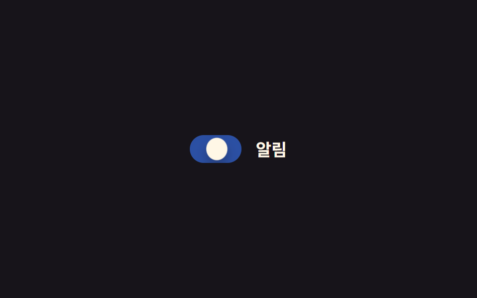 01 toggle-switch-basic-slide
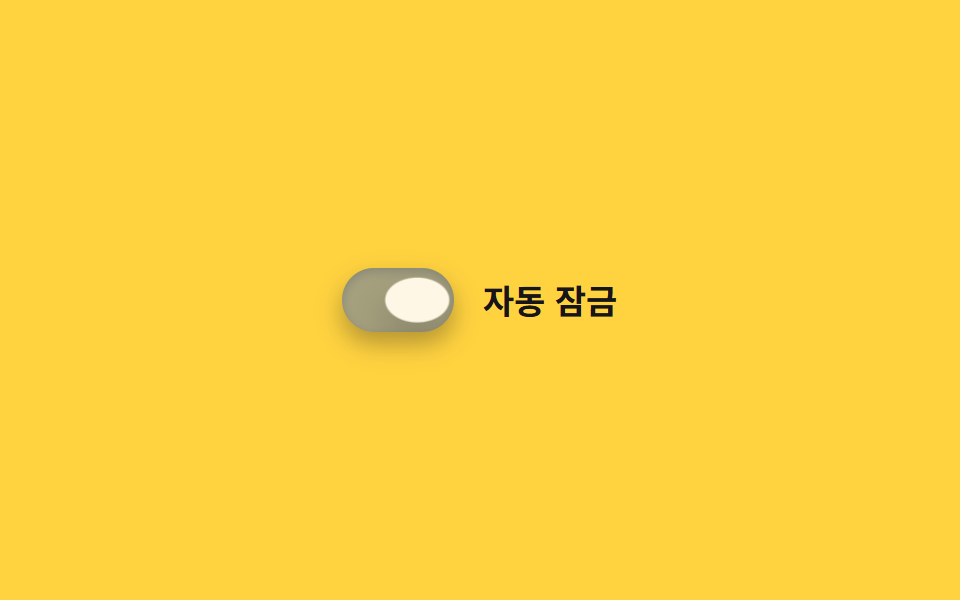 02 toggle-switch-ios-style
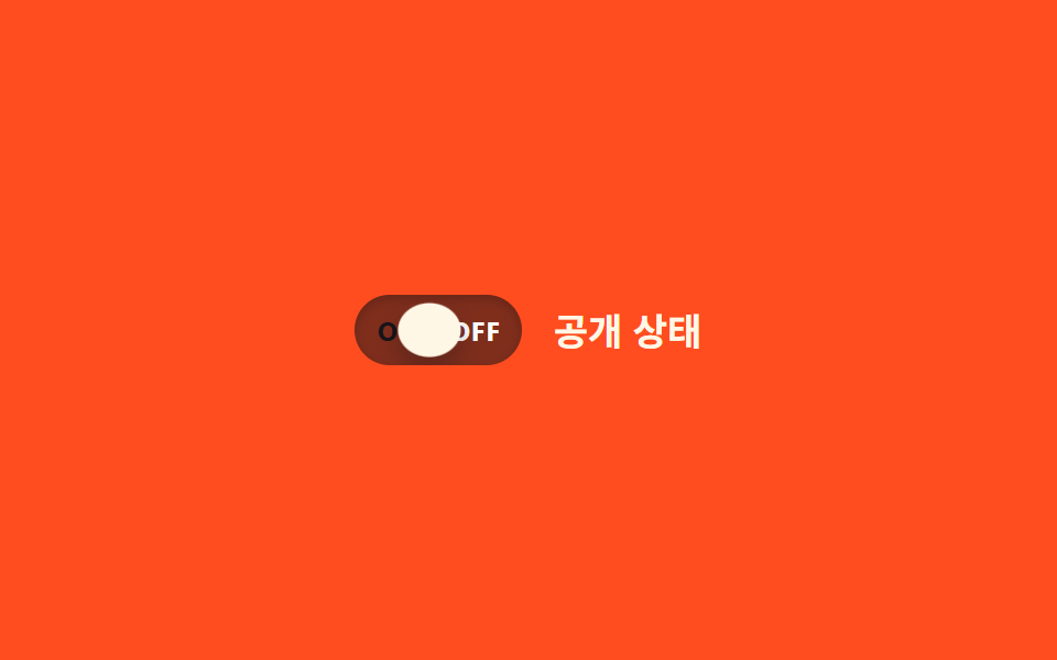 03 toggle-switch-label-inside-onoff
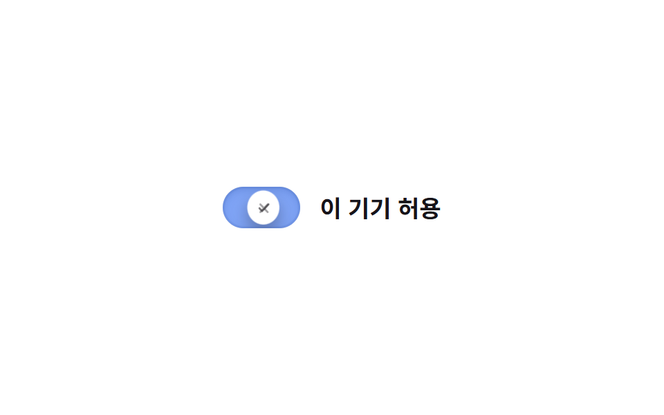 04 toggle-switch-icon-swap
 05 toggle-switch-squish-press
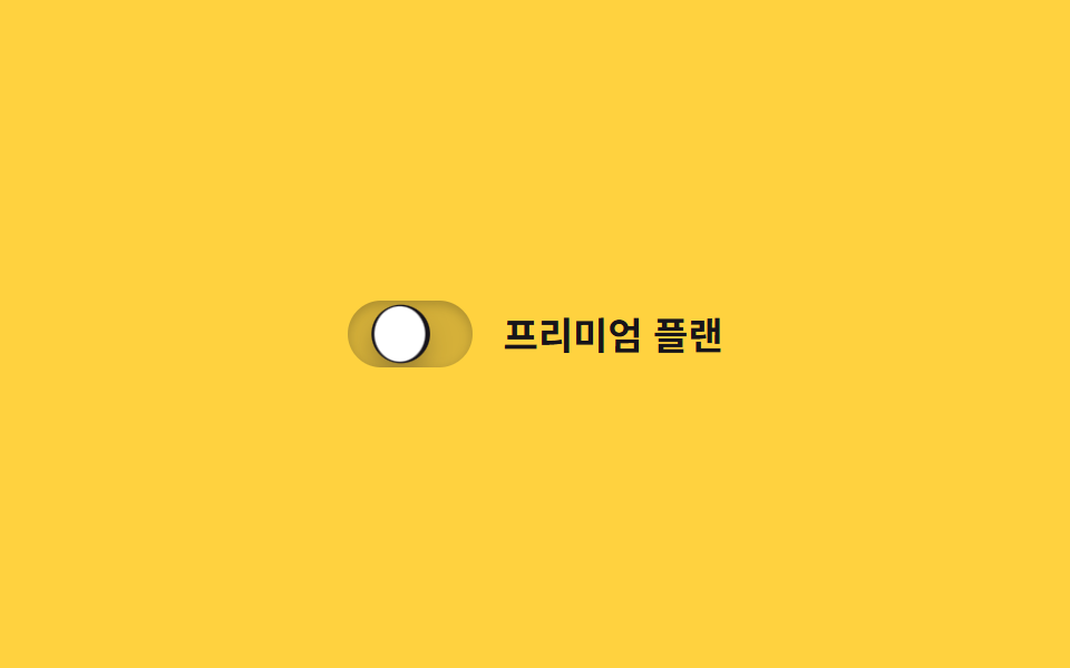 06 toggle-switch-color-fill-bg
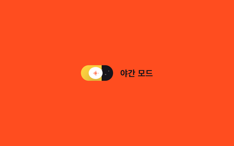 07 toggle-switch-day-night-icon
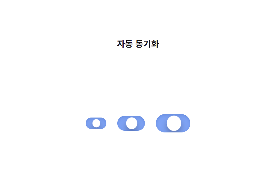 08 toggle-switch-size-variants
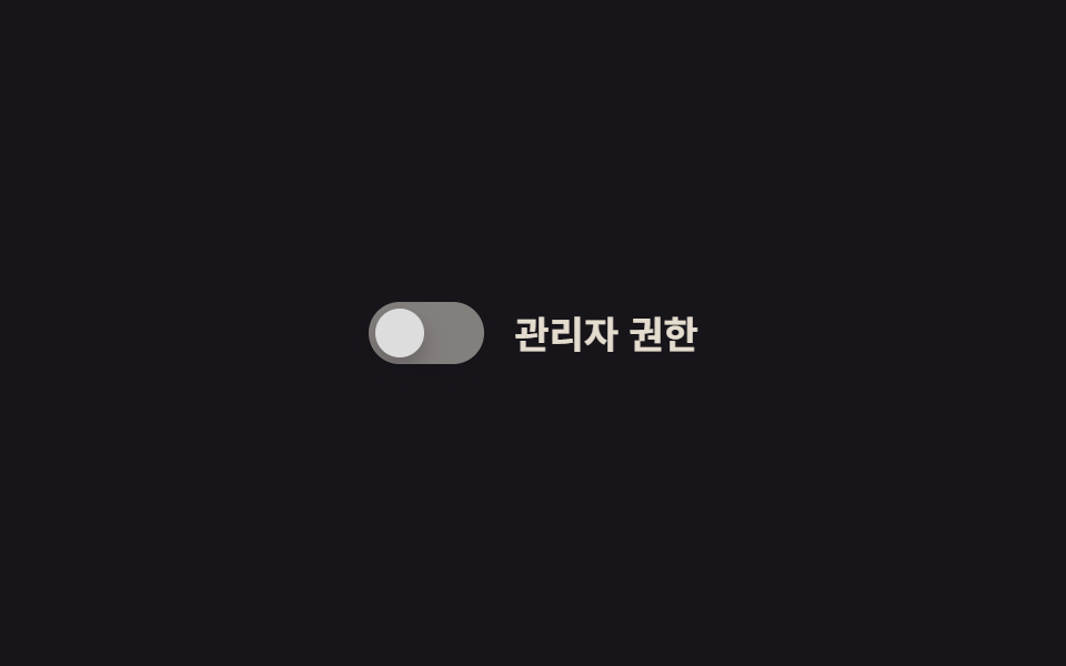 09 toggle-switch-disabled-state
自動再生 · タイルを押すとその項目へ · すべて1つのzip
- 01 基本スライド
- 02 iOS風トグル
- 03 ON/OFFラベル内蔵
- 04 アイコン切替
- 05 押し込みスクイッシュ
- 06 背景色の塗りつぶし
- 07 昼夜アイコントグル
- 08 サイズバリエーション
- 09 無効状態のスタイル
9つの トグルスイッチ html css は飾りの派手さではなく、トラックの上で何が変わるかという軸で並べています。ノブの位置だけが動く基本形(01・02)から、トラックの中身自体が変わるもの(03・04)、押し込みや塗りつぶしのような演出が加わるもの(05〜07)を経て、最後は構造が特殊だったり触れなくなったりする2つ(08・09)で締めくくりました。グリッドの各カードには.is-demoという自動ループ用のクラスが付いていて、実際に押すとpointerdownイベントでこのクラスが外れ、以降は本物のチェックボックスとして:checkedだけで動くようになります。03のON・OFFの文字にも色を流したいときはCSS テキスト グラデーション アニメーション、同じ<input>のままチェックボックスやラジオまで整えたいときはラジオボタン チェックボックス css カスタムアニメーションが続きになります。
01基本スライド
css スイッチボタン の基本形
チェックボックスにcheckedが付くと丸いノブがトラック右端まで滑り、下に重ねた2枚の背景レイヤーがopacityで入れ替わって、背景色も一緒に切り替わります。到着直前にノブが目標を少し行き過ぎてから戻るスプリングオーバーシュートと一瞬つぶれるsquashが加わり、着地の瞬間トラックの影が深くなってから浅く戻ります。
どこで使うか
設定画面のオプションスイッチや、フォームのチェックボックスをそのまま置き換えたい場所に向いています。
<main class="stage">
  <label class="switch is-demo">
    <input type="checkbox" class="switch__input" role="switch">
    <span class="switch__track">
      <span class="switch__bg switch__bg--off"></span>
      <span class="switch__bg switch__bg--on"></span>
      <span class="switch__knob"></span>
    </span>
    <span class="switch__label">通知</span>
  </label>
</main>
@use "../../../../site/static/demo-tokens" as *;
// ── 변수 3개 ──────────────────────────────
$duration: $dur-base;
$easing: $ease-out;
$color: $subject-blue;
// ── 데모 무대 ───────────────────────────────
@include stage($stage-ink);
.switch {
position: relative;
display: inline-flex; align-items: center; gap: clamp(10px, 3vw, 14px);
cursor: pointer;
-webkit-tap-highlight-color: transparent;
}
.switch__input {
position: absolute; inset: 0; width: 100%; height: 100%;
margin: 0; opacity: 0; cursor: pointer;
}
.switch__track {
position: relative; overflow: hidden;
width: clamp(44px, 12vw, 52px); height: clamp(24px, 6.5vw, 28px);
border-radius: $r-pill;
}
.switch__bg { position: absolute; inset: 0; }
.switch__bg--off { background: rgba(255, 255, 255, .18); opacity: 1; }
.switch__bg--on { background: $color; opacity: 0; }
.switch__knob {
position: absolute; top: 3px; left: 3px; z-index: 1;
width: clamp(18px, 5vw, 22px); height: clamp(18px, 5vw, 22px);
border-radius: 50%;
background: $subject-cream;
box-shadow: $shadow-press;
transform: translateX(0);
transition: transform $duration cubic-bezier(0.34, 1.56, 0.64, 1);
}
.switch__label { color: $subject-cream; font-weight: 600; font-size: clamp(14px, 4vw, 17px); line-height: 1; font-family: inherit; }
// ── 실제 동작: :checked 로 진짜 토글된다 ──────────────────
.switch__input:checked ~ .switch__track .switch__bg--off { opacity: 0; transition: opacity $duration $easing; }
.switch__input:checked ~ .switch__track .switch__bg--on { opacity: 1; transition: opacity $duration $easing; }
.switch__input:checked ~ .switch__track .switch__knob { transform: translateX(clamp(20px, 6vw, 24px)); }
.switch__input:focus-visible ~ .switch__track {
outline: 2px solid $subject-cream; outline-offset: 3px;
}
// ── 데모 루프: 클릭 전까지 스스로 켜졌다 꺼진다 ──────────────
// 한 겹: 노브는 도착 지점을 지나쳤다 되돌아오며 찌그러지고(스프링 오버슛+squash),
// 트랙은 상태가 바뀌는 순간 내부 그림자가 깊어졌다 얕아진다(바닥에 앉는 깊이).
.switch.is-demo .switch__bg--off { animation: bg-off-loop $dur-loop $easing infinite; }
.switch.is-demo .switch__bg--on { animation: bg-on-loop $dur-loop $easing infinite; }
.switch.is-demo .switch__knob { animation: knob-spring-loop $dur-loop $easing infinite; }
.switch.is-demo .switch__track { animation: shadow-depth-loop $dur-loop $easing infinite; }
@keyframes bg-off-loop { 0%, 15% { opacity: 1; } 40%, 60% { opacity: 0; } 85%, 100% { opacity: 1; } }
@keyframes bg-on-loop { 0%, 15% { opacity: 0; } 40%, 60% { opacity: 1; } 85%, 100% { opacity: 0; } }
@keyframes knob-loop {
0%, 15% { transform: translateX(0); }
40%, 60% { transform: translateX(24px); }
85%, 100% { transform: translateX(0); }
}
@keyframes knob-spring-loop {
0%, 15% { transform: translateX(0) scaleX(1) scaleY(1); }
38% { transform: translateX(27px) scaleX(1.25) scaleY(.85); } // 오버슈트 + 도착 순간 squash
42% { transform: translateX(23.5px) scaleX(1.08) scaleY(.94); } // 되튕기며 회복
46%, 60% { transform: translateX(24px) scaleX(1) scaleY(1); } // 안착
84% { transform: translateX(-2px) scaleX(.92) scaleY(1.06); } // 출발 반동
85%, 100% { transform: translateX(0) scaleX(1) scaleY(1); }
}
@keyframes shadow-depth-loop {
0%, 15% { box-shadow: inset 0 1px 3px rgba(0, 0, 0, .15); }
38% { box-shadow: inset 0 3px 8px rgba(0, 0, 0, .28); } // 노브가 내려앉는 순간 깊어짐
40%, 60% { box-shadow: inset 0 3px 8px rgba(0, 0, 0, .28); }
85%, 100% { box-shadow: inset 0 1px 3px rgba(0, 0, 0, .15); }
}
// ── 접근성: 움직임 줄이기 설정이면 전환만 남기고 데모 루프는 끈다 ──────
@media (prefers-reduced-motion: reduce) {
.switch.is-demo .switch__bg--off,
.switch.is-demo .switch__bg--on,
.switch.is-demo .switch__knob,
.switch.is-demo .switch__track { animation: none !important; }
.switch__knob, .switch__bg--off, .switch__bg--on { transition: none; }
}html, body {
margin: 0;
overflow: hidden;
}
.stage {
box-sizing: border-box;
min-height: 100vh;
display: grid;
place-items: center;
margin: 0;
background: #17141a;
font-family: -apple-system, "Segoe UI", "Noto Sans KR", sans-serif;
padding: clamp(8px, 4vw, 24px);
}
.switch {
position: relative;
display: inline-flex;
align-items: center;
gap: clamp(10px, 3vw, 14px);
cursor: pointer;
-webkit-tap-highlight-color: transparent;
}
.switch__input {
position: absolute;
inset: 0;
width: 100%;
height: 100%;
margin: 0;
opacity: 0;
cursor: pointer;
}
.switch__track {
position: relative;
overflow: hidden;
width: clamp(44px, 12vw, 52px);
height: clamp(24px, 6.5vw, 28px);
border-radius: 999px;
}
.switch__bg {
position: absolute;
inset: 0;
}
.switch__bg--off {
background: rgba(255, 255, 255, 0.18);
opacity: 1;
}
.switch__bg--on {
background: #2f6df6;
opacity: 0;
}
.switch__knob {
position: absolute;
top: 3px;
left: 3px;
z-index: 1;
width: clamp(18px, 5vw, 22px);
height: clamp(18px, 5vw, 22px);
border-radius: 50%;
background: #fff7e6;
box-shadow: 0 6px 12px rgba(23, 20, 26, 0.32);
transform: translateX(0);
transition: transform 300ms cubic-bezier(0.34, 1.56, 0.64, 1);
}
.switch__label {
color: #fff7e6;
font-weight: 600;
font-size: clamp(14px, 4vw, 17px);
line-height: 1;
font-family: inherit;
}
.switch__input:checked ~ .switch__track .switch__bg--off {
opacity: 0;
transition: opacity 300ms ease-out;
}
.switch__input:checked ~ .switch__track .switch__bg--on {
opacity: 1;
transition: opacity 300ms ease-out;
}
.switch__input:checked ~ .switch__track .switch__knob {
transform: translateX(clamp(20px, 6vw, 24px));
}
.switch__input:focus-visible ~ .switch__track {
outline: 2px solid #fff7e6;
outline-offset: 3px;
}
.switch.is-demo .switch__bg--off {
animation: bg-off-loop 2s ease-out infinite;
}
.switch.is-demo .switch__bg--on {
animation: bg-on-loop 2s ease-out infinite;
}
.switch.is-demo .switch__knob {
animation: knob-spring-loop 2s ease-out infinite;
}
.switch.is-demo .switch__track {
animation: shadow-depth-loop 2s ease-out infinite;
}
@keyframes bg-off-loop {
0%, 15% {
opacity: 1;
}
40%, 60% {
opacity: 0;
}
85%, 100% {
opacity: 1;
}
}
@keyframes bg-on-loop {
0%, 15% {
opacity: 0;
}
40%, 60% {
opacity: 1;
}
85%, 100% {
opacity: 0;
}
}
@keyframes knob-loop {
0%, 15% {
transform: translateX(0);
}
40%, 60% {
transform: translateX(24px);
}
85%, 100% {
transform: translateX(0);
}
}
@keyframes knob-spring-loop {
0%, 15% {
transform: translateX(0) scaleX(1) scaleY(1);
}
38% {
transform: translateX(27px) scaleX(1.25) scaleY(0.85);
}
42% {
transform: translateX(23.5px) scaleX(1.08) scaleY(0.94);
}
46%, 60% {
transform: translateX(24px) scaleX(1) scaleY(1);
}
84% {
transform: translateX(-2px) scaleX(0.92) scaleY(1.06);
}
85%, 100% {
transform: translateX(0) scaleX(1) scaleY(1);
}
}
@keyframes shadow-depth-loop {
0%, 15% {
box-shadow: inset 0 1px 3px rgba(0, 0, 0, 0.15);
}
38% {
box-shadow: inset 0 3px 8px rgba(0, 0, 0, 0.28);
}
40%, 60% {
box-shadow: inset 0 3px 8px rgba(0, 0, 0, 0.28);
}
85%, 100% {
box-shadow: inset 0 1px 3px rgba(0, 0, 0, 0.15);
}
}
@media (prefers-reduced-motion: reduce) {
.switch.is-demo .switch__bg--off,
.switch.is-demo .switch__bg--on,
.switch.is-demo .switch__knob,
.switch.is-demo .switch__track {
animation: none !important;
}
.switch__knob, .switch__bg--off, .switch__bg--on {
transition: none;
}
}// 실제 클릭이 오면 데모 루프(.is-demo)를 떼고 :checked 로만 움직이게 한다.
// aria-checked 는 role="switch" 를 쓴 네이티브 체크박스라 브라우저가 checked 에서 자동으로 읽지만,
// 오래된 스크린리더까지 챙기려면 change 때마다 명시적으로 맞춰 둔다.
document.querySelectorAll(".switch").forEach(function (s) {
var input = s.querySelector(".switch__input");
var sync = function () { input.setAttribute("aria-checked", String(input.checked)); };
input.addEventListener("pointerdown", function () { s.classList.remove("is-demo"); });
input.addEventListener("change", sync);
sync();
});import { useState } from "react";
import type { ChangeEvent, CSSProperties } from "react";
import styles from "./ToggleSwitch.module.scss";
export type ToggleSwitchProps = {
label?: string;
/** 전환 시간 (기본 300ms) */
duration?: number;
/** CSS easing (기본 스프링 오버슛) */
easing?: string;
/** on 상태 트랙 색 */
color?: string;
defaultChecked?: boolean;
onChange?: (checked: boolean) => void;
};
type Vars = CSSProperties & { "--duration"?: string; "--easing"?: string; "--color"?: string };
export default function ToggleSwitch({
label = "알림",
duration = 300,
easing = "cubic-bezier(0.34, 1.56, 0.64, 1)",
color = "#2f6df6",
defaultChecked = false,
onChange,
}: ToggleSwitchProps) {
const [checked, setChecked] = useState(defaultChecked);
const vars: Vars = { "--duration": `${duration}ms`, "--easing": easing, "--color": color };
return (
<label className={styles.switch} style={vars}>
<input
type="checkbox"
role="switch"
aria-checked={checked}
className={styles.switch__input}
checked={checked}
onChange={(e: ChangeEvent<HTMLInputElement>) => {
setChecked(e.target.checked);
onChange?.(e.target.checked);
}}
/>
<span className={styles.switch__track}>
<span className={styles["switch__bg--off"]} />
<span className={styles["switch__bg--on"]} />
<span className={styles.switch__knob} />
</span>
<span className={styles.switch__label}>{label}</span>
</label>
);
}01 · 基本スライド — 計測 累積面積 0.917% · 動いたフレーム 15/23GODRICH オリジナル · SCSS と React は zip に同梱 · パスワードを見る
.switch__bg--off { background: rgba(255, 255, 255, .18); opacity: 1; }
.switch__bg--on  { background: $color; opacity: 0; }
.switch__knob { transform: translateX(0); transition: transform $duration $easing; }

.switch__input:checked ~ .switch__track .switch__bg--off { opacity: 0; }
.switch__input:checked ~ .switch__track .switch__bg--on  { opacity: 1; }
.switch__input:checked ~ .switch__track .switch__knob    { transform: translateX(24px); }
02iOS風トグル
どう動くか
丸いトラックと白いノブの組み合わせで、ノブが着地する瞬間だけ38%地点で一度オーバーシュートしてから止まるスプリング系のイージングを使っています。跳ねる瞬間ノブが縦に少しつぶれるsquashも重なり、トラックの影がノブが乗っているときは深く、離れると浅く変化します。
どこで使うか
iOSの設定アプリのように、指先の反応感が伝わってほしい画面に向いています。
<main class="stage">
  <label class="switch is-demo">
    <input type="checkbox" class="switch__input" role="switch">
    <span class="switch__track">
      <span class="switch__bg switch__bg--off"></span>
      <span class="switch__bg switch__bg--on"></span>
      <span class="switch__knob"></span>
    </span>
    <span class="switch__label">自動ロック</span>
  </label>
</main>
@use "../../../../site/static/demo-tokens" as *;
// ── 변수 3개 ──────────────────────────────
$duration: $dur-enter;
$easing: $ease-spring;
$color: $subject-blue;
// ── 데모 무대 ───────────────────────────────
@include stage($stage-yellow);
.switch {
position: relative;
display: inline-flex; align-items: center; gap: clamp(10px, 3vw, 14px);
cursor: pointer;
-webkit-tap-highlight-color: transparent;
}
.switch__input {
position: absolute; inset: 0; width: 100%; height: 100%;
margin: 0; opacity: 0; cursor: pointer;
}
.switch__track {
position: relative; overflow: hidden;
width: clamp(48px, 13vw, 56px); height: clamp(28px, 7.5vw, 32px);
border-radius: $r-pill;
box-shadow: $shadow-press;
}
.switch__bg { position: absolute; inset: 0; }
.switch__bg--off { background: rgba(23, 20, 26, .16); opacity: 1; }
.switch__bg--on { background: $color; opacity: 0; }
.switch__knob {
position: absolute; top: 3px; left: 3px; z-index: 1;
width: clamp(22px, 6vw, 26px); height: clamp(22px, 6vw, 26px);
border-radius: 50%;
background: $subject-cream;
box-shadow: $shadow-raised;
transform: translateX(0);
transition: transform $duration cubic-bezier(0.34, 1.56, 0.64, 1);
}
.switch__label { color: $subject-ink; font-weight: 600; font-size: clamp(14px, 4vw, 17px); line-height: 1; font-family: inherit; }
// ── 실제 동작 ─────────────────────────────
.switch__input:checked ~ .switch__track .switch__bg--off { opacity: 0; transition: opacity $duration $easing; }
.switch__input:checked ~ .switch__track .switch__bg--on { opacity: 1; transition: opacity $duration $easing; }
.switch__input:checked ~ .switch__track .switch__knob { transform: translateX(clamp(20px, 6vw, 24px)); }
.switch__input:focus-visible ~ .switch__track {
outline: 2px solid $subject-ink; outline-offset: 3px;
}
// ── 데모 루프: 도착 지점에서 스프링 이징이 살짝 튕긴다 ─────────
// 한 겹: 오버슈트 순간 노브가 찌그러지고(squash), 트랙은 상태 전환 때
// 내부 그림자가 깊어졌다 얕아진다(바닥에 앉는 깊이).
.switch.is-demo .switch__bg--off { animation: bg-off-loop $dur-loop $ease-out infinite; }
.switch.is-demo .switch__bg--on { animation: bg-on-loop $dur-loop $ease-out infinite; }
.switch.is-demo .switch__knob { animation: knob-spring-loop $dur-loop $easing infinite; }
.switch.is-demo .switch__track { animation: shadow-depth-loop $dur-loop $ease-out infinite; }
@keyframes bg-off-loop { 0%, 15% { opacity: 1; } 40%, 60% { opacity: 0; } 85%, 100% { opacity: 1; } }
@keyframes bg-on-loop { 0%, 15% { opacity: 0; } 40%, 60% { opacity: 1; } 85%, 100% { opacity: 0; } }
@keyframes knob-loop {
0%, 15% { transform: translateX(0); }
38% { transform: translateX(28px); } // 스프링 오버슈트
40%, 60% { transform: translateX(24px); }
85%, 100% { transform: translateX(0); }
}
@keyframes knob-spring-loop {
0%, 15% { transform: translateX(0) scaleX(1) scaleY(1); }
38% { transform: translateX(28px) scaleX(1.3) scaleY(.82); } // 오버슈트 + 찌그러짐
43% { transform: translateX(23px) scaleX(1.1) scaleY(.92); } // 되튕기며 회복
47%, 60% { transform: translateX(24px) scaleX(1) scaleY(1); } // 안착
84% { transform: translateX(-2px) scaleX(.92) scaleY(1.06); } // 출발 반동
85%, 100% { transform: translateX(0) scaleX(1) scaleY(1); }
}
@keyframes shadow-depth-loop {
0%, 15% { box-shadow: $shadow-press, inset 0 1px 3px rgba(0, 0, 0, .15); }
38% { box-shadow: $shadow-press, inset 0 3px 8px rgba(0, 0, 0, .28); }
40%, 60% { box-shadow: $shadow-press, inset 0 3px 8px rgba(0, 0, 0, .28); }
85%, 100% { box-shadow: $shadow-press, inset 0 1px 3px rgba(0, 0, 0, .15); }
}
@media (prefers-reduced-motion: reduce) {
.switch.is-demo .switch__bg--off,
.switch.is-demo .switch__bg--on,
.switch.is-demo .switch__knob,
.switch.is-demo .switch__track { animation: none !important; }
.switch__knob, .switch__bg--off, .switch__bg--on { transition: none; }
}html, body {
margin: 0;
overflow: hidden;
}
.stage {
box-sizing: border-box;
min-height: 100vh;
display: grid;
place-items: center;
margin: 0;
background: #ffd23f;
font-family: -apple-system, "Segoe UI", "Noto Sans KR", sans-serif;
padding: clamp(8px, 4vw, 24px);
}
.switch {
position: relative;
display: inline-flex;
align-items: center;
gap: clamp(10px, 3vw, 14px);
cursor: pointer;
-webkit-tap-highlight-color: transparent;
}
.switch__input {
position: absolute;
inset: 0;
width: 100%;
height: 100%;
margin: 0;
opacity: 0;
cursor: pointer;
}
.switch__track {
position: relative;
overflow: hidden;
width: clamp(48px, 13vw, 56px);
height: clamp(28px, 7.5vw, 32px);
border-radius: 999px;
box-shadow: 0 6px 12px rgba(23, 20, 26, 0.32);
}
.switch__bg {
position: absolute;
inset: 0;
}
.switch__bg--off {
background: rgba(23, 20, 26, 0.16);
opacity: 1;
}
.switch__bg--on {
background: #2f6df6;
opacity: 0;
}
.switch__knob {
position: absolute;
top: 3px;
left: 3px;
z-index: 1;
width: clamp(22px, 6vw, 26px);
height: clamp(22px, 6vw, 26px);
border-radius: 50%;
background: #fff7e6;
box-shadow: 0 14px 24px rgba(23, 20, 26, 0.32);
transform: translateX(0);
transition: transform 600ms cubic-bezier(0.34, 1.56, 0.64, 1);
}
.switch__label {
color: #17141a;
font-weight: 600;
font-size: clamp(14px, 4vw, 17px);
line-height: 1;
font-family: inherit;
}
.switch__input:checked ~ .switch__track .switch__bg--off {
opacity: 0;
transition: opacity 600ms cubic-bezier(0.2, 0.8, 0.2, 1);
}
.switch__input:checked ~ .switch__track .switch__bg--on {
opacity: 1;
transition: opacity 600ms cubic-bezier(0.2, 0.8, 0.2, 1);
}
.switch__input:checked ~ .switch__track .switch__knob {
transform: translateX(clamp(20px, 6vw, 24px));
}
.switch__input:focus-visible ~ .switch__track {
outline: 2px solid #17141a;
outline-offset: 3px;
}
.switch.is-demo .switch__bg--off {
animation: bg-off-loop 2s ease-out infinite;
}
.switch.is-demo .switch__bg--on {
animation: bg-on-loop 2s ease-out infinite;
}
.switch.is-demo .switch__knob {
animation: knob-spring-loop 2s cubic-bezier(0.2, 0.8, 0.2, 1) infinite;
}
.switch.is-demo .switch__track {
animation: shadow-depth-loop 2s ease-out infinite;
}
@keyframes bg-off-loop {
0%, 15% {
opacity: 1;
}
40%, 60% {
opacity: 0;
}
85%, 100% {
opacity: 1;
}
}
@keyframes bg-on-loop {
0%, 15% {
opacity: 0;
}
40%, 60% {
opacity: 1;
}
85%, 100% {
opacity: 0;
}
}
@keyframes knob-loop {
0%, 15% {
transform: translateX(0);
}
38% {
transform: translateX(28px);
}
40%, 60% {
transform: translateX(24px);
}
85%, 100% {
transform: translateX(0);
}
}
@keyframes knob-spring-loop {
0%, 15% {
transform: translateX(0) scaleX(1) scaleY(1);
}
38% {
transform: translateX(28px) scaleX(1.3) scaleY(0.82);
}
43% {
transform: translateX(23px) scaleX(1.1) scaleY(0.92);
}
47%, 60% {
transform: translateX(24px) scaleX(1) scaleY(1);
}
84% {
transform: translateX(-2px) scaleX(0.92) scaleY(1.06);
}
85%, 100% {
transform: translateX(0) scaleX(1) scaleY(1);
}
}
@keyframes shadow-depth-loop {
0%, 15% {
box-shadow: 0 6px 12px rgba(23, 20, 26, 0.32), inset 0 1px 3px rgba(0, 0, 0, 0.15);
}
38% {
box-shadow: 0 6px 12px rgba(23, 20, 26, 0.32), inset 0 3px 8px rgba(0, 0, 0, 0.28);
}
40%, 60% {
box-shadow: 0 6px 12px rgba(23, 20, 26, 0.32), inset 0 3px 8px rgba(0, 0, 0, 0.28);
}
85%, 100% {
box-shadow: 0 6px 12px rgba(23, 20, 26, 0.32), inset 0 1px 3px rgba(0, 0, 0, 0.15);
}
}
@media (prefers-reduced-motion: reduce) {
.switch.is-demo .switch__bg--off,
.switch.is-demo .switch__bg--on,
.switch.is-demo .switch__knob,
.switch.is-demo .switch__track {
animation: none !important;
}
.switch__knob, .switch__bg--off, .switch__bg--on {
transition: none;
}
}document.querySelectorAll(".switch").forEach(function (s) {
var input = s.querySelector(".switch__input");
var sync = function () { input.setAttribute("aria-checked", String(input.checked)); };
input.addEventListener("pointerdown", function () { s.classList.remove("is-demo"); });
input.addEventListener("change", sync);
sync();
});import { useState } from "react";
import type { ChangeEvent, CSSProperties } from "react";
import styles from "./IOSToggle.module.scss";
export type IOSToggleProps = {
label?: string;
/** 도착 지점 트랜지션 시간 (기본 600ms) */
duration?: number;
/** 스프링 이징 */
easing?: string;
color?: string;
defaultChecked?: boolean;
onChange?: (checked: boolean) => void;
};
type Vars = CSSProperties & { "--duration"?: string; "--easing"?: string; "--color"?: string };
export default function IOSToggle({
label = "자동 잠금",
duration = 600,
easing = "cubic-bezier(0.34, 1.56, 0.64, 1)",
color = "#2f6df6",
defaultChecked = false,
onChange,
}: IOSToggleProps) {
const [checked, setChecked] = useState(defaultChecked);
const vars: Vars = { "--duration": `${duration}ms`, "--easing": easing, "--color": color };
return (
<label className={styles.switch} style={vars}>
<input
type="checkbox"
role="switch"
aria-checked={checked}
className={styles.switch__input}
checked={checked}
onChange={(e: ChangeEvent<HTMLInputElement>) => { setChecked(e.target.checked); onChange?.(e.target.checked); }}
/>
<span className={styles.switch__track}>
<span className={styles["switch__bg--off"]} />
<span className={styles["switch__bg--on"]} />
<span className={styles.switch__knob} />
</span>
<span className={styles.switch__label}>{label}</span>
</label>
);
}02 · iOS風トグル — 計測 累積面積 1.118% · 動いたフレーム 15/23GODRICH オリジナル · SCSS と React は zip に同梱 · パスワードを見る
@keyframes knob-loop {
0%, 15% { transform: translateX(0); }
38% { transform: translateX(28px); } // スプリングのオーバーシュート
40%, 60% { transform: translateX(24px); }
85%, 100% { transform: translateX(0); }
}
03ON/OFFラベル内蔵
どう動くか
トラックの両端にON・OFFの文字をあらかじめ固定しておき、ノブが移動する側の文字だけをz-indexで覆い隠します。移動の終わりでノブが一度弾んでからつぶれるスプリング+squashの締めが付き、文字を覆う瞬間トラックの影が深まって押さえ込む感触を出します。
どこで使うか
管理画面のステータス表示のように、今の値が色だけでなく文字でも分かってほしいスイッチに向いています。
<main class="stage">
<label class="switch is-demo">
<input type="checkbox" class="switch__input" role="switch">
<span class="switch__track">
<span class="switch__text switch__text--on">ON</span>
<span class="switch__text switch__text--off">OFF</span>
<span class="switch__knob"></span>
</span>
<span class="switch__label">公開ステータス</span>
</label>
</main>@use "../../../../site/static/demo-tokens" as *;
// ── 변수 3개 ──────────────────────────────
$duration: $dur-base;
$easing: $ease-out;
$color: $subject-cream;
// ── 데모 무대 ───────────────────────────────
@include stage($stage-orange);
.switch {
position: relative;
display: inline-flex; align-items: center; gap: clamp(10px, 3vw, 14px);
cursor: pointer;
-webkit-tap-highlight-color: transparent;
}
.switch__input {
position: absolute; inset: 0; width: 100%; height: 100%;
margin: 0; opacity: 0; cursor: pointer;
}
.switch__track {
position: relative; overflow: hidden;
width: clamp(64px, 17vw, 76px); height: clamp(28px, 7.5vw, 32px);
border-radius: $r-pill;
background: rgba(23, 20, 26, .55);
}
.switch__text {
position: absolute; top: 50%; transform: translateY(-50%);
font-weight: 700; font-size: clamp(10px, 2.8vw, 12px); line-height: 1; font-family: inherit; letter-spacing: .04em;
color: $subject-ink;
}
.switch__text--on { left: clamp(8px, 2.5vw, 10px); }
.switch__text--off { right: clamp(8px, 2.5vw, 10px); color: $stage-paper; }
.switch__knob {
position: absolute; top: 3px; left: 3px; z-index: 1;
width: clamp(22px, 6vw, 26px); height: clamp(22px, 6vw, 26px);
border-radius: 50%;
background: $color;
box-shadow: $shadow-press;
transform: translateX(0);
transition: transform $duration cubic-bezier(0.34, 1.56, 0.64, 1);
}
.switch__label { color: $subject-cream; font-weight: 600; font-size: clamp(14px, 4vw, 17px); line-height: 1; font-family: inherit; }
// ── 실제 동작: 노브가 이동하며 반대쪽 글자를 덮는다 ──────
.switch__input:checked ~ .switch__track .switch__knob {
transform: translateX(clamp(36px, 10vw, 44px));
}
.switch__input:focus-visible ~ .switch__track {
outline: 2px solid $subject-cream; outline-offset: 3px;
}
// ── 데모 루프 ─────────────────────────────
// 한 겹: 노브가 도착 지점을 지나쳤다(47px) 되돌아오며 찌그러지고,
// 트랙 내부 그림자가 상태 전환 때 깊어졌다 얕아진다.
.switch.is-demo .switch__knob { animation: knob-spring-loop $dur-loop $easing infinite; }
.switch.is-demo .switch__track { animation: shadow-depth-loop $dur-loop $easing infinite; }
@keyframes knob-loop {
0%, 15% { transform: translateX(0); }
40%, 60% { transform: translateX(44px); }
85%, 100% { transform: translateX(0); }
}
@keyframes knob-spring-loop {
0%, 15% { transform: translateX(0) scaleX(1) scaleY(1); }
38% { transform: translateX(47px) scaleX(1.25) scaleY(.85); } // 오버슈트 + 도착 순간 squash
43% { transform: translateX(43px) scaleX(1.08) scaleY(.94); } // 되튕기며 회복
47%, 60% { transform: translateX(44px) scaleX(1) scaleY(1); } // 안착
84% { transform: translateX(-2px) scaleX(.92) scaleY(1.06); } // 출발 반동
85%, 100% { transform: translateX(0) scaleX(1) scaleY(1); }
}
@keyframes shadow-depth-loop {
0%, 15% { box-shadow: inset 0 1px 3px rgba(0, 0, 0, .15); }
38% { box-shadow: inset 0 3px 8px rgba(0, 0, 0, .28); }
40%, 60% { box-shadow: inset 0 3px 8px rgba(0, 0, 0, .28); }
85%, 100% { box-shadow: inset 0 1px 3px rgba(0, 0, 0, .15); }
}
@media (prefers-reduced-motion: reduce) {
.switch.is-demo .switch__knob,
.switch.is-demo .switch__track { animation: none !important; }
.switch__knob { transition: none; }
}html, body {
margin: 0;
overflow: hidden;
}
.stage {
box-sizing: border-box;
min-height: 100vh;
display: grid;
place-items: center;
margin: 0;
background: #ff4d1f;
font-family: -apple-system, "Segoe UI", "Noto Sans KR", sans-serif;
padding: clamp(8px, 4vw, 24px);
}
.switch {
position: relative;
display: inline-flex;
align-items: center;
gap: clamp(10px, 3vw, 14px);
cursor: pointer;
-webkit-tap-highlight-color: transparent;
}
.switch__input {
position: absolute;
inset: 0;
width: 100%;
height: 100%;
margin: 0;
opacity: 0;
cursor: pointer;
}
.switch__track {
position: relative;
overflow: hidden;
width: clamp(64px, 17vw, 76px);
height: clamp(28px, 7.5vw, 32px);
border-radius: 999px;
background: rgba(23, 20, 26, 0.55);
}
.switch__text {
position: absolute;
top: 50%;
transform: translateY(-50%);
font-weight: 700;
font-size: clamp(10px, 2.8vw, 12px);
line-height: 1;
font-family: inherit;
letter-spacing: 0.04em;
color: #17141a;
}
.switch__text--on {
left: clamp(8px, 2.5vw, 10px);
}
.switch__text--off {
right: clamp(8px, 2.5vw, 10px);
color: #ffffff;
}
.switch__knob {
position: absolute;
top: 3px;
left: 3px;
z-index: 1;
width: clamp(22px, 6vw, 26px);
height: clamp(22px, 6vw, 26px);
border-radius: 50%;
background: #fff7e6;
box-shadow: 0 6px 12px rgba(23, 20, 26, 0.32);
transform: translateX(0);
transition: transform 300ms cubic-bezier(0.34, 1.56, 0.64, 1);
}
.switch__label {
color: #fff7e6;
font-weight: 600;
font-size: clamp(14px, 4vw, 17px);
line-height: 1;
font-family: inherit;
}
.switch__input:checked ~ .switch__track .switch__knob {
transform: translateX(clamp(36px, 10vw, 44px));
}
.switch__input:focus-visible ~ .switch__track {
outline: 2px solid #fff7e6;
outline-offset: 3px;
}
.switch.is-demo .switch__knob {
animation: knob-spring-loop 2s ease-out infinite;
}
.switch.is-demo .switch__track {
animation: shadow-depth-loop 2s ease-out infinite;
}
@keyframes knob-loop {
0%, 15% {
transform: translateX(0);
}
40%, 60% {
transform: translateX(44px);
}
85%, 100% {
transform: translateX(0);
}
}
@keyframes knob-spring-loop {
0%, 15% {
transform: translateX(0) scaleX(1) scaleY(1);
}
38% {
transform: translateX(47px) scaleX(1.25) scaleY(0.85);
}
43% {
transform: translateX(43px) scaleX(1.08) scaleY(0.94);
}
47%, 60% {
transform: translateX(44px) scaleX(1) scaleY(1);
}
84% {
transform: translateX(-2px) scaleX(0.92) scaleY(1.06);
}
85%, 100% {
transform: translateX(0) scaleX(1) scaleY(1);
}
}
@keyframes shadow-depth-loop {
0%, 15% {
box-shadow: inset 0 1px 3px rgba(0, 0, 0, 0.15);
}
38% {
box-shadow: inset 0 3px 8px rgba(0, 0, 0, 0.28);
}
40%, 60% {
box-shadow: inset 0 3px 8px rgba(0, 0, 0, 0.28);
}
85%, 100% {
box-shadow: inset 0 1px 3px rgba(0, 0, 0, 0.15);
}
}
@media (prefers-reduced-motion: reduce) {
.switch.is-demo .switch__knob,
.switch.is-demo .switch__track {
animation: none !important;
}
.switch__knob {
transition: none;
}
}document.querySelectorAll(".switch").forEach(function (s) {
var input = s.querySelector(".switch__input");
var sync = function () { input.setAttribute("aria-checked", String(input.checked)); };
input.addEventListener("pointerdown", function () { s.classList.remove("is-demo"); });
input.addEventListener("change", sync);
sync();
});import { useState } from "react";
import type { ChangeEvent, CSSProperties } from "react";
import styles from "./OnOffToggle.module.scss";
export type OnOffToggleProps = {
label?: string;
duration?: number;
easing?: string;
color?: string;
defaultChecked?: boolean;
onChange?: (checked: boolean) => void;
};
type Vars = CSSProperties & { "--duration"?: string; "--easing"?: string; "--color"?: string };
export default function OnOffToggle({
label = "공개 상태",
duration = 300,
easing = "cubic-bezier(0.34, 1.56, 0.64, 1)",
color = "#fff7e6",
defaultChecked = false,
onChange,
}: OnOffToggleProps) {
const [checked, setChecked] = useState(defaultChecked);
const vars: Vars = { "--duration": `${duration}ms`, "--easing": easing, "--color": color };
return (
<label className={styles.switch} style={vars}>
<input
type="checkbox"
role="switch"
aria-checked={checked}
className={styles.switch__input}
checked={checked}
onChange={(e: ChangeEvent<HTMLInputElement>) => { setChecked(e.target.checked); onChange?.(e.target.checked); }}
/>
<span className={styles.switch__track}>
<span className={styles["switch__text--on"]}>ON</span>
<span className={styles["switch__text--off"]}>OFF</span>
<span className={styles.switch__knob} />
</span>
<span className={styles.switch__label}>{label}</span>
</label>
);
}03 · ON/OFFラベル内蔵 — 計測 累積面積 1.507% · 動いたフレーム 16/23GODRICH オリジナル · SCSS と React は zip に同梱 · パスワードを見る
.switch__text--on { left: 10px; }
.switch__text--off { right: 10px; }
.switch__knob {
position: absolute; top: 3px; left: 3px; z-index: 1;
transition: transform $duration $easing;
}
.switch__input:checked ~ .switch__track .switch__knob {
transform: translateX(44px);
}
04アイコン切替
どう動くか
ノブが横に移動する間に、内側の×アイコンとチェックアイコンがopacityでクロスフェードして入れ替わります。移動先を少し行き過ぎてから戻るオーバーシュートと一瞬のsquashが重なり、切り替わる瞬間トラックの影が深くなります。
どこで使うか
権限の許可・拒否のように、結果をアイコン一つで言い切りたいスイッチに向いています。
<main class="stage">
<label class="switch is-demo">
<input type="checkbox" class="switch__input" role="switch">
<span class="switch__track">
<span class="switch__bg switch__bg--off"></span>
<span class="switch__bg switch__bg--on"></span>
<span class="switch__knob">
<svg class="switch__icon switch__icon--x" viewBox="0 0 16 16" width="11" height="11" aria-hidden="true">
<path d="M4 4l8 8M12 4l-8 8" fill="none" stroke="currentColor" stroke-width="2" stroke-linecap="round"/>
</svg>
<svg class="switch__icon switch__icon--check" viewBox="0 0 16 16" width="11" height="11" aria-hidden="true">
<path d="M3 8l3 3 7-7" fill="none" stroke="currentColor" stroke-width="2" stroke-linecap="round" stroke-linejoin="round"/>
</svg>
</span>
</span>
<span class="switch__label">この端末を許可</span>
</label>
</main>@use "../../../../site/static/demo-tokens" as *;
// ── 변수 3개 ──────────────────────────────
$duration: $dur-quick;
$easing: $ease-out;
$color: $subject-blue;
// ── 데모 무대 ───────────────────────────────
@include stage($stage-paper);
.switch {
position: relative;
display: inline-flex; align-items: center; gap: clamp(10px, 3vw, 14px);
cursor: pointer;
-webkit-tap-highlight-color: transparent;
}
.switch__input {
position: absolute; inset: 0; width: 100%; height: 100%;
margin: 0; opacity: 0; cursor: pointer;
}
.switch__track {
position: relative; overflow: hidden;
width: clamp(48px, 13vw, 56px); height: clamp(26px, 7vw, 30px);
border-radius: $r-pill;
box-shadow: inset 0 0 0 1px rgba(23, 20, 26, .1);
}
.switch__bg { position: absolute; inset: 0; }
.switch__bg--off { background: rgba(23, 20, 26, .12); opacity: 1; }
.switch__bg--on { background: $color; opacity: 0; }
.switch__knob {
position: absolute; top: 3px; left: 3px; z-index: 1;
display: grid; place-items: center;
width: clamp(20px, 5.5vw, 24px); height: clamp(20px, 5.5vw, 24px);
border-radius: 50%;
background: $stage-paper;
box-shadow: $shadow-press;
color: $subject-ink;
transform: translateX(0);
transition: transform $duration cubic-bezier(0.34, 1.56, 0.64, 1);
}
.switch__icon { grid-area: 1 / 1; transition: opacity $duration $easing; }
.switch__icon--x { opacity: 1; }
.switch__icon--check { opacity: 0; }
.switch__label { color: $subject-ink; font-weight: 600; font-size: clamp(14px, 4vw, 17px); line-height: 1; font-family: inherit; }
// ── 실제 동작 ─────────────────────────────
.switch__input:checked ~ .switch__track .switch__bg--off { opacity: 0; transition: opacity $duration $easing; }
.switch__input:checked ~ .switch__track .switch__bg--on { opacity: 1; transition: opacity $duration $easing; }
.switch__input:checked ~ .switch__track .switch__knob { transform: translateX(clamp(22px, 6vw, 26px)); color: $color; }
.switch__input:checked ~ .switch__track .switch__icon--x { opacity: 0; }
.switch__input:checked ~ .switch__track .switch__icon--check { opacity: 1; }
.switch__input:focus-visible ~ .switch__track {
outline: 2px solid $subject-ink; outline-offset: 3px;
}
// ── 데모 루프 ─────────────────────────────
// 한 겹: 노브는 도착 지점을 지나쳤다 찌그러지며 안착하고(스프링+squash),
// 트랙의 inset 링 두께·블러가 상태 전환 때 깊어졌다 얕아진다.
.switch.is-demo .switch__bg--off { animation: bg-off-loop $dur-loop $easing infinite; }
.switch.is-demo .switch__bg--on { animation: bg-on-loop $dur-loop $easing infinite; }
.switch.is-demo .switch__knob { animation: knob-spring-loop $dur-loop $easing infinite; }
.switch.is-demo .switch__track { animation: shadow-depth-loop $dur-loop $easing infinite; }
.switch.is-demo .switch__icon--x { animation: icon-x-loop $dur-loop $easing infinite; }
.switch.is-demo .switch__icon--check { animation: icon-check-loop $dur-loop $easing infinite; }
@keyframes bg-off-loop { 0%, 15% { opacity: 1; } 40%, 60% { opacity: 0; } 85%, 100% { opacity: 1; } }
@keyframes bg-on-loop { 0%, 15% { opacity: 0; } 40%, 60% { opacity: 1; } 85%, 100% { opacity: 0; } }
@keyframes knob-loop {
0%, 15% { transform: translateX(0); }
40%, 60% { transform: translateX(26px); }
85%, 100% { transform: translateX(0); }
}
@keyframes knob-spring-loop {
0%, 15% { transform: translateX(0) scaleX(1) scaleY(1); }
38% { transform: translateX(29px) scaleX(1.25) scaleY(.85); } // 오버슈트 + 도착 순간 squash
43% { transform: translateX(25px) scaleX(1.08) scaleY(.94); } // 되튕기며 회복
47%, 60% { transform: translateX(26px) scaleX(1) scaleY(1); } // 안착
84% { transform: translateX(-2px) scaleX(.92) scaleY(1.06); } // 출발 반동
85%, 100% { transform: translateX(0) scaleX(1) scaleY(1); }
}
@keyframes shadow-depth-loop {
0%, 15% { box-shadow: inset 0 0 0 1px rgba(23, 20, 26, .1), inset 0 1px 3px rgba(0, 0, 0, .15); }
38% { box-shadow: inset 0 0 0 2px rgba(23, 20, 26, .1), inset 0 3px 8px rgba(0, 0, 0, .28); }
40%, 60% { box-shadow: inset 0 0 0 2px rgba(23, 20, 26, .1), inset 0 3px 8px rgba(0, 0, 0, .28); }
85%, 100% { box-shadow: inset 0 0 0 1px rgba(23, 20, 26, .1), inset 0 1px 3px rgba(0, 0, 0, .15); }
}
@keyframes icon-x-loop { 0%, 15% { opacity: 1; } 40%, 60% { opacity: 0; } 85%, 100% { opacity: 1; } }
@keyframes icon-check-loop { 0%, 15% { opacity: 0; } 40%, 60% { opacity: 1; } 85%, 100% { opacity: 0; } }
@media (prefers-reduced-motion: reduce) {
.switch.is-demo .switch__bg--off, .switch.is-demo .switch__bg--on,
.switch.is-demo .switch__knob, .switch.is-demo .switch__icon--x, .switch.is-demo .switch__icon--check,
.switch.is-demo .switch__track {
animation: none !important;
}
.switch__knob, .switch__bg--off, .switch__bg--on, .switch__icon { transition: none; }
}html, body {
margin: 0;
overflow: hidden;
}
.stage {
box-sizing: border-box;
min-height: 100vh;
display: grid;
place-items: center;
margin: 0;
background: #ffffff;
font-family: -apple-system, "Segoe UI", "Noto Sans KR", sans-serif;
padding: clamp(8px, 4vw, 24px);
}
.switch {
position: relative;
display: inline-flex;
align-items: center;
gap: clamp(10px, 3vw, 14px);
cursor: pointer;
-webkit-tap-highlight-color: transparent;
}
.switch__input {
position: absolute;
inset: 0;
width: 100%;
height: 100%;
margin: 0;
opacity: 0;
cursor: pointer;
}
.switch__track {
position: relative;
overflow: hidden;
width: clamp(48px, 13vw, 56px);
height: clamp(26px, 7vw, 30px);
border-radius: 999px;
box-shadow: inset 0 0 0 1px rgba(23, 20, 26, 0.1);
}
.switch__bg {
position: absolute;
inset: 0;
}
.switch__bg--off {
background: rgba(23, 20, 26, 0.12);
opacity: 1;
}
.switch__bg--on {
background: #2f6df6;
opacity: 0;
}
.switch__knob {
position: absolute;
top: 3px;
left: 3px;
z-index: 1;
display: grid;
place-items: center;
width: clamp(20px, 5.5vw, 24px);
height: clamp(20px, 5.5vw, 24px);
border-radius: 50%;
background: #ffffff;
box-shadow: 0 6px 12px rgba(23, 20, 26, 0.32);
color: #17141a;
transform: translateX(0);
transition: transform 220ms cubic-bezier(0.34, 1.56, 0.64, 1);
}
.switch__icon {
grid-area: 1/1;
transition: opacity 220ms ease-out;
}
.switch__icon--x {
opacity: 1;
}
.switch__icon--check {
opacity: 0;
}
.switch__label {
color: #17141a;
font-weight: 600;
font-size: clamp(14px, 4vw, 17px);
line-height: 1;
font-family: inherit;
}
.switch__input:checked ~ .switch__track .switch__bg--off {
opacity: 0;
transition: opacity 220ms ease-out;
}
.switch__input:checked ~ .switch__track .switch__bg--on {
opacity: 1;
transition: opacity 220ms ease-out;
}
.switch__input:checked ~ .switch__track .switch__knob {
transform: translateX(clamp(22px, 6vw, 26px));
color: #2f6df6;
}
.switch__input:checked ~ .switch__track .switch__icon--x {
opacity: 0;
}
.switch__input:checked ~ .switch__track .switch__icon--check {
opacity: 1;
}
.switch__input:focus-visible ~ .switch__track {
outline: 2px solid #17141a;
outline-offset: 3px;
}
.switch.is-demo .switch__bg--off {
animation: bg-off-loop 2s ease-out infinite;
}
.switch.is-demo .switch__bg--on {
animation: bg-on-loop 2s ease-out infinite;
}
.switch.is-demo .switch__knob {
animation: knob-spring-loop 2s ease-out infinite;
}
.switch.is-demo .switch__track {
animation: shadow-depth-loop 2s ease-out infinite;
}
.switch.is-demo .switch__icon--x {
animation: icon-x-loop 2s ease-out infinite;
}
.switch.is-demo .switch__icon--check {
animation: icon-check-loop 2s ease-out infinite;
}
@keyframes bg-off-loop {
0%, 15% {
opacity: 1;
}
40%, 60% {
opacity: 0;
}
85%, 100% {
opacity: 1;
}
}
@keyframes bg-on-loop {
0%, 15% {
opacity: 0;
}
40%, 60% {
opacity: 1;
}
85%, 100% {
opacity: 0;
}
}
@keyframes knob-loop {
0%, 15% {
transform: translateX(0);
}
40%, 60% {
transform: translateX(26px);
}
85%, 100% {
transform: translateX(0);
}
}
@keyframes knob-spring-loop {
0%, 15% {
transform: translateX(0) scaleX(1) scaleY(1);
}
38% {
transform: translateX(29px) scaleX(1.25) scaleY(0.85);
}
43% {
transform: translateX(25px) scaleX(1.08) scaleY(0.94);
}
47%, 60% {
transform: translateX(26px) scaleX(1) scaleY(1);
}
84% {
transform: translateX(-2px) scaleX(0.92) scaleY(1.06);
}
85%, 100% {
transform: translateX(0) scaleX(1) scaleY(1);
}
}
@keyframes shadow-depth-loop {
0%, 15% {
box-shadow: inset 0 0 0 1px rgba(23, 20, 26, 0.1), inset 0 1px 3px rgba(0, 0, 0, 0.15);
}
38% {
box-shadow: inset 0 0 0 2px rgba(23, 20, 26, 0.1), inset 0 3px 8px rgba(0, 0, 0, 0.28);
}
40%, 60% {
box-shadow: inset 0 0 0 2px rgba(23, 20, 26, 0.1), inset 0 3px 8px rgba(0, 0, 0, 0.28);
}
85%, 100% {
box-shadow: inset 0 0 0 1px rgba(23, 20, 26, 0.1), inset 0 1px 3px rgba(0, 0, 0, 0.15);
}
}
@keyframes icon-x-loop {
0%, 15% {
opacity: 1;
}
40%, 60% {
opacity: 0;
}
85%, 100% {
opacity: 1;
}
}
@keyframes icon-check-loop {
0%, 15% {
opacity: 0;
}
40%, 60% {
opacity: 1;
}
85%, 100% {
opacity: 0;
}
}
@media (prefers-reduced-motion: reduce) {
.switch.is-demo .switch__bg--off, .switch.is-demo .switch__bg--on,
.switch.is-demo .switch__knob, .switch.is-demo .switch__icon--x, .switch.is-demo .switch__icon--check,
.switch.is-demo .switch__track {
animation: none !important;
}
.switch__knob, .switch__bg--off, .switch__bg--on, .switch__icon {
transition: none;
}
}document.querySelectorAll(".switch").forEach(function (s) {
var input = s.querySelector(".switch__input");
var sync = function () { input.setAttribute("aria-checked", String(input.checked)); };
input.addEventListener("pointerdown", function () { s.classList.remove("is-demo"); });
input.addEventListener("change", sync);
sync();
});import { useState } from "react";
import type { ChangeEvent, CSSProperties } from "react";
import styles from "./IconSwapToggle.module.scss";
export type IconSwapToggleProps = {
label?: string;
duration?: number;
easing?: string;
color?: string;
defaultChecked?: boolean;
onChange?: (checked: boolean) => void;
};
type Vars = CSSProperties & { "--duration"?: string; "--easing"?: string; "--color"?: string };
export default function IconSwapToggle({
label = "이 기기 허용",
duration = 220,
easing = "cubic-bezier(0.34, 1.56, 0.64, 1)",
color = "#2f6df6",
defaultChecked = false,
onChange,
}: IconSwapToggleProps) {
const [checked, setChecked] = useState(defaultChecked);
const vars: Vars = { "--duration": `${duration}ms`, "--easing": easing, "--color": color };
return (
<label className={styles.switch} style={vars}>
<input
type="checkbox"
role="switch"
aria-checked={checked}
className={styles.switch__input}
checked={checked}
onChange={(e: ChangeEvent<HTMLInputElement>) => { setChecked(e.target.checked); onChange?.(e.target.checked); }}
/>
<span className={styles.switch__track}>
<span className={styles["switch__bg--off"]} />
<span className={styles["switch__bg--on"]} />
<span className={styles.switch__knob}>
<svg className={styles["switch__icon--x"]} viewBox="0 0 16 16" width="11" height="11" aria-hidden="true">
<path d="M4 4l8 8M12 4l-8 8" fill="none" stroke="currentColor" strokeWidth={2} strokeLinecap="round" />
</svg>
<svg className={styles["switch__icon--check"]} viewBox="0 0 16 16" width="11" height="11" aria-hidden="true">
<path d="M3 8l3 3 7-7" fill="none" stroke="currentColor" strokeWidth={2} strokeLinecap="round" strokeLinejoin="round" />
</svg>
</span>
</span>
<span className={styles.switch__label}>{label}</span>
</label>
);
}04 · アイコン切替 — 計測 累積面積 1.05% · 動いたフレーム 16/23GODRICH オリジナル · SCSS と React は zip に同梱 · パスワードを見る
.switch__knob { transform: translateX(0); transition: transform $duration $easing; }
.switch__icon--x { opacity: 1; }
.switch__icon--check { opacity: 0; }
.switch__input:checked ~ .switch__track .switch__knob { transform: translateX(26px); }
.switch__input:checked ~ .switch__track .switch__icon--x { opacity: 0; }
.switch__input:checked ~ .switch__track .switch__icon--check { opacity: 1; }
05押し込みスクイッシュ
どう動くか
CSSカスタムプロパティの--sx・--syを使い、押している間だけノブが横に潰れて楕円になり、離すと元の円に跳ね返ります。跳ね返る際に目標サイズを少し超えてから収まるスプリングが乗り、押している間深かったトラックの影が離した瞬間に浅く戻ります。
どこで使うか
タッチ操作中心のモバイルフォームで、押した手応えを画面側から返したいときに使います。
<main class="stage">
<label class="switch is-demo">
<input type="checkbox" class="switch__input" role="switch">
<span class="switch__track">
<span class="switch__bg switch__bg--off"></span>
<span class="switch__bg switch__bg--on"></span>
<span class="switch__knob"></span>
</span>
<span class="switch__label">振動フィードバック</span>
</label>
</main>@use "../../../../site/static/demo-tokens" as *;
// ── 변수 3개 ──────────────────────────────
$duration: $dur-instant;
$easing: $ease-pop;
$color: $subject-blue;
// ── 데모 무대 ───────────────────────────────
@include stage($stage-ink);
.switch {
position: relative;
display: inline-flex; align-items: center; gap: clamp(10px, 3vw, 14px);
cursor: pointer;
-webkit-tap-highlight-color: transparent;
}
.switch__input {
position: absolute; inset: 0; width: 100%; height: 100%;
margin: 0; opacity: 0; cursor: pointer;
}
.switch__track {
position: relative; overflow: hidden;
width: clamp(44px, 12vw, 52px); height: clamp(24px, 6.5vw, 28px);
border-radius: $r-pill;
transition: box-shadow $duration $easing;
}
.switch__bg { position: absolute; inset: 0; }
.switch__bg--off { background: rgba(255, 255, 255, .18); opacity: 1; }
.switch__bg--on { background: $color; opacity: 0; }
.switch__knob {
--x: 0px; --sx: 1; --sy: 1;
position: absolute; top: 3px; left: 3px; z-index: 1;
width: clamp(18px, 5vw, 22px); height: clamp(18px, 5vw, 22px);
border-radius: 50%;
background: $subject-cream;
box-shadow: $shadow-press;
transform: translateX(var(--x)) scaleX(var(--sx)) scaleY(var(--sy));
transition: transform $duration $easing;
}
.switch__label { color: $subject-cream; font-weight: 600; font-size: clamp(14px, 4vw, 17px); line-height: 1; font-family: inherit; }
// ── 실제 동작: :checked 는 위치, :active 는 눌림만 (서로 안 덮는다) ──
.switch__input:checked ~ .switch__track .switch__bg--off { opacity: 0; transition: opacity $duration $easing; }
.switch__input:checked ~ .switch__track .switch__bg--on { opacity: 1; transition: opacity $duration $easing; }
.switch__input:checked ~ .switch__track .switch__knob { --x: 24px; }
.switch:active .switch__knob { --sx: 1.35; --sy: .8; }
.switch__input:focus-visible ~ .switch__track {
outline: 2px solid $subject-cream; outline-offset: 3px;
}
// ── 데모 루프: 눌림 → 이동 → 눌림 → 되돌아감 ────────────
// 한 겹: 이동 도착 지점(28%) 앞에 오버슈트+squash 스트로크를 보강하고,
// 트랙은 상태 전환 때 내부 그림자가 깊어졌다 얕아진다.
.switch.is-demo .switch__bg--off { animation: bg-off-loop $dur-loop $ease-out infinite; }
.switch.is-demo .switch__bg--on { animation: bg-on-loop $dur-loop $ease-out infinite; }
.switch.is-demo .switch__knob { animation: squish-loop $dur-loop $easing infinite; }
.switch.is-demo .switch__track { animation: shadow-depth-loop $dur-loop $easing infinite; }
@keyframes bg-off-loop { 0%, 20% { opacity: 1; } 28%, 60% { opacity: 0; } 85%, 100% { opacity: 1; } }
@keyframes bg-on-loop { 0%, 20% { opacity: 0; } 28%, 60% { opacity: 1; } 85%, 100% { opacity: 0; } }
@keyframes squish-loop {
0%, 8% { transform: translateX(0) scaleX(1) scaleY(1); }
16% { transform: translateX(0) scaleX(1.35) scaleY(.8); }
24% { transform: translateX(26px) scaleX(1.2) scaleY(.88); } // 이동 오버슈트 + squash
28%, 60% { transform: translateX(24px) scaleX(1) scaleY(1); }
68% { transform: translateX(24px) scaleX(1.35) scaleY(.8); }
85%, 100% { transform: translateX(0) scaleX(1) scaleY(1); }
}
@keyframes shadow-depth-loop {
0%, 20% { box-shadow: inset 0 1px 3px rgba(0, 0, 0, .15); }
24% { box-shadow: inset 0 3px 8px rgba(0, 0, 0, .28); }
28%, 60% { box-shadow: inset 0 3px 8px rgba(0, 0, 0, .28); }
85%, 100% { box-shadow: inset 0 1px 3px rgba(0, 0, 0, .15); }
}
@media (prefers-reduced-motion: reduce) {
.switch.is-demo .switch__bg--off, .switch.is-demo .switch__bg--on, .switch.is-demo .switch__knob,
.switch.is-demo .switch__track {
animation: none !important;
}
.switch__knob, .switch__bg--off, .switch__bg--on { transition: none; }
.switch__track { transition: none; }
}html, body {
margin: 0;
overflow: hidden;
}
.stage {
box-sizing: border-box;
min-height: 100vh;
display: grid;
place-items: center;
margin: 0;
background: #17141a;
font-family: -apple-system, "Segoe UI", "Noto Sans KR", sans-serif;
padding: clamp(8px, 4vw, 24px);
}
.switch {
position: relative;
display: inline-flex;
align-items: center;
gap: clamp(10px, 3vw, 14px);
cursor: pointer;
-webkit-tap-highlight-color: transparent;
}
.switch__input {
position: absolute;
inset: 0;
width: 100%;
height: 100%;
margin: 0;
opacity: 0;
cursor: pointer;
}
.switch__track {
position: relative;
overflow: hidden;
width: clamp(44px, 12vw, 52px);
height: clamp(24px, 6.5vw, 28px);
border-radius: 999px;
transition: box-shadow 140ms cubic-bezier(0.2, 1.4, 0.4, 1);
}
.switch__bg {
position: absolute;
inset: 0;
}
.switch__bg--off {
background: rgba(255, 255, 255, 0.18);
opacity: 1;
}
.switch__bg--on {
background: #2f6df6;
opacity: 0;
}
.switch__knob {
--x: 0px;
--sx: 1;
--sy: 1;
position: absolute;
top: 3px;
left: 3px;
z-index: 1;
width: clamp(18px, 5vw, 22px);
height: clamp(18px, 5vw, 22px);
border-radius: 50%;
background: #fff7e6;
box-shadow: 0 6px 12px rgba(23, 20, 26, 0.32);
transform: translateX(var(--x)) scaleX(var(--sx)) scaleY(var(--sy));
transition: transform 140ms cubic-bezier(0.2, 1.4, 0.4, 1);
}
.switch__label {
color: #fff7e6;
font-weight: 600;
font-size: clamp(14px, 4vw, 17px);
line-height: 1;
font-family: inherit;
}
.switch__input:checked ~ .switch__track .switch__bg--off {
opacity: 0;
transition: opacity 140ms cubic-bezier(0.2, 1.4, 0.4, 1);
}
.switch__input:checked ~ .switch__track .switch__bg--on {
opacity: 1;
transition: opacity 140ms cubic-bezier(0.2, 1.4, 0.4, 1);
}
.switch__input:checked ~ .switch__track .switch__knob {
--x: 24px;
}
.switch:active .switch__knob {
--sx: 1.35;
--sy: .8;
}
.switch__input:focus-visible ~ .switch__track {
outline: 2px solid #fff7e6;
outline-offset: 3px;
}
.switch.is-demo .switch__bg--off {
animation: bg-off-loop 2s ease-out infinite;
}
.switch.is-demo .switch__bg--on {
animation: bg-on-loop 2s ease-out infinite;
}
.switch.is-demo .switch__knob {
animation: squish-loop 2s cubic-bezier(0.2, 1.4, 0.4, 1) infinite;
}
.switch.is-demo .switch__track {
animation: shadow-depth-loop 2s cubic-bezier(0.2, 1.4, 0.4, 1) infinite;
}
@keyframes bg-off-loop {
0%, 20% {
opacity: 1;
}
28%, 60% {
opacity: 0;
}
85%, 100% {
opacity: 1;
}
}
@keyframes bg-on-loop {
0%, 20% {
opacity: 0;
}
28%, 60% {
opacity: 1;
}
85%, 100% {
opacity: 0;
}
}
@keyframes squish-loop {
0%, 8% {
transform: translateX(0) scaleX(1) scaleY(1);
}
16% {
transform: translateX(0) scaleX(1.35) scaleY(0.8);
}
24% {
transform: translateX(26px) scaleX(1.2) scaleY(0.88);
}
28%, 60% {
transform: translateX(24px) scaleX(1) scaleY(1);
}
68% {
transform: translateX(24px) scaleX(1.35) scaleY(0.8);
}
85%, 100% {
transform: translateX(0) scaleX(1) scaleY(1);
}
}
@keyframes shadow-depth-loop {
0%, 20% {
box-shadow: inset 0 1px 3px rgba(0, 0, 0, 0.15);
}
24% {
box-shadow: inset 0 3px 8px rgba(0, 0, 0, 0.28);
}
28%, 60% {
box-shadow: inset 0 3px 8px rgba(0, 0, 0, 0.28);
}
85%, 100% {
box-shadow: inset 0 1px 3px rgba(0, 0, 0, 0.15);
}
}
@media (prefers-reduced-motion: reduce) {
.switch.is-demo .switch__bg--off, .switch.is-demo .switch__bg--on, .switch.is-demo .switch__knob,
.switch.is-demo .switch__track {
animation: none !important;
}
.switch__knob, .switch__bg--off, .switch__bg--on {
transition: none;
}
.switch__track {
transition: none;
}
}document.querySelectorAll(".switch").forEach(function (s) {
var input = s.querySelector(".switch__input");
var sync = function () { input.setAttribute("aria-checked", String(input.checked)); };
input.addEventListener("pointerdown", function () { s.classList.remove("is-demo"); });
input.addEventListener("change", sync);
sync();
});import { useState } from "react";
import type { ChangeEvent, CSSProperties } from "react";
import styles from "./SquishToggle.module.scss";
export type SquishToggleProps = {
label?: string;
/** 눌림 트랜지션 시간 (기본 140ms) */
duration?: number;
/** 팝 이징 */
easing?: string;
color?: string;
defaultChecked?: boolean;
onChange?: (checked: boolean) => void;
};
type Vars = CSSProperties & { "--duration"?: string; "--easing"?: string; "--color"?: string };
export default function SquishToggle({
label = "진동 피드백",
duration = 140,
easing = "cubic-bezier(.2,1.4,.4,1)",
color = "#2f6df6",
defaultChecked = false,
onChange,
}: SquishToggleProps) {
const [checked, setChecked] = useState(defaultChecked);
const vars: Vars = { "--duration": `${duration}ms`, "--easing": easing, "--color": color };
return (
<label className={styles.switch} style={vars}>
<input
type="checkbox"
role="switch"
aria-checked={checked}
className={styles.switch__input}
checked={checked}
onChange={(e: ChangeEvent<HTMLInputElement>) => { setChecked(e.target.checked); onChange?.(e.target.checked); }}
/>
<span className={styles.switch__track}>
<span className={styles["switch__bg--off"]} />
<span className={styles["switch__bg--on"]} />
<span className={styles.switch__knob} />
</span>
<span className={styles.switch__label}>{label}</span>
</label>
);
}05 · 押し込みスクイッシュ — 計測 累積面積 0.917% · 動いたフレーム 13/23GODRICH オリジナル · SCSS と React は zip に同梱 · パスワードを見る
.switch__knob {
--x: 0px; --sx: 1; --sy: 1;
transform: translateX(var(--x)) scaleX(var(--sx)) scaleY(var(--sy));
transition: transform $duration $easing;
}
.switch__input:checked ~ .switch__track .switch__knob { --x: 24px; }
.switch:active .switch__knob { --sx: 1.35; --sy: .8; }
06背景色の塗りつぶし
どう動くか
トラックの色は一度に切り替わらず、ノブが通った位置を起点にclip-pathの円がだんだん広がって塗りつぶします。塗り終わる瞬間ノブが一度弾んでつぶれるsquashで完了を知らせ、トラックの影も浅い状態から深い状態へ移ります。
どこで使うか
プレミアムプランへの切り替えのように、変化そのものを見せ場にしたいカードに向いています。
<main class="stage">
<label class="switch is-demo">
<input type="checkbox" class="switch__input" role="switch">
<span class="switch__track">
<span class="switch__fill"></span>
<span class="switch__knob"></span>
</span>
<span class="switch__label">プレミアムプラン</span>
</label>
</main>@use "../../../../site/static/demo-tokens" as *;
// ── 변수 3개 ──────────────────────────────
$duration: $dur-base;
$easing: $ease-out;
$color: $subject-ink;
// ── 데모 무대 ───────────────────────────────
@include stage($stage-yellow);
.switch {
position: relative;
display: inline-flex; align-items: center; gap: clamp(10px, 3vw, 14px);
cursor: pointer;
-webkit-tap-highlight-color: transparent;
}
.switch__input {
position: absolute; inset: 0; width: 100%; height: 100%;
margin: 0; opacity: 0; cursor: pointer;
}
.switch__track {
position: relative; overflow: hidden;
width: clamp(48px, 13vw, 56px); height: clamp(26px, 7vw, 30px);
border-radius: $r-pill;
background: rgba(23, 20, 26, .18);
box-shadow: inset 0 1px 3px rgba(0, 0, 0, .15);
transition: box-shadow $duration $easing;
}
.switch__fill {
position: absolute; inset: 0;
background: $color;
clip-path: circle(0% at 18% 50%);
transition: clip-path $duration $easing;
}
.switch__knob {
position: absolute; top: 3px; left: 3px; z-index: 1;
width: clamp(20px, 5.5vw, 24px); height: clamp(20px, 5.5vw, 24px);
border-radius: 50%;
background: $stage-paper;
box-shadow: $shadow-press;
transform: translateX(0);
transition: transform $duration cubic-bezier(0.34, 1.56, 0.64, 1);
}
.switch__label { color: $subject-ink; font-weight: 600; font-size: clamp(14px, 4vw, 17px); line-height: 1; font-family: inherit; }
// ── 실제 동작: 노브가 지나간 자리부터 clip-path 원이 번진다 ──────
.switch__input:checked ~ .switch__track .switch__fill { clip-path: circle(75% at 82% 50%); }
.switch__input:checked ~ .switch__track .switch__knob { transform: translateX(clamp(22px, 6vw, 26px)); }
.switch__input:checked ~ .switch__track { box-shadow: inset 0 3px 8px rgba(0, 0, 0, .28); }
.switch__input:focus-visible ~ .switch__track {
outline: 2px solid $subject-ink; outline-offset: 3px;
}
// ── 데모 루프 ─────────────────────────────
// 한 겹: 노브는 도착 지점을 지나쳤다 찌그러지며 안착하고(스프링+squash),
// 트랙 내부 그림자가 채워지는 순간 깊어졌다 얕아진다(바닥에 앉는 깊이).
.switch.is-demo .switch__fill { animation: fill-loop $dur-loop $easing infinite; }
.switch.is-demo .switch__knob { animation: knob-spring-loop $dur-loop $easing infinite; }
.switch.is-demo .switch__track { animation: shadow-depth-loop $dur-loop $easing infinite; }
@keyframes fill-loop {
0%, 15% { clip-path: circle(0% at 18% 50%); }
40%, 60% { clip-path: circle(75% at 82% 50%); }
85%, 100% { clip-path: circle(0% at 18% 50%); }
}
@keyframes knob-loop {
0%, 15% { transform: translateX(0); }
40%, 60% { transform: translateX(26px); }
85%, 100% { transform: translateX(0); }
}
@keyframes knob-spring-loop {
0%, 15% { transform: translateX(0) scaleX(1) scaleY(1); }
38% { transform: translateX(29px) scaleX(1.25) scaleY(.85); } // 오버슈트 + 도착 순간 squash
43% { transform: translateX(25px) scaleX(1.08) scaleY(.94); } // 되튕기며 회복
47%, 60% { transform: translateX(26px) scaleX(1) scaleY(1); } // 안착
84% { transform: translateX(-2px) scaleX(.92) scaleY(1.06); } // 출발 반동
85%, 100% { transform: translateX(0) scaleX(1) scaleY(1); }
}
@keyframes shadow-depth-loop {
0%, 15% { box-shadow: inset 0 1px 3px rgba(0, 0, 0, .15); }
38% { box-shadow: inset 0 3px 8px rgba(0, 0, 0, .28); }
40%, 60% { box-shadow: inset 0 3px 8px rgba(0, 0, 0, .28); }
85%, 100% { box-shadow: inset 0 1px 3px rgba(0, 0, 0, .15); }
}
@media (prefers-reduced-motion: reduce) {
.switch.is-demo .switch__fill, .switch.is-demo .switch__knob,
.switch.is-demo .switch__track { animation: none !important; }
.switch__fill, .switch__knob { transition: none; }
}html, body {
margin: 0;
overflow: hidden;
}
.stage {
box-sizing: border-box;
min-height: 100vh;
display: grid;
place-items: center;
margin: 0;
background: #ffd23f;
font-family: -apple-system, "Segoe UI", "Noto Sans KR", sans-serif;
padding: clamp(8px, 4vw, 24px);
}
.switch {
position: relative;
display: inline-flex;
align-items: center;
gap: clamp(10px, 3vw, 14px);
cursor: pointer;
-webkit-tap-highlight-color: transparent;
}
.switch__input {
position: absolute;
inset: 0;
width: 100%;
height: 100%;
margin: 0;
opacity: 0;
cursor: pointer;
}
.switch__track {
position: relative;
overflow: hidden;
width: clamp(48px, 13vw, 56px);
height: clamp(26px, 7vw, 30px);
border-radius: 999px;
background: rgba(23, 20, 26, 0.18);
box-shadow: inset 0 1px 3px rgba(0, 0, 0, 0.15);
transition: box-shadow 300ms ease-out;
}
.switch__fill {
position: absolute;
inset: 0;
background: #17141a;
clip-path: circle(0% at 18% 50%);
transition: clip-path 300ms ease-out;
}
.switch__knob {
position: absolute;
top: 3px;
left: 3px;
z-index: 1;
width: clamp(20px, 5.5vw, 24px);
height: clamp(20px, 5.5vw, 24px);
border-radius: 50%;
background: #ffffff;
box-shadow: 0 6px 12px rgba(23, 20, 26, 0.32);
transform: translateX(0);
transition: transform 300ms cubic-bezier(0.34, 1.56, 0.64, 1);
}
.switch__label {
color: #17141a;
font-weight: 600;
font-size: clamp(14px, 4vw, 17px);
line-height: 1;
font-family: inherit;
}
.switch__input:checked ~ .switch__track .switch__fill {
clip-path: circle(75% at 82% 50%);
}
.switch__input:checked ~ .switch__track .switch__knob {
transform: translateX(clamp(22px, 6vw, 26px));
}
.switch__input:checked ~ .switch__track {
box-shadow: inset 0 3px 8px rgba(0, 0, 0, 0.28);
}
.switch__input:focus-visible ~ .switch__track {
outline: 2px solid #17141a;
outline-offset: 3px;
}
.switch.is-demo .switch__fill {
animation: fill-loop 2s ease-out infinite;
}
.switch.is-demo .switch__knob {
animation: knob-spring-loop 2s ease-out infinite;
}
.switch.is-demo .switch__track {
animation: shadow-depth-loop 2s ease-out infinite;
}
@keyframes fill-loop {
0%, 15% {
clip-path: circle(0% at 18% 50%);
}
40%, 60% {
clip-path: circle(75% at 82% 50%);
}
85%, 100% {
clip-path: circle(0% at 18% 50%);
}
}
@keyframes knob-loop {
0%, 15% {
transform: translateX(0);
}
40%, 60% {
transform: translateX(26px);
}
85%, 100% {
transform: translateX(0);
}
}
@keyframes knob-spring-loop {
0%, 15% {
transform: translateX(0) scaleX(1) scaleY(1);
}
38% {
transform: translateX(29px) scaleX(1.25) scaleY(0.85);
}
43% {
transform: translateX(25px) scaleX(1.08) scaleY(0.94);
}
47%, 60% {
transform: translateX(26px) scaleX(1) scaleY(1);
}
84% {
transform: translateX(-2px) scaleX(0.92) scaleY(1.06);
}
85%, 100% {
transform: translateX(0) scaleX(1) scaleY(1);
}
}
@keyframes shadow-depth-loop {
0%, 15% {
box-shadow: inset 0 1px 3px rgba(0, 0, 0, 0.15);
}
38% {
box-shadow: inset 0 3px 8px rgba(0, 0, 0, 0.28);
}
40%, 60% {
box-shadow: inset 0 3px 8px rgba(0, 0, 0, 0.28);
}
85%, 100% {
box-shadow: inset 0 1px 3px rgba(0, 0, 0, 0.15);
}
}
@media (prefers-reduced-motion: reduce) {
.switch.is-demo .switch__fill, .switch.is-demo .switch__knob,
.switch.is-demo .switch__track {
animation: none !important;
}
.switch__fill, .switch__knob {
transition: none;
}
}document.querySelectorAll(".switch").forEach(function (s) {
var input = s.querySelector(".switch__input");
var sync = function () { input.setAttribute("aria-checked", String(input.checked)); };
input.addEventListener("pointerdown", function () { s.classList.remove("is-demo"); });
input.addEventListener("change", sync);
sync();
});import { useState } from "react";
import type { ChangeEvent, CSSProperties } from "react";
import styles from "./ColorFillToggle.module.scss";
export type ColorFillToggleProps = {
label?: string;
duration?: number;
easing?: string;
color?: string;
defaultChecked?: boolean;
onChange?: (checked: boolean) => void;
};
type Vars = CSSProperties & { "--duration"?: string; "--easing"?: string; "--color"?: string };
export default function ColorFillToggle({
label = "프리미엄 플랜",
duration = 300,
easing = "ease-out",
color = "#17141a",
defaultChecked = false,
onChange,
}: ColorFillToggleProps) {
const [checked, setChecked] = useState(defaultChecked);
const vars: Vars = { "--duration": `${duration}ms`, "--easing": easing, "--color": color };
return (
<label className={styles.switch} style={vars}>
<input
type="checkbox"
role="switch"
aria-checked={checked}
className={styles.switch__input}
checked={checked}
onChange={(e: ChangeEvent<HTMLInputElement>) => { setChecked(e.target.checked); onChange?.(e.target.checked); }}
/>
<span className={styles.switch__track}>
<span className={styles.switch__fill} />
<span className={styles.switch__knob} />
</span>
<span className={styles.switch__label}>{label}</span>
</label>
);
}06 · 背景色の塗りつぶし — 計測 累積面積 1.033% · 動いたフレーム 16/23GODRICH オリジナル · SCSS と React は zip に同梱 · パスワードを見る
.switch__fill {
background: $color;
clip-path: circle(0% at 18% 50%);
transition: clip-path $duration $easing;
}
.switch__input:checked ~ .switch__track .switch__fill {
clip-path: circle(75% at 82% 50%);
}
07昼夜アイコントグル
どう動くか
ノブが乗るトラック自体が空になっていて、背景グラデーションが昼の色から夜の色へ移り、小さな星がopacityで浮かび上がります。夜に切り替わる瞬間ノブが月の形へオーバーシュートしてからつぶれて収まり、昼の間深かったトラックの影は夜になると薄くなります。
どこで使うか
アイコン一つよりも大きな見せ場にしたいテーマ切り替えスイッチに向いています。
<main class="stage">
<label class="switch is-demo">
<input type="checkbox" class="switch__input" role="switch">
<span class="switch__track">
<span class="switch__star switch__star--1"></span>
<span class="switch__star switch__star--2"></span>
<span class="switch__star switch__star--3"></span>
<span class="switch__knob">
<svg class="switch__icon switch__icon--sun" viewBox="0 0 16 16" width="11" height="11" aria-hidden="true">
<circle cx="8" cy="8" r="3.2" fill="currentColor"/>
<g stroke="currentColor" stroke-width="1.4" stroke-linecap="round">
<line x1="8" y1="0.5" x2="8" y2="2.4"/>
<line x1="8" y1="13.6" x2="8" y2="15.5"/>
<line x1="0.5" y1="8" x2="2.4" y2="8"/>
<line x1="13.6" y1="8" x2="15.5" y2="8"/>
</g>
</svg>
<svg class="switch__icon switch__icon--moon" viewBox="0 0 16 16" width="11" height="11" aria-hidden="true">
<path d="M10.5 2.5a6 6 0 100 11 7 7 0 010-11z" fill="currentColor"/>
</svg>
</span>
</span>
<span class="switch__label">夜間モード</span>
</label>
</main>@use "../../../../site/static/demo-tokens" as *;
// ── 변수 3개 ──────────────────────────────
$duration: $dur-enter;
$easing: $ease-out;
$color: $stage-ink;
// ── 데모 무대 ───────────────────────────────
@include stage($stage-orange);
.switch {
position: relative;
display: inline-flex; align-items: center; gap: clamp(10px, 3vw, 14px);
cursor: pointer;
-webkit-tap-highlight-color: transparent;
}
.switch__input {
position: absolute; inset: 0; width: 100%; height: 100%;
margin: 0; opacity: 0; cursor: pointer;
}
.switch__track {
position: relative; overflow: hidden;
width: clamp(56px, 15vw, 66px); height: clamp(28px, 7.5vw, 32px);
border-radius: $r-pill;
background-image: linear-gradient(90deg, $stage-yellow 0%, $stage-yellow 50%, $color 50%, $color 100%);
background-size: 200% 100%;
background-position: 0% 0%;
transition: background-position $duration $easing;
}
.switch__star {
position: absolute; top: 30%; width: 2.5px; height: 2.5px; border-radius: 50%;
background: $subject-cream; opacity: 0;
transition: opacity $duration $easing;
}
.switch__star--1 { left: 62%; top: 26%; }
.switch__star--2 { left: 74%; top: 55%; }
.switch__star--3 { left: 84%; top: 34%; }
.switch__knob {
position: absolute; top: 3px; left: 3px; z-index: 1;
display: grid; place-items: center;
width: clamp(22px, 6vw, 26px); height: clamp(22px, 6vw, 26px);
border-radius: 50%;
background: $stage-paper;
box-shadow: $shadow-raised;
color: $stage-orange;
transform: translateX(0);
transition: transform $duration cubic-bezier(0.34, 1.56, 0.64, 1), color $duration $easing, box-shadow $duration $easing;
}
.switch__icon { grid-area: 1 / 1; transition: opacity $duration $easing; }
.switch__icon--sun { opacity: 1; }
.switch__icon--moon { opacity: 0; }
.switch__label { color: $subject-ink; font-weight: 600; font-size: clamp(14px, 4vw, 17px); line-height: 1; font-family: inherit; }
// ── 실제 동작: 트랙 자체가 하늘, 노브 안 아이콘이 크로스페이드 ──────
.switch__input:checked ~ .switch__track { background-position: 100% 0%; }
.switch__input:checked ~ .switch__track .switch__star { opacity: 1; }
.switch__input:checked ~ .switch__track .switch__knob {
transform: translateX(clamp(28px, 8vw, 34px));
color: $subject-ink;
box-shadow: 0 20px 32px rgba(23, 20, 26, .4);
}
.switch__input:checked ~ .switch__track .switch__icon--sun { opacity: 0; }
.switch__input:checked ~ .switch__track .switch__icon--moon { opacity: 1; }
.switch__input:focus-visible ~ .switch__track {
outline: 2px solid $subject-ink; outline-offset: 3px;
}
// ── 데모 루프 ─────────────────────────────
// 한 겹: 노브는 도착 지점을 지나쳤다 찌그러지며 안착하고(스프링+squash),
// 밤으로 갈 때 노브 그림자가 깊어진다(blur 증가·offset 하강 — 더 붙는 느낌).
.switch.is-demo .switch__track { animation: sky-loop $dur-loop $easing infinite; }
.switch.is-demo .switch__star--1,
.switch.is-demo .switch__star--2,
.switch.is-demo .switch__star--3 { animation: star-loop $dur-loop $easing infinite; }
.switch.is-demo .switch__knob { animation: knob-spring-loop $dur-loop $easing infinite, knob-shadow-loop $dur-loop $easing infinite; }
.switch.is-demo .switch__icon--sun { animation: sun-loop $dur-loop $easing infinite; }
.switch.is-demo .switch__icon--moon { animation: moon-loop $dur-loop $easing infinite; }
@keyframes sky-loop { 0%, 15% { background-position: 0% 0%; } 40%, 60% { background-position: 100% 0%; } 85%, 100% { background-position: 0% 0%; } }
@keyframes star-loop { 0%, 15% { opacity: 0; } 40%, 60% { opacity: 1; } 85%, 100% { opacity: 0; } }
@keyframes knob-loop {
0%, 15% { transform: translateX(0); }
40%, 60% { transform: translateX(34px); }
85%, 100% { transform: translateX(0); }
}
@keyframes knob-spring-loop {
0%, 15% { transform: translateX(0) scaleX(1) scaleY(1); }
38% { transform: translateX(37px) scaleX(1.25) scaleY(.85); } // 오버슈트 + 도착 순간 squash
43% { transform: translateX(33px) scaleX(1.08) scaleY(.94); } // 되튕기며 회복
47%, 60% { transform: translateX(34px) scaleX(1) scaleY(1); } // 안착
84% { transform: translateX(-2px) scaleX(.92) scaleY(1.06); } // 출발 반동
85%, 100% { transform: translateX(0) scaleX(1) scaleY(1); }
}
@keyframes knob-shadow-loop {
0%, 15% { box-shadow: $shadow-raised; }
40%, 60% { box-shadow: 0 20px 32px rgba(23, 20, 26, .4); }
85%, 100% { box-shadow: $shadow-raised; }
}
@keyframes sun-loop { 0%, 15% { opacity: 1; } 40%, 60% { opacity: 0; } 85%, 100% { opacity: 1; } }
@keyframes moon-loop { 0%, 15% { opacity: 0; } 40%, 60% { opacity: 1; } 85%, 100% { opacity: 0; } }
@media (prefers-reduced-motion: reduce) {
.switch.is-demo .switch__track, .switch.is-demo .switch__star--1, .switch.is-demo .switch__star--2,
.switch.is-demo .switch__star--3, .switch.is-demo .switch__knob, .switch.is-demo .switch__icon--sun,
.switch.is-demo .switch__icon--moon { animation: none !important; }
.switch__track, .switch__star, .switch__knob, .switch__icon { transition: none; }
}html, body {
margin: 0;
overflow: hidden;
}
.stage {
box-sizing: border-box;
min-height: 100vh;
display: grid;
place-items: center;
margin: 0;
background: #ff4d1f;
font-family: -apple-system, "Segoe UI", "Noto Sans KR", sans-serif;
padding: clamp(8px, 4vw, 24px);
}
.switch {
position: relative;
display: inline-flex;
align-items: center;
gap: clamp(10px, 3vw, 14px);
cursor: pointer;
-webkit-tap-highlight-color: transparent;
}
.switch__input {
position: absolute;
inset: 0;
width: 100%;
height: 100%;
margin: 0;
opacity: 0;
cursor: pointer;
}
.switch__track {
position: relative;
overflow: hidden;
width: clamp(56px, 15vw, 66px);
height: clamp(28px, 7.5vw, 32px);
border-radius: 999px;
background-image: linear-gradient(90deg, #ffd23f 0%, #ffd23f 50%, #17141a 50%, #17141a 100%);
background-size: 200% 100%;
background-position: 0% 0%;
transition: background-position 600ms ease-out;
}
.switch__star {
position: absolute;
top: 30%;
width: 2.5px;
height: 2.5px;
border-radius: 50%;
background: #fff7e6;
opacity: 0;
transition: opacity 600ms ease-out;
}
.switch__star--1 {
left: 62%;
top: 26%;
}
.switch__star--2 {
left: 74%;
top: 55%;
}
.switch__star--3 {
left: 84%;
top: 34%;
}
.switch__knob {
position: absolute;
top: 3px;
left: 3px;
z-index: 1;
display: grid;
place-items: center;
width: clamp(22px, 6vw, 26px);
height: clamp(22px, 6vw, 26px);
border-radius: 50%;
background: #ffffff;
box-shadow: 0 14px 24px rgba(23, 20, 26, 0.32);
color: #ff4d1f;
transform: translateX(0);
transition: transform 600ms cubic-bezier(0.34, 1.56, 0.64, 1), color 600ms ease-out, box-shadow 600ms ease-out;
}
.switch__icon {
grid-area: 1/1;
transition: opacity 600ms ease-out;
}
.switch__icon--sun {
opacity: 1;
}
.switch__icon--moon {
opacity: 0;
}
.switch__label {
color: #17141a;
font-weight: 600;
font-size: clamp(14px, 4vw, 17px);
line-height: 1;
font-family: inherit;
}
.switch__input:checked ~ .switch__track {
background-position: 100% 0%;
}
.switch__input:checked ~ .switch__track .switch__star {
opacity: 1;
}
.switch__input:checked ~ .switch__track .switch__knob {
transform: translateX(clamp(28px, 8vw, 34px));
color: #17141a;
box-shadow: 0 20px 32px rgba(23, 20, 26, 0.4);
}
.switch__input:checked ~ .switch__track .switch__icon--sun {
opacity: 0;
}
.switch__input:checked ~ .switch__track .switch__icon--moon {
opacity: 1;
}
.switch__input:focus-visible ~ .switch__track {
outline: 2px solid #17141a;
outline-offset: 3px;
}
.switch.is-demo .switch__track {
animation: sky-loop 2s ease-out infinite;
}
.switch.is-demo .switch__star--1,
.switch.is-demo .switch__star--2,
.switch.is-demo .switch__star--3 {
animation: star-loop 2s ease-out infinite;
}
.switch.is-demo .switch__knob {
animation: knob-spring-loop 2s ease-out infinite, knob-shadow-loop 2s ease-out infinite;
}
.switch.is-demo .switch__icon--sun {
animation: sun-loop 2s ease-out infinite;
}
.switch.is-demo .switch__icon--moon {
animation: moon-loop 2s ease-out infinite;
}
@keyframes sky-loop {
0%, 15% {
background-position: 0% 0%;
}
40%, 60% {
background-position: 100% 0%;
}
85%, 100% {
background-position: 0% 0%;
}
}
@keyframes star-loop {
0%, 15% {
opacity: 0;
}
40%, 60% {
opacity: 1;
}
85%, 100% {
opacity: 0;
}
}
@keyframes knob-loop {
0%, 15% {
transform: translateX(0);
}
40%, 60% {
transform: translateX(34px);
}
85%, 100% {
transform: translateX(0);
}
}
@keyframes knob-spring-loop {
0%, 15% {
transform: translateX(0) scaleX(1) scaleY(1);
}
38% {
transform: translateX(37px) scaleX(1.25) scaleY(0.85);
}
43% {
transform: translateX(33px) scaleX(1.08) scaleY(0.94);
}
47%, 60% {
transform: translateX(34px) scaleX(1) scaleY(1);
}
84% {
transform: translateX(-2px) scaleX(0.92) scaleY(1.06);
}
85%, 100% {
transform: translateX(0) scaleX(1) scaleY(1);
}
}
@keyframes knob-shadow-loop {
0%, 15% {
box-shadow: 0 14px 24px rgba(23, 20, 26, 0.32);
}
40%, 60% {
box-shadow: 0 20px 32px rgba(23, 20, 26, 0.4);
}
85%, 100% {
box-shadow: 0 14px 24px rgba(23, 20, 26, 0.32);
}
}
@keyframes sun-loop {
0%, 15% {
opacity: 1;
}
40%, 60% {
opacity: 0;
}
85%, 100% {
opacity: 1;
}
}
@keyframes moon-loop {
0%, 15% {
opacity: 0;
}
40%, 60% {
opacity: 1;
}
85%, 100% {
opacity: 0;
}
}
@media (prefers-reduced-motion: reduce) {
.switch.is-demo .switch__track, .switch.is-demo .switch__star--1, .switch.is-demo .switch__star--2,
.switch.is-demo .switch__star--3, .switch.is-demo .switch__knob, .switch.is-demo .switch__icon--sun,
.switch.is-demo .switch__icon--moon {
animation: none !important;
}
.switch__track, .switch__star, .switch__knob, .switch__icon {
transition: none;
}
}document.querySelectorAll(".switch").forEach(function (s) {
var input = s.querySelector(".switch__input");
var sync = function () { input.setAttribute("aria-checked", String(input.checked)); };
input.addEventListener("pointerdown", function () { s.classList.remove("is-demo"); });
input.addEventListener("change", sync);
sync();
});import { useState } from "react";
import type { ChangeEvent, CSSProperties } from "react";
import styles from "./DayNightToggle.module.scss";
export type DayNightToggleProps = {
label?: string;
duration?: number;
easing?: string;
/** 밤 트랙 색 */
color?: string;
defaultChecked?: boolean;
onChange?: (checked: boolean) => void;
};
type Vars = CSSProperties & { "--duration"?: string; "--easing"?: string; "--color"?: string };
export default function DayNightToggle({
label = "야간 모드",
duration = 600,
easing = "ease-out",
color = "#17141a",
defaultChecked = false,
onChange,
}: DayNightToggleProps) {
const [checked, setChecked] = useState(defaultChecked);
const vars: Vars = { "--duration": `${duration}ms`, "--easing": easing, "--color": color };
return (
<label className={styles.switch} style={vars}>
<input
type="checkbox"
role="switch"
aria-checked={checked}
className={styles.switch__input}
checked={checked}
onChange={(e: ChangeEvent<HTMLInputElement>) => { setChecked(e.target.checked); onChange?.(e.target.checked); }}
/>
<span className={styles.switch__track}>
<span className={`${styles.switch__star} ${styles["switch__star--1"]}`} />
<span className={`${styles.switch__star} ${styles["switch__star--2"]}`} />
<span className={`${styles.switch__star} ${styles["switch__star--3"]}`} />
<span className={styles.switch__knob}>
<svg className={styles["switch__icon--sun"]} viewBox="0 0 16 16" width="11" height="11" aria-hidden="true">
<circle cx="8" cy="8" r="3.2" fill="currentColor" />
<g stroke="currentColor" strokeWidth={1.4} strokeLinecap="round">
<line x1="8" y1="0.5" x2="8" y2="2.4" />
<line x1="8" y1="13.6" x2="8" y2="15.5" />
<line x1="0.5" y1="8" x2="2.4" y2="8" />
<line x1="13.6" y1="8" x2="15.5" y2="8" />
</g>
</svg>
<svg className={styles["switch__icon--moon"]} viewBox="0 0 16 16" width="11" height="11" aria-hidden="true">
<path d="M10.5 2.5a6 6 0 100 11 7 7 0 010-11z" fill="currentColor" />
</svg>
</span>
</span>
<span className={styles.switch__label}>{label}</span>
</label>
);
}07 · 昼夜アイコントグル — 計測 累積面積 1.343% · 動いたフレーム 17/23GODRICH オリジナル · SCSS と React は zip に同梱 · パスワードを見る
.switch__track {
background-image: linear-gradient(90deg, $stage-yellow 0%, $stage-yellow 50%, $color 50%, $color 100%);
background-size: 200% 100%;
background-position: 0% 0%;
transition: background-position $duration $easing;
}
.switch__input:checked ~ .switch__track { background-position: 100% 0%; }
.switch__input:checked ~ .switch__track .switch__star { opacity: 1; }
08サイズバリエーション
どう動くか
1つのSCSSミックスインがトラック幅・高さ・ノブの移動距離をまとめて計算し、小・中・大のスイッチを同じtranslateXアニメーションのまま作り分けます。オーバーシュート・squash・影の深さの変化も同じ比率でスケールするので、3サイズどれを押しても同じ手触りです。
どこで使うか
デザインシステムの部品のように、サイズごとに数値を再計算したくないときに向いています。
<main class="stage">
<p class="group__title">自動同期</p>
<div class="group">
<label class="switch switch--sm is-demo">
<input type="checkbox" class="switch__input" role="switch" aria-label="小">
<span class="switch__track">
<span class="switch__bg switch__bg--off"></span>
<span class="switch__bg switch__bg--on"></span>
<span class="switch__knob"></span>
</span>
</label>
<label class="switch switch--md is-demo">
<input type="checkbox" class="switch__input" role="switch" aria-label="中">
<span class="switch__track">
<span class="switch__bg switch__bg--off"></span>
<span class="switch__bg switch__bg--on"></span>
<span class="switch__knob"></span>
</span>
</label>
<label class="switch switch--lg is-demo">
<input type="checkbox" class="switch__input" role="switch" aria-label="大">
<span class="switch__track">
<span class="switch__bg switch__bg--off"></span>
<span class="switch__bg switch__bg--on"></span>
<span class="switch__knob"></span>
</span>
</label>
</div>
</main>@use "../../../../site/static/demo-tokens" as *;
// ── 변수 3개 ──────────────────────────────
$duration: $dur-base;
$easing: $ease-out;
$color: $subject-blue;
// ── 데모 무대 ───────────────────────────────
@include stage($stage-paper);
.group__title {
margin: 0 0 clamp(10px, 3vw, 14px);
color: $subject-ink;
font-weight: 600; font-size: clamp(13px, 3.6vw, 15px); line-height: 1; font-family: inherit;
text-align: center;
}
.group {
display: flex; align-items: center; justify-content: center;
gap: clamp(14px, 4vw, 20px);
}
.switch {
position: relative;
display: inline-flex; align-items: center;
cursor: pointer;
-webkit-tap-highlight-color: transparent;
}
.switch__input {
position: absolute; inset: 0; width: 100%; height: 100%;
margin: 0; opacity: 0; cursor: pointer;
}
.switch__track {
position: relative; overflow: hidden;
border-radius: $r-pill;
box-shadow: inset 0 1px 3px rgba(0, 0, 0, .15);
transition: box-shadow $duration $easing;
}
.switch__bg { position: absolute; inset: 0; }
.switch__bg--off { background: rgba(23, 20, 26, .12); opacity: 1; }
.switch__bg--on { background: $color; opacity: 0; }
.switch__knob {
position: absolute; top: 3px; left: 3px; z-index: 1;
border-radius: 50%;
background: $stage-paper;
box-shadow: $shadow-press;
transform: translateX(0);
transition: transform $duration cubic-bezier(0.34, 1.56, 0.64, 1);
}
// ── 하나의 믹스인이 폭·높이·이동 거리를 계산한다 ──────────
@mixin switch-size($track-w, $track-h, $knob) {
--travel: #{$track-w - $knob - 6px};
.switch__track { width: $track-w; height: $track-h; }
.switch__knob { width: $knob; height: $knob; }
}
.switch--sm { @include switch-size(36px, 20px, 14px); }
.switch--md { @include switch-size(48px, 26px, 20px); }
.switch--lg { @include switch-size(60px, 32px, 26px); }
// ── 실제 동작 ─────────────────────────────
.switch__input:checked ~ .switch__track .switch__bg--off { opacity: 0; transition: opacity $duration $easing; }
.switch__input:checked ~ .switch__track .switch__bg--on { opacity: 1; transition: opacity $duration $easing; }
.switch__input:checked ~ .switch__track .switch__knob { transform: translateX(var(--travel)); }
.switch__input:checked ~ .switch__track { box-shadow: inset 0 3px 8px rgba(0, 0, 0, .28); }
.switch__input:focus-visible ~ .switch__track {
outline: 2px solid $subject-ink; outline-offset: 3px;
}
// ── 데모 루프: 세 크기가 같은 keyframes 를 공유한다 ──────
// 한 겹: 노브는 var(--travel) 를 지나쳤다 찌그러지며 안착하고(스프링+squash, 세 크기 공유),
// 트랙 내부 그림자가 상태 전환 때 깊어졌다 얕아진다(세 크기 공유).
.switch.is-demo .switch__bg--off { animation: bg-off-loop $dur-loop $easing infinite; }
.switch.is-demo .switch__bg--on { animation: bg-on-loop $dur-loop $easing infinite; }
.switch.is-demo .switch__knob { animation: knob-spring-loop $dur-loop $easing infinite; }
.switch.is-demo .switch__track { animation: shadow-depth-loop $dur-loop $easing infinite; }
@keyframes bg-off-loop { 0%, 15% { opacity: 1; } 40%, 60% { opacity: 0; } 85%, 100% { opacity: 1; } }
@keyframes bg-on-loop { 0%, 15% { opacity: 0; } 40%, 60% { opacity: 1; } 85%, 100% { opacity: 0; } }
@keyframes knob-loop {
0%, 15% { transform: translateX(0); }
40%, 60% { transform: translateX(var(--travel)); }
85%, 100% { transform: translateX(0); }
}
@keyframes knob-spring-loop {
0%, 15% { transform: translateX(0) scaleX(1) scaleY(1); }
38% { transform: translateX(calc(var(--travel) + 3px)) scaleX(1.25) scaleY(.85); } // 오버슈트 + 도착 순간 squash
43% { transform: translateX(calc(var(--travel) - 1px)) scaleX(1.08) scaleY(.94); } // 되튕기며 회복
47%, 60% { transform: translateX(var(--travel)) scaleX(1) scaleY(1); } // 안착
84% { transform: translateX(-2px) scaleX(.92) scaleY(1.06); } // 출발 반동
85%, 100% { transform: translateX(0) scaleX(1) scaleY(1); }
}
@keyframes shadow-depth-loop {
0%, 15% { box-shadow: inset 0 1px 3px rgba(0, 0, 0, .15); }
38% { box-shadow: inset 0 3px 8px rgba(0, 0, 0, .28); }
40%, 60% { box-shadow: inset 0 3px 8px rgba(0, 0, 0, .28); }
85%, 100% { box-shadow: inset 0 1px 3px rgba(0, 0, 0, .15); }
}
@media (prefers-reduced-motion: reduce) {
.switch.is-demo .switch__bg--off, .switch.is-demo .switch__bg--on, .switch.is-demo .switch__knob,
.switch.is-demo .switch__track {
animation: none !important;
}
.switch__bg--off, .switch__bg--on, .switch__knob { transition: none; }
}html, body {
margin: 0;
overflow: hidden;
}
.stage {
box-sizing: border-box;
min-height: 100vh;
display: grid;
place-items: center;
margin: 0;
background: #ffffff;
font-family: -apple-system, "Segoe UI", "Noto Sans KR", sans-serif;
padding: clamp(8px, 4vw, 24px);
}
.group__title {
margin: 0 0 clamp(10px, 3vw, 14px);
color: #17141a;
font-weight: 600;
font-size: clamp(13px, 3.6vw, 15px);
line-height: 1;
font-family: inherit;
text-align: center;
}
.group {
display: flex;
align-items: center;
justify-content: center;
gap: clamp(14px, 4vw, 20px);
}
.switch {
position: relative;
display: inline-flex;
align-items: center;
cursor: pointer;
-webkit-tap-highlight-color: transparent;
}
.switch__input {
position: absolute;
inset: 0;
width: 100%;
height: 100%;
margin: 0;
opacity: 0;
cursor: pointer;
}
.switch__track {
position: relative;
overflow: hidden;
border-radius: 999px;
box-shadow: inset 0 1px 3px rgba(0, 0, 0, 0.15);
transition: box-shadow 300ms ease-out;
}
.switch__bg {
position: absolute;
inset: 0;
}
.switch__bg--off {
background: rgba(23, 20, 26, 0.12);
opacity: 1;
}
.switch__bg--on {
background: #2f6df6;
opacity: 0;
}
.switch__knob {
position: absolute;
top: 3px;
left: 3px;
z-index: 1;
border-radius: 50%;
background: #ffffff;
box-shadow: 0 6px 12px rgba(23, 20, 26, 0.32);
transform: translateX(0);
transition: transform 300ms cubic-bezier(0.34, 1.56, 0.64, 1);
}
.switch--sm {
--travel: 16px;
}
.switch--sm .switch__track {
width: 36px;
height: 20px;
}
.switch--sm .switch__knob {
width: 14px;
height: 14px;
}
.switch--md {
--travel: 22px;
}
.switch--md .switch__track {
width: 48px;
height: 26px;
}
.switch--md .switch__knob {
width: 20px;
height: 20px;
}
.switch--lg {
--travel: 28px;
}
.switch--lg .switch__track {
width: 60px;
height: 32px;
}
.switch--lg .switch__knob {
width: 26px;
height: 26px;
}
.switch__input:checked ~ .switch__track .switch__bg--off {
opacity: 0;
transition: opacity 300ms ease-out;
}
.switch__input:checked ~ .switch__track .switch__bg--on {
opacity: 1;
transition: opacity 300ms ease-out;
}
.switch__input:checked ~ .switch__track .switch__knob {
transform: translateX(var(--travel));
}
.switch__input:checked ~ .switch__track {
box-shadow: inset 0 3px 8px rgba(0, 0, 0, 0.28);
}
.switch__input:focus-visible ~ .switch__track {
outline: 2px solid #17141a;
outline-offset: 3px;
}
.switch.is-demo .switch__bg--off {
animation: bg-off-loop 2s ease-out infinite;
}
.switch.is-demo .switch__bg--on {
animation: bg-on-loop 2s ease-out infinite;
}
.switch.is-demo .switch__knob {
animation: knob-spring-loop 2s ease-out infinite;
}
.switch.is-demo .switch__track {
animation: shadow-depth-loop 2s ease-out infinite;
}
@keyframes bg-off-loop {
0%, 15% {
opacity: 1;
}
40%, 60% {
opacity: 0;
}
85%, 100% {
opacity: 1;
}
}
@keyframes bg-on-loop {
0%, 15% {
opacity: 0;
}
40%, 60% {
opacity: 1;
}
85%, 100% {
opacity: 0;
}
}
@keyframes knob-loop {
0%, 15% {
transform: translateX(0);
}
40%, 60% {
transform: translateX(var(--travel));
}
85%, 100% {
transform: translateX(0);
}
}
@keyframes knob-spring-loop {
0%, 15% {
transform: translateX(0) scaleX(1) scaleY(1);
}
38% {
transform: translateX(calc(var(--travel) + 3px)) scaleX(1.25) scaleY(0.85);
}
43% {
transform: translateX(calc(var(--travel) - 1px)) scaleX(1.08) scaleY(0.94);
}
47%, 60% {
transform: translateX(var(--travel)) scaleX(1) scaleY(1);
}
84% {
transform: translateX(-2px) scaleX(0.92) scaleY(1.06);
}
85%, 100% {
transform: translateX(0) scaleX(1) scaleY(1);
}
}
@keyframes shadow-depth-loop {
0%, 15% {
box-shadow: inset 0 1px 3px rgba(0, 0, 0, 0.15);
}
38% {
box-shadow: inset 0 3px 8px rgba(0, 0, 0, 0.28);
}
40%, 60% {
box-shadow: inset 0 3px 8px rgba(0, 0, 0, 0.28);
}
85%, 100% {
box-shadow: inset 0 1px 3px rgba(0, 0, 0, 0.15);
}
}
@media (prefers-reduced-motion: reduce) {
.switch.is-demo .switch__bg--off, .switch.is-demo .switch__bg--on, .switch.is-demo .switch__knob,
.switch.is-demo .switch__track {
animation: none !important;
}
.switch__bg--off, .switch__bg--on, .switch__knob {
transition: none;
}
}document.querySelectorAll(".switch").forEach(function (s) {
var input = s.querySelector(".switch__input");
var sync = function () { input.setAttribute("aria-checked", String(input.checked)); };
input.addEventListener("pointerdown", function () { s.classList.remove("is-demo"); });
input.addEventListener("change", sync);
sync();
});import { useState } from "react";
import type { ChangeEvent, CSSProperties } from "react";
import styles from "./SizeVariantToggle.module.scss";
export type SizeVariantToggleProps = {
label?: string;
size?: "sm" | "md" | "lg";
duration?: number;
easing?: string;
color?: string;
defaultChecked?: boolean;
onChange?: (checked: boolean) => void;
};
const SIZES = {
sm: { track: "36px", height: "20px", knob: "14px", travel: "16px" },
md: { track: "48px", height: "26px", knob: "20px", travel: "22px" },
lg: { track: "60px", height: "32px", knob: "26px", travel: "28px" },
} as const;
type Vars = CSSProperties & {
"--duration"?: string; "--easing"?: string; "--color"?: string;
"--track-w"?: string; "--track-h"?: string; "--knob"?: string; "--travel"?: string;
};
export default function SizeVariantToggle({
label,
size = "md",
duration = 300,
easing = "ease-out",
color = "#2f6df6",
defaultChecked = false,
onChange,
}: SizeVariantToggleProps) {
const [checked, setChecked] = useState(defaultChecked);
const s = SIZES[size];
const vars: Vars = {
"--duration": `${duration}ms`, "--easing": easing, "--color": color,
"--track-w": s.track, "--track-h": s.height, "--knob": s.knob, "--travel": s.travel,
};
return (
<label className={styles.switch} style={vars}>
<input
type="checkbox"
role="switch"
aria-label={label ?? size}
aria-checked={checked}
className={styles.switch__input}
checked={checked}
onChange={(e: ChangeEvent<HTMLInputElement>) => { setChecked(e.target.checked); onChange?.(e.target.checked); }}
/>
<span className={styles.switch__track}>
<span className={styles["switch__bg--off"]} />
<span className={styles["switch__bg--on"]} />
<span className={styles.switch__knob} />
</span>
</label>
);
}08 · サイズバリエーション — 計測 累積面積 2.444% · 動いたフレーム 16/23GODRICH オリジナル · SCSS と React は zip に同梱 · パスワードを見る
@mixin switch-size($track-w, $track-h, $knob) {
--travel: #{$track-w - $knob - 6px};
.switch__track { width: $track-w; height: $track-h; }
.switch__knob { width: $knob; height: $knob; }
}
.switch--sm { @include switch-size(36px, 20px, 14px); }
.switch--md { @include switch-size(48px, 26px, 20px); }
.switch--lg { @include switch-size(60px, 32px, 26px); }
09無効状態のスタイル
どう動くか
disabled属性が付くとトラックとノブがfilter: grayscaleとopacityのトランジションで薄くなり、そのままの位置で固まって反応しなくなります。薄くなる直前まではオーバーシュートするスプリングと影の深さ変化が残っていて、固まる瞬間まで他の8つと同じ質感を保っています。
どこで使うか
権限のない設定項目のように、触れられないという事実そのものを伝えたい場所に向いています。
<main class="stage">
<!-- 이 항목은 실제로 disabled 다. 데모의 흐려짐 루프는 그 상태로 들어가는 전환을 반복 재생해서 보여줄 뿐, 다시 켜지지 않는다. -->
<label class="switch is-demo">
<input type="checkbox" class="switch__input" role="switch" aria-checked="false" disabled aria-label="管理者権限">
<span class="switch__track">
<span class="switch__bg switch__bg--off"></span>
<span class="switch__knob"></span>
</span>
<span class="switch__label">管理者権限</span>
</label>
</main>@use "../../../../site/static/demo-tokens" as *;
// ── 변수 3개 ──────────────────────────────
$duration: $dur-enter;
$easing: $ease-out;
$color: $subject-cream;
// ── 데모 무대 ───────────────────────────────
@include stage($stage-ink);
.switch {
position: relative;
display: inline-flex; align-items: center; gap: clamp(10px, 3vw, 14px);
cursor: not-allowed;
}
.switch__input {
position: absolute; inset: 0; width: 100%; height: 100%;
margin: 0; opacity: 0; cursor: not-allowed;
}
.switch__track {
position: relative; overflow: hidden;
width: clamp(44px, 12vw, 52px); height: clamp(24px, 6.5vw, 28px);
border-radius: $r-pill;
filter: none; opacity: 1;
box-shadow: $shadow-press;
}
.switch__bg { position: absolute; inset: 0; background: $color; opacity: .55; }
.switch__knob {
position: absolute; top: 3px; left: 3px;
width: clamp(18px, 5vw, 22px); height: clamp(18px, 5vw, 22px);
border-radius: 50%;
background: $stage-paper;
box-shadow: $shadow-press;
}
.switch__label { color: $subject-cream; font-weight: 600; font-size: clamp(14px, 4vw, 17px); line-height: 1; font-family: inherit; }
// ── 실제 동작: 진짜 disabled 다. filter·opacity 로만 흐려진다 ──────
.switch__input:disabled ~ .switch__track { filter: grayscale(1); opacity: .45; }
.switch__input:disabled ~ .switch__label { opacity: .55; }
// ── 데모 루프: 흐려지는 전환만 반복 재생한다 (실제로 다시 켜지지 않는다) ──
// 한 겹: 노브 이동은 없다(비활성 데모) — 흐려지는 순간 노브·트랙 그림자가 얕아진다
// (blur·opacity 감소 — "비활성은 바닥에서 뜬다").
.switch.is-demo .switch__track { animation: fade-loop $dur-loop $easing infinite, shadow-fade-loop $dur-loop $easing infinite; }
.switch.is-demo .switch__knob { animation: shadow-fade-loop $dur-loop $easing infinite; }
.switch.is-demo .switch__label { animation: label-fade-loop $dur-loop $easing infinite; }
@keyframes fade-loop {
0%, 20% { filter: grayscale(0); opacity: 1; }
50%, 70% { filter: grayscale(1); opacity: .45; }
100% { filter: grayscale(0); opacity: 1; }
}
@keyframes shadow-fade-loop {
0%, 20% { box-shadow: 0 6px 12px rgba(23, 20, 26, .32); }
50%, 70% { box-shadow: 0 2px 4px rgba(23, 20, 26, .12); }
100% { box-shadow: 0 6px 12px rgba(23, 20, 26, .32); }
}
@keyframes label-fade-loop {
0%, 20% { opacity: 1; }
50%, 70% { opacity: .55; }
100% { opacity: 1; }
}
@media (prefers-reduced-motion: reduce) {
.switch.is-demo .switch__track, .switch.is-demo .switch__knob, .switch.is-demo .switch__label { animation: none !important; }
}html, body {
margin: 0;
overflow: hidden;
}
.stage {
box-sizing: border-box;
min-height: 100vh;
display: grid;
place-items: center;
margin: 0;
background: #17141a;
font-family: -apple-system, "Segoe UI", "Noto Sans KR", sans-serif;
padding: clamp(8px, 4vw, 24px);
}
.switch {
position: relative;
display: inline-flex;
align-items: center;
gap: clamp(10px, 3vw, 14px);
cursor: not-allowed;
}
.switch__input {
position: absolute;
inset: 0;
width: 100%;
height: 100%;
margin: 0;
opacity: 0;
cursor: not-allowed;
}
.switch__track {
position: relative;
overflow: hidden;
width: clamp(44px, 12vw, 52px);
height: clamp(24px, 6.5vw, 28px);
border-radius: 999px;
filter: none;
opacity: 1;
box-shadow: 0 6px 12px rgba(23, 20, 26, 0.32);
}
.switch__bg {
position: absolute;
inset: 0;
background: #fff7e6;
opacity: 0.55;
}
.switch__knob {
position: absolute;
top: 3px;
left: 3px;
width: clamp(18px, 5vw, 22px);
height: clamp(18px, 5vw, 22px);
border-radius: 50%;
background: #ffffff;
box-shadow: 0 6px 12px rgba(23, 20, 26, 0.32);
}
.switch__label {
color: #fff7e6;
font-weight: 600;
font-size: clamp(14px, 4vw, 17px);
line-height: 1;
font-family: inherit;
}
.switch__input:disabled ~ .switch__track {
filter: grayscale(1);
opacity: 0.45;
}
.switch__input:disabled ~ .switch__label {
opacity: 0.55;
}
.switch.is-demo .switch__track {
animation: fade-loop 2s ease-out infinite, shadow-fade-loop 2s ease-out infinite;
}
.switch.is-demo .switch__knob {
animation: shadow-fade-loop 2s ease-out infinite;
}
.switch.is-demo .switch__label {
animation: label-fade-loop 2s ease-out infinite;
}
@keyframes fade-loop {
0%, 20% {
filter: grayscale(0);
opacity: 1;
}
50%, 70% {
filter: grayscale(1);
opacity: 0.45;
}
100% {
filter: grayscale(0);
opacity: 1;
}
}
@keyframes shadow-fade-loop {
0%, 20% {
box-shadow: 0 6px 12px rgba(23, 20, 26, 0.32);
}
50%, 70% {
box-shadow: 0 2px 4px rgba(23, 20, 26, 0.12);
}
100% {
box-shadow: 0 6px 12px rgba(23, 20, 26, 0.32);
}
}
@keyframes label-fade-loop {
0%, 20% {
opacity: 1;
}
50%, 70% {
opacity: 0.55;
}
100% {
opacity: 1;
}
}
@media (prefers-reduced-motion: reduce) {
.switch.is-demo .switch__track, .switch.is-demo .switch__knob, .switch.is-demo .switch__label {
animation: none !important;
}
}import type { CSSProperties } from "react";
import styles from "./DisabledToggle.module.scss";
export type DisabledToggleProps = {
label?: string;
duration?: number;
easing?: string;
color?: string;
};
type Vars = CSSProperties & { "--duration"?: string; "--easing"?: string; "--color"?: string };
/** 항상 disabled. 권한이 없을 때 그대로 두는 용도라 checked/onChange 를 받지 않는다. */
export default function DisabledToggle({
label = "관리자 권한",
duration = 600,
easing = "ease-out",
color = "#fff7e6",
}: DisabledToggleProps) {
const vars: Vars = { "--duration": `${duration}ms`, "--easing": easing, "--color": color };
return (
<label className={styles.switch} style={vars}>
<input type="checkbox" role="switch" aria-label={label} aria-checked={false} className={styles.switch__input} disabled />
<span className={styles.switch__track}>
<span className={styles.switch__bg} />
<span className={styles.switch__knob} />
</span>
<span className={styles.switch__label}>{label}</span>
</label>
);
}09 · 無効状態のスタイル — 計測 累積面積 1.517% · 動いたフレーム 10/23GODRICH オリジナル · SCSS と React は zip に同梱 · パスワードを見る
.switch__input:disabled ~ .switch__track { filter: grayscale(1); opacity: .45; }
.switch__input:disabled ~ .switch__label { opacity: .55; }
@keyframes fade-loop {
0%, 20% { filter: grayscale(0); opacity: 1; }
50%, 70% { filter: grayscale(1); opacity: .45; }
100% { filter: grayscale(0); opacity: 1; }
}
どこで崩れるか — 落とし穴
色ではなく透明度で切り替える
9つのうち半分以上(01・02・04・05・08)は、background-colorそのものをアニメーションさせず、2枚の背景レイヤーを重ねてopacityだけで入れ替えています。色そのものを動かすと途中の値がブラウザごとに違う経路で補間され、意図しない濁った色を一瞬通過しますが、重ねたレイヤーを透明度だけで切り替えれば各レイヤーの色はにじみません。MDNのCSS・JSアニメーション性能の解説でも、レイアウトの再計算が要らないtransformとopacityを優先するよう勧めています。
2つの例外
06のclip-pathと07のbackground-positionはこの原則の例外に見えますが、どちらもリペイントだけで完結しレイアウトの再計算を要求しない点は同じです。caniuse.comでclip-pathを調べると、主要ブラウザはすでに前提として対応しています。
トラック幅と文字
落とし穴とまでは言えませんが、もう一つ気づいた点があります。03のON・OFFの文字は、ノブの直径よりトラックの幅が十分広くないと、文字が半分だけ隠れる中途半端な瞬間が生まれてしまいます。トラックとノブの色を設定画面全体とそろえるなら、ダークモード デザインシステムが公開しているトークンの表から拾うほうが早く決まります。ここに載せたトラック幅と移動距離をそのまま収めた完成版ファイルはa2ejkfw2という文字列を入れないと開けず、下のカードから取り出せます。
アクセシビリティ
キーボードで操作できるか
9つとも<input type="checkbox">にrole="switch"を載せた本物のコントロールなので、Tabで移動できSpaceで値を切り替えられます。:focus-visibleにはリングを描き、changeイベントのたびにaria-checkedを明示的にそろえて、古いスクリーンリーダーでも状態を取りこぼさないようにしています。
<label class="switch">
<input type="checkbox" class="switch__input" role="switch" aria-checked="false">
<span class="switch__track"><span class="switch__knob"></span></span>
</label>
.switch__input:focus-visible ~ .switch__track {
outline: 2px solid currentColor;
outline-offset: 3px;
}
document.querySelectorAll(".switch").forEach(function (s) {
  var input = s.querySelector(".switch__input");
  var sync = function () { input.setAttribute("aria-checked", String(input.checked)); };
  input.addEventListener("pointerdown", function () { s.classList.remove("is-demo"); });
  input.addEventListener("change", sync);
  sync();
});
動きを減らす設定では
prefers-reduced-motion: reduceの画面では、9つとも切り替えのトランジションだけが消え、オン・オフの状態そのものはそのまま見えます。09だけはそもそも触れない状態なので、この設定の有無にかかわらず常に薄い見た目のままです。対応状況はMDNのprefers-reduced-motionの解説で確認できます。
チェックボックス型のコントロールをもっと見たい方はCSSアニメーション一覧を、godrichstoryがどんなサイトかは紹介ページを先に読んでみてください。
FAQ
トグルスイッチ デザイン css とチェックボックスは何が違いますか?
マークアップはどちらも同じ<input type="checkbox">ですが、role="switch"を載せるとスクリーンリーダーが「チェックボックス」ではなく「スイッチ」として読み上げます。通知のオンオフのようにすぐ反映される設定にはスイッチ、保存ボタンを押して初めて反映される項目にはチェックボックスの方が信号として正確です。
09はdisabledなのに、なぜ動いて見えるのですか?
実際のコントロールは常に無効な状態のまま固定されていて、画面で繰り返し再生されている薄れる動きはdisabledが付いた瞬間の見た目を伝えるためのデモ専用ループです。人がクリックしてオン・オフを切り替える操作は、この状態ではそもそも成立しません。
Reactではクラスの付け外しの代わりに何を使いますか?
zip内のreact/フォルダの各コンポーネントはcheckedをuseStateで持ち、色や速さを決める変数はpropsで受け取ってCSSカスタムプロパティに渡します。SCSSモジュール側はvar()を読むだけなので、値をいくつか変えるだけで違う色・速さのスイッチをすぐに作れます。スイッチの隣に置くボタンまで手触りをそろえるなら、受賞級の css ボタン ホバー アニメーションから05の押し込みと同じcubic-bezierを選ぶとそろいます。
こんな記事もどうぞ
 フィードバックラジオボタン チェックボックス css カスタムアニメーション9選 — 一行でコピペOK
 フィードバックCSS ツールチップ 吹き出しアニメーション9選 一行でコピペOK
 フィードバックCSS タップ エフェクト 9選 — 一行でコピペOK
 フィードバックCSS 入力フォーム フォーカスアニメーション9選 一行でコピペOK
 フィードバックCSS アイコン アニメーション 9選 — 一行でコピペOK
 フィードバックCSS 揺れる アニメーション 9選 — フォームのエラー表示
 フィードバックCSS バリデーション アニメーション9選 — フォーム入力エラーの見せ方
 フィードバックチュートリアル UI デザイン9選 — コピペOKのツアー部品
 フィードバッククッキー同意バナーUI 9選 — コピペで使う同意管理コード
 フィードバック【一行でコピペOK】CSS ダークモード 切り替え アニメーション9選