08サイズバリエーション
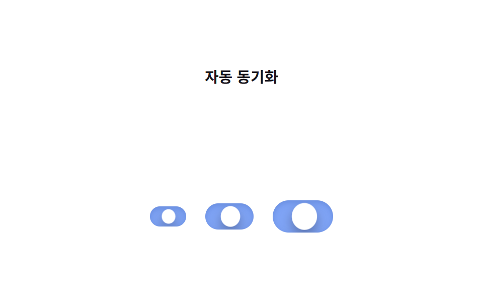
1つの SCSS ミックスインが幅・高さ・移動距離を計算し、小・中・大のスイッチを作り、すべて同じ translateX アニメーションで動く。
使いどころデザインシステムのコンポーネント、レスポンシブフォームのサイズ対応
@mixinem 단위0.25초
<main class="stage">
  <p class="group__title">自動同期</p>
  <div class="group">
    <label class="switch switch--sm is-demo">
      <input type="checkbox" class="switch__input" role="switch" aria-label="小">
      <span class="switch__track">
        <span class="switch__bg switch__bg--off"></span>
        <span class="switch__bg switch__bg--on"></span>
        <span class="switch__knob"></span>
      </span>
    </label>
    <label class="switch switch--md is-demo">
      <input type="checkbox" class="switch__input" role="switch" aria-label="中">
      <span class="switch__track">
        <span class="switch__bg switch__bg--off"></span>
        <span class="switch__bg switch__bg--on"></span>
        <span class="switch__knob"></span>
      </span>
    </label>
    <label class="switch switch--lg is-demo">
      <input type="checkbox" class="switch__input" role="switch" aria-label="大">
      <span class="switch__track">
        <span class="switch__bg switch__bg--off"></span>
        <span class="switch__bg switch__bg--on"></span>
        <span class="switch__knob"></span>
      </span>
    </label>
  </div>
</main>@use "../../../../site/static/demo-tokens" as *;
// ── 변수 3개 ──────────────────────────────
$duration: $dur-base;
$easing: $ease-out;
$color: $subject-blue;
// ── 데모 무대 ───────────────────────────────
@include stage($stage-paper);
.group__title {
margin: 0 0 clamp(10px, 3vw, 14px);
color: $subject-ink;
font-weight: 600; font-size: clamp(13px, 3.6vw, 15px); line-height: 1; font-family: inherit;
text-align: center;
}
.group {
display: flex; align-items: center; justify-content: center;
gap: clamp(14px, 4vw, 20px);
}
.switch {
position: relative;
display: inline-flex; align-items: center;
cursor: pointer;
-webkit-tap-highlight-color: transparent;
}
.switch__input {
position: absolute; inset: 0; width: 100%; height: 100%;
margin: 0; opacity: 0; cursor: pointer;
}
.switch__track {
position: relative; overflow: hidden;
border-radius: $r-pill;
box-shadow: inset 0 1px 3px rgba(0, 0, 0, .15);
transition: box-shadow $duration $easing;
}
.switch__bg { position: absolute; inset: 0; }
.switch__bg--off { background: rgba(23, 20, 26, .12); opacity: 1; }
.switch__bg--on { background: $color; opacity: 0; }
.switch__knob {
position: absolute; top: 3px; left: 3px; z-index: 1;
border-radius: 50%;
background: $stage-paper;
box-shadow: $shadow-press;
transform: translateX(0);
transition: transform $duration cubic-bezier(0.34, 1.56, 0.64, 1);
}
// ── 하나의 믹스인이 폭·높이·이동 거리를 계산한다 ──────────
@mixin switch-size($track-w, $track-h, $knob) {
--travel: #{$track-w - $knob - 6px};
.switch__track { width: $track-w; height: $track-h; }
.switch__knob { width: $knob; height: $knob; }
}
.switch--sm { @include switch-size(36px, 20px, 14px); }
.switch--md { @include switch-size(48px, 26px, 20px); }
.switch--lg { @include switch-size(60px, 32px, 26px); }
// ── 실제 동작 ─────────────────────────────
.switch__input:checked ~ .switch__track .switch__bg--off { opacity: 0; transition: opacity $duration $easing; }
.switch__input:checked ~ .switch__track .switch__bg--on { opacity: 1; transition: opacity $duration $easing; }
.switch__input:checked ~ .switch__track .switch__knob { transform: translateX(var(--travel)); }
.switch__input:checked ~ .switch__track { box-shadow: inset 0 3px 8px rgba(0, 0, 0, .28); }
.switch__input:focus-visible ~ .switch__track {
outline: 2px solid $subject-ink; outline-offset: 3px;
}
// ── 데모 루프: 세 크기가 같은 keyframes 를 공유한다 ──────
// 한 겹: 노브는 var(--travel) 를 지나쳤다 찌그러지며 안착하고(스프링+squash, 세 크기 공유),
// 트랙 내부 그림자가 상태 전환 때 깊어졌다 얕아진다(세 크기 공유).
.switch.is-demo .switch__bg--off { animation: bg-off-loop $dur-loop $easing infinite; }
.switch.is-demo .switch__bg--on { animation: bg-on-loop $dur-loop $easing infinite; }
.switch.is-demo .switch__knob { animation: knob-spring-loop $dur-loop $easing infinite; }
.switch.is-demo .switch__track { animation: shadow-depth-loop $dur-loop $easing infinite; }
@keyframes bg-off-loop { 0%, 15% { opacity: 1; } 40%, 60% { opacity: 0; } 85%, 100% { opacity: 1; } }
@keyframes bg-on-loop { 0%, 15% { opacity: 0; } 40%, 60% { opacity: 1; } 85%, 100% { opacity: 0; } }
@keyframes knob-loop {
0%, 15% { transform: translateX(0); }
40%, 60% { transform: translateX(var(--travel)); }
85%, 100% { transform: translateX(0); }
}
@keyframes knob-spring-loop {
0%, 15% { transform: translateX(0) scaleX(1) scaleY(1); }
38% { transform: translateX(calc(var(--travel) + 3px)) scaleX(1.25) scaleY(.85); } // 오버슈트 + 도착 순간 squash
43% { transform: translateX(calc(var(--travel) - 1px)) scaleX(1.08) scaleY(.94); } // 되튕기며 회복
47%, 60% { transform: translateX(var(--travel)) scaleX(1) scaleY(1); } // 안착
84% { transform: translateX(-2px) scaleX(.92) scaleY(1.06); } // 출발 반동
85%, 100% { transform: translateX(0) scaleX(1) scaleY(1); }
}
@keyframes shadow-depth-loop {
0%, 15% { box-shadow: inset 0 1px 3px rgba(0, 0, 0, .15); }
38% { box-shadow: inset 0 3px 8px rgba(0, 0, 0, .28); }
40%, 60% { box-shadow: inset 0 3px 8px rgba(0, 0, 0, .28); }
85%, 100% { box-shadow: inset 0 1px 3px rgba(0, 0, 0, .15); }
}
@media (prefers-reduced-motion: reduce) {
.switch.is-demo .switch__bg--off, .switch.is-demo .switch__bg--on, .switch.is-demo .switch__knob,
.switch.is-demo .switch__track {
animation: none !important;
}
.switch__bg--off, .switch__bg--on, .switch__knob { transition: none; }
}html, body {
margin: 0;
overflow: hidden;
}
.stage {
box-sizing: border-box;
min-height: 100vh;
display: grid;
place-items: center;
margin: 0;
background: #ffffff;
font-family: -apple-system, "Segoe UI", "Noto Sans KR", sans-serif;
padding: clamp(8px, 4vw, 24px);
}
.group__title {
margin: 0 0 clamp(10px, 3vw, 14px);
color: #17141a;
font-weight: 600;
font-size: clamp(13px, 3.6vw, 15px);
line-height: 1;
font-family: inherit;
text-align: center;
}
.group {
display: flex;
align-items: center;
justify-content: center;
gap: clamp(14px, 4vw, 20px);
}
.switch {
position: relative;
display: inline-flex;
align-items: center;
cursor: pointer;
-webkit-tap-highlight-color: transparent;
}
.switch__input {
position: absolute;
inset: 0;
width: 100%;
height: 100%;
margin: 0;
opacity: 0;
cursor: pointer;
}
.switch__track {
position: relative;
overflow: hidden;
border-radius: 999px;
box-shadow: inset 0 1px 3px rgba(0, 0, 0, 0.15);
transition: box-shadow 300ms ease-out;
}
.switch__bg {
position: absolute;
inset: 0;
}
.switch__bg--off {
background: rgba(23, 20, 26, 0.12);
opacity: 1;
}
.switch__bg--on {
background: #2f6df6;
opacity: 0;
}
.switch__knob {
position: absolute;
top: 3px;
left: 3px;
z-index: 1;
border-radius: 50%;
background: #ffffff;
box-shadow: 0 6px 12px rgba(23, 20, 26, 0.32);
transform: translateX(0);
transition: transform 300ms cubic-bezier(0.34, 1.56, 0.64, 1);
}
.switch--sm {
--travel: 16px;
}
.switch--sm .switch__track {
width: 36px;
height: 20px;
}
.switch--sm .switch__knob {
width: 14px;
height: 14px;
}
.switch--md {
--travel: 22px;
}
.switch--md .switch__track {
width: 48px;
height: 26px;
}
.switch--md .switch__knob {
width: 20px;
height: 20px;
}
.switch--lg {
--travel: 28px;
}
.switch--lg .switch__track {
width: 60px;
height: 32px;
}
.switch--lg .switch__knob {
width: 26px;
height: 26px;
}
.switch__input:checked ~ .switch__track .switch__bg--off {
opacity: 0;
transition: opacity 300ms ease-out;
}
.switch__input:checked ~ .switch__track .switch__bg--on {
opacity: 1;
transition: opacity 300ms ease-out;
}
.switch__input:checked ~ .switch__track .switch__knob {
transform: translateX(var(--travel));
}
.switch__input:checked ~ .switch__track {
box-shadow: inset 0 3px 8px rgba(0, 0, 0, 0.28);
}
.switch__input:focus-visible ~ .switch__track {
outline: 2px solid #17141a;
outline-offset: 3px;
}
.switch.is-demo .switch__bg--off {
animation: bg-off-loop 2s ease-out infinite;
}
.switch.is-demo .switch__bg--on {
animation: bg-on-loop 2s ease-out infinite;
}
.switch.is-demo .switch__knob {
animation: knob-spring-loop 2s ease-out infinite;
}
.switch.is-demo .switch__track {
animation: shadow-depth-loop 2s ease-out infinite;
}
@keyframes bg-off-loop {
0%, 15% {
opacity: 1;
}
40%, 60% {
opacity: 0;
}
85%, 100% {
opacity: 1;
}
}
@keyframes bg-on-loop {
0%, 15% {
opacity: 0;
}
40%, 60% {
opacity: 1;
}
85%, 100% {
opacity: 0;
}
}
@keyframes knob-loop {
0%, 15% {
transform: translateX(0);
}
40%, 60% {
transform: translateX(var(--travel));
}
85%, 100% {
transform: translateX(0);
}
}
@keyframes knob-spring-loop {
0%, 15% {
transform: translateX(0) scaleX(1) scaleY(1);
}
38% {
transform: translateX(calc(var(--travel) + 3px)) scaleX(1.25) scaleY(0.85);
}
43% {
transform: translateX(calc(var(--travel) - 1px)) scaleX(1.08) scaleY(0.94);
}
47%, 60% {
transform: translateX(var(--travel)) scaleX(1) scaleY(1);
}
84% {
transform: translateX(-2px) scaleX(0.92) scaleY(1.06);
}
85%, 100% {
transform: translateX(0) scaleX(1) scaleY(1);
}
}
@keyframes shadow-depth-loop {
0%, 15% {
box-shadow: inset 0 1px 3px rgba(0, 0, 0, 0.15);
}
38% {
box-shadow: inset 0 3px 8px rgba(0, 0, 0, 0.28);
}
40%, 60% {
box-shadow: inset 0 3px 8px rgba(0, 0, 0, 0.28);
}
85%, 100% {
box-shadow: inset 0 1px 3px rgba(0, 0, 0, 0.15);
}
}
@media (prefers-reduced-motion: reduce) {
.switch.is-demo .switch__bg--off, .switch.is-demo .switch__bg--on, .switch.is-demo .switch__knob,
.switch.is-demo .switch__track {
animation: none !important;
}
.switch__bg--off, .switch__bg--on, .switch__knob {
transition: none;
}
}document.querySelectorAll(".switch").forEach(function (s) {
var input = s.querySelector(".switch__input");
var sync = function () { input.setAttribute("aria-checked", String(input.checked)); };
input.addEventListener("pointerdown", function () { s.classList.remove("is-demo"); });
input.addEventListener("change", sync);
sync();
});import { useState } from "react";
import type { ChangeEvent, CSSProperties } from "react";
import styles from "./SizeVariantToggle.module.scss";
export type SizeVariantToggleProps = {
label?: string;
size?: "sm" | "md" | "lg";
duration?: number;
easing?: string;
color?: string;
defaultChecked?: boolean;
onChange?: (checked: boolean) => void;
};
const SIZES = {
sm: { track: "36px", height: "20px", knob: "14px", travel: "16px" },
md: { track: "48px", height: "26px", knob: "20px", travel: "22px" },
lg: { track: "60px", height: "32px", knob: "26px", travel: "28px" },
} as const;
type Vars = CSSProperties & {
"--duration"?: string; "--easing"?: string; "--color"?: string;
"--track-w"?: string; "--track-h"?: string; "--knob"?: string; "--travel"?: string;
};
export default function SizeVariantToggle({
label,
size = "md",
duration = 300,
easing = "ease-out",
color = "#2f6df6",
defaultChecked = false,
onChange,
}: SizeVariantToggleProps) {
const [checked, setChecked] = useState(defaultChecked);
const s = SIZES[size];
const vars: Vars = {
"--duration": `${duration}ms`, "--easing": easing, "--color": color,
"--track-w": s.track, "--track-h": s.height, "--knob": s.knob, "--travel": s.travel,
};
return (
<label className={styles.switch} style={vars}>
<input
type="checkbox"
role="switch"
aria-label={label ?? size}
aria-checked={checked}
className={styles.switch__input}
checked={checked}
onChange={(e: ChangeEvent<HTMLInputElement>) => { setChecked(e.target.checked); onChange?.(e.target.checked); }}
/>
<span className={styles.switch__track}>
<span className={styles["switch__bg--off"]} />
<span className={styles["switch__bg--on"]} />
<span className={styles.switch__knob} />
</span>
</label>
);
}08 サイズバリエーション — 計測 累積面積 2.444% · 動いたフレーム 16/23GODRICH オリジナル · SCSS と React は zip に同梱 · CSS トグルスイッチ 9選 — 一行でコピペOK
このデモが属する記事
 CSS トグルスイッチ 9選 — 一行でコピペOKcss トグルスイッチは、チェックボックス一つで実際にオン・オフができ、トラックとノブの位置・色・アイコンだけを変えて見た目を作るコントロールです。ここでは9種類を集め、どれもtransformとopacityを軸にしたコードで組みました。 この記事のデモをすべて見る