08送信ボタンのローディング→成功変化
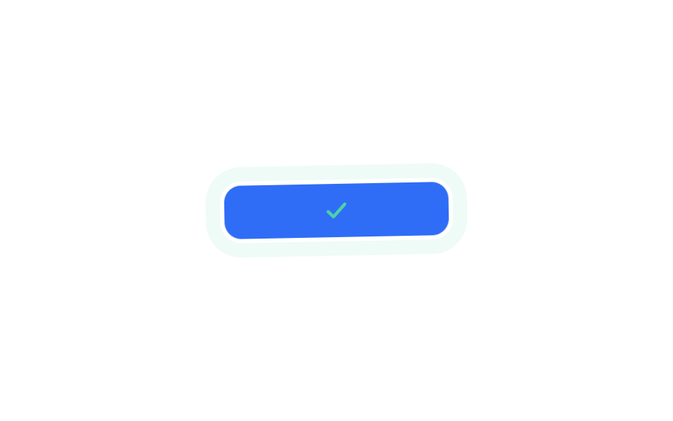
ボタンがscale(1→.96→1)で押され、ラベルがopacityで消えた場所でスピナーがrotateで回り、opacity・scaleのクロスフェードでミント色のチェックへ引き継がれる、一続きの送信の流れです。
使いどころ会員登録の送信ボタン、フォーム保存ボタンのローディング・成功表示
scalerotateopacity 크로스페이드
<main class="stage">
  <button class="fv8 is-demo" type="button">
    <span class="fv8__label">登録する</span>
    <svg class="fv8__spinner" viewBox="0 0 24 24" width="18" height="18" fill="none" stroke="currentColor" stroke-width="3" stroke-linecap="round"><circle cx="12" cy="12" r="9" stroke-dasharray="42 14"/></svg>
    <svg class="fv8__check" viewBox="0 0 24 24" width="18" height="18" fill="none" stroke="currentColor" stroke-width="3" stroke-linecap="round" stroke-linejoin="round"><polyline points="4,13 9,18 20,6"/></svg>
  </button>
</main>
@use "../../../../site/static/demo-tokens" as *;
// 제출 버튼 하나가 눌림(scale) → 로딩 스피너(rotate) → 성공 체크로 모핑(opacity+scale) 된다. 하나의 제출 상태 여정이다
$duration: $dur-loop;
$easing: $ease-pop;
$color: $subject-mint;
@include stage($stage-paper);
.fv8 {
position: relative; display: inline-flex; align-items: center; justify-content: center;
gap: $sp-2; min-width: min(160px, 70vw);
padding: $sp-3 $sp-6; border-radius: $r-control; border: 0;
background: $subject-blue; color: $subject-cream;
font-weight: 700; font-size: 14px; line-height: 1; font-family: inherit;
transform: scale(1);
}
.fv8__spinner, .fv8__check { position: absolute; opacity: 0; }
.fv8__check { color: $color; }
// 한 겹: 성공 체크 순간(74%) 버튼 둘레로 퍼지는 mint 글로우 surge 링
.fv8::after {
content: ""; position: absolute; inset: -3px; border-radius: calc(#{$r-control} + 3px);
opacity: 0; pointer-events: none;
}
@keyframes fv8-press { 0%, 8% { transform: scale(1); } 14% { transform: scale(.96); } 22%, 100% { transform: scale(1); } }
@keyframes fv8-label { 0%, 14% { opacity: 1; } 22%, 100% { opacity: 0; } }
@keyframes fv8-spin { to { transform: rotate(360deg); } }
@keyframes fv8-spinner-show { 0%, 20% { opacity: 0; } 26%, 58% { opacity: 1; } 66%, 100% { opacity: 0; } }
@keyframes fv8-check-show { 0%, 66% { opacity: 0; transform: scale(.5); } 74% { opacity: 1; transform: scale(1.15); } 86%, 100% { opacity: 1; transform: scale(1); } }
// 한 겹: 체크 피크(74%) 감쇠 rotate 진동 — 개별 rotate 속성이라 fv8-press 의 scale 과 독립 결합된다
@keyframes fv8-shake {
0%, 73% { rotate: 0deg; }
74% { rotate: 2deg; } 76% { rotate: -2deg; } 78% { rotate: 1.4deg; }
80% { rotate: -1deg; } 82% { rotate: .4deg; }
84%, 100% { rotate: 0deg; }
}
@keyframes fv8-surge {
0%, 73% { opacity: 0; box-shadow: 0 0 0 0 rgba($color, 0); }
74% { opacity: .95; box-shadow: 0 0 0 4px rgba($color, .6); }
82% { opacity: .5; box-shadow: 0 0 0 10px rgba($color, .22); }
92% { opacity: 0; box-shadow: 0 0 0 15px rgba($color, 0); }
100% { opacity: 0; box-shadow: 0 0 0 0 rgba($color, 0); }
}
.fv8.is-demo { animation: fv8-press $duration $easing infinite, fv8-shake $duration $easing infinite; }
.fv8.is-demo .fv8__label { animation: fv8-label $duration $easing infinite; }
.fv8.is-demo .fv8__spinner { animation: fv8-spin $dur-base linear infinite, fv8-spinner-show $duration $easing infinite; }
.fv8.is-demo .fv8__check { animation: fv8-check-show $duration $easing infinite; }
.fv8.is-demo::after { animation: fv8-surge $duration $easing infinite; }
@media (prefers-reduced-motion: reduce) {
.fv8.is-demo,
.fv8.is-demo .fv8__label,
.fv8.is-demo .fv8__spinner,
.fv8.is-demo .fv8__check { animation: none !important; }
.fv8.is-demo .fv8__label { opacity: 0; }
.fv8.is-demo .fv8__check { opacity: 1; transform: scale(1); }
.fv8.is-demo::after { animation: none !important; opacity: 0; }
.fv8.is-demo { rotate: 0deg; }
}html, body {
margin: 0;
overflow: hidden;
}
.stage {
box-sizing: border-box;
min-height: 100vh;
display: grid;
place-items: center;
margin: 0;
background: #ffffff;
font-family: -apple-system, "Segoe UI", "Noto Sans KR", sans-serif;
padding: clamp(8px, 4vw, 24px);
}
.fv8 {
position: relative;
display: inline-flex;
align-items: center;
justify-content: center;
gap: 8px;
min-width: min(160px, 70vw);
padding: 12px 24px;
border-radius: 12px;
border: 0;
background: #2f6df6;
color: #fff7e6;
font-weight: 700;
font-size: 14px;
line-height: 1;
font-family: inherit;
transform: scale(1);
}
.fv8__spinner, .fv8__check {
position: absolute;
opacity: 0;
}
.fv8__check {
color: #4cd4a6;
}
.fv8::after {
content: "";
position: absolute;
inset: -3px;
border-radius: calc(12px + 3px);
opacity: 0;
pointer-events: none;
}
@keyframes fv8-press {
0%, 8% {
transform: scale(1);
}
14% {
transform: scale(0.96);
}
22%, 100% {
transform: scale(1);
}
}
@keyframes fv8-label {
0%, 14% {
opacity: 1;
}
22%, 100% {
opacity: 0;
}
}
@keyframes fv8-spin {
to {
transform: rotate(360deg);
}
}
@keyframes fv8-spinner-show {
0%, 20% {
opacity: 0;
}
26%, 58% {
opacity: 1;
}
66%, 100% {
opacity: 0;
}
}
@keyframes fv8-check-show {
0%, 66% {
opacity: 0;
transform: scale(0.5);
}
74% {
opacity: 1;
transform: scale(1.15);
}
86%, 100% {
opacity: 1;
transform: scale(1);
}
}
@keyframes fv8-shake {
0%, 73% {
rotate: 0deg;
}
74% {
rotate: 2deg;
}
76% {
rotate: -2deg;
}
78% {
rotate: 1.4deg;
}
80% {
rotate: -1deg;
}
82% {
rotate: 0.4deg;
}
84%, 100% {
rotate: 0deg;
}
}
@keyframes fv8-surge {
0%, 73% {
opacity: 0;
box-shadow: 0 0 0 0 rgba(76, 212, 166, 0);
}
74% {
opacity: 0.95;
box-shadow: 0 0 0 4px rgba(76, 212, 166, 0.6);
}
82% {
opacity: 0.5;
box-shadow: 0 0 0 10px rgba(76, 212, 166, 0.22);
}
92% {
opacity: 0;
box-shadow: 0 0 0 15px rgba(76, 212, 166, 0);
}
100% {
opacity: 0;
box-shadow: 0 0 0 0 rgba(76, 212, 166, 0);
}
}
.fv8.is-demo {
animation: fv8-press 2s cubic-bezier(0.2, 1.4, 0.4, 1) infinite, fv8-shake 2s cubic-bezier(0.2, 1.4, 0.4, 1) infinite;
}
.fv8.is-demo .fv8__label {
animation: fv8-label 2s cubic-bezier(0.2, 1.4, 0.4, 1) infinite;
}
.fv8.is-demo .fv8__spinner {
animation: fv8-spin 300ms linear infinite, fv8-spinner-show 2s cubic-bezier(0.2, 1.4, 0.4, 1) infinite;
}
.fv8.is-demo .fv8__check {
animation: fv8-check-show 2s cubic-bezier(0.2, 1.4, 0.4, 1) infinite;
}
.fv8.is-demo::after {
animation: fv8-surge 2s cubic-bezier(0.2, 1.4, 0.4, 1) infinite;
}
@media (prefers-reduced-motion: reduce) {
.fv8.is-demo,
.fv8.is-demo .fv8__label,
.fv8.is-demo .fv8__spinner,
.fv8.is-demo .fv8__check {
animation: none !important;
}
.fv8.is-demo .fv8__label {
opacity: 0;
}
.fv8.is-demo .fv8__check {
opacity: 1;
transform: scale(1);
}
.fv8.is-demo::after {
animation: none !important;
opacity: 0;
}
.fv8.is-demo {
rotate: 0deg;
}
}import type { CSSProperties } from "react";
import styles from "./SubmitButtonSuccessMorph.module.scss";
export type SubmitButtonSuccessMorphProps = { duration?: number; easing?: string; color?: string };
type Vars = CSSProperties & { "--duration"?: string; "--easing"?: string; "--color"?: string };
export default function SubmitButtonSuccessMorph({ duration = 2000, easing = "cubic-bezier(.2,1.4,.4,1)", color = "#4cd4a6" }: SubmitButtonSuccessMorphProps) {
const vars: Vars = { "--duration": `${duration}ms`, "--easing": easing, "--color": color };
return (
<button type="button" className={styles.fv8} style={vars}>
<span className={styles.label}>가입하기</span>
<svg className={styles.spinner} viewBox="0 0 24 24" width="18" height="18" fill="none" stroke="currentColor" strokeWidth={3} strokeLinecap="round"><circle cx="12" cy="12" r="9" strokeDasharray="42 14" /></svg>
<svg className={styles.check} viewBox="0 0 24 24" width="18" height="18" fill="none" stroke="currentColor" strokeWidth={3} strokeLinecap="round" strokeLinejoin="round"><polyline points="4,13 9,18 20,6" /></svg>
</button>
);
}08 送信ボタンのローディング→成功変化 — 計測 累積面積 4.267% · 動いたフレーム 20/23GODRICH オリジナル · SCSS と React は zip に同梱 · CSS バリデーション アニメーション9選 — フォーム入力エラーの見せ方
このデモが属する記事
 CSS バリデーション アニメーション9選 — フォーム入力エラーの見せ方CSS バリデーションのアニメーションは、揺れではなく色・アイコン・グローのような別の合図で、フォームの値が合っているか間違っているかを伝える動きです。以下9つはコピペで動く形にまとめ、会員登録フォームで実際に起きる順番に並べました。 この記事のデモをすべて見る