08巨大ワードマークフッター
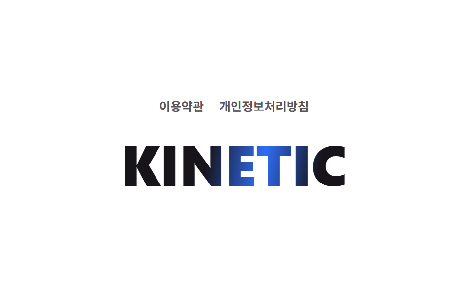
フッター最下部の巨大なワードマークの上を、光が斜めに一度だけ通り過ぎる。
使いどころマルチカラムフッター・ブランドの締め
background-clip: textgradient sweepclamp() 초대형 폰트
<main class="stage">
  <footer class="footer is-demo">
    <nav class="footer__links">
      <span class="footer__link">利用規約</span>
      <span class="footer__link">プライバシーポリシー</span>
    </nav>
    <p class="footer__wordmark">KINETIC</p>
  </footer>
</main>
@use "../../../../site/static/demo-tokens" as *;
$duration: $dur-loop; // 빛 띠가 한 번 훑고 돌아오는 시간
$easing: $ease-out;
$color: $subject-blue; // 훑고 지나가는 빛 색
@include stage($stage-paper);
.footer {
display: flex;
flex-direction: column;
align-items: center;
gap: $sp-6;
text-align: center;
}
.footer__links {
display: flex;
gap: $sp-4;
}
.footer__link {
color: rgba($subject-ink, .72); // AA 4.5 (blog-design 글자 대비)
font-weight: 600;
font-size: clamp(11px, 2.6vw, 13px);
line-height: 1;
}
// 거대 워드마크 위로 그라디언트가 한 번 대각선으로 훑는다 — background-clip: text 예외 (033 과 같은 계열)
.footer__wordmark {
margin: 0;
font-weight: 800;
font-size: clamp(36px, 12vw, 80px);
line-height: 1;
background: linear-gradient(100deg, $subject-ink 40%, $color 50%, $subject-ink 60%);
background-size: 250% 100%;
background-clip: text;
-webkit-background-clip: text;
color: transparent;
-webkit-text-fill-color: transparent;
animation: sheen-sweep $duration $easing infinite;
}
@keyframes sheen-sweep {
0% { background-position: 200% 0; }
55%, 100% { background-position: -50% 0; }
}
@media (prefers-reduced-motion: reduce) {
.footer__wordmark { animation: none; background-position: -50% 0; }
}html, body {
margin: 0;
overflow: hidden;
}
.stage {
box-sizing: border-box;
min-height: 100vh;
display: grid;
place-items: center;
margin: 0;
background: #ffffff;
font-family: -apple-system, "Segoe UI", "Noto Sans KR", sans-serif;
padding: clamp(8px, 4vw, 24px);
}
.footer {
display: flex;
flex-direction: column;
align-items: center;
gap: 24px;
text-align: center;
}
.footer__links {
display: flex;
gap: 16px;
}
.footer__link {
color: rgba(23, 20, 26, 0.72);
font-weight: 600;
font-size: clamp(11px, 2.6vw, 13px);
line-height: 1;
}
.footer__wordmark {
margin: 0;
font-weight: 800;
font-size: clamp(36px, 12vw, 80px);
line-height: 1;
background: linear-gradient(100deg, #17141a 40%, #2f6df6 50%, #17141a 60%);
background-size: 250% 100%;
background-clip: text;
-webkit-background-clip: text;
color: transparent;
-webkit-text-fill-color: transparent;
animation: sheen-sweep 2s ease-out infinite;
}
@keyframes sheen-sweep {
0% {
background-position: 200% 0;
}
55%, 100% {
background-position: -50% 0;
}
}
@media (prefers-reduced-motion: reduce) {
.footer__wordmark {
animation: none;
background-position: -50% 0;
}
}import type { CSSProperties } from "react";
import styles from "./KineticFooter.module.scss";
export type KineticFooterProps = {
link1?: string;
link2?: string;
wordmark?: string;
/** 빛 띠가 한 번 훑고 돌아오는 시간(기본 2000ms) */
duration?: number;
easing?: string;
color?: string;
};
type Vars = CSSProperties & { "--duration"?: string; "--easing"?: string; "--color"?: string };
export default function KineticFooter({
link1 = "Terms",
link2 = "Privacy",
wordmark = "KINETIC",
duration = 2000,
easing = "ease-out",
color = "#2f6df6",
}: KineticFooterProps) {
const vars: Vars = { "--duration": `${duration}ms`, "--easing": easing, "--color": color };
return (
<footer className={styles.stage} style={vars}>
<nav className={styles.links}>
<span className={styles.link}>{link1}</span>
<span className={styles.link}>{link2}</span>
</nav>
<p className={styles.wordmark}>{wordmark}</p>
</footer>
);
}08 巨大ワードマークフッター — 計測 累積面積 4.284% · 動いたフレーム 8/23GODRICH オリジナル · SCSS と React は zip に同梱 · キネティックタイポグラフィをコードで分解してみた
このデモが属する記事
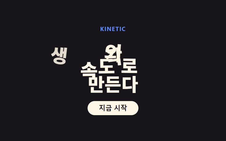 キネティックタイポグラフィをコードで分解してみたキネティックタイポグラフィとは、見出しの文字サイズが画面幅に合わせて変わり、単語が順番に浮かび上がり、数字がオドメーターのように上がっていくデザイン手法のことです。最近のランディングページはどれもファーストビューがこれなので、実際にコードを この記事のデモをすべて見る