07呼吸するグローCTA帯
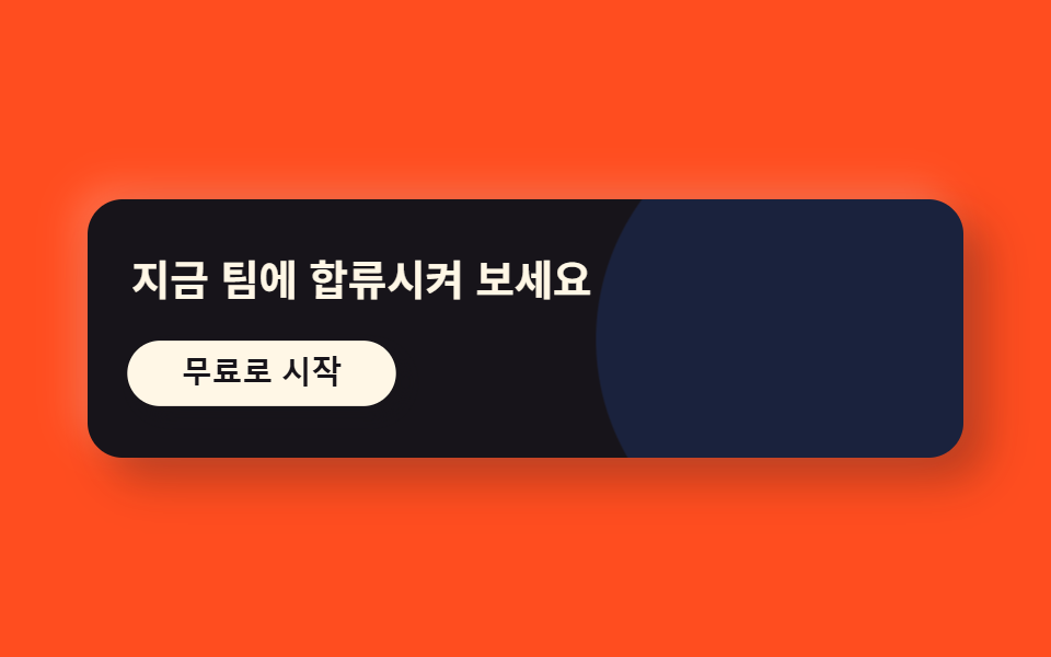
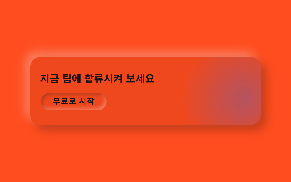
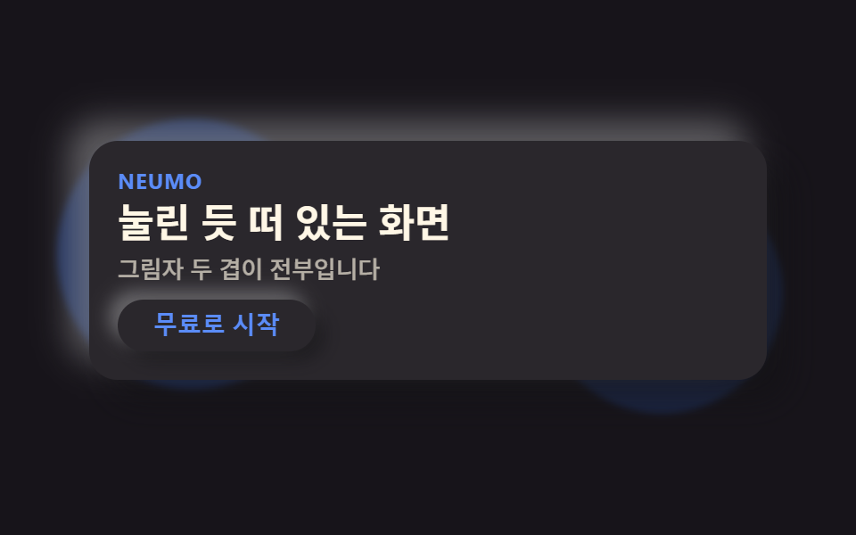
浮き出た帯の裏に隠れた円形の光が呼吸するように大きく小さくなり、その上のボタンは押し込まれては戻ります。
使いどころ登録誘導帯・無料トライアル開始
radial-gradient 글로우raised 밴드press 버튼
<main class="stage">
  <div class="ctaneu">
    <span class="ctaneu__glow is-demo" aria-hidden="true"></span>
    <h3 class="ctaneu__title">今すぐチームを招待しましょう</h3>
    <button class="ctaneu__btn is-demo" type="button">無料で始める</button>
  </div>
</main>
@use "../../../../site/static/demo-tokens" as *;
$duration: $dur-loop; // 글로우가 숨쉬듯 커졌다 작아지는 한 주기
$easing: $ease-out; // 번지는 곡선
$color: $subject-blue; // 글로우·버튼 강조 색
@include stage($stage-orange);
$neu-surface: mix($stage-orange, black, 94%);
$neu-light: rgba(mix($neu-surface, white, 40%), .5);
$neu-dark: rgba(mix($neu-surface, black, 40%), .4);
.ctaneu {
position: relative;
box-sizing: border-box;
width: clamp(240px, 84vw, 380px);
padding: $sp-6 $sp-4;
border-radius: $r-card;
background: $neu-surface;
box-shadow: 8px 8px 16px $neu-dark, -8px -8px 16px $neu-light;
overflow: hidden;
display: flex;
flex-direction: column;
align-items: flex-start;
gap: $sp-3;
}
.ctaneu__glow {
position: absolute;
top: -20%;
right: -16%;
width: clamp(120px, 40vw, 180px);
aspect-ratio: 1;
border-radius: 50%;
background: radial-gradient(circle, rgba($color, .35), rgba($color, 0) 70%);
animation: breathe $duration $easing infinite;
}
.ctaneu__title {
position: relative;
margin: 0;
max-width: 260px;
color: $subject-ink;
font-weight: 700; font-size: clamp(15px, 3.6vw, 19px); line-height: 1.3;
}
.ctaneu__btn {
position: relative;
border: 0;
border-radius: $r-pill;
background: $neu-surface;
color: $subject-ink;
padding: $sp-2 $sp-5;
font-weight: 700; font-size: clamp(12px, 2.8vw, 14px); line-height: 1;
box-shadow: 5px 5px 10px $neu-dark, -5px -5px 10px $neu-light;
animation: btnPulse $duration $easing infinite;
}
.ctaneu__btn:focus-visible {
outline: 3px solid $color;
outline-offset: 2px;
}
// 데모: 배경 글로우가 숨쉬듯 커졌다 작아지고, 버튼은 살짝 눌렸다 돌아온다
@keyframes breathe {
0%, 100% { transform: scale(1); opacity: .7; }
50% { transform: scale(1.25); opacity: 1; }
}
@keyframes btnPulse {
0%, 55%, 100% { box-shadow: 5px 5px 10px $neu-dark, -5px -5px 10px $neu-light; transform: scale(1); }
75% { box-shadow: inset 3px 3px 6px $neu-dark, inset -3px -3px 6px $neu-light; transform: scale(.96); }
}
@media (prefers-reduced-motion: reduce) {
.ctaneu__glow, .ctaneu__btn { animation: none !important; transform: none; }
}html, body {
margin: 0;
overflow: hidden;
}
.stage {
box-sizing: border-box;
min-height: 100vh;
display: grid;
place-items: center;
margin: 0;
background: #ff4d1f;
font-family: -apple-system, "Segoe UI", "Noto Sans KR", sans-serif;
padding: clamp(8px, 4vw, 24px);
}
.ctaneu {
position: relative;
box-sizing: border-box;
width: clamp(240px, 84vw, 380px);
padding: 24px 16px;
border-radius: 16px;
background: rgb(94%, 28.3843137255%, 11.4274509804%);
box-shadow: 8px 8px 16px rgba(37.6%, 11.3537254902%, 4.5709803922%, 0.4), -8px -8px 16px rgba(97.6%, 71.3537254902%, 64.5709803922%, 0.5);
overflow: hidden;
display: flex;
flex-direction: column;
align-items: flex-start;
gap: 12px;
}
.ctaneu__glow {
position: absolute;
top: -20%;
right: -16%;
width: clamp(120px, 40vw, 180px);
aspect-ratio: 1;
border-radius: 50%;
background: radial-gradient(circle, rgba(47, 109, 246, 0.35), rgba(47, 109, 246, 0) 70%);
animation: breathe 2s ease-out infinite;
}
.ctaneu__title {
position: relative;
margin: 0;
max-width: 260px;
color: #17141a;
font-weight: 700;
font-size: clamp(15px, 3.6vw, 19px);
line-height: 1.3;
}
.ctaneu__btn {
position: relative;
border: 0;
border-radius: 999px;
background: rgb(94%, 28.3843137255%, 11.4274509804%);
color: #17141a;
padding: 8px 20px;
font-weight: 700;
font-size: clamp(12px, 2.8vw, 14px);
line-height: 1;
box-shadow: 5px 5px 10px rgba(37.6%, 11.3537254902%, 4.5709803922%, 0.4), -5px -5px 10px rgba(97.6%, 71.3537254902%, 64.5709803922%, 0.5);
animation: btnPulse 2s ease-out infinite;
}
.ctaneu__btn:focus-visible {
outline: 3px solid #2f6df6;
outline-offset: 2px;
}
@keyframes breathe {
0%, 100% {
transform: scale(1);
opacity: 0.7;
}
50% {
transform: scale(1.25);
opacity: 1;
}
}
@keyframes btnPulse {
0%, 55%, 100% {
box-shadow: 5px 5px 10px rgba(37.6%, 11.3537254902%, 4.5709803922%, 0.4), -5px -5px 10px rgba(97.6%, 71.3537254902%, 64.5709803922%, 0.5);
transform: scale(1);
}
75% {
box-shadow: inset 3px 3px 6px rgba(37.6%, 11.3537254902%, 4.5709803922%, 0.4), inset -3px -3px 6px rgba(97.6%, 71.3537254902%, 64.5709803922%, 0.5);
transform: scale(0.96);
}
}
@media (prefers-reduced-motion: reduce) {
.ctaneu__glow, .ctaneu__btn {
animation: none !important;
transform: none;
}
}import type { CSSProperties } from "react";
import styles from "./CtaBandNeu.module.scss";
export type CtaBandNeuProps = {
title?: string;
cta?: string;
duration?: number;
easing?: string;
color?: string;
};
type Vars = CSSProperties & { "--duration"?: string; "--easing"?: string; "--color"?: string };
export default function CtaBandNeu({
title = "지금 팀에 합류시켜 보세요",
cta = "무료로 시작",
duration = 2000,
easing = "ease-out",
color = "#2f6df6",
}: CtaBandNeuProps) {
const vars: Vars = { "--duration": `${duration}ms`, "--easing": easing, "--color": color };
return (
<div className={styles.band} style={vars}>
<span className={styles.glow} aria-hidden="true" />
<h3 className={styles.title}>{title}</h3>
<button type="button" className={styles.btn}>{cta}</button>
</div>
);
}07 呼吸するグローCTA帯 — 計測 累積面積 11.604% · 動いたフレーム 10/23GODRICH オリジナル · SCSS と React は zip に同梱 · ニューモーフィズム デザインとは?二重の影だけのLPパーツ9選
このデモが属する記事
 ニューモーフィズム デザインとは?二重の影だけのLPパーツ9選ニューモーフィズム デザインとは、カードやボタンの背景色を画面の背景とほぼ同じにしたうえで、明るい影と暗い影を反対方向に重ねることで、色ではなく影だけで立体感を出すデザイン手法です。名前も作り方も知らなかった、あの「押し込まれたようにふくら この記事のデモをすべて見る