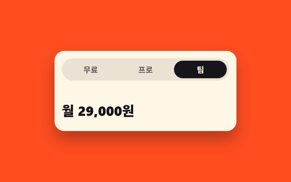
07タブを移ると高さまで伸び縮みするパネル
パネルを grid-template-rows の 0fr と 1fr の間で補間し、内容の高さを知らなくても滑らかに伸ばします。今選ばれているタブは aria-selected が持ちます。
使いどころ説明の長さがばらばらな料金プラン・詳細情報タブ
grid-template-rows0fraria-selected
<main class="stage">
  <section class="th is-demo" id="th">
    <div class="th__tabs" role="tablist" aria-label="料金プランのタブ">
      <button class="th__tab" type="button" role="tab" id="th-t1" aria-controls="th-p1" aria-selected="true">無料</button>
      <button class="th__tab" type="button" role="tab" id="th-t2" aria-controls="th-p2" aria-selected="false" tabindex="-1">プロ</button>
      <button class="th__tab" type="button" role="tab" id="th-t3" aria-controls="th-p3" aria-selected="false" tabindex="-1">チーム</button>
    </div>

    <div class="th__panels">
      <div class="th__panel is-open" role="tabpanel" id="th-p1" aria-labelledby="th-t1">
        <div class="th__clip">
          <div class="th__body">
            <p class="th__price">0円</p>
            <p class="th__desc">一人で使うならこれで十分です。</p>
          </div>
        </div>
      </div>
      <div class="th__panel" role="tabpanel" id="th-p2" aria-labelledby="th-t2" aria-hidden="true">
        <div class="th__clip">
          <div class="th__body">
            <p class="th__price">月1,200円</p>
            <p class="th__desc">作業記録を数の制限なく残し、書き出し形式を全部使えます。過去30日以内に変えたものはいつでも戻せて、返信は一日以内に届きます。</p>
          </div>
        </div>
      </div>
      <div class="th__panel" role="tabpanel" id="th-p3" aria-labelledby="th-t3" aria-hidden="true">
        <div class="th__clip">
          <div class="th__body">
            <p class="th__price">月2,900円</p>
            <p class="th__desc">五人まで同じ作業スペースを一緒に使えます。</p>
          </div>
        </div>
      </div>
    </div>
  </section>
</main>@use "../../../../site/static/demo-tokens" as *;
// 탭 높이 모프 — 패널을 grid-template-rows 의 0fr 과 1fr 사이에서 보간해
// 내용 높이를 미리 모르고도 부드럽게 늘린다. 내용 교체는 컷, 높이만 보간한다.
$duration: $dur-base;
$easing: $ease-spring;
$color: $subject-cream;
@include stage($stage-orange);
$ink-soft: rgba(23, 20, 26, .68);
$ink-track: rgba(23, 20, 26, .09);
.th {
box-sizing: border-box;
display: grid;
gap: $sp-2;
width: min(300px, 92vw);
padding: $sp-3;
border-radius: $r-card;
background: $color;
color: $subject-ink;
box-shadow: $shadow-raised;
}
.th * { box-sizing: border-box; }
// ── 탭 줄: 인디케이터를 고정 px 로 옮기지 않는다. 칸은 1fr 3등분, 표시는 배경으로 ──
.th__tabs {
display: grid;
grid-template-columns: repeat(3, 1fr);
gap: $sp-1;
padding: $sp-1;
border-radius: $r-pill;
background: $ink-track;
}
.th__tab {
margin: 0;
padding: $sp-2 0;
border: 0;
border-radius: $r-pill;
background: transparent;
color: $ink-soft;
font-family: inherit;
font-size: 13px;
font-weight: 700;
line-height: 1;
cursor: pointer;
transition: background-color $duration $easing, color $duration $easing;
}
.th__tab:focus-visible { outline: 2px solid $subject-ink; outline-offset: 2px; }
.th__tab[aria-selected="true"] { background: $subject-ink; color: $color; }
// ── 패널: 0fr ↔ 1fr 보간 ──
// 0fr 칸의 자식에 min-height: 0 과 overflow: hidden 이 둘 다 있어야 실제로 접힌다.
// 접히는 칸에 세로 패딩을 주면 0fr 에서도 그만큼 남으므로 패딩은 안쪽 래퍼에 둔다.
.th__panel {
display: grid;
grid-template-rows: 0fr;
transition: grid-template-rows $duration $easing;
}
.th__panel.is-open { grid-template-rows: 1fr; }
.th__clip { min-height: 0; overflow: hidden; }
.th__body {
padding: $sp-2 0 0;
opacity: 0;
transition: opacity $duration steps(1, end);
}
// 펼침은 바로 보이고, 접힘은 높이가 다 줄어든 뒤 한 프레임에 컷 — 크로스페이드가 생기지 않는다
.th__panel.is-open .th__body { opacity: 1; transition-duration: 0s; }
.th__price {
margin: 0;
font-size: 22px;
font-weight: 800;
line-height: 1.1;
}
.th__desc {
margin: $sp-1 0 0;
color: $ink-soft;
font-size: 12px;
font-weight: 500;
line-height: 1.5;
}
// ── 격자 미리보기 전용 2초 루프 ──
// 높이는 이징으로 보간하고(아래 th-row-*), 글자와 탭 표시는 steps(1, end) 컷으로 갈아 끼운다.
@keyframes th-row-1 {
0%, 20% { grid-template-rows: 1fr; }
28%, 82% { grid-template-rows: 0fr; }
90%, 100% { grid-template-rows: 1fr; }
}
@keyframes th-row-2 {
0%, 20% { grid-template-rows: 0fr; }
28%, 48% { grid-template-rows: 1fr; }
56%, 100% { grid-template-rows: 0fr; }
}
@keyframes th-row-3 {
0%, 48% { grid-template-rows: 0fr; }
56%, 74% { grid-template-rows: 1fr; }
82%, 100% { grid-template-rows: 0fr; }
}
@keyframes th-body-1 {
0% { opacity: 1; }
28% { opacity: 0; }
82%, 100% { opacity: 1; }
}
@keyframes th-body-2 {
0% { opacity: 0; }
20% { opacity: 1; }
56%, 100% { opacity: 0; }
}
@keyframes th-body-3 {
0% { opacity: 0; }
48% { opacity: 1; }
82%, 100% { opacity: 0; }
}
@keyframes th-tab-1 {
0% { background-color: $subject-ink; color: $color; }
20% { background-color: transparent; color: $ink-soft; }
82%, 100% { background-color: $subject-ink; color: $color; }
}
@keyframes th-tab-2 {
0% { background-color: transparent; color: $ink-soft; }
20% { background-color: $subject-ink; color: $color; }
48%, 100% { background-color: transparent; color: $ink-soft; }
}
@keyframes th-tab-3 {
0% { background-color: transparent; color: $ink-soft; }
48% { background-color: $subject-ink; color: $color; }
82%, 100% { background-color: transparent; color: $ink-soft; }
}
.th.is-demo {
.th__panel:nth-child(1) { animation-name: th-row-1; }
.th__panel:nth-child(2) { animation-name: th-row-2; }
.th__panel:nth-child(3) { animation-name: th-row-3; }
.th__panel {
animation-duration: $dur-loop;
animation-timing-function: $easing;
animation-iteration-count: infinite;
animation-fill-mode: backwards;
}
.th__panel:nth-child(1) .th__body { animation-name: th-body-1; }
.th__panel:nth-child(2) .th__body { animation-name: th-body-2; }
.th__panel:nth-child(3) .th__body { animation-name: th-body-3; }
.th__tab:nth-child(1) { animation-name: th-tab-1; }
.th__tab:nth-child(2) { animation-name: th-tab-2; }
.th__tab:nth-child(3) { animation-name: th-tab-3; }
.th__body,
.th__tab {
animation-duration: $dur-loop;
animation-timing-function: steps(1, end);
animation-iteration-count: infinite;
animation-fill-mode: backwards;
}
}
@media (max-width: 340px) {
.th { gap: $sp-1; width: min(292px, 96vw); padding: $sp-2; }
.th__tabs { gap: 0; }
.th__tab { padding: $sp-1 0; font-size: 11px; }
.th__body { padding: $sp-1 0 0; }
.th__price { font-size: 17px; }
.th__desc { margin: 0; font-size: 10px; }
}
@media (prefers-reduced-motion: reduce) {
.th.is-demo .th__panel,
.th.is-demo .th__body,
.th.is-demo .th__tab { animation: none !important; transition: none !important; }
// 움직임만 끄고 첫 탭이 펼쳐진 결과는 그대로 남긴다
.th.is-demo .th__panel:nth-child(1) { grid-template-rows: 1fr !important; }
.th.is-demo .th__panel:nth-child(1) .th__body { opacity: 1 !important; }
.th.is-demo .th__tab:nth-child(1) { background-color: $subject-ink !important; color: $color !important; }
}html, body {
margin: 0;
overflow: hidden;
}
.stage {
box-sizing: border-box;
min-height: 100vh;
display: grid;
place-items: center;
margin: 0;
background: #ff4d1f;
font-family: -apple-system, "Segoe UI", "Noto Sans KR", sans-serif;
padding: clamp(8px, 4vw, 24px);
}
.th {
box-sizing: border-box;
display: grid;
gap: 8px;
width: min(300px, 92vw);
padding: 12px;
border-radius: 16px;
background: #fff7e6;
color: #17141a;
box-shadow: 0 14px 24px rgba(23, 20, 26, 0.32);
}
.th * {
box-sizing: border-box;
}
.th__tabs {
display: grid;
grid-template-columns: repeat(3, 1fr);
gap: 4px;
padding: 4px;
border-radius: 999px;
background: rgba(23, 20, 26, 0.09);
}
.th__tab {
margin: 0;
padding: 8px 0;
border: 0;
border-radius: 999px;
background: transparent;
color: rgba(23, 20, 26, 0.68);
font-family: inherit;
font-size: 13px;
font-weight: 700;
line-height: 1;
cursor: pointer;
transition: background-color 300ms cubic-bezier(0.2, 0.8, 0.2, 1), color 300ms cubic-bezier(0.2, 0.8, 0.2, 1);
}
.th__tab:focus-visible {
outline: 2px solid #17141a;
outline-offset: 2px;
}
.th__tab[aria-selected=true] {
background: #17141a;
color: #fff7e6;
}
.th__panel {
display: grid;
grid-template-rows: 0fr;
transition: grid-template-rows 300ms cubic-bezier(0.2, 0.8, 0.2, 1);
}
.th__panel.is-open {
grid-template-rows: 1fr;
}
.th__clip {
min-height: 0;
overflow: hidden;
}
.th__body {
padding: 8px 0 0;
opacity: 0;
transition: opacity 300ms steps(1, end);
}
.th__panel.is-open .th__body {
opacity: 1;
transition-duration: 0s;
}
.th__price {
margin: 0;
font-size: 22px;
font-weight: 800;
line-height: 1.1;
}
.th__desc {
margin: 4px 0 0;
color: rgba(23, 20, 26, 0.68);
font-size: 12px;
font-weight: 500;
line-height: 1.5;
}
@keyframes th-row-1 {
0%, 20% {
grid-template-rows: 1fr;
}
28%, 82% {
grid-template-rows: 0fr;
}
90%, 100% {
grid-template-rows: 1fr;
}
}
@keyframes th-row-2 {
0%, 20% {
grid-template-rows: 0fr;
}
28%, 48% {
grid-template-rows: 1fr;
}
56%, 100% {
grid-template-rows: 0fr;
}
}
@keyframes th-row-3 {
0%, 48% {
grid-template-rows: 0fr;
}
56%, 74% {
grid-template-rows: 1fr;
}
82%, 100% {
grid-template-rows: 0fr;
}
}
@keyframes th-body-1 {
0% {
opacity: 1;
}
28% {
opacity: 0;
}
82%, 100% {
opacity: 1;
}
}
@keyframes th-body-2 {
0% {
opacity: 0;
}
20% {
opacity: 1;
}
56%, 100% {
opacity: 0;
}
}
@keyframes th-body-3 {
0% {
opacity: 0;
}
48% {
opacity: 1;
}
82%, 100% {
opacity: 0;
}
}
@keyframes th-tab-1 {
0% {
background-color: #17141a;
color: #fff7e6;
}
20% {
background-color: transparent;
color: rgba(23, 20, 26, 0.68);
}
82%, 100% {
background-color: #17141a;
color: #fff7e6;
}
}
@keyframes th-tab-2 {
0% {
background-color: transparent;
color: rgba(23, 20, 26, 0.68);
}
20% {
background-color: #17141a;
color: #fff7e6;
}
48%, 100% {
background-color: transparent;
color: rgba(23, 20, 26, 0.68);
}
}
@keyframes th-tab-3 {
0% {
background-color: transparent;
color: rgba(23, 20, 26, 0.68);
}
48% {
background-color: #17141a;
color: #fff7e6;
}
82%, 100% {
background-color: transparent;
color: rgba(23, 20, 26, 0.68);
}
}
.th.is-demo .th__panel:nth-child(1) {
animation-name: th-row-1;
}
.th.is-demo .th__panel:nth-child(2) {
animation-name: th-row-2;
}
.th.is-demo .th__panel:nth-child(3) {
animation-name: th-row-3;
}
.th.is-demo .th__panel {
animation-duration: 2s;
animation-timing-function: cubic-bezier(0.2, 0.8, 0.2, 1);
animation-iteration-count: infinite;
animation-fill-mode: backwards;
}
.th.is-demo .th__panel:nth-child(1) .th__body {
animation-name: th-body-1;
}
.th.is-demo .th__panel:nth-child(2) .th__body {
animation-name: th-body-2;
}
.th.is-demo .th__panel:nth-child(3) .th__body {
animation-name: th-body-3;
}
.th.is-demo .th__tab:nth-child(1) {
animation-name: th-tab-1;
}
.th.is-demo .th__tab:nth-child(2) {
animation-name: th-tab-2;
}
.th.is-demo .th__tab:nth-child(3) {
animation-name: th-tab-3;
}
.th.is-demo .th__body,
.th.is-demo .th__tab {
animation-duration: 2s;
animation-timing-function: steps(1, end);
animation-iteration-count: infinite;
animation-fill-mode: backwards;
}
@media (max-width: 340px) {
.th {
gap: 4px;
width: min(292px, 96vw);
padding: 8px;
}
.th__tabs {
gap: 0;
}
.th__tab {
padding: 4px 0;
font-size: 11px;
}
.th__body {
padding: 4px 0 0;
}
.th__price {
font-size: 17px;
}
.th__desc {
margin: 0;
font-size: 10px;
}
}
@media (prefers-reduced-motion: reduce) {
.th.is-demo .th__panel,
.th.is-demo .th__body,
.th.is-demo .th__tab {
animation: none !important;
transition: none !important;
}
.th.is-demo .th__panel:nth-child(1) {
grid-template-rows: 1fr !important;
}
.th.is-demo .th__panel:nth-child(1) .th__body {
opacity: 1 !important;
}
.th.is-demo .th__tab:nth-child(1) {
background-color: #17141a !important;
color: #fff7e6 !important;
}
}// 탭 높이 모프: 고른 탭은 aria-selected 가 들고, 패널은 0fr ↔ 1fr 사이에서 높이가 보간된다.
var th = document.getElementById('th');
var thTabs = [].slice.call(th.querySelectorAll('.th__tab'));
function thSelect(i) {
th.classList.remove('is-demo');
thTabs.forEach(function (t, n) {
var on = n === i;
t.setAttribute('aria-selected', on ? 'true' : 'false');
t.tabIndex = on ? 0 : -1;
var p = document.getElementById(t.getAttribute('aria-controls'));
p.classList.toggle('is-open', on);
p.setAttribute('aria-hidden', on ? 'false' : 'true');
});
}
thTabs.forEach(function (t, i) {
t.addEventListener('click', function () { thSelect(i); });
t.addEventListener('keydown', function (e) {
var d = e.key === 'ArrowRight' ? 1 : e.key === 'ArrowLeft' ? -1 : 0;
if (!d) return;
e.preventDefault();
var n = (i + d + thTabs.length) % thTabs.length;
thSelect(n);
thTabs[n].focus({ preventScroll: true });
});
});import { useState, useRef } from "react";
import type { CSSProperties } from "react";
import styles from "./TabHeightMorph.module.scss";
export type TabHeightMorphItem = { tab: string; price: string; desc: string };
export type TabHeightMorphProps = {
/** 탭 라벨과 그 안의 내용. 설명 길이가 제각각이어도 높이가 따라 늘어난다 */
items?: TabHeightMorphItem[];
groupLabel?: string;
/** 격자 미리보기용 2초 자동 루프. 사람이 손대면 꺼진다 */
demo?: boolean;
duration?: number;
easing?: string;
color?: string;
};
type Vars = CSSProperties & { "--duration"?: string; "--easing"?: string; "--color"?: string };
// ambient 가 얇아 KeyboardEvent·HTMLElement 를 못 쓴다 — 필요한 꼴만 로컬 타입으로 선언
type KeyEvt = { key: string; preventDefault(): void };
type Focusable = { focus(o: { preventScroll: boolean }): void };
type Box<T> = { current: T };
const DEFAULT_ITEMS: TabHeightMorphItem[] = [
{ tab: "Free", price: "$0", desc: "Enough when it is just you." },
{
tab: "Pro",
price: "$9 / month",
desc:
"Keep an unlimited history, use every export format, and roll back anything you changed in the last 30 days. Replies arrive within a day.",
},
{ tab: "Team", price: "$24 / month", desc: "Up to five people share one workspace." },
];
let seq = 0;
export default function TabHeightMorph({
items = DEFAULT_ITEMS,
groupLabel = "Pricing tabs",
demo = true,
duration = 300,
easing = "cubic-bezier(.2,.8,.2,1)",
color = "#fff7e6",
}: TabHeightMorphProps) {
const [current, setCurrent] = useState(0);
const [live, setLive] = useState(demo);
const [uid] = useState<string>(() => "tab-height-morph-" + String(++seq));
// useRef 는 { current: T | null } 이라 배열로 쓸 땐 단언이 필요하다
const tabRefs = useRef<(Focusable | null)[]>([]) as Box<(Focusable | null)[]>;
const vars: Vars = { "--duration": `${duration}ms`, "--easing": easing, "--color": color };
function select(i: number) {
setLive(false);
setCurrent(i);
}
function onKeyDown(e: KeyEvt, i: number) {
const step = e.key === "ArrowRight" ? 1 : e.key === "ArrowLeft" ? -1 : 0;
if (step === 0) return;
e.preventDefault();
const next = (i + step + items.length) % items.length;
select(next);
const el = tabRefs.current[next];
// iframe 안에서 무가드 focus 는 부모 페이지를 끌어당긴다
if (el) el.focus({ preventScroll: true });
}
const cls = [styles.th, live ? styles.isDemo : ""].filter(Boolean).join(" ");
return (
<section className={cls} style={vars}>
<div className={styles.tabs} role="tablist" aria-label={groupLabel}>
{items.map((it, i) => (
<button
key={it.tab}
className={styles.tab}
type="button"
role="tab"
id={`${uid}-t${i}`}
aria-controls={`${uid}-p${i}`}
aria-selected={i === current}
tabIndex={i === current ? 0 : -1}
ref={(el: Focusable | null) => {
tabRefs.current[i] = el;
}}
onClick={() => select(i)}
onKeyDown={(e: KeyEvt) => onKeyDown(e, i)}
>
{it.tab}
</button>
))}
</div>
<div className={styles.panels}>
{items.map((it, i) => (
<div
key={it.tab}
className={[styles.panel, i === current ? styles.isOpen : ""].filter(Boolean).join(" ")}
role="tabpanel"
id={`${uid}-p${i}`}
aria-labelledby={`${uid}-t${i}`}
aria-hidden={i !== current}
>
{/* 0fr 칸이 실제로 접히려면 이 래퍼에 min-height: 0 과 overflow: hidden 이 둘 다 있어야 한다 */}
<div className={styles.clip}>
<div className={styles.body}>
<p className={styles.price}>{it.price}</p>
<p className={styles.desc}>{it.desc}</p>
</div>
</div>
</div>
))}
</div>
</section>
);
}07 タブを移ると高さまで伸び縮みするパネル — 計測 累積面積 36.456% · 動いたフレーム 11/23GODRICH オリジナル · SCSS と React は zip に同梱 · ページ遷移 ローディング 9選 — コピペで動く
このデモが属する記事
 ページ遷移 ローディング 9選 — コピペで動くページ遷移 ローディングとは、画面が次の画面へ切り替わるまでのわずかな待ち時間を目に見える形にする仕組みです。この九つは中央で回るスピナーではなく、プログレスバー・色の帯・点線のプレースホルダー・楽観的な遷移のように、画面全体が入れ替わる瞬 この記事のデモをすべて見る