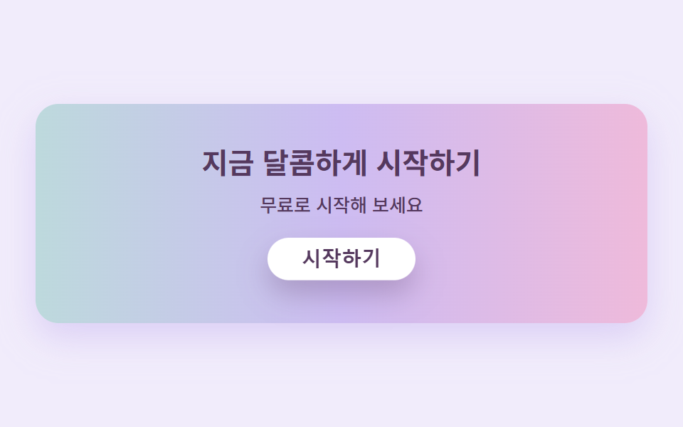
07캔디 그라디언트 CTA 밴드
밴드 하나에 핑크에서 라벤더로 지나가는 캔디 그라디언트를 깔고 그 위치가 천천히 흐릅니다. 위의 흰 버튼은 눌렸다가 통통 튕겨 돌아오는 것을 반복합니다.
쓰임가입 유도 띠, 무료 체험 시작
background-position 흐름press 버튼radius pill
<main class="stage">
  <section class="ctacandy">
    <h2 class="ctacandy__title">지금 달콤하게 시작하기</h2>
    <p class="ctacandy__sub">무료로 시작해 보세요</p>
    <button class="ctacandy__btn" type="button">시작하기</button>
  </section>
</main>
@use "../../../../site/static/demo-tokens" as *;
$duration: $dur-loop; // 그라디언트가 한 바퀴 흐르는 주기
$easing: $ease-spring; // 버튼이 눌렸다 튕겨 돌아오는 곡선
$color: $stage-ink; // 글자 기본(토큰) — 베리 잉크로 덮는다
// 캔디 팔레트 — 값은 tailwind.config.js · tokens.css 와 같다
$candy-cream: #fff6f0;
$candy-bubble: #ffb9cf;
$candy-peach: #ffd2b8;
$candy-lemon: #ffe9a3;
$candy-mint: #b5e8d2;
$candy-lavender: #cdbcf2;
$candy-berry: #55395e;
// 무대 — 라벤더 물색
@include stage(mix($candy-lavender, $stage-paper, 28%));
.ctacandy {
box-sizing: border-box;
width: clamp(280px, 90vw, 430px);
display: flex;
flex-direction: column;
align-items: center;
gap: $sp-2;
padding: clamp($sp-5, 6vw, $sp-8) $sp-5;
border-radius: $r-card;
// 캔디 그라디언트 — 색이 이어지도록 양 끝을 같은 색으로 두고 300% 폭으로 깔아 위치를 흘린다
background: linear-gradient(90deg, $candy-bubble, $candy-lavender, $candy-mint, $candy-lavender, $candy-bubble);
background-size: 300% 100%;
box-shadow: 0 10px 24px rgba($candy-lavender, .6);
animation: gradFlow $duration linear infinite;
}
.ctacandy__title {
margin: 0;
color: $candy-berry;
font-weight: 700; font-size: clamp(16px, 4.2vw, 21px); line-height: 1.25;
text-align: center;
}
.ctacandy__sub {
margin: 0;
color: $candy-berry;
font-weight: 500; font-size: clamp(11px, 2.8vw, 13px); line-height: 1.4;
text-align: center;
}
.ctacandy__btn {
margin-top: $sp-2;
border: 0;
border-radius: $r-pill;
background: $stage-paper;
color: $candy-berry;
padding: $sp-2 $sp-6;
font-weight: 700; font-size: clamp(12px, 3vw, 14px); line-height: 1;
box-shadow: 0 8px 18px rgba($candy-berry, .28);
animation: btnPress $duration $easing infinite;
}
.ctacandy__btn:focus-visible {
outline: 3px solid $candy-berry;
outline-offset: 2px;
}
// 데모: 그라디언트는 왼쪽으로 천천히 흐르고, 버튼은 살짝 눌렸다 통통 튕겨 돌아온다
@keyframes gradFlow {
0% { background-position: 0% 50%; }
100% { background-position: -300% 50%; }
}
@keyframes btnPress {
0%, 55%, 100% { transform: translateY(0); box-shadow: 0 8px 18px rgba($candy-berry, .28); }
65% { transform: translateY(4px) scaleY(.96); box-shadow: 0 2px 6px rgba($candy-berry, .2); }
82% { transform: translateY(-3px); box-shadow: 0 11px 22px rgba($candy-berry, .3); }
}
@media (prefers-reduced-motion: reduce) {
.ctacandy, .ctacandy__btn { animation: none !important; transform: none; }
}html, body {
margin: 0;
overflow: hidden;
}
.stage {
box-sizing: border-box;
min-height: 100vh;
display: grid;
place-items: center;
margin: 0;
background: rgb(94.5098039216%, 92.6431372549%, 98.5725490196%);
font-family: -apple-system, "Segoe UI", "Noto Sans KR", sans-serif;
padding: clamp(8px, 4vw, 24px);
}
.ctacandy {
box-sizing: border-box;
width: clamp(280px, 90vw, 430px);
display: flex;
flex-direction: column;
align-items: center;
gap: 8px;
padding: clamp(20px, 6vw, 32px) 20px;
border-radius: 16px;
background: linear-gradient(90deg, #ffb9cf, #cdbcf2, #b5e8d2, #cdbcf2, #ffb9cf);
background-size: 300% 100%;
box-shadow: 0 10px 24px rgba(205, 188, 242, 0.6);
animation: gradFlow 2s linear infinite;
}
.ctacandy__title {
margin: 0;
color: #55395e;
font-weight: 700;
font-size: clamp(16px, 4.2vw, 21px);
line-height: 1.25;
text-align: center;
}
.ctacandy__sub {
margin: 0;
color: #55395e;
font-weight: 500;
font-size: clamp(11px, 2.8vw, 13px);
line-height: 1.4;
text-align: center;
}
.ctacandy__btn {
margin-top: 8px;
border: 0;
border-radius: 999px;
background: #ffffff;
color: #55395e;
padding: 8px 24px;
font-weight: 700;
font-size: clamp(12px, 3vw, 14px);
line-height: 1;
box-shadow: 0 8px 18px rgba(85, 57, 94, 0.28);
animation: btnPress 2s cubic-bezier(0.2, 0.8, 0.2, 1) infinite;
}
.ctacandy__btn:focus-visible {
outline: 3px solid #55395e;
outline-offset: 2px;
}
@keyframes gradFlow {
0% {
background-position: 0% 50%;
}
100% {
background-position: -300% 50%;
}
}
@keyframes btnPress {
0%, 55%, 100% {
transform: translateY(0);
box-shadow: 0 8px 18px rgba(85, 57, 94, 0.28);
}
65% {
transform: translateY(4px) scaleY(0.96);
box-shadow: 0 2px 6px rgba(85, 57, 94, 0.2);
}
82% {
transform: translateY(-3px);
box-shadow: 0 11px 22px rgba(85, 57, 94, 0.3);
}
}
@media (prefers-reduced-motion: reduce) {
.ctacandy, .ctacandy__btn {
animation: none !important;
transform: none;
}
}import type { CSSProperties } from "react";
import styles from "./CtaBandCandy.module.scss";
export type CtaBandCandyProps = {
title?: string;
sub?: string;
cta?: string;
/** 한 주기(기본 2000ms) */
duration?: number;
easing?: string;
color?: string;
};
type Vars = CSSProperties & { "--duration"?: string; "--easing"?: string; "--color"?: string };
export default function CtaBandCandy({
title = "지금 달콤하게 시작하기",
sub = "무료로 시작해 보세요",
cta = "시작하기",
duration = 2000,
easing = "cubic-bezier(.2,.8,.2,1)",
color = "#ffb9cf",
}: CtaBandCandyProps) {
const vars: Vars = { "--duration": `${duration}ms`, "--easing": easing, "--color": color };
return (
<section className={styles.ctacandy} style={vars}>
<h2 className={styles.title}>{title}</h2>
<p className={styles.sub}>{sub}</p>
<button type="button" className={styles.btn}>{cta}</button>
</section>
);
}07 캔디 그라디언트 CTA 밴드 — 측정 누적면적 44.037% · 움직인 프레임 23/23GODRICH 원작 · zip 에 SCSS·React 포함 · 파스텔 톤 디자인 랜딩 UI 키트, 캔디 색 섹션 9개
이 데모가 속한 글
 파스텔 톤 디자인 랜딩 UI 키트, 캔디 색 섹션 9개파스텔 톤 디자인은 크림색 바탕 위에 버블검 핑크·피치·레몬·민트·라벤더의 연한 색을 얹고, 그림자까지 회색 대신 같은 계열의 파스텔로 그려 사탕처럼 말랑하고 상큼하게 보이게 만드는 스타일입니다. 디저트 가게나 뷰티 이 글의 데모 전부 보기