07가격 공개 카드
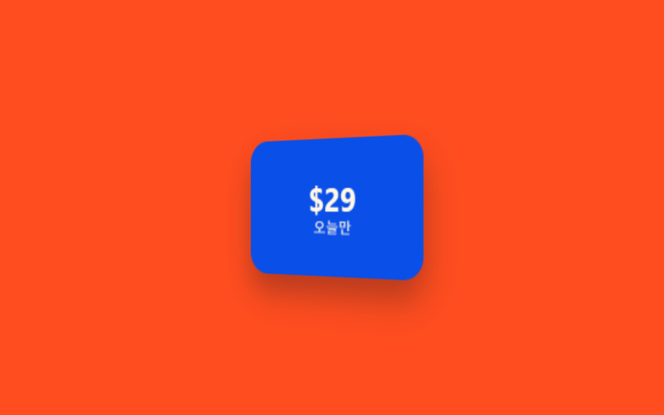
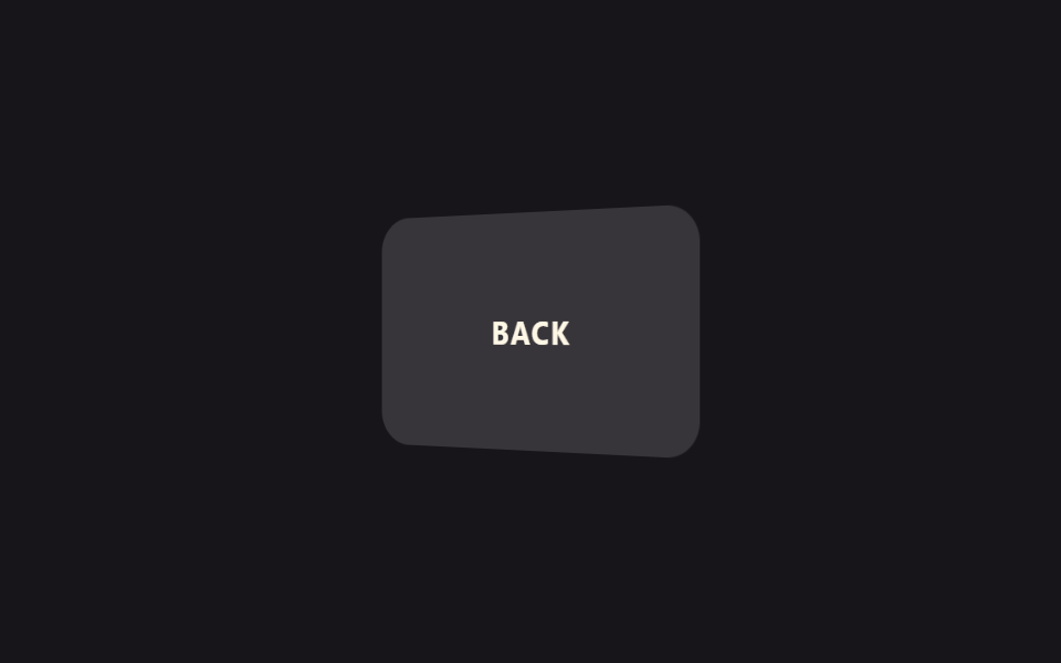
카드에 마우스를 올리면 뒤집히며 할인된 가격이나 숨겨진 조건이 뒷면에 나타납니다. 정가와 할인가를 한 카드에서 비교할 때 씁니다.
쓰임할인 상품 카드, 정가/할인가 비교 카드
rotateYbackface-visibility: hidden180ms
<main class="stage">
  <div class="rp-card is-demo">
    <div class="rp-card__inner">
      <div class="rp-card__face rp-card__face--front">
        <span class="rp-price">$49</span>
        <span class="rp-label">정가</span>
      </div>
      <div class="rp-card__face rp-card__face--back">
        <span class="rp-price">$29</span>
        <span class="rp-label">오늘만</span>
      </div>
    </div>
  </div>
</main>
@use "../../../../site/static/demo-tokens" as *;
// ── 변수 3개 ──────────────────────────────────────────
$duration: $dur-quick * 1.5;
$easing: $ease-spring;
$color: $subject-blue;
@include stage($stage-orange);
.rp-card {
perspective: 700px;
width: 150px;
height: 100px;
}
.rp-card__inner {
position: relative;
width: 100%;
height: 100%;
transform-style: preserve-3d;
transition: transform $duration $easing;
}
.rp-card:hover .rp-card__inner { transform: rotateY(180deg); }
.rp-card__face {
position: absolute;
inset: 0;
display: flex;
flex-direction: column;
align-items: center;
justify-content: center;
gap: $sp-1;
border-radius: $r-card;
backface-visibility: hidden;
box-shadow: $shadow-raised;
}
.rp-card__face--front { background: $subject-cream; }
.rp-card__face--back { background: $subject-blue-deep; transform: rotateY(180deg); }
.rp-price { font: 700 24px/1 -apple-system, "Segoe UI", sans-serif; color: $subject-ink; }
.rp-card__face--back .rp-price { color: $subject-cream; }
.rp-label { font: 600 11px/1 -apple-system, sans-serif; opacity: .6; color: $subject-ink; }
.rp-card__face--back .rp-label { color: $subject-cream; opacity: .8; }
// 데모 루프
@keyframes rp-flip {
0%, 40% { transform: rotateY(0); }
60%, 100% { transform: rotateY(180deg); }
}
.rp-card.is-demo .rp-card__inner { animation: rp-flip $duration * 2.6 $easing infinite; }
@media (prefers-reduced-motion: reduce) {
.rp-card:hover .rp-card__inner,
.rp-card.is-demo .rp-card__inner { animation: none !important; transition: none !important; transform: none !important; }
}html, body {
margin: 0;
overflow: hidden;
}
.stage {
box-sizing: border-box;
min-height: 100vh;
display: grid;
place-items: center;
margin: 0;
background: #ff4d1f;
font-family: -apple-system, "Segoe UI", "Noto Sans KR", sans-serif;
padding: clamp(8px, 4vw, 24px);
}
.rp-card {
perspective: 700px;
width: 150px;
height: 100px;
}
.rp-card__inner {
position: relative;
width: 100%;
height: 100%;
transform-style: preserve-3d;
transition: transform 330ms cubic-bezier(0.2, 0.8, 0.2, 1);
}
.rp-card:hover .rp-card__inner {
transform: rotateY(180deg);
}
.rp-card__face {
position: absolute;
inset: 0;
display: flex;
flex-direction: column;
align-items: center;
justify-content: center;
gap: 4px;
border-radius: 16px;
backface-visibility: hidden;
box-shadow: 0 14px 24px rgba(23, 20, 26, 0.32);
}
.rp-card__face--front {
background: #fff7e6;
}
.rp-card__face--back {
background: #0a4fe8;
transform: rotateY(180deg);
}
.rp-price {
font: 700 24px/1 -apple-system, "Segoe UI", sans-serif;
color: #17141a;
}
.rp-card__face--back .rp-price {
color: #fff7e6;
}
.rp-label {
font: 600 11px/1 -apple-system, sans-serif;
opacity: 0.6;
color: #17141a;
}
.rp-card__face--back .rp-label {
color: #fff7e6;
opacity: 0.8;
}
@keyframes rp-flip {
0%, 40% {
transform: rotateY(0);
}
60%, 100% {
transform: rotateY(180deg);
}
}
.rp-card.is-demo .rp-card__inner {
animation: rp-flip 858ms cubic-bezier(0.2, 0.8, 0.2, 1) infinite;
}
@media (prefers-reduced-motion: reduce) {
.rp-card:hover .rp-card__inner,
.rp-card.is-demo .rp-card__inner {
animation: none !important;
transition: none !important;
transform: none !important;
}
}import { CSSProperties } from "react";
import styles from "./RevealPriceCard.module.scss";
export interface RevealPriceCardProps {
duration?: string;
easing?: string;
listPrice?: string;
salePrice?: string;
saleLabel?: string;
}
export default function RevealPriceCard({
duration = "330ms",
easing = "cubic-bezier(.2, .8, .2, 1)",
listPrice = "$49",
salePrice = "$29",
saleLabel = "Today only",
}: RevealPriceCardProps) {
const style = { "--duration": duration, "--easing": easing } as CSSProperties;
return (
<div className={styles.card} style={style}>
<div className={styles.inner}>
<div className={`${styles.face} ${styles.front}`}>
<span className={styles.price}>{listPrice}</span>
<span className={styles.label}>List price</span>
</div>
<div className={`${styles.face} ${styles.back}`}>
<span className={styles.price}>{salePrice}</span>
<span className={styles.label}>{saleLabel}</span>
</div>
</div>
</div>
);
}07 가격 공개 카드 — 측정 누적면적 12.062% · 움직인 프레임 7/23GODRICH 원작 · zip 에 SCSS·React 포함 · CSS 카드 뒤집기 애니메이션 9종 (복붙 20줄)
이 데모가 속한 글
 CSS 카드 뒤집기 애니메이션 9종 (복붙 20줄)CSS 카드 뒤집기는 마우스를 올리거나 클릭했을 때 카드가 휙 돌아가거나 반으로 접히면서 반대쪽 내용을 보여주는 애니메이션입니다. 코드를 몰라도 아래 데모에 마우스를 올려보면 바로 무슨 효과인지 알 수 있습니다. 이 이 글의 데모 전부 보기