02유리 내비게이션
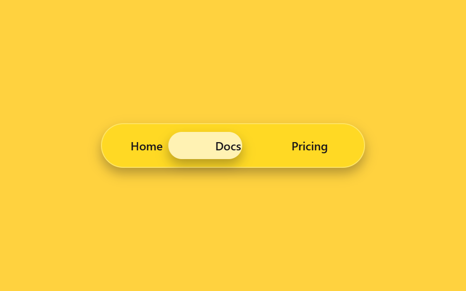
반투명 유리 재질의 내비게이션 바 안에서, 지금 선택된 메뉴 뒤로 흐릿한 유리 알약이 translateX로 옮겨 다닙니다. 메뉴 글자 수가 달라도 각 탭 폭을 고정해 알약이 정확한 자리에 멈춥니다.
쓰임웹앱 상단 내비게이션, 랜딩 페이지 헤더 메뉴
backdrop-filtertranslateX220ms
<main class="stage">
  <nav class="gn-nav is-demo" aria-label="demo">
    <span class="gn-pill" aria-hidden="true"></span>
    <a class="gn-link" href="#">Home</a>
    <a class="gn-link" href="#">Docs</a>
    <a class="gn-link" href="#">Pricing</a>
  </nav>
</main>
@use "../../../../site/static/demo-tokens" as *;
// ── 변수 3개 ──────────────────────────────────────────
$duration: $dur-quick;
$easing: $ease-pop;
$color: $subject-blue;
@include stage($stage-yellow);
// 라벨 폭을 고정값으로 둔다 — translateX 만 쓰고 scaleX 는 안 쓰므로 BD19(flex 분배) 대상은 아니지만,
// 실제 폭이 흔들리면 필이 라벨 밖으로 걸리는 건 매한가지라 flex:0 0 auto + 고정 width 로 고정한다
$w: 76px;
.gn-nav {
position: relative;
box-sizing: border-box;
width: min(272px, 86vw);
display: flex;
gap: $sp-2;
padding: $sp-2;
border-radius: $r-pill;
background: rgba(255, 255, 255, .14);
border: 1px solid rgba(255, 255, 255, .3);
backdrop-filter: blur(14px) saturate(160%);
-webkit-backdrop-filter: blur(14px) saturate(160%);
box-shadow: $shadow-press;
}
.gn-link {
position: relative;
z-index: 1;
flex: 0 0 auto;
box-sizing: border-box;
width: $w;
text-align: center;
padding: $sp-2 0;
border-radius: $r-pill;
font: 600 12px/1 -apple-system, "Segoe UI", sans-serif;
color: $subject-ink;
text-decoration: none;
}
.gn-pill {
position: absolute;
top: $sp-2; left: $sp-2; bottom: $sp-2;
box-sizing: border-box;
width: $w;
border-radius: $r-pill;
background: rgba(255, 255, 255, .6);
backdrop-filter: blur(6px);
box-shadow: $shadow-press;
transform: translateX(0);
transition: transform $duration $easing;
}
// 실사용: 진짜 호버로 필이 그 링크 아래로 이동 (:has 로 형제 상태를 읽는다)
.gn-nav:has(.gn-link:nth-child(3):hover) .gn-pill { transform: translateX(calc(#{$w} + #{$sp-2})); }
.gn-nav:has(.gn-link:nth-child(4):hover) .gn-pill { transform: translateX(calc((#{$w} + #{$sp-2}) * 2)); }
// 데모 루프: is-demo 는 세 자리를 keyframes 로 오간다 (헤드리스는 :has(:hover) 를 못 건다)
@keyframes gn-loop {
0%, 15% { transform: translateX(0); }
33%, 48% { transform: translateX(calc(#{$w} + #{$sp-2})); }
66%, 81% { transform: translateX(calc((#{$w} + #{$sp-2}) * 2)); }
100% { transform: translateX(0); }
}
.gn-nav.is-demo .gn-pill { animation: gn-loop $dur-loop $easing infinite; }
@media (prefers-reduced-motion: reduce) {
.gn-pill { transition: none; }
.gn-nav.is-demo .gn-pill { animation: none !important; }
}html, body {
margin: 0;
overflow: hidden;
}
.stage {
box-sizing: border-box;
min-height: 100vh;
display: grid;
place-items: center;
margin: 0;
background: #ffd23f;
font-family: -apple-system, "Segoe UI", "Noto Sans KR", sans-serif;
padding: clamp(8px, 4vw, 24px);
}
.gn-nav {
position: relative;
box-sizing: border-box;
width: min(272px, 86vw);
display: flex;
gap: 8px;
padding: 8px;
border-radius: 999px;
background: rgba(255, 255, 255, 0.14);
border: 1px solid rgba(255, 255, 255, 0.3);
backdrop-filter: blur(14px) saturate(160%);
-webkit-backdrop-filter: blur(14px) saturate(160%);
box-shadow: 0 6px 12px rgba(23, 20, 26, 0.32);
}
.gn-link {
position: relative;
z-index: 1;
flex: 0 0 auto;
box-sizing: border-box;
width: 76px;
text-align: center;
padding: 8px 0;
border-radius: 999px;
font: 600 12px/1 -apple-system, "Segoe UI", sans-serif;
color: #17141a;
text-decoration: none;
}
.gn-pill {
position: absolute;
top: 8px;
left: 8px;
bottom: 8px;
box-sizing: border-box;
width: 76px;
border-radius: 999px;
background: rgba(255, 255, 255, 0.6);
backdrop-filter: blur(6px);
box-shadow: 0 6px 12px rgba(23, 20, 26, 0.32);
transform: translateX(0);
transition: transform 220ms cubic-bezier(0.2, 1.4, 0.4, 1);
}
.gn-nav:has(.gn-link:nth-child(3):hover) .gn-pill {
transform: translateX(calc(76px + 8px));
}
.gn-nav:has(.gn-link:nth-child(4):hover) .gn-pill {
transform: translateX(calc((76px + 8px) * 2));
}
@keyframes gn-loop {
0%, 15% {
transform: translateX(0);
}
33%, 48% {
transform: translateX(calc(76px + 8px));
}
66%, 81% {
transform: translateX(calc((76px + 8px) * 2));
}
100% {
transform: translateX(0);
}
}
.gn-nav.is-demo .gn-pill {
animation: gn-loop 2s cubic-bezier(0.2, 1.4, 0.4, 1) infinite;
}
@media (prefers-reduced-motion: reduce) {
.gn-pill {
transition: none;
}
.gn-nav.is-demo .gn-pill {
animation: none !important;
}
}import { CSSProperties } from "react";
import styles from "./GlassNavbar.module.scss";
type Vars = CSSProperties & {
"--duration"?: string;
"--easing"?: string;
};
export interface GlassNavbarProps {
duration?: string;
easing?: string;
}
const LINKS = ["Home", "Docs", "Pricing"];
export default function GlassNavbar({
duration = "220ms",
easing = "cubic-bezier(.2, 1.4, .4, 1)",
}: GlassNavbarProps) {
const style: Vars = { "--duration": duration, "--easing": easing };
return (
<nav className={styles.nav} style={style} aria-label="glass nav">
<span className={styles.pill} aria-hidden="true" />
{LINKS.map((label) => (
<a key={label} className={styles.link} href="#">
{label}
</a>
))}
</nav>
);
}02 유리 내비게이션 — 측정 누적면적 6.783% · 움직인 프레임 14/23GODRICH 원작 · zip 에 SCSS·React 포함 · CSS 글래스모피즘 리퀴드 글래스 효과 9종
이 데모가 속한 글
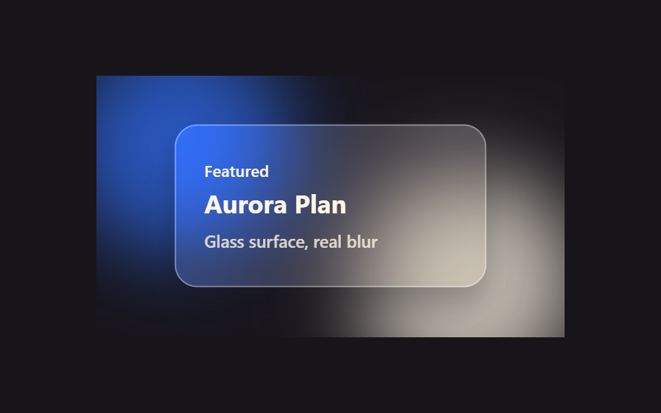 CSS 글래스모피즘 리퀴드 글래스 효과 9종화면 위에 반투명한 유리판을 얹어 놓은 것처럼, 뒤 배경이 흐릿하게 비치면서 내용은 또렷하게 보이는 디자인을 CSS 글래스모피즘(리퀴드 글래스)이라고 부릅니다. 카드부터 내비게이션, 버튼, 토글까지 아홉 가지 유리 이 글의 데모 전부 보기