01캔디 링 회전
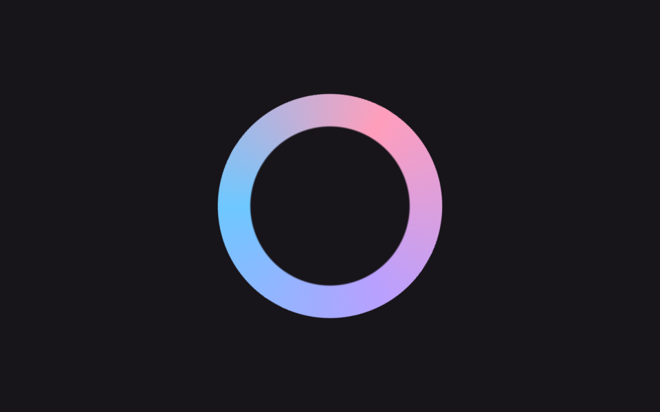
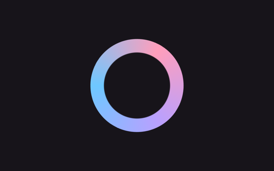
파스텔 세 색이 섞인 conic-gradient 링이 빙글 돌면서 살짝 커졌다 작아지며 숨 쉬어, 어두운 화면에서도 사탕처럼 눈에 띄는 첫 화면 로딩 표시가 됩니다.
쓰임서비스 첫 화면 로딩, 다크 테마 대시보드 진입 시
conic-gradientmask$duration
<main class="stage">
  <div class="cr-wrap is-demo" aria-hidden="true">
    <div class="cr-ring"></div>
  </div>
</main>
@use "../../../../site/static/demo-tokens" as *;
// ── 변수 3개 ──────────────────────────────────────────
$duration: 1s; // 링 한 바퀴
$easing: $ease-out;
$color: $subject-pink;
@include stage($stage-ink);
// 실사용: 로딩 시작하면 JS 가 .is-loading 을 붙인다
.cr-wrap {
width: 148px;
height: 148px;
display: grid;
place-items: center;
}
.cr-ring {
width: 148px;
height: 148px;
border-radius: 50%;
background: conic-gradient(from 0deg, $color, $subject-lilac, $subject-sky, $color);
mask: radial-gradient(farthest-side, #0000 calc(100% - 22px), #000 calc(100% - 21px));
}
.cr-wrap.is-loading,
.cr-wrap.is-demo {
.cr-ring { animation: cr-spin $duration linear infinite; }
animation: cr-breathe 2s $easing infinite;
}
@keyframes cr-spin {
to { transform: rotate(360deg); }
}
@keyframes cr-breathe {
0%, 100% { transform: scale(1); }
50% { transform: scale(1.12); }
}
@media (prefers-reduced-motion: reduce) {
.cr-wrap.is-loading,
.cr-wrap.is-demo {
animation: none !important;
.cr-ring { animation: none !important; }
}
}
// 320px 폭 스테이지에서 1.12배 breathe 가 패딩 여유를 거의 다 먹어 타이밍에 따라 세로 넘침이 났다
// (실측 2026-09-11: 148px 링 기준 여유 8.64px 뿐이라 렌더 타이밍마다 폰넘침 O/X 가 갈림) — 좁은 화면에서 링 자체를 줄여 여유를 키운다
@media (max-width: 340px), (max-height: 220px) {
.cr-wrap, .cr-ring { width: 116px; height: 116px; }
}html, body {
margin: 0;
overflow: hidden;
}
.stage {
box-sizing: border-box;
min-height: 100vh;
display: grid;
place-items: center;
margin: 0;
background: #17141a;
font-family: -apple-system, "Segoe UI", "Noto Sans KR", sans-serif;
padding: clamp(8px, 4vw, 24px);
}
.cr-wrap {
width: 148px;
height: 148px;
display: grid;
place-items: center;
}
.cr-ring {
width: 148px;
height: 148px;
border-radius: 50%;
background: conic-gradient(from 0deg, #ff9ebb, #b9a0ff, #6ec8ff, #ff9ebb);
mask: radial-gradient(farthest-side, rgba(0, 0, 0, 0) calc(100% - 22px), #000 calc(100% - 21px));
}
.cr-wrap.is-loading .cr-ring,
.cr-wrap.is-demo .cr-ring {
animation: cr-spin 1s linear infinite;
}
.cr-wrap.is-loading,
.cr-wrap.is-demo {
animation: cr-breathe 2s ease-out infinite;
}
@keyframes cr-spin {
to {
transform: rotate(360deg);
}
}
@keyframes cr-breathe {
0%, 100% {
transform: scale(1);
}
50% {
transform: scale(1.12);
}
}
@media (prefers-reduced-motion: reduce) {
.cr-wrap.is-loading,
.cr-wrap.is-demo {
animation: none !important;
}
.cr-wrap.is-loading .cr-ring,
.cr-wrap.is-demo .cr-ring {
animation: none !important;
}
}
@media (max-width: 340px), (max-height: 220px) {
.cr-wrap, .cr-ring {
width: 116px;
height: 116px;
}
}import { CSSProperties } from "react";
import styles from "./CandyRing.module.scss";
type Vars = CSSProperties & {
"--duration"?: string;
"--easing"?: string;
"--color"?: string;
};
export interface CandyRingProps {
duration?: string;
easing?: string;
color?: string;
}
export default function CandyRing({
duration = "1s",
easing = "ease-out",
color = "#ff9ebb",
}: CandyRingProps) {
const style: Vars = {
"--duration": duration,
"--easing": easing,
"--color": color,
};
return (
<div className={`${styles.wrap} ${styles.demo}`} style={style} aria-hidden="true">
<div className={styles.ring} />
</div>
);
}01 캔디 링 회전 — 측정 누적면적 9.335% · 움직인 프레임 23/23GODRICH 원작 · zip 에 SCSS·React 포함 · 로딩페이지 디자인 9종 — 복붙하는 예쁜 CSS 로딩 화면
이 데모가 속한 글
 로딩페이지 디자인 9종 — 복붙하는 예쁜 CSS 로딩 화면로딩페이지 디자인은 서비스가 켜지는 첫 순간에 사용자에게 "기다리고 있네"라고 말해주는 화면입니다. 기본 스피너 하나로도 되지만, 파스텔 링이나 차오르는 물처럼 예쁜 로딩 화면은 복붙 몇 줄로 사이트 인상을 바꿔 놓 이 글의 데모 전부 보기