08바깥 클릭 시 흔들림
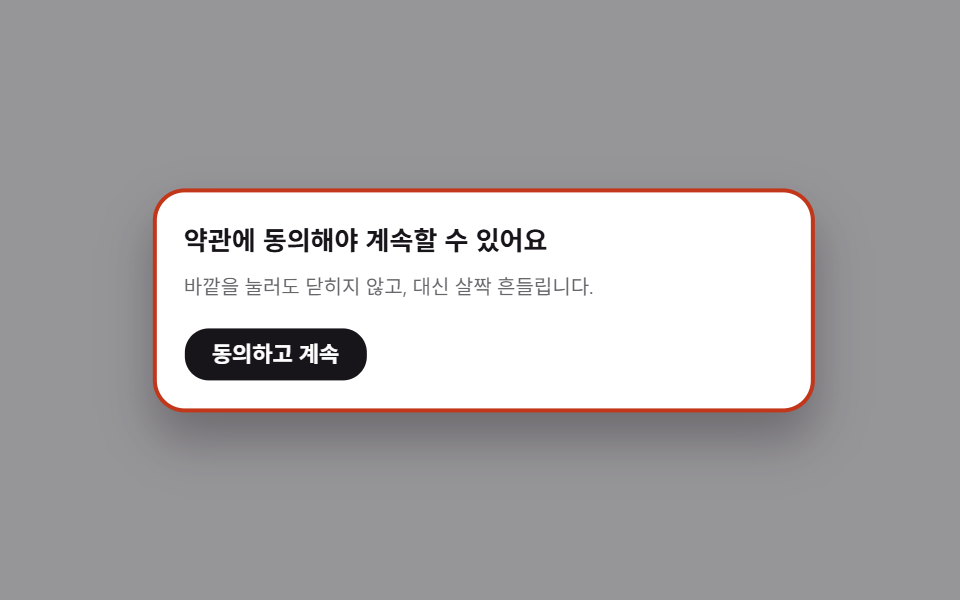
닫을 수 없는 모달 밖을 누르면 살짝 흔들려 알린다.
쓰임약관 동의, 필수 입력
4px두 번테두리 강조
<main class="stage is-demo">
  <div class="overlay"></div>
  <div class="modal" role="dialog" aria-modal="true" aria-labelledby="t8">
    <h2 id="t8">약관에 동의해야 계속할 수 있어요</h2>
    <p>바깥을 눌러도 닫히지 않고, 대신 살짝 흔들립니다.</p>
    <button class="modal__accept" type="button">동의하고 계속</button>
  </div>
</main>
@use "../../../../site/static/demo-tokens" as *;
// ── 변수 3개 ──────────────────────────────────────────
$duration: $dur-base; // 흔들림 지속 시간
$easing: $ease-spring; // 실제 흔들림엔 별도 cubic-bezier 를 쓴다(아래)
$color: $subject-ink; // 강조색(버튼)
@include stage($stage-paper);
.stage { position: relative; }
// 닫을 수 없는 모달이라 열린 채로 고정. 오버레이는 어둡게만 유지한다
.overlay {
position: fixed; inset: 0;
background: rgba($stage-ink, .45);
}
.modal {
position: fixed; left: 50%; top: 50%;
transform: translate(-50%, -50%);
width: min(80vw, 300px);
padding: clamp(12px, 4.5vmin, 22px);
border-radius: $r-card; background: $stage-paper; color: $stage-ink;
border: 2px solid rgba($stage-ink, .12);
box-shadow: $shadow-raised;
h2 { margin: 0 0 6px; font-size: clamp(13px, 4.2vmin, 17px); }
p { margin: 0 0 14px; font-size: clamp(10px, 3.2vmin, 13px); color: rgba($stage-ink, .65); }
}
.modal__accept {
border: 0; border-radius: $r-control; background: $color; color: $stage-paper;
padding: clamp(7px, 2.6vmin, 9px) clamp(14px, 4.6vmin, 18px);
font-weight: 600;
font-size: clamp(11px, 3.4vmin, 13px);
line-height: 1;
font-family: inherit;
cursor: pointer;
}
.modal.is-shaking {
animation: shake $duration cubic-bezier(.36, .07, .19, .97) both;
border-color: $error;
}
@keyframes shake {
10%, 90% { transform: translate(calc(-50% - 3px), -50%); }
20%, 80% { transform: translate(calc(-50% + 4px), -50%); border-color: $error; }
30%, 70% { transform: translate(calc(-50% - 4px), -50%); }
40%, 60% { transform: translate(calc(-50% + 3px), -50%); }
50% { transform: translate(calc(-50% - 3px), -50%); border-color: $error; }
}
// 데모: 2초마다 두 번씩 흔든다
.stage.is-demo .modal { animation: shake-loop $dur-loop cubic-bezier(.36, .07, .19, .97) infinite; }
@keyframes shake-loop {
0%, 40%, 100% { transform: translate(-50%, -50%); border-color: rgba($stage-ink, .12); }
44% { transform: translate(calc(-50% - 4px), -50%); border-color: $error; }
48% { transform: translate(calc(-50% + 4px), -50%); }
52% { transform: translate(calc(-50% - 4px), -50%); border-color: $error; }
56% { transform: translate(calc(-50% + 3px), -50%); }
60% { transform: translate(-50%, -50%); border-color: rgba($stage-ink, .12); }
}
@media (prefers-reduced-motion: reduce) {
.stage.is-demo .modal, .modal.is-shaking { animation: none; }
.modal.is-shaking { border-color: $error; }
}html, body {
margin: 0;
overflow: hidden;
}
.stage {
box-sizing: border-box;
min-height: 100vh;
display: grid;
place-items: center;
margin: 0;
background: #ffffff;
font-family: -apple-system, "Segoe UI", "Noto Sans KR", sans-serif;
padding: clamp(8px, 4vw, 24px);
}
.stage {
position: relative;
}
.overlay {
position: fixed;
inset: 0;
background: rgba(23, 20, 26, 0.45);
}
.modal {
position: fixed;
left: 50%;
top: 50%;
transform: translate(-50%, -50%);
width: min(80vw, 300px);
padding: clamp(12px, 4.5vmin, 22px);
border-radius: 16px;
background: #ffffff;
color: #17141a;
border: 2px solid rgba(23, 20, 26, 0.12);
box-shadow: 0 14px 24px rgba(23, 20, 26, 0.32);
}
.modal h2 {
margin: 0 0 6px;
font-size: clamp(13px, 4.2vmin, 17px);
}
.modal p {
margin: 0 0 14px;
font-size: clamp(10px, 3.2vmin, 13px);
color: rgba(23, 20, 26, 0.65);
}
.modal__accept {
border: 0;
border-radius: 12px;
background: #17141a;
color: #ffffff;
padding: clamp(7px, 2.6vmin, 9px) clamp(14px, 4.6vmin, 18px);
font-weight: 600;
font-size: clamp(11px, 3.4vmin, 13px);
line-height: 1;
font-family: inherit;
cursor: pointer;
}
.modal.is-shaking {
animation: shake 300ms cubic-bezier(0.36, 0.07, 0.19, 0.97) both;
border-color: #c2361a;
}
@keyframes shake {
10%, 90% {
transform: translate(calc(-50% - 3px), -50%);
}
20%, 80% {
transform: translate(calc(-50% + 4px), -50%);
border-color: #c2361a;
}
30%, 70% {
transform: translate(calc(-50% - 4px), -50%);
}
40%, 60% {
transform: translate(calc(-50% + 3px), -50%);
}
50% {
transform: translate(calc(-50% - 3px), -50%);
border-color: #c2361a;
}
}
.stage.is-demo .modal {
animation: shake-loop 2s cubic-bezier(0.36, 0.07, 0.19, 0.97) infinite;
}
@keyframes shake-loop {
0%, 40%, 100% {
transform: translate(-50%, -50%);
border-color: rgba(23, 20, 26, 0.12);
}
44% {
transform: translate(calc(-50% - 4px), -50%);
border-color: #c2361a;
}
48% {
transform: translate(calc(-50% + 4px), -50%);
}
52% {
transform: translate(calc(-50% - 4px), -50%);
border-color: #c2361a;
}
56% {
transform: translate(calc(-50% + 3px), -50%);
}
60% {
transform: translate(-50%, -50%);
border-color: rgba(23, 20, 26, 0.12);
}
}
@media (prefers-reduced-motion: reduce) {
.stage.is-demo .modal, .modal.is-shaking {
animation: none;
}
.modal.is-shaking {
border-color: #c2361a;
}
}// 실제 클릭: 바깥(overlay)을 누르면 닫히는 대신 흔들린다.
(function () {
var stage = document.querySelector('.stage');
var overlay = document.querySelector('.overlay');
var modal = document.querySelector('.modal');
overlay.addEventListener('click', function () {
stage.classList.remove('is-demo');
modal.classList.remove('is-shaking');
void modal.offsetWidth;
modal.classList.add('is-shaking');
});
modal.addEventListener('animationend', function (e) {
if (e.animationName === 'shake') modal.classList.remove('is-shaking');
});
})();import { useState } from "react";
import type { CSSProperties } from "react";
import styles from "./ShakeOutsideModal.module.scss";
export type ShakeOutsideModalProps = {
title: string;
description: string;
acceptLabel: string;
onAccept?: () => void;
/** 흔들림 지속 시간 (기본 300ms) */
duration?: number;
easing?: string;
color?: string;
};
type Vars = CSSProperties & { "--duration"?: string; "--easing"?: string; "--color"?: string };
export default function ShakeOutsideModal({
title,
description,
acceptLabel,
onAccept,
duration = 300,
easing = "cubic-bezier(.36,.07,.19,.97)",
color = "#17141a",
}: ShakeOutsideModalProps) {
const [shakeKey, setShakeKey] = useState(0);
const vars: Vars = { "--duration": `${duration}ms`, "--easing": easing, "--color": color };
return (
<div className={styles.stage} style={vars}>
<div className={styles.overlay} onClick={() => setShakeKey((k) => k + 1)} />
<div
key={shakeKey}
className={shakeKey ? `${styles.modal} ${styles.isShaking}` : styles.modal}
role="dialog"
aria-modal="true"
>
<h2>{title}</h2>
<p>{description}</p>
<button type="button" className={styles.accept} onClick={onAccept}>
{acceptLabel}
</button>
</div>
</div>
);
}08 바깥 클릭 시 흔들림 — 측정 누적면적 5.663% · 움직인 프레임 6/23GODRICH 원작 · zip 에 SCSS·React 포함 · CSS 모달 팝업 애니메이션 9종 — JS 최소, @starting-style로
이 데모가 속한 글
 CSS 모달 팝업 애니메이션 9종 — JS 최소, @starting-style로CSS 모달 팝업 애니메이션 아홉 개를 한 번에 모았습니다. 확인창부터 바텀 시트, 팝오버, 겹쳐 열리는 모달까지 실무에서 자주 쓰는 장면을 아홉 가지로 나눠 담았고, 전부 transform과 opacity만(배경 이 글의 데모 전부 보기