06카드 깊이 레이어
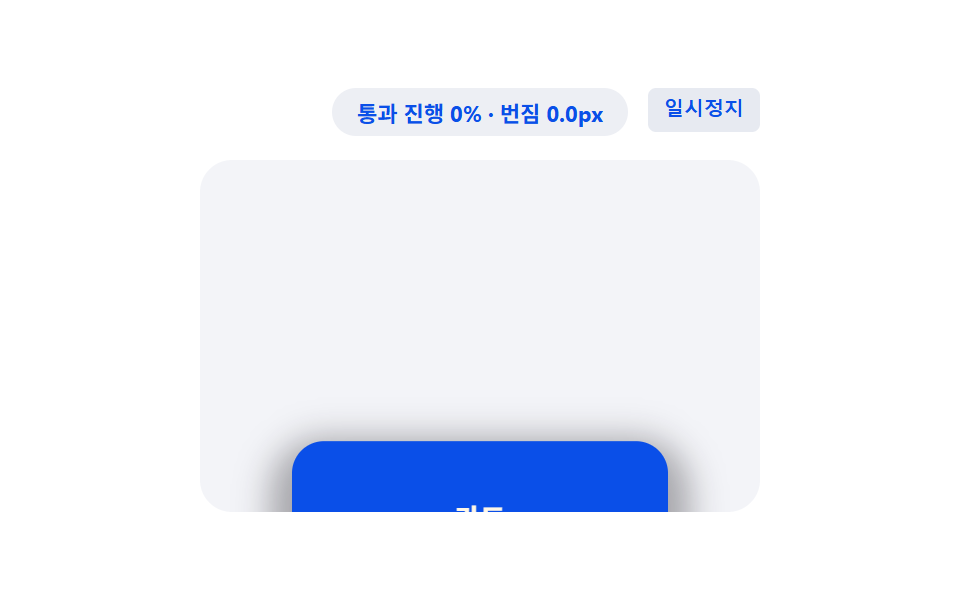
겹쳐 쌓인 카드 세 장이 스크롤할 때마다 서로 다른 속도로 밀려나며 깊이를 드러낸다.
쓰임기능 소개 카드, 요금제 비교
scale 단계별animation-timeline: scroll(root)translateY
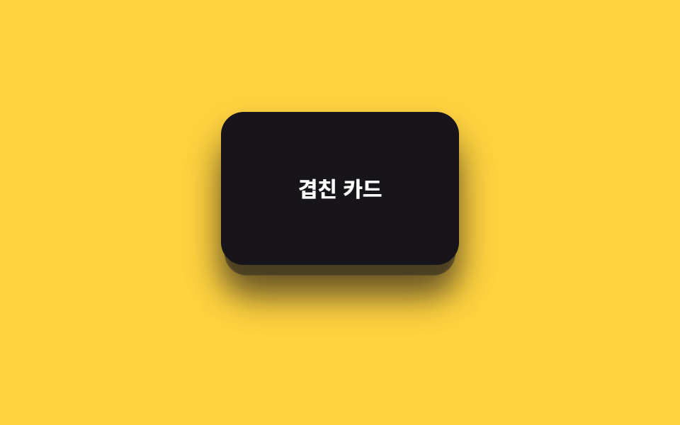
<main class="stage is-demo">
  <div class="depthcards">
    <div class="depthcards__card depthcards__card--3" aria-hidden="true"></div>
    <div class="depthcards__card depthcards__card--2" aria-hidden="true"></div>
    <div class="depthcards__card depthcards__card--1">
      <span>겹친 카드</span>
    </div>
  </div>
</main>
@use "../../../../site/static/demo-tokens" as *;
// ── 변수 3개. 변형은 이것만 바꾼다 ──────────────────────────
$peel: 34px; // 맨 앞 카드가 밀려나는 거리
$scale-step: .06; // 뒤 카드일수록 커지는 폭
$color: $subject-ink; // 카드 색 (yellow 무대라 ink)
@include stage($stage-yellow);
.depthcards {
position: relative;
width: 100%;
height: 100%;
display: grid;
place-items: center;
}
.depthcards__card {
position: absolute;
width: 168px;
height: 108px;
border-radius: $r-card;
box-shadow: $shadow-raised;
display: grid;
place-items: center;
font: 700 clamp(13px, 4vw, 15px)/1 -apple-system, "Segoe UI", "Noto Sans KR", sans-serif;
&--3 {
background: rgba($color, .28);
transform: translateY(18px) scale(.88);
@supports (animation-timeline: scroll()) { animation: peel-3 linear both; animation-timeline: scroll(root); }
}
&--2 {
background: rgba($color, .58);
transform: translateY(9px) scale(.94);
@supports (animation-timeline: scroll()) { animation: peel-2 linear both; animation-timeline: scroll(root); }
}
&--1 {
background: $color;
color: #fff;
@supports (animation-timeline: scroll()) { animation: peel-1 linear both; animation-timeline: scroll(root); }
}
}
// ── 실제 사용 코드: 앞 카드일수록 더 멀리, 더 빨리 밀려난다 ──
@keyframes peel-1 { from { transform: translateY(0) scale(1); } to { transform: translateY(-#{$peel}) scale(1); } }
@keyframes peel-2 { from { transform: translateY(9px) scale(.94); } to { transform: translateY(9px - $peel) scale(.94 + $scale-step); } }
@keyframes peel-3 { from { transform: translateY(18px) scale(.88); } to { transform: translateY(18px - $peel * 1.4) scale(.88 + $scale-step * 2); } }
// ── 데모(.is-demo): 왕복 루프로 흉내 ────────
.stage.is-demo .depthcards__card--1 { animation: loop-1 $dur-loop ease-in-out infinite; }
.stage.is-demo .depthcards__card--2 { animation: loop-2 $dur-loop ease-in-out infinite; }
.stage.is-demo .depthcards__card--3 { animation: loop-3 $dur-loop ease-in-out infinite; }
@keyframes loop-1 { 0%, 100% { transform: translateY(0) scale(1); } 50% { transform: translateY(-$peel) scale(1); } }
@keyframes loop-2 { 0%, 100% { transform: translateY(9px) scale(.94); } 50% { transform: translateY(9px - $peel) scale(.94 + $scale-step); } }
@keyframes loop-3 { 0%, 100% { transform: translateY(18px) scale(.88); } 50% { transform: translateY(18px - $peel * 1.4) scale(.88 + $scale-step * 2); } }
@media (prefers-reduced-motion: reduce) {
.depthcards__card--1, .depthcards__card--2, .depthcards__card--3,
.stage.is-demo .depthcards__card--1, .stage.is-demo .depthcards__card--2, .stage.is-demo .depthcards__card--3 {
animation: none !important;
}
.depthcards__card--1 { transform: translateY(0) scale(1); }
.depthcards__card--2 { transform: translateY(9px) scale(.94); }
.depthcards__card--3 { transform: translateY(18px) scale(.88); }
}html, body {
margin: 0;
overflow: hidden;
}
.stage {
box-sizing: border-box;
min-height: 100vh;
display: grid;
place-items: center;
margin: 0;
background: #ffd23f;
font-family: -apple-system, "Segoe UI", "Noto Sans KR", sans-serif;
padding: clamp(8px, 4vw, 24px);
}
.depthcards {
position: relative;
width: 100%;
height: 100%;
display: grid;
place-items: center;
}
.depthcards__card {
position: absolute;
width: 168px;
height: 108px;
border-radius: 16px;
box-shadow: 0 14px 24px rgba(23, 20, 26, 0.32);
display: grid;
place-items: center;
font: 700 clamp(13px, 4vw, 15px)/1 -apple-system, "Segoe UI", "Noto Sans KR", sans-serif;
}
.depthcards__card--3 {
background: rgba(23, 20, 26, 0.28);
transform: translateY(18px) scale(0.88);
}
@supports (animation-timeline: scroll()) {
.depthcards__card--3 {
animation: peel-3 linear both;
animation-timeline: scroll(root);
}
}
.depthcards__card--2 {
background: rgba(23, 20, 26, 0.58);
transform: translateY(9px) scale(0.94);
}
@supports (animation-timeline: scroll()) {
.depthcards__card--2 {
animation: peel-2 linear both;
animation-timeline: scroll(root);
}
}
.depthcards__card--1 {
background: #17141a;
color: #fff;
}
@supports (animation-timeline: scroll()) {
.depthcards__card--1 {
animation: peel-1 linear both;
animation-timeline: scroll(root);
}
}
@keyframes peel-1 {
from {
transform: translateY(0) scale(1);
}
to {
transform: translateY(-34px) scale(1);
}
}
@keyframes peel-2 {
from {
transform: translateY(9px) scale(0.94);
}
to {
transform: translateY(-25px) scale(1);
}
}
@keyframes peel-3 {
from {
transform: translateY(18px) scale(0.88);
}
to {
transform: translateY(-29.6px) scale(1);
}
}
.stage.is-demo .depthcards__card--1 {
animation: loop-1 2s ease-in-out infinite;
}
.stage.is-demo .depthcards__card--2 {
animation: loop-2 2s ease-in-out infinite;
}
.stage.is-demo .depthcards__card--3 {
animation: loop-3 2s ease-in-out infinite;
}
@keyframes loop-1 {
0%, 100% {
transform: translateY(0) scale(1);
}
50% {
transform: translateY(-34px) scale(1);
}
}
@keyframes loop-2 {
0%, 100% {
transform: translateY(9px) scale(0.94);
}
50% {
transform: translateY(-25px) scale(1);
}
}
@keyframes loop-3 {
0%, 100% {
transform: translateY(18px) scale(0.88);
}
50% {
transform: translateY(-29.6px) scale(1);
}
}
@media (prefers-reduced-motion: reduce) {
.depthcards__card--1, .depthcards__card--2, .depthcards__card--3,
.stage.is-demo .depthcards__card--1, .stage.is-demo .depthcards__card--2, .stage.is-demo .depthcards__card--3 {
animation: none !important;
}
.depthcards__card--1 {
transform: translateY(0) scale(1);
}
.depthcards__card--2 {
transform: translateY(9px) scale(0.94);
}
.depthcards__card--3 {
transform: translateY(18px) scale(0.88);
}
}import type { CSSProperties, ReactNode } from "react";
import styles from "./DepthCards.module.scss";
export type DepthCardsProps = {
/** 맨 앞 카드 라벨 */
children: ReactNode;
/** 맨 앞 카드가 밀려나는 거리 (기본 34px) */
peel?: number;
/** 뒤 카드일수록 커지는 폭 (기본 .06) */
scaleStep?: number;
className?: string;
};
type Vars = CSSProperties & { "--peel"?: string; "--scale-step"?: string };
export default function DepthCards({
children,
peel = 34,
scaleStep = 0.06,
className = "",
}: DepthCardsProps) {
const vars: Vars = { "--peel": `${peel}px`, "--scale-step": `${scaleStep}` };
return (
<div className={`${styles.wrap} ${className}`} style={vars}>
<div className={`${styles.card} ${styles.card3}`} aria-hidden="true" />
<div className={`${styles.card} ${styles.card2}`} aria-hidden="true" />
<div className={`${styles.card} ${styles.card1}`}>{children}</div>
</div>
);
}06 카드 깊이 레이어 — 측정 누적면적 16.794% · 움직인 프레임 23/23GODRICH 원작 · zip 에 SCSS·React 포함 · CSS 패럴랙스 스크롤 9종 — AOS·GSAP 없이, JS 0줄
이 데모가 속한 글
 CSS 패럴랙스 스크롤 9종 — AOS·GSAP 없이, JS 0줄CSS 패럴랙스 스크롤 아홉 개를 모았습니다. 레이어마다 이동 속도를 다르게 주는 원리 하나로 배경이 내용보다 느리게 움직이는 착시를 만듭니다. 격자에서는 아홉 개가 2초 간격으로 자동 반복되니 먼저 눈으로 훑고 마 이 글의 데모 전부 보기