01공지 배너 접힘
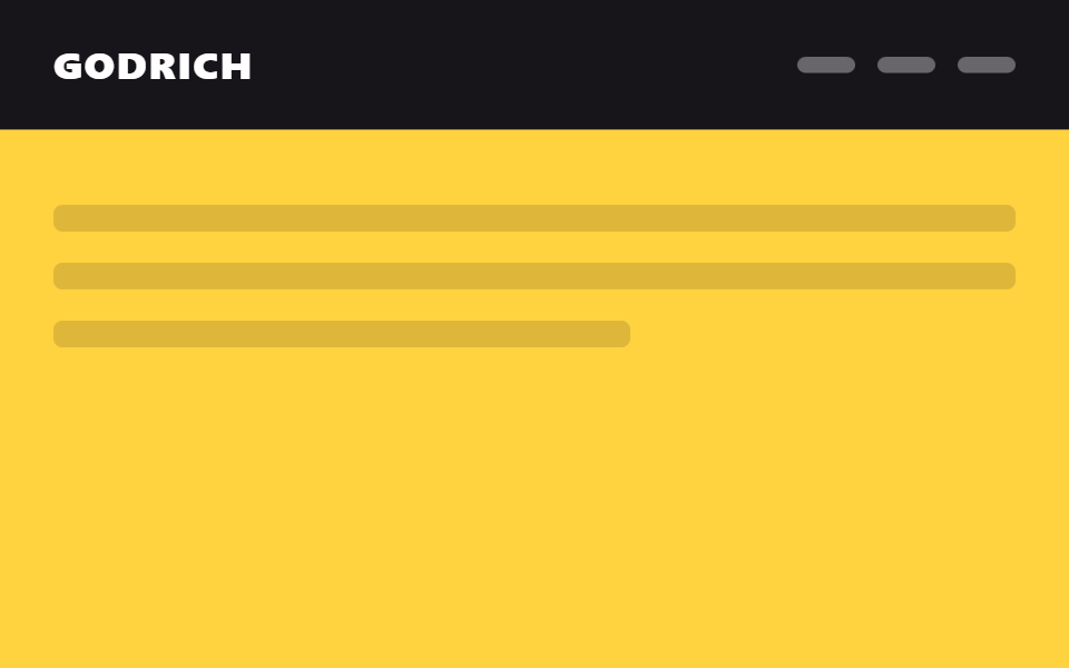
페이지 맨 위 프로모션 배너 줄이 스크롤을 시작하자마자 높이가 0으로 접히고 로고 줄만 남는다.
쓰임이커머스 무료배송 안내줄, 시즌 프로모션 배너
translateY(-100%)2단→1단scroll 임계값

<main class="stage">
  <div class="ahc is-demo">
    <div class="ahc__slot">
      <div class="ahc__bar">무료 배송 · 오늘까지</div>
      <header class="ahc__head">
        <span class="ahc__logo">GODRICH</span>
        <nav class="ahc__nav" aria-hidden="true"><span></span><span></span><span></span></nav>
      </header>
    </div>
    <div class="ahc__page">
      <p class="ahc__line"></p>
      <p class="ahc__line short"></p>
    </div>
  </div>
</main>
@use "../../../../site/static/demo-tokens" as *;
// ── 변수 3개. 변형은 이것만 바꾼다 ──────────────────────────
$duration: $dur-base; // 배너가 접히고 헤더가 올라오는 시간
// 관성 lerp — p += (목표-p) * .32 를 20스텝 반복한 실제 계산 결과를 그대로 커브로 굽는다
// (형태 2차, 사용자 2026-09-14). ease-out 은 미리 그려둔 곡선이지만 이건 반복 계산의 산출값이다.
$easing: linear(0, .32, .538, .686, .786, .855, .901, .933, .954, .969, .979, .986, .99, .993, .995, .997, .998, .999, .999, .999, 1);
$easing-content: linear(0, .18, .328, .449, .548, .629, .696, .751, .796, .832, .863, .887, .908, .924, .938, .949, .958, .966, .972, .977, 1); // 알파 .18 — 헤더보다 느리게 목표를 따라잡아 시차가 생긴다
$dur-content: $dur-base * 1.4; // 콘텐츠가 헤더보다 늦게 도착
$color: $stage-ink; // 헤더·배너 배경
@include stage($stage-ink);
$bar-h: 32px;
$head-h: 56px;
.ahc { width: min(380px, 90vw); }
// ── 고정 높이 슬롯: 배너+헤더 두 층을 겹쳐 두고 transform 만 움직인다 (height 애니메이션 없음) ──
.ahc__slot {
position: relative;
height: $bar-h + $head-h;
}
.ahc__bar {
position: absolute; inset: 0 0 auto 0;
height: $bar-h;
display: flex; align-items: center; justify-content: center;
font-weight: 600;
font-size: clamp(10px, 2.8vw, 12px);
line-height: 1;
font-family: inherit;
color: $subject-cream;
background: $subject-blue-deep;
transform: translateY(0);
opacity: 1;
transition: transform $duration $easing, opacity $duration $easing;
}
.ahc__head {
position: absolute; left: 0; right: 0; top: $bar-h;
height: $head-h;
display: flex; align-items: center; justify-content: space-between;
padding: 0 $sp-4;
background: $color;
transform: translateY(0);
transition: transform $duration $easing;
}
.ahc__logo { color: $subject-cream; font-weight: 800; font-size: clamp(14px, 4vw, 18px); line-height: 1; font-family: inherit; letter-spacing: .04em; }
.ahc__nav { display: flex; gap: $sp-2; span { width: 20px; height: 6px; border-radius: $r-pill; background: rgba($subject-cream, .35); } }
// 실제 사용: 스크롤을 시작하면 배너가 위로 사라지고 헤더가 그 빈 자리로 올라온다
.ahc.is-scrolled {
.ahc__bar { transform: translateY(-100%); opacity: 0; }
.ahc__head { transform: translateY(-#{$bar-h}); }
// 콘텐츠는 헤더를 그대로 따라가지 않고 $easing-content 로 뒤처져 도착 — 시차 스크롤
.ahc__page { transform: translateY(-8px); }
}
// ── 데모(.is-demo): 접혔다 돌아오는 2초 루프 ──────────────
.ahc.is-demo {
.ahc__bar { animation: ahc-bar-loop $dur-loop $easing infinite; }
.ahc__head { animation: ahc-head-loop $dur-loop $easing infinite; }
.ahc__page { animation: ahc-page-loop $dur-loop $easing-content infinite; }
}
@keyframes ahc-bar-loop {
0%, 20% { transform: translateY(0); opacity: 1; }
45%, 70% { transform: translateY(-100%); opacity: 0; }
95%, 100% { transform: translateY(0); opacity: 1; }
}
@keyframes ahc-head-loop {
0%, 20% { transform: translateY(0); }
45%, 70% { transform: translateY(-#{$bar-h}); }
95%, 100% { transform: translateY(0); }
}
// 헤더보다 느린 $easing-content 로 같은 20~45%·70~95% 구간을 밟는다 — 관성이 덜 붙어 뒤처져 보인다
@keyframes ahc-page-loop {
0%, 20% { transform: translateY(0); }
45%, 70% { transform: translateY(-8px); }
95%, 100% { transform: translateY(0); }
}
// ── 배경: 문서처럼 보이는 자리 ─────────────────────────
.ahc__page {
padding: $sp-4 0 0;
transform: translateY(0);
transition: transform $dur-content $easing-content;
}
.ahc__line {
height: 10px;
margin: 0 0 $sp-3;
border-radius: $r-xs;
background: rgba($subject-cream, .12);
&.short { width: 55%; }
}
// ── 접근성: 움직임 줄이기 설정이면 즉시 상태만 바뀐다 ────────
@media (prefers-reduced-motion: reduce) {
.ahc__bar, .ahc__head, .ahc__page { transition: none; }
.ahc.is-demo {
.ahc__bar, .ahc__head, .ahc__page { animation: none !important; }
.ahc__bar { transform: translateY(0); opacity: 1; }
.ahc__head { transform: translateY(0); }
.ahc__page { transform: translateY(0); }
}
}html, body {
margin: 0;
overflow: hidden;
}
.stage {
box-sizing: border-box;
min-height: 100vh;
display: grid;
place-items: center;
margin: 0;
background: #17141a;
font-family: -apple-system, "Segoe UI", "Noto Sans KR", sans-serif;
padding: clamp(8px, 4vw, 24px);
}
.ahc {
width: min(380px, 90vw);
}
.ahc__slot {
position: relative;
height: 88px;
}
.ahc__bar {
position: absolute;
inset: 0 0 auto 0;
height: 32px;
display: flex;
align-items: center;
justify-content: center;
font-weight: 600;
font-size: clamp(10px, 2.8vw, 12px);
line-height: 1;
font-family: inherit;
color: #fff7e6;
background: #0a4fe8;
transform: translateY(0);
opacity: 1;
transition: transform 300ms linear(0, 0.32, 0.538, 0.686, 0.786, 0.855, 0.901, 0.933, 0.954, 0.969, 0.979, 0.986, 0.99, 0.993, 0.995, 0.997, 0.998, 0.999, 0.999, 0.999, 1), opacity 300ms linear(0, 0.32, 0.538, 0.686, 0.786, 0.855, 0.901, 0.933, 0.954, 0.969, 0.979, 0.986, 0.99, 0.993, 0.995, 0.997, 0.998, 0.999, 0.999, 0.999, 1);
}
.ahc__head {
position: absolute;
left: 0;
right: 0;
top: 32px;
height: 56px;
display: flex;
align-items: center;
justify-content: space-between;
padding: 0 16px;
background: #17141a;
transform: translateY(0);
transition: transform 300ms linear(0, 0.32, 0.538, 0.686, 0.786, 0.855, 0.901, 0.933, 0.954, 0.969, 0.979, 0.986, 0.99, 0.993, 0.995, 0.997, 0.998, 0.999, 0.999, 0.999, 1);
}
.ahc__logo {
color: #fff7e6;
font-weight: 800;
font-size: clamp(14px, 4vw, 18px);
line-height: 1;
font-family: inherit;
letter-spacing: 0.04em;
}
.ahc__nav {
display: flex;
gap: 8px;
}
.ahc__nav span {
width: 20px;
height: 6px;
border-radius: 999px;
background: rgba(255, 247, 230, 0.35);
}
.ahc.is-scrolled .ahc__bar {
transform: translateY(-100%);
opacity: 0;
}
.ahc.is-scrolled .ahc__head {
transform: translateY(-32px);
}
.ahc.is-scrolled .ahc__page {
transform: translateY(-8px);
}
.ahc.is-demo .ahc__bar {
animation: ahc-bar-loop 2s linear(0, 0.32, 0.538, 0.686, 0.786, 0.855, 0.901, 0.933, 0.954, 0.969, 0.979, 0.986, 0.99, 0.993, 0.995, 0.997, 0.998, 0.999, 0.999, 0.999, 1) infinite;
}
.ahc.is-demo .ahc__head {
animation: ahc-head-loop 2s linear(0, 0.32, 0.538, 0.686, 0.786, 0.855, 0.901, 0.933, 0.954, 0.969, 0.979, 0.986, 0.99, 0.993, 0.995, 0.997, 0.998, 0.999, 0.999, 0.999, 1) infinite;
}
.ahc.is-demo .ahc__page {
animation: ahc-page-loop 2s linear(0, 0.18, 0.328, 0.449, 0.548, 0.629, 0.696, 0.751, 0.796, 0.832, 0.863, 0.887, 0.908, 0.924, 0.938, 0.949, 0.958, 0.966, 0.972, 0.977, 1) infinite;
}
@keyframes ahc-bar-loop {
0%, 20% {
transform: translateY(0);
opacity: 1;
}
45%, 70% {
transform: translateY(-100%);
opacity: 0;
}
95%, 100% {
transform: translateY(0);
opacity: 1;
}
}
@keyframes ahc-head-loop {
0%, 20% {
transform: translateY(0);
}
45%, 70% {
transform: translateY(-32px);
}
95%, 100% {
transform: translateY(0);
}
}
@keyframes ahc-page-loop {
0%, 20% {
transform: translateY(0);
}
45%, 70% {
transform: translateY(-8px);
}
95%, 100% {
transform: translateY(0);
}
}
.ahc__page {
padding: 16px 0 0;
transform: translateY(0);
transition: transform 420ms linear(0, 0.18, 0.328, 0.449, 0.548, 0.629, 0.696, 0.751, 0.796, 0.832, 0.863, 0.887, 0.908, 0.924, 0.938, 0.949, 0.958, 0.966, 0.972, 0.977, 1);
}
.ahc__line {
height: 10px;
margin: 0 0 12px;
border-radius: 4px;
background: rgba(255, 247, 230, 0.12);
}
.ahc__line.short {
width: 55%;
}
@media (prefers-reduced-motion: reduce) {
.ahc__bar, .ahc__head, .ahc__page {
transition: none;
}
.ahc.is-demo .ahc__bar, .ahc.is-demo .ahc__head, .ahc.is-demo .ahc__page {
animation: none !important;
}
.ahc.is-demo .ahc__bar {
transform: translateY(0);
opacity: 1;
}
.ahc.is-demo .ahc__head {
transform: translateY(0);
}
.ahc.is-demo .ahc__page {
transform: translateY(0);
}
}// 실제 페이지: 스크롤을 시작하는 순간 공지 배너가 위로 사라지고 헤더가 그 자리로 올라온다 (7줄)
var el = document.querySelector('.ahc');
window.addEventListener('scroll', function () {
el.classList.toggle('is-scrolled', window.scrollY > 20);
}, { passive: true });import { useEffect, useRef } from "react";
import type { CSSProperties, ReactNode } from "react";
import styles from "./AnnouncementCollapseHeader.module.scss";
export type AnnouncementCollapseHeaderProps = {
logo: string;
announcement: string;
children?: ReactNode;
/** 배너가 접히고 헤더가 올라오는 시간 (기본 300ms) */
duration?: number;
/** 관성 lerp 커브(p += (목표-p)*.32 를 20스텝 반복해 구운 linear()) — 기본값이 vanilla 와 같다 */
easing?: string;
color?: string;
};
type Vars = CSSProperties & { "--duration"?: string; "--easing"?: string; "--color"?: string };
const LERP_EASING = "linear(0, .32, .538, .686, .786, .855, .901, .933, .954, .969, .979, .986, .99, .993, .995, .997, .998, .999, .999, .999, 1)";
export default function AnnouncementCollapseHeader({
logo,
announcement,
children,
duration = 300,
easing = LERP_EASING,
color = "#17141a",
}: AnnouncementCollapseHeaderProps) {
const ref = useRef<HTMLDivElement>(null);
const vars: Vars = { "--duration": `${duration}ms`, "--easing": easing, "--color": color };
useEffect(() => {
function onScroll() {
ref.current?.classList.toggle("is-scrolled", window.scrollY > 20);
}
window.addEventListener("scroll", onScroll, { passive: true });
return () => window.removeEventListener("scroll", onScroll);
}, []);
return (
<div ref={ref} className={styles.slot} style={vars}>
<div className={styles.bar}>{announcement}</div>
<header className={styles.head}>
<span className={styles.logo}>{logo}</span>
<nav className={styles.nav}>{children}</nav>
</header>
</div>
);
}01 공지 배너 접힘 — 측정 누적면적 23.972% · 움직인 프레임 12/23GODRICH 원작 · zip 에 SCSS·React 포함 · CSS 헤더 고정 9가지 응용 — 검색바·CTA·배지까지
이 데모가 속한 글
 CSS 헤더 고정 9가지 응용 — 검색바·CTA·배지까지CSS 헤더 고정은 스크롤해도 페이지 위쪽 메뉴 줄이 화면에 그대로 붙어 있게 만드는 기능으로, position: sticky 한 줄이면 충분합니다. 여기 아홉 개는 그냥 붙어만 있는 헤더를 넘어, 스크롤하는 동안 이 글의 데모 전부 보기