09쿠키 한 입씩 나눠 먹기
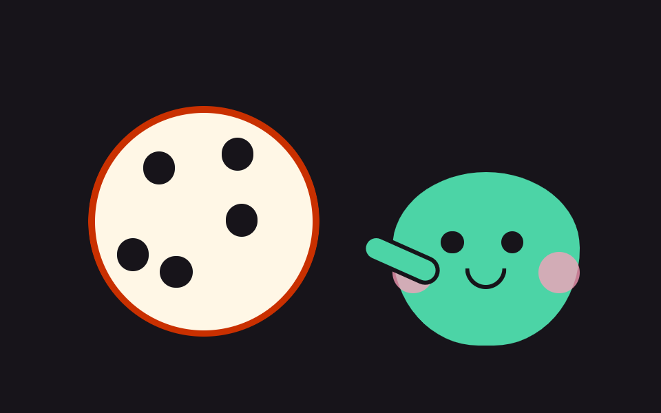
캐릭터가 쿠키를 들고 서 있고, 누를 때마다 한 입 베어 물려 쿠키가 네 단계로 줄고 볼이 부풉니다. 네 번을 다 누르면 캐릭터가 아쉬워하고 다시 버튼이 놓입니다.
쓰임하루 네 번 체크인 화면
clip-pathscaletranslateY
<main class="stage">
<div class="ck is-demo" id="ck" data-bite="0">
  <button class="ck__hit" type="button" aria-label="쿠키 한 입 먹기">
    <span class="ck__scene" aria-hidden="true">
      <span class="ck__cookieWrap">
        <span class="ck__cookie" id="ckCookie">
          <span class="ck__chip ck__chip--1"></span>
          <span class="ck__chip ck__chip--2"></span>
          <span class="ck__chip ck__chip--3"></span>
          <span class="ck__chip ck__chip--4"></span>
          <span class="ck__chip ck__chip--5"></span>
          <span class="ck__crumb ck__crumb--1"></span>
          <span class="ck__crumb ck__crumb--2"></span>
          <span class="ck__crumb ck__crumb--3"></span>
        </span>
      </span>
      <span class="ck__char" id="ckChar">
        <span class="ck__eye ck__eye--l"></span>
        <span class="ck__eye ck__eye--r"></span>
        <span class="ck__sad ck__sad--l"></span>
        <span class="ck__sad ck__sad--r"></span>
        <span class="ck__cheek ck__cheek--l"></span>
        <span class="ck__cheek ck__cheek--r"></span>
        <span class="ck__mouth"></span>
        <span class="ck__arm"></span>
      </span>
    </span>
  </button>
  <button class="ck__reset" id="ckReset" type="button" hidden>다시</button>
</div>
</main>@use "../../../../site/static/demo-tokens" as *;
// 쿠키 한 입씩 나눠 먹기 — 캐릭터 옆 쿠키를 누를 때마다 한 입 베어 물어 네 단계로 줄어든다.
// 한 입은 clip-path: circle() 의 반지름과 중심을 옮겨 표현한다 — 우측 상단으로 중심을 밀수록
// 왼쪽 아래 초승달 모양의 쿠키가 남는다. 부스러기는 크기로 소멸(translateY + scale) — 페이드 금지.
// 네 번째에는 캐릭터 눈이 아래로 접힌 반달로 컷 교체되고 다시 단추가 나타난다.
$duration: $dur-loop;
$easing: $ease-pop;
$color: $subject-mint;
@include stage($stage-ink);
.ck { width: min(92vw, 400px); display: grid; justify-items: center; gap: $sp-2; }
// 뿌리가 vw 폭을 정하고 단추는 그 100% 를 쓴다 — 수축 폭 안에서 % 폭은 0 으로 접힌다
.ck__hit { display: block; width: 100%; border: 0; padding: 0; background: none; cursor: pointer; -webkit-tap-highlight-color: transparent; }
.ck__hit:focus-visible { outline: 2px solid $stage-yellow; outline-offset: 4px; border-radius: 50%; }
.ck__scene {
position: relative; display: block; box-sizing: border-box;
width: 100%; aspect-ratio: 16 / 9;
}
// 쿠키 — 크림 반죽에 코코아 칩. 무대색과 같은 색 자국이 붙으면 '먹혔다'로 읽힌다
.ck__cookieWrap { position: absolute; left: 6%; bottom: 8%; width: 42%; aspect-ratio: 1; }
.ck__cookie {
position: absolute; inset: 0;
background: $subject-cream; border: 5px solid $subject-orange-deep; border-radius: 50%;
clip-path: circle(50% at 50% 50%);
}
.ck__chip {
position: absolute; width: 15%; aspect-ratio: 1;
background: $subject-ink; border-radius: 50%;
}
.ck__chip--1 { top: 18%; left: 22%; }
.ck__chip--2 { top: 42%; left: 60%; }
.ck__chip--3 { top: 66%; left: 30%; }
.ck__chip--4 { top: 12%; left: 58%; }
.ck__chip--5 { top: 58%; left: 10%; }
// 한 입 단계 — 원의 반지름이 줄고 중심이 우측 상단으로 이동해 초승달이 남는다
.ck[data-bite="1"] .ck__cookie { clip-path: circle(44% at 60% 38%); }
.ck[data-bite="2"] .ck__cookie { clip-path: circle(36% at 66% 44%); }
.ck[data-bite="3"] .ck__cookie { clip-path: circle(26% at 70% 52%); }
.ck[data-bite="4"] .ck__cookie { clip-path: circle(15% at 72% 58%); }
// 부스러기 — 한 입마다 쿠키 밑으로 떨어진다(미리보기 루프에서도 돌고, 누를 때마다 반복 재생)
.ck__crumb {
position: absolute; bottom: -8%; width: 8%; aspect-ratio: 1;
background: $subject-cream; border-radius: 50%;
transform: scale(0);
animation-name: ckCrumb;
animation-duration: $duration;
animation-timing-function: ease-in;
animation-iteration-count: infinite;
}
.ck__crumb--1 { left: 30%; }
.ck__crumb--2 { left: 48%; animation-delay: .1s; }
.ck__crumb--3 { left: 62%; animation-delay: .2s; }
@keyframes ckCrumb {
0% { transform: translateY(-6px) scale(0); }
10% { transform: translateY(0) scale(1); }
55% { transform: translateY(18px) scale(1); }
70%, 100% { transform: translateY(22px) scale(0); }
}
// 캐릭터 — 쿠키를 나눠 주는 민트 친구. 한 입마다 볼이 부푼다(--puff)
.ck__char {
--puff: 0;
position: absolute; right: 4%; bottom: 4%; width: 34%; aspect-ratio: 1 / .92;
background: $color; border: 3px solid $subject-ink;
border-radius: 50% 50% 46% 46% / 44% 44% 56% 56%;
}
.ck__eye, .ck__sad { position: absolute; top: 34%; width: 12%; aspect-ratio: 1; }
.ck__eye { background: $subject-ink; border-radius: 50%; }
.ck__eye--l { left: 26%; }
.ck__eye--r { left: 58%; }
// 아쉬운 눈(아래로 접힌 반달) — 쿠키가 다 떨어진 넷째 단계에 컷 교체
.ck__sad { border-bottom: 4px solid $subject-ink; border-radius: 50%; visibility: hidden; }
.ck__sad--l { left: 26%; }
.ck__sad--r { left: 58%; }
.ck[data-bite="4"] .ck__eye { visibility: hidden; }
.ck[data-bite="4"] .ck__sad { visibility: visible; }
// 볼 — 한 입 먹을 때마다 하트 얼굴 옆 볼이 부풀어 오른다(--puff 로 scale)
.ck__cheek {
position: absolute; top: 46%; width: 22%; aspect-ratio: 1;
background: $subject-pink; border-radius: 50%; opacity: .75;
transform: scale(calc(1 + var(--puff)));
transform-origin: 50% 50%;
}
.ck__cheek--l { left: 0; }
.ck__cheek--r { right: 0; }
.ck[data-bite="1"] .ck__char { --puff: .05; }
.ck[data-bite="2"] .ck__char { --puff: .1; }
.ck[data-bite="3"] .ck__char, .ck[data-bite="4"] .ck__char { --puff: .16; }
.ck__mouth {
position: absolute; top: 56%; left: 50%; width: 18%; height: 9%;
border: 3px solid $subject-ink; border-top: 0; border-radius: 0 0 $r-pill $r-pill;
transform: translateX(-50%);
}
.ck__arm {
position: absolute; top: 42%; left: -18%; width: 40%; height: 12%;
background: $color; border: 3px solid $subject-ink; border-radius: $r-pill;
transform: rotate(24deg); // 쿠키 쪽으로 뻗은 팔
}
// 다시 단추 — 잉크 무대 위 크림 알약. 쿠키가 끝나야 나타난다(hidden 속성으로 제어)
.ck__reset {
padding: 0 $sp-4; background: $subject-cream; color: $subject-ink;
border: 2px solid $subject-cream; border-radius: $r-pill;
font-family: inherit; font-weight: 700; font-size: 12px; line-height: 20px;
cursor: pointer;
}
.ck__reset:focus-visible { outline: 2px solid $stage-yellow; outline-offset: 2px; }
// ── 격자 미리보기 루프(2초): 쿠키가 통째 → 한 입 → 두 입 → 세 입으로 컷으로 줄고(20% 간격)
// 80% 에 다시 통째로 돌아온다. 부스러기가 프레임 사이를 채운다
.ck.is-demo .ck__cookie {
animation-name: ckEat;
animation-duration: $duration;
animation-timing-function: steps(1, end);
animation-iteration-count: infinite;
}
@keyframes ckEat {
0%, 19% { clip-path: circle(50% at 50% 50%); }
20%, 39% { clip-path: circle(44% at 60% 38%); }
40%, 59% { clip-path: circle(36% at 66% 44%); }
60%, 79% { clip-path: circle(26% at 70% 52%); }
80%, 100% { clip-path: circle(50% at 50% 50%); }
}
.ck.is-demo .ck__cheek {
animation-name: ckPuff;
animation-duration: $duration;
animation-timing-function: steps(1, end);
animation-iteration-count: infinite;
}
@keyframes ckPuff {
0%, 19% { transform: scale(1); }
20%, 39% { transform: scale(1.18); }
40%, 59% { transform: scale(1.36); }
60%, 79% { transform: scale(1.56); }
80%, 100% { transform: scale(1); }
}
// ── 좁은 화면
@media (max-width: 340px) {
.ck__cookie { border-width: 3px; }
.ck__char { border-width: 2px; }
.ck__reset { font-size: 11px; line-height: 16px; }
}
@media (prefers-reduced-motion: reduce) {
// 먹는 루프를 끊면 온전한 쿠키와 친구가 나란히 선다 — 눌러도 단계만 바뀐다
.ck.is-demo .ck__cookie,
.ck.is-demo .ck__cheek,
.ck__crumb {
animation: none !important;
}
.ck__crumb { transform: scale(0); }
}html, body {
margin: 0;
overflow: hidden;
}
.stage {
box-sizing: border-box;
min-height: 100vh;
display: grid;
place-items: center;
margin: 0;
background: #17141a;
font-family: -apple-system, "Segoe UI", "Noto Sans KR", sans-serif;
padding: clamp(8px, 4vw, 24px);
}
.ck {
width: min(92vw, 400px);
display: grid;
justify-items: center;
gap: 8px;
}
.ck__hit {
display: block;
width: 100%;
border: 0;
padding: 0;
background: none;
cursor: pointer;
-webkit-tap-highlight-color: transparent;
}
.ck__hit:focus-visible {
outline: 2px solid #ffd23f;
outline-offset: 4px;
border-radius: 50%;
}
.ck__scene {
position: relative;
display: block;
box-sizing: border-box;
width: 100%;
aspect-ratio: 16/9;
}
.ck__cookieWrap {
position: absolute;
left: 6%;
bottom: 8%;
width: 42%;
aspect-ratio: 1;
}
.ck__cookie {
position: absolute;
inset: 0;
background: #fff7e6;
border: 5px solid #c93000;
border-radius: 50%;
clip-path: circle(50% at 50% 50%);
}
.ck__chip {
position: absolute;
width: 15%;
aspect-ratio: 1;
background: #17141a;
border-radius: 50%;
}
.ck__chip--1 {
top: 18%;
left: 22%;
}
.ck__chip--2 {
top: 42%;
left: 60%;
}
.ck__chip--3 {
top: 66%;
left: 30%;
}
.ck__chip--4 {
top: 12%;
left: 58%;
}
.ck__chip--5 {
top: 58%;
left: 10%;
}
.ck[data-bite="1"] .ck__cookie {
clip-path: circle(44% at 60% 38%);
}
.ck[data-bite="2"] .ck__cookie {
clip-path: circle(36% at 66% 44%);
}
.ck[data-bite="3"] .ck__cookie {
clip-path: circle(26% at 70% 52%);
}
.ck[data-bite="4"] .ck__cookie {
clip-path: circle(15% at 72% 58%);
}
.ck__crumb {
position: absolute;
bottom: -8%;
width: 8%;
aspect-ratio: 1;
background: #fff7e6;
border-radius: 50%;
transform: scale(0);
animation-name: ckCrumb;
animation-duration: 2s;
animation-timing-function: ease-in;
animation-iteration-count: infinite;
}
.ck__crumb--1 {
left: 30%;
}
.ck__crumb--2 {
left: 48%;
animation-delay: 0.1s;
}
.ck__crumb--3 {
left: 62%;
animation-delay: 0.2s;
}
@keyframes ckCrumb {
0% {
transform: translateY(-6px) scale(0);
}
10% {
transform: translateY(0) scale(1);
}
55% {
transform: translateY(18px) scale(1);
}
70%, 100% {
transform: translateY(22px) scale(0);
}
}
.ck__char {
--puff: 0;
position: absolute;
right: 4%;
bottom: 4%;
width: 34%;
aspect-ratio: 1/0.92;
background: #4cd4a6;
border: 3px solid #17141a;
border-radius: 50% 50% 46% 46%/44% 44% 56% 56%;
}
.ck__eye, .ck__sad {
position: absolute;
top: 34%;
width: 12%;
aspect-ratio: 1;
}
.ck__eye {
background: #17141a;
border-radius: 50%;
}
.ck__eye--l {
left: 26%;
}
.ck__eye--r {
left: 58%;
}
.ck__sad {
border-bottom: 4px solid #17141a;
border-radius: 50%;
visibility: hidden;
}
.ck__sad--l {
left: 26%;
}
.ck__sad--r {
left: 58%;
}
.ck[data-bite="4"] .ck__eye {
visibility: hidden;
}
.ck[data-bite="4"] .ck__sad {
visibility: visible;
}
.ck__cheek {
position: absolute;
top: 46%;
width: 22%;
aspect-ratio: 1;
background: #ff9ebb;
border-radius: 50%;
opacity: 0.75;
transform: scale(calc(1 + var(--puff)));
transform-origin: 50% 50%;
}
.ck__cheek--l {
left: 0;
}
.ck__cheek--r {
right: 0;
}
.ck[data-bite="1"] .ck__char {
--puff: .05;
}
.ck[data-bite="2"] .ck__char {
--puff: .1;
}
.ck[data-bite="3"] .ck__char, .ck[data-bite="4"] .ck__char {
--puff: .16;
}
.ck__mouth {
position: absolute;
top: 56%;
left: 50%;
width: 18%;
height: 9%;
border: 3px solid #17141a;
border-top: 0;
border-radius: 0 0 999px 999px;
transform: translateX(-50%);
}
.ck__arm {
position: absolute;
top: 42%;
left: -18%;
width: 40%;
height: 12%;
background: #4cd4a6;
border: 3px solid #17141a;
border-radius: 999px;
transform: rotate(24deg);
}
.ck__reset {
padding: 0 16px;
background: #fff7e6;
color: #17141a;
border: 2px solid #fff7e6;
border-radius: 999px;
font-family: inherit;
font-weight: 700;
font-size: 12px;
line-height: 20px;
cursor: pointer;
}
.ck__reset:focus-visible {
outline: 2px solid #ffd23f;
outline-offset: 2px;
}
.ck.is-demo .ck__cookie {
animation-name: ckEat;
animation-duration: 2s;
animation-timing-function: steps(1, end);
animation-iteration-count: infinite;
}
@keyframes ckEat {
0%, 19% {
clip-path: circle(50% at 50% 50%);
}
20%, 39% {
clip-path: circle(44% at 60% 38%);
}
40%, 59% {
clip-path: circle(36% at 66% 44%);
}
60%, 79% {
clip-path: circle(26% at 70% 52%);
}
80%, 100% {
clip-path: circle(50% at 50% 50%);
}
}
.ck.is-demo .ck__cheek {
animation-name: ckPuff;
animation-duration: 2s;
animation-timing-function: steps(1, end);
animation-iteration-count: infinite;
}
@keyframes ckPuff {
0%, 19% {
transform: scale(1);
}
20%, 39% {
transform: scale(1.18);
}
40%, 59% {
transform: scale(1.36);
}
60%, 79% {
transform: scale(1.56);
}
80%, 100% {
transform: scale(1);
}
}
@media (max-width: 340px) {
.ck__cookie {
border-width: 3px;
}
.ck__char {
border-width: 2px;
}
.ck__reset {
font-size: 11px;
line-height: 16px;
}
}
@media (prefers-reduced-motion: reduce) {
.ck.is-demo .ck__cookie,
.ck.is-demo .ck__cheek,
.ck__crumb {
animation: none !important;
}
.ck__crumb {
transform: scale(0);
}
}var ck = document.getElementById('ck');
var resetBtn = document.getElementById('ckReset');
var bites = 0;
// 누를 때마다 한 입: 쿠키가 네 단계로 줄고(data-bite) 볼이 부푼다. 네 번을 다 먹으면
// 아쉬운 눈과 함께 다시 단추가 나타나고, 누르면 처음으로 돌아간다
document.querySelector('.ck__hit').addEventListener('click', function () {
ck.classList.remove('is-demo');
if (bites >= 4) { return; }
bites = bites + 1;
ck.dataset.bite = String(bites);
if (bites === 4) { resetBtn.hidden = false; }
});
resetBtn.addEventListener('click', function () {
bites = 0;
ck.dataset.bite = '0';
resetBtn.hidden = true;
});
ck.addEventListener('pointerdown', function () { ck.classList.remove('is-demo'); });// CuteCookieBiteCounter — vanilla 판(run/075/demo/09-cute-cookie-bite-counter) 의 React 포트.
// 누를 때마다 한 입: 쿠키가 네 단계로 줄고(data-bite) 볼이 부푼다. 다 먹으면 다시 단추가 나타난다.
import { useState } from "react";
import type { CSSProperties } from "react";
import styles from "./CuteCookieBiteCounter.module.scss";
export type CuteCookieBiteCounterProps = {
duration?: number;
easing?: string;
color?: string;
};
type Vars = CSSProperties & { "--duration"?: string; "--easing"?: string; "--color"?: string };
export default function CuteCookieBiteCounter(props: CuteCookieBiteCounterProps) {
const duration = props.duration ?? 2000;
const easing = props.easing ?? "cubic-bezier(.2, 1.4, .4, 1)";
const color = props.color ?? "#4cd4a6";
const [bites, setBites] = useState<number>(0);
const [preview, setPreview] = useState<boolean>(true);
const vars: Vars = { "--duration": duration + "ms", "--easing": easing, "--color": color };
const done = bites >= 4;
return (
<main className={styles.stage}>
<div
className={styles.ck + (preview ? " " + styles.isDemo : "")}
style={vars}
data-bite={Math.min(bites, 4)}
>
<button
className={styles.hit}
type="button"
aria-label="쿠키 한 입 먹기"
onClick={() => { if (!done) { setBites(bites + 1); } }}
onPointerDown={() => setPreview(false)}
>
<span className={styles.scene} aria-hidden="true">
<span className={styles.cookieWrap}>
<span className={styles.cookie} key={"bite" + bites}>
<span className={styles.chip + " " + styles.chip1}></span>
<span className={styles.chip + " " + styles.chip2}></span>
<span className={styles.chip + " " + styles.chip3}></span>
<span className={styles.chip + " " + styles.chip4}></span>
<span className={styles.chip + " " + styles.chip5}></span>
<span className={styles.crumb + " " + styles.crumb1}></span>
<span className={styles.crumb + " " + styles.crumb2}></span>
<span className={styles.crumb + " " + styles.crumb3}></span>
</span>
</span>
<span className={styles.char}>
<span className={styles.eye + " " + styles.eyeL}></span>
<span className={styles.eye + " " + styles.eyeR}></span>
<span className={styles.sad + " " + styles.sadL}></span>
<span className={styles.sad + " " + styles.sadR}></span>
<span className={styles.cheek + " " + styles.cheekL}></span>
<span className={styles.cheek + " " + styles.cheekR}></span>
<span className={styles.mouth}></span>
<span className={styles.arm}></span>
</span>
</span>
</button>
{done ? (
<button className={styles.reset} type="button" onClick={() => setBites(0)}>다시</button>
) : null}
</div>
</main>
);
}09 쿠키 한 입씩 나눠 먹기 — 측정 누적면적 11.737% · 움직인 프레임 8/23GODRICH 원작 · zip 에 SCSS·React 포함 · 귀여운 캐릭터 애니메이션 9종 — 일러스트 캐릭터 CSS 모음
이 데모가 속한 글
 귀여운 캐릭터 애니메이션 9종 — 일러스트 캐릭터 CSS 모음귀여운 캐릭터 애니메이션은 그린 캐릭터를 이미지 파일 없이 코드만으로 깜빡이고 튀게 만드는 일입니다. 하트 눈 얼굴에서 쿠키 나눠 주는 친구까지 아홉 마리를 CSS 와 SVG 도형으로 지었고, 클릭하면 캐릭터가 바로 이 글의 데모 전부 보기