06쌓기와 나란히를 오가며 같은 값을 다르게 본다
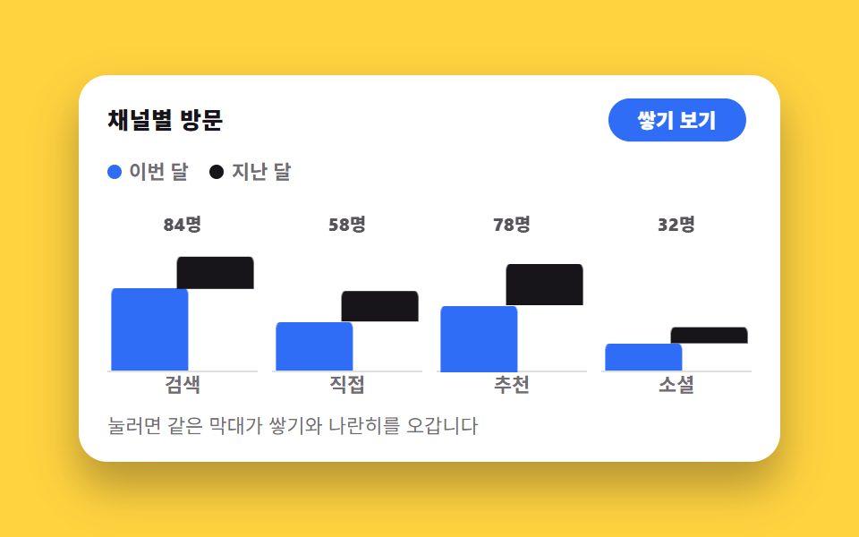
같은 데이터를 쌓아 올린 막대와 나란히 세운 막대가 한 번의 토글로 갈리고, 두 계열이 각각 제자리를 찾아 가로로 벌어지거나 위아래로 포개집니다.
쓰임합계와 계열 크기를 둘 다 봐야 하는 월간 비교 리포트
aria-pressedgrid-columnsteps(1, end)
<main class="stage">
  <figure class="sk is-demo" id="sk" data-mode="stack">
    <figcaption class="sk__head">
      <span class="sk__title">채널별 방문</span>
      <button class="sk__btn" type="button" id="sk-btn" aria-pressed="false" aria-label="막대 배열 바꾸기">
        <span class="sk__lab sk__lab--side">나란히 보기</span>
        <span class="sk__lab sk__lab--stack">쌓기 보기</span>
      </button>
    </figcaption>

    <div class="sk__legend" aria-hidden="true">
      <span class="sk__key"><i class="sk__dot sk__dot--a"></i>이번 달</span>
      <span class="sk__key"><i class="sk__dot sk__dot--b"></i>지난 달</span>
    </div>

    <div class="sk__plot" role="img" aria-label="채널 4개의 이번 달·지난 달 방문 막대. 검색 60·24, 직접 36·22, 추천 48·30, 소셜 20·12">
      <div class="sk__col">
        <span class="sk__tot">84명</span>
        <span class="sk__b sk__b--a"></span><span class="sk__b sk__b--b"></span>
      </div>
      <div class="sk__col">
        <span class="sk__tot">58명</span>
        <span class="sk__b sk__b--a"></span><span class="sk__b sk__b--b"></span>
      </div>
      <div class="sk__col">
        <span class="sk__tot">78명</span>
        <span class="sk__b sk__b--a"></span><span class="sk__b sk__b--b"></span>
      </div>
      <div class="sk__col">
        <span class="sk__tot">32명</span>
        <span class="sk__b sk__b--a"></span><span class="sk__b sk__b--b"></span>
      </div>
      <span class="sk__x">검색</span><span class="sk__x">직접</span><span class="sk__x">추천</span><span class="sk__x">소셜</span>
    </div>

    <p class="sk__hint">눌러면 같은 막대가 쌓기와 나란히를 오갑니다</p>

    <div class="sr">
      <span aria-live="polite" id="sk-live"></span>
      <table>
        <caption>채널별 방문자 수</caption>
        <thead><tr><th>채널</th><th>이번 달</th><th>지난 달</th><th>합계</th></tr></thead>
        <tbody>
          <tr><th>검색</th><td>60</td><td>24</td><td>84</td></tr>
          <tr><th>직접</th><td>36</td><td>22</td><td>58</td></tr>
          <tr><th>추천</th><td>48</td><td>30</td><td>78</td></tr>
          <tr><th>소셜</th><td>20</td><td>12</td><td>32</td></tr>
        </tbody>
      </table>
    </div>
  </figure>
</main>@use "../../../../site/static/demo-tokens" as *;
// 두 계열의 높이(px). 막대 구역이 76px 고정이라 값/100×76 로 정한다 — 84·58·78·32.
// 합계 라벨(84명…)도 이 값에서 나온다. 소수는 그대로 둔다(76px 안에서만 쓰인다)
$ha: 45.6px 27.4px 36.5px 15.2px; // 이번 달 60·36·48·20
$hb: 18.2px 16.7px 22.8px 9.1px; // 지난 달 24·22·30·12
$duration: $dur-quick;
$easing: $ease-spring;
$color: $subject-blue;
@include stage($stage-yellow);
.sr {
position: absolute;
width: 1px;
height: 1px;
overflow: hidden;
clip-path: inset(50%);
white-space: nowrap;
}
.sk {
box-sizing: border-box;
width: min(392px, 88vw);
display: flex;
flex-direction: column;
gap: $sp-2;
margin: 0;
padding: $sp-3;
border-radius: $r-card;
background: $stage-paper;
box-shadow: $shadow-raised;
color: $subject-ink;
font-family: -apple-system, "Segoe UI", "Noto Sans KR", sans-serif;
}
.sk__head {
display: flex;
align-items: center;
justify-content: space-between;
gap: $sp-2;
padding: 0 $sp-1;
}
.sk__title { font-size: 13px; line-height: 18px; font-weight: 800; letter-spacing: .02em; }
// 토글 — aria-pressed 로 눌림을 알린다. 두 라벨을 한 칸에 겹쳐 놓고
// data-mode 가 보여 줄 쪽만 딱 바꾼다(교체지 페이드가 아니다)
.sk__btn {
position: relative;
display: grid;
place-items: center;
margin: 0;
padding: $sp-1 $sp-3;
border: 0;
border-radius: $r-pill;
background: $color;
color: $stage-paper;
font-family: inherit;
font-size: 12px;
line-height: 18px;
font-weight: 800;
cursor: pointer;
}
.sk__btn[aria-pressed="true"] { background: $subject-ink; }
.sk__btn:focus-visible { outline: 2px solid $subject-ink; outline-offset: 2px; }
.sk__lab { grid-area: 1 / 1; white-space: nowrap; }
.sk[data-mode="stack"] .sk__lab--stack,
.sk[data-mode="side"] .sk__lab--side { visibility: hidden; }
.sk__legend {
display: flex;
gap: $sp-3;
padding: 0 $sp-1;
font-size: 11px;
line-height: 16px;
font-weight: 700;
color: rgba(23, 20, 26, .62);
}
.sk__key { display: inline-flex; align-items: center; gap: $sp-1; }
.sk__dot { width: 8px; height: 8px; border-radius: $r-xs; }
.sk__dot--a { background: $color; }
.sk__dot--b { background: $subject-ink; }
// ── 차트: 카테고리 4칸 grid, 아래 축 라벨이 같은 grid 의 둘째 줄 ──
.sk__plot {
display: grid;
grid-template-columns: repeat(4, 1fr);
grid-template-rows: 96px 14px;
column-gap: $sp-2;
padding: 0 $sp-1;
}
.sk__x {
grid-row: 2;
text-align: center;
font-size: 11px;
line-height: 14px;
font-weight: 700;
color: rgba(23, 20, 26, .62);
}
// 칸 하나 — 안은 다시 2열 grid. 막대 둘은 **같은 칸(grid-column: 1 / -1)에 겹쳐** 놓고
// 쌓기/나란히를 전부 transform 으로 갈아입는다. grid 칸 배치를 모드마다 바꾸면
// transition 이 안 되고 레이아웃이 점프한다 — 그래서 칸은 고정, transform 이 움직인다
.sk__col {
grid-row: 1;
display: grid;
grid-template-columns: repeat(2, 1fr);
grid-template-rows: 20px 1fr;
align-items: end;
border-bottom: 1px solid rgba(23, 20, 26, .14);
}
// 합계 라벨은 모드에 따라 자리가 달라진다 — 쌓기에서는 두 계열을 덮는 한 줄,
// 나란히에서는 위 칸 반쪽(grid-column: 1)으로 물러난 뒤 감춘다. 어차피 컷으로
// 사라지니 점프는 보이지 않는다
.sk__tot {
grid-row: 1;
grid-column: 1 / -1;
align-self: end;
justify-self: center;
font-size: 10px;
line-height: 14px;
font-weight: 800;
font-variant-numeric: tabular-nums;
color: rgba(23, 20, 26, .72);
}
.sk[data-mode="side"] .sk__tot { grid-column: 1; grid-row: 2; justify-self: start; visibility: hidden; }
.sk__b {
grid-row: 2;
grid-column: 1 / -1;
align-self: end;
transform-origin: 0 100%; // 왼쪽 아래 고정 — scaleX 로 폭을 줄여도 바닥은 그대로
border-radius: $r-xs $r-xs 0 0;
}
.sk__b--a { background: $color; }
.sk__b--b { background: $subject-ink; }
@for $i from 1 through 4 {
.sk__col:nth-child(#{$i}) .sk__b--a { height: nth($ha, $i); }
.sk__col:nth-child(#{$i}) .sk__b--b { height: nth($hb, $i); }
}
// ── 정적 경로(사람이 만진 뒤). 쌓기 ↔ 나란히 전부 transform ──
// 나란히: 두 계열이 각자 반쪽으로 폭을 줄고(sX .44) 좌우로 벌어진다(tX 3%·53%).
// 쌓기: b 계열이 a 위로 올라탄다(tY −a높이). 함수 목록 순서는 언제나 동일해야 보간된다
.sk[data-mode="side"] .sk__b--a { transform: translateX(3%) scaleX(.44); }
.sk[data-mode="side"] .sk__b--b { transform: translateX(53%) translateY(0) scaleX(.44); }
.sk[data-mode="stack"] .sk__b--a { transform: translateX(0) scaleX(1); }
@for $i from 1 through 4 {
.sk[data-mode="stack"] .sk__col:nth-child(#{$i}) .sk__b--b {
transform: translateX(0) translateY(#{-1 * nth($ha, $i)}) scaleX(1);
}
}
.sk:not(.is-demo) .sk__b {
transition-property: transform;
transition-duration: $duration;
transition-timing-function: $easing;
}
.sk__hint { margin: 0; padding: 0 $sp-1; font-size: 11px; line-height: 16px; color: rgba(23, 20, 26, .62); }
// ── 자동 루프(2초): 쌓기 → 나란히 → 쌓기. 복귀는 88% 안에 끝난다 ──
// 막대는 부드러운 transform, 라벨 교체는 steps(1, end) 컷(움직임 시작점에서 갈아입는다)
@for $i from 1 through 4 {
@keyframes sk-a#{$i} {
0%, 34% { transform: translateX(0) scaleX(1); }
44%, 76% { transform: translateX(3%) scaleX(.44); }
86%, 100% { transform: translateX(0) scaleX(1); }
}
// 지난 달 계열은 **가로로 먼저 비켜난 뒤에** 내려앉는다(그 반대로 올라탄다).
// 가로·세로를 한꺼번에 보간하면 검은 막대가 파란 막대를 대각선으로 뚫고 지나가
// 두 계열이 겹친 프레임이 생기고, 그 장이 곧 대표 이미지가 된다 (첫 판 실측)
@keyframes sk-b#{$i} {
0%, 34% { transform: translateX(0) translateY(#{-1 * nth($ha, $i)}) scaleX(1); }
44% { transform: translateX(53%) translateY(#{-1 * nth($ha, $i)}) scaleX(.44); }
52%, 76% { transform: translateX(53%) translateY(0) scaleX(.44); }
82% { transform: translateX(53%) translateY(#{-1 * nth($ha, $i)}) scaleX(.44); }
86%, 100% { transform: translateX(0) translateY(#{-1 * nth($ha, $i)}) scaleX(1); }
}
.sk.is-demo .sk__col:nth-child(#{$i}) .sk__b--a {
animation-name: sk-a#{$i};
animation-duration: $dur-loop;
animation-timing-function: $easing;
animation-iteration-count: infinite;
}
.sk.is-demo .sk__col:nth-child(#{$i}) .sk__b--b {
animation-name: sk-b#{$i};
animation-duration: $dur-loop;
animation-timing-function: $easing;
animation-iteration-count: infinite;
}
}
// 합계 라벨 — 쌓기에서만 보인다(컷). 컷은 막대가 움직이기 시작하는 36% 가 아니라
// **다 도착한 52%**(복귀는 86%)에 둔다. 시작에 두면 막대가 아직 겹쳐 미끄러지는 중인
// 프레임이 「가장 크게 달라진 장」이 되어 대표 이미지로 뽑힌다 (첫 판 실측)
.sk.is-demo .sk__tot {
animation-name: sk-tot;
animation-duration: $dur-loop;
animation-timing-function: steps(1, end);
animation-iteration-count: infinite;
}
@keyframes sk-tot {
0% { opacity: 1; }
52% { opacity: 0; }
86%, 100% { opacity: 1; }
}
// 버튼 라벨도 같은 박자의 컷 — 두 라벨이 겹치지 않는다
.sk.is-demo .sk__lab--side {
animation-name: sk-lside;
animation-duration: $dur-loop;
animation-timing-function: steps(1, end);
animation-iteration-count: infinite;
}
@keyframes sk-lside {
0% { visibility: visible; }
36% { visibility: hidden; }
80%, 100% { visibility: visible; }
}
.sk.is-demo .sk__lab--stack {
animation-name: sk-lstack;
animation-duration: $dur-loop;
animation-timing-function: steps(1, end);
animation-iteration-count: infinite;
}
@keyframes sk-lstack {
0% { visibility: hidden; }
36% { visibility: visible; }
80%, 100% { visibility: hidden; }
}
// 컷 옆의 보조 움직임 — 버튼이 살짝 눌렸다 돌아온다(페이드가 아닌 transform)
.sk.is-demo .sk__btn {
animation-name: sk-press;
animation-duration: $dur-loop;
animation-timing-function: $ease-pop;
animation-iteration-count: infinite;
}
@keyframes sk-press {
0%, 36%, 80% { transform: scale(1); }
40%, 84% { transform: scale(.93); }
46%, 90% { transform: scale(1); }
}
@media (max-width: 340px) {
.sk { padding: $sp-2; gap: $sp-1; }
.sk__hint { display: none; }
.sk__title { font-size: 12px; line-height: 16px; }
.sk__legend { font-size: 10px; line-height: 14px; }
.sk__btn { padding: $sp-1 $sp-2; font-size: 11px; }
.sk__plot { grid-template-rows: 88px 14px; }
}
@media (prefers-reduced-motion: reduce) {
.sk.is-demo .sk__b,
.sk.is-demo .sk__tot,
.sk.is-demo .sk__lab--side,
.sk.is-demo .sk__lab--stack,
.sk.is-demo .sk__btn { animation: none !important; }
.sk:not(.is-demo) .sk__b { transition: none !important; }
}html, body {
margin: 0;
overflow: hidden;
}
.stage {
box-sizing: border-box;
min-height: 100vh;
display: grid;
place-items: center;
margin: 0;
background: #ffd23f;
font-family: -apple-system, "Segoe UI", "Noto Sans KR", sans-serif;
padding: clamp(8px, 4vw, 24px);
}
.sr {
position: absolute;
width: 1px;
height: 1px;
overflow: hidden;
clip-path: inset(50%);
white-space: nowrap;
}
.sk {
box-sizing: border-box;
width: min(392px, 88vw);
display: flex;
flex-direction: column;
gap: 8px;
margin: 0;
padding: 12px;
border-radius: 16px;
background: #ffffff;
box-shadow: 0 14px 24px rgba(23, 20, 26, 0.32);
color: #17141a;
font-family: -apple-system, "Segoe UI", "Noto Sans KR", sans-serif;
}
.sk__head {
display: flex;
align-items: center;
justify-content: space-between;
gap: 8px;
padding: 0 4px;
}
.sk__title {
font-size: 13px;
line-height: 18px;
font-weight: 800;
letter-spacing: 0.02em;
}
.sk__btn {
position: relative;
display: grid;
place-items: center;
margin: 0;
padding: 4px 12px;
border: 0;
border-radius: 999px;
background: #2f6df6;
color: #ffffff;
font-family: inherit;
font-size: 12px;
line-height: 18px;
font-weight: 800;
cursor: pointer;
}
.sk__btn[aria-pressed=true] {
background: #17141a;
}
.sk__btn:focus-visible {
outline: 2px solid #17141a;
outline-offset: 2px;
}
.sk__lab {
grid-area: 1/1;
white-space: nowrap;
}
.sk[data-mode=stack] .sk__lab--stack,
.sk[data-mode=side] .sk__lab--side {
visibility: hidden;
}
.sk__legend {
display: flex;
gap: 12px;
padding: 0 4px;
font-size: 11px;
line-height: 16px;
font-weight: 700;
color: rgba(23, 20, 26, 0.62);
}
.sk__key {
display: inline-flex;
align-items: center;
gap: 4px;
}
.sk__dot {
width: 8px;
height: 8px;
border-radius: 4px;
}
.sk__dot--a {
background: #2f6df6;
}
.sk__dot--b {
background: #17141a;
}
.sk__plot {
display: grid;
grid-template-columns: repeat(4, 1fr);
grid-template-rows: 96px 14px;
column-gap: 8px;
padding: 0 4px;
}
.sk__x {
grid-row: 2;
text-align: center;
font-size: 11px;
line-height: 14px;
font-weight: 700;
color: rgba(23, 20, 26, 0.62);
}
.sk__col {
grid-row: 1;
display: grid;
grid-template-columns: repeat(2, 1fr);
grid-template-rows: 20px 1fr;
align-items: end;
border-bottom: 1px solid rgba(23, 20, 26, 0.14);
}
.sk__tot {
grid-row: 1;
grid-column: 1/-1;
align-self: end;
justify-self: center;
font-size: 10px;
line-height: 14px;
font-weight: 800;
font-variant-numeric: tabular-nums;
color: rgba(23, 20, 26, 0.72);
}
.sk[data-mode=side] .sk__tot {
grid-column: 1;
grid-row: 2;
justify-self: start;
visibility: hidden;
}
.sk__b {
grid-row: 2;
grid-column: 1/-1;
align-self: end;
transform-origin: 0 100%;
border-radius: 4px 4px 0 0;
}
.sk__b--a {
background: #2f6df6;
}
.sk__b--b {
background: #17141a;
}
.sk__col:nth-child(1) .sk__b--a {
height: 45.6px;
}
.sk__col:nth-child(1) .sk__b--b {
height: 18.2px;
}
.sk__col:nth-child(2) .sk__b--a {
height: 27.4px;
}
.sk__col:nth-child(2) .sk__b--b {
height: 16.7px;
}
.sk__col:nth-child(3) .sk__b--a {
height: 36.5px;
}
.sk__col:nth-child(3) .sk__b--b {
height: 22.8px;
}
.sk__col:nth-child(4) .sk__b--a {
height: 15.2px;
}
.sk__col:nth-child(4) .sk__b--b {
height: 9.1px;
}
.sk[data-mode=side] .sk__b--a {
transform: translateX(3%) scaleX(0.44);
}
.sk[data-mode=side] .sk__b--b {
transform: translateX(53%) translateY(0) scaleX(0.44);
}
.sk[data-mode=stack] .sk__b--a {
transform: translateX(0) scaleX(1);
}
.sk[data-mode=stack] .sk__col:nth-child(1) .sk__b--b {
transform: translateX(0) translateY(-45.6px) scaleX(1);
}
.sk[data-mode=stack] .sk__col:nth-child(2) .sk__b--b {
transform: translateX(0) translateY(-27.4px) scaleX(1);
}
.sk[data-mode=stack] .sk__col:nth-child(3) .sk__b--b {
transform: translateX(0) translateY(-36.5px) scaleX(1);
}
.sk[data-mode=stack] .sk__col:nth-child(4) .sk__b--b {
transform: translateX(0) translateY(-15.2px) scaleX(1);
}
.sk:not(.is-demo) .sk__b {
transition-property: transform;
transition-duration: 220ms;
transition-timing-function: cubic-bezier(0.2, 0.8, 0.2, 1);
}
.sk__hint {
margin: 0;
padding: 0 4px;
font-size: 11px;
line-height: 16px;
color: rgba(23, 20, 26, 0.62);
}
@keyframes sk-a1 {
0%, 34% {
transform: translateX(0) scaleX(1);
}
44%, 76% {
transform: translateX(3%) scaleX(0.44);
}
86%, 100% {
transform: translateX(0) scaleX(1);
}
}
@keyframes sk-b1 {
0%, 34% {
transform: translateX(0) translateY(-45.6px) scaleX(1);
}
44% {
transform: translateX(53%) translateY(-45.6px) scaleX(0.44);
}
52%, 76% {
transform: translateX(53%) translateY(0) scaleX(0.44);
}
82% {
transform: translateX(53%) translateY(-45.6px) scaleX(0.44);
}
86%, 100% {
transform: translateX(0) translateY(-45.6px) scaleX(1);
}
}
.sk.is-demo .sk__col:nth-child(1) .sk__b--a {
animation-name: sk-a1;
animation-duration: 2s;
animation-timing-function: cubic-bezier(0.2, 0.8, 0.2, 1);
animation-iteration-count: infinite;
}
.sk.is-demo .sk__col:nth-child(1) .sk__b--b {
animation-name: sk-b1;
animation-duration: 2s;
animation-timing-function: cubic-bezier(0.2, 0.8, 0.2, 1);
animation-iteration-count: infinite;
}
@keyframes sk-a2 {
0%, 34% {
transform: translateX(0) scaleX(1);
}
44%, 76% {
transform: translateX(3%) scaleX(0.44);
}
86%, 100% {
transform: translateX(0) scaleX(1);
}
}
@keyframes sk-b2 {
0%, 34% {
transform: translateX(0) translateY(-27.4px) scaleX(1);
}
44% {
transform: translateX(53%) translateY(-27.4px) scaleX(0.44);
}
52%, 76% {
transform: translateX(53%) translateY(0) scaleX(0.44);
}
82% {
transform: translateX(53%) translateY(-27.4px) scaleX(0.44);
}
86%, 100% {
transform: translateX(0) translateY(-27.4px) scaleX(1);
}
}
.sk.is-demo .sk__col:nth-child(2) .sk__b--a {
animation-name: sk-a2;
animation-duration: 2s;
animation-timing-function: cubic-bezier(0.2, 0.8, 0.2, 1);
animation-iteration-count: infinite;
}
.sk.is-demo .sk__col:nth-child(2) .sk__b--b {
animation-name: sk-b2;
animation-duration: 2s;
animation-timing-function: cubic-bezier(0.2, 0.8, 0.2, 1);
animation-iteration-count: infinite;
}
@keyframes sk-a3 {
0%, 34% {
transform: translateX(0) scaleX(1);
}
44%, 76% {
transform: translateX(3%) scaleX(0.44);
}
86%, 100% {
transform: translateX(0) scaleX(1);
}
}
@keyframes sk-b3 {
0%, 34% {
transform: translateX(0) translateY(-36.5px) scaleX(1);
}
44% {
transform: translateX(53%) translateY(-36.5px) scaleX(0.44);
}
52%, 76% {
transform: translateX(53%) translateY(0) scaleX(0.44);
}
82% {
transform: translateX(53%) translateY(-36.5px) scaleX(0.44);
}
86%, 100% {
transform: translateX(0) translateY(-36.5px) scaleX(1);
}
}
.sk.is-demo .sk__col:nth-child(3) .sk__b--a {
animation-name: sk-a3;
animation-duration: 2s;
animation-timing-function: cubic-bezier(0.2, 0.8, 0.2, 1);
animation-iteration-count: infinite;
}
.sk.is-demo .sk__col:nth-child(3) .sk__b--b {
animation-name: sk-b3;
animation-duration: 2s;
animation-timing-function: cubic-bezier(0.2, 0.8, 0.2, 1);
animation-iteration-count: infinite;
}
@keyframes sk-a4 {
0%, 34% {
transform: translateX(0) scaleX(1);
}
44%, 76% {
transform: translateX(3%) scaleX(0.44);
}
86%, 100% {
transform: translateX(0) scaleX(1);
}
}
@keyframes sk-b4 {
0%, 34% {
transform: translateX(0) translateY(-15.2px) scaleX(1);
}
44% {
transform: translateX(53%) translateY(-15.2px) scaleX(0.44);
}
52%, 76% {
transform: translateX(53%) translateY(0) scaleX(0.44);
}
82% {
transform: translateX(53%) translateY(-15.2px) scaleX(0.44);
}
86%, 100% {
transform: translateX(0) translateY(-15.2px) scaleX(1);
}
}
.sk.is-demo .sk__col:nth-child(4) .sk__b--a {
animation-name: sk-a4;
animation-duration: 2s;
animation-timing-function: cubic-bezier(0.2, 0.8, 0.2, 1);
animation-iteration-count: infinite;
}
.sk.is-demo .sk__col:nth-child(4) .sk__b--b {
animation-name: sk-b4;
animation-duration: 2s;
animation-timing-function: cubic-bezier(0.2, 0.8, 0.2, 1);
animation-iteration-count: infinite;
}
.sk.is-demo .sk__tot {
animation-name: sk-tot;
animation-duration: 2s;
animation-timing-function: steps(1, end);
animation-iteration-count: infinite;
}
@keyframes sk-tot {
0% {
opacity: 1;
}
52% {
opacity: 0;
}
86%, 100% {
opacity: 1;
}
}
.sk.is-demo .sk__lab--side {
animation-name: sk-lside;
animation-duration: 2s;
animation-timing-function: steps(1, end);
animation-iteration-count: infinite;
}
@keyframes sk-lside {
0% {
visibility: visible;
}
36% {
visibility: hidden;
}
80%, 100% {
visibility: visible;
}
}
.sk.is-demo .sk__lab--stack {
animation-name: sk-lstack;
animation-duration: 2s;
animation-timing-function: steps(1, end);
animation-iteration-count: infinite;
}
@keyframes sk-lstack {
0% {
visibility: hidden;
}
36% {
visibility: visible;
}
80%, 100% {
visibility: hidden;
}
}
.sk.is-demo .sk__btn {
animation-name: sk-press;
animation-duration: 2s;
animation-timing-function: cubic-bezier(0.2, 1.4, 0.4, 1);
animation-iteration-count: infinite;
}
@keyframes sk-press {
0%, 36%, 80% {
transform: scale(1);
}
40%, 84% {
transform: scale(0.93);
}
46%, 90% {
transform: scale(1);
}
}
@media (max-width: 340px) {
.sk {
padding: 8px;
gap: 4px;
}
.sk__hint {
display: none;
}
.sk__title {
font-size: 12px;
line-height: 16px;
}
.sk__legend {
font-size: 10px;
line-height: 14px;
}
.sk__btn {
padding: 4px 8px;
font-size: 11px;
}
.sk__plot {
grid-template-rows: 88px 14px;
}
}
@media (prefers-reduced-motion: reduce) {
.sk.is-demo .sk__b,
.sk.is-demo .sk__tot,
.sk.is-demo .sk__lab--side,
.sk.is-demo .sk__lab--stack,
.sk.is-demo .sk__btn {
animation: none !important;
}
.sk:not(.is-demo) .sk__b {
transition: none !important;
}
}// 실제 동작: JS 는 data-mode 와 aria-pressed 에만 적는다. 막대가 어디 붙는지는
// CSS 가 data-mode 를 읽어 transform 으로 정한다 — grid 칸은 그대로다.
var sk = document.getElementById('sk');
var btn = document.getElementById('sk-btn');
var live = document.getElementById('sk-live');
btn.addEventListener('click', function () {
var side = sk.dataset.mode !== 'side';
sk.classList.remove('is-demo');
sk.dataset.mode = side ? 'side' : 'stack';
btn.setAttribute('aria-pressed', side ? 'true' : 'false');
live.textContent = side ? '나란히 보기' : '쌓기 보기';
});import { useState } from "react";
import type { CSSProperties } from "react";
import styles from "./StackGroupSwitch.module.scss";
export type StackGroupSwitchProps = {
title?: string;
toggleLabel?: string;
sideLabel?: string;
stackLabel?: string;
seriesA?: string;
seriesB?: string;
categories?: string[];
totals?: string[];
hint?: string;
chartLabel?: string;
tableCaption?: string;
headChannel?: string;
headTotal?: string;
rows?: [number, number][];
duration?: number;
easing?: string;
color?: string;
};
// 값은 vanilla(run/264/demo/06) 의 표와 같다 — 합계 84·58·78·32
export default function StackGroupSwitch({
title = "채널별 방문",
toggleLabel = "막대 배열 바꾸기",
sideLabel = "나란히 보기",
stackLabel = "쌓기 보기",
seriesA = "이번 달",
seriesB = "지난 달",
categories = ["검색", "직접", "추천", "소셜"],
totals = ["84명", "58명", "78명", "32명"],
hint = "눌러면 같은 막대가 쌓기와 나란히를 오갑니다",
chartLabel = "채널 4개의 이번 달·지난 달 방문 막대. 검색 60·24, 직접 36·22, 추천 48·30, 소셜 20·12",
tableCaption = "채널별 방문자 수",
headChannel = "채널",
headTotal = "합계",
rows = [[60, 24], [36, 22], [48, 30], [20, 12]],
duration = 220,
easing = "cubic-bezier(.2,.8,.2,1)",
color = "#2f6df6",
}: StackGroupSwitchProps) {
const [demo, setDemo] = useState(true);
const [side, setSide] = useState(false);
const vars: CSSProperties = { "--duration": `${duration}ms`, "--easing": easing, "--color": color } as CSSProperties;
function toggle() {
setDemo(false);
setSide((v) => !v);
}
return (
<div
className={`${styles.sk} ${demo ? styles.isDemo : ""}`}
data-mode={side ? "side" : "stack"}
style={vars}
>
<div className={styles.head}>
<span className={styles.title}>{title}</span>
<button
type="button"
className={styles.btn}
aria-pressed={side}
aria-label={toggleLabel}
onClick={toggle}
>
<span className={styles.labSide}>{sideLabel}</span>
<span className={styles.labStack}>{stackLabel}</span>
</button>
</div>
<div className={styles.legend} aria-hidden="true">
<span className={styles.key}><i className={styles.dotA} />{seriesA}</span>
<span className={styles.key}><i className={styles.dotB} />{seriesB}</span>
</div>
<div className={styles.plot} role="img" aria-label={chartLabel}>
{categories.map((c, i) => (
<div className={styles.col} key={c}>
<span className={styles.tot}>{totals[i]}</span>
<span className={`${styles.b} ${styles.bA}`} />
<span className={`${styles.b} ${styles.bB}`} />
</div>
))}
{categories.map((c) => <span className={styles.x} key={"x" + c}>{c}</span>)}
</div>
<p className={styles.hint}>{hint}</p>
<div className={styles.sr}>
<span aria-live="polite">{side ? sideLabel : stackLabel}</span>
<table>
<caption>{tableCaption}</caption>
<thead>
<tr><th>{headChannel}</th><th>{seriesA}</th><th>{seriesB}</th><th>{headTotal}</th></tr>
</thead>
<tbody>
{rows.map((r, i) => (
<tr key={i}><th>{categories[i]}</th><td>{r[0]}</td><td>{r[1]}</td><td>{r[0] + r[1]}</td></tr>
))}
</tbody>
</table>
</div>
</div>
);
}06 쌓기와 나란히를 오가며 같은 값을 다르게 본다 — 측정 누적면적 9.367% · 움직인 프레임 9/23GODRICH 원작 · zip 에 SCSS·React 포함 · 대시보드 차트 디자인 인터랙션 9종 — 호버부터 드릴다운까지
이 데모가 속한 글
 대시보드 차트 디자인 인터랙션 9종 — 호버부터 드릴다운까지대시보드 차트 디자인에서 진짜 일을 하는 건 그려진 선이 아니라 그 위에서 손이 하는 일입니다. 아홉 개 전부 차트 라이브러리 없이 CSS 막대와 인라인 SVG 위에 바닐라 JS만 얹었고, 만지면 숫자가 바뀌는 쪽으 이 글의 데모 전부 보기