03굴러가며 눈을 뜨는 토글
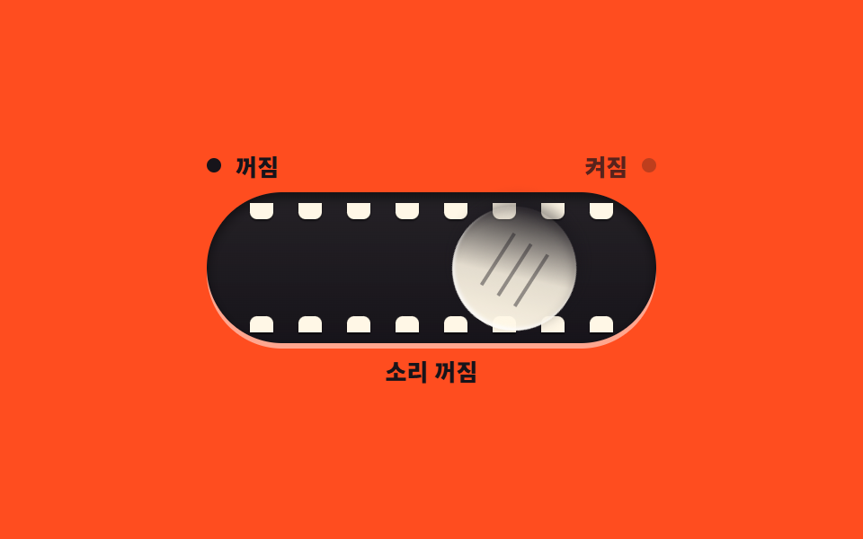
노브가 미끄러지는 대신 한 바퀴 굴러서 반대편으로 가고, 도착하면 감겨 있던 두 눈이 위아래로 벌어집니다. 꺼질 때는 굴러 돌아오며 다시 감깁니다.
쓰임아이 대상 앱의 소리 켜기
rotatescaleYcubic-bezier
<main class="stage">
<div class="tr is-demo" id="tr">
  <div class="tr__unit">
    <div class="tr__head" aria-hidden="true">
      <span class="tr__side tr__side--off"><span class="tr__dot"></span><span class="tr__word">꺼짐</span></span>
      <span class="tr__side tr__side--on"><span class="tr__word">켜짐</span><span class="tr__dot"></span></span>
    </div>
    <div class="tr__track">
      <span class="tr__rack tr__rack--top" aria-hidden="true">
        <span class="tr__tooth"></span><span class="tr__tooth"></span><span class="tr__tooth"></span><span class="tr__tooth"></span><span class="tr__tooth"></span><span class="tr__tooth"></span><span class="tr__tooth"></span><span class="tr__tooth"></span>
      </span>
      <span class="tr__rack tr__rack--bottom" aria-hidden="true">
        <span class="tr__tooth"></span><span class="tr__tooth"></span><span class="tr__tooth"></span><span class="tr__tooth"></span><span class="tr__tooth"></span><span class="tr__tooth"></span><span class="tr__tooth"></span><span class="tr__tooth"></span>
      </span>
      <span class="tr__knob" aria-hidden="true">
        <span class="tr__roll"><span class="tr__grip"></span></span>
        <span class="tr__eyes"><span class="tr__eye"></span><span class="tr__eye"></span></span>
      </span>
      <button class="tr__hit" id="trHit" type="button" role="switch" aria-checked="false" aria-label="소리"></button>
    </div>
    <p class="tr__state" role="status"><span class="tr__wordOn">소리 켜짐</span><span class="tr__wordOff">소리 꺼짐</span></p>
  </div>
</div>
</main>
@use "../../../../site/static/demo-tokens" as *;
// 굴러가며 눈을 뜨는 토글 — 노브는 미끄러지는 대신 굴러서 반대편으로 간다.
// translateX(이동)와 rotate(회전)를 같은 시간에 놓아 바퀴가 도는 착각을 만든다(회전각은 근사 — 아래 주석).
// 도착하면 감겨 있던 두 눈이 위아래로 벌어지고, 꺼질 때는 굴러 돌아오며 다시 감긴다.
// 트랙 안쪽 위·아래 벽에는 크림색 이빨이 한 줄씩 — 노브가 기어(rack)를 지나는 셈이다.
// 라벨·상태점·상태 글자는 steps(1, end) 컷으로 교차한다. role="switch" + aria-checked.
$duration: $dur-base;
$easing: cubic-bezier(.2, 1.4, .4, 1); // = $ease-pop — 칩 값 그대로 노출
$color: $subject-cream;
@include stage($stage-orange);
.tr { display: grid; place-items: center; width: 100%; }
.tr__unit { display: flex; flex-direction: column; align-items: center; gap: $sp-2; }
// ── 위 줄: 상태점 두 개와 라벨 ────────────────────────────────
.tr__head { display: flex; justify-content: space-between; width: 250px; }
.tr__side { display: flex; align-items: center; gap: $sp-2; }
.tr__dot { width: 8px; height: 8px; border-radius: 50%; background: rgba($subject-ink, .28); }
.tr__word { font-weight: 800; font-size: 13px; line-height: 1; color: rgba($subject-ink, .72); }
// 기본(꺼짐)은 왼쪽 점·글자가 켜져 있다
.tr__side--off .tr__dot { background: $subject-ink; }
.tr__side--off .tr__word { color: $subject-ink; }
.tr.is-on .tr__side--off .tr__dot { background: rgba($subject-ink, .28); }
.tr.is-on .tr__side--off .tr__word { color: rgba($subject-ink, .72); }
.tr.is-on .tr__side--on .tr__dot { background: $subject-ink; }
.tr.is-on .tr__side--on .tr__word { color: $subject-ink; }
// ── 트랙(기어 랙) ────────────────────────────────────────────
.tr__track {
--travel: 163px; // 이동거리: 250 − 노브 69 − 좌우 여백 18
--roll: 271deg; // 회전각 근사: 이동 163px ÷ 반지름 34.5px ≈ 4.7rad ≈ 271deg
position: relative; width: 250px; height: 84px; border-radius: $r-pill;
background: linear-gradient(180deg, rgba($color, .06), rgba($stage-ink, .25)), $subject-ink;
box-shadow: inset 0 3px 6px rgba(0, 0, 0, .5), 0 3px 0 rgba($stage-paper, .5);
}
// 이빨 한 줄 — 위 벽과 아래 벽을 따라 8개씩. 안쪽 모서리만 둥글게
.tr__rack {
position: absolute; left: 24px; right: 24px; height: 9px;
display: flex; justify-content: space-between;
}
.tr__rack--top { top: 6px; }
.tr__rack--bottom { bottom: 6px; }
.tr__tooth { width: 13px; height: 100%; background: $color; box-shadow: 0 1px 1px rgba(0, 0, 0, .5); }
.tr__rack--top .tr__tooth { border-radius: 0 0 $r-xs $r-xs; }
.tr__rack--bottom .tr__tooth { border-radius: $r-xs $r-xs 0 0; }
// ── 노브(굴러가는 디스크) ────────────────────────────────────
// tr__knob 은 이동만, tr__roll 은 회전만 — 눈(tr__eyes)은 회전에서 빼 둥근 채 도착하게 한다.
.tr__knob {
position: absolute; left: 9px; top: 8px; width: 69px; height: 69px;
transform: translateX(0);
transition: transform $duration $easing;
}
.tr__roll {
position: absolute; inset: 0; border-radius: 50%;
background: linear-gradient(160deg, $color, rgba($color, .88) 45%, rgba($subject-ink, .16) 92%);
box-shadow: 0 4px 8px rgba($stage-ink, .45), inset 0 2px 2px rgba($stage-paper, .8), inset 0 -3px 5px rgba($stage-ink, .22);
transform: rotate(0deg);
transition: transform $duration $easing;
}
// 표면 세로 3줄 그립 눈금 — 회전하면 굴러가는 게 보인다
.tr__grip {
position: absolute; left: 22px; top: 17px; width: 24px; height: 34px;
background: linear-gradient(90deg, rgba($subject-ink, .42) 0 2px, transparent 2px 11px) 0 0 / 11px 100%;
}
// 두 눈 — 감김 = scaleY(0) 의 가는 선, 뜸 = scaleY(1) 의 동그라미
.tr__eyes {
position: absolute; inset: 0;
display: flex; align-items: center; justify-content: center; gap: $sp-2;
}
.tr__eye {
width: 8px; height: 8px; border-radius: 50%; background: $subject-ink;
transform: scaleY(0);
transition: transform $dur-quick $ease-pop;
}
// 켤 때는 도착한 뒤에 뜬다(지연 $duration), 끌 때는 굴러 돌아오며 곧바로 감긴다(지연 없음)
.tr.is-on .tr__eye { transform: scaleY(1); transition: transform $dur-quick $ease-pop $duration; }
.tr.is-on .tr__knob { transform: translateX(var(--travel)); }
.tr.is-on .tr__roll { transform: rotate(var(--roll)); }
// 트랙 전체가 클릭 면적
.tr__hit {
position: absolute; inset: 0; z-index: 10;
margin: 0; padding: 0; border: 0; border-radius: $r-pill;
background: transparent; cursor: pointer;
}
.tr__hit:focus-visible { outline: 2px solid $subject-ink; outline-offset: 3px; }
// ── 상태 글자 ────────────────────────────────────────────────
.tr__state { position: relative; margin: 0; width: 72px; height: 16px; }
.tr__wordOn, .tr__wordOff {
position: absolute; inset: 0; display: flex; align-items: center; justify-content: center;
font-weight: 800; font-size: 13px; line-height: 1; color: $subject-ink;
}
.tr__wordOn { display: none; }
.tr.is-on .tr__wordOn { display: flex; }
.tr.is-on .tr__wordOff { display: none; }
// ── 미리보기 루프(2초 한 바퀴) ────────────────────────────────
// 굴러가기(이동+회전 동시) → 눈 뜨기 → 유지 → 눈 감기 → 굴러오기. 라벨·상태점은 steps(1, end) 컷.
.tr.is-demo .tr__knob, .tr.is-demo .tr__roll {
animation-duration: $dur-loop;
animation-timing-function: $easing; animation-iteration-count: infinite;
}
.tr.is-demo .tr__knob { animation-name: trRollX; }
.tr.is-demo .tr__roll { animation-name: trRollSpin; }
@keyframes trRollX {
0%, 8% { transform: translateX(0); }
36% { transform: translateX(calc(var(--travel) + 5px)); }
42% { transform: translateX(calc(var(--travel) - 3px)); }
46%, 66% { transform: translateX(var(--travel)); }
88% { transform: translateX(-4px); }
92% { transform: translateX(2px); }
96%, 100% { transform: translateX(0); }
}
@keyframes trRollSpin {
0%, 8% { transform: rotate(0deg); }
36% { transform: rotate(calc(var(--roll) + 9deg)); }
42% { transform: rotate(calc(var(--roll) - 5deg)); }
46%, 66% { transform: rotate(var(--roll)); }
88% { transform: rotate(-7deg); }
92% { transform: rotate(3deg); }
96%, 100% { transform: rotate(0deg); }
}
.tr.is-demo .tr__eye {
animation-name: trEyeLoop; animation-duration: $dur-loop;
animation-timing-function: $ease-pop; animation-iteration-count: infinite;
}
@keyframes trEyeLoop {
0%, 46% { transform: scaleY(0); }
52%, 64% { transform: scaleY(1); }
69%, 100% { transform: scaleY(0); }
}
// 상태점·라벨 컷 — 도착(46%)과 복귀(92%)에 한 프레임으로 갈린다
.tr.is-demo .tr__side--off .tr__dot {
animation-name: trDotOff; animation-duration: $dur-loop;
animation-timing-function: steps(1, end); animation-iteration-count: infinite;
}
@keyframes trDotOff {
0% { background-color: $subject-ink; }
46% { background-color: rgba($subject-ink, .28); }
92% { background-color: $subject-ink; }
100% { background-color: $subject-ink; }
}
.tr.is-demo .tr__side--on .tr__dot {
animation-name: trDotOn; animation-duration: $dur-loop;
animation-timing-function: steps(1, end); animation-iteration-count: infinite;
}
@keyframes trDotOn {
0% { background-color: rgba($subject-ink, .28); }
46% { background-color: $subject-ink; }
92% { background-color: rgba($subject-ink, .28); }
100% { background-color: rgba($subject-ink, .28); }
}
.tr.is-demo .tr__side--off .tr__word {
animation-name: trLitOff; animation-duration: $dur-loop;
animation-timing-function: steps(1, end); animation-iteration-count: infinite;
}
@keyframes trLitOff {
0% { color: $subject-ink; }
46% { color: rgba($subject-ink, .72); }
92% { color: $subject-ink; }
100% { color: $subject-ink; }
}
.tr.is-demo .tr__side--on .tr__word {
animation-name: trLitOn; animation-duration: $dur-loop;
animation-timing-function: steps(1, end); animation-iteration-count: infinite;
}
@keyframes trLitOn {
0% { color: rgba($subject-ink, .72); }
46% { color: $subject-ink; }
92% { color: rgba($subject-ink, .72); }
100% { color: rgba($subject-ink, .72); }
}
// 상태 글자는 둘 다 띄워 두고 opacity 컷으로 갈아 낀다(정적 규칙의 display 는 건드리지 않는다)
.tr.is-demo .tr__wordOn { display: flex; opacity: 0; }
.tr.is-demo .tr__wordOff { opacity: 1; }
.tr.is-demo .tr__wordOn {
animation-name: trWordOn; animation-duration: $dur-loop;
animation-timing-function: steps(1, end); animation-iteration-count: infinite;
}
@keyframes trWordOn {
0%, 46% { opacity: 0; }
50% { opacity: 1; }
92% { opacity: 0; }
100% { opacity: 0; }
}
.tr.is-demo .tr__wordOff {
animation-name: trWordOff; animation-duration: $dur-loop;
animation-timing-function: steps(1, end); animation-iteration-count: infinite;
}
@keyframes trWordOff {
0%, 46% { opacity: 1; }
50% { opacity: 0; }
92% { opacity: 1; }
100% { opacity: 1; }
}
@media (max-width: 340px) {
.tr__unit { gap: $sp-1; }
.tr__head { width: 210px; }
.tr__word { font-size: 11px; }
.tr__track { --travel: 142px; --roll: 313deg; width: 210px; height: 64px; }
.tr__rack { left: 20px; right: 20px; height: 7px; }
.tr__rack--top { top: 4px; }
.tr__rack--bottom { bottom: 4px; }
.tr__tooth { width: 11px; }
.tr__knob { left: 8px; top: 6px; width: 52px; height: 52px; }
.tr__grip { left: 17px; top: 13px; width: 18px; height: 26px;
background: linear-gradient(90deg, rgba($subject-ink, .42) 0 2px, transparent 2px 8px) 0 0 / 8px 100%; }
.tr__eye { width: 6px; height: 6px; }
.tr__state { width: 60px; height: 14px; }
.tr__wordOn, .tr__wordOff { font-size: 11px; }
}
@media (prefers-reduced-motion: reduce) {
.tr .tr__knob { transition: none !important; }
.tr .tr__roll { transition: none !important; }
.tr .tr__eye { transition: none !important; }
.tr.is-demo .tr__knob { animation: none !important; transform: translateX(0) !important; }
.tr.is-demo .tr__roll { animation: none !important; transform: rotate(0deg) !important; }
.tr.is-demo .tr__eye { animation: none !important; transform: scaleY(0) !important; }
.tr.is-demo .tr__dot { animation: none !important; }
.tr.is-demo .tr__word { animation: none !important; }
.tr.is-demo .tr__wordOn { animation: none !important; opacity: 0 !important; }
.tr.is-demo .tr__wordOff { animation: none !important; opacity: 1 !important; }
}html, body {
margin: 0;
overflow: hidden;
}
.stage {
box-sizing: border-box;
min-height: 100vh;
display: grid;
place-items: center;
margin: 0;
background: #ff4d1f;
font-family: -apple-system, "Segoe UI", "Noto Sans KR", sans-serif;
padding: clamp(8px, 4vw, 24px);
}
.tr {
display: grid;
place-items: center;
width: 100%;
}
.tr__unit {
display: flex;
flex-direction: column;
align-items: center;
gap: 8px;
}
.tr__head {
display: flex;
justify-content: space-between;
width: 250px;
}
.tr__side {
display: flex;
align-items: center;
gap: 8px;
}
.tr__dot {
width: 8px;
height: 8px;
border-radius: 50%;
background: rgba(23, 20, 26, 0.28);
}
.tr__word {
font-weight: 800;
font-size: 13px;
line-height: 1;
color: rgba(23, 20, 26, 0.72);
}
.tr__side--off .tr__dot {
background: #17141a;
}
.tr__side--off .tr__word {
color: #17141a;
}
.tr.is-on .tr__side--off .tr__dot {
background: rgba(23, 20, 26, 0.28);
}
.tr.is-on .tr__side--off .tr__word {
color: rgba(23, 20, 26, 0.72);
}
.tr.is-on .tr__side--on .tr__dot {
background: #17141a;
}
.tr.is-on .tr__side--on .tr__word {
color: #17141a;
}
.tr__track {
--travel: 163px;
--roll: 271deg;
position: relative;
width: 250px;
height: 84px;
border-radius: 999px;
background: linear-gradient(180deg, rgba(255, 247, 230, 0.06), rgba(23, 20, 26, 0.25)), #17141a;
box-shadow: inset 0 3px 6px rgba(0, 0, 0, 0.5), 0 3px 0 rgba(255, 255, 255, 0.5);
}
.tr__rack {
position: absolute;
left: 24px;
right: 24px;
height: 9px;
display: flex;
justify-content: space-between;
}
.tr__rack--top {
top: 6px;
}
.tr__rack--bottom {
bottom: 6px;
}
.tr__tooth {
width: 13px;
height: 100%;
background: #fff7e6;
box-shadow: 0 1px 1px rgba(0, 0, 0, 0.5);
}
.tr__rack--top .tr__tooth {
border-radius: 0 0 4px 4px;
}
.tr__rack--bottom .tr__tooth {
border-radius: 4px 4px 0 0;
}
.tr__knob {
position: absolute;
left: 9px;
top: 8px;
width: 69px;
height: 69px;
transform: translateX(0);
transition: transform 300ms cubic-bezier(0.2, 1.4, 0.4, 1);
}
.tr__roll {
position: absolute;
inset: 0;
border-radius: 50%;
background: linear-gradient(160deg, #fff7e6, rgba(255, 247, 230, 0.88) 45%, rgba(23, 20, 26, 0.16) 92%);
box-shadow: 0 4px 8px rgba(23, 20, 26, 0.45), inset 0 2px 2px rgba(255, 255, 255, 0.8), inset 0 -3px 5px rgba(23, 20, 26, 0.22);
transform: rotate(0deg);
transition: transform 300ms cubic-bezier(0.2, 1.4, 0.4, 1);
}
.tr__grip {
position: absolute;
left: 22px;
top: 17px;
width: 24px;
height: 34px;
background: linear-gradient(90deg, rgba(23, 20, 26, 0.42) 0 2px, transparent 2px 11px) 0 0/11px 100%;
}
.tr__eyes {
position: absolute;
inset: 0;
display: flex;
align-items: center;
justify-content: center;
gap: 8px;
}
.tr__eye {
width: 8px;
height: 8px;
border-radius: 50%;
background: #17141a;
transform: scaleY(0);
transition: transform 220ms cubic-bezier(0.2, 1.4, 0.4, 1);
}
.tr.is-on .tr__eye {
transform: scaleY(1);
transition: transform 220ms cubic-bezier(0.2, 1.4, 0.4, 1) 300ms;
}
.tr.is-on .tr__knob {
transform: translateX(var(--travel));
}
.tr.is-on .tr__roll {
transform: rotate(var(--roll));
}
.tr__hit {
position: absolute;
inset: 0;
z-index: 10;
margin: 0;
padding: 0;
border: 0;
border-radius: 999px;
background: transparent;
cursor: pointer;
}
.tr__hit:focus-visible {
outline: 2px solid #17141a;
outline-offset: 3px;
}
.tr__state {
position: relative;
margin: 0;
width: 72px;
height: 16px;
}
.tr__wordOn, .tr__wordOff {
position: absolute;
inset: 0;
display: flex;
align-items: center;
justify-content: center;
font-weight: 800;
font-size: 13px;
line-height: 1;
color: #17141a;
}
.tr__wordOn {
display: none;
}
.tr.is-on .tr__wordOn {
display: flex;
}
.tr.is-on .tr__wordOff {
display: none;
}
.tr.is-demo .tr__knob, .tr.is-demo .tr__roll {
animation-duration: 2s;
animation-timing-function: cubic-bezier(0.2, 1.4, 0.4, 1);
animation-iteration-count: infinite;
}
.tr.is-demo .tr__knob {
animation-name: trRollX;
}
.tr.is-demo .tr__roll {
animation-name: trRollSpin;
}
@keyframes trRollX {
0%, 8% {
transform: translateX(0);
}
36% {
transform: translateX(calc(var(--travel) + 5px));
}
42% {
transform: translateX(calc(var(--travel) - 3px));
}
46%, 66% {
transform: translateX(var(--travel));
}
88% {
transform: translateX(-4px);
}
92% {
transform: translateX(2px);
}
96%, 100% {
transform: translateX(0);
}
}
@keyframes trRollSpin {
0%, 8% {
transform: rotate(0deg);
}
36% {
transform: rotate(calc(var(--roll) + 9deg));
}
42% {
transform: rotate(calc(var(--roll) - 5deg));
}
46%, 66% {
transform: rotate(var(--roll));
}
88% {
transform: rotate(-7deg);
}
92% {
transform: rotate(3deg);
}
96%, 100% {
transform: rotate(0deg);
}
}
.tr.is-demo .tr__eye {
animation-name: trEyeLoop;
animation-duration: 2s;
animation-timing-function: cubic-bezier(0.2, 1.4, 0.4, 1);
animation-iteration-count: infinite;
}
@keyframes trEyeLoop {
0%, 46% {
transform: scaleY(0);
}
52%, 64% {
transform: scaleY(1);
}
69%, 100% {
transform: scaleY(0);
}
}
.tr.is-demo .tr__side--off .tr__dot {
animation-name: trDotOff;
animation-duration: 2s;
animation-timing-function: steps(1, end);
animation-iteration-count: infinite;
}
@keyframes trDotOff {
0% {
background-color: #17141a;
}
46% {
background-color: rgba(23, 20, 26, 0.28);
}
92% {
background-color: #17141a;
}
100% {
background-color: #17141a;
}
}
.tr.is-demo .tr__side--on .tr__dot {
animation-name: trDotOn;
animation-duration: 2s;
animation-timing-function: steps(1, end);
animation-iteration-count: infinite;
}
@keyframes trDotOn {
0% {
background-color: rgba(23, 20, 26, 0.28);
}
46% {
background-color: #17141a;
}
92% {
background-color: rgba(23, 20, 26, 0.28);
}
100% {
background-color: rgba(23, 20, 26, 0.28);
}
}
.tr.is-demo .tr__side--off .tr__word {
animation-name: trLitOff;
animation-duration: 2s;
animation-timing-function: steps(1, end);
animation-iteration-count: infinite;
}
@keyframes trLitOff {
0% {
color: #17141a;
}
46% {
color: rgba(23, 20, 26, 0.72);
}
92% {
color: #17141a;
}
100% {
color: #17141a;
}
}
.tr.is-demo .tr__side--on .tr__word {
animation-name: trLitOn;
animation-duration: 2s;
animation-timing-function: steps(1, end);
animation-iteration-count: infinite;
}
@keyframes trLitOn {
0% {
color: rgba(23, 20, 26, 0.72);
}
46% {
color: #17141a;
}
92% {
color: rgba(23, 20, 26, 0.72);
}
100% {
color: rgba(23, 20, 26, 0.72);
}
}
.tr.is-demo .tr__wordOn {
display: flex;
opacity: 0;
}
.tr.is-demo .tr__wordOff {
opacity: 1;
}
.tr.is-demo .tr__wordOn {
animation-name: trWordOn;
animation-duration: 2s;
animation-timing-function: steps(1, end);
animation-iteration-count: infinite;
}
@keyframes trWordOn {
0%, 46% {
opacity: 0;
}
50% {
opacity: 1;
}
92% {
opacity: 0;
}
100% {
opacity: 0;
}
}
.tr.is-demo .tr__wordOff {
animation-name: trWordOff;
animation-duration: 2s;
animation-timing-function: steps(1, end);
animation-iteration-count: infinite;
}
@keyframes trWordOff {
0%, 46% {
opacity: 1;
}
50% {
opacity: 0;
}
92% {
opacity: 1;
}
100% {
opacity: 1;
}
}
@media (max-width: 340px) {
.tr__unit {
gap: 4px;
}
.tr__head {
width: 210px;
}
.tr__word {
font-size: 11px;
}
.tr__track {
--travel: 142px;
--roll: 313deg;
width: 210px;
height: 64px;
}
.tr__rack {
left: 20px;
right: 20px;
height: 7px;
}
.tr__rack--top {
top: 4px;
}
.tr__rack--bottom {
bottom: 4px;
}
.tr__tooth {
width: 11px;
}
.tr__knob {
left: 8px;
top: 6px;
width: 52px;
height: 52px;
}
.tr__grip {
left: 17px;
top: 13px;
width: 18px;
height: 26px;
background: linear-gradient(90deg, rgba(23, 20, 26, 0.42) 0 2px, transparent 2px 8px) 0 0/8px 100%;
}
.tr__eye {
width: 6px;
height: 6px;
}
.tr__state {
width: 60px;
height: 14px;
}
.tr__wordOn, .tr__wordOff {
font-size: 11px;
}
}
@media (prefers-reduced-motion: reduce) {
.tr .tr__knob {
transition: none !important;
}
.tr .tr__roll {
transition: none !important;
}
.tr .tr__eye {
transition: none !important;
}
.tr.is-demo .tr__knob {
animation: none !important;
transform: translateX(0) !important;
}
.tr.is-demo .tr__roll {
animation: none !important;
transform: rotate(0deg) !important;
}
.tr.is-demo .tr__eye {
animation: none !important;
transform: scaleY(0) !important;
}
.tr.is-demo .tr__dot {
animation: none !important;
}
.tr.is-demo .tr__word {
animation: none !important;
}
.tr.is-demo .tr__wordOn {
animation: none !important;
opacity: 0 !important;
}
.tr.is-demo .tr__wordOff {
animation: none !important;
opacity: 1 !important;
}
}var trRoot = document.getElementById('tr');
var trHit = document.getElementById('trHit');
function trSet(on) {
trHit.setAttribute('aria-checked', on ? 'true' : 'false');
trRoot.classList.toggle('is-on', on);
}
trHit.addEventListener('pointerdown', function () { trRoot.classList.remove('is-demo'); });
trHit.addEventListener('click', function () {
trRoot.classList.remove('is-demo');
trSet(trHit.getAttribute('aria-checked') !== 'true');
});// PlayfulMorphToggle — vanilla 판(run/076/demo/03-real-playful-morph-toggle/index.html) 의 React 포트.
// 노브는 미끄러지는 대신 굴러서 반대편으로 간다(translateX + rotate 동시). 도착하면 감겨 있던 두 눈이 벌어진다.
// 값·키프레임은 vanilla 와 같다(다시 타이핑하지 않는다). 누르면 미리보기 루프를 뗀다.
import { useState } from "react";
import styles from "./PlayfulMorphToggle.module.scss";
export type PlayfulMorphToggleProps = {
duration?: number;
easing?: string;
color?: string;
};
type Vars = { [k: string]: any };
const SIDE_OFF = "꺼짐";
const SIDE_ON = "켜짐";
const ARIA_LABEL = "소리";
const STATE_ON = "소리 켜짐";
const STATE_OFF = "소리 꺼짐";
const TOOTH_COUNT = 8; // 위·아래 랙의 이빨 수(vanilla 와 같다)
export default function PlayfulMorphToggle({
duration = 300,
easing = "cubic-bezier(.2, 1.4, .4, 1)", // = $ease-pop — 칩 값 그대로 노출
color = "#fff7e6",
}: PlayfulMorphToggleProps) {
const [on, setOn] = useState(false);
const [demo, setDemo] = useState(true);
const vars: Vars = {
"--duration": `${duration}ms`,
"--easing": easing,
"--color": color,
};
const cls = [styles.root, demo ? styles.isDemo : "", on ? styles.isOn : ""].filter(Boolean).join(" ");
const teeth: number[] = [];
for (let i = 0; i < TOOTH_COUNT; i++) { teeth.push(i); }
function wake() {
setDemo(false);
}
function toggle() {
setDemo(false);
setOn((prev) => !prev);
}
return (
<main className={styles.stage}>
<div className={cls} style={vars}>
<div className={styles.unit}>
<div className={styles.head} aria-hidden="true">
<span className={[styles.side, styles.sideOff].join(" ")}>
<span className={styles.dot}></span>
<span className={styles.word}>{SIDE_OFF}</span>
</span>
<span className={[styles.side, styles.sideOn].join(" ")}>
<span className={styles.word}>{SIDE_ON}</span>
<span className={styles.dot}></span>
</span>
</div>
<div className={styles.track}>
<span className={[styles.rack, styles.rackTop].join(" ")} aria-hidden="true">
{teeth.map((i) => <span key={i} className={styles.tooth}></span>)}
</span>
<span className={[styles.rack, styles.rackBottom].join(" ")} aria-hidden="true">
{teeth.map((i) => <span key={`b${i}`} className={styles.tooth}></span>)}
</span>
<span className={styles.knob} aria-hidden="true">
<span className={styles.roll}><span className={styles.grip}></span></span>
<span className={styles.eyes}><span className={styles.eye}></span><span className={styles.eye}></span></span>
</span>
<button
className={styles.hit}
type="button"
role="switch"
aria-checked={on}
aria-label={ARIA_LABEL}
onPointerDown={wake}
onClick={toggle}
></button>
</div>
<p className={styles.state} role="status">
<span className={styles.wordOn}>{STATE_ON}</span>
<span className={styles.wordOff}>{STATE_OFF}</span>
</p>
</div>
</div>
</main>
);
}03 굴러가며 눈을 뜨는 토글 — 측정 누적면적 9.99% · 움직인 프레임 21/23GODRICH 원작 · zip 에 SCSS·React 포함 · CSS 토글 버튼 9종 — 실물처럼 만드는 토글 스위치 UI
이 데모가 속한 글
 CSS 토글 버튼 9종 — 실물처럼 만드는 토글 스위치 UIcss 토글 버튼은 화면 속에서 전원을 넣고 끄는 작은 스위치를 뜻합니다. 아홉 개를 라이브러리 없이 체크박스 하나로 만들었고, 아래 격자에서 지금 돌아갑니다. 클릭·Space·드래그 전부 실제로 움직입니다. 이 글의 데모 전부 보기