09반응형 자동 스택
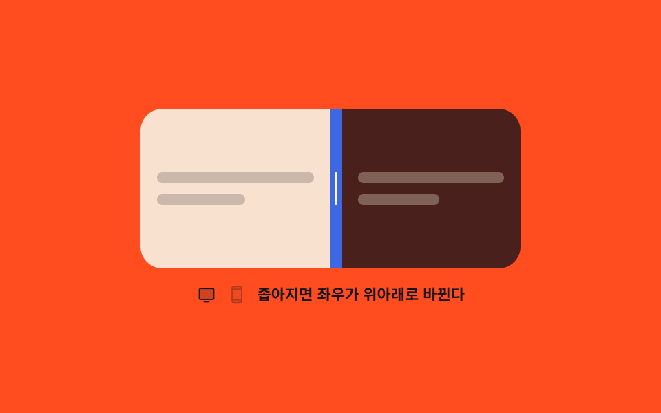
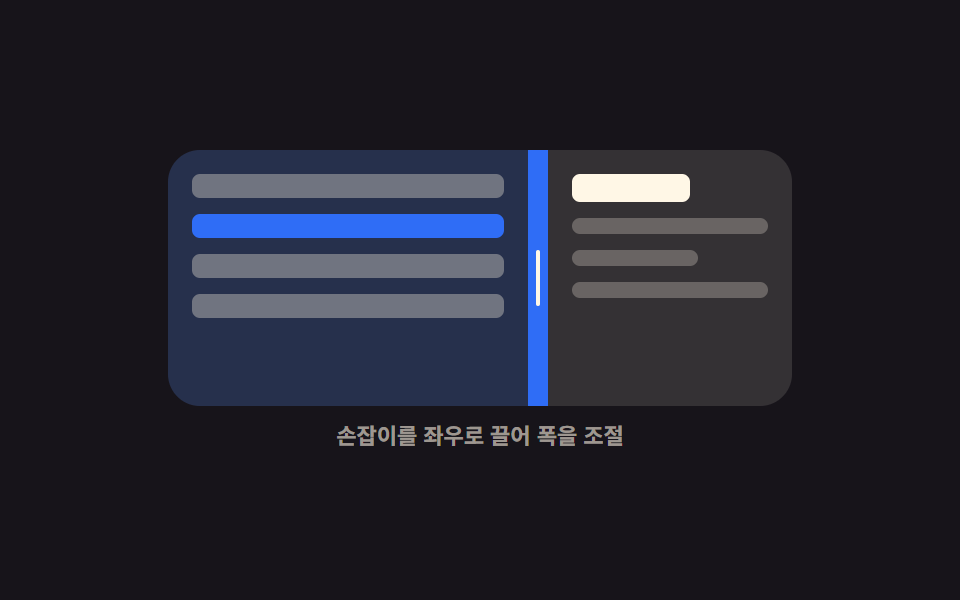
상자 폭이 기준 아래로 줄어드는 순간 좌우로 나뉘어 있던 패널이 위아래로 바뀌고, 손잡이도 세로에서 가로로 함께 돌아눕습니다.
쓰임같은 분할 화면을 넓은 모니터와 좁은 휴대폰에서 모두 써야 할 때
ResizeObserveraria-orientationgrid-template-rows
<main class="stage">
  <div class="as is-demo" id="as-root">
    <div class="as__frame" id="as-frame">
      <div class="as__box" id="as-box">
        <section class="as__pane as__pane--a" aria-label="위쪽 화면">
          <span class="as__ln"></span>
          <span class="as__ln as__ln--s"></span>
        </section>
        <div class="as__bar" id="as-bar" role="separator" tabindex="0"
             aria-orientation="vertical" aria-label="분할 위치" aria-valuemin="20" aria-valuemax="80" aria-valuenow="50">
          <i class="as__grip" aria-hidden="true"></i>
        </div>
        <section class="as__pane as__pane--b" aria-label="아래쪽 화면">
          <span class="as__ln as__ln--d"></span>
          <span class="as__ln as__ln--d as__ln--s"></span>
        </section>
      </div>
    </div>
    <p class="as__cap">
      <span class="as__ico as__ico--wide" aria-hidden="true"><svg viewBox="0 0 256 256"><g fill="currentColor"><path d="M224 64v112a16 16 0 0 1-16 16H48a16 16 0 0 1-16-16V64a16 16 0 0 1 16-16h160a16 16 0 0 1 16 16" opacity=".2"/><path d="M208 40H48a24 24 0 0 0-24 24v112a24 24 0 0 0 24 24h160a24 24 0 0 0 24-24V64a24 24 0 0 0-24-24m8 136a8 8 0 0 1-8 8H48a8 8 0 0 1-8-8V64a8 8 0 0 1 8-8h160a8 8 0 0 1 8 8Zm-48 48a8 8 0 0 1-8 8H96a8 8 0 0 1 0-16h64a8 8 0 0 1 8 8"/></g></svg></span>
      <span class="as__ico as__ico--narrow" aria-hidden="true"><svg viewBox="0 0 256 256"><g fill="currentColor"><path d="M192 56v144H64V56Z" opacity=".2"/><path d="M176 16H80a24 24 0 0 0-24 24v176a24 24 0 0 0 24 24h96a24 24 0 0 0 24-24V40a24 24 0 0 0-24-24M72 64h112v128H72Zm8-32h96a8 8 0 0 1 8 8v8H72v-8a8 8 0 0 1 8-8m96 192H80a8 8 0 0 1-8-8v-8h112v8a8 8 0 0 1-8 8"/></g></svg></span>
      좁아지면 좌우가 위아래로 바뀐다
    </p>
  </div>
</main>@use "../../../../site/static/demo-tokens" as *;
$duration: $dur-quick;
$easing: $ease-spring;
$color: $subject-cream;
@include stage($stage-orange);
@property --w {
syntax: "<length>";
inherits: true;
initial-value: 280px;
}
.as {
--w: 280px;
--split: 50%;
display: flex;
flex-direction: column;
align-items: center;
gap: $sp-3;
}
// 상자만 좁아진다 — 자리는 고정이라 무대 높이가 흔들리지 않는다
.as__frame {
display: grid;
place-items: center;
width: 288px;
max-width: 92vw;
height: 116px;
}
.as__box {
box-sizing: border-box;
width: min(var(--w), 100%);
height: 116px;
display: grid;
grid-template-columns: var(--split) 8px 1fr;
grid-template-rows: 1fr;
border-radius: $r-card;
overflow: hidden;
background: rgba(23, 20, 26, .24);
}
// 세로 배치에서는 열이 하나, 행이 셋
.as.is-stack .as__box {
grid-template-columns: 1fr;
grid-template-rows: var(--split) 8px 1fr;
}
.as__pane {
box-sizing: border-box;
display: flex;
flex-direction: column;
justify-content: center;
gap: $sp-2;
padding: $sp-3;
overflow: hidden;
}
.as__ln {
flex: 0 0 auto;
height: 8px;
border-radius: $r-xs;
background: rgba(23, 20, 26, .2);
}
.as__ln--d { background: rgba(255, 247, 230, .3); }
.as__ln--s { width: 56%; }
.as__pane--a { background: rgba(255, 247, 230, .88); }
.as__pane--b { background: rgba(23, 20, 26, .72); }
.as__bar {
display: grid;
place-items: center;
background: rgba(47, 109, 246, .9);
cursor: col-resize;
touch-action: none;
}
.as.is-stack .as__bar { cursor: row-resize; }
.as__grip {
display: block;
width: 2px;
height: 24px;
border-radius: $r-pill;
background: $color;
transition: transform $duration $easing;
}
.as.is-stack .as__grip { transform: rotate(90deg); }
.as__bar:focus-visible { outline: 2px solid $subject-cream; outline-offset: -2px; }
.as__cap {
display: flex;
align-items: center;
gap: $sp-2;
margin: 0;
font-size: 11px;
line-height: 14px;
font-weight: 700;
color: $subject-ink; // AA 4.5: cream on orange 2.83 -> ink 5.50
text-align: center;
}
.as__ico { display: block; width: 14px; height: 14px; }
.as__ico svg { display: block; width: 14px; height: 14px; }
.as__ico--narrow { opacity: .35; }
// ── 자동 루프: 상자 폭이 줄었다 늘고, 배치는 기준선에서 한 프레임에 컷으로 뒤집힌다 ──
.as.is-demo .as__box {
animation-name: as-width, as-mode;
animation-duration: $dur-loop, $dur-loop;
animation-timing-function: $easing, steps(1, end);
animation-iteration-count: infinite, infinite;
}
@keyframes as-width {
0%, 10% { --w: 280px; }
44%, 58% { --w: 148px; }
88%, 100% { --w: 280px; }
}
@keyframes as-mode {
0%, 30% { grid-template-columns: var(--split) 8px 1fr; grid-template-rows: 1fr; }
31%, 71% { grid-template-columns: 1fr; grid-template-rows: var(--split) 8px 1fr; }
72%, 100% { grid-template-columns: var(--split) 8px 1fr; grid-template-rows: 1fr; }
}
.as.is-demo .as__grip { animation: as-grip $dur-loop steps(1, end) infinite; }
@keyframes as-grip {
0%, 30% { transform: rotate(0deg); }
31%, 71% { transform: rotate(90deg); }
72%, 100% { transform: rotate(0deg); }
}
.as.is-demo .as__ico--wide { animation: as-w $dur-loop steps(1, end) infinite; }
.as.is-demo .as__ico--narrow { animation: as-n $dur-loop steps(1, end) infinite; }
@keyframes as-w { 0%, 30% { opacity: 1; } 31%, 71% { opacity: .35; } 72%, 100% { opacity: 1; } }
@keyframes as-n { 0%, 30% { opacity: .35; } 31%, 71% { opacity: 1; } 72%, 100% { opacity: .35; } }
@media (prefers-reduced-motion: reduce) {
.as.is-demo .as__box,
.as.is-demo .as__grip,
.as.is-demo .as__ico--wide,
.as.is-demo .as__ico--narrow { animation: none !important; }
.as__grip { transition: none; }
}
@media (max-width: 340px) {
.as__frame { height: 104px; }
.as__box { height: 104px; }
}html, body {
margin: 0;
overflow: hidden;
}
.stage {
box-sizing: border-box;
min-height: 100vh;
display: grid;
place-items: center;
margin: 0;
background: #ff4d1f;
font-family: -apple-system, "Segoe UI", "Noto Sans KR", sans-serif;
padding: clamp(8px, 4vw, 24px);
}
@property --w {
syntax: "<length>";
inherits: true;
initial-value: 280px;
}
.as {
--w: 280px;
--split: 50%;
display: flex;
flex-direction: column;
align-items: center;
gap: 12px;
}
.as__frame {
display: grid;
place-items: center;
width: 288px;
max-width: 92vw;
height: 116px;
}
.as__box {
box-sizing: border-box;
width: min(var(--w), 100%);
height: 116px;
display: grid;
grid-template-columns: var(--split) 8px 1fr;
grid-template-rows: 1fr;
border-radius: 16px;
overflow: hidden;
background: rgba(23, 20, 26, 0.24);
}
.as.is-stack .as__box {
grid-template-columns: 1fr;
grid-template-rows: var(--split) 8px 1fr;
}
.as__pane {
box-sizing: border-box;
display: flex;
flex-direction: column;
justify-content: center;
gap: 8px;
padding: 12px;
overflow: hidden;
}
.as__ln {
flex: 0 0 auto;
height: 8px;
border-radius: 4px;
background: rgba(23, 20, 26, 0.2);
}
.as__ln--d {
background: rgba(255, 247, 230, 0.3);
}
.as__ln--s {
width: 56%;
}
.as__pane--a {
background: rgba(255, 247, 230, 0.88);
}
.as__pane--b {
background: rgba(23, 20, 26, 0.72);
}
.as__bar {
display: grid;
place-items: center;
background: rgba(47, 109, 246, 0.9);
cursor: col-resize;
touch-action: none;
}
.as.is-stack .as__bar {
cursor: row-resize;
}
.as__grip {
display: block;
width: 2px;
height: 24px;
border-radius: 999px;
background: #fff7e6;
transition: transform 220ms cubic-bezier(0.2, 0.8, 0.2, 1);
}
.as.is-stack .as__grip {
transform: rotate(90deg);
}
.as__bar:focus-visible {
outline: 2px solid #fff7e6;
outline-offset: -2px;
}
.as__cap {
display: flex;
align-items: center;
gap: 8px;
margin: 0;
font-size: 11px;
line-height: 14px;
font-weight: 700;
color: #17141a;
text-align: center;
}
.as__ico {
display: block;
width: 14px;
height: 14px;
}
.as__ico svg {
display: block;
width: 14px;
height: 14px;
}
.as__ico--narrow {
opacity: 0.35;
}
.as.is-demo .as__box {
animation-name: as-width, as-mode;
animation-duration: 2s, 2s;
animation-timing-function: cubic-bezier(0.2, 0.8, 0.2, 1), steps(1, end);
animation-iteration-count: infinite, infinite;
}
@keyframes as-width {
0%, 10% {
--w: 280px;
}
44%, 58% {
--w: 148px;
}
88%, 100% {
--w: 280px;
}
}
@keyframes as-mode {
0%, 30% {
grid-template-columns: var(--split) 8px 1fr;
grid-template-rows: 1fr;
}
31%, 71% {
grid-template-columns: 1fr;
grid-template-rows: var(--split) 8px 1fr;
}
72%, 100% {
grid-template-columns: var(--split) 8px 1fr;
grid-template-rows: 1fr;
}
}
.as.is-demo .as__grip {
animation: as-grip 2s steps(1, end) infinite;
}
@keyframes as-grip {
0%, 30% {
transform: rotate(0deg);
}
31%, 71% {
transform: rotate(90deg);
}
72%, 100% {
transform: rotate(0deg);
}
}
.as.is-demo .as__ico--wide {
animation: as-w 2s steps(1, end) infinite;
}
.as.is-demo .as__ico--narrow {
animation: as-n 2s steps(1, end) infinite;
}
@keyframes as-w {
0%, 30% {
opacity: 1;
}
31%, 71% {
opacity: 0.35;
}
72%, 100% {
opacity: 1;
}
}
@keyframes as-n {
0%, 30% {
opacity: 0.35;
}
31%, 71% {
opacity: 1;
}
72%, 100% {
opacity: 0.35;
}
}
@media (prefers-reduced-motion: reduce) {
.as.is-demo .as__box,
.as.is-demo .as__grip,
.as.is-demo .as__ico--wide,
.as.is-demo .as__ico--narrow {
animation: none !important;
}
.as__grip {
transition: none;
}
}
@media (max-width: 340px) {
.as__frame {
height: 104px;
}
.as__box {
height: 104px;
}
}// 실제 동작: ResizeObserver 가 상자 폭을 재고 200px 아래로 내려가면 세로 배치로 뒤집는다.
var root = document.getElementById('as-root');
var frame = document.getElementById('as-frame');
var box = document.getElementById('as-box');
var bar = document.getElementById('as-bar');
var FLIP = 200, dragging = false, stacked = false;
var ro = new ResizeObserver(function (entries) {
var w = entries[0].contentRect.width;
var next = w < FLIP;
if (next === stacked) return;
stacked = next;
root.classList.toggle('is-stack', stacked);
bar.setAttribute('aria-orientation', stacked ? 'horizontal' : 'vertical');
});
ro.observe(box);
function set(pct) {
var v = Math.max(20, Math.min(pct, 80));
root.style.setProperty('--split', v.toFixed(1) + '%');
bar.setAttribute('aria-valuenow', String(Math.round(v)));
}
bar.addEventListener('pointerdown', function (e) {
root.classList.remove('is-demo');
dragging = true;
bar.setPointerCapture(e.pointerId);
e.preventDefault();
});
bar.addEventListener('pointermove', function (e) {
if (!dragging) return;
var r = box.getBoundingClientRect();
set(stacked ? (e.clientY - r.top) / r.height * 100 : (e.clientX - r.left) / r.width * 100);
});
bar.addEventListener('pointerup', function () { dragging = false; });
bar.addEventListener('keydown', function (e) {
var d = (e.key === 'ArrowLeft' || e.key === 'ArrowUp') ? -5 : (e.key === 'ArrowRight' || e.key === 'ArrowDown') ? 5 : 0;
if (!d) return;
root.classList.remove('is-demo');
set(Number(bar.getAttribute('aria-valuenow')) + d);
bar.focus({ preventScroll: true });
e.preventDefault();
});import { useEffect, useRef, useState } from "react";
import type { CSSProperties } from "react";
import styles from "./AutoStackSplit.module.scss";
export type AutoStackSplitProps = {
/** 이 폭 아래로 내려가면 위아래 배치로 뒤집는다 (px) */
flipAt?: number;
start?: number;
duration?: number;
easing?: string;
color?: string;
};
type PEvt = { clientX: number; clientY: number; pointerId: number; preventDefault(): void; currentTarget: { setPointerCapture(id: number): void } };
type KeyEvt = { key: string; preventDefault(): void };
type Vars = CSSProperties & { "--split"?: string; "--duration"?: string; "--easing"?: string; "--color"?: string };
export default function AutoStackSplit({
flipAt = 200,
start = 50,
duration = 220,
easing = "cubic-bezier(.2,.8,.2,1)",
color = "#2f6df6",
}: AutoStackSplitProps) {
const [split, setSplit] = useState(start);
const [stacked, setStacked] = useState(false);
const boxRef = useRef<HTMLDivElement>(null);
const dragging = useRef(false);
// 미디어쿼리가 아니라 **상자 폭**을 잰다 — 같은 컴포넌트가 어디에 놓여도 맞는다
useEffect(() => {
const box = boxRef.current;
if (!box) return;
const ro = new ResizeObserver((entries) => {
setStacked(entries[0].contentRect.width < flipAt);
});
ro.observe(box);
return () => ro.disconnect();
}, [flipAt]);
function set(pct: number): void { setSplit(Math.max(20, Math.min(pct, 80))); }
function onDown(e: PEvt): void {
dragging.current = true;
e.currentTarget.setPointerCapture(e.pointerId);
e.preventDefault();
}
function onMove(e: PEvt): void {
const box = boxRef.current;
if (!dragging.current || !box) return;
const r = box.getBoundingClientRect();
set(stacked ? ((e.clientY - r.top) / r.height) * 100 : ((e.clientX - r.left) / r.width) * 100);
}
function onUp(): void { dragging.current = false; }
function onKey(e: KeyEvt): void {
const d = e.key === "ArrowLeft" || e.key === "ArrowUp" ? -5 : e.key === "ArrowRight" || e.key === "ArrowDown" ? 5 : 0;
if (!d) return;
set(split + d);
e.preventDefault();
}
const vars: Vars = {
"--split": `${split.toFixed(1)}%`,
"--duration": `${duration}ms`,
"--easing": easing,
"--color": color,
};
return (
<div className={stacked ? `${styles.as} ${styles.isStack}` : styles.as} style={vars}>
<div className={styles.frame}>
<div className={styles.box} ref={boxRef}>
<section className={`${styles.pane} ${styles.paneA}`} aria-label="Top pane">
<span className={styles.ln} />
<span className={`${styles.ln} ${styles.lnShort}`} />
</section>
<div
className={styles.bar}
role="separator"
tabIndex={0}
aria-orientation={stacked ? "horizontal" : "vertical"}
aria-label="Split position"
aria-valuemin={20}
aria-valuemax={80}
aria-valuenow={Math.round(split)}
onPointerDown={onDown}
onPointerMove={onMove}
onPointerUp={onUp}
onPointerCancel={onUp}
onKeyDown={onKey}
>
<i className={styles.grip} aria-hidden="true" />
</div>
<section className={`${styles.pane} ${styles.paneB}`} aria-label="Bottom pane">
<span className={`${styles.ln} ${styles.lnDark}`} />
<span className={`${styles.ln} ${styles.lnDark} ${styles.lnShort}`} />
</section>
</div>
</div>
<p className={styles.cap}>Narrow enough and the sides become stacked</p>
</div>
);
}09 반응형 자동 스택 — 측정 누적면적 19.089% · 움직인 프레임 14/23GODRICH 원작 · zip 에 SCSS·React 포함 · CSS 화면 분할 패널 9종 — 드래그로 폭이 따라오는
이 데모가 속한 글
 CSS 화면 분할 패널 9종 — 드래그로 폭이 따라오는css 화면 분할은 한 화면을 두세 칸으로 나누고 그 경계선을 잡아 끌어 각 칸의 크기를 바꾸는 배치 방식입니다. 아홉 개 중 여덟은 경계선 하나만 옮겨도 옆 칸이 같이 줄고, 하나는 상자가 좁아지는 순간 좌우가 위 이 글의 데모 전부 보기