08패럴랙스 3층
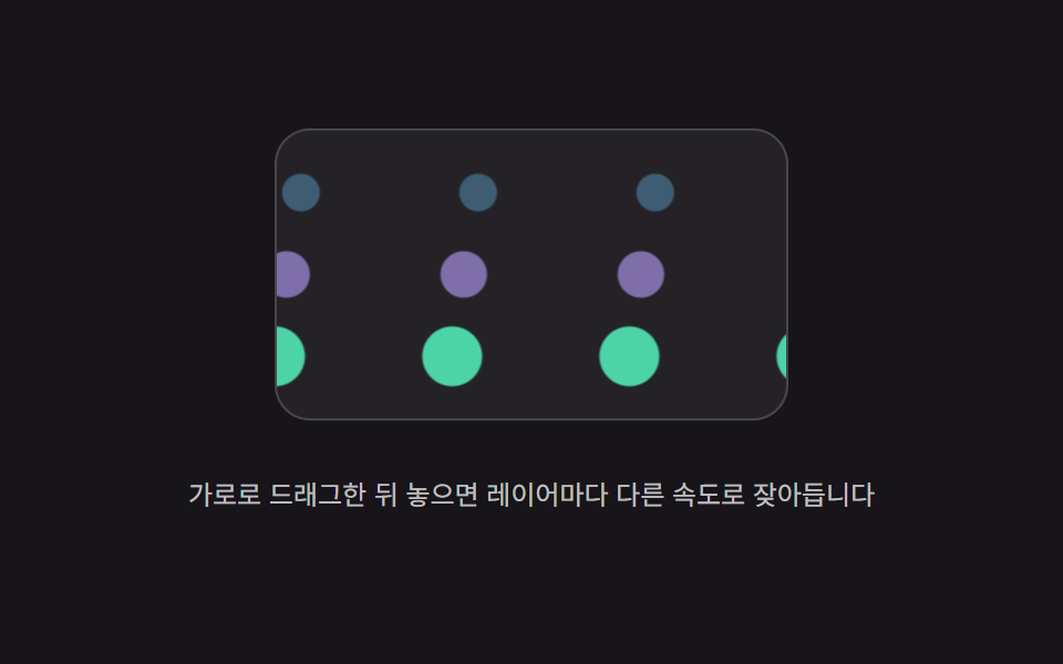
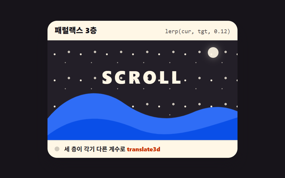
먼 별·중간 언덕·앞 글자가 각기 다른 계수로 translate3d 로 움직입니다. 매 프레임 lerp 로 목표를 부드럽게 따라가므로 빠른 스크롤에도 끊기지 않습니다.
쓰임히어로 배경 씬
translate3dlerpwill-change
<main class="stage">
  <section class="px is-demo" id="px" aria-label="패럴랙스 3층 데모">
    <header class="px__head">
      <p class="px__title">패럴랙스 3층</p>
      <p class="px__attr"><code>lerp(cur, tgt, 0.12)</code></p>
    </header>
    <div class="px__view" id="px-view" tabindex="0" role="region" aria-label="별과 언덕과 글자 씬 — 스크롤하면 층마다 다른 거리로 움직입니다">
      <div class="px__scene">
        <div class="px__layer px__layer--stars" data-rate="0.12" aria-hidden="true"></div>
        <div class="px__layer px__layer--hills" data-rate="0.3" aria-hidden="true">
          <svg class="px__hills" viewBox="0 0 320 130" preserveAspectRatio="none">
            <path class="px__hill px__hill--back" d="M0 130 L0 72 C 34 30, 84 16, 128 46 C 168 74, 206 78, 244 62 C 276 48, 302 52, 320 60 L320 130 Z"></path>
            <path class="px__hill px__hill--front" d="M0 130 L0 100 C 50 62, 100 68, 148 88 C 198 110, 250 92, 320 70 L320 130 Z"></path>
          </svg>
        </div>
        <div class="px__layer px__layer--type" data-rate="0.55">
          <p class="px__word">SCROLL</p>
        </div>
      </div>
      <div class="px__spacer" aria-hidden="true"></div>
    </div>
    <footer class="px__foot">
      <span class="px__dot" aria-hidden="true"></span>
      <span class="px__state">세 층이 각기 다른 계수로 <b>translate3d</b></span>
    </footer>
  </section>
</main>@use "../../../../site/static/demo-tokens" as *;
// 패럴랙스 3층 — 먼 별·중간 언덕·앞 글자가 각기 다른 계수로 translate3d 로 움직인다
// 미리보기(.is-demo)는 CSS 키프레임이 스크롤을 대신하고, 손이 닿으면 JS 의 rAF 루프가 lerp 로 이어받는다
$duration: $dur-loop;
$easing: $ease-spring;
$color: $subject-blue;
@include stage($stage-ink);
.px {
position: relative;
box-sizing: border-box;
width: min(320px, 92vw);
border-radius: $r-card;
background: $subject-cream;
color: $subject-ink;
font-family: -apple-system, "Segoe UI", "Noto Sans KR", sans-serif;
overflow: hidden;
box-shadow: $shadow-raised;
}
.px__head {
display: flex;
align-items: baseline;
justify-content: space-between;
gap: $sp-2;
padding: $sp-2 $sp-3;
}
.px__title {
margin: 0;
font-size: 13px;
font-weight: 800;
line-height: 1.3;
}
.px__attr {
margin: 0;
font-size: 10px;
line-height: 1.3;
color: rgba($subject-ink, .72);
code { font-family: "Consolas", "Menlo", monospace; }
}
// 스크롤 상자(view)와 씬(scene)은 분리 — transform 은 언제나 씬 안 층에만 건다 (051 함정)
.px__view {
position: relative;
height: 168px;
overflow-y: auto;
background: $tick-panel;
outline: none;
}
.px__scene {
position: sticky;
top: 0;
height: 100%;
}
// 스크롤 여유 — 이 세로 폭이 곧 스크롤 범위(120px)다
.px__spacer { height: 120px; }
.px__layer {
position: absolute;
will-change: transform;
}
// 먼 별 — 44px 타일로 뿌린 점과 달. 가장 느린 계수를 받는다 (이동 14.4px + 여유)
.px__layer--stars {
inset: -24px 0;
background-image:
radial-gradient(circle 1.5px at 12px 12px, rgba($subject-cream, .9) 99%, transparent 100%),
radial-gradient(circle 1px at 30px 26px, rgba($subject-cream, .5) 99%, transparent 100%),
radial-gradient(circle 2px at 36px 8px, rgba($subject-cream, .75) 99%, transparent 100%);
background-size: 44px 44px;
&::after {
content: "";
position: absolute;
top: 44px;
right: 32px;
width: 18px;
height: 18px;
border-radius: 50%;
background: rgba($subject-cream, .92);
box-shadow: 0 0 12px rgba($subject-cream, .4);
}
}
// 중간 언덕 — 두 겹의 언덕이 밑에서 올라온다 (이동 36px + 여유)
.px__layer--hills {
inset: -44px 0;
.px__hills {
position: absolute;
bottom: 0;
left: 0;
display: block;
width: 100%;
height: 132px;
}
.px__hill--back { fill: $subject-blue; }
.px__hill--front { fill: $subject-blue-deep; }
}
// 앞 글자 — 가장 빠른 계수. 씬 중심보다 낮게 시작해 위로 지나간다 (이동 66px + 여유)
.px__layer--type {
inset: -72px 0;
display: grid;
place-items: center;
}
.px__word {
margin: $sp-8 0 0;
font-size: 30px;
font-weight: 800;
line-height: 1.1;
letter-spacing: .14em;
color: $subject-cream;
}
.px__foot {
display: flex;
align-items: center;
gap: $sp-2;
padding: $sp-2 $sp-3;
border-top: 1px solid rgba($subject-ink, .12);
font-size: 10px;
font-weight: 700;
line-height: 1.3;
b { color: $subject-orange-deep; }
}
.px__dot {
width: 8px;
height: 8px;
border-radius: $r-pill;
background: $color;
}
.px__view:focus-visible {
outline: 2px solid $color;
outline-offset: -2px;
}
// 미리보기 — 스크롤을 대신해 세 층이 계수 비율 그대로 미끄러진다 (계수 곱하기 범위 120: 14.4 대 36 대 66)
.px.is-demo {
.px__layer--stars { animation-name: px-far; animation-duration: $duration; animation-timing-function: $easing; animation-iteration-count: infinite; }
.px__layer--hills { animation-name: px-mid; animation-duration: $duration; animation-timing-function: $easing; animation-iteration-count: infinite; }
.px__layer--type { animation-name: px-near; animation-duration: $duration; animation-timing-function: $easing; animation-iteration-count: infinite; }
.px__dot {
animation-name: px-blink;
animation-duration: $duration;
animation-timing-function: steps(1, end);
animation-iteration-count: infinite;
}
}
@keyframes px-far { 0%, 8% { transform: translate3d(0, 0, 0); } 36%, 56% { transform: translate3d(0, -14.4px, 0); } 82%, 100% { transform: translate3d(0, 0, 0); } }
@keyframes px-mid { 0%, 8% { transform: translate3d(0, 0, 0); } 36%, 56% { transform: translate3d(0, -36px, 0); } 82%, 100% { transform: translate3d(0, 0, 0); } }
@keyframes px-near { 0%, 8% { transform: translate3d(0, 0, 0); } 36%, 56% { transform: translate3d(0, -66px, 0); } 82%, 100% { transform: translate3d(0, 0, 0); } }
@keyframes px-blink {
0% { background: rgba($subject-ink, .2); }
36% { background: $color; }
86% { background: rgba($subject-ink, .2); }
}
@media (max-width: 340px) {
.px { width: 100%; }
.px__head,
.px__foot { padding: $sp-1 $sp-2; }
.px__view { height: 112px; }
.px__word { margin-top: 28px; font-size: 24px; }
.px__layer--hills .px__hills { height: 100px; }
}
@media (prefers-reduced-motion: reduce) {
.px__layer { transition: none !important; }
.px.is-demo .px__layer,
.px.is-demo .px__dot { animation: none !important; }
// 정지 상태 — 세 층이 제자리에서 온전히 보인다
.px.is-demo .px__layer { transform: none !important; }
.px.is-demo .px__dot { background: $color !important; }
}html, body {
margin: 0;
overflow: hidden;
}
.stage {
box-sizing: border-box;
min-height: 100vh;
display: grid;
place-items: center;
margin: 0;
background: #17141a;
font-family: -apple-system, "Segoe UI", "Noto Sans KR", sans-serif;
padding: clamp(8px, 4vw, 24px);
}
.px {
position: relative;
box-sizing: border-box;
width: min(320px, 92vw);
border-radius: 16px;
background: #fff7e6;
color: #17141a;
font-family: -apple-system, "Segoe UI", "Noto Sans KR", sans-serif;
overflow: hidden;
box-shadow: 0 14px 24px rgba(23, 20, 26, 0.32);
}
.px__head {
display: flex;
align-items: baseline;
justify-content: space-between;
gap: 8px;
padding: 8px 12px;
}
.px__title {
margin: 0;
font-size: 13px;
font-weight: 800;
line-height: 1.3;
}
.px__attr {
margin: 0;
font-size: 10px;
line-height: 1.3;
color: rgba(23, 20, 26, 0.72);
}
.px__attr code {
font-family: "Consolas", "Menlo", monospace;
}
.px__view {
position: relative;
height: 168px;
overflow-y: auto;
background: #231f28;
outline: none;
}
.px__scene {
position: sticky;
top: 0;
height: 100%;
}
.px__spacer {
height: 120px;
}
.px__layer {
position: absolute;
will-change: transform;
}
.px__layer--stars {
inset: -24px 0;
background-image: radial-gradient(circle 1.5px at 12px 12px, rgba(255, 247, 230, 0.9) 99%, transparent 100%), radial-gradient(circle 1px at 30px 26px, rgba(255, 247, 230, 0.5) 99%, transparent 100%), radial-gradient(circle 2px at 36px 8px, rgba(255, 247, 230, 0.75) 99%, transparent 100%);
background-size: 44px 44px;
}
.px__layer--stars::after {
content: "";
position: absolute;
top: 44px;
right: 32px;
width: 18px;
height: 18px;
border-radius: 50%;
background: rgba(255, 247, 230, 0.92);
box-shadow: 0 0 12px rgba(255, 247, 230, 0.4);
}
.px__layer--hills {
inset: -44px 0;
}
.px__layer--hills .px__hills {
position: absolute;
bottom: 0;
left: 0;
display: block;
width: 100%;
height: 132px;
}
.px__layer--hills .px__hill--back {
fill: #2f6df6;
}
.px__layer--hills .px__hill--front {
fill: #0a4fe8;
}
.px__layer--type {
inset: -72px 0;
display: grid;
place-items: center;
}
.px__word {
margin: 32px 0 0;
font-size: 30px;
font-weight: 800;
line-height: 1.1;
letter-spacing: 0.14em;
color: #fff7e6;
}
.px__foot {
display: flex;
align-items: center;
gap: 8px;
padding: 8px 12px;
border-top: 1px solid rgba(23, 20, 26, 0.12);
font-size: 10px;
font-weight: 700;
line-height: 1.3;
}
.px__foot b {
color: #c93000;
}
.px__dot {
width: 8px;
height: 8px;
border-radius: 999px;
background: #2f6df6;
}
.px__view:focus-visible {
outline: 2px solid #2f6df6;
outline-offset: -2px;
}
.px.is-demo .px__layer--stars {
animation-name: px-far;
animation-duration: 2s;
animation-timing-function: cubic-bezier(0.2, 0.8, 0.2, 1);
animation-iteration-count: infinite;
}
.px.is-demo .px__layer--hills {
animation-name: px-mid;
animation-duration: 2s;
animation-timing-function: cubic-bezier(0.2, 0.8, 0.2, 1);
animation-iteration-count: infinite;
}
.px.is-demo .px__layer--type {
animation-name: px-near;
animation-duration: 2s;
animation-timing-function: cubic-bezier(0.2, 0.8, 0.2, 1);
animation-iteration-count: infinite;
}
.px.is-demo .px__dot {
animation-name: px-blink;
animation-duration: 2s;
animation-timing-function: steps(1, end);
animation-iteration-count: infinite;
}
@keyframes px-far {
0%, 8% {
transform: translate3d(0, 0, 0);
}
36%, 56% {
transform: translate3d(0, -14.4px, 0);
}
82%, 100% {
transform: translate3d(0, 0, 0);
}
}
@keyframes px-mid {
0%, 8% {
transform: translate3d(0, 0, 0);
}
36%, 56% {
transform: translate3d(0, -36px, 0);
}
82%, 100% {
transform: translate3d(0, 0, 0);
}
}
@keyframes px-near {
0%, 8% {
transform: translate3d(0, 0, 0);
}
36%, 56% {
transform: translate3d(0, -66px, 0);
}
82%, 100% {
transform: translate3d(0, 0, 0);
}
}
@keyframes px-blink {
0% {
background: rgba(23, 20, 26, 0.2);
}
36% {
background: #2f6df6;
}
86% {
background: rgba(23, 20, 26, 0.2);
}
}
@media (max-width: 340px) {
.px {
width: 100%;
}
.px__head,
.px__foot {
padding: 4px 8px;
}
.px__view {
height: 112px;
}
.px__word {
margin-top: 28px;
font-size: 24px;
}
.px__layer--hills .px__hills {
height: 100px;
}
}
@media (prefers-reduced-motion: reduce) {
.px__layer {
transition: none !important;
}
.px.is-demo .px__layer,
.px.is-demo .px__dot {
animation: none !important;
}
.px.is-demo .px__layer {
transform: none !important;
}
.px.is-demo .px__dot {
background: #2f6df6 !important;
}
}// 패럴랙스 3층 — 스크롤 위치를 매 프레임 lerp 로 좇아 층마다 다른 계수로 translate3d 를 건다
var root = document.getElementById('px');
var view = document.getElementById('px-view');
var layers = Array.prototype.slice.call(document.querySelectorAll('.px__layer'));
var current = 0;
var started = false;
function lerp(a, b, t) {
return a + (b - a) * t;
}
function frame() {
var target = view.scrollTop;
// 매 프레임 목표의 12 퍼센트씩 다가가므로 빠른 스크롤에도 끊기지 않고, 0.1px 안으로 좁혀지면 딱 맞춘다
current = Math.abs(target - current) < 0.1 ? target : lerp(current, target, 0.12);
for (var i = 0; i < layers.length; i++) {
var rate = parseFloat(layers[i].getAttribute('data-rate')) || 0;
layers[i].style.transform = 'translate3d(0, ' + (-current * rate).toFixed(2) + 'px, 0)';
}
requestAnimationFrame(frame);
}
function start() {
root.classList.remove('is-demo');
if (started) return;
started = true;
requestAnimationFrame(frame);
}
view.addEventListener('scroll', start, { passive: true });
view.addEventListener('pointerdown', start);
view.addEventListener('keydown', function (e) {
if (e.key === 'ArrowDown' || e.key === 'ArrowUp' || e.key === 'PageDown' || e.key === 'PageUp' || e.key === ' ') start();
});import { useEffect, useRef, useState } from "react";
import type { CSSProperties } from "react";
import styles from "./ParallaxRatioLayers.module.scss";
export type ParallaxRatioLayersProps = {
title?: string;
attr?: string;
state?: string;
stateBold?: string;
word?: string;
groupLabel?: string;
sceneLabel?: string;
rates?: number[];
/** 격자 미리보기용 2초 자동 루프. 사람이 손대면 꺼진다 */
demo?: boolean;
duration?: number;
easing?: string;
color?: string;
};
type Vars = CSSProperties & { "--duration"?: string; "--easing"?: string; "--color"?: string };
// ambient 가 얇아 DOM 요소 타입을 못 쓴다 — 필요한 꼴만 로컬 타입으로 선언
type Box<T> = { current: T };
type KeyEvt = { key: string };
function lerp(a: number, b: number, t: number) {
return a + (b - a) * t;
}
export default function ParallaxRatioLayers({
title = "패럴랙스 3층",
attr = "lerp(cur, tgt, 0.12)",
state = "세 층이 각기 다른 계수로",
stateBold = "translate3d",
word = "SCROLL",
groupLabel = "패럴랙스 3층 데모",
sceneLabel = "별과 언덕과 글자 씬 — 스크롤하면 층마다 다른 거리로 움직입니다",
rates = [0.12, 0.3, 0.55],
demo = true,
duration = 2000,
easing = "cubic-bezier(.2, .8, .2, 1)",
color = "#2f6df6",
}: ParallaxRatioLayersProps) {
const [live, setLive] = useState(demo);
const viewRef = useRef<HTMLDivElement>(null) as unknown as Box<HTMLDivElement | null>;
const layerRefs = useRef<(HTMLElement | null)[]>([]) as unknown as Box<(HTMLElement | null)[]>;
useEffect(() => {
if (live) return;
const view = viewRef.current;
if (!view) return;
let raf = 0;
let current = 0;
// 매 프레임 목표의 12 퍼센트씩 다가가 0.1px 안으로 좁혀지면 딱 맞춘다
const tick = () => {
const target = view.scrollTop;
current = Math.abs(target - current) < 0.1 ? target : lerp(current, target, 0.12);
layerRefs.current.forEach((el) => {
if (!el) return;
const rate = parseFloat(el.getAttribute("data-rate") || "0") || 0;
el.style.transform = `translate3d(0, ${(-current * rate).toFixed(2)}px, 0)`;
});
raf = requestAnimationFrame(tick);
};
raf = requestAnimationFrame(tick);
return () => cancelAnimationFrame(raf);
}, [live]);
const vars: Vars = {
"--duration": `${duration}ms`,
"--easing": easing,
"--color": color,
};
const layerClass = [styles.layerStars, styles.layerHills, styles.layerType];
return (
<section
className={`${styles.px} ${live ? styles.isDemo : ""}`}
style={vars}
aria-label={groupLabel}
>
<header className={styles.head}>
<p className={styles.title}>{title}</p>
<p className={styles.attr}><code>{attr}</code></p>
</header>
<div
className={styles.view}
ref={viewRef as unknown as Box<HTMLDivElement>}
onScroll={() => setLive(false)}
onPointerDown={() => setLive(false)}
onKeyDown={(e: KeyEvt) => {
if (e.key === "ArrowDown" || e.key === "ArrowUp" || e.key === "PageDown" || e.key === "PageUp" || e.key === " ") setLive(false);
}}
tabIndex={0}
role="region"
aria-label={sceneLabel}
>
<div className={styles.scene}>
<div className={`${styles.layer} ${layerClass[0]}`} data-rate={rates[0]} aria-hidden="true" />
<div className={`${styles.layer} ${layerClass[1]}`} data-rate={rates[1]} aria-hidden="true">
<svg className={styles.hills} viewBox="0 0 320 130" preserveAspectRatio="none">
<path className={styles.hillBack} d="M0 130 L0 72 C 34 30, 84 16, 128 46 C 168 74, 206 78, 244 62 C 276 48, 302 52, 320 60 L320 130 Z" />
<path className={styles.hillFront} d="M0 130 L0 100 C 50 62, 100 68, 148 88 C 198 110, 250 92, 320 70 L320 130 Z" />
</svg>
</div>
<div className={`${styles.layer} ${layerClass[2]}`} data-rate={rates[2]}>
<p className={styles.word}>{word}</p>
</div>
</div>
<div className={styles.spacer} aria-hidden="true" />
</div>
<footer className={styles.foot}>
<span className={styles.dot} aria-hidden="true" />
<span className={styles.state}>
{state} <b>{stateBold}</b>
</span>
</footer>
</section>
);
}08 패럴랙스 3층 — 측정 누적면적 20.681% · 움직인 프레임 16/23GODRICH 원작 · zip 에 SCSS·React 포함 · 스크롤 트리거 애니메이션 9종 — GSAP 없이 바닐라 JS 엔진으로
이 데모가 속한 글
 스크롤 트리거 애니메이션 9종 — GSAP 없이 바닐라 JS 엔진으로스크롤 트리거 애니메이션이란 화면을 내리다가 요소가 뷰포트에 들어오는 순간 움직임을 시작하게 하는 장치입니다. GSAP 없이 IntersectionObserver 하나로 아홉 개의 엔진을 직접 만들었고, 아래 격자에 이 글의 데모 전부 보기