07업적 배지 잠금 해제 애니메이션
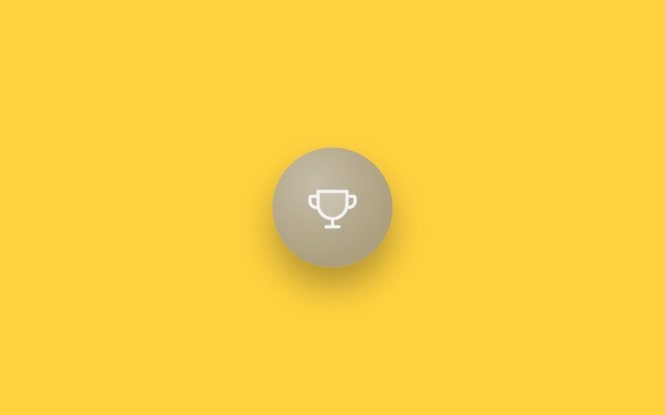
회색조 필터(grayscale·brightness)로 흐려진 트로피 배지가 scale(.85→1.12→.96→1)로 크게 튀어오르며 색을 되찾고, 그 순간 대각선 빛줄기가 opacity 0→1→0과 translateX로 배지 위를 한 번 스쳐 지나가 '방금 달성'을 강조한다.
쓰임게이미피케이션 대시보드 업적 목록, 온보딩 완료 보상 화면
filter grayscale→colorscale bounceshine sweep translateX
<main class="stage is-demo">
  <div class="badge" aria-label="업적 달성 — 첫 걸음">
    <svg class="badge__icon" viewBox="0 0 256 256" width="36" height="36" aria-hidden="true"><g fill="currentColor"><path d="M200,48v63.1c0,39.7-31.75,72.6-71.45,72.9A72,72,0,0,1,56,112V48Z" opacity=".2"/><path d="M232,64H208V48a8,8,0,0,0-8-8H56a8,8,0,0,0-8,8V64H24A16,16,0,0,0,8,80V96a40,40,0,0,0,40,40h3.65A80.13,80.13,0,0,0,120,191.61V216H96a8,8,0,0,0,0,16h64a8,8,0,0,0,0-16H136V191.58c31.94-3.23,58.44-25.64,68.08-55.58H208a40,40,0,0,0,40-40V80A16,16,0,0,0,232,64ZM48,120A24,24,0,0,1,24,96V80H48v32q0,4,.39,8Zm144-8.9c0,35.52-29,64.64-64,64.9a64,64,0,0,1-64-64V56H192ZM232,96a24,24,0,0,1-24,24h-.5a81.81,81.81,0,0,0,.5-8.9V80h24Z"/></g></svg>
    <span class="badge__shine" aria-hidden="true"></span>
  </div>
</main>
@use "../../../../site/static/demo-tokens" as *;
// ── 변수 3개 ──────────────────────────────────────────
$duration: $dur-loop; // 2s — 잠금 해제 바운스+샤인 한 주기
$easing: $ease-pop;
$color: #baa774; // 트로피 골드
@include stage($stage-yellow);
.badge {
position: relative;
width: 84px; height: 84px;
display: grid; place-items: center;
border-radius: 50%;
background: radial-gradient(circle at 35% 30%, mix(#fff, $color, 35%), $color 70%);
box-shadow: $shadow-raised;
overflow: hidden;
transform: scale(.85);
filter: grayscale(1) brightness(.85);
}
.badge__icon {
color: #fff;
position: relative;
z-index: 1;
}
.badge__shine {
position: absolute;
top: -20%; left: -60%;
width: 40%; height: 140%;
background: linear-gradient(115deg, transparent, rgba(255, 255, 255, .85), transparent);
transform: translateX(0) rotate(12deg);
opacity: 0;
}
.stage.is-demo .badge {
animation: unlock $duration $easing infinite;
}
.stage.is-demo .badge__shine {
animation: shine $duration $easing infinite;
}
@keyframes unlock {
0%, 30% { transform: scale(.85); filter: grayscale(1) brightness(.85); }
55% { transform: scale(1.12); filter: grayscale(0) brightness(1); }
70% { transform: scale(.96); }
82%, 100% { transform: scale(1); filter: grayscale(0) brightness(1); }
}
@keyframes shine {
0%, 55% { opacity: 0; transform: translateX(0) rotate(12deg); }
62% { opacity: 1; }
78%, 100% { opacity: 0; transform: translateX(340%) rotate(12deg); }
}
// ── 한 겹: unlock(55%) 순간 골드 링 파문 ──────────────────
// badge 는 overflow:hidden(샤인 클리핑) 이므로 링은 테두리 안쪽에서 바깥(테두리)로 확산되는 안팎 파문
.badge::after {
content: "";
position: absolute;
inset: 0;
border-radius: 50%;
border: 2px solid mix(#fff, #baa774, 25%);
transform: scale(.62);
opacity: 0;
}
.stage.is-demo .badge::after {
animation: unlock-ring $duration $easing infinite;
}
@keyframes unlock-ring {
0%, 45% { transform: scale(.62); opacity: 0; }
55% { transform: scale(.8); opacity: .8; }
82%, 100% { transform: scale(1.15); opacity: 0; }
}
@media (prefers-reduced-motion: reduce) {
.stage.is-demo .badge { animation: none; transform: scale(1); filter: none; }
.stage.is-demo .badge__shine { animation: none; opacity: 0; }
.stage.is-demo .badge::after { animation: none; opacity: 0; }
}html, body {
margin: 0;
overflow: hidden;
}
.stage {
box-sizing: border-box;
min-height: 100vh;
display: grid;
place-items: center;
margin: 0;
background: #ffd23f;
font-family: -apple-system, "Segoe UI", "Noto Sans KR", sans-serif;
padding: clamp(8px, 4vw, 24px);
}
.badge {
position: relative;
width: 84px;
height: 84px;
display: grid;
place-items: center;
border-radius: 50%;
background: radial-gradient(circle at 35% 30%, rgb(82.4117647059%, 77.568627451%, 64.568627451%), #baa774 70%);
box-shadow: 0 14px 24px rgba(23, 20, 26, 0.32);
overflow: hidden;
transform: scale(0.85);
filter: grayscale(1) brightness(0.85);
}
.badge__icon {
color: #fff;
position: relative;
z-index: 1;
}
.badge__shine {
position: absolute;
top: -20%;
left: -60%;
width: 40%;
height: 140%;
background: linear-gradient(115deg, transparent, rgba(255, 255, 255, 0.85), transparent);
transform: translateX(0) rotate(12deg);
opacity: 0;
}
.stage.is-demo .badge {
animation: unlock 2s cubic-bezier(0.2, 1.4, 0.4, 1) infinite;
}
.stage.is-demo .badge__shine {
animation: shine 2s cubic-bezier(0.2, 1.4, 0.4, 1) infinite;
}
@keyframes unlock {
0%, 30% {
transform: scale(0.85);
filter: grayscale(1) brightness(0.85);
}
55% {
transform: scale(1.12);
filter: grayscale(0) brightness(1);
}
70% {
transform: scale(0.96);
}
82%, 100% {
transform: scale(1);
filter: grayscale(0) brightness(1);
}
}
@keyframes shine {
0%, 55% {
opacity: 0;
transform: translateX(0) rotate(12deg);
}
62% {
opacity: 1;
}
78%, 100% {
opacity: 0;
transform: translateX(340%) rotate(12deg);
}
}
.badge::after {
content: "";
position: absolute;
inset: 0;
border-radius: 50%;
border: 2px solid rgb(79.7058823529%, 74.1176470588%, 59.1176470588%);
transform: scale(0.62);
opacity: 0;
}
.stage.is-demo .badge::after {
animation: unlock-ring 2s cubic-bezier(0.2, 1.4, 0.4, 1) infinite;
}
@keyframes unlock-ring {
0%, 45% {
transform: scale(0.62);
opacity: 0;
}
55% {
transform: scale(0.8);
opacity: 0.8;
}
82%, 100% {
transform: scale(1.15);
opacity: 0;
}
}
@media (prefers-reduced-motion: reduce) {
.stage.is-demo .badge {
animation: none;
transform: scale(1);
filter: none;
}
.stage.is-demo .badge__shine {
animation: none;
opacity: 0;
}
.stage.is-demo .badge::after {
animation: none;
opacity: 0;
}
}import type { CSSProperties } from "react";
import styles from "./AchievementBadgeUnlock.module.scss";
export type AchievementBadgeUnlockProps = {
duration?: number;
easing?: string;
color?: string;
};
export default function AchievementBadgeUnlock({
duration = 2000,
easing = "cubic-bezier(.2,1.4,.4,1)",
color = "#f5b301",
}: AchievementBadgeUnlockProps) {
const vars: CSSProperties = { "--duration": `${duration}ms`, "--easing": easing, "--color": color } as CSSProperties;
return (
<div className={styles.badge} style={vars} aria-label="achievement unlocked — first step">
<svg className={styles.icon} viewBox="0 0 256 256" width={36} height={36} aria-hidden="true">
<g fill="currentColor">
<path d="M200,48v63.1c0,39.7-31.75,72.6-71.45,72.9A72,72,0,0,1,56,112V48Z" opacity=".2" />
<path d="M232,64H208V48a8,8,0,0,0-8-8H56a8,8,0,0,0-8,8V64H24A16,16,0,0,0,8,80V96a40,40,0,0,0,40,40h3.65A80.13,80.13,0,0,0,120,191.61V216H96a8,8,0,0,0,0,16h64a8,8,0,0,0,0-16H136V191.58c31.94-3.23,58.44-25.64,68.08-55.58H208a40,40,0,0,0,40-40V80A16,16,0,0,0,232,64ZM48,120A24,24,0,0,1,24,96V80H48v32q0,4,.39,8Zm144-8.9c0,35.52-29,64.64-64,64.9a64,64,0,0,1-64-64V56H192ZM232,96a24,24,0,0,1-24,24h-.5a81.81,81.81,0,0,0,.5-8.9V80h24Z" />
</g>
</svg>
<span className={styles.shine} aria-hidden="true" />
</div>
);
}07 업적 배지 잠금 해제 애니메이션 — 측정 누적면적 7.692% · 움직인 프레임 13/23GODRICH 원작 · zip 에 SCSS·React 포함 · 태그 UI 디자인 9종 — 상태·우선순위·인증 배지 코드
이 데모가 속한 글
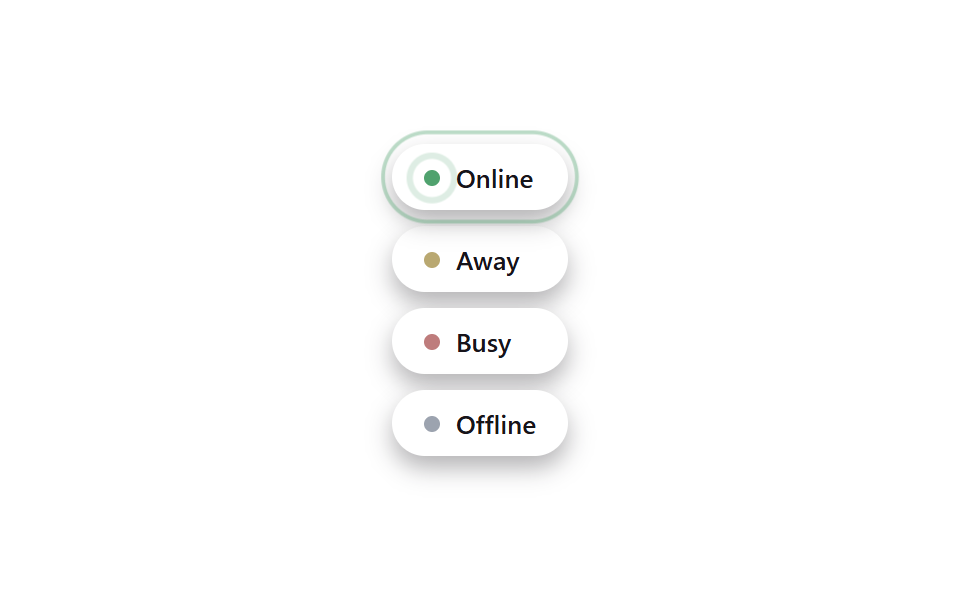 태그 UI 디자인 9종 — 상태·우선순위·인증 배지 코드태그 UI 디자인은 상태·카테고리·우선순위 같은 정보를 작은 알약이나 칩 모양으로 압축해 보여주는 장식이다. 온라인 점 하나, 우선순위 색 하나만 봐도 상태를 바로 알 수 있고, 움직임을 더하면 그대로 붙여서 훨씬 이 글의 데모 전부 보기