04Thẻ tính năng icon + số
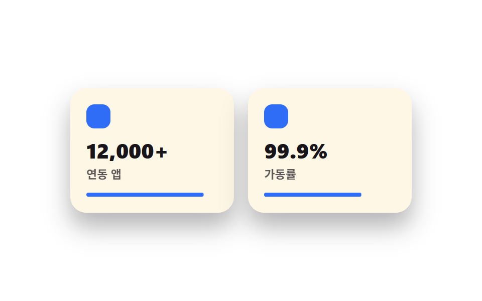
Mỗi tính năng có một icon và một con số nổi bật đặt lớn trong thẻ riêng, nên lướt đọc rất nhanh.
Dùng choTóm tắt tính năng ngay trên khối bảng giá, các section giới thiệu sản phẩm
숫자 강조아이콘 40px호버 살짝 뜸
<main class="stage">
  <section class="feat">
    <div class="feat__card is-demo">
      <span class="feat__icon" aria-hidden="true"></span>
      <p class="feat__num">12,000+</p>
      <p class="feat__label">Ứng dụng liên kết</p>
      <span class="feat__bar" aria-hidden="true"></span>
    </div>
    <div class="feat__card feat__card--b is-demo">
      <span class="feat__icon" aria-hidden="true"></span>
      <p class="feat__num">99.9%</p>
      <p class="feat__label">Thời gian hoạt động</p>
      <span class="feat__bar" aria-hidden="true"></span>
    </div>
  </section>
</main>
@use "../../../../site/static/demo-tokens" as *;
$duration: $dur-loop; // 두 카드가 채워지는 한 주기
$easing: $ease-out; // 채우는 곡선
$color: $subject-blue; // 아이콘·바 색
@include stage($stage-paper);
.feat {
width: clamp(220px, 76vw, 340px);
display: flex;
gap: clamp(10px, 3vw, 16px);
}
.feat__card {
flex: 1;
border-radius: $r-card;
background: $subject-cream;
box-shadow: $shadow-raised;
padding: clamp(12px, 3.4vw, 16px);
display: flex;
flex-direction: column;
gap: 6px;
}
.feat__icon {
width: 24px;
height: 24px;
border-radius: 8px;
background: $color;
margin-bottom: 4px;
}
.feat__num {
margin: 0;
color: $subject-ink;
font-weight: 800; font-size: clamp(17px, 4.6vw, 21px); line-height: 1.1;
}
.feat__label {
margin: 0;
color: $subject-ink;
opacity: .7;
font-weight: 600; font-size: clamp(10px, 2.4vw, 11.5px); line-height: 1.3;
}
.feat__bar {
display: block;
height: 4px;
border-radius: $r-pill;
background: $color;
margin-top: 4px;
transform-origin: left; // 규칙8: 왼쪽부터 차오르는 바
transform: scaleX(0);
animation: barFill $duration $easing infinite;
}
.feat__card--b .feat__bar { animation-delay: -1s; }
// 데모: 바가 왼쪽부터 차오르고, 다 차면 잠깐 머물다 비워진다
@keyframes barFill {
0% { transform: scaleX(0); }
40% { transform: scaleX(1); }
75% { transform: scaleX(1); }
100% { transform: scaleX(0); }
}
@media (prefers-reduced-motion: reduce) {
.feat__bar {
animation: none !important;
transform: scaleX(1);
}
}html, body {
margin: 0;
overflow: hidden;
}
.stage {
box-sizing: border-box;
min-height: 100vh;
display: grid;
place-items: center;
margin: 0;
background: #ffffff;
font-family: -apple-system, "Segoe UI", "Noto Sans KR", sans-serif;
padding: clamp(8px, 4vw, 24px);
}
.feat {
width: clamp(220px, 76vw, 340px);
display: flex;
gap: clamp(10px, 3vw, 16px);
}
.feat__card {
flex: 1;
border-radius: 16px;
background: #fff7e6;
box-shadow: 0 14px 24px rgba(23, 20, 26, 0.32);
padding: clamp(12px, 3.4vw, 16px);
display: flex;
flex-direction: column;
gap: 6px;
}
.feat__icon {
width: 24px;
height: 24px;
border-radius: 8px;
background: #2f6df6;
margin-bottom: 4px;
}
.feat__num {
margin: 0;
color: #17141a;
font-weight: 800;
font-size: clamp(17px, 4.6vw, 21px);
line-height: 1.1;
}
.feat__label {
margin: 0;
color: #17141a;
opacity: 0.7;
font-weight: 600;
font-size: clamp(10px, 2.4vw, 11.5px);
line-height: 1.3;
}
.feat__bar {
display: block;
height: 4px;
border-radius: 999px;
background: #2f6df6;
margin-top: 4px;
transform-origin: left;
transform: scaleX(0);
animation: barFill 2s ease-out infinite;
}
.feat__card--b .feat__bar {
animation-delay: -1s;
}
@keyframes barFill {
0% {
transform: scaleX(0);
}
40% {
transform: scaleX(1);
}
75% {
transform: scaleX(1);
}
100% {
transform: scaleX(0);
}
}
@media (prefers-reduced-motion: reduce) {
.feat__bar {
animation: none !important;
transform: scaleX(1);
}
}import type { CSSProperties } from "react";
import styles from "./BentoFeatures.module.scss";
export type BentoFeaturesProps = {
items?: { num: string; label: string }[];
duration?: number;
easing?: string;
color?: string;
};
type Vars = CSSProperties & { "--duration"?: string; "--easing"?: string; "--color"?: string };
export default function BentoFeatures({
items = [
{ num: "12,000+", label: "Connected apps" },
{ num: "99.9%", label: "Uptime" },
],
duration = 2000,
easing = "ease-out",
color = "#2f6df6",
}: BentoFeaturesProps) {
const vars: Vars = { "--duration": `${duration}ms`, "--easing": easing, "--color": color };
return (
<section className={styles.feat} style={vars}>
{items.map((it, i) => (
<div key={it.label} className={i === 1 ? `${styles.card} ${styles.cardB}` : styles.card}>
<span className={styles.icon} aria-hidden="true" />
<p className={styles.num}>{it.num}</p>
<p className={styles.label}>{it.label}</p>
<span className={styles.bar} aria-hidden="true" />
</div>
))}
</section>
);
}04 Thẻ tính năng icon + số — Diện tích đo được 0.728% · khung hình chuyển động 23/23Nguyên tác GODRICH · SCSS và React nằm trong tệp zip · Bento grid design — 9 phần landing đang thịnh
Bài viết chứa demo này
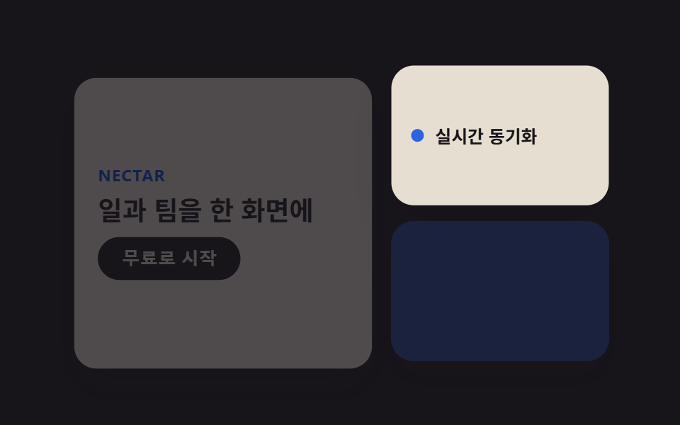 Bento grid design — 9 phần landing đang thịnhBento grid design là cách xếp các ô vuông to nhỏ khác nhau vào một grid như hộp cơm Nhật, đang thịnh trên Pinterest nhờ Xem tất cả demo trong bài này