Bento grid design — 9 phần landing đang thịnh
Bento grid design là cách xếp các ô vuông to nhỏ khác nhau vào một grid như hộp cơm Nhật, đang thịnh trên Pinterest nhờ landing SaaS.
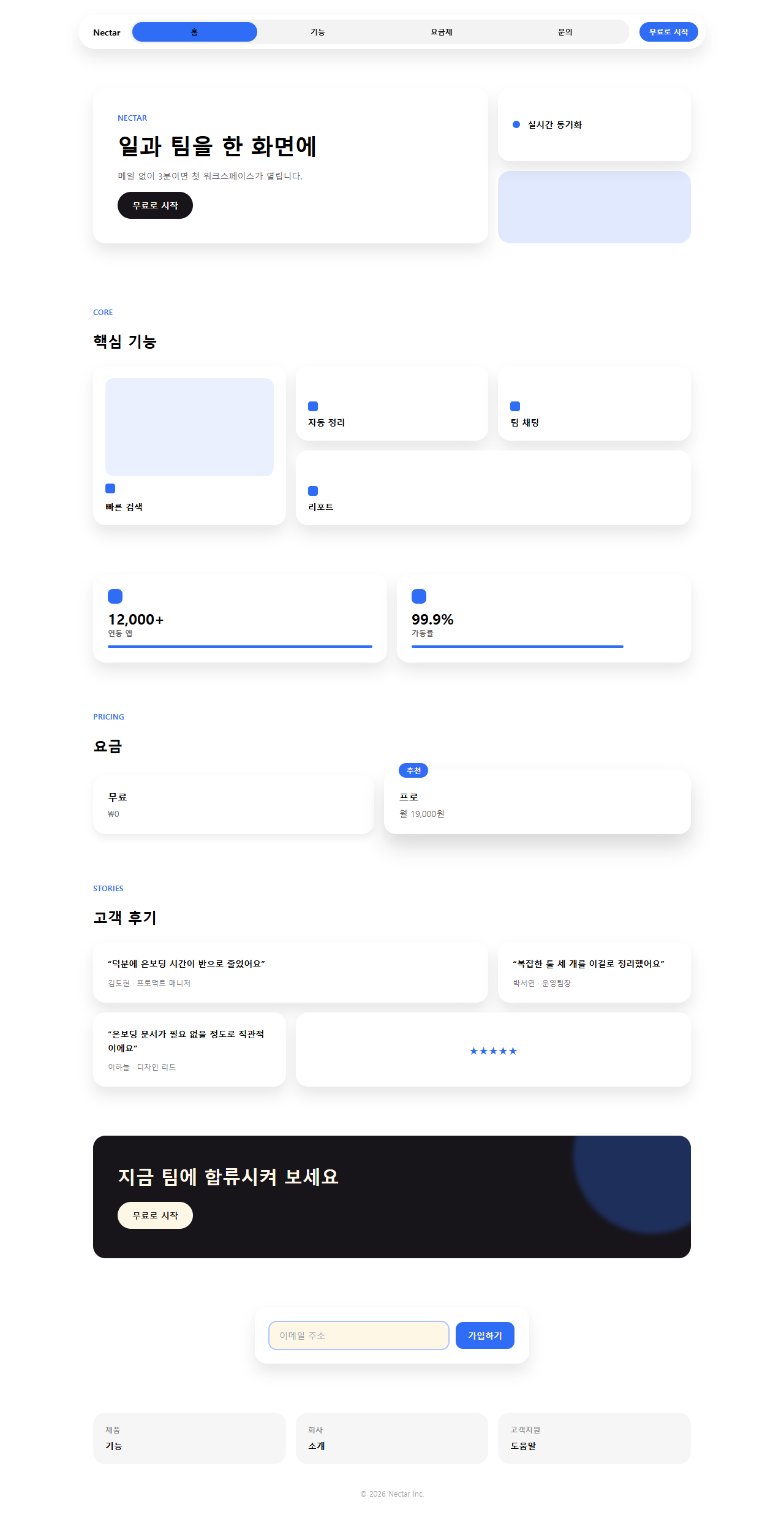
Dưới đây là landing one-page dựng thật bằng đúng phong cách này. Bạn cứ cuộn từ navigation đến footer để xem toàn bộ dòng chảy trước đã.

Chín bộ phận cấu thành one-page ở trên đã được tách từng mảnh và gom lại thành grid. Mỗi mảnh đi theo trình tự khách thật sự lướt qua trang: bắt mắt, ngó quanh, xem giá, dựng lòng tin, hành động, đăng ký.
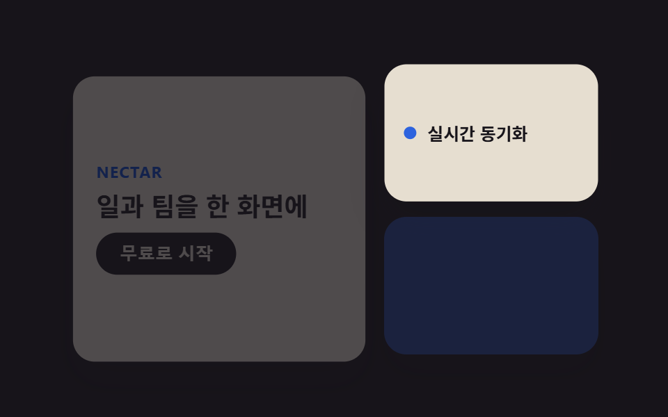 01 bento-grid-hero
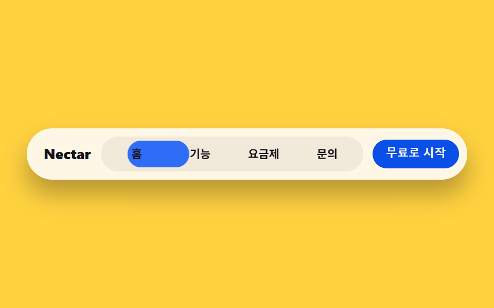 02 bento-grid-nav
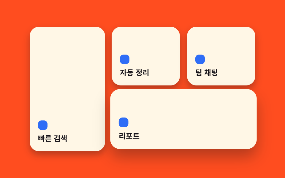 03 bento-grid-card-grid
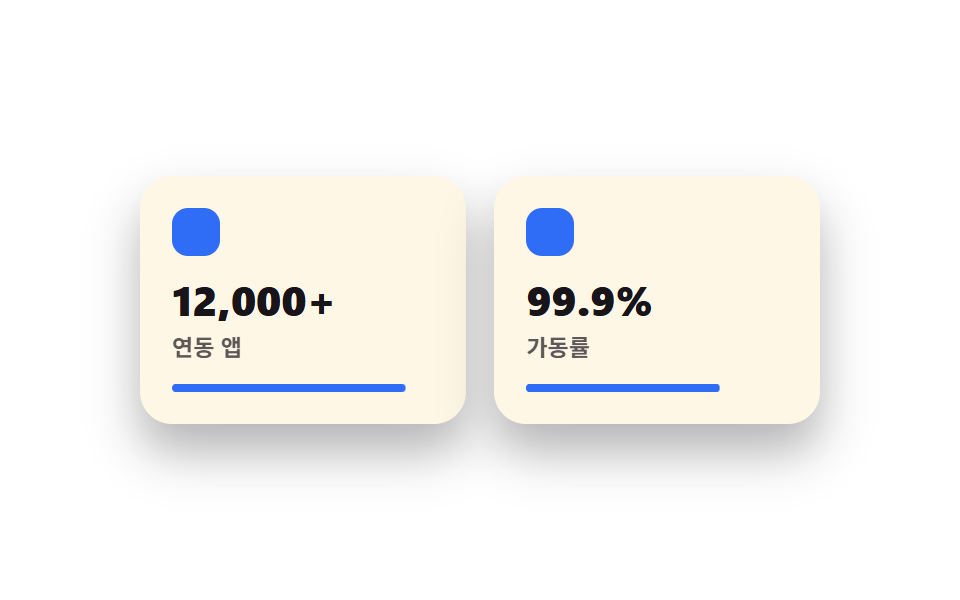 04 bento-grid-features
 05 bento-grid-pricing
 06 bento-grid-testimonials
 07 bento-grid-cta-band
 08 bento-grid-footer
 09 bento-grid-buttons-inputs
Tự chạy · bấm ô để tới mục đó · cả 9 trong một zip
- 01 Hero bento 2×2
- 02 Thanh điều hướng pill bo tròn
- 03 Lưới thẻ bento cốt lõi
- 04 Thẻ tính năng icon + số
- 05 Gói giá phân cấp theo cỡ ô
- 06 Thẻ trích dẫn rải trong lưới
- 07 Ô CTA ngang dài
- 08 Nhóm liên kết thành ô riêng
- 09 Nút pill radius 12
01Hero
Bạn thấy gì
Vùng hero được chia thành ba tile kích thước khác nhau thay vì một khối lớn duy nhất.
<main class="stage">
  <section class="hero">
    <div class="hero__tile hero__tile--main is-demo">
      <p class="hero__eyebrow">Nectar</p>
      <h2 class="hero__title">Việc và đội nhóm trên một màn hình</h2>
      <button class="hero__cta" type="button">Bắt đầu miễn phí</button>
    </div>
    <div class="hero__tile hero__tile--stat is-demo">
      <span class="hero__dot" aria-hidden="true"></span>
      <span class="hero__stat-label">Đồng bộ thời gian thực</span>
    </div>
    <div class="hero__tile hero__tile--visual is-demo" aria-hidden="true"></div>
  </section>
</main>
@use "../../../../site/static/demo-tokens" as *;
$duration: $dur-loop; // 카드가 뜨고 지는 한 주기
$easing: $ease-spring; // 등장 곡선
$color: $subject-blue; // 강조 색
@include stage($stage-ink);
.hero {
width: clamp(240px, 82vw, 380px);
height: clamp(160px, 46vw, 210px);
display: grid;
grid-template-columns: 1.4fr 1fr;
grid-template-rows: 1fr 1fr;
gap: clamp(8px, 2.4vw, 12px);
}
.hero__tile {
border-radius: $r-card;
background: $subject-cream;
box-shadow: $shadow-raised;
animation: heroIn $duration $easing infinite;
}
.hero__tile--main {
grid-row: 1 / 3;
display: flex;
flex-direction: column;
justify-content: center;
gap: clamp(6px, 1.6vw, 10px);
padding: clamp(12px, 3.6vw, 18px);
animation-delay: 0s;
}
.hero__tile--stat {
display: flex;
align-items: center;
gap: 8px;
padding: clamp(10px, 3vw, 14px);
animation-delay: -0.5s;
}
.hero__tile--visual {
background: $color;
opacity: .16;
animation-name: heroInFaint;
animation-delay: -1s;
}
.hero__eyebrow {
margin: 0;
color: $subject-blue-deep; // 밝은 면 위 파란 글자 — AA 4.5 (blog-design 글자 대비)
font-weight: 700; font-size: clamp(10px, 2.6vw, 12px); line-height: 1;
letter-spacing: .04em;
text-transform: uppercase;
}
.hero__title {
margin: 0;
color: $subject-ink;
font-weight: 700; font-size: clamp(15px, 4vw, 19px); line-height: 1.25;
}
.hero__cta {
align-self: flex-start;
border: 0;
border-radius: $r-pill;
background: $subject-ink;
color: $subject-cream;
padding: clamp(7px, 2vw, 9px) clamp(14px, 3.6vw, 18px);
font-weight: 600; font-size: clamp(11px, 2.8vw, 13px); line-height: 1;
}
.hero__dot {
width: 9px;
height: 9px;
border-radius: 50%;
background: $color;
flex: none;
}
.hero__stat-label {
color: $subject-ink;
font-weight: 600; font-size: clamp(10.5px, 2.6vw, 12.5px); line-height: 1.3;
}
// 데모: 세 칸이 살짝 다른 박자로 떠올랐다 가라앉는다 (WAAPI 시계가 잡을 수 있게 keyframes)
@keyframes heroIn {
0% { opacity: 0; transform: translateY(10px) scale(.97); }
22% { opacity: 1; transform: translateY(0) scale(1); }
78% { opacity: 1; transform: translateY(0) scale(1); }
100% { opacity: 0; transform: translateY(10px) scale(.97); }
}
@keyframes heroInFaint {
0% { opacity: 0; transform: translateY(10px) scale(.97); }
22% { opacity: .16; transform: translateY(0) scale(1); }
78% { opacity: .16; transform: translateY(0) scale(1); }
100% { opacity: 0; transform: translateY(10px) scale(.97); }
}
@media (prefers-reduced-motion: reduce) {
.hero__tile {
animation: none !important;
opacity: 1;
transform: none;
}
.hero__tile--visual { opacity: .16; }
}html, body {
margin: 0;
overflow: hidden;
}
.stage {
box-sizing: border-box;
min-height: 100vh;
display: grid;
place-items: center;
margin: 0;
background: #17141a;
font-family: -apple-system, "Segoe UI", "Noto Sans KR", sans-serif;
padding: clamp(8px, 4vw, 24px);
}
.hero {
width: clamp(240px, 82vw, 380px);
height: clamp(160px, 46vw, 210px);
display: grid;
grid-template-columns: 1.4fr 1fr;
grid-template-rows: 1fr 1fr;
gap: clamp(8px, 2.4vw, 12px);
}
.hero__tile {
border-radius: 16px;
background: #fff7e6;
box-shadow: 0 14px 24px rgba(23, 20, 26, 0.32);
animation: heroIn 2s cubic-bezier(0.2, 0.8, 0.2, 1) infinite;
}
.hero__tile--main {
grid-row: 1/3;
display: flex;
flex-direction: column;
justify-content: center;
gap: clamp(6px, 1.6vw, 10px);
padding: clamp(12px, 3.6vw, 18px);
animation-delay: 0s;
}
.hero__tile--stat {
display: flex;
align-items: center;
gap: 8px;
padding: clamp(10px, 3vw, 14px);
animation-delay: -0.5s;
}
.hero__tile--visual {
background: #2f6df6;
opacity: 0.16;
animation-name: heroInFaint;
animation-delay: -1s;
}
.hero__eyebrow {
margin: 0;
color: #0a4fe8;
font-weight: 700;
font-size: clamp(10px, 2.6vw, 12px);
line-height: 1;
letter-spacing: 0.04em;
text-transform: uppercase;
}
.hero__title {
margin: 0;
color: #17141a;
font-weight: 700;
font-size: clamp(15px, 4vw, 19px);
line-height: 1.25;
}
.hero__cta {
align-self: flex-start;
border: 0;
border-radius: 999px;
background: #17141a;
color: #fff7e6;
padding: clamp(7px, 2vw, 9px) clamp(14px, 3.6vw, 18px);
font-weight: 600;
font-size: clamp(11px, 2.8vw, 13px);
line-height: 1;
}
.hero__dot {
width: 9px;
height: 9px;
border-radius: 50%;
background: #2f6df6;
flex: none;
}
.hero__stat-label {
color: #17141a;
font-weight: 600;
font-size: clamp(10.5px, 2.6vw, 12.5px);
line-height: 1.3;
}
@keyframes heroIn {
0% {
opacity: 0;
transform: translateY(10px) scale(0.97);
}
22% {
opacity: 1;
transform: translateY(0) scale(1);
}
78% {
opacity: 1;
transform: translateY(0) scale(1);
}
100% {
opacity: 0;
transform: translateY(10px) scale(0.97);
}
}
@keyframes heroInFaint {
0% {
opacity: 0;
transform: translateY(10px) scale(0.97);
}
22% {
opacity: 0.16;
transform: translateY(0) scale(1);
}
78% {
opacity: 0.16;
transform: translateY(0) scale(1);
}
100% {
opacity: 0;
transform: translateY(10px) scale(0.97);
}
}
@media (prefers-reduced-motion: reduce) {
.hero__tile {
animation: none !important;
opacity: 1;
transform: none;
}
.hero__tile--visual {
opacity: 0.16;
}
}import type { CSSProperties } from "react";
import styles from "./BentoHero.module.scss";
export type BentoHeroProps = {
eyebrow?: string;
title?: string;
cta?: string;
stat?: string;
/** 한 주기(기본 2000ms) */
duration?: number;
easing?: string;
color?: string;
};
type Vars = CSSProperties & { "--duration"?: string; "--easing"?: string; "--color"?: string };
export default function BentoHero({
eyebrow = "Nectar",
title = "Your work and team, one screen",
cta = "Start for free",
stat = "Real-time sync",
duration = 2000,
easing = "cubic-bezier(.2,.8,.2,1)",
color = "#2f6df6",
}: BentoHeroProps) {
const vars: Vars = { "--duration": `${duration}ms`, "--easing": easing, "--color": color };
return (
<section className={styles.hero} style={vars}>
<div className={`${styles.tile} ${styles.tileMain}`}>
<p className={styles.eyebrow}>{eyebrow}</p>
<h2 className={styles.title}>{title}</h2>
<button type="button" className={styles.cta}>{cta}</button>
</div>
<div className={`${styles.tile} ${styles.tileStat}`}>
<span className={styles.dot} aria-hidden="true" />
<span className={styles.statLabel}>{stat}</span>
</div>
<div className={`${styles.tile} ${styles.tileVisual}`} aria-hidden="true" />
</section>
);
}01 · Hero bento 2×2 — Diện tích đo được 53.267% · khung hình chuyển động 16/23Nguyên tác GODRICH · SCSS và React nằm trong tệp zip · Xem mật khẩu
Dùng ở đâu
Tile lớn nhất giữ headline và nút CTA, hai ô nhỏ chỉ đặt một huy hiệu trạng thái và một khối màu.
<div class="grid grid-cols-3 grid-rows-2 gap-4">
  <div class="col-span-2 row-span-2 flex flex-col justify-center gap-4
              rounded-tile bg-white p-10 shadow-bento">
    <h1 class="text-4xl font-extrabold">Công việc và đội nhóm trên một màn hình</h1>
    <button class="w-fit rounded-pill bg-ink px-6 py-3 text-sm font-bold text-cream">
      Dùng thử miễn phí
    </button>
  </div>
  <div class="flex items-center gap-3 rounded-tile bg-white p-6 shadow-bento">
    <span class="h-3 w-3 rounded-full bg-accent"></span>
    <span class="text-sm font-semibold">Đồng bộ thời gian thực</span>
  </div>
</div>
02Navigation
Chuyện gì diễn ra trên màn hình
Toàn bộ menu nằm gọn trong một hình viên thuốc, còn chip màu đậm ở bên trong bám theo vị trí hiện tại và trượt qua lại giữa các mục.
<main class="stage">
  <nav class="navbar">
    <span class="navbar__brand">Nectar</span>
    <div class="navbar__pill is-demo">
      <span class="navbar__indicator" aria-hidden="true"></span>
      <span class="navbar__item">Trang chủ</span>
      <span class="navbar__item">Tính năng</span>
      <span class="navbar__item">Bảng giá</span>
      <span class="navbar__item">Liên hệ</span>
    </div>
    <button class="navbar__cta" type="button">Bắt đầu miễn phí</button>
  </nav>
</main>
@use "../../../../site/static/demo-tokens" as *;
$duration: $dur-loop; // 표시등이 네 항목을 도는 한 주기
$easing: $ease-spring; // 이동 곡선
$color: $subject-blue; // 표시등 색
@include stage($stage-yellow);
.navbar {
width: clamp(260px, 84vw, 420px);
display: flex;
align-items: center;
gap: clamp(8px, 2vw, 14px);
background: $subject-cream;
border-radius: $r-pill;
padding: 8px 8px 8px 16px;
box-shadow: $shadow-raised;
}
.navbar__brand {
color: $subject-ink;
font-weight: 800; font-size: clamp(12px, 3vw, 14px); line-height: 1;
flex: none;
}
.navbar__pill {
position: relative;
flex: 1;
display: grid;
grid-template-columns: repeat(4, 1fr);
background: rgba($subject-ink, .06);
border-radius: $r-pill;
padding: 4px;
}
.navbar__indicator {
position: absolute;
inset: 4px auto 4px 4px;
width: calc(25% - 4px);
border-radius: $r-pill;
background: $color;
animation: navSlide $duration $easing infinite;
}
.navbar__item {
position: relative;
z-index: 1;
text-align: center;
color: $subject-ink;
font-weight: 600; font-size: clamp(9.5px, 2.3vw, 11.5px); line-height: 1;
padding: clamp(6px, 1.6vw, 8px) 2px;
}
.navbar__cta {
flex: none;
border: 0;
border-radius: $r-pill;
background: $subject-blue-deep;
color: $subject-cream;
padding: clamp(7px, 1.8vw, 9px) clamp(12px, 2.6vw, 15px);
font-weight: 700; font-size: clamp(9.5px, 2.3vw, 11.5px); line-height: 1;
}
// 데모: 표시등이 홈 → 기능 → 요금제 → 문의 순으로 옮겨간 뒤 처음으로 돌아온다
@keyframes navSlide {
0% { transform: translateX(0%); }
12% { transform: translateX(0%); }
25% { transform: translateX(100%); }
37% { transform: translateX(100%); }
50% { transform: translateX(200%); }
62% { transform: translateX(200%); }
75% { transform: translateX(300%); }
87% { transform: translateX(300%); }
100% { transform: translateX(0%); }
}
@media (prefers-reduced-motion: reduce) {
.navbar__indicator {
animation: none !important;
transform: translateX(0%);
}
}html, body {
margin: 0;
overflow: hidden;
}
.stage {
box-sizing: border-box;
min-height: 100vh;
display: grid;
place-items: center;
margin: 0;
background: #ffd23f;
font-family: -apple-system, "Segoe UI", "Noto Sans KR", sans-serif;
padding: clamp(8px, 4vw, 24px);
}
.navbar {
width: clamp(260px, 84vw, 420px);
display: flex;
align-items: center;
gap: clamp(8px, 2vw, 14px);
background: #fff7e6;
border-radius: 999px;
padding: 8px 8px 8px 16px;
box-shadow: 0 14px 24px rgba(23, 20, 26, 0.32);
}
.navbar__brand {
color: #17141a;
font-weight: 800;
font-size: clamp(12px, 3vw, 14px);
line-height: 1;
flex: none;
}
.navbar__pill {
position: relative;
flex: 1;
display: grid;
grid-template-columns: repeat(4, 1fr);
background: rgba(23, 20, 26, 0.06);
border-radius: 999px;
padding: 4px;
}
.navbar__indicator {
position: absolute;
inset: 4px auto 4px 4px;
width: calc(25% - 4px);
border-radius: 999px;
background: #2f6df6;
animation: navSlide 2s cubic-bezier(0.2, 0.8, 0.2, 1) infinite;
}
.navbar__item {
position: relative;
z-index: 1;
text-align: center;
color: #17141a;
font-weight: 600;
font-size: clamp(9.5px, 2.3vw, 11.5px);
line-height: 1;
padding: clamp(6px, 1.6vw, 8px) 2px;
}
.navbar__cta {
flex: none;
border: 0;
border-radius: 999px;
background: #0a4fe8;
color: #fff7e6;
padding: clamp(7px, 1.8vw, 9px) clamp(12px, 2.6vw, 15px);
font-weight: 700;
font-size: clamp(9.5px, 2.3vw, 11.5px);
line-height: 1;
}
@keyframes navSlide {
0% {
transform: translateX(0%);
}
12% {
transform: translateX(0%);
}
25% {
transform: translateX(100%);
}
37% {
transform: translateX(100%);
}
50% {
transform: translateX(200%);
}
62% {
transform: translateX(200%);
}
75% {
transform: translateX(300%);
}
87% {
transform: translateX(300%);
}
100% {
transform: translateX(0%);
}
}
@media (prefers-reduced-motion: reduce) {
.navbar__indicator {
animation: none !important;
transform: translateX(0%);
}
}import type { CSSProperties } from "react";
import styles from "./BentoNav.module.scss";
export type BentoNavProps = {
brand?: string;
items?: string[];
cta?: string;
duration?: number;
easing?: string;
color?: string;
};
type Vars = CSSProperties & { "--duration"?: string; "--easing"?: string; "--color"?: string };
export default function BentoNav({
brand = "Nectar",
items = ["Home", "Features", "Pricing", "Contact"],
cta = "Start for free",
duration = 2000,
easing = "cubic-bezier(.2,.8,.2,1)",
color = "#2f6df6",
}: BentoNavProps) {
const vars: Vars = { "--duration": `${duration}ms`, "--easing": easing, "--color": color };
return (
<nav className={styles.navbar} style={vars}>
<span className={styles.brand}>{brand}</span>
<div className={styles.pill}>
<span className={styles.indicator} aria-hidden="true" />
{items.map((label) => (
<span key={label} className={styles.item}>{label}</span>
))}
</div>
<button type="button" className={styles.cta}>{cta}</button>
</nav>
);
}02 · Thanh điều hướng pill bo tròn — Diện tích đo được 4.193% · khung hình chuyển động 15/23Nguyên tác GODRICH · SCSS và React nằm trong tệp zip · Xem mật khẩu
Chỗ dùng
Thương hiệu và nút CTA cố định ở hai đầu bên ngoài viên thuốc.
<nav class="flex items-center gap-4 rounded-pill bg-white/80 backdrop-blur
            px-3 py-2 shadow-bento">
  <span class="pl-3 font-display font-extrabold text-sm">Nectar</span>
  <div class="relative flex flex-1 rounded-pill bg-ink/5 p-1">
    <span class="absolute inset-y-1 left-1 w-1/4 rounded-pill bg-accent"></span>
    <span class="relative z-10 flex-1 text-center text-xs font-semibold py-2">Trang chủ</span>
    <span class="relative z-10 flex-1 text-center text-xs font-semibold py-2">Tính năng</span>
  </div>
  <button class="rounded-pill bg-accent px-4 py-2 text-xs font-bold text-cream">
    Dùng thử miễn phí
  </button>
</nav>
03Card grid
Chuyển động thế nào
Đây là thân của cả phong cách.
<main class="stage">
  <section class="grid">
    <div class="grid__tile grid__tile--a is-demo">
      <span class="grid__dot" aria-hidden="true"></span>
      <p class="grid__label">Tìm kiếm tức thì</p>
    </div>
    <div class="grid__tile grid__tile--b is-demo">
      <span class="grid__dot" aria-hidden="true"></span>
      <p class="grid__label">Tự động sắp xếp</p>
    </div>
    <div class="grid__tile grid__tile--c is-demo">
      <span class="grid__dot" aria-hidden="true"></span>
      <p class="grid__label">Chat nhóm</p>
    </div>
    <div class="grid__tile grid__tile--d is-demo">
      <span class="grid__dot" aria-hidden="true"></span>
      <p class="grid__label">Báo cáo</p>
    </div>
  </section>
</main>
@use "../../../../site/static/demo-tokens" as *;
$duration: $dur-loop; // 네 칸을 도는 한 주기
$easing: $ease-pop; // 살짝 튀는 곡선
$color: $subject-blue; // 점 강조 색
@include stage($stage-orange);
.grid {
width: clamp(240px, 82vw, 380px);
height: clamp(160px, 46vw, 210px);
display: grid;
grid-template-columns: 1.1fr 1fr 1fr;
grid-template-rows: 1fr 1fr;
gap: clamp(8px, 2.4vw, 12px);
}
.grid__tile {
border-radius: $r-card;
background: $subject-cream;
box-shadow: $shadow-press;
padding: clamp(10px, 3vw, 14px);
display: flex;
flex-direction: column;
justify-content: flex-end;
gap: 6px;
animation: tileWave $duration $easing infinite;
}
.grid__tile--a { grid-row: 1 / 3; animation-delay: 0s; }
.grid__tile--b { grid-column: 2; grid-row: 1; animation-delay: -0.5s; }
.grid__tile--c { grid-column: 3; grid-row: 1; animation-delay: -1s; }
.grid__tile--d { grid-column: 2 / 4; grid-row: 2; animation-delay: -1.5s; }
.grid__dot {
width: 16px;
height: 16px;
border-radius: 6px;
background: $color;
}
.grid__label {
margin: 0;
color: $subject-ink;
font-weight: 600; font-size: clamp(10.5px, 2.6vw, 12.5px); line-height: 1.3;
}
// 데모: 칸마다 살짝 떠올랐다 가라앉는 물결이 시차를 두고 지나간다
@keyframes tileWave {
0% { transform: translateY(0) scale(1); box-shadow: $shadow-press; }
15% { transform: translateY(-5px) scale(1.02); box-shadow: $shadow-raised; }
30% { transform: translateY(0) scale(1); box-shadow: $shadow-press; }
100% { transform: translateY(0) scale(1); box-shadow: $shadow-press; }
}
@media (prefers-reduced-motion: reduce) {
.grid__tile {
animation: none !important;
transform: none;
box-shadow: $shadow-press;
}
}html, body {
margin: 0;
overflow: hidden;
}
.stage {
box-sizing: border-box;
min-height: 100vh;
display: grid;
place-items: center;
margin: 0;
background: #ff4d1f;
font-family: -apple-system, "Segoe UI", "Noto Sans KR", sans-serif;
padding: clamp(8px, 4vw, 24px);
}
.grid {
width: clamp(240px, 82vw, 380px);
height: clamp(160px, 46vw, 210px);
display: grid;
grid-template-columns: 1.1fr 1fr 1fr;
grid-template-rows: 1fr 1fr;
gap: clamp(8px, 2.4vw, 12px);
}
.grid__tile {
border-radius: 16px;
background: #fff7e6;
box-shadow: 0 6px 12px rgba(23, 20, 26, 0.32);
padding: clamp(10px, 3vw, 14px);
display: flex;
flex-direction: column;
justify-content: flex-end;
gap: 6px;
animation: tileWave 2s cubic-bezier(0.2, 1.4, 0.4, 1) infinite;
}
.grid__tile--a {
grid-row: 1/3;
animation-delay: 0s;
}
.grid__tile--b {
grid-column: 2;
grid-row: 1;
animation-delay: -0.5s;
}
.grid__tile--c {
grid-column: 3;
grid-row: 1;
animation-delay: -1s;
}
.grid__tile--d {
grid-column: 2/4;
grid-row: 2;
animation-delay: -1.5s;
}
.grid__dot {
width: 16px;
height: 16px;
border-radius: 6px;
background: #2f6df6;
}
.grid__label {
margin: 0;
color: #17141a;
font-weight: 600;
font-size: clamp(10.5px, 2.6vw, 12.5px);
line-height: 1.3;
}
@keyframes tileWave {
0% {
transform: translateY(0) scale(1);
box-shadow: 0 6px 12px rgba(23, 20, 26, 0.32);
}
15% {
transform: translateY(-5px) scale(1.02);
box-shadow: 0 14px 24px rgba(23, 20, 26, 0.32);
}
30% {
transform: translateY(0) scale(1);
box-shadow: 0 6px 12px rgba(23, 20, 26, 0.32);
}
100% {
transform: translateY(0) scale(1);
box-shadow: 0 6px 12px rgba(23, 20, 26, 0.32);
}
}
@media (prefers-reduced-motion: reduce) {
.grid__tile {
animation: none !important;
transform: none;
box-shadow: 0 6px 12px rgba(23, 20, 26, 0.32);
}
}import type { CSSProperties } from "react";
import styles from "./BentoCardGrid.module.scss";
export type BentoCardGridProps = {
labels?: [string, string, string, string];
duration?: number;
easing?: string;
color?: string;
};
type Vars = CSSProperties & { "--duration"?: string; "--easing"?: string; "--color"?: string };
export default function BentoCardGrid({
labels = ["Instant search", "Auto-organize", "Team chat", "Reports"],
duration = 2000,
easing = "cubic-bezier(.2,1.4,.4,1)",
color = "#2f6df6",
}: BentoCardGridProps) {
const vars: Vars = { "--duration": `${duration}ms`, "--easing": easing, "--color": color };
const cls = [styles.tileA, styles.tileB, styles.tileC, styles.tileD];
return (
<section className={styles.grid} style={vars}>
{labels.map((label, i) => (
<div key={label} className={`${styles.tile} ${cls[i]}`}>
<span className={styles.dot} aria-hidden="true" />
<p className={styles.label}>{label}</p>
</div>
))}
</section>
);
}03 · Lưới thẻ bento cốt lõi — Diện tích đo được 17.204% · khung hình chuyển động 20/23Nguyên tác GODRICH · SCSS và React nằm trong tệp zip · Xem mật khẩu
Khi nào dùng bento grid layout css
Mỗi ô chiếm số cột và số hàng khác nhau, nên khi lướt nhanh, mắt bạn dừng ở ô to nhất trước rồi mới chảy sang những ô còn lại.
<div class="grid grid-cols-3 grid-rows-2 gap-4">
  <div class="row-span-2 flex flex-col justify-end gap-3 rounded-tile
              bg-white p-5 shadow-bento hover:shadow-bento-hover transition-shadow">
    <div class="flex-1 rounded-[14px] bg-accent/10"></div>
    <p class="text-sm font-semibold">Tìm nhanh</p>
  </div>
  <div class="rounded-tile bg-white p-5 shadow-bento">Tự sắp xếp</div>
  <div class="col-span-2 rounded-tile bg-white p-5 shadow-bento">Báo cáo</div>
</div>
04Danh sách tính năng
Bạn thấy gì
Mỗi tính năng có sẵn chỗ cho icon và một con số nhấn to đùng trong card của nó, nhờ vậy lướt qua là nắm được ngay.
<main class="stage">
  <section class="feat">
    <div class="feat__card is-demo">
      <span class="feat__icon" aria-hidden="true"></span>
      <p class="feat__num">12,000+</p>
      <p class="feat__label">Ứng dụng liên kết</p>
      <span class="feat__bar" aria-hidden="true"></span>
    </div>
    <div class="feat__card feat__card--b is-demo">
      <span class="feat__icon" aria-hidden="true"></span>
      <p class="feat__num">99.9%</p>
      <p class="feat__label">Thời gian hoạt động</p>
      <span class="feat__bar" aria-hidden="true"></span>
    </div>
  </section>
</main>
@use "../../../../site/static/demo-tokens" as *;
$duration: $dur-loop; // 두 카드가 채워지는 한 주기
$easing: $ease-out; // 채우는 곡선
$color: $subject-blue; // 아이콘·바 색
@include stage($stage-paper);
.feat {
width: clamp(220px, 76vw, 340px);
display: flex;
gap: clamp(10px, 3vw, 16px);
}
.feat__card {
flex: 1;
border-radius: $r-card;
background: $subject-cream;
box-shadow: $shadow-raised;
padding: clamp(12px, 3.4vw, 16px);
display: flex;
flex-direction: column;
gap: 6px;
}
.feat__icon {
width: 24px;
height: 24px;
border-radius: 8px;
background: $color;
margin-bottom: 4px;
}
.feat__num {
margin: 0;
color: $subject-ink;
font-weight: 800; font-size: clamp(17px, 4.6vw, 21px); line-height: 1.1;
}
.feat__label {
margin: 0;
color: $subject-ink;
opacity: .7;
font-weight: 600; font-size: clamp(10px, 2.4vw, 11.5px); line-height: 1.3;
}
.feat__bar {
display: block;
height: 4px;
border-radius: $r-pill;
background: $color;
margin-top: 4px;
transform-origin: left; // 규칙8: 왼쪽부터 차오르는 바
transform: scaleX(0);
animation: barFill $duration $easing infinite;
}
.feat__card--b .feat__bar { animation-delay: -1s; }
// 데모: 바가 왼쪽부터 차오르고, 다 차면 잠깐 머물다 비워진다
@keyframes barFill {
0% { transform: scaleX(0); }
40% { transform: scaleX(1); }
75% { transform: scaleX(1); }
100% { transform: scaleX(0); }
}
@media (prefers-reduced-motion: reduce) {
.feat__bar {
animation: none !important;
transform: scaleX(1);
}
}html, body {
margin: 0;
overflow: hidden;
}
.stage {
box-sizing: border-box;
min-height: 100vh;
display: grid;
place-items: center;
margin: 0;
background: #ffffff;
font-family: -apple-system, "Segoe UI", "Noto Sans KR", sans-serif;
padding: clamp(8px, 4vw, 24px);
}
.feat {
width: clamp(220px, 76vw, 340px);
display: flex;
gap: clamp(10px, 3vw, 16px);
}
.feat__card {
flex: 1;
border-radius: 16px;
background: #fff7e6;
box-shadow: 0 14px 24px rgba(23, 20, 26, 0.32);
padding: clamp(12px, 3.4vw, 16px);
display: flex;
flex-direction: column;
gap: 6px;
}
.feat__icon {
width: 24px;
height: 24px;
border-radius: 8px;
background: #2f6df6;
margin-bottom: 4px;
}
.feat__num {
margin: 0;
color: #17141a;
font-weight: 800;
font-size: clamp(17px, 4.6vw, 21px);
line-height: 1.1;
}
.feat__label {
margin: 0;
color: #17141a;
opacity: 0.7;
font-weight: 600;
font-size: clamp(10px, 2.4vw, 11.5px);
line-height: 1.3;
}
.feat__bar {
display: block;
height: 4px;
border-radius: 999px;
background: #2f6df6;
margin-top: 4px;
transform-origin: left;
transform: scaleX(0);
animation: barFill 2s ease-out infinite;
}
.feat__card--b .feat__bar {
animation-delay: -1s;
}
@keyframes barFill {
0% {
transform: scaleX(0);
}
40% {
transform: scaleX(1);
}
75% {
transform: scaleX(1);
}
100% {
transform: scaleX(0);
}
}
@media (prefers-reduced-motion: reduce) {
.feat__bar {
animation: none !important;
transform: scaleX(1);
}
}import type { CSSProperties } from "react";
import styles from "./BentoFeatures.module.scss";
export type BentoFeaturesProps = {
items?: { num: string; label: string }[];
duration?: number;
easing?: string;
color?: string;
};
type Vars = CSSProperties & { "--duration"?: string; "--easing"?: string; "--color"?: string };
export default function BentoFeatures({
items = [
{ num: "12,000+", label: "Connected apps" },
{ num: "99.9%", label: "Uptime" },
],
duration = 2000,
easing = "ease-out",
color = "#2f6df6",
}: BentoFeaturesProps) {
const vars: Vars = { "--duration": `${duration}ms`, "--easing": easing, "--color": color };
return (
<section className={styles.feat} style={vars}>
{items.map((it, i) => (
<div key={it.label} className={i === 1 ? `${styles.card} ${styles.cardB}` : styles.card}>
<span className={styles.icon} aria-hidden="true" />
<p className={styles.num}>{it.num}</p>
<p className={styles.label}>{it.label}</p>
<span className={styles.bar} aria-hidden="true" />
</div>
))}
</section>
);
}04 · Thẻ tính năng icon + số — Diện tích đo được 0.728% · khung hình chuyển động 23/23Nguyên tác GODRICH · SCSS và React nằm trong tệp zip · Xem mật khẩu
Dùng ở đâu
Thanh mỏng nằm dưới con số diễn họa độ lớn của giá trị đó.
<div class="flex gap-4">
  <div class="flex-1 rounded-tile bg-white p-6 shadow-bento">
    <span class="mb-2 block h-6 w-6 rounded-lg bg-accent"></span>
    <p class="text-2xl font-extrabold">12,000+</p>
    <p class="text-xs font-semibold text-ink/70">App tích hợp</p>
    <span class="mt-3 block h-1 w-full rounded-pill bg-accent"></span>
  </div>
</div>
05Bảng giá
Chuyện gì diễn ra trên màn hình
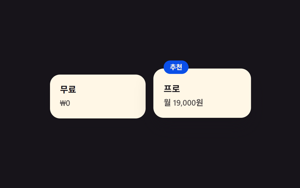
Chỉ riêng gói đề xuất được ô to hơn 1.1 lần và đeo thêm badge, nên chưa cần bảng so sánh bạn cũng thấy ngay bên nào đang được đẩy.
<main class="stage">
  <section class="pricing">
    <div class="pricing__tile pricing__tile--basic">
      <p class="pricing__plan">Miễn phí</p>
      <p class="pricing__price">₩0</p>
    </div>
    <div class="pricing__tile pricing__tile--pro is-demo">
      <span class="pricing__badge">Đề xuất</span>
      <p class="pricing__plan">Pro</p>
      <p class="pricing__price">19.000đ/tháng</p>
    </div>
  </section>
</main>
@use "../../../../site/static/demo-tokens" as *;
$duration: $dur-loop; // 추천 칸이 숨쉬는 한 주기
$easing: $ease-spring; // 배지가 튀는 곡선
$color: $subject-blue-deep; // 배지 색 (크림 글자가 얹히므로 진한 파랑)
@include stage($stage-ink);
.pricing {
width: clamp(220px, 76vw, 320px);
display: flex;
align-items: flex-end;
gap: clamp(10px, 3vw, 14px);
}
.pricing__tile {
flex: 1;
border-radius: $r-card;
padding: clamp(12px, 3.4vw, 16px);
display: flex;
flex-direction: column;
gap: 4px;
}
.pricing__tile--basic {
background: $subject-cream;
box-shadow: $shadow-press;
}
.pricing__tile--pro {
position: relative;
background: $subject-cream;
box-shadow: $shadow-raised;
padding-top: clamp(20px, 5vw, 26px);
transform-origin: bottom center; // 규칙8: 바닥 붙은 채 위로 숨쉼
animation: proBreathe $duration $easing infinite;
}
.pricing__badge {
position: absolute;
top: -10px;
left: clamp(12px, 3.4vw, 16px);
background: $color;
color: $subject-cream;
border-radius: $r-pill;
padding: 3px 10px;
font-weight: 700; font-size: clamp(9px, 2.2vw, 10.5px); line-height: 1.4;
animation: badgeBounce $duration $easing infinite;
}
.pricing__plan {
margin: 0;
color: $subject-ink;
font-weight: 700; font-size: clamp(12px, 3vw, 14px); line-height: 1.2;
}
.pricing__price {
margin: 0;
color: $subject-ink;
opacity: .75;
font-weight: 600; font-size: clamp(11px, 2.6vw, 12.5px); line-height: 1.3;
}
// 데모: 추천 칸이 살짝 커졌다 돌아오고, 배지는 그 위에서 한 번 더 튄다
@keyframes proBreathe {
0%, 100% { transform: scale(1); }
50% { transform: scale(1.035); }
}
@keyframes badgeBounce {
0%, 100% { transform: translateY(0); }
45% { transform: translateY(-4px); }
55% { transform: translateY(-4px); }
}
@media (prefers-reduced-motion: reduce) {
.pricing__tile--pro,
.pricing__badge {
animation: none !important;
transform: none;
}
}html, body {
margin: 0;
overflow: hidden;
}
.stage {
box-sizing: border-box;
min-height: 100vh;
display: grid;
place-items: center;
margin: 0;
background: #17141a;
font-family: -apple-system, "Segoe UI", "Noto Sans KR", sans-serif;
padding: clamp(8px, 4vw, 24px);
}
.pricing {
width: clamp(220px, 76vw, 320px);
display: flex;
align-items: flex-end;
gap: clamp(10px, 3vw, 14px);
}
.pricing__tile {
flex: 1;
border-radius: 16px;
padding: clamp(12px, 3.4vw, 16px);
display: flex;
flex-direction: column;
gap: 4px;
}
.pricing__tile--basic {
background: #fff7e6;
box-shadow: 0 6px 12px rgba(23, 20, 26, 0.32);
}
.pricing__tile--pro {
position: relative;
background: #fff7e6;
box-shadow: 0 14px 24px rgba(23, 20, 26, 0.32);
padding-top: clamp(20px, 5vw, 26px);
transform-origin: bottom center;
animation: proBreathe 2s cubic-bezier(0.2, 0.8, 0.2, 1) infinite;
}
.pricing__badge {
position: absolute;
top: -10px;
left: clamp(12px, 3.4vw, 16px);
background: #0a4fe8;
color: #fff7e6;
border-radius: 999px;
padding: 3px 10px;
font-weight: 700;
font-size: clamp(9px, 2.2vw, 10.5px);
line-height: 1.4;
animation: badgeBounce 2s cubic-bezier(0.2, 0.8, 0.2, 1) infinite;
}
.pricing__plan {
margin: 0;
color: #17141a;
font-weight: 700;
font-size: clamp(12px, 3vw, 14px);
line-height: 1.2;
}
.pricing__price {
margin: 0;
color: #17141a;
opacity: 0.75;
font-weight: 600;
font-size: clamp(11px, 2.6vw, 12.5px);
line-height: 1.3;
}
@keyframes proBreathe {
0%, 100% {
transform: scale(1);
}
50% {
transform: scale(1.035);
}
}
@keyframes badgeBounce {
0%, 100% {
transform: translateY(0);
}
45% {
transform: translateY(-4px);
}
55% {
transform: translateY(-4px);
}
}
@media (prefers-reduced-motion: reduce) {
.pricing__tile--pro,
.pricing__badge {
animation: none !important;
transform: none;
}
}import type { CSSProperties } from "react";
import styles from "./BentoPricing.module.scss";
export type BentoPricingProps = {
basicLabel?: string;
basicPrice?: string;
proLabel?: string;
proPrice?: string;
badge?: string;
duration?: number;
easing?: string;
color?: string;
};
type Vars = CSSProperties & { "--duration"?: string; "--easing"?: string; "--color"?: string };
export default function BentoPricing({
basicLabel = "Free",
basicPrice = "$0",
proLabel = "Pro",
proPrice = "$19/mo",
badge = "Recommended",
duration = 2000,
easing = "cubic-bezier(.2,.8,.2,1)",
color = "#0a4fe8",
}: BentoPricingProps) {
const vars: Vars = { "--duration": `${duration}ms`, "--easing": easing, "--color": color };
return (
<section className={styles.pricing} style={vars}>
<div className={`${styles.tile} ${styles.basic}`}>
<p className={styles.plan}>{basicLabel}</p>
<p className={styles.price}>{basicPrice}</p>
</div>
<div className={`${styles.tile} ${styles.pro}`}>
<span className={styles.badge}>{badge}</span>
<p className={styles.plan}>{proLabel}</p>
<p className={styles.price}>{proPrice}</p>
</div>
</section>
);
}05 · Gói giá phân cấp theo cỡ ô — Diện tích đo được 1.839% · khung hình chuyển động 21/23Nguyên tác GODRICH · SCSS và React nằm trong tệp zip · Xem mật khẩu
Chỗ dùng
Các gói còn lại lùi về nền nhạt.
<div class="flex items-end gap-4">
  <div class="flex-1 rounded-tile bg-white/60 p-6">
    <p class="font-bold">Miễn phí</p>
  </div>
  <div class="relative flex-[1.1] rounded-tile bg-white pt-8 p-6 shadow-bento-hover">
    <span class="absolute -top-3 left-6 rounded-pill bg-accent px-3 py-1
                 text-xs font-bold text-cream">Đề xuất</span>
    <p class="font-bold">Pro</p>
    <p class="mt-1 text-sm text-ink/70">199.000₫/tháng</p>
  </div>
</div>
06Đánh giá
Chuyển động thế nào
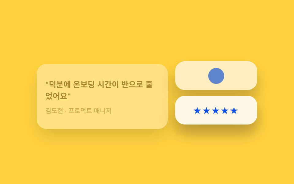
Card trích lời đánh giá được rải rác lẫn giữa các ô khác, nên không bị nhìn như dãy quảng cáo xếp hàng.
<main class="stage">
  <section class="testi">
    <div class="testi__tile testi__tile--quote is-demo">
      <p class="testi__text">"Thời gian onboarding giảm một nửa nhờ nó."</p>
      <p class="testi__by">Kim Do-hyun · Quản lý sản phẩm</p>
    </div>
    <div class="testi__tile testi__tile--avatar is-demo" aria-hidden="true"></div>
    <div class="testi__tile testi__tile--stars is-demo" aria-hidden="true">★★★★★</div>
  </section>
</main>
@use "../../../../site/static/demo-tokens" as *;
$duration: $dur-loop; // 세 칸이 스치듯 들어오는 한 주기
$easing: $ease-spring; // 등장 곡선
$color: $subject-blue; // 별점 색
@include stage($stage-yellow);
.testi {
width: clamp(240px, 82vw, 360px);
display: grid;
grid-template-columns: 1.6fr 1fr;
grid-template-rows: 1fr 1fr;
gap: clamp(8px, 2.4vw, 12px);
}
.testi__tile {
border-radius: $r-card;
background: $subject-cream;
box-shadow: $shadow-raised;
padding: clamp(10px, 3vw, 14px);
animation: driftIn $duration $easing infinite;
}
.testi__tile--quote {
grid-row: 1 / 3;
display: flex;
flex-direction: column;
justify-content: center;
gap: 8px;
animation-delay: 0s;
}
.testi__tile--avatar {
position: relative;
animation-delay: -0.6s;
}
.testi__tile--avatar::before {
content: "";
position: absolute;
inset: 0;
margin: auto;
width: 26px;
height: 26px;
border-radius: 50%;
background: $color;
}
.testi__tile--stars {
display: grid;
place-items: center;
color: $subject-blue-deep; // 밝은 면 위 파란 글자 — AA 4.5 (blog-design 글자 대비)
letter-spacing: 2px;
font-size: clamp(11px, 2.8vw, 13px);
animation-delay: -1.2s;
}
.testi__text {
margin: 0;
color: $subject-ink;
font-weight: 600; font-size: clamp(11px, 2.8vw, 13px); line-height: 1.5;
}
.testi__by {
margin: 0;
color: $subject-ink;
opacity: .65;
font-weight: 500; font-size: clamp(9.5px, 2.2vw, 11px); line-height: 1.3;
}
// 데모: 세 칸이 아래서 살짝 미끄러져 들어왔다 멈췄다 사라진다 (시차)
@keyframes driftIn {
0% { opacity: 0; transform: translateY(12px); }
20% { opacity: 1; transform: translateY(0); }
70% { opacity: 1; transform: translateY(0); }
100% { opacity: 0; transform: translateY(12px); }
}
@media (prefers-reduced-motion: reduce) {
.testi__tile {
animation: none !important;
opacity: 1;
transform: none;
}
}html, body {
margin: 0;
overflow: hidden;
}
.stage {
box-sizing: border-box;
min-height: 100vh;
display: grid;
place-items: center;
margin: 0;
background: #ffd23f;
font-family: -apple-system, "Segoe UI", "Noto Sans KR", sans-serif;
padding: clamp(8px, 4vw, 24px);
}
.testi {
width: clamp(240px, 82vw, 360px);
display: grid;
grid-template-columns: 1.6fr 1fr;
grid-template-rows: 1fr 1fr;
gap: clamp(8px, 2.4vw, 12px);
}
.testi__tile {
border-radius: 16px;
background: #fff7e6;
box-shadow: 0 14px 24px rgba(23, 20, 26, 0.32);
padding: clamp(10px, 3vw, 14px);
animation: driftIn 2s cubic-bezier(0.2, 0.8, 0.2, 1) infinite;
}
.testi__tile--quote {
grid-row: 1/3;
display: flex;
flex-direction: column;
justify-content: center;
gap: 8px;
animation-delay: 0s;
}
.testi__tile--avatar {
position: relative;
animation-delay: -0.6s;
}
.testi__tile--avatar::before {
content: "";
position: absolute;
inset: 0;
margin: auto;
width: 26px;
height: 26px;
border-radius: 50%;
background: #2f6df6;
}
.testi__tile--stars {
display: grid;
place-items: center;
color: #0a4fe8;
letter-spacing: 2px;
font-size: clamp(11px, 2.8vw, 13px);
animation-delay: -1.2s;
}
.testi__text {
margin: 0;
color: #17141a;
font-weight: 600;
font-size: clamp(11px, 2.8vw, 13px);
line-height: 1.5;
}
.testi__by {
margin: 0;
color: #17141a;
opacity: 0.65;
font-weight: 500;
font-size: clamp(9.5px, 2.2vw, 11px);
line-height: 1.3;
}
@keyframes driftIn {
0% {
opacity: 0;
transform: translateY(12px);
}
20% {
opacity: 1;
transform: translateY(0);
}
70% {
opacity: 1;
transform: translateY(0);
}
100% {
opacity: 0;
transform: translateY(12px);
}
}
@media (prefers-reduced-motion: reduce) {
.testi__tile {
animation: none !important;
opacity: 1;
transform: none;
}
}import type { CSSProperties } from "react";
import styles from "./BentoTestimonials.module.scss";
export type BentoTestimonialsProps = {
quote?: string;
by?: string;
duration?: number;
easing?: string;
color?: string;
};
type Vars = CSSProperties & { "--duration"?: string; "--easing"?: string; "--color"?: string };
export default function BentoTestimonials({
quote = "Onboarding time dropped by half for us.",
by = "Kim Do-hyun · Product Manager",
duration = 2000,
easing = "cubic-bezier(.2,.8,.2,1)",
color = "#2f6df6",
}: BentoTestimonialsProps) {
const vars: Vars = { "--duration": `${duration}ms`, "--easing": easing, "--color": color };
return (
<section className={styles.testi} style={vars}>
<div className={`${styles.tile} ${styles.quote}`}>
<p className={styles.text}>“{quote}”</p>
<p className={styles.by}>{by}</p>
</div>
<div className={`${styles.tile} ${styles.avatar}`} aria-hidden="true" />
<div className={`${styles.tile} ${styles.stars}`} aria-hidden="true">★★★★★</div>
</section>
);
}06 · Thẻ trích dẫn rải trong lưới — Diện tích đo được 33.467% · khung hình chuyển động 16/23Nguyên tác GODRICH · SCSS và React nằm trong tệp zip · Xem mật khẩu
Dùng khi nào
Thêm một ô sao đánh giá để tín hiệu tin cậy lặp lại thêm lần nữa bằng hình ảnh.
<div class="grid grid-cols-3 gap-4">
  <div class="col-span-2 rounded-tile bg-white p-6 shadow-bento">
    <p class="text-sm font-semibold">"Nhờ nó thời gian onboarding của chúng tôi giảm một nửa"</p>
    <p class="mt-3 text-xs text-ink/60">Kim Do-hyun · Product Manager</p>
  </div>
  <div class="rounded-tile bg-white p-6 shadow-bento">
    <p class="text-sm font-semibold">"Ba công cụ rối rắm giờ gộp hết vào một"</p>
  </div>
</div>
07Dải CTA
Bạn thấy gì
Trong grid có đúng một ô trải hết chiều ngang, nên nơi ánh nhìn dừng lại cuối cùng chính là nó.
<main class="stage">
  <section class="cta">
    <span class="cta__glow is-demo" aria-hidden="true"></span>
    <h3 class="cta__title">Mời cả đội vào ngay hôm nay</h3>
    <button class="cta__btn is-demo" type="button">Bắt đầu miễn phí</button>
  </section>
</main>
@use "../../../../site/static/demo-tokens" as *;
$duration: $dur-loop; // 은은한 빛이 숨쉬는 한 주기
$easing: $ease-out; // 번짐 곡선
$color: $subject-blue; // 강조 색
@include stage($stage-orange);
.cta {
position: relative;
width: clamp(260px, 86vw, 400px);
overflow: hidden;
border-radius: $r-card;
background: $subject-ink;
padding: clamp(20px, 5.6vw, 28px) clamp(16px, 5vw, 24px);
display: flex;
flex-direction: column;
align-items: flex-start;
gap: clamp(10px, 3vw, 14px);
}
.cta__glow {
position: absolute;
top: -40%;
right: -20%;
width: 60%;
aspect-ratio: 1;
border-radius: 50%;
background: $color;
filter: blur(2px);
opacity: .3;
animation: glowPulse $duration $easing infinite;
}
.cta__title {
position: relative;
margin: 0;
color: $subject-cream;
font-weight: 700; font-size: clamp(15px, 4vw, 19px); line-height: 1.35;
max-width: 80%;
}
.cta__btn {
position: relative;
border: 0;
border-radius: $r-pill;
background: $subject-cream;
color: $subject-ink;
padding: clamp(8px, 2.2vw, 10px) clamp(16px, 4vw, 20px);
font-weight: 700; font-size: clamp(11px, 2.8vw, 13px); line-height: 1;
animation: btnPulse $duration $easing infinite;
}
// 데모: 배경 빛이 커졌다 작아지고, 버튼이 그 박자에 맞춰 살짝 눌렸다 돌아온다
@keyframes glowPulse {
0%, 100% { transform: scale(1); opacity: .3; }
50% { transform: scale(1.25); opacity: .5; }
}
@keyframes btnPulse {
0%, 100% { transform: scale(1); }
50% { transform: scale(1.06); }
}
@media (prefers-reduced-motion: reduce) {
.cta__glow,
.cta__btn {
animation: none !important;
transform: none;
}
.cta__glow { opacity: .3; }
}html, body {
margin: 0;
overflow: hidden;
}
.stage {
box-sizing: border-box;
min-height: 100vh;
display: grid;
place-items: center;
margin: 0;
background: #ff4d1f;
font-family: -apple-system, "Segoe UI", "Noto Sans KR", sans-serif;
padding: clamp(8px, 4vw, 24px);
}
.cta {
position: relative;
width: clamp(260px, 86vw, 400px);
overflow: hidden;
border-radius: 16px;
background: #17141a;
padding: clamp(20px, 5.6vw, 28px) clamp(16px, 5vw, 24px);
display: flex;
flex-direction: column;
align-items: flex-start;
gap: clamp(10px, 3vw, 14px);
}
.cta__glow {
position: absolute;
top: -40%;
right: -20%;
width: 60%;
aspect-ratio: 1;
border-radius: 50%;
background: #2f6df6;
filter: blur(2px);
opacity: 0.3;
animation: glowPulse 2s ease-out infinite;
}
.cta__title {
position: relative;
margin: 0;
color: #fff7e6;
font-weight: 700;
font-size: clamp(15px, 4vw, 19px);
line-height: 1.35;
max-width: 80%;
}
.cta__btn {
position: relative;
border: 0;
border-radius: 999px;
background: #fff7e6;
color: #17141a;
padding: clamp(8px, 2.2vw, 10px) clamp(16px, 4vw, 20px);
font-weight: 700;
font-size: clamp(11px, 2.8vw, 13px);
line-height: 1;
animation: btnPulse 2s ease-out infinite;
}
@keyframes glowPulse {
0%, 100% {
transform: scale(1);
opacity: 0.3;
}
50% {
transform: scale(1.25);
opacity: 0.5;
}
}
@keyframes btnPulse {
0%, 100% {
transform: scale(1);
}
50% {
transform: scale(1.06);
}
}
@media (prefers-reduced-motion: reduce) {
.cta__glow,
.cta__btn {
animation: none !important;
transform: none;
}
.cta__glow {
opacity: 0.3;
}
}import type { CSSProperties } from "react";
import styles from "./BentoCtaBand.module.scss";
export type BentoCtaBandProps = {
title?: string;
cta?: string;
duration?: number;
easing?: string;
color?: string;
};
type Vars = CSSProperties & { "--duration"?: string; "--easing"?: string; "--color"?: string };
export default function BentoCtaBand({
title = "Bring your team in today",
cta = "Start for free",
duration = 2000,
easing = "ease-out",
color = "#2f6df6",
}: BentoCtaBandProps) {
const vars: Vars = { "--duration": `${duration}ms`, "--easing": easing, "--color": color };
return (
<section className={styles.cta} style={vars}>
<span className={styles.glow} aria-hidden="true" />
<h3 className={styles.title}>{title}</h3>
<button type="button" className={styles.btn}>{cta}</button>
</section>
);
}07 · Ô CTA ngang dài — Diện tích đo được 19.051% · khung hình chuyển động 22/23Nguyên tác GODRICH · SCSS và React nằm trong tệp zip · Xem mật khẩu
Dùng ở đâu
Một vệt sáng dịu phủ trên nền tối, dồn trọng lượng về phía nút CTA.
<div class="relative overflow-hidden rounded-tile bg-ink px-10 py-12">
  <span class="absolute -right-16 -top-24 h-64 w-64 rounded-full
               bg-accent opacity-30 blur-sm"></span>
  <h3 class="relative max-w-md text-3xl font-extrabold text-cream">
    Đưa đội ngũ của bạn vào ngay hôm nay
  </h3>
  <button class="relative mt-6 rounded-pill bg-cream px-6 py-3
                 text-sm font-bold text-ink">Dùng thử miễn phí</button>
</div>
08Footer
Chuyện gì diễn ra trên màn hình
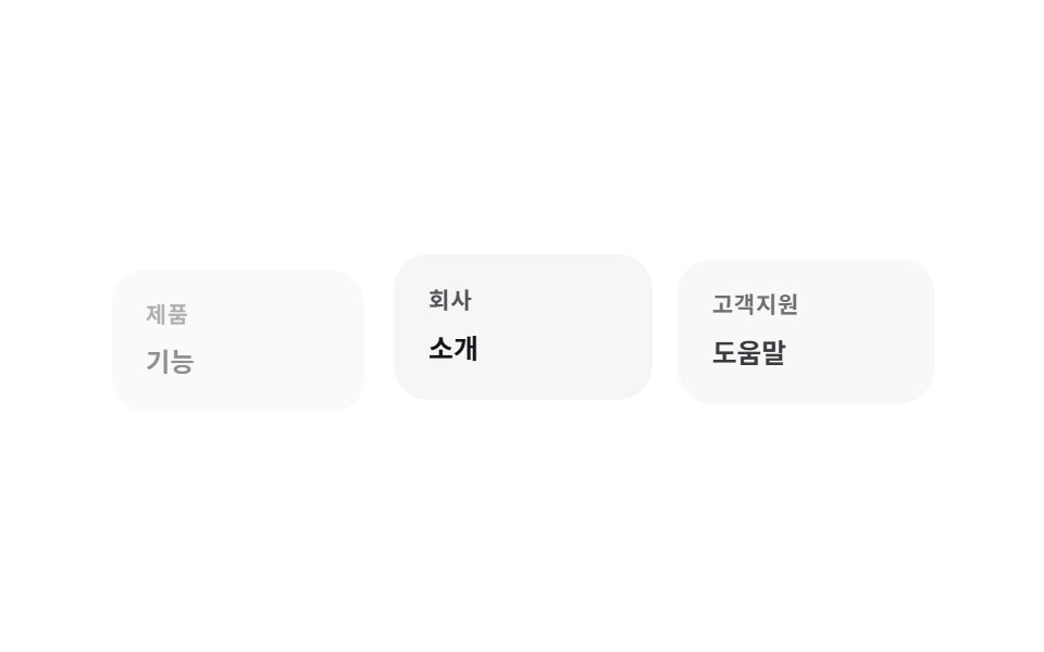
Mỗi nhóm link ở footer nhận một ô nền rất nhạt, kéo phong cách grid đi đến tận cuối trang.
<main class="stage">
  <footer class="footer">
    <div class="footer__tile is-demo">
      <p class="footer__head">Sản phẩm</p>
      <p class="footer__link">Tính năng</p>
    </div>
    <div class="footer__tile is-demo">
      <p class="footer__head">Công ty</p>
      <p class="footer__link">Giới thiệu</p>
    </div>
    <div class="footer__tile is-demo">
      <p class="footer__head">Hỗ trợ</p>
      <p class="footer__link">Trung tâm trợ giúp</p>
    </div>
  </footer>
</main>
@use "../../../../site/static/demo-tokens" as *;
$duration: $dur-loop; // 세 칸이 차례로 밝아지는 한 주기
$easing: $ease-out; // 등장 곡선
$color: $subject-blue; // 링크 강조 색
@include stage($stage-paper);
.footer {
width: clamp(240px, 84vw, 380px);
display: flex;
gap: clamp(8px, 2.4vw, 12px);
}
.footer__tile {
flex: 1;
border-radius: $r-card;
background: rgba($subject-ink, .04);
padding: clamp(12px, 3.4vw, 16px);
display: flex;
flex-direction: column;
gap: 8px;
animation: tileReveal $duration $easing infinite;
}
.footer__tile:nth-child(2) { animation-delay: -0.66s; }
.footer__tile:nth-child(3) { animation-delay: -1.33s; }
.footer__head {
margin: 0;
color: $subject-ink;
opacity: .72; // AA 4.5 (blog-design 글자 대비)
font-weight: 700; font-size: clamp(9.5px, 2.2vw, 11px); line-height: 1;
text-transform: uppercase;
letter-spacing: .04em;
}
.footer__link {
margin: 0;
color: $subject-ink;
font-weight: 600; font-size: clamp(11px, 2.6vw, 12.5px); line-height: 1.3;
}
// 데모: 칸마다 살짝 떠오르며 나타났다가 가라앉는다 — 세 칸이 순서대로 (시차)
@keyframes tileReveal {
0% { opacity: .35; transform: translateY(8px) scale(.97); }
35% { opacity: 1; transform: translateY(0) scale(1); }
65% { opacity: 1; transform: translateY(0) scale(1); }
100% { opacity: .35; transform: translateY(8px) scale(.97); }
}
@media (prefers-reduced-motion: reduce) {
.footer__tile {
animation: none !important;
opacity: 1;
transform: none;
}
}html, body {
margin: 0;
overflow: hidden;
}
.stage {
box-sizing: border-box;
min-height: 100vh;
display: grid;
place-items: center;
margin: 0;
background: #ffffff;
font-family: -apple-system, "Segoe UI", "Noto Sans KR", sans-serif;
padding: clamp(8px, 4vw, 24px);
}
.footer {
width: clamp(240px, 84vw, 380px);
display: flex;
gap: clamp(8px, 2.4vw, 12px);
}
.footer__tile {
flex: 1;
border-radius: 16px;
background: rgba(23, 20, 26, 0.04);
padding: clamp(12px, 3.4vw, 16px);
display: flex;
flex-direction: column;
gap: 8px;
animation: tileReveal 2s ease-out infinite;
}
.footer__tile:nth-child(2) {
animation-delay: -0.66s;
}
.footer__tile:nth-child(3) {
animation-delay: -1.33s;
}
.footer__head {
margin: 0;
color: #17141a;
opacity: 0.72;
font-weight: 700;
font-size: clamp(9.5px, 2.2vw, 11px);
line-height: 1;
text-transform: uppercase;
letter-spacing: 0.04em;
}
.footer__link {
margin: 0;
color: #17141a;
font-weight: 600;
font-size: clamp(11px, 2.6vw, 12.5px);
line-height: 1.3;
}
@keyframes tileReveal {
0% {
opacity: 0.35;
transform: translateY(8px) scale(0.97);
}
35% {
opacity: 1;
transform: translateY(0) scale(1);
}
65% {
opacity: 1;
transform: translateY(0) scale(1);
}
100% {
opacity: 0.35;
transform: translateY(8px) scale(0.97);
}
}
@media (prefers-reduced-motion: reduce) {
.footer__tile {
animation: none !important;
opacity: 1;
transform: none;
}
}import type { CSSProperties } from "react";
import styles from "./BentoFooter.module.scss";
export type BentoFooterProps = {
groups?: { head: string; link: string }[];
duration?: number;
easing?: string;
color?: string;
};
type Vars = CSSProperties & { "--duration"?: string; "--easing"?: string; "--color"?: string };
export default function BentoFooter({
groups = [
{ head: "Product", link: "Features" },
{ head: "Company", link: "About" },
{ head: "Support", link: "Help center" },
],
duration = 2000,
easing = "ease-out",
color = "#2f6df6",
}: BentoFooterProps) {
const vars: Vars = { "--duration": `${duration}ms`, "--easing": easing, "--color": color };
return (
<footer className={styles.footer} style={vars}>
{groups.map((g, i) => (
<div key={g.head} className={styles.tile} style={{ animationDelay: `${-i * 0.66}s` }}>
<p className={styles.head}>{g.head}</p>
<p className={styles.link}>{g.link}</p>
</div>
))}
</footer>
);
}08 · Nhóm liên kết thành ô riêng — Diện tích đo được 1.765% · khung hình chuyển động 23/23Nguyên tác GODRICH · SCSS và React nằm trong tệp zip · Xem mật khẩu
Chỗ dùng
Chia ô bằng khác biệt tông nền thay cho đường kẻ.
<footer class="grid grid-cols-3 gap-4">
  <div class="rounded-tile bg-ink/[.04] p-5">
    <p class="mb-2 text-xs font-bold uppercase text-ink/50">Sản phẩm</p>
    <p class="text-sm font-semibold">Tính năng</p>
  </div>
  <div class="rounded-tile bg-ink/[.04] p-5">
    <p class="mb-2 text-xs font-bold uppercase text-ink/50">Công ty</p>
    <p class="text-sm font-semibold">Giới thiệu</p>
  </div>
</footer>
09Nút và ô nhập
Chuyển động thế nào
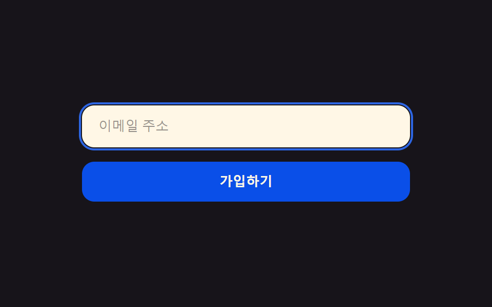
Nút và ô nhập dùng đúng bán kính bo góc của card, khiến cả màn hình đọc như một hệ thống duy nhất.
<main class="stage">
  <form class="form">
    <label class="form__field is-demo">
      <span class="form__ring" aria-hidden="true"></span>
      <input class="form__input" type="email" placeholder="Địa chỉ email" readonly>
    </label>
    <button class="form__btn is-demo" type="button">Đăng ký</button>
  </form>
</main>
@use "../../../../site/static/demo-tokens" as *;
$duration: $dur-loop; // 포커스 링과 버튼이 도는 한 주기
$easing: $ease-spring; // 눌리는 곡선
$color: $subject-blue; // 포커스 색
@include stage($stage-ink);
.form {
width: clamp(220px, 76vw, 320px);
display: flex;
flex-direction: column;
gap: clamp(10px, 3vw, 14px);
}
.form__field {
position: relative;
display: block;
border-radius: $r-control;
background: $subject-cream;
}
.form__ring {
position: absolute;
inset: -3px;
border-radius: calc(#{$r-control} + 3px);
border: 2px solid $color;
opacity: 0;
animation: ringPulse $duration $easing infinite;
}
.form__input {
width: 100%;
box-sizing: border-box;
border: 0;
border-radius: $r-control;
background: transparent;
padding: clamp(11px, 3vw, 13px) clamp(14px, 3.6vw, 16px);
color: $subject-ink;
font-weight: 500; font-size: clamp(11px, 2.8vw, 13px); line-height: 1;
}
.form__input::placeholder { color: rgba($subject-ink, .45); }
.form__btn {
border: 0;
border-radius: $r-control;
background: $subject-blue-deep;
color: $subject-cream;
padding: clamp(11px, 3vw, 13px);
font-weight: 700; font-size: clamp(11px, 2.8vw, 13px); line-height: 1;
animation: btnPress $duration $easing infinite;
}
// 데모: 입력창에 포커스 링이 떴다 사라지고, 이어서 버튼이 한 번 눌린다
@keyframes ringPulse {
0%, 20% { opacity: 0; }
32%, 55% { opacity: 1; }
68%, 100% { opacity: 0; }
}
@keyframes btnPress {
0%, 68% { transform: scale(1); }
78% { transform: scale(.96); }
88%, 100% { transform: scale(1); }
}
@media (prefers-reduced-motion: reduce) {
.form__ring,
.form__btn {
animation: none !important;
transform: none;
}
.form__ring { opacity: 0; }
}html, body {
margin: 0;
overflow: hidden;
}
.stage {
box-sizing: border-box;
min-height: 100vh;
display: grid;
place-items: center;
margin: 0;
background: #17141a;
font-family: -apple-system, "Segoe UI", "Noto Sans KR", sans-serif;
padding: clamp(8px, 4vw, 24px);
}
.form {
width: clamp(220px, 76vw, 320px);
display: flex;
flex-direction: column;
gap: clamp(10px, 3vw, 14px);
}
.form__field {
position: relative;
display: block;
border-radius: 12px;
background: #fff7e6;
}
.form__ring {
position: absolute;
inset: -3px;
border-radius: calc(12px + 3px);
border: 2px solid #2f6df6;
opacity: 0;
animation: ringPulse 2s cubic-bezier(0.2, 0.8, 0.2, 1) infinite;
}
.form__input {
width: 100%;
box-sizing: border-box;
border: 0;
border-radius: 12px;
background: transparent;
padding: clamp(11px, 3vw, 13px) clamp(14px, 3.6vw, 16px);
color: #17141a;
font-weight: 500;
font-size: clamp(11px, 2.8vw, 13px);
line-height: 1;
}
.form__input::placeholder {
color: rgba(23, 20, 26, 0.45);
}
.form__btn {
border: 0;
border-radius: 12px;
background: #0a4fe8;
color: #fff7e6;
padding: clamp(11px, 3vw, 13px);
font-weight: 700;
font-size: clamp(11px, 2.8vw, 13px);
line-height: 1;
animation: btnPress 2s cubic-bezier(0.2, 0.8, 0.2, 1) infinite;
}
@keyframes ringPulse {
0%, 20% {
opacity: 0;
}
32%, 55% {
opacity: 1;
}
68%, 100% {
opacity: 0;
}
}
@keyframes btnPress {
0%, 68% {
transform: scale(1);
}
78% {
transform: scale(0.96);
}
88%, 100% {
transform: scale(1);
}
}
@media (prefers-reduced-motion: reduce) {
.form__ring,
.form__btn {
animation: none !important;
transform: none;
}
.form__ring {
opacity: 0;
}
}import type { CSSProperties } from "react";
import styles from "./BentoButtonsInputs.module.scss";
export type BentoButtonsInputsProps = {
placeholder?: string;
cta?: string;
duration?: number;
easing?: string;
color?: string;
};
type Vars = CSSProperties & { "--duration"?: string; "--easing"?: string; "--color"?: string };
export default function BentoButtonsInputs({
placeholder = "Email address",
cta = "Sign up",
duration = 2000,
easing = "cubic-bezier(.2,.8,.2,1)",
color = "#2f6df6",
}: BentoButtonsInputsProps) {
const vars: Vars = { "--duration": `${duration}ms`, "--easing": easing, "--color": color };
return (
<form className={styles.form} style={vars}>
<label className={styles.field}>
<span className={styles.ring} aria-hidden="true" />
<input className={styles.input} type="email" placeholder={placeholder} readOnly />
</label>
<button type="button" className={styles.btn}>{cta}</button>
</form>
);
}09 · Nút pill radius 12 — Diện tích đo được 2.1% · khung hình chuyển động 10/23Nguyên tác GODRICH · SCSS và React nằm trong tệp zip · Xem mật khẩu
Dùng khi nào
Vòng focus cũng ôm theo bán kính tròn hơn card một chút.
<form class="flex gap-3 rounded-tile bg-white p-6 shadow-bento">
  <label class="relative flex-1 rounded-[12px] bg-cream">
    <input class="w-full rounded-[12px] bg-transparent px-4 py-3 text-sm
                  outline-none ring-2 ring-accent/40" type="email"
           placeholder="Địa chỉ email">
  </label>
  <button class="rounded-[12px] bg-accent px-5 py-3 text-sm font-bold text-cream">
    Đăng ký
  </button>
</form>
Tùy chỉnh tailwind.config
One-page và chín bộ phận trên đều sinh ra từ đúng một bộ giá trị này. Sửa bán kính, bóng đổ hay khoảng cách ở một chỗ duy nhất này là tông cả trang đổi ngay lập tức. Toàn bộ phần bento grid css trong bài chỉ dựa vào các token dưới đây.
theme: {
  extend: {
    colors: {
      cream: "#fff7e6",
      ink: "#17141a",
      accent: "#2f6df6",
      line: "rgba(23,20,26,.08)",
    },
    fontFamily: {
      display: ["'Plus Jakarta Sans'", "system-ui", "sans-serif"],
      body: ["'Inter'", "system-ui", "sans-serif"],
    },
    borderRadius: {
      tile: "20px",
      pill: "999px",
    },
    boxShadow: {
      bento: "0 14px 24px rgba(23,20,26,.10)",
      "bento-hover": "0 20px 32px rgba(23,20,26,.16)",
    },
    spacing: {
      gutter: "14px",
    },
  },
},
Prompt vibe-coding
Bạn chỉ việc đưa config này vào dự án rồi giao việc cho Claude Code hay Cursor theo prompt mẫu dưới đây. Nguyên văn prompt đầy đủ nằm trong prompt.md của zip.
Hero không dựng thành một khối lớn mà chia thành nhiều tile kích thước khác
nhau, dạng mosaic 2x2 không đối xứng. Mọi card dùng rounded-tile và
shadow-bento. Khi hover chỉ đổi bóng sang shadow-bento-hover cho bóng to hơn
— vị trí không xê dịch. Nền chỉ một màu cream. Chỗ nào cần nhấn mới dùng
accent, tuyệt đối không tô gradient.
Kết quả sau khi áp dụng prompt này vào page/index.html thật, chụp toàn trang ở viewport 1280px.
Bento grid dễ vỡ ở đâu — những cái bẫy
Kích thước tile và màn hình hẹp
Trộn hơn ba cỡ tile là grid biến thành collage. Bố cục gọn gàng bằng grid-template-areas trên màn rộng, khi container thu hẹp lại dễ bị ô này chồng đè lên ô khác, và tài liệu MDN về CSS Grid Layout khuyến nghị ở độ hẹp ấy nên khai báo lại tên vùng từ đầu cho an toàn. Chính dự án này lúc đầu cũng chỉ xếp dọc nguyên bốn ô, kết quả khoảng trắng trong ô to chiếm quá nửa màn hình mobile, cuối cùng phải thêm riêng quy tắc giảm chiều cao ô to bên dưới bề rộng 640px. Cái lỗi hay gặp nữa là cho mỗi ô một độ bóng khác nhau. Chốt đúng hai cấp shadow-bento và shadow-bento-hover là vì bóng đổ đậm nhạt tùy ô sẽ khiến trang nhìn như mấy cái website khác nhau dán chung vào một màn. Zip chứa mã nguồn của chín bộ phận và one-page này mở bằng mật khẩu j7zbg3ef, tải ngay qua nút dưới đây.
Chỉ một màu nhấn
Dùng từ hai màu nhấn trở lên cũng là bẫy lớn của bento grid ui. Dồn hết ánh nhìn về một màu accent chính là lõi của phong cách, nên khi màu nhấn thứ hai xuất hiện, bạn lập tức không còn biết ô nào mới thật sự quan trọng.
Khả năng tiếp cận
Tương phản và giảm chuyển động
Huy hiệu và nút CTA đặt chữ ink(#17141a) trên nền accent(#2f6df6) có tương phản khá thấp, nên chữ badge cỡ nhỏ được chuyển lên nền cream, còn nền accent chỉ dành cho những phần tử to như nút. Vòng focus của demo 09 và vệt sáng dịu của dải CTA được bọc trong media query theo tài liệu MDN về prefers-reduced-motion, khách truy cập bật giảm chuyển động sẽ chỉ thấy trạng thái tĩnh. Nút CTA của one-page viết sao cho chỉ riêng chữ đã đủ nghĩa, còn những chỗ tô khối màu thì README của zip ghi rõ phải điền alt khi thay bằng icon hay ảnh thật.
Các xu hướng khác được gom trong mục xu hướng thiết kế, còn trang này chuyên về gì thì trang giới thiệu nói rõ.
FAQ
Bento grid chỉ dựng được bằng CSS Grid thôi à?
Flexbox cũng nhại được gần giống, nhưng để từng ô chiếm bao nhiêu cột và hàng thì grid-column cùng grid-row của CSS Grid cho code ngắn hơn hẳn. Trong bài này, mục 03·06·08 cần grid dùng CSS Grid, phần còn lại gọn trong một hàng nên dùng Flexbox. Ai muốn xem bento grid html css hoàn chỉnh hơn thì nguyên bản trong zip đã xếp sẵn cả hai kiểu.
Không có ảnh hay minh họa thì bento grid có hợp không?
Hợp, và chính các bento grid design examples không dùng ảnh vẫn tạo được cảm giác chỉn chu. One-page và toàn bộ demo trong bài này không có lấy một tấm hình, chỉ dùng khối màu accent và chỗ để icon, nên rất đáng dùng ở giai đoạn wireframe trước khi có màn hình thật.
Từ bao nhiêu tile thì gọi là bento grid?
Không có chuẩn chính thức, nhưng tối thiểu nên có bốn ô thì khác biệt kích thước mới đủ rõ. Bố cục bốn ô như mục 03 — một ô to trộn ba ô nhỏ — là phổ biến nhất, và nếu section rộng hơn thì kéo lên 6 đến 8 ô như mục 06 vẫn ổn.
Có thể bạn cũng thích
 Cuộn trang9 hiệu ứng css scroll animation không cần JS
 Section landing page9 mẫu press page design — dán vào landing
 Section landing page9 mẫu portfolio grid css — dán vào landing
 Nút bấm9 css button design ideas — dán một file là chạy
 Loading9 hiệu ứng css skeleton loading copy-paste
 Phản hồi9 hiệu ứng css dark mode toggle 1 dòng CSS
 Phản hồi9 micro interactions css — dán 1 dòng chạy ngay
 Cuộn trang9 hiệu ứng css parallax scrolling, không cần JS
 Phản hồi9 hiệu ứng custom cursor css — copy dán một dòng
 Phản hồi9 kiểu css typing animation, copy dán là chạy