03Xoay tròn
`.a-spin` xoay rotate từ 0 đến 360 độ bằng linear không ngắt quãng, là class xoay dùng chung cho icon làm mới lẫn icon đồng bộ, không riêng spinner tải.
Dùng choNút làm mới, icon đồng bộ, vòng xoay trang trí quanh logo
rotatelinear1초
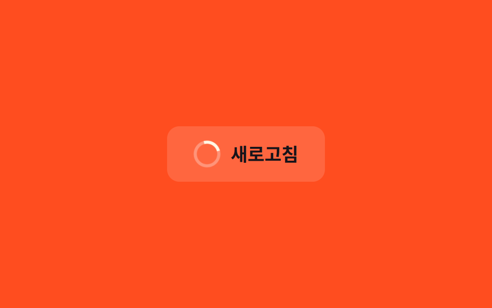
<main class="stage">
  <button class="btn" type="button">
    <span class="icon a-spin" aria-hidden="true"></span>
    Làm mới
  </button>
</main>
@use "../../../../site/static/demo-tokens" as *;
// ── 변수 3개 ──────────────────────────────────────────
$duration: 1s;
$easing: linear; // 가감속 없이 일정한 속도라야 회전이 끊겨 보이지 않는다
$color: $subject-cream;
// ── 데모 무대 ───────────────────────────────
@include stage($stage-orange);
.btn {
display: inline-flex;
align-items: center;
gap: 10px;
border: 0;
border-radius: $r-control;
padding: 14px 26px;
background: rgba(255, 255, 255, .14);
color: $subject-ink; // AA: 주황 면(흰 14% 겹침 #d2ada4) 위 6.28:1 — 스피너 링은 크림 유지
font-weight: 700; font-size: clamp(15px, 4vw, 18px); line-height: 1; font-family: inherit;
cursor: pointer;
-webkit-tap-highlight-color: transparent;
}
.icon {
width: 20px;
height: 20px;
border-radius: 50%;
border: 3px solid rgba(255, 255, 255, .3);
border-top-color: $color; // 이 한 변만 다른 색이라 회전이 보인다
flex: none;
}
// ── .a-spin 은 로딩뿐 아니라 새로고침·동기화 아이콘에도 그대로 쓴다 ─
.a-spin {
animation: spin $duration $easing infinite;
}
@keyframes spin {
to { transform: rotate(360deg); }
}
@media (prefers-reduced-motion: reduce) {
.a-spin { animation: none; }
}html, body {
margin: 0;
overflow: hidden;
}
.stage {
box-sizing: border-box;
min-height: 100vh;
display: grid;
place-items: center;
margin: 0;
background: #ff4d1f;
font-family: -apple-system, "Segoe UI", "Noto Sans KR", sans-serif;
padding: clamp(8px, 4vw, 24px);
}
.btn {
display: inline-flex;
align-items: center;
gap: 10px;
border: 0;
border-radius: 12px;
padding: 14px 26px;
background: rgba(255, 255, 255, 0.14);
color: #17141a;
font-weight: 700;
font-size: clamp(15px, 4vw, 18px);
line-height: 1;
font-family: inherit;
cursor: pointer;
-webkit-tap-highlight-color: transparent;
}
.icon {
width: 20px;
height: 20px;
border-radius: 50%;
border: 3px solid rgba(255, 255, 255, 0.3);
border-top-color: #fff7e6;
flex: none;
}
.a-spin {
animation: spin 1s linear infinite;
}
@keyframes spin {
to {
transform: rotate(360deg);
}
}
@media (prefers-reduced-motion: reduce) {
.a-spin {
animation: none;
}
}import type { CSSProperties, ReactNode } from "react";
import styles from "./SpinIcon.module.scss";
export type SpinIconProps = {
children: ReactNode;
/** 한 바퀴 도는 데 걸리는 시간 (기본 1000ms) */
duration?: number;
/** CSS easing (기본 linear — 끊김 없이 일정한 속도) */
easing?: string;
/** 링 강조 색 */
color?: string;
onClick?: () => void;
};
type Vars = CSSProperties & {
"--duration"?: string;
"--easing"?: string;
"--color"?: string;
};
export default function SpinIcon({
children,
duration = 1000,
easing = "linear",
color = "#fff7e6",
onClick,
}: SpinIconProps) {
const vars: Vars = {
"--duration": `${duration}ms`,
"--easing": easing,
"--color": color,
};
return (
<button type="button" className={styles.btn} style={vars} onClick={onClick}>
<span className={styles.icon} aria-hidden="true" />
{children}
</button>
);
}03 Xoay tròn — Diện tích đo được 0.233% · khung hình chuyển động 23/23Nguyên tác GODRICH · SCSS và React nằm trong tệp zip · 9 CSS Keyframe Animations — dán 1 dòng là chạy
Bài viết chứa demo này
 9 CSS Keyframe Animations — dán 1 dòng là chạyCSS keyframe animation là chuyển động lặp được định nghĩa bằng @keyframes rồi gộp vào một class duy nhất, dán vào phần t Xem tất cả demo trong bài này