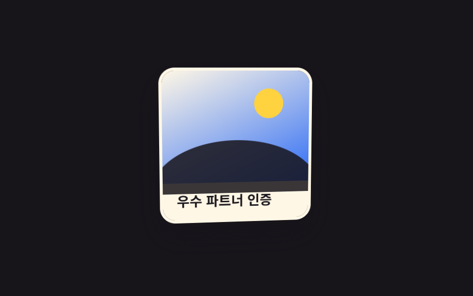
03Nghiêng 3D thị sai
Card nghiêng theo rotateX/rotateY dựa trên toạ độ con trỏ mà JS đọc được, còn lớp nền dịch ngược hướng để tạo cảm giác tách lớp.
Dùng choCard giới thiệu tính năng, card dự án portfolio
perspectiverotateX/rotateYJS 좌표

<main class="stage">
  <div class="frame">
    <article class="card is-demo" tabindex="0">
      <span class="card__layer card__layer--back" aria-hidden="true"></span>
      <div class="card__layer card__layer--front">
        <h3 class="card__title">Dự án portfolio</h3>
        <p class="card__meta">Xem chi tiết</p>
      </div>
    </article>
  </div>
</main>
@use "../../../../site/static/demo-tokens" as *;
$duration: $dur-base; // 기울기가 붙는 시간
$easing: $ease-spring; // 탄력 있게
$color: $subject-cream; // 카드 배경
@include stage($stage-orange);
.stage { padding: clamp(6px, 2.4vw, 16px); }
// 스포트라이트(커서 하이라이트) — 기존 틸트 효과는 그대로, 이 층만 얹는다
@property --mx { syntax: "<percentage>"; inherits: true; initial-value: 50%; }
@property --my { syntax: "<percentage>"; inherits: true; initial-value: 50%; }
@property --sp { syntax: "<number>"; inherits: true; initial-value: 0; }
.frame { perspective: 700px; } // 자식 카드가 이 값 기준으로 기운다
.card {
position: relative;
width: min(190px, 58vw);
border-radius: $r-card;
background: $color;
box-shadow: $shadow-raised;
outline: none;
cursor: pointer;
overflow: hidden;
transform-style: preserve-3d;
transform: rotateX(var(--rx, 0deg)) rotateY(var(--ry, 0deg));
transition: transform $duration $easing;
}
.card__layer--back {
position: absolute;
inset: -12%;
background: linear-gradient(155deg, $subject-blue-deep 0%, $stage-ink 100%);
transform: translateZ(-20px) translateX(var(--pz, 0px));
transition: transform $duration $easing;
}
.card__layer--front {
position: relative;
padding: 36px 14px 14px;
transform: translateZ(20px);
}
.card__layer--front::after {
content: '';
position: absolute; inset: 0; pointer-events: none;
background: radial-gradient(120px circle at var(--mx) var(--my), rgba(255, 255, 255, .32), transparent 70%);
opacity: var(--sp);
}
.card__title { position: relative; z-index: 1; margin: 0 0 4px; font-weight: 700; font-size: clamp(12px, 3.4vw, 14px); line-height: 1.3; font-family: inherit; color: $subject-cream; }
.card__meta { position: relative; z-index: 1; margin: 0; font-weight: 500; font-size: clamp(11px, 3vw, 12px); line-height: 1.3; font-family: inherit; color: rgba($subject-cream, .72); }
.card:focus-visible,
.card:active {
transform: rotateX(-8deg) rotateY(12deg);
}
.card:focus-visible .card__layer--back,
.card:active .card__layer--back {
transform: translateZ(-20px) translateX(10px);
}
.card.is-demo { animation: tilt-loop $dur-loop $easing infinite, spot-loop $dur-loop $easing infinite; }
.card.is-demo .card__layer--back { animation: tilt-loop-bg $dur-loop $easing infinite; }
@keyframes tilt-loop {
0%, 15% { transform: rotateX(0) rotateY(0); }
40% { transform: rotateX(-8deg) rotateY(12deg); }
65% { transform: rotateX(6deg) rotateY(-10deg); }
100% { transform: rotateX(0) rotateY(0); }
}
@keyframes tilt-loop-bg {
0%, 15% { transform: translateZ(-20px) translateX(0); }
40% { transform: translateZ(-20px) translateX(10px); }
65% { transform: translateZ(-20px) translateX(-8px); }
100% { transform: translateZ(-20px) translateX(0); }
}
@keyframes spot-loop {
0%, 15% { --sp: 0; --mx: 15%; --my: 20%; }
30% { --sp: 1; }
50% { --mx: 85%; --my: 30%; }
70% { --mx: 50%; --my: 80%; }
85%, 100% { --sp: 0; }
}
@media (hover: none) {
.card:active { transform: rotateX(-8deg) rotateY(12deg); }
.card:active .card__layer--back { transform: translateZ(-20px) translateX(10px); }
}
@media (prefers-reduced-motion: reduce) {
.card, .card__layer--back { transition: none; }
.card.is-demo, .card.is-demo .card__layer--back { animation: none; }
.card.is-demo { --sp: 0; }
}html, body {
margin: 0;
overflow: hidden;
}
.stage {
box-sizing: border-box;
min-height: 100vh;
display: grid;
place-items: center;
margin: 0;
background: #ff4d1f;
font-family: -apple-system, "Segoe UI", "Noto Sans KR", sans-serif;
padding: clamp(8px, 4vw, 24px);
}
.stage {
padding: clamp(6px, 2.4vw, 16px);
}
@property --mx {
syntax: "<percentage>";
inherits: true;
initial-value: 50%;
}
@property --my {
syntax: "<percentage>";
inherits: true;
initial-value: 50%;
}
@property --sp {
syntax: "<number>";
inherits: true;
initial-value: 0;
}
.frame {
perspective: 700px;
}
.card {
position: relative;
width: min(190px, 58vw);
border-radius: 16px;
background: #fff7e6;
box-shadow: 0 14px 24px rgba(23, 20, 26, 0.32);
outline: none;
cursor: pointer;
overflow: hidden;
transform-style: preserve-3d;
transform: rotateX(var(--rx, 0deg)) rotateY(var(--ry, 0deg));
transition: transform 300ms cubic-bezier(0.2, 0.8, 0.2, 1);
}
.card__layer--back {
position: absolute;
inset: -12%;
background: linear-gradient(155deg, #0a4fe8 0%, #17141a 100%);
transform: translateZ(-20px) translateX(var(--pz, 0px));
transition: transform 300ms cubic-bezier(0.2, 0.8, 0.2, 1);
}
.card__layer--front {
position: relative;
padding: 36px 14px 14px;
transform: translateZ(20px);
}
.card__layer--front::after {
content: "";
position: absolute;
inset: 0;
pointer-events: none;
background: radial-gradient(120px circle at var(--mx) var(--my), rgba(255, 255, 255, 0.32), transparent 70%);
opacity: var(--sp);
}
.card__title {
position: relative;
z-index: 1;
margin: 0 0 4px;
font-weight: 700;
font-size: clamp(12px, 3.4vw, 14px);
line-height: 1.3;
font-family: inherit;
color: #fff7e6;
}
.card__meta {
position: relative;
z-index: 1;
margin: 0;
font-weight: 500;
font-size: clamp(11px, 3vw, 12px);
line-height: 1.3;
font-family: inherit;
color: rgba(255, 247, 230, 0.72);
}
.card:focus-visible,
.card:active {
transform: rotateX(-8deg) rotateY(12deg);
}
.card:focus-visible .card__layer--back,
.card:active .card__layer--back {
transform: translateZ(-20px) translateX(10px);
}
.card.is-demo {
animation: tilt-loop 2s cubic-bezier(0.2, 0.8, 0.2, 1) infinite, spot-loop 2s cubic-bezier(0.2, 0.8, 0.2, 1) infinite;
}
.card.is-demo .card__layer--back {
animation: tilt-loop-bg 2s cubic-bezier(0.2, 0.8, 0.2, 1) infinite;
}
@keyframes tilt-loop {
0%, 15% {
transform: rotateX(0) rotateY(0);
}
40% {
transform: rotateX(-8deg) rotateY(12deg);
}
65% {
transform: rotateX(6deg) rotateY(-10deg);
}
100% {
transform: rotateX(0) rotateY(0);
}
}
@keyframes tilt-loop-bg {
0%, 15% {
transform: translateZ(-20px) translateX(0);
}
40% {
transform: translateZ(-20px) translateX(10px);
}
65% {
transform: translateZ(-20px) translateX(-8px);
}
100% {
transform: translateZ(-20px) translateX(0);
}
}
@keyframes spot-loop {
0%, 15% {
--sp: 0;
--mx: 15%;
--my: 20%;
}
30% {
--sp: 1;
}
50% {
--mx: 85%;
--my: 30%;
}
70% {
--mx: 50%;
--my: 80%;
}
85%, 100% {
--sp: 0;
}
}
@media (hover: none) {
.card:active {
transform: rotateX(-8deg) rotateY(12deg);
}
.card:active .card__layer--back {
transform: translateZ(-20px) translateX(10px);
}
}
@media (prefers-reduced-motion: reduce) {
.card, .card__layer--back {
transition: none;
}
.card.is-demo, .card.is-demo .card__layer--back {
animation: none;
}
.card.is-demo {
--sp: 0;
}
}// 카드 위 커서 위치로 기울기를 만든다. 배경 레이어가 반대로 움직여 층이 갈린다(시차).
var card = document.querySelector('.card');
card.addEventListener('pointermove', function (e) {
card.classList.remove('is-demo');
var r = card.getBoundingClientRect(), px = (e.clientX - r.left) / r.width - .5, py = (e.clientY - r.top) / r.height - .5;
card.style.setProperty('--rx', (-py * 14) + 'deg');
card.style.setProperty('--ry', (px * 16) + 'deg');
card.style.setProperty('--pz', (px * -12) + 'px');
// 스포트라이트(커서 하이라이트) — 틸트는 그대로, 이 층만 얹는다
card.style.setProperty('--mx', ((e.clientX - r.left) / r.width * 100) + '%');
card.style.setProperty('--my', ((e.clientY - r.top) / r.height * 100) + '%');
card.style.setProperty('--sp', 1);
});
card.addEventListener('pointerleave', function () { card.style.cssText = ''; });import { useCallback, useRef } from "react";
import type { CSSProperties, PointerEvent } from "react";
import styles from "./TiltParallaxCard.module.scss";
export type TiltParallaxCardProps = {
title: string;
meta: string;
/** 기울기가 붙는 시간 (기본 300ms) */
duration?: number;
easing?: string;
color?: string;
};
type Vars = CSSProperties & { "--duration"?: string; "--easing"?: string; "--color"?: string };
export default function TiltParallaxCard({
title,
meta,
duration = 300,
easing = "cubic-bezier(.2,.8,.2,1)",
color = "#fff7e6",
}: TiltParallaxCardProps) {
const ref = useRef<HTMLElement>(null);
const move = useCallback((e: PointerEvent<HTMLElement>) => {
const el = ref.current;
if (!el) return;
const r = el.getBoundingClientRect();
const px = (e.clientX - r.left) / r.width - 0.5;
const py = (e.clientY - r.top) / r.height - 0.5;
el.style.setProperty("--rx", `${-py * 14}deg`);
el.style.setProperty("--ry", `${px * 16}deg`);
el.style.setProperty("--pz", `${px * -12}px`);
// 스포트라이트(커서 하이라이트) — 틸트는 그대로, 이 층만 얹는다
el.style.setProperty("--mx", `${((e.clientX - r.left) / r.width) * 100}%`);
el.style.setProperty("--my", `${((e.clientY - r.top) / r.height) * 100}%`);
el.style.setProperty("--sp", "1");
}, []);
const leave = useCallback(() => {
const el = ref.current;
if (el) {
el.style.removeProperty("--rx"); el.style.removeProperty("--ry"); el.style.removeProperty("--pz");
el.style.removeProperty("--mx"); el.style.removeProperty("--my"); el.style.removeProperty("--sp");
}
}, []);
const vars: Vars = { "--duration": `${duration}ms`, "--easing": easing, "--color": color };
return (
<div className={styles.frame}>
<article
ref={ref}
className={styles.card}
style={vars}
tabIndex={0}
onPointerMove={move}
onPointerLeave={leave}
>
<span className={styles.back} aria-hidden="true" />
<div className={styles.front}>
<h3 className={styles.title}>{title}</h3>
<p className={styles.meta}>{meta}</p>
</div>
</article>
</div>
);
}03 Nghiêng 3D thị sai — Diện tích đo được 11.272% · khung hình chuyển động 18/23Nguyên tác GODRICH · SCSS và React nằm trong tệp zip · 9 CSS Card Hover Effects — dán 1 dòng là chạy
Bài viết chứa demo này
 9 CSS Card Hover Effects — dán 1 dòng là chạyCSS card hover effects là các hiệu ứng CSS khiến thẻ card phản hồi khi con trỏ dừng trên nó — nổi lên, viền phát sáng, n Xem tất cả demo trong bài này