04Lật chữ 3D
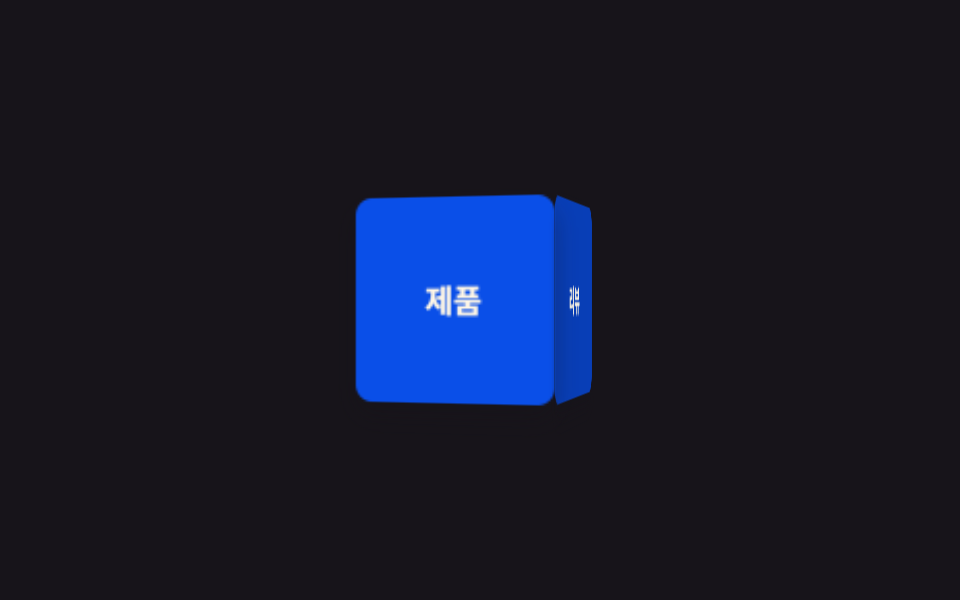
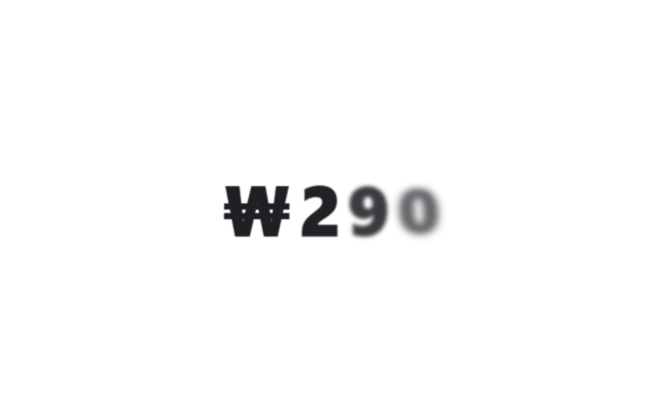
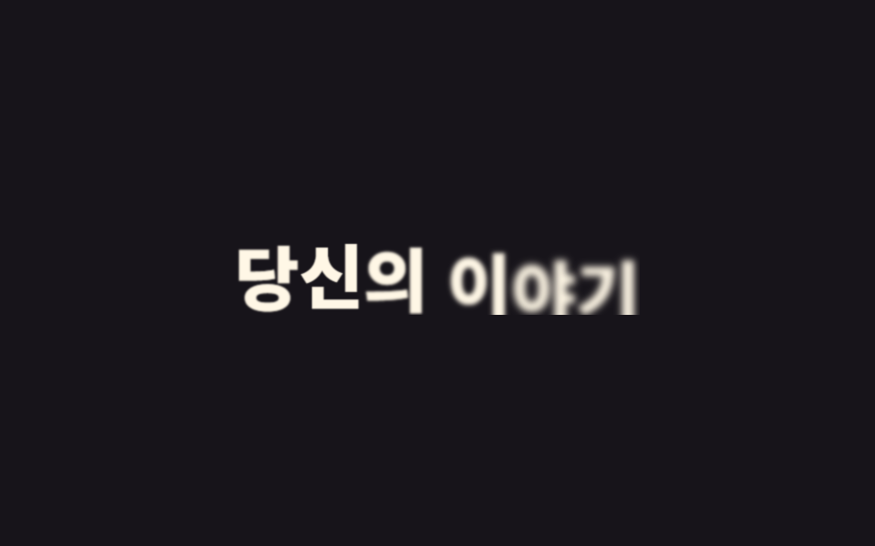
Bên trong phần tử cha mang perspective, mỗi chữ ẩn mặt sau bằng backface-visibility rồi quay quanh rotateX từ 90 độ về 0 độ, lật ra phía trước như một lá bài nhỏ. Cảm giác lật rõ nhất khi con số hay giá tiền vừa đổi.
Dùng choKhoảnh khắc giá hoặc số cập nhật, intro tiêu đề phong cách game
perspectiverotateX 90→0backface-visibility
<main class="stage">
  <h1 class="flip" data-split>₩290</h1>
</main>
@use "../../../../site/static/demo-tokens" as *;
$duration: $dur-loop; // 글자들이 한 바퀴 도는 시간 (시차는 $stagger)
$easing: $ease-spring;
$stagger: 70ms; // --i 1당 시차
@include stage($stage-paper);
.flip {
margin: 0;
display: flex;
gap: clamp(2px, 1vw, 8px);
font-weight: 800; font-size: clamp(32px, 12vw, 52px); line-height: 1; font-family: inherit;
color: $subject-ink;
perspective: 480px;
span {
display: inline-block;
backface-visibility: hidden;
animation: flip-in $duration $easing infinite, letter-blur-in $duration $easing infinite;
animation-delay: calc(var(--i) * #{$stagger} + var(--n) * 60ms);
}
}
@keyframes flip-in {
0%, 4% { opacity: 0; transform: rotateX(90deg); }
30%, 74% { opacity: 1; transform: rotateX(0deg); }
94%, 100% { opacity: 0; transform: rotateX(-90deg); }
}
@keyframes letter-blur-in {
0%, 4% { filter: blur(9px); }
30%, 74% { filter: blur(0); }
94%, 100% { filter: blur(9px); }
}
@media (prefers-reduced-motion: reduce) {
.flip span { animation: none; opacity: 1; transform: none; filter: none; }
}html, body {
margin: 0;
overflow: hidden;
}
.stage {
box-sizing: border-box;
min-height: 100vh;
display: grid;
place-items: center;
margin: 0;
background: #ffffff;
font-family: -apple-system, "Segoe UI", "Noto Sans KR", sans-serif;
padding: clamp(8px, 4vw, 24px);
}
.flip {
margin: 0;
display: flex;
gap: clamp(2px, 1vw, 8px);
font-weight: 800;
font-size: clamp(32px, 12vw, 52px);
line-height: 1;
font-family: inherit;
color: #17141a;
perspective: 480px;
}
.flip span {
display: inline-block;
backface-visibility: hidden;
animation: flip-in 2s cubic-bezier(0.2, 0.8, 0.2, 1) infinite, letter-blur-in 2s cubic-bezier(0.2, 0.8, 0.2, 1) infinite;
animation-delay: calc(var(--i) * 70ms + var(--n) * 60ms);
}
@keyframes flip-in {
0%, 4% {
opacity: 0;
transform: rotateX(90deg);
}
30%, 74% {
opacity: 1;
transform: rotateX(0deg);
}
94%, 100% {
opacity: 0;
transform: rotateX(-90deg);
}
}
@keyframes letter-blur-in {
0%, 4% {
filter: blur(9px);
}
30%, 74% {
filter: blur(0);
}
94%, 100% {
filter: blur(9px);
}
}
@media (prefers-reduced-motion: reduce) {
.flip span {
animation: none;
opacity: 1;
transform: none;
filter: none;
}
}(function(){
function splitLetters(el){
var text = el.textContent;
el.textContent = "";
Array.from(text).forEach(function(ch, i){
var span = document.createElement("span");
span.className = "letter";
var seed = Math.sin((i + 1) * 12.9898) * 43758.5453;
var noise = seed - Math.floor(seed);
span.style.setProperty("--i", i);
span.style.setProperty("--n", noise.toFixed(3));
span.textContent = ch === " " ? " " : ch;
el.appendChild(span);
});
}
document.querySelectorAll("[data-split]").forEach(splitLetters);
})();import type { CSSProperties } from "react";
import styles from "./Flip3D.module.scss";
type Vars = CSSProperties & { "--i"?: number; "--n"?: number };
function noise(i: number): number {
const s = Math.sin((i + 1) * 12.9898) * 43758.5453;
return Number((s - Math.floor(s)).toFixed(3));
}
export type Flip3DProps = {
letters: string[];
/** 글자들이 한 바퀴 도는 시간 ms (기본 2000) */
duration?: number;
/** --i 1당 시차 ms (기본 70ms) */
stagger?: number;
color?: string;
};
export default function Flip3D({ letters, duration = 2000, color = "#17141a" }: Flip3DProps) {
return (
<h1 className={styles.flip} style={{ "--color": color, "--duration": `${duration}ms` } as CSSProperties}>
{letters.map((ch, i) => (
<span key={i} style={{ "--i": i, "--n": noise(i) } as Vars}>{ch}</span>
))}
</h1>
);
}04 Lật chữ 3D — Diện tích đo được 3.824% · khung hình chuyển động 13/23Nguyên tác GODRICH · SCSS và React nằm trong tệp zip · 9 CSS Text Animation Effects — dán 1 dòng là chạy
Bài viết chứa demo này
 9 CSS Text Animation Effects — dán 1 dòng là chạyCSS text animation effects là các chuyển động chữ dựng thuần bằng CSS, không cần JavaScript, giúp tiêu đề hay câu chữ xu Xem tất cả demo trong bài này