9 CSS Text Animation Effects — dán 1 dòng là chạy
CSS text animation effects là các chuyển động chữ dựng thuần bằng CSS, không cần JavaScript, giúp tiêu đề hay câu chữ xuất hiện, nhấn mạnh hoặc lặp lại.
 01 text-animation-mask-reveal-up
 02 text-animation-letter-bounce
 03 text-animation-rotate-in
 04 text-animation-flip-3d
 05 text-animation-blur-focus
 06 text-animation-wave
 07 text-animation-wiggle-emphasis
 08 text-animation-two-tone-sweep
 09 text-animation-glitch
Tự chạy · bấm ô để tới mục đó · cả 9 trong một zip
- 01 Lộ chữ từ mặt nạ dưới lên
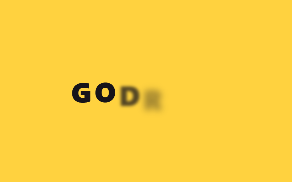
- 02 Nảy từng chữ
- 03 Xoay vào khung hình
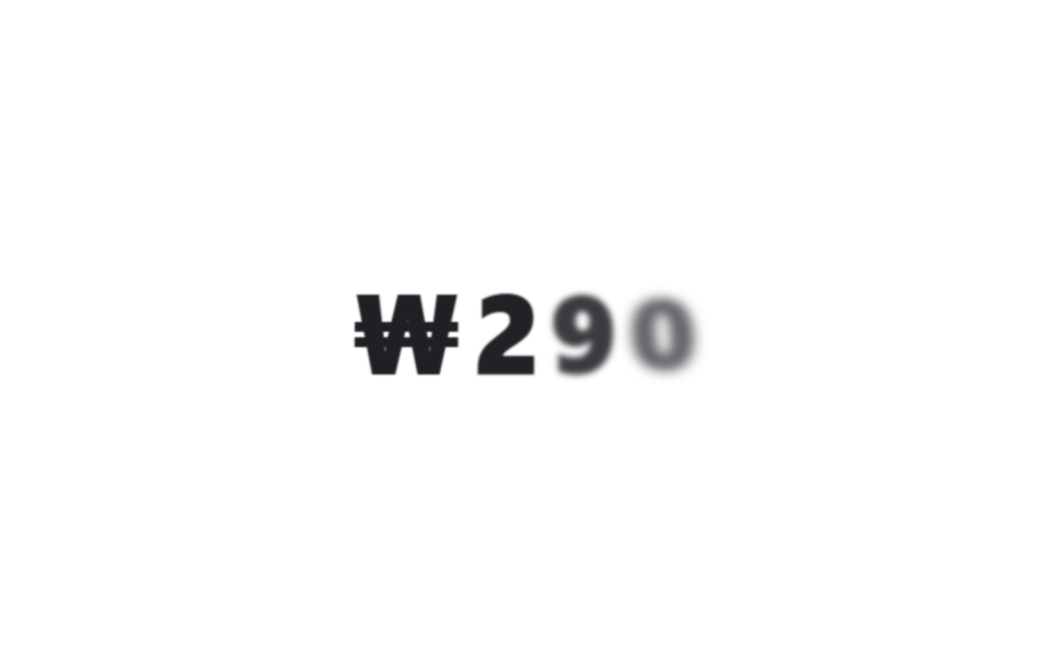
- 04 Lật chữ 3D
- 05 Mờ rồi nét dần
- 06 Chữ gợn sóng
- 07 Lắc nhẹ nhấn mạnh
- 08 Quét hai tông màu
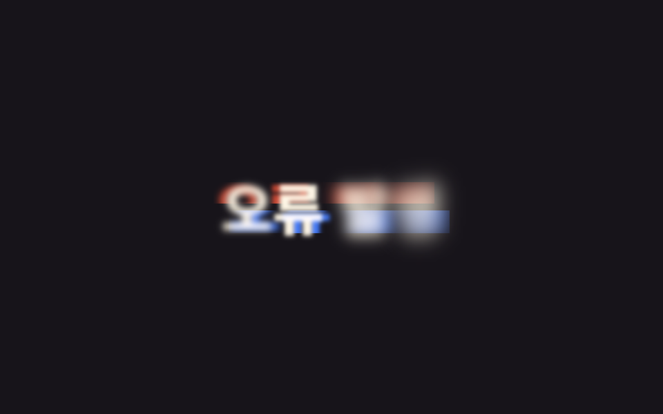
- 09 Glitch
Chín hiệu ứng xếp theo thứ tự chữ trải qua trên màn hình, không phải theo độ nổi tiếng. Năm kiểu đầu (01–05) là lúc chữ xuất hiện lần đầu, rồi đến một trạng thái chờ lặp mãi sau khi đã hiện ra (06), tiếp theo hai kiểu nhấn mạnh khi câu chữ đã đứng yên trên màn hình (07–08), và khép lại bằng một trạng thái trông bất ổn như màn hình vừa lỗi (09). Mỗi mục dưới đây chỉ giữ lại rule cốt lõi, còn file đầy đủ kèm markup nằm trong zip.
01Lộ chữ từ mặt nạ dưới lên
Bạn thấy gì
Tiêu đề nằm trong khung overflow:hidden bị cắt gọn, còn chữ bên trong trượt lên bằng translateY từ ngoài mép dưới về đúng vị trí, lộ ra một lượt như kéo một tấm rèm. Đúng lúc rèm kéo lên, từng chữ còn được gỡ mờ dần qua filter: blur, nên chữ không chỉ trồi lên mà còn như đang lấy nét theo.
<main class="stage">
  <div class="mask">
    <h1 class="mask__text" data-split>Câu chuyện của bạn</h1>
  </div>
</main>
@use "../../../../site/static/demo-tokens" as *;
$duration: $dur-loop; // 마스크가 걷히는 한 주기
$easing: $ease-spring; // 처음 빠르고 끝은 부드럽게
$color: $subject-cream; // 글자 색
@include stage($stage-ink);
.mask {
overflow: hidden; // 상자 밖은 자른다 — 이게 마스크
max-width: min(380px, 90vw);
}
.mask__text {
margin: 0;
font-weight: 800; font-size: clamp(26px, 8vw, 42px); line-height: 1.2; font-family: inherit;
color: $color;
text-align: center;
}
.mask__text .letter {
display: inline-block;
animation: mask-up $duration $easing infinite, letter-blur-in $duration $easing infinite;
animation-delay: calc(var(--i) * 30ms + var(--n) * 70ms); // --i 시차 + --n 노이즈로 기계적 정렬을 깬다
}
@keyframes mask-up {
0%, 4% { transform: translateY(115%); }
30%, 78% { transform: translateY(0); }
96%, 100% { transform: translateY(115%); }
}
@keyframes letter-blur-in {
0%, 4% { filter: blur(10px); }
30%, 78% { filter: blur(0); }
96%, 100% { filter: blur(10px); }
}
@media (prefers-reduced-motion: reduce) {
.mask__text .letter { animation: none; transform: none; filter: none; }
}html, body {
margin: 0;
overflow: hidden;
}
.stage {
box-sizing: border-box;
min-height: 100vh;
display: grid;
place-items: center;
margin: 0;
background: #17141a;
font-family: -apple-system, "Segoe UI", "Noto Sans KR", sans-serif;
padding: clamp(8px, 4vw, 24px);
}
.mask {
overflow: hidden;
max-width: min(380px, 90vw);
}
.mask__text {
margin: 0;
font-weight: 800;
font-size: clamp(26px, 8vw, 42px);
line-height: 1.2;
font-family: inherit;
color: #fff7e6;
text-align: center;
}
.mask__text .letter {
display: inline-block;
animation: mask-up 2s cubic-bezier(0.2, 0.8, 0.2, 1) infinite, letter-blur-in 2s cubic-bezier(0.2, 0.8, 0.2, 1) infinite;
animation-delay: calc(var(--i) * 30ms + var(--n) * 70ms);
}
@keyframes mask-up {
0%, 4% {
transform: translateY(115%);
}
30%, 78% {
transform: translateY(0);
}
96%, 100% {
transform: translateY(115%);
}
}
@keyframes letter-blur-in {
0%, 4% {
filter: blur(10px);
}
30%, 78% {
filter: blur(0);
}
96%, 100% {
filter: blur(10px);
}
}
@media (prefers-reduced-motion: reduce) {
.mask__text .letter {
animation: none;
transform: none;
filter: none;
}
}(function(){
function splitLetters(el){
var text = el.textContent;
el.textContent = "";
Array.from(text).forEach(function(ch, i){
var span = document.createElement("span");
span.className = "letter";
var seed = Math.sin((i + 1) * 12.9898) * 43758.5453;
var noise = seed - Math.floor(seed);
span.style.setProperty("--i", i);
span.style.setProperty("--n", noise.toFixed(3));
span.textContent = ch === " " ? " " : ch;
el.appendChild(span);
});
}
document.querySelectorAll("[data-split]").forEach(splitLetters);
})();import type { CSSProperties } from "react";
import styles from "./MaskRevealUp.module.scss";
type Vars = CSSProperties & { "--i"?: number; "--n"?: number };
function noise(i: number): number {
const s = Math.sin((i + 1) * 12.9898) * 43758.5453;
return Number((s - Math.floor(s)).toFixed(3));
}
export type MaskRevealUpProps = {
text: string;
/** 마스크가 걷히는 한 주기 (기본 2000ms) */
duration?: number;
color?: string;
};
export default function MaskRevealUp({ text, duration = 2000, color = "#fff7e6" }: MaskRevealUpProps) {
const vars = { "--duration": `${duration}ms`, "--color": color } as CSSProperties;
const chars = Array.from(text);
return (
<div className={styles.mask}>
<h1 className={styles.text} style={vars}>
{chars.map((ch, i) => (
<span key={i} className={styles.letter} style={{ "--i": i, "--n": noise(i) } as Vars}>
{ch === " " ? " " : ch}
</span>
))}
</h1>
</div>
);
}01 · Lộ chữ từ mặt nạ dưới lên — Diện tích đo được 5.417% · khung hình chuyển động 12/23Nguyên tác GODRICH · SCSS và React nằm trong tệp zip · Xem mật khẩu
Dùng ở đâu
Khung không hề di chuyển nên bố cục xung quanh đứng yên tuyệt đối trong lúc chữ tự đi lên.
.mask {
  overflow: hidden;
  max-width: min(380px, 90vw);
}
.mask__text {
  color: #fff7e6;
  animation: mask-up 2s cubic-bezier(.2, .8, .2, 1) infinite;
}
@keyframes mask-up {
  0%, 4%    { transform: translateY(115%); }
  30%, 78%  { transform: translateY(0); }
  96%, 100% { transform: translateY(115%); }
}
02Nảy từng chữ
Chuyện gì diễn ra trên màn hình
Gắn thuộc tính data-split vào tiêu đề là đủ — một đoạn script ngắn tự tách chữ thành từng thẻ span khi trang vừa mở, gán --i (thứ tự) và --n (nhiễu ngẫu nhiên) cho mỗi chữ, nên chữ nảy lên từ dưới và rơi đúng vị trí lần lượt chứ không cùng lúc, lại hơi lệch nhịp tự nhiên nhờ --n. Trong lúc nảy, từng chữ còn được gỡ mờ dần một lượt trước khi rơi hẳn xuống.
<main class="stage">
  <h1 class="letters" data-split>GODRICH</h1>
</main>
@use "../../../../site/static/demo-tokens" as *;
$duration: $dur-loop; // 글자들이 한 바퀴 도는 시간 (시차는 $stagger)
$easing: $ease-pop; // 아래에서 튀어오르는 느낌
$stagger: 40ms; // --i 1당 시차
@include stage($stage-yellow);
.letters {
margin: 0;
display: flex;
gap: clamp(2px, 1vw, 6px);
font-weight: 800; font-size: clamp(28px, 10vw, 46px); line-height: 1; font-family: inherit;
color: $subject-ink;
span {
display: inline-block;
animation: letter-bounce $duration $easing infinite, letter-blur-in $duration $easing infinite;
animation-delay: calc(var(--i) * #{$stagger} + var(--n) * 60ms);
}
}
@keyframes letter-bounce {
0%, 4% { opacity: 0; transform: translateY(22px); }
22%, 70% { opacity: 1; transform: translateY(0); }
88%, 100% { opacity: 0; transform: translateY(-14px); }
}
@keyframes letter-blur-in {
0%, 4% { filter: blur(10px); }
22%, 70% { filter: blur(0); }
88%, 100% { filter: blur(10px); }
}
@media (prefers-reduced-motion: reduce) {
.letters span { animation: none; opacity: 1; transform: none; filter: none; }
}html, body {
margin: 0;
overflow: hidden;
}
.stage {
box-sizing: border-box;
min-height: 100vh;
display: grid;
place-items: center;
margin: 0;
background: #ffd23f;
font-family: -apple-system, "Segoe UI", "Noto Sans KR", sans-serif;
padding: clamp(8px, 4vw, 24px);
}
.letters {
margin: 0;
display: flex;
gap: clamp(2px, 1vw, 6px);
font-weight: 800;
font-size: clamp(28px, 10vw, 46px);
line-height: 1;
font-family: inherit;
color: #17141a;
}
.letters span {
display: inline-block;
animation: letter-bounce 2s cubic-bezier(0.2, 1.4, 0.4, 1) infinite, letter-blur-in 2s cubic-bezier(0.2, 1.4, 0.4, 1) infinite;
animation-delay: calc(var(--i) * 40ms + var(--n) * 60ms);
}
@keyframes letter-bounce {
0%, 4% {
opacity: 0;
transform: translateY(22px);
}
22%, 70% {
opacity: 1;
transform: translateY(0);
}
88%, 100% {
opacity: 0;
transform: translateY(-14px);
}
}
@keyframes letter-blur-in {
0%, 4% {
filter: blur(10px);
}
22%, 70% {
filter: blur(0);
}
88%, 100% {
filter: blur(10px);
}
}
@media (prefers-reduced-motion: reduce) {
.letters span {
animation: none;
opacity: 1;
transform: none;
filter: none;
}
}(function(){
function splitLetters(el){
var text = el.textContent;
el.textContent = "";
Array.from(text).forEach(function(ch, i){
var span = document.createElement("span");
span.className = "letter";
var seed = Math.sin((i + 1) * 12.9898) * 43758.5453;
var noise = seed - Math.floor(seed);
span.style.setProperty("--i", i);
span.style.setProperty("--n", noise.toFixed(3));
span.textContent = ch === " " ? " " : ch;
el.appendChild(span);
});
}
document.querySelectorAll("[data-split]").forEach(splitLetters);
})();import type { CSSProperties } from "react";
import styles from "./LetterBounce.module.scss";
type Vars = CSSProperties & { "--i"?: number; "--n"?: number };
function noise(i: number): number {
const s = Math.sin((i + 1) * 12.9898) * 43758.5453;
return Number((s - Math.floor(s)).toFixed(3));
}
export type LetterBounceProps = {
letters: string[];
/** 글자들이 한 바퀴 도는 시간 ms (기본 2000) */
duration?: number;
/** --i 1당 시차 ms (기본 40ms) */
stagger?: number;
color?: string;
};
export default function LetterBounce({ letters, duration = 2000, color = "#17141a" }: LetterBounceProps) {
return (
<h1 className={styles.letters} style={{ "--color": color, "--duration": `${duration}ms` } as CSSProperties}>
{letters.map((ch, i) => (
<span key={i} style={{ "--i": i, "--n": noise(i) } as Vars}>{ch}</span>
))}
</h1>
);
}02 · Nảy từng chữ — Diện tích đo được 8.615% · khung hình chuyển động 12/23Nguyên tác GODRICH · SCSS và React nằm trong tệp zip · Xem mật khẩu
Chỗ dùng
Không cần đụng tay vào span nữa — script đọc đúng số chữ hiện có và tự sinh --i, --n tương ứng, nên thêm bớt chữ không phải sửa HTML lẫn keyframes.
.letters span {
  display: inline-block;
  animation: letter-bounce 2s cubic-bezier(.2, 1.4, .4, 1) infinite;
  animation-delay: calc(var(--i) * 40ms);
}
@keyframes letter-bounce {
  0%, 4%    { opacity: 0; transform: translateY(22px); }
  22%, 70%  { opacity: 1; transform: translateY(0); }
  88%, 100% { opacity: 0; transform: translateY(-14px); }
}
03Xoay vào khung hình
Chuyển động thế nào
Mỗi chữ chuyển rotate và opacity cùng lúc từ -25 độ về 0 độ, trông như bay vào lúc còn nghiêng rồi tự đứng thẳng lại. Trong lúc xoay vào, mỗi chữ cũng được gỡ mờ dần, nên vừa đứng thẳng là nét luôn.
<main class="stage">
  <h1 class="rot" data-split>Hàng mới</h1>
</main>
@use "../../../../site/static/demo-tokens" as *;
$duration: $dur-loop; // 글자들이 한 바퀴 도는 시간 (시차는 $stagger)
$easing: $ease-out; // 시작 빠르고 끝은 부드럽게
$stagger: 90ms; // --i 1당 시차
@include stage($stage-orange);
.rot {
margin: 0;
display: flex;
gap: clamp(4px, 1.4vw, 10px);
font-weight: 800; font-size: clamp(30px, 11vw, 48px); line-height: 1; font-family: inherit;
color: $subject-cream;
span {
display: inline-block;
animation: rotate-in $duration $easing infinite, letter-blur-in $duration $easing infinite;
animation-delay: calc(var(--i) * #{$stagger} + var(--n) * 60ms);
}
}
@keyframes rotate-in {
0%, 4% { opacity: 0; transform: rotate(-25deg); }
26%, 72% { opacity: 1; transform: rotate(0deg); }
90%, 100% { opacity: 0; transform: rotate(18deg); }
}
@keyframes letter-blur-in {
0%, 4% { filter: blur(9px); }
26%, 72% { filter: blur(0); }
90%, 100% { filter: blur(9px); }
}
@media (prefers-reduced-motion: reduce) {
.rot span { animation: none; opacity: 1; transform: none; filter: none; }
}html, body {
margin: 0;
overflow: hidden;
}
.stage {
box-sizing: border-box;
min-height: 100vh;
display: grid;
place-items: center;
margin: 0;
background: #ff4d1f;
font-family: -apple-system, "Segoe UI", "Noto Sans KR", sans-serif;
padding: clamp(8px, 4vw, 24px);
}
.rot {
margin: 0;
display: flex;
gap: clamp(4px, 1.4vw, 10px);
font-weight: 800;
font-size: clamp(30px, 11vw, 48px);
line-height: 1;
font-family: inherit;
color: #fff7e6;
}
.rot span {
display: inline-block;
animation: rotate-in 2s ease-out infinite, letter-blur-in 2s ease-out infinite;
animation-delay: calc(var(--i) * 90ms + var(--n) * 60ms);
}
@keyframes rotate-in {
0%, 4% {
opacity: 0;
transform: rotate(-25deg);
}
26%, 72% {
opacity: 1;
transform: rotate(0deg);
}
90%, 100% {
opacity: 0;
transform: rotate(18deg);
}
}
@keyframes letter-blur-in {
0%, 4% {
filter: blur(9px);
}
26%, 72% {
filter: blur(0);
}
90%, 100% {
filter: blur(9px);
}
}
@media (prefers-reduced-motion: reduce) {
.rot span {
animation: none;
opacity: 1;
transform: none;
filter: none;
}
}(function(){
function splitLetters(el){
var text = el.textContent;
el.textContent = "";
Array.from(text).forEach(function(ch, i){
var span = document.createElement("span");
span.className = "letter";
var seed = Math.sin((i + 1) * 12.9898) * 43758.5453;
var noise = seed - Math.floor(seed);
span.style.setProperty("--i", i);
span.style.setProperty("--n", noise.toFixed(3));
span.textContent = ch === " " ? " " : ch;
el.appendChild(span);
});
}
document.querySelectorAll("[data-split]").forEach(splitLetters);
})();import type { CSSProperties } from "react";
import styles from "./RotateIn.module.scss";
type Vars = CSSProperties & { "--i"?: number; "--n"?: number };
function noise(i: number): number {
const s = Math.sin((i + 1) * 12.9898) * 43758.5453;
return Number((s - Math.floor(s)).toFixed(3));
}
export type RotateInProps = {
letters: string[];
/** 글자들이 한 바퀴 도는 시간 ms (기본 2000) */
duration?: number;
/** --i 1당 시차 ms (기본 90ms) */
stagger?: number;
color?: string;
};
export default function RotateIn({ letters, duration = 2000, color = "#fff7e6" }: RotateInProps) {
return (
<h1 className={styles.rot} style={{ "--color": color, "--duration": `${duration}ms` } as CSSProperties}>
{letters.map((ch, i) => (
<span key={i} style={{ "--i": i, "--n": noise(i) } as Vars}>{ch}</span>
))}
</h1>
);
}03 · Xoay vào khung hình — Diện tích đo được 4.82% · khung hình chuyển động 15/23Nguyên tác GODRICH · SCSS và React nằm trong tệp zip · Xem mật khẩu
Dùng khi nào
Vì mỗi chữ tự có delay riêng qua --i, cụm chữ ngắn kiểu badge hay tag xoay vào theo đúng thứ tự đọc.
.rot span {
  animation: rotate-in 300ms ease-out infinite;
  animation-delay: calc(var(--i) * 90ms);
}
@keyframes rotate-in {
  0%, 4%    { opacity: 0; transform: rotate(-25deg); }
  26%, 72%  { opacity: 1; transform: rotate(0deg); }
  90%, 100% { opacity: 0; transform: rotate(18deg); }
}
04Lật chữ 3D
Bạn thấy gì
Bên trong phần tử cha mang perspective, mỗi chữ ẩn mặt sau bằng backface-visibility rồi quay quanh rotateX từ 90 độ về 0 độ, lật ra phía trước như một lá bài nhỏ. Mỗi chữ lật ra còn kèm một lớp gỡ mờ dần, nên khoảnh khắc số hay giá tiền đổi càng rõ mắt hơn.
<main class="stage">
  <h1 class="flip" data-split>₩290</h1>
</main>
@use "../../../../site/static/demo-tokens" as *;
$duration: $dur-loop; // 글자들이 한 바퀴 도는 시간 (시차는 $stagger)
$easing: $ease-spring;
$stagger: 70ms; // --i 1당 시차
@include stage($stage-paper);
.flip {
margin: 0;
display: flex;
gap: clamp(2px, 1vw, 8px);
font-weight: 800; font-size: clamp(32px, 12vw, 52px); line-height: 1; font-family: inherit;
color: $subject-ink;
perspective: 480px;
span {
display: inline-block;
backface-visibility: hidden;
animation: flip-in $duration $easing infinite, letter-blur-in $duration $easing infinite;
animation-delay: calc(var(--i) * #{$stagger} + var(--n) * 60ms);
}
}
@keyframes flip-in {
0%, 4% { opacity: 0; transform: rotateX(90deg); }
30%, 74% { opacity: 1; transform: rotateX(0deg); }
94%, 100% { opacity: 0; transform: rotateX(-90deg); }
}
@keyframes letter-blur-in {
0%, 4% { filter: blur(9px); }
30%, 74% { filter: blur(0); }
94%, 100% { filter: blur(9px); }
}
@media (prefers-reduced-motion: reduce) {
.flip span { animation: none; opacity: 1; transform: none; filter: none; }
}html, body {
margin: 0;
overflow: hidden;
}
.stage {
box-sizing: border-box;
min-height: 100vh;
display: grid;
place-items: center;
margin: 0;
background: #ffffff;
font-family: -apple-system, "Segoe UI", "Noto Sans KR", sans-serif;
padding: clamp(8px, 4vw, 24px);
}
.flip {
margin: 0;
display: flex;
gap: clamp(2px, 1vw, 8px);
font-weight: 800;
font-size: clamp(32px, 12vw, 52px);
line-height: 1;
font-family: inherit;
color: #17141a;
perspective: 480px;
}
.flip span {
display: inline-block;
backface-visibility: hidden;
animation: flip-in 2s cubic-bezier(0.2, 0.8, 0.2, 1) infinite, letter-blur-in 2s cubic-bezier(0.2, 0.8, 0.2, 1) infinite;
animation-delay: calc(var(--i) * 70ms + var(--n) * 60ms);
}
@keyframes flip-in {
0%, 4% {
opacity: 0;
transform: rotateX(90deg);
}
30%, 74% {
opacity: 1;
transform: rotateX(0deg);
}
94%, 100% {
opacity: 0;
transform: rotateX(-90deg);
}
}
@keyframes letter-blur-in {
0%, 4% {
filter: blur(9px);
}
30%, 74% {
filter: blur(0);
}
94%, 100% {
filter: blur(9px);
}
}
@media (prefers-reduced-motion: reduce) {
.flip span {
animation: none;
opacity: 1;
transform: none;
filter: none;
}
}(function(){
function splitLetters(el){
var text = el.textContent;
el.textContent = "";
Array.from(text).forEach(function(ch, i){
var span = document.createElement("span");
span.className = "letter";
var seed = Math.sin((i + 1) * 12.9898) * 43758.5453;
var noise = seed - Math.floor(seed);
span.style.setProperty("--i", i);
span.style.setProperty("--n", noise.toFixed(3));
span.textContent = ch === " " ? " " : ch;
el.appendChild(span);
});
}
document.querySelectorAll("[data-split]").forEach(splitLetters);
})();import type { CSSProperties } from "react";
import styles from "./Flip3D.module.scss";
type Vars = CSSProperties & { "--i"?: number; "--n"?: number };
function noise(i: number): number {
const s = Math.sin((i + 1) * 12.9898) * 43758.5453;
return Number((s - Math.floor(s)).toFixed(3));
}
export type Flip3DProps = {
letters: string[];
/** 글자들이 한 바퀴 도는 시간 ms (기본 2000) */
duration?: number;
/** --i 1당 시차 ms (기본 70ms) */
stagger?: number;
color?: string;
};
export default function Flip3D({ letters, duration = 2000, color = "#17141a" }: Flip3DProps) {
return (
<h1 className={styles.flip} style={{ "--color": color, "--duration": `${duration}ms` } as CSSProperties}>
{letters.map((ch, i) => (
<span key={i} style={{ "--i": i, "--n": noise(i) } as Vars}>{ch}</span>
))}
</h1>
);
}04 · Lật chữ 3D — Diện tích đo được 3.824% · khung hình chuyển động 13/23Nguyên tác GODRICH · SCSS và React nằm trong tệp zip · Xem mật khẩu
Dùng ở đâu
Cảm giác lật rõ nhất khi con số hay giá tiền vừa đổi, vì mắt dễ bắt được đúng khoảnh khắc chữ đang xoay ngang.
.flip { perspective: 480px; }
.flip span {
  backface-visibility: hidden;
  animation: flip-in 600ms cubic-bezier(.2, .8, .2, 1) infinite;
  animation-delay: calc(var(--i) * 70ms);
}
@keyframes flip-in {
  0%, 4%    { opacity: 0; transform: rotateX(90deg); }
  30%, 74%  { opacity: 1; transform: rotateX(0deg); }
  94%, 100% { opacity: 0; transform: rotateX(-90deg); }
}
05Mờ rồi nét dần
Chuyện gì diễn ra trên màn hình
Trước đây cả câu chữ nét dần cùng lúc như một khối, nhưng giờ mỗi chữ được tách riêng qua data-split và nét dần lệch nhau theo --n — chữ nào rơi vào mốc nhiễu sớm thì nét trước, chữ khác nét sau, nên cảm giác lấy nét trông tự nhiên và ít máy móc hơn hẳn.
<main class="stage">
  <h1 class="blur" data-split>Khoảnh khắc hôm nay</h1>
</main>
@use "../../../../site/static/demo-tokens" as *;
$duration: $dur-loop; // 흐림에서 초점까지 한 주기
$easing: $ease-out;
$blur: 14px; // 시작 흐림 정도
@include stage($stage-ink);
.blur {
margin: 0;
font-weight: 800; font-size: clamp(28px, 8.6vw, 44px); line-height: 1.2; font-family: inherit;
color: $subject-cream;
text-align: center;
}
.blur .letter {
display: inline-block;
animation: blur-focus $duration $easing infinite;
animation-delay: calc(var(--i) * 40ms + var(--n) * 80ms); // 글자마다 흐림이 풀리는 순간을 흩뜨린다
}
@keyframes blur-focus {
0%, 4% { opacity: 0; filter: blur(#{$blur}); }
30%, 76% { opacity: 1; filter: blur(0); }
96%, 100% { opacity: 0; filter: blur(#{$blur}); }
}
@media (prefers-reduced-motion: reduce) {
.blur .letter { animation: none; opacity: 1; filter: none; }
}html, body {
margin: 0;
overflow: hidden;
}
.stage {
box-sizing: border-box;
min-height: 100vh;
display: grid;
place-items: center;
margin: 0;
background: #17141a;
font-family: -apple-system, "Segoe UI", "Noto Sans KR", sans-serif;
padding: clamp(8px, 4vw, 24px);
}
.blur {
margin: 0;
font-weight: 800;
font-size: clamp(28px, 8.6vw, 44px);
line-height: 1.2;
font-family: inherit;
color: #fff7e6;
text-align: center;
}
.blur .letter {
display: inline-block;
animation: blur-focus 2s ease-out infinite;
animation-delay: calc(var(--i) * 40ms + var(--n) * 80ms);
}
@keyframes blur-focus {
0%, 4% {
opacity: 0;
filter: blur(14px);
}
30%, 76% {
opacity: 1;
filter: blur(0);
}
96%, 100% {
opacity: 0;
filter: blur(14px);
}
}
@media (prefers-reduced-motion: reduce) {
.blur .letter {
animation: none;
opacity: 1;
filter: none;
}
}(function(){
function splitLetters(el){
var text = el.textContent;
el.textContent = "";
Array.from(text).forEach(function(ch, i){
var span = document.createElement("span");
span.className = "letter";
var seed = Math.sin((i + 1) * 12.9898) * 43758.5453;
var noise = seed - Math.floor(seed);
span.style.setProperty("--i", i);
span.style.setProperty("--n", noise.toFixed(3));
span.textContent = ch === " " ? " " : ch;
el.appendChild(span);
});
}
document.querySelectorAll("[data-split]").forEach(splitLetters);
})();import type { CSSProperties } from "react";
import styles from "./BlurFocus.module.scss";
type Vars = CSSProperties & { "--i"?: number; "--n"?: number };
function noise(i: number): number {
const s = Math.sin((i + 1) * 12.9898) * 43758.5453;
return Number((s - Math.floor(s)).toFixed(3));
}
export type BlurFocusProps = {
text: string;
/** 흐림에서 초점까지 한 주기 (기본 2000ms) */
duration?: number;
color?: string;
};
export default function BlurFocus({ text, duration = 2000, color = "#fff7e6" }: BlurFocusProps) {
const vars = { "--duration": `${duration}ms`, "--color": color } as CSSProperties;
const chars = Array.from(text);
return (
<h1 className={styles.blur} style={vars}>
{chars.map((ch, i) => (
<span key={i} className={styles.letter} style={{ "--i": i, "--n": noise(i) } as Vars}>
{ch === " " ? " " : ch}
</span>
))}
</h1>
);
}05 · Mờ rồi nét dần — Diện tích đo được 6.333% · khung hình chuyển động 15/23Nguyên tác GODRICH · SCSS và React nằm trong tệp zip · Xem mật khẩu
Chỗ dùng
Không một thuộc tính transform nào được động tới, vị trí chữ đứng yên suốt, chỉ độ sắc nét thay đổi.
.blur {
  animation: blur-focus 2s ease-out infinite;
}
@keyframes blur-focus {
  0%, 4%    { opacity: 0; filter: blur(14px); }
  30%, 76%  { opacity: 1; filter: blur(0); }
  96%, 100% { opacity: 0; filter: blur(14px); }
}
06Chữ gợn sóng
Chuyển động thế nào
Mọi chữ chạy chung một đoạn keyframes translateY từ 0 lên -16px rồi về 0, chỉ khác delay 90ms mỗi chữ qua --i, nên riêng độ lệch delay đã đủ khiến cả dòng gợn sóng liên tục. Ở đỉnh sóng, mỗi chữ còn dính một chút filter: blur thoáng qua, giống vệt mờ chuyển động thật.
<main class="stage">
  <h1 class="wave" data-split>Vui lòng chờ</h1>
</main>
@use "../../../../site/static/demo-tokens" as *;
$duration: $dur-loop; // 한 글자가 오르내리는 한 주기
$easing: $ease-out;
$stagger: 90ms; // --i 1당 시차 — 이 간격이 파도를 만든다
@include stage($stage-yellow);
.wave {
margin: 0;
display: flex;
gap: clamp(2px, 1vw, 6px);
font-weight: 800; font-size: clamp(28px, 10vw, 46px); line-height: 1; font-family: inherit;
color: $subject-ink;
span {
display: inline-block;
animation: wave-up $duration $easing infinite, letter-blur-in $duration $easing infinite;
animation-delay: calc(var(--i) * #{$stagger} + var(--n) * 70ms); // 노이즈로 파도가 기계적으로 안 맞게
}
}
@keyframes wave-up {
0%, 100% { transform: translateY(0); }
50% { transform: translateY(-16px); }
}
@keyframes letter-blur-in {
0%, 100% { filter: blur(0); }
50% { filter: blur(3px); } // 정점에서 살짝 흐려져 움직임 잔상처럼 보인다
}
@media (prefers-reduced-motion: reduce) {
.wave span { animation: none; transform: none; filter: none; }
}html, body {
margin: 0;
overflow: hidden;
}
.stage {
box-sizing: border-box;
min-height: 100vh;
display: grid;
place-items: center;
margin: 0;
background: #ffd23f;
font-family: -apple-system, "Segoe UI", "Noto Sans KR", sans-serif;
padding: clamp(8px, 4vw, 24px);
}
.wave {
margin: 0;
display: flex;
gap: clamp(2px, 1vw, 6px);
font-weight: 800;
font-size: clamp(28px, 10vw, 46px);
line-height: 1;
font-family: inherit;
color: #17141a;
}
.wave span {
display: inline-block;
animation: wave-up 2s ease-out infinite, letter-blur-in 2s ease-out infinite;
animation-delay: calc(var(--i) * 90ms + var(--n) * 70ms);
}
@keyframes wave-up {
0%, 100% {
transform: translateY(0);
}
50% {
transform: translateY(-16px);
}
}
@keyframes letter-blur-in {
0%, 100% {
filter: blur(0);
}
50% {
filter: blur(3px);
}
}
@media (prefers-reduced-motion: reduce) {
.wave span {
animation: none;
transform: none;
filter: none;
}
}(function(){
function splitLetters(el){
var text = el.textContent;
el.textContent = "";
Array.from(text).forEach(function(ch, i){
var span = document.createElement("span");
span.className = "letter";
var seed = Math.sin((i + 1) * 12.9898) * 43758.5453;
var noise = seed - Math.floor(seed);
span.style.setProperty("--i", i);
span.style.setProperty("--n", noise.toFixed(3));
span.textContent = ch === " " ? " " : ch;
el.appendChild(span);
});
}
document.querySelectorAll("[data-split]").forEach(splitLetters);
})();import type { CSSProperties } from "react";
import styles from "./WaveText.module.scss";
type Vars = CSSProperties & { "--i"?: number; "--n"?: number };
function noise(i: number): number {
const s = Math.sin((i + 1) * 12.9898) * 43758.5453;
return Number((s - Math.floor(s)).toFixed(3));
}
export type WaveTextProps = {
letters: string[];
/** 글자들이 한 바퀴 도는 시간 ms (기본 2000) */
duration?: number;
/** --i 1당 시차 ms (기본 90ms) — 이 간격이 파도를 만든다 */
stagger?: number;
color?: string;
};
export default function WaveText({ letters, duration = 2000, color = "#17141a" }: WaveTextProps) {
return (
<h1 className={styles.wave} style={{ "--color": color, "--duration": `${duration}ms` } as CSSProperties}>
{letters.map((ch, i) => (
<span key={i} style={{ "--i": i, "--n": noise(i) } as Vars}>{ch}</span>
))}
</h1>
);
}06 · Chữ gợn sóng — Diện tích đo được 6.247% · khung hình chuyển động 23/23Nguyên tác GODRICH · SCSS và React nằm trong tệp zip · Xem mật khẩu
Dùng khi nào
Vòng lặp không có điểm vào hay điểm ra, hợp với chữ đứng chờ khi trang đang tải.
.wave span {
  animation: wave-up 2s ease-out infinite;
  animation-delay: calc(var(--i) * 90ms);
}
@keyframes wave-up {
  0%, 100% { transform: translateY(0); }
  50%      { transform: translateY(-16px); }
}
07Lắc nhẹ nhấn mạnh
Bạn thấy gì
Cả cụm chữ xoay qua lại rất nhẹ giữa rotate 1-2 độ và translateX 2px, yếu hơn hẳn một cú rung báo lỗi, chỉ đủ kéo mắt liếc qua một lần. 60% đầu vòng lặp đứng yên hoàn toàn, chữ chỉ lắc trong khoảng 66-90%, nên dù xung quanh có chuyển động khác, khoảnh khắc lắc đó vẫn nổi bật.
<main class="stage">
  <p class="wiggle" data-split>Hàng mới về</p>
</main>
@use "../../../../site/static/demo-tokens" as *;
$duration: $dur-loop;
$easing: $ease-out;
$angle: 2deg; // 회전 폭 — 에러 흔들림보다 훨씬 작다
@include stage($stage-orange);
.wiggle {
margin: 0;
font-weight: 800; font-size: clamp(26px, 8vw, 40px); line-height: 1.2; font-family: inherit;
color: $subject-cream;
text-align: center;
animation: wiggle $duration $easing infinite;
}
.wiggle .letter {
display: inline-block;
animation: letter-blur-in $duration $easing infinite;
animation-delay: calc(var(--i) * 35ms + var(--n) * 60ms);
}
@keyframes wiggle {
0%, 60%, 100% { transform: rotate(0) translateX(0); }
66% { transform: rotate(-#{$angle}) translateX(-2px); }
72% { transform: rotate(#{$angle}) translateX(2px); }
78% { transform: rotate(-#{$angle}) translateX(-2px); }
84% { transform: rotate(#{$angle}) translateX(2px); }
90% { transform: rotate(0) translateX(0); }
}
@keyframes letter-blur-in {
0%, 4% { filter: blur(8px); opacity: .3; }
22%, 100% { filter: blur(0); opacity: 1; }
}
@media (prefers-reduced-motion: reduce) {
.wiggle { animation: none; transform: none; }
.wiggle .letter { animation: none; filter: none; opacity: 1; }
}html, body {
margin: 0;
overflow: hidden;
}
.stage {
box-sizing: border-box;
min-height: 100vh;
display: grid;
place-items: center;
margin: 0;
background: #ff4d1f;
font-family: -apple-system, "Segoe UI", "Noto Sans KR", sans-serif;
padding: clamp(8px, 4vw, 24px);
}
.wiggle {
margin: 0;
font-weight: 800;
font-size: clamp(26px, 8vw, 40px);
line-height: 1.2;
font-family: inherit;
color: #fff7e6;
text-align: center;
animation: wiggle 2s ease-out infinite;
}
.wiggle .letter {
display: inline-block;
animation: letter-blur-in 2s ease-out infinite;
animation-delay: calc(var(--i) * 35ms + var(--n) * 60ms);
}
@keyframes wiggle {
0%, 60%, 100% {
transform: rotate(0) translateX(0);
}
66% {
transform: rotate(-2deg) translateX(-2px);
}
72% {
transform: rotate(2deg) translateX(2px);
}
78% {
transform: rotate(-2deg) translateX(-2px);
}
84% {
transform: rotate(2deg) translateX(2px);
}
90% {
transform: rotate(0) translateX(0);
}
}
@keyframes letter-blur-in {
0%, 4% {
filter: blur(8px);
opacity: 0.3;
}
22%, 100% {
filter: blur(0);
opacity: 1;
}
}
@media (prefers-reduced-motion: reduce) {
.wiggle {
animation: none;
transform: none;
}
.wiggle .letter {
animation: none;
filter: none;
opacity: 1;
}
}(function(){
function splitLetters(el){
var text = el.textContent;
el.textContent = "";
Array.from(text).forEach(function(ch, i){
var span = document.createElement("span");
span.className = "letter";
var seed = Math.sin((i + 1) * 12.9898) * 43758.5453;
var noise = seed - Math.floor(seed);
span.style.setProperty("--i", i);
span.style.setProperty("--n", noise.toFixed(3));
span.textContent = ch === " " ? " " : ch;
el.appendChild(span);
});
}
document.querySelectorAll("[data-split]").forEach(splitLetters);
})();import type { CSSProperties } from "react";
import styles from "./WiggleEmphasis.module.scss";
type Vars = CSSProperties & { "--i"?: number; "--n"?: number };
function noise(i: number): number {
const s = Math.sin((i + 1) * 12.9898) * 43758.5453;
return Number((s - Math.floor(s)).toFixed(3));
}
export type WiggleEmphasisProps = {
text: string;
/** 왕복 한 주기 (기본 2000ms) */
duration?: number;
color?: string;
};
export default function WiggleEmphasis({ text, duration = 2000, color = "#fff7e6" }: WiggleEmphasisProps) {
const vars = { "--duration": `${duration}ms`, "--color": color } as CSSProperties;
const chars = Array.from(text);
return (
<p className={styles.wiggle} style={vars}>
{chars.map((ch, i) => (
<span key={i} className={styles.letter} style={{ "--i": i, "--n": noise(i) } as Vars}>
{ch === " " ? " " : ch}
</span>
))}
</p>
);
}07 · Lắc nhẹ nhấn mạnh — Diện tích đo được 4.14% · khung hình chuyển động 15/23Nguyên tác GODRICH · SCSS và React nằm trong tệp zip · Xem mật khẩu
Dùng ở đâu
Trước khi lắc, mỗi chữ còn chạy một lượt gỡ mờ dần lúc mới xuất hiện, rồi mới tới phần lắc quen thuộc.
.wiggle {
  animation: wiggle 2s ease-out infinite;
}
@keyframes wiggle {
  0%, 60%, 100% { transform: rotate(0) translateX(0); }
  66% { transform: rotate(-2deg) translateX(-2px); }
  72% { transform: rotate(2deg) translateX(2px); }
  78% { transform: rotate(-2deg) translateX(-2px); }
  84% { transform: rotate(2deg) translateX(2px); }
  90% { transform: rotate(0) translateX(0); }
}
08Quét hai tông màu
Chuyện gì diễn ra trên màn hình
Cùng một câu chữ được xếp chồng hai lớp màu khác nhau, còn clip-path của lớp trên quét từ trái sang phải để màu lớp dưới lộ dần ra. Song song với cú quét đó, mỗi chữ còn được gỡ mờ dần ngay lúc xuất hiện.
<main class="stage">
  <div class="sweep">
    <span class="sweep__base" data-split>Giảm nửa giá</span>
    <span class="sweep__top" aria-hidden="true" data-split>Giảm nửa giá</span>
  </div>
</main>
@use "../../../../site/static/demo-tokens" as *;
$duration: $dur-loop;
$easing: $ease-spring;
$base: $subject-ink; // 아래 색
$sweep: $subject-blue; // 위에서 걷히는 색
@include stage($stage-paper);
.sweep {
position: relative;
font-weight: 800; font-size: clamp(26px, 8.4vw, 42px); line-height: 1.2; font-family: inherit;
}
.sweep__base, .sweep__top {
display: block;
margin: 0;
text-align: center;
}
.sweep__base { color: $base; }
.sweep__top {
position: absolute;
inset: 0;
color: $sweep;
animation: sweep-wipe $duration $easing infinite;
}
.sweep .letter {
display: inline-block;
animation: letter-blur-in $duration $easing infinite;
animation-delay: calc(var(--i) * 30ms + var(--n) * 50ms);
}
@keyframes sweep-wipe {
0%, 4% { clip-path: inset(0 100% 0 0); }
40%, 62% { clip-path: inset(0 0 0 0); }
96%, 100% { clip-path: inset(0 100% 0 0); }
}
@keyframes letter-blur-in {
0%, 2% { filter: blur(9px); }
14%, 100% { filter: blur(0); }
}
@media (prefers-reduced-motion: reduce) {
.sweep__top { animation: none; clip-path: inset(0 0 0 0); }
.sweep .letter { animation: none; filter: none; }
}html, body {
margin: 0;
overflow: hidden;
}
.stage {
box-sizing: border-box;
min-height: 100vh;
display: grid;
place-items: center;
margin: 0;
background: #ffffff;
font-family: -apple-system, "Segoe UI", "Noto Sans KR", sans-serif;
padding: clamp(8px, 4vw, 24px);
}
.sweep {
position: relative;
font-weight: 800;
font-size: clamp(26px, 8.4vw, 42px);
line-height: 1.2;
font-family: inherit;
}
.sweep__base, .sweep__top {
display: block;
margin: 0;
text-align: center;
}
.sweep__base {
color: #17141a;
}
.sweep__top {
position: absolute;
inset: 0;
color: #2f6df6;
animation: sweep-wipe 2s cubic-bezier(0.2, 0.8, 0.2, 1) infinite;
}
.sweep .letter {
display: inline-block;
animation: letter-blur-in 2s cubic-bezier(0.2, 0.8, 0.2, 1) infinite;
animation-delay: calc(var(--i) * 30ms + var(--n) * 50ms);
}
@keyframes sweep-wipe {
0%, 4% {
clip-path: inset(0 100% 0 0);
}
40%, 62% {
clip-path: inset(0 0 0 0);
}
96%, 100% {
clip-path: inset(0 100% 0 0);
}
}
@keyframes letter-blur-in {
0%, 2% {
filter: blur(9px);
}
14%, 100% {
filter: blur(0);
}
}
@media (prefers-reduced-motion: reduce) {
.sweep__top {
animation: none;
clip-path: inset(0 0 0 0);
}
.sweep .letter {
animation: none;
filter: none;
}
}(function(){
function splitLetters(el){
var text = el.textContent;
el.textContent = "";
Array.from(text).forEach(function(ch, i){
var span = document.createElement("span");
span.className = "letter";
var seed = Math.sin((i + 1) * 12.9898) * 43758.5453;
var noise = seed - Math.floor(seed);
span.style.setProperty("--i", i);
span.style.setProperty("--n", noise.toFixed(3));
span.textContent = ch === " " ? " " : ch;
el.appendChild(span);
});
}
document.querySelectorAll("[data-split]").forEach(splitLetters);
})();import type { CSSProperties } from "react";
import styles from "./TwoToneSweep.module.scss";
type Vars = CSSProperties & { "--i"?: number; "--n"?: number };
function noise(i: number): number {
const s = Math.sin((i + 1) * 12.9898) * 43758.5453;
return Number((s - Math.floor(s)).toFixed(3));
}
export type TwoToneSweepProps = {
text: string;
/** 스윕 한 주기 (기본 2000ms) */
duration?: number;
base?: string;
sweep?: string;
};
export default function TwoToneSweep({ text, duration = 2000, base = "#17141a", sweep = "#2f6df6" }: TwoToneSweepProps) {
const vars = { "--duration": `${duration}ms`, "--base": base, "--sweep": sweep } as CSSProperties;
const chars = Array.from(text);
const renderLetters = () =>
chars.map((ch, i) => (
<span key={i} className={styles.letter} style={{ "--i": i, "--n": noise(i) } as Vars}>
{ch === " " ? " " : ch}
</span>
));
return (
<div className={styles.sweep} style={vars}>
<span className={styles.base}>{renderLetters()}</span>
<span className={styles.top} aria-hidden="true">{renderLetters()}</span>
</div>
);
}08 · Quét hai tông màu — Diện tích đo được 6.474% · khung hình chuyển động 14/23Nguyên tác GODRICH · SCSS và React nằm trong tệp zip · Xem mật khẩu
Chỗ dùng
Ranh giới giữa hai lớp luôn rõ và cứng chứ không mờ dần như gradient, vì clip-path cắt dứt khoát chứ không nội suy màu.
.sweep__top {
  position: absolute;
  inset: 0;
  animation: sweep-wipe 2s cubic-bezier(.2, .8, .2, 1) infinite;
}
@keyframes sweep-wipe {
  0%, 4%    { clip-path: inset(0 100% 0 0); }
  40%, 62%  { clip-path: inset(0 0 0 0); }
  96%, 100% { clip-path: inset(0 100% 0 0); }
}
09Glitch
Chuyển động thế nào
Cùng một câu chữ chồng hai lớp khác màu bị clip-path cắt thành từng dải mỏng, mỗi lớp lệch translateX vài pixel trong chốc lát rồi trả lại đúng vị trí cũ. Ngoài glitch màu, mỗi chữ còn có một lượt gỡ mờ dần ngắn ngay khi xuất hiện.
<main class="stage">
  <div class="glitch">
    <span class="glitch__base" data-split>Đã xảy ra lỗi</span>
    <span class="glitch__r" aria-hidden="true" data-split>Đã xảy ra lỗi</span>
    <span class="glitch__b" aria-hidden="true" data-split>Đã xảy ra lỗi</span>
  </div>
</main>
@use "../../../../site/static/demo-tokens" as *;
$duration: $dur-loop; // 글리치 두 번이 도는 한 주기
$easing: linear;
$base: $subject-cream;
@include stage($stage-ink);
.glitch {
position: relative;
font-weight: 800; font-size: clamp(26px, 8.4vw, 42px); line-height: 1.2; font-family: inherit;
text-align: center;
}
.glitch__base, .glitch__r, .glitch__b {
display: block;
margin: 0;
}
.glitch__base { color: $base; }
.glitch__r, .glitch__b {
position: absolute;
inset: 0;
mix-blend-mode: screen;
}
.glitch__r { color: $error; animation: glitch-r $duration $easing infinite; }
.glitch__b { color: $subject-blue; animation: glitch-b $duration $easing infinite; }
.glitch .letter {
display: inline-block;
animation: letter-blur-in $duration $ease-out infinite;
animation-delay: calc(var(--i) * 25ms + var(--n) * 50ms);
}
@keyframes glitch-r {
0% { transform: translateX(0); clip-path: inset(0 0 0 0); }
8% { transform: translateX(-6px); clip-path: inset(12% 0 58% 0); }
16% { transform: translateX(4px); clip-path: inset(48% 0 14% 0); }
24% { transform: translateX(0); clip-path: inset(0 0 0 0); }
50% { transform: translateX(-4px); clip-path: inset(20% 0 40% 0); }
58% { transform: translateX(5px); clip-path: inset(55% 0 8% 0); }
66% { transform: translateX(0); clip-path: inset(0 0 0 0); }
100% { transform: translateX(0); clip-path: inset(0 0 0 0); }
}
@keyframes glitch-b {
0% { transform: translateX(0); clip-path: inset(0 0 0 0); }
8% { transform: translateX(6px); clip-path: inset(58% 0 10% 0); }
16% { transform: translateX(-4px); clip-path: inset(14% 0 48% 0); }
24% { transform: translateX(0); clip-path: inset(0 0 0 0); }
50% { transform: translateX(4px); clip-path: inset(40% 0 22% 0); }
58% { transform: translateX(-5px); clip-path: inset(8% 0 55% 0); }
66% { transform: translateX(0); clip-path: inset(0 0 0 0); }
100% { transform: translateX(0); clip-path: inset(0 0 0 0); }
}
@keyframes letter-blur-in {
0%, 2% { filter: blur(8px); }
10%, 100% { filter: blur(0); }
}
@media (prefers-reduced-motion: reduce) {
.glitch__r, .glitch__b { animation: none; opacity: 0; }
.glitch .letter { animation: none; filter: none; }
}html, body {
margin: 0;
overflow: hidden;
}
.stage {
box-sizing: border-box;
min-height: 100vh;
display: grid;
place-items: center;
margin: 0;
background: #17141a;
font-family: -apple-system, "Segoe UI", "Noto Sans KR", sans-serif;
padding: clamp(8px, 4vw, 24px);
}
.glitch {
position: relative;
font-weight: 800;
font-size: clamp(26px, 8.4vw, 42px);
line-height: 1.2;
font-family: inherit;
text-align: center;
}
.glitch__base, .glitch__r, .glitch__b {
display: block;
margin: 0;
}
.glitch__base {
color: #fff7e6;
}
.glitch__r, .glitch__b {
position: absolute;
inset: 0;
mix-blend-mode: screen;
}
.glitch__r {
color: #c2361a;
animation: glitch-r 2s linear infinite;
}
.glitch__b {
color: #2f6df6;
animation: glitch-b 2s linear infinite;
}
.glitch .letter {
display: inline-block;
animation: letter-blur-in 2s ease-out infinite;
animation-delay: calc(var(--i) * 25ms + var(--n) * 50ms);
}
@keyframes glitch-r {
0% {
transform: translateX(0);
clip-path: inset(0 0 0 0);
}
8% {
transform: translateX(-6px);
clip-path: inset(12% 0 58% 0);
}
16% {
transform: translateX(4px);
clip-path: inset(48% 0 14% 0);
}
24% {
transform: translateX(0);
clip-path: inset(0 0 0 0);
}
50% {
transform: translateX(-4px);
clip-path: inset(20% 0 40% 0);
}
58% {
transform: translateX(5px);
clip-path: inset(55% 0 8% 0);
}
66% {
transform: translateX(0);
clip-path: inset(0 0 0 0);
}
100% {
transform: translateX(0);
clip-path: inset(0 0 0 0);
}
}
@keyframes glitch-b {
0% {
transform: translateX(0);
clip-path: inset(0 0 0 0);
}
8% {
transform: translateX(6px);
clip-path: inset(58% 0 10% 0);
}
16% {
transform: translateX(-4px);
clip-path: inset(14% 0 48% 0);
}
24% {
transform: translateX(0);
clip-path: inset(0 0 0 0);
}
50% {
transform: translateX(4px);
clip-path: inset(40% 0 22% 0);
}
58% {
transform: translateX(-5px);
clip-path: inset(8% 0 55% 0);
}
66% {
transform: translateX(0);
clip-path: inset(0 0 0 0);
}
100% {
transform: translateX(0);
clip-path: inset(0 0 0 0);
}
}
@keyframes letter-blur-in {
0%, 2% {
filter: blur(8px);
}
10%, 100% {
filter: blur(0);
}
}
@media (prefers-reduced-motion: reduce) {
.glitch__r, .glitch__b {
animation: none;
opacity: 0;
}
.glitch .letter {
animation: none;
filter: none;
}
}(function(){
function splitLetters(el){
var text = el.textContent;
el.textContent = "";
Array.from(text).forEach(function(ch, i){
var span = document.createElement("span");
span.className = "letter";
var seed = Math.sin((i + 1) * 12.9898) * 43758.5453;
var noise = seed - Math.floor(seed);
span.style.setProperty("--i", i);
span.style.setProperty("--n", noise.toFixed(3));
span.textContent = ch === " " ? " " : ch;
el.appendChild(span);
});
}
document.querySelectorAll("[data-split]").forEach(splitLetters);
})();import type { CSSProperties } from "react";
import { useEffect, useRef } from "react";
import styles from "./GlitchText.module.scss";
type Vars = CSSProperties & { "--i"?: number; "--n"?: number };
function noise(i: number): number {
const s = Math.sin((i + 1) * 12.9898) * 43758.5453;
return Number((s - Math.floor(s)).toFixed(3));
}
export type GlitchTextProps = {
text: string;
/** 글리치 두 번이 도는 한 주기 (기본 2000ms) */
duration?: number;
color?: string;
};
export default function GlitchText({ text, duration = 2000, color = "#fff7e6" }: GlitchTextProps) {
const ref = useRef<HTMLDivElement | null>(null);
useEffect(() => {
// reduced-motion 이면 재생 자체를 걸지 않는다 (el.animate() 를 쓰는 항목의 정리 규칙과 같다)
return () => ref.current?.getAnimations().forEach((a) => a.cancel());
}, []);
const vars = { "--duration": `${duration}ms`, "--color": color } as CSSProperties;
const chars = Array.from(text);
const renderLetters = () =>
chars.map((ch, i) => (
<span key={i} className={styles.letter} style={{ "--i": i, "--n": noise(i) } as Vars}>
{ch === " " ? " " : ch}
</span>
));
return (
<div ref={ref} className={styles.glitch} style={vars}>
<span className={styles.base}>{renderLetters()}</span>
<span className={styles.r} aria-hidden="true">{renderLetters()}</span>
<span className={styles.b} aria-hidden="true">{renderLetters()}</span>
</div>
);
}09 · Glitch — Diện tích đo được 6.18% · khung hình chuyển động 16/23Nguyên tác GODRICH · SCSS và React nằm trong tệp zip · Xem mật khẩu
Dùng khi nào
Độ lệch lặp lại hai lượt trong một vòng thay vì chỉ một lần, nên cảm giác màn hình vỡ giống một lỗi thật hơn là một cú rung đơn.
.glitch__r { mix-blend-mode: screen; animation: glitch-r 2s linear infinite; }
@keyframes glitch-r {
  0%   { transform: translateX(0);    clip-path: inset(0 0 0 0); }
  8%   { transform: translateX(-6px); clip-path: inset(12% 0 58% 0); }
  16%  { transform: translateX(4px);  clip-path: inset(48% 0 14% 0); }
  24%  { transform: translateX(0);    clip-path: inset(0 0 0 0); }
  50%  { transform: translateX(-4px); clip-path: inset(20% 0 40% 0); }
  58%  { transform: translateX(5px);  clip-path: inset(55% 0 8% 0); }
  66%  { transform: translateX(0);    clip-path: inset(0 0 0 0); }
}
Chỗ dễ hỏng ở đâu? — bẫy stagger và bẫy màu
Biến --i và calc trên từng chữ
Cả chín mục đều dùng biến --i cùng --n qua calc() để tính độ trễ, đặt phép tính ngay trên animation-delay của từng chữ do script data-split tự sinh ra, không phải trên phần tử cha. Điều đó cho phép thêm bớt chữ mà không phải sửa SCSS lẫn HTML, nhưng đổi lại, nếu bạn gắn thêm một transition opacity trên phần tử cha bọc ngoài, transition đó không hề biết --i hay --n là gì nên toàn bộ chữ mờ dần cùng một nhịp thay vì lệch nhau theo đúng thứ tự đã thấy trong demo. Độ trễ luôn phải nằm trên animation của chính từng chữ.
mix-blend-mode screen và độ sáng
Bẫy thứ hai nằm ở độ sáng. Mục 09 glitch chồng hai lớp đỏ và xanh bằng mix-blend-mode: screen để giả lập màu bị tách ra, nhưng theo trang mix-blend-mode của MDN, screen luôn hoà hai màu về phía trắng, nên nền càng sáng thì hiệu ứng càng bị xoá nhoè. Vì lý do đó mục 09 chỉ đứng trên nền tối, còn muốn dùng trên nền sáng thì phải đổi screen sang difference hoặc một lớp màu đặc có opacity thay vì blend. Đo thật trên khung hình cho thấy mục 06 chuyển động ở 23 trên 24 khung đo được, còn mục 07 giờ chuyển động ở 15 trên 24 khung — tăng hẳn so với 7 khung trước đây, vì lớp gỡ mờ dần theo từng chữ lúc xuất hiện làm nhiều khung hơn có thay đổi thật sự — và chín file đã đóng gói cũng được tinh chỉnh theo đúng sự khác biệt đó — mở bằng mật khẩu 97me82wy gõ đúng như nó hiện trên dòng này.
Khả năng tiếp cận
Trạng thái để lại của từng mục
Cả chín hiệu ứng đều tắt animation khi prefers-reduced-motion: reduce được bật, nhưng trạng thái để lại không giống nhau. Giờ cả chín mục đều chia chữ thành span qua data-split cho lớp gỡ mờ dần mới thêm, nên khi tắt animation thì lớp đó cũng khoá theo — mục 01 và 05 giữ nguyên opacity 1 cùng transform hoặc filter rỗng nên hiện thẳng ra, còn 02, 03, 04, 06 khoá opacity 1 và transform none cho từng chữ cùng lúc, không còn thứ tự lệch nhau. Mục 07 và 09 chỉ đóng vai trang trí thuần tuý nên có thể tắt hẳn không để lại dấu vết, riêng mục 08 giữ nguyên clip-path ở trạng thái đã quét hết vì màu chính là thông tin cần đọc được ngay. Mức hỗ trợ trình duyệt của media query này được liệt kê trên trang prefers-reduced-motion của MDN.
@media (prefers-reduced-motion: reduce) {
  .mask__text, .blur, .wiggle { animation: none; transform: none; filter: none; opacity: 1; }
  .letters span, .rot span, .flip span, .wave span { animation: none; opacity: 1; transform: none; }
  .sweep__top { animation: none; clip-path: inset(0 0 0 0); }
  .glitch__r, .glitch__b { animation: none; opacity: 0; }
}
Các hiệu ứng chữ khác nằm chung trong chuyên mục CSS, còn trang giới thiệu nói rõ site này đóng gói mỗi bài thành file zip có khoá như thế nào.
FAQ
Chỉ cần một hiệu ứng, không lấy hết chín cái, có được không?
Được. Mỗi hiệu ứng gói gọn trong một class riêng và không chia sẻ biến hay keyframes với mục khác, nên copy đúng phần SCSS cùng đoạn HTML đi kèm là chạy độc lập ngay. Mục 01 và 05 vẫn là hai bản dễ đọc nhất nếu bạn chỉ cần một chuyển động — chuyển động chính vẫn nằm trên cả khối, chỉ riêng lớp gỡ mờ dần mới cần chia chữ qua data-split.
Đổi tốc độ hoặc thời lượng animation ở đâu?
Mỗi file SCSS khai một biến $duration hoặc thời lượng ngay trong khai báo animation ở đầu file, nên chỉ cần sửa một con số đó là toàn bộ nhịp đổi theo. Cả chín mục giờ đều dùng --i (và --n cho lớp gỡ mờ dần) nên còn có thêm một khoảng trễ mỗi chữ (40ms, 70ms, 90ms tuỳ mục) khai riêng ngay cạnh, tách hẳn khỏi thời lượng animation.
Dùng chung với Tailwind hoặc dự án React được không?
Được. Bản demo biên dịch từ SCSS ra CSS thuần nên không kéo theo công cụ build nào, còn một rule @keyframes tuỳ biến như thế này vẫn khai animation ngoài bộ utility mặc định của Tailwind, vì hiệu ứng chữ dạng này hiếm khi có sẵn utility dựng sẵn tương ứng. Thư mục react/ trong zip có sẵn một component riêng cho mỗi hiệu ứng, nhận số chữ và thời lượng qua props.
Có thể bạn cũng thích
 Phản hồi9 hiệu ứng custom cursor css — copy dán một dòng
 Phản hồi9 kiểu css typing animation, copy dán là chạy
 Phản hồi9 hiệu ứng css dark mode toggle 1 dòng CSS
 Phản hồi9 micro interactions css — dán 1 dòng chạy ngay
 Phản hồi9 CSS tooltip examples — copy dán một dòng là chạy
 Phản hồi9 hiệu ứng css background animation dán là chạy
 Phản hồi9 CSS Image Hover Effects — dán 1 dòng là chạy
 Phản hồi9 CSS Number Counter Animation — dán 1 dòng
 Phản hồi9 CSS Chat Bubble Animation — dán 1 dòng là chạy
 Phản hồi9 CSS Card Hover Effects — dán 1 dòng là chạy