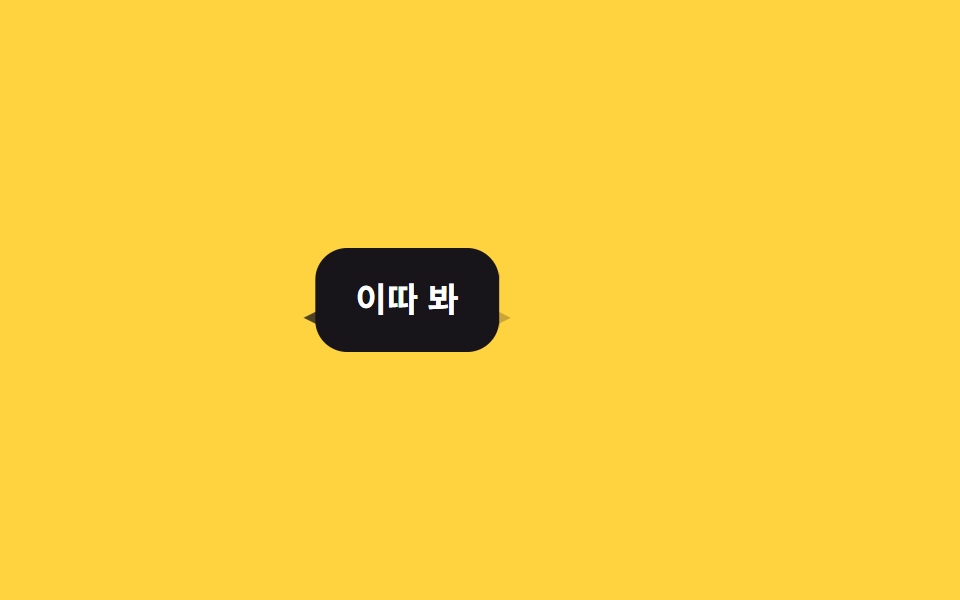
02Đổi hướng đuôi bong bóng
Đuôi tam giác vẽ bằng clip-path đổi bên trái/phải bằng opacity chồng lớp, tuỳ theo tin gửi đi hay nhận về.
Dùng choChat 1:1 cần phân biệt gửi/nhận, bong bóng trong chat nhóm
clip-pathpolygon()좌우 반전
<main class="stage">
  <div class="bubble is-demo">
    Gặp sau nhé
    <i class="tail tail--left"></i>
    <i class="tail tail--right"></i>
  </div>
</main>
@use "../../../../site/static/demo-tokens" as *;
// ── 변수 3개 ──────────────────────────────────────────────
$duration: $dur-base; // 왼쪽 ↔ 오른쪽 한 번 전환에 걸리는 시간
$easing: $ease-out;
$color: $subject-ink; // 말풍선 색 (yellow 무대라 ink)
@include stage($stage-yellow);
.bubble {
position: relative;
padding: 14px 20px;
border-radius: $r-card;
background: $color;
color: #fff;
font-weight: 600; font-size: clamp(14px, 4.5vw, 17px); line-height: 1.4; font-family: inherit;
&.is-demo {
animation: tail-shift-loop $dur-loop $easing infinite;
}
}
// clip-path 삼각형 꼬리 — 왼쪽·오른쪽 두 장을 겹쳐 두고 opacity 로만 바꿔친다
.tail {
position: absolute;
bottom: 10px;
width: 14px;
height: 14px;
background: $color;
}
.tail--left { left: -6px; clip-path: polygon(100% 0, 100% 100%, 0 50%); animation: tail-left-loop $dur-loop $easing infinite; }
.tail--right { right: -6px; clip-path: polygon(0 0, 0 100%, 100% 50%); animation: tail-right-loop $dur-loop $easing infinite; }
// 말풍선 전체가 왼쪽(수신)↔오른쪽(발신)으로 옮겨가고, 꼬리는 그 자리에서 opacity 로 바뀐다
@keyframes tail-shift-loop {
0% { transform: translateX(-70px); }
32% { transform: translateX(-70px); }
68% { transform: translateX(70px); }
100% { transform: translateX(70px); }
}
@keyframes tail-left-loop {
0% { opacity: 1; }
32% { opacity: 1; }
68% { opacity: 0; }
100% { opacity: 0; }
}
@keyframes tail-right-loop {
0% { opacity: 0; }
32% { opacity: 0; }
68% { opacity: 1; }
100% { opacity: 1; }
}
@media (prefers-reduced-motion: reduce) {
.bubble.is-demo, .tail--left, .tail--right { animation: none !important; }
.bubble.is-demo { transform: translateX(-70px); }
.tail--left { opacity: 1; }
.tail--right { opacity: 0; }
}html, body {
margin: 0;
overflow: hidden;
}
.stage {
box-sizing: border-box;
min-height: 100vh;
display: grid;
place-items: center;
margin: 0;
background: #ffd23f;
font-family: -apple-system, "Segoe UI", "Noto Sans KR", sans-serif;
padding: clamp(8px, 4vw, 24px);
}
.bubble {
position: relative;
padding: 14px 20px;
border-radius: 16px;
background: #17141a;
color: #fff;
font-weight: 600;
font-size: clamp(14px, 4.5vw, 17px);
line-height: 1.4;
font-family: inherit;
}
.bubble.is-demo {
animation: tail-shift-loop 2s ease-out infinite;
}
.tail {
position: absolute;
bottom: 10px;
width: 14px;
height: 14px;
background: #17141a;
}
.tail--left {
left: -6px;
clip-path: polygon(100% 0, 100% 100%, 0 50%);
animation: tail-left-loop 2s ease-out infinite;
}
.tail--right {
right: -6px;
clip-path: polygon(0 0, 0 100%, 100% 50%);
animation: tail-right-loop 2s ease-out infinite;
}
@keyframes tail-shift-loop {
0% {
transform: translateX(-70px);
}
32% {
transform: translateX(-70px);
}
68% {
transform: translateX(70px);
}
100% {
transform: translateX(70px);
}
}
@keyframes tail-left-loop {
0% {
opacity: 1;
}
32% {
opacity: 1;
}
68% {
opacity: 0;
}
100% {
opacity: 0;
}
}
@keyframes tail-right-loop {
0% {
opacity: 0;
}
32% {
opacity: 0;
}
68% {
opacity: 1;
}
100% {
opacity: 1;
}
}
@media (prefers-reduced-motion: reduce) {
.bubble.is-demo, .tail--left, .tail--right {
animation: none !important;
}
.bubble.is-demo {
transform: translateX(-70px);
}
.tail--left {
opacity: 1;
}
.tail--right {
opacity: 0;
}
}import type { CSSProperties } from "react";
import styles from "./TailDirection.module.scss";
export type TailDirectionProps = {
children: string;
/** 발신(right)인가 수신(left)인가 */
side?: "left" | "right";
/** 전환에 걸리는 시간 (기본 300ms) */
duration?: number;
easing?: string;
className?: string;
};
type Vars = CSSProperties & { "--duration"?: string; "--easing"?: string };
export default function TailDirection({
children,
side = "right",
duration = 300,
easing = "ease-out",
className = "",
}: TailDirectionProps) {
const vars: Vars = { "--duration": `${duration}ms`, "--easing": easing };
return (
<div className={`${styles.bubble} ${styles[side]} ${className}`} style={vars}>
{children}
<i className={`${styles.tail} ${styles.tailLeft}`} />
<i className={`${styles.tail} ${styles.tailRight}`} />
</div>
);
}02 Đổi hướng đuôi bong bóng — Diện tích đo được 8.289% · khung hình chuyển động 10/23Nguyên tác GODRICH · SCSS và React nằm trong tệp zip · 9 CSS Chat Bubble Animation — dán 1 dòng là chạy
Bài viết chứa demo này
 9 CSS Chat Bubble Animation — dán 1 dòng là chạyCSS chat bubble animation là hiệu ứng bong bóng chat chạy bằng CSS thuần khi tin nhắn xuất hiện hoặc được xem. Chín kiểu Xem tất cả demo trong bài này