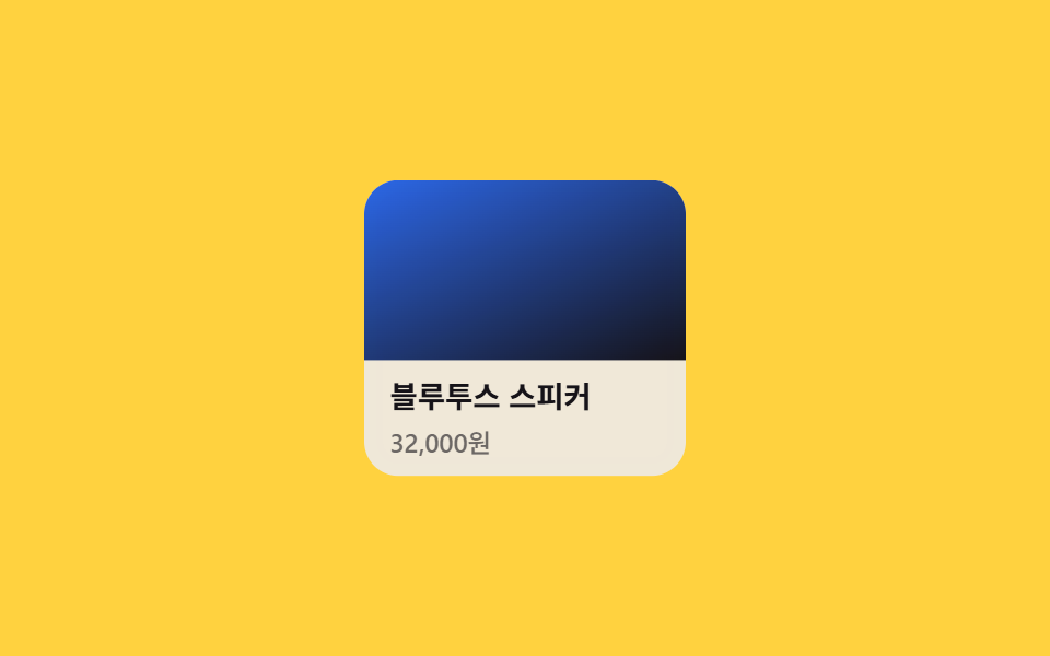
06Thẻ co nhẹ và tối màu khi chạm
Trong lúc chạm, scale(.98) và filter: brightness(.94) chạy cùng lúc nên cả thẻ trông như bị ấn xuống chứ không chỉ đổi viền ngoài.
Dùng choThẻ sản phẩm hoặc thumbnail, nơi vùng chạm rộng và cần cảm giác bấm rõ ràng.
scalefilter: brightnesstouch-action
<main class="stage">
  <article class="card is-demo" tabindex="0">
    <span class="card__media" aria-hidden="true"></span>
    <div class="card__body">
      <h3 class="card__title">Loa Bluetooth</h3>
      <p class="card__meta">32.000 KRW</p>
    </div>
  </article>
</main>
@use "../../../../site/static/demo-tokens" as *;
$duration: $dur-quick;
$easing: $ease-out;
$color: $stage-ink; // 글자 색
@include stage($stage-yellow);
.stage { padding: clamp(6px, 2.4vw, 16px); }
.card {
position: relative;
width: min(150px, 48vw);
border-radius: $r-card;
background: $subject-cream;
overflow: hidden;
cursor: pointer;
touch-action: manipulation; // 더블탭 확대 방지
transform: scale(1);
filter: brightness(1);
transition: transform $duration $easing, filter $duration $easing;
// 규칙8 한 겹: 눌리는 순간 카드 안쪽 가장자리로 두 겹 링이 불규칙하게 번지다 감쇠
&::after {
content: "";
position: absolute;
inset: 0;
border-radius: inherit;
box-shadow: inset 0 0 0 0 rgba($subject-blue, .4), inset 0 0 0 0 rgba($subject-blue, .22);
opacity: 0;
pointer-events: none;
}
}
.card__media {
display: block;
aspect-ratio: 16 / 9;
background: linear-gradient(155deg, $subject-blue 0%, $stage-ink 100%);
}
.card__body { padding: 8px 12px; }
.card__title { margin: 0 0 4px; font-weight: 700; font-size: clamp(12px, 3.4vw, 14px); line-height: 1.3; font-family: inherit; color: $color; }
.card__meta { margin: 0; font-weight: 500; font-size: clamp(11px, 3vw, 12px); line-height: 1.3; font-family: inherit; color: rgba($color, .6); }
.card:active {
transform: scale(.98);
filter: brightness(.94);
}
.card:active::after {
animation: ripple-wave $dur-enter $easing;
}
.card:focus-visible {
outline: 3px solid $subject-blue;
outline-offset: 3px;
}
.card.is-demo { animation: tap-loop $dur-loop $easing infinite; }
.card.is-demo::after { animation: ripple-loop $dur-loop $easing infinite; }
@keyframes tap-loop {
0%, 20% { transform: scale(1); filter: brightness(1); }
50%, 70% { transform: scale(.98); filter: brightness(.94); }
100% { transform: scale(1); filter: brightness(1); }
}
@keyframes ripple-wave {
0% { box-shadow: inset 0 0 0 0 rgba($subject-blue, .62), inset 0 0 0 0 rgba($subject-blue, .45); opacity: 1; }
16% { box-shadow: inset 0 0 0 5px rgba($subject-blue, .62), inset 0 0 0 2px rgba($subject-blue, .45); opacity: 1; }
48% { box-shadow: inset 0 0 0 8px rgba($subject-blue, .55), inset 0 0 0 5px rgba($subject-blue, .4); opacity: 1; }
56% { box-shadow: inset 0 0 0 9px rgba($subject-blue, 0), inset 0 0 0 6px rgba($subject-blue, 0); opacity: 0; }
100% { box-shadow: inset 0 0 0 9px rgba($subject-blue, 0), inset 0 0 0 6px rgba($subject-blue, 0); opacity: 0; }
}
@keyframes ripple-loop {
0%, 40% { box-shadow: inset 0 0 0 0 rgba($subject-blue, .62), inset 0 0 0 0 rgba($subject-blue, .45); opacity: 1; }
46% { box-shadow: inset 0 0 0 5px rgba($subject-blue, .62), inset 0 0 0 2px rgba($subject-blue, .45); opacity: 1; }
62% { box-shadow: inset 0 0 0 8px rgba($subject-blue, .55), inset 0 0 0 5px rgba($subject-blue, .4); opacity: 1; }
68% { box-shadow: inset 0 0 0 9px rgba($subject-blue, 0), inset 0 0 0 6px rgba($subject-blue, 0); opacity: 0; }
74%, 100% { box-shadow: inset 0 0 0 9px rgba($subject-blue, 0), inset 0 0 0 6px rgba($subject-blue, 0); opacity: 0; }
}
@media (prefers-reduced-motion: reduce) {
.card { transition: none; }
.card::after { animation: none !important; opacity: 0; }
.card.is-demo { animation: none; }
}html, body {
margin: 0;
overflow: hidden;
}
.stage {
box-sizing: border-box;
min-height: 100vh;
display: grid;
place-items: center;
margin: 0;
background: #ffd23f;
font-family: -apple-system, "Segoe UI", "Noto Sans KR", sans-serif;
padding: clamp(8px, 4vw, 24px);
}
.stage {
padding: clamp(6px, 2.4vw, 16px);
}
.card {
position: relative;
width: min(150px, 48vw);
border-radius: 16px;
background: #fff7e6;
overflow: hidden;
cursor: pointer;
touch-action: manipulation;
transform: scale(1);
filter: brightness(1);
transition: transform 220ms ease-out, filter 220ms ease-out;
}
.card::after {
content: "";
position: absolute;
inset: 0;
border-radius: inherit;
box-shadow: inset 0 0 0 0 rgba(47, 109, 246, 0.4), inset 0 0 0 0 rgba(47, 109, 246, 0.22);
opacity: 0;
pointer-events: none;
}
.card__media {
display: block;
aspect-ratio: 16/9;
background: linear-gradient(155deg, #2f6df6 0%, #17141a 100%);
}
.card__body {
padding: 8px 12px;
}
.card__title {
margin: 0 0 4px;
font-weight: 700;
font-size: clamp(12px, 3.4vw, 14px);
line-height: 1.3;
font-family: inherit;
color: #17141a;
}
.card__meta {
margin: 0;
font-weight: 500;
font-size: clamp(11px, 3vw, 12px);
line-height: 1.3;
font-family: inherit;
color: rgba(23, 20, 26, 0.6);
}
.card:active {
transform: scale(0.98);
filter: brightness(0.94);
}
.card:active::after {
animation: ripple-wave 600ms ease-out;
}
.card:focus-visible {
outline: 3px solid #2f6df6;
outline-offset: 3px;
}
.card.is-demo {
animation: tap-loop 2s ease-out infinite;
}
.card.is-demo::after {
animation: ripple-loop 2s ease-out infinite;
}
@keyframes tap-loop {
0%, 20% {
transform: scale(1);
filter: brightness(1);
}
50%, 70% {
transform: scale(0.98);
filter: brightness(0.94);
}
100% {
transform: scale(1);
filter: brightness(1);
}
}
@keyframes ripple-wave {
0% {
box-shadow: inset 0 0 0 0 rgba(47, 109, 246, 0.62), inset 0 0 0 0 rgba(47, 109, 246, 0.45);
opacity: 1;
}
16% {
box-shadow: inset 0 0 0 5px rgba(47, 109, 246, 0.62), inset 0 0 0 2px rgba(47, 109, 246, 0.45);
opacity: 1;
}
48% {
box-shadow: inset 0 0 0 8px rgba(47, 109, 246, 0.55), inset 0 0 0 5px rgba(47, 109, 246, 0.4);
opacity: 1;
}
56% {
box-shadow: inset 0 0 0 9px rgba(47, 109, 246, 0), inset 0 0 0 6px rgba(47, 109, 246, 0);
opacity: 0;
}
100% {
box-shadow: inset 0 0 0 9px rgba(47, 109, 246, 0), inset 0 0 0 6px rgba(47, 109, 246, 0);
opacity: 0;
}
}
@keyframes ripple-loop {
0%, 40% {
box-shadow: inset 0 0 0 0 rgba(47, 109, 246, 0.62), inset 0 0 0 0 rgba(47, 109, 246, 0.45);
opacity: 1;
}
46% {
box-shadow: inset 0 0 0 5px rgba(47, 109, 246, 0.62), inset 0 0 0 2px rgba(47, 109, 246, 0.45);
opacity: 1;
}
62% {
box-shadow: inset 0 0 0 8px rgba(47, 109, 246, 0.55), inset 0 0 0 5px rgba(47, 109, 246, 0.4);
opacity: 1;
}
68% {
box-shadow: inset 0 0 0 9px rgba(47, 109, 246, 0), inset 0 0 0 6px rgba(47, 109, 246, 0);
opacity: 0;
}
74%, 100% {
box-shadow: inset 0 0 0 9px rgba(47, 109, 246, 0), inset 0 0 0 6px rgba(47, 109, 246, 0);
opacity: 0;
}
}
@media (prefers-reduced-motion: reduce) {
.card {
transition: none;
}
.card::after {
animation: none !important;
opacity: 0;
}
.card.is-demo {
animation: none;
}
}import type { CSSProperties, ReactNode } from "react";
import styles from "./TapScaleCard.module.scss";
export type TapScaleCardProps = {
title: string;
meta: string;
duration?: number;
easing?: string;
media?: ReactNode;
};
type Vars = CSSProperties & { "--duration"?: string; "--easing"?: string };
export default function TapScaleCard({
title,
meta,
duration = 220,
easing = "ease-out",
media,
}: TapScaleCardProps) {
const vars: Vars = { "--duration": `${duration}ms`, "--easing": easing };
return (
<article className={styles.card} style={vars} tabIndex={0}>
<span className={styles.media} aria-hidden="true">{media}</span>
<div className={styles.body}>
<h3 className={styles.title}>{title}</h3>
<p className={styles.meta}>{meta}</p>
</div>
</article>
);
}06 Thẻ co nhẹ và tối màu khi chạm — Diện tích đo được 7.167% · khung hình chuyển động 19/23Nguyên tác GODRICH · SCSS và React nằm trong tệp zip · 9 CSS Button Click Feedback, dán 1 dòng chạy ngay
Bài viết chứa demo này
 9 CSS Button Click Feedback, dán 1 dòng chạy ngayCSS button click feedback là chuyển động CSS ngắn xuất hiện khi bạn nhấn hoặc chạm vào một nút, báo hiệu rằng thao tác đ Xem tất cả demo trong bài này