02Vòng tròn bám theo con trỏ
Toạ độ lấy từ pointermove được đưa vào một custom property rồi truyền cho transform: translate, nên vòng tròn viền bám theo vị trí con trỏ với một chút độ trễ.
Dùng choKhu vực hero của portfolio, landing tương tác gợi ý âm thầm vùng có thể click
pointermovetransform: translate지연 추적
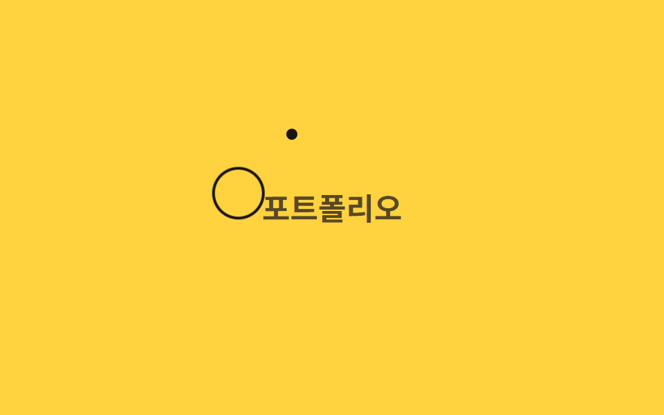
<main class="stage">
  <p class="hint">Portfolio</p>
  <div class="dot is-demo" aria-hidden="true"></div>
  <div class="ring is-demo" aria-hidden="true"></div>
</main>
@use "../../../../site/static/demo-tokens" as *;
$duration: $dur-loop; // 점이 경로를 한 바퀴 도는 시간
$easing: $ease-spring;
$color: $subject-ink; // 링 색
@include stage($stage-yellow);
.stage { position: relative; overflow: hidden; cursor: none; }
.hint {
margin: 0;
font-weight: 700; font-size: clamp(16px, 5vw, 22px); line-height: 1.3; font-family: inherit;
color: rgba($stage-ink, .72); // AA: 옐로 면 위 6.06:1
}
.dot,
.ring {
position: absolute;
top: 0;
left: 0;
border-radius: 50%;
pointer-events: none;
}
.dot {
width: 8px;
height: 8px;
background: $color;
}
.ring {
width: 34px;
height: 34px;
margin: -13px 0 0 -13px; // 점과 중심을 맞춘다
border: 2px solid $color;
transition: transform 180ms $easing; // 실제 조작에서 링이 뒤늦게 쫓아오는 이유
}
.dot.is-demo { animation: cursor-path $duration $easing infinite; }
.ring.is-demo { animation: cursor-path $duration $easing infinite; animation-delay: -140ms; }
@keyframes cursor-path {
0% { transform: translate(50px, 40px); }
35% { transform: translate(230px, 70px); }
70% { transform: translate(150px, 150px); }
100% { transform: translate(50px, 40px); }
}
@media (pointer: coarse) {
.dot, .ring { display: none; }
.stage { cursor: auto; }
}
@media (prefers-reduced-motion: reduce) {
.dot.is-demo, .ring.is-demo { animation: none; transform: translate(50px, 40px); }
.ring { transition: none; }
}html, body {
margin: 0;
overflow: hidden;
}
.stage {
box-sizing: border-box;
min-height: 100vh;
display: grid;
place-items: center;
margin: 0;
background: #ffd23f;
font-family: -apple-system, "Segoe UI", "Noto Sans KR", sans-serif;
padding: clamp(8px, 4vw, 24px);
}
.stage {
position: relative;
overflow: hidden;
cursor: none;
}
.hint {
margin: 0;
font-weight: 700;
font-size: clamp(16px, 5vw, 22px);
line-height: 1.3;
font-family: inherit;
color: rgba(23, 20, 26, 0.72);
}
.dot,
.ring {
position: absolute;
top: 0;
left: 0;
border-radius: 50%;
pointer-events: none;
}
.dot {
width: 8px;
height: 8px;
background: #17141a;
}
.ring {
width: 34px;
height: 34px;
margin: -13px 0 0 -13px;
border: 2px solid #17141a;
transition: transform 180ms cubic-bezier(0.2, 0.8, 0.2, 1);
}
.dot.is-demo {
animation: cursor-path 2s cubic-bezier(0.2, 0.8, 0.2, 1) infinite;
}
.ring.is-demo {
animation: cursor-path 2s cubic-bezier(0.2, 0.8, 0.2, 1) infinite;
animation-delay: -140ms;
}
@keyframes cursor-path {
0% {
transform: translate(50px, 40px);
}
35% {
transform: translate(230px, 70px);
}
70% {
transform: translate(150px, 150px);
}
100% {
transform: translate(50px, 40px);
}
}
@media (pointer: coarse) {
.dot, .ring {
display: none;
}
.stage {
cursor: auto;
}
}
@media (prefers-reduced-motion: reduce) {
.dot.is-demo, .ring.is-demo {
animation: none;
transform: translate(50px, 40px);
}
.ring {
transition: none;
}
}// 실제 포인터가 움직이면 점과 링이 같은 좌표를 따라가되 링에는 transition 지연이 있어 뒤처져 보인다.
if (matchMedia('(pointer: fine)').matches) {
var stage = document.querySelector('.stage');
var dot = document.querySelector('.dot');
var ring = document.querySelector('.ring');
stage.addEventListener('pointermove', function (e) {
var r = stage.getBoundingClientRect();
dot.classList.remove('is-demo'); ring.classList.remove('is-demo');
var v = 'translate(' + (e.clientX - r.left) + 'px,' + (e.clientY - r.top) + 'px)';
dot.style.transform = v; ring.style.transform = v;
});
}import { useState } from "react";
import type { CSSProperties, PointerEvent } from "react";
import styles from "./CursorRingFollow.module.scss";
export type CursorRingFollowProps = {
hint?: string;
duration?: number;
easing?: string;
color?: string;
};
type Vars = CSSProperties & { "--duration"?: string; "--easing"?: string; "--color"?: string };
export default function CursorRingFollow({
hint = "포트폴리오",
duration = 2000,
easing = "cubic-bezier(.2,.8,.2,1)",
color = "#17141a",
}: CursorRingFollowProps) {
const [demo, setDemo] = useState(true);
const [pos, setPos] = useState({ x: 50, y: 40 });
const move = (e: PointerEvent<HTMLDivElement>) => {
const r = e.currentTarget.getBoundingClientRect();
setDemo(false);
setPos({ x: e.clientX - r.left, y: e.clientY - r.top });
};
const vars: Vars = { "--duration": `${duration}ms`, "--easing": easing, "--color": color };
const t = `translate(${pos.x}px,${pos.y}px)`;
return (
<div className={styles.stage} style={vars} onPointerMove={move}>
<p className={styles.hint}>{hint}</p>
<div className={demo ? `${styles.dot} ${styles.isDemo}` : styles.dot} style={demo ? undefined : { transform: t }} />
<div className={demo ? `${styles.ring} ${styles.isDemo}` : styles.ring} style={demo ? undefined : { transform: t }} />
</div>
);
}02 Vòng tròn bám theo con trỏ — Diện tích đo được 4.766% · khung hình chuyển động 23/23Nguyên tác GODRICH · SCSS và React nằm trong tệp zip · 9 hiệu ứng custom cursor css — copy dán một dòng
Bài viết chứa demo này
 9 hiệu ứng custom cursor css — copy dán một dòngCustom cursor css là cách thay mũi tên mặc định của trình duyệt bằng một phần tử tự vẽ, bám theo toạ độ chuột thật qua p Xem tất cả demo trong bài này