07Mở trễ (transition-delay)
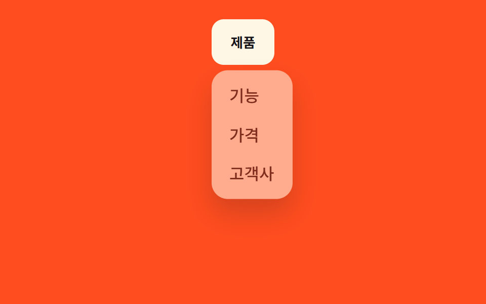
Menu chờ 150ms sau khi con trỏ đi vào, nhờ transition-delay, để con trỏ lướt qua không làm menu mở ra.
Dùng choNhiều menu header xếp cạnh nhau, điều hướng không nên mở nhầm
transition-delay150ms 지연:hover 진입
<main class="stage">
  <nav class="menu is-demo">
    <button class="menu__trigger" type="button" aria-expanded="false">Sản phẩm</button>
    <ul class="menu__panel">
      <li><a href="#">Tính năng</a></li>
      <li><a href="#">Bảng giá</a></li>
      <li><a href="#">Khách hàng</a></li>
    </ul>
  </nav>
</main>
@use "../../../../site/static/demo-tokens" as *;
$duration: $dur-quick; // 열리고 닫히는 시간
$easing: $ease-out; // 시작 빠르고 끝은 부드럽게
$delay: 150ms; // 진입 후 기다리는 시간 (닫힐 땐 지연 없음)
$color: $subject-cream; // 트리거 버튼 색 (주황 무대와 대비)
@include stage($stage-orange);
.menu {
position: relative;
align-self: flex-start; // 패널이 트리거 아래로 열려 무대 중앙에 두면 아래로 넘친다 — 위로 붙여 여유를 둔다 (실측 320px 재검증 2026-09-10)
font-weight: 500;
font-size: clamp(13px, 3.6vw, 16px);
line-height: 1.4;
font-family: inherit;
&__trigger {
border: 0;
border-radius: $r-control;
padding: clamp(9px, 3vw, 13px) clamp(16px, 4vw, 22px);
font-weight: 700;
font-family: inherit;
color: $stage-ink;
background: $color;
cursor: pointer;
}
&__panel {
position: absolute;
top: calc(100% + 8px);
left: 0;
width: max-content;
max-width: min(150px, 76vw);
margin: 0;
padding: 6px;
list-style: none;
background: $subject-cream;
border-radius: $r-card;
box-shadow: $shadow-raised;
opacity: 0;
transform: translateY(-6px);
pointer-events: none;
transition: opacity $duration $easing, transform $duration $easing; // 닫힐 때는 지연 없이 바로
}
&__panel li a {
display: block;
padding: 8px 12px;
border-radius: $r-control - 4px;
color: $stage-ink;
text-decoration: none;
}
&__panel li a:hover { background: rgba($stage-ink, .06); }
// 마우스가 지나가기만 해선 안 열리게 — 진입 후 $delay 를 기다렸다가 연다
&:hover &__panel,
&.is-open &__panel {
opacity: 1;
transform: none;
pointer-events: auto;
transition-delay: $delay;
}
&.is-demo &__panel { animation: reveal-loop $dur-loop $easing infinite; }
}
@keyframes reveal-loop {
0%, 40% { opacity: 0; transform: translateY(-6px); }
55%, 80% { opacity: 1; transform: none; }
95%, 100% { opacity: 0; transform: translateY(-6px); }
}
@media (prefers-reduced-motion: reduce) {
.menu__panel { transition: none !important; }
.menu.is-demo .menu__panel { animation: none; opacity: 0; transform: none; }
}html, body {
margin: 0;
overflow: hidden;
}
.stage {
box-sizing: border-box;
min-height: 100vh;
display: grid;
place-items: center;
margin: 0;
background: #ff4d1f;
font-family: -apple-system, "Segoe UI", "Noto Sans KR", sans-serif;
padding: clamp(8px, 4vw, 24px);
}
.menu {
position: relative;
align-self: flex-start;
font-weight: 500;
font-size: clamp(13px, 3.6vw, 16px);
line-height: 1.4;
font-family: inherit;
}
.menu__trigger {
border: 0;
border-radius: 12px;
padding: clamp(9px, 3vw, 13px) clamp(16px, 4vw, 22px);
font-weight: 700;
font-family: inherit;
color: #17141a;
background: #fff7e6;
cursor: pointer;
}
.menu__panel {
position: absolute;
top: calc(100% + 8px);
left: 0;
width: max-content;
max-width: min(150px, 76vw);
margin: 0;
padding: 6px;
list-style: none;
background: #fff7e6;
border-radius: 16px;
box-shadow: 0 14px 24px rgba(23, 20, 26, 0.32);
opacity: 0;
transform: translateY(-6px);
pointer-events: none;
transition: opacity 220ms ease-out, transform 220ms ease-out;
}
.menu__panel li a {
display: block;
padding: 8px 12px;
border-radius: 8px;
color: #17141a;
text-decoration: none;
}
.menu__panel li a:hover {
background: rgba(23, 20, 26, 0.06);
}
.menu:hover .menu__panel, .menu.is-open .menu__panel {
opacity: 1;
transform: none;
pointer-events: auto;
transition-delay: 150ms;
}
.menu.is-demo .menu__panel {
animation: reveal-loop 2s ease-out infinite;
}
@keyframes reveal-loop {
0%, 40% {
opacity: 0;
transform: translateY(-6px);
}
55%, 80% {
opacity: 1;
transform: none;
}
95%, 100% {
opacity: 0;
transform: translateY(-6px);
}
}
@media (prefers-reduced-motion: reduce) {
.menu__panel {
transition: none !important;
}
.menu.is-demo .menu__panel {
animation: none;
opacity: 0;
transform: none;
}
}// 데스크톱은 :hover + transition-delay 로만 연다(아래 CSS). 터치 화면을 위해 클릭 토글도 둔다.
var m = document.querySelector('.menu'), t = m.querySelector('.menu__trigger');
t.addEventListener('click', function () {
m.classList.remove('is-demo');
t.setAttribute('aria-expanded', m.classList.toggle('is-open'));
});import { useState } from "react";
import type { CSSProperties } from "react";
import styles from "./HoverIntentDropdown.module.scss";
export type HoverIntentDropdownProps = {
triggerLabel: string;
items: string[];
/** 열리고 닫히는 시간 (기본 220ms) */
duration?: number;
easing?: string;
/** 진입 후 기다리는 시간 (기본 150ms, 닫힐 땐 지연 없음) */
delay?: number;
color?: string;
};
type Vars = CSSProperties & { "--duration"?: string; "--easing"?: string; "--delay"?: string; "--color"?: string };
export default function HoverIntentDropdown({
triggerLabel,
items,
duration = 220,
easing = "ease-out",
delay = 150,
color = "#fff7e6",
}: HoverIntentDropdownProps) {
const [open, setOpen] = useState(false);
const vars: Vars = { "--duration": `${duration}ms`, "--easing": easing, "--delay": `${delay}ms`, "--color": color };
return (
// 데스크톱은 CSS :hover 만으로 지연 열림이 동작한다. 터치 화면을 위해 클릭 토글도 겸한다.
<nav className={styles.menu} style={vars} onClick={() => setOpen((v) => !v)}>
<button type="button" className={styles.trigger} aria-expanded={open}>{triggerLabel}</button>
<ul className={open ? `${styles.panel} ${styles.panelOpen}` : styles.panel}>
{items.map((label) => (
<li key={label}><a href="#">{label}</a></li>
))}
</ul>
</nav>
);
}07 Mở trễ (transition-delay) — Diện tích đo được 10.278% · khung hình chuyển động 8/23Nguyên tác GODRICH · SCSS và React nằm trong tệp zip · 9 css dropdown menu animation — không JS, chỉ CSS
Bài viết chứa demo này
 9 css dropdown menu animation — không JS, chỉ CSSMột css dropdown menu animation là chuyển động khi menu điều hướng ẩn hiện, dựng bằng transition hoặc keyframes thuần CS Xem tất cả demo trong bài này