02Thanh nav kính
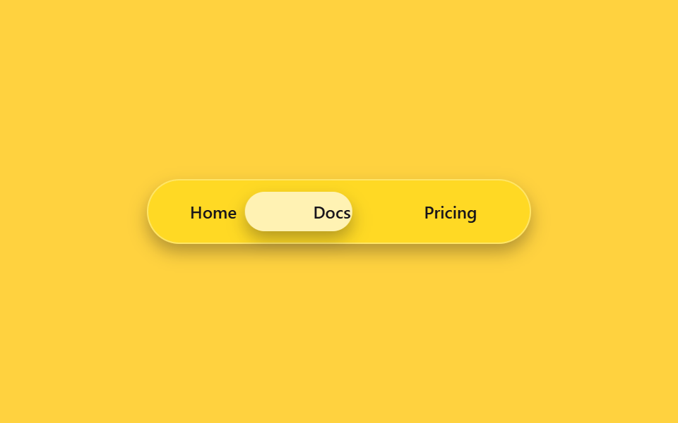
Trong thanh nav chất liệu kính bán trong suốt, một pill kính nhòe trượt bằng translateX đến phía sau menu đang chọn; mỗi tab giữ độ rộng cố định nên pill luôn đáp đúng vị trí dù chữ dài ngắn khác nhau.
Dùng choNav đầu trang của web app, menu header landing page
backdrop-filtertranslateX220ms
<main class="stage">
  <nav class="gn-nav is-demo" aria-label="demo">
    <span class="gn-pill" aria-hidden="true"></span>
    <a class="gn-link" href="#">Home</a>
    <a class="gn-link" href="#">Docs</a>
    <a class="gn-link" href="#">Pricing</a>
  </nav>
</main>
@use "../../../../site/static/demo-tokens" as *;
// ── 변수 3개 ──────────────────────────────────────────
$duration: $dur-quick;
$easing: $ease-pop;
$color: $subject-blue;
@include stage($stage-yellow);
// 라벨 폭을 고정값으로 둔다 — translateX 만 쓰고 scaleX 는 안 쓰므로 BD19(flex 분배) 대상은 아니지만,
// 실제 폭이 흔들리면 필이 라벨 밖으로 걸리는 건 매한가지라 flex:0 0 auto + 고정 width 로 고정한다
$w: 76px;
.gn-nav {
position: relative;
box-sizing: border-box;
width: min(272px, 86vw);
display: flex;
gap: $sp-2;
padding: $sp-2;
border-radius: $r-pill;
background: rgba(255, 255, 255, .14);
border: 1px solid rgba(255, 255, 255, .3);
backdrop-filter: blur(14px) saturate(160%);
-webkit-backdrop-filter: blur(14px) saturate(160%);
box-shadow: $shadow-press;
}
.gn-link {
position: relative;
z-index: 1;
flex: 0 0 auto;
box-sizing: border-box;
width: $w;
text-align: center;
padding: $sp-2 0;
border-radius: $r-pill;
font: 600 12px/1 -apple-system, "Segoe UI", sans-serif;
color: $subject-ink;
text-decoration: none;
}
.gn-pill {
position: absolute;
top: $sp-2; left: $sp-2; bottom: $sp-2;
box-sizing: border-box;
width: $w;
border-radius: $r-pill;
background: rgba(255, 255, 255, .6);
backdrop-filter: blur(6px);
box-shadow: $shadow-press;
transform: translateX(0);
transition: transform $duration $easing;
}
// 실사용: 진짜 호버로 필이 그 링크 아래로 이동 (:has 로 형제 상태를 읽는다)
.gn-nav:has(.gn-link:nth-child(3):hover) .gn-pill { transform: translateX(calc(#{$w} + #{$sp-2})); }
.gn-nav:has(.gn-link:nth-child(4):hover) .gn-pill { transform: translateX(calc((#{$w} + #{$sp-2}) * 2)); }
// 데모 루프: is-demo 는 세 자리를 keyframes 로 오간다 (헤드리스는 :has(:hover) 를 못 건다)
@keyframes gn-loop {
0%, 15% { transform: translateX(0); }
33%, 48% { transform: translateX(calc(#{$w} + #{$sp-2})); }
66%, 81% { transform: translateX(calc((#{$w} + #{$sp-2}) * 2)); }
100% { transform: translateX(0); }
}
.gn-nav.is-demo .gn-pill { animation: gn-loop $dur-loop $easing infinite; }
@media (prefers-reduced-motion: reduce) {
.gn-pill { transition: none; }
.gn-nav.is-demo .gn-pill { animation: none !important; }
}html, body {
margin: 0;
overflow: hidden;
}
.stage {
box-sizing: border-box;
min-height: 100vh;
display: grid;
place-items: center;
margin: 0;
background: #ffd23f;
font-family: -apple-system, "Segoe UI", "Noto Sans KR", sans-serif;
padding: clamp(8px, 4vw, 24px);
}
.gn-nav {
position: relative;
box-sizing: border-box;
width: min(272px, 86vw);
display: flex;
gap: 8px;
padding: 8px;
border-radius: 999px;
background: rgba(255, 255, 255, 0.14);
border: 1px solid rgba(255, 255, 255, 0.3);
backdrop-filter: blur(14px) saturate(160%);
-webkit-backdrop-filter: blur(14px) saturate(160%);
box-shadow: 0 6px 12px rgba(23, 20, 26, 0.32);
}
.gn-link {
position: relative;
z-index: 1;
flex: 0 0 auto;
box-sizing: border-box;
width: 76px;
text-align: center;
padding: 8px 0;
border-radius: 999px;
font: 600 12px/1 -apple-system, "Segoe UI", sans-serif;
color: #17141a;
text-decoration: none;
}
.gn-pill {
position: absolute;
top: 8px;
left: 8px;
bottom: 8px;
box-sizing: border-box;
width: 76px;
border-radius: 999px;
background: rgba(255, 255, 255, 0.6);
backdrop-filter: blur(6px);
box-shadow: 0 6px 12px rgba(23, 20, 26, 0.32);
transform: translateX(0);
transition: transform 220ms cubic-bezier(0.2, 1.4, 0.4, 1);
}
.gn-nav:has(.gn-link:nth-child(3):hover) .gn-pill {
transform: translateX(calc(76px + 8px));
}
.gn-nav:has(.gn-link:nth-child(4):hover) .gn-pill {
transform: translateX(calc((76px + 8px) * 2));
}
@keyframes gn-loop {
0%, 15% {
transform: translateX(0);
}
33%, 48% {
transform: translateX(calc(76px + 8px));
}
66%, 81% {
transform: translateX(calc((76px + 8px) * 2));
}
100% {
transform: translateX(0);
}
}
.gn-nav.is-demo .gn-pill {
animation: gn-loop 2s cubic-bezier(0.2, 1.4, 0.4, 1) infinite;
}
@media (prefers-reduced-motion: reduce) {
.gn-pill {
transition: none;
}
.gn-nav.is-demo .gn-pill {
animation: none !important;
}
}import { CSSProperties } from "react";
import styles from "./GlassNavbar.module.scss";
type Vars = CSSProperties & {
"--duration"?: string;
"--easing"?: string;
};
export interface GlassNavbarProps {
duration?: string;
easing?: string;
}
const LINKS = ["Home", "Docs", "Pricing"];
export default function GlassNavbar({
duration = "220ms",
easing = "cubic-bezier(.2, 1.4, .4, 1)",
}: GlassNavbarProps) {
const style: Vars = { "--duration": duration, "--easing": easing };
return (
<nav className={styles.nav} style={style} aria-label="glass nav">
<span className={styles.pill} aria-hidden="true" />
{LINKS.map((label) => (
<a key={label} className={styles.link} href="#">
{label}
</a>
))}
</nav>
);
}02 Thanh nav kính — Diện tích đo được 6.783% · khung hình chuyển động 14/23Nguyên tác GODRICH · SCSS và React nằm trong tệp zip · 9 css glassmorphism — dán một file là chạy
Bài viết chứa demo này
 9 css glassmorphism — dán một file là chạyGlassmorphism là đặt một tấm kính mờ lên màn hình: nền phía sau hiện lên mờ mềm còn chữ phía trên vẫn rõ nét. Chín hiệu Xem tất cả demo trong bài này