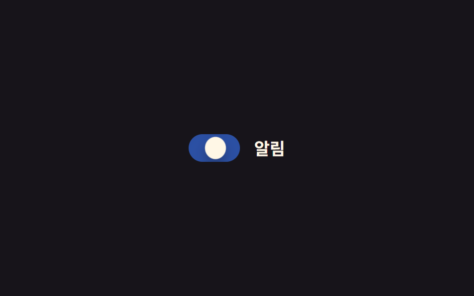
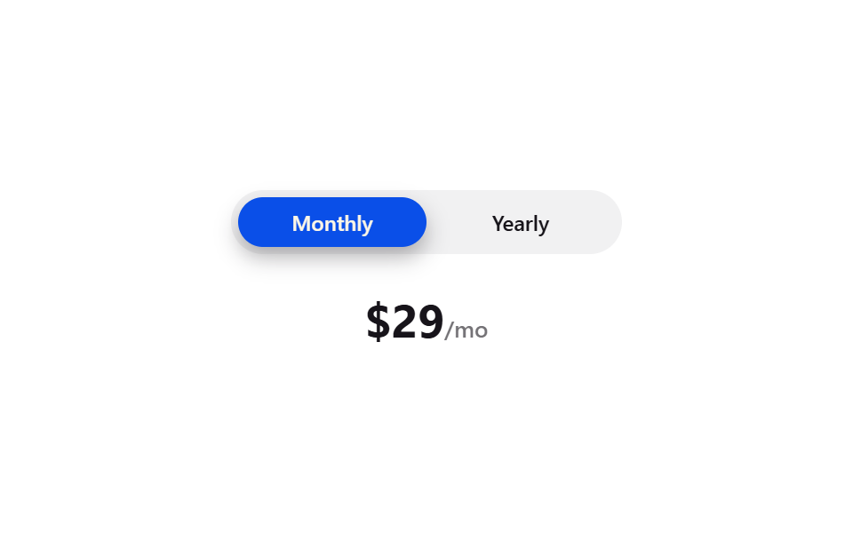
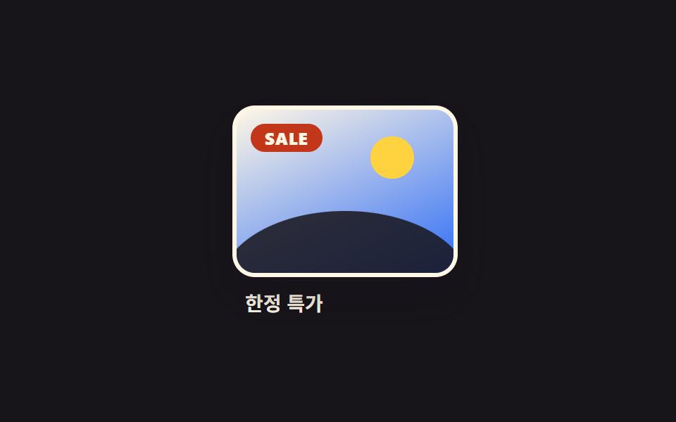
08Công tắc kính
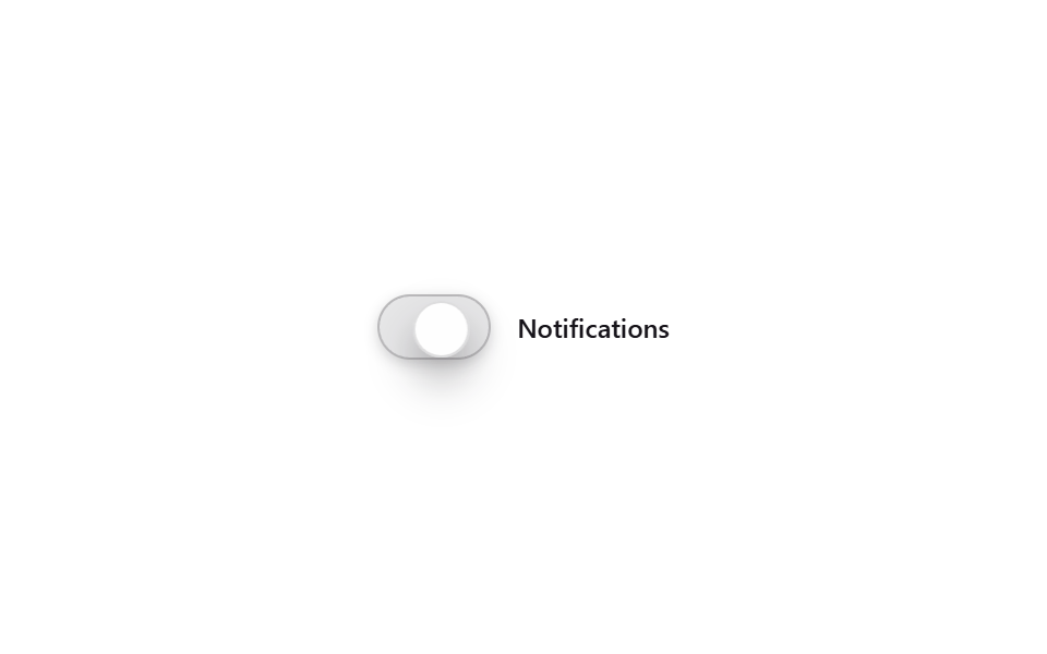
Trong rãnh chất liệu kính, núm trượt qua lại giữa bật và tắt bằng translateX, màu rãnh cũng đổi nhè nhẹ theo trạng thái.
Dùng choCông tắc màn hình cài đặt, bật/tắt thông báo
backdrop-filtertranslateX300ms
<main class="stage">
  <label class="sw is-demo">
    <input type="checkbox" class="sw__input">
    <span class="sw__track"><span class="sw__knob"></span></span>
    <span class="sw__label">Notifications</span>
  </label>
</main>
@use "../../../../site/static/demo-tokens" as *;
// ── 변수 3개 ──────────────────────────────────────────
$duration: $dur-base;
$easing: $ease-spring;
$color: $subject-blue;
@include stage($stage-paper);
.sw {
display: inline-flex;
align-items: center;
gap: $sp-3;
cursor: pointer;
}
.sw__input { position: absolute; opacity: 0; pointer-events: none; }
// 무대(paper, 흰색) 위에서 흰 유리 트랙은 대비가 거의 사라졌다 (실측: poster.png 가 거의 빈 화면으로 보임) —
// 트랙 색조를 잉크 쪽으로 옮기고 테두리·그림자를 짙게 해 흰 무대에서도 윤곽이 읽히게 했다
.sw__track {
position: relative;
flex: 0 0 auto;
width: 52px;
height: 30px;
box-sizing: border-box;
border-radius: $r-pill;
background: rgba($subject-ink, .1);
border: 1px solid rgba($subject-ink, .22);
backdrop-filter: blur(10px) saturate(160%);
-webkit-backdrop-filter: blur(10px) saturate(160%);
box-shadow: 0 2px 6px rgba($subject-ink, .18);
}
.sw__knob {
position: absolute;
top: 2px; left: 2px;
width: 24px; height: 24px;
border-radius: 50%;
background: rgba(255, 255, 255, .96);
border: 1px solid rgba($subject-ink, .14);
box-shadow: $shadow-press;
transform: translateX(0);
transition: transform $duration $easing, box-shadow $duration $easing;
}
.sw__label { color: $subject-ink; font: 600 12px/1 -apple-system, "Segoe UI", sans-serif; }
// 실사용: 체크박스 상태만으로 손잡이가 이동한다
.sw__input:checked ~ .sw__track .sw__knob {
transform: translateX(22px);
box-shadow: $shadow-raised;
}
.sw__input:checked ~ .sw__track { background: rgba($color, .55); }
// 데모 루프: 클릭 전까지 켜짐·꺼짐을 스스로 오간다
@keyframes sw-knob-loop {
0%, 20% { transform: translateX(0); box-shadow: $shadow-press; }
50%, 70% { transform: translateX(22px); box-shadow: $shadow-raised; }
100% { transform: translateX(0); box-shadow: $shadow-press; }
}
.sw.is-demo .sw__knob { animation: sw-knob-loop $dur-loop $easing infinite; }
@media (prefers-reduced-motion: reduce) {
.sw__knob { transition: none; }
.sw.is-demo .sw__knob { animation: none !important; }
}html, body {
margin: 0;
overflow: hidden;
}
.stage {
box-sizing: border-box;
min-height: 100vh;
display: grid;
place-items: center;
margin: 0;
background: #ffffff;
font-family: -apple-system, "Segoe UI", "Noto Sans KR", sans-serif;
padding: clamp(8px, 4vw, 24px);
}
.sw {
display: inline-flex;
align-items: center;
gap: 12px;
cursor: pointer;
}
.sw__input {
position: absolute;
opacity: 0;
pointer-events: none;
}
.sw__track {
position: relative;
flex: 0 0 auto;
width: 52px;
height: 30px;
box-sizing: border-box;
border-radius: 999px;
background: rgba(23, 20, 26, 0.1);
border: 1px solid rgba(23, 20, 26, 0.22);
backdrop-filter: blur(10px) saturate(160%);
-webkit-backdrop-filter: blur(10px) saturate(160%);
box-shadow: 0 2px 6px rgba(23, 20, 26, 0.18);
}
.sw__knob {
position: absolute;
top: 2px;
left: 2px;
width: 24px;
height: 24px;
border-radius: 50%;
background: rgba(255, 255, 255, 0.96);
border: 1px solid rgba(23, 20, 26, 0.14);
box-shadow: 0 6px 12px rgba(23, 20, 26, 0.32);
transform: translateX(0);
transition: transform 300ms cubic-bezier(0.2, 0.8, 0.2, 1), box-shadow 300ms cubic-bezier(0.2, 0.8, 0.2, 1);
}
.sw__label {
color: #17141a;
font: 600 12px/1 -apple-system, "Segoe UI", sans-serif;
}
.sw__input:checked ~ .sw__track .sw__knob {
transform: translateX(22px);
box-shadow: 0 14px 24px rgba(23, 20, 26, 0.32);
}
.sw__input:checked ~ .sw__track {
background: rgba(47, 109, 246, 0.55);
}
@keyframes sw-knob-loop {
0%, 20% {
transform: translateX(0);
box-shadow: 0 6px 12px rgba(23, 20, 26, 0.32);
}
50%, 70% {
transform: translateX(22px);
box-shadow: 0 14px 24px rgba(23, 20, 26, 0.32);
}
100% {
transform: translateX(0);
box-shadow: 0 6px 12px rgba(23, 20, 26, 0.32);
}
}
.sw.is-demo .sw__knob {
animation: sw-knob-loop 2s cubic-bezier(0.2, 0.8, 0.2, 1) infinite;
}
@media (prefers-reduced-motion: reduce) {
.sw__knob {
transition: none;
}
.sw.is-demo .sw__knob {
animation: none !important;
}
}// 체크박스가 진짜 켜짐·꺼짐을 낸다. 실제로 누르면 데모 루프(.is-demo)만 뗀다.
document.querySelector('.sw__input').addEventListener('pointerdown', function () {
document.querySelector('.sw').classList.remove('is-demo');
});import { CSSProperties, useState } from "react";
import styles from "./GlassToggle.module.scss";
type Vars = CSSProperties & {
"--duration"?: string;
"--easing"?: string;
"--color"?: string;
};
export interface GlassToggleProps {
duration?: string;
easing?: string;
color?: string;
}
export default function GlassToggle({
duration = "300ms",
easing = "cubic-bezier(.2, .8, .2, 1)",
color = "#2f6df6",
}: GlassToggleProps) {
const [on, setOn] = useState(false);
const style: Vars = { "--duration": duration, "--easing": easing, "--color": color };
return (
<button
type="button"
className={styles.sw}
style={style}
role="switch"
aria-checked={on}
onClick={() => setOn((v) => !v)}
>
<span className={`${styles.track} ${on ? styles.on : ""}`}>
<span className={`${styles.knob} ${on ? styles.on : ""}`} />
</span>
<span className={styles.label}>Notifications</span>
</button>
);
}08 Công tắc kính — Diện tích đo được 1.328% · khung hình chuyển động 12/23Nguyên tác GODRICH · SCSS và React nằm trong tệp zip · 9 css glassmorphism — dán một file là chạy
Bài viết chứa demo này
 9 css glassmorphism — dán một file là chạyGlassmorphism là đặt một tấm kính mờ lên màn hình: nền phía sau hiện lên mờ mềm còn chữ phía trên vẫn rõ nét. Chín hiệu Xem tất cả demo trong bài này