01Trái tim bung ra
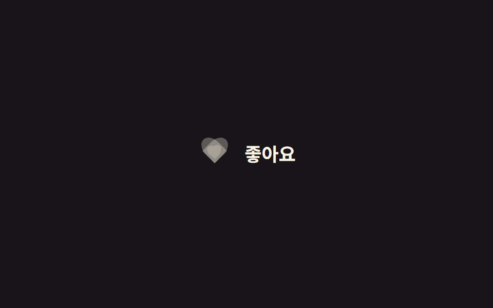
Check vào là lớp tô của trái tim CSS phóng từ 0 lên 1.15 lần quanh chính tâm rồi lắng lại về 1 lần, dựng bằng hai pseudo-element chứ không cần ảnh hay SVG.
Dùng choNút thích bài viết, icon yêu thích sản phẩm
::before/::after 하트:checked0.22초
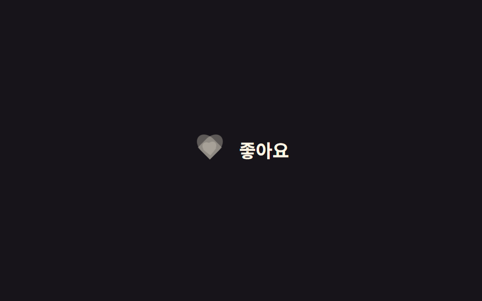
<main class="stage">
  <label class="heart is-demo">
    <input type="checkbox" class="heart__input">
    <span class="heart__icon" aria-hidden="true">
      <span class="heart__shape heart__shape--outline"></span>
      <span class="heart__shape heart__shape--fill"></span>
      <span class="heart__particle heart__particle--heart"></span>
      <span class="heart__particle heart__particle--heart"></span>
      <span class="heart__particle heart__particle--star"></span>
      <span class="heart__particle heart__particle--heart"></span>
      <span class="heart__particle heart__particle--star"></span>
      <span class="heart__particle heart__particle--heart"></span>
      <span class="heart__particle heart__particle--star"></span>
    </span>
    <span class="heart__label">Thích</span>
  </label>
</main>
@use "../../../../site/static/demo-tokens" as *;
// ── 변수 3개. 변형은 이것만 바꾼다 ──────────────────────────
$duration: $dur-quick; // 하트가 튀어 오르는 시간
$easing: $ease-pop; // 튕기는 이징
$color: $subject-cream; // 채워질 때 하트 색
// ── 데모 무대 ──────────────────────────────────────────
@include stage($stage-ink);
@mixin heart-shape {
content: "";
position: absolute;
top: 0;
width: 50%;
height: 80%;
border-radius: 50% 50% 0 0;
background: currentColor;
}
.heart {
display: inline-flex;
align-items: center;
gap: clamp(8px, 2.6vw, 12px);
cursor: pointer;
-webkit-tap-highlight-color: transparent;
&__input { position: absolute; opacity: 0; width: 1px; height: 1px; }
&__icon { position: relative; width: 34px; height: 30px; flex: none; }
&__shape {
position: absolute; inset: 0;
&::before { @include heart-shape; left: 50%; transform: rotate(-45deg); transform-origin: 0 100%; } // 규칙8: 하트 로브 회전 피벗
&::after { @include heart-shape; left: 0; transform: rotate(45deg); transform-origin: 100% 100%; } // 규칙8: 하트 로브 회전 피벗
}
&__shape--outline { color: rgba(255, 247, 230, .3); }
&__shape--fill {
color: $color;
opacity: 0;
transform: scale(.4) rotate(-8deg);
transition: opacity $duration $easing, transform $duration $easing;
}
// 한 겹: 물리 버스트 파티클(미니 하트·별). 좌표·페이드는 JS 가 계산해 여기 transform 을 덮어쓴다.
&__particle {
position: absolute; top: 50%; left: 50%;
width: 10px; height: 10px; margin: -5px 0 0 -5px;
opacity: 0;
pointer-events: none;
will-change: transform, opacity;
}
&__particle--heart {
width: 12px; height: 12px; margin: -6px 0 0 -6px;
background: $color;
clip-path: path("M6 11 1 6.5C-.5 5 .0 2.5 2 2 3.5 1.5 5 2.5 6 4 7 2.5 8.5 1.5 10 2 12 2.5 12.5 5 11 6.5Z");
}
&__particle--star {
background: $color;
clip-path: polygon(50% 0%, 61% 35%, 98% 35%, 68% 57%, 79% 91%, 50% 70%, 21% 91%, 32% 57%, 2% 35%, 39% 35%);
}
&__label { font-weight: 600; font-size: clamp(15px, 4.2vw, 18px); line-height: 1; font-family: inherit; color: $subject-cream; }
// 실제 클릭: 체크되면 채움 하트가 튀며 나타난다
&__input:checked ~ &__icon &__shape--fill { opacity: 1; transform: scale(1) rotate(0deg); }
// 데모 · 문서용: 2초마다 자동 반복
&.is-demo &__icon &__shape--fill { animation: heart-pop-loop $dur-loop $easing infinite; }
}
@keyframes heart-pop-loop {
0%, 15% { opacity: 0; transform: scale(.4) rotate(-8deg); }
35% { opacity: 1; transform: scale(1.15) rotate(6deg); }
55%, 80% { opacity: 1; transform: scale(1) rotate(0deg); }
100% { opacity: 0; transform: scale(.4) rotate(-8deg); }
}
// ── 접근성: 움직임 줄이기 설정이면 순간 전환만 ────────────
@media (prefers-reduced-motion: reduce) {
.heart__shape--fill { transition: opacity 1ms; }
.heart__particle { display: none; } // 파티클 버스트는 꺼짐 — 기본 상태 전환만
.heart.is-demo .heart__icon .heart__shape--fill { animation: none !important; opacity: 1; }
}html, body {
margin: 0;
overflow: hidden;
}
.stage {
box-sizing: border-box;
min-height: 100vh;
display: grid;
place-items: center;
margin: 0;
background: #17141a;
font-family: -apple-system, "Segoe UI", "Noto Sans KR", sans-serif;
padding: clamp(8px, 4vw, 24px);
}
.heart {
display: inline-flex;
align-items: center;
gap: clamp(8px, 2.6vw, 12px);
cursor: pointer;
-webkit-tap-highlight-color: transparent;
}
.heart__input {
position: absolute;
opacity: 0;
width: 1px;
height: 1px;
}
.heart__icon {
position: relative;
width: 34px;
height: 30px;
flex: none;
}
.heart__shape {
position: absolute;
inset: 0;
}
.heart__shape::before {
content: "";
position: absolute;
top: 0;
width: 50%;
height: 80%;
border-radius: 50% 50% 0 0;
background: currentColor;
left: 50%;
transform: rotate(-45deg);
transform-origin: 0 100%;
}
.heart__shape::after {
content: "";
position: absolute;
top: 0;
width: 50%;
height: 80%;
border-radius: 50% 50% 0 0;
background: currentColor;
left: 0;
transform: rotate(45deg);
transform-origin: 100% 100%;
}
.heart__shape--outline {
color: rgba(255, 247, 230, 0.3);
}
.heart__shape--fill {
color: #fff7e6;
opacity: 0;
transform: scale(0.4) rotate(-8deg);
transition: opacity 220ms cubic-bezier(0.2, 1.4, 0.4, 1), transform 220ms cubic-bezier(0.2, 1.4, 0.4, 1);
}
.heart__particle {
position: absolute;
top: 50%;
left: 50%;
width: 10px;
height: 10px;
margin: -5px 0 0 -5px;
opacity: 0;
pointer-events: none;
will-change: transform, opacity;
}
.heart__particle--heart {
width: 12px;
height: 12px;
margin: -6px 0 0 -6px;
background: #fff7e6;
clip-path: path("M6 11 1 6.5C-.5 5 .0 2.5 2 2 3.5 1.5 5 2.5 6 4 7 2.5 8.5 1.5 10 2 12 2.5 12.5 5 11 6.5Z");
}
.heart__particle--star {
background: #fff7e6;
clip-path: polygon(50% 0%, 61% 35%, 98% 35%, 68% 57%, 79% 91%, 50% 70%, 21% 91%, 32% 57%, 2% 35%, 39% 35%);
}
.heart__label {
font-weight: 600;
font-size: clamp(15px, 4.2vw, 18px);
line-height: 1;
font-family: inherit;
color: #fff7e6;
}
.heart__input:checked ~ .heart__icon .heart__shape--fill {
opacity: 1;
transform: scale(1) rotate(0deg);
}
.heart.is-demo .heart__icon .heart__shape--fill {
animation: heart-pop-loop 2s cubic-bezier(0.2, 1.4, 0.4, 1) infinite;
}
@keyframes heart-pop-loop {
0%, 15% {
opacity: 0;
transform: scale(0.4) rotate(-8deg);
}
35% {
opacity: 1;
transform: scale(1.15) rotate(6deg);
}
55%, 80% {
opacity: 1;
transform: scale(1) rotate(0deg);
}
100% {
opacity: 0;
transform: scale(0.4) rotate(-8deg);
}
}
@media (prefers-reduced-motion: reduce) {
.heart__shape--fill {
transition: opacity 1ms;
}
.heart__particle {
display: none;
}
.heart.is-demo .heart__icon .heart__shape--fill {
animation: none !important;
opacity: 1;
}
}// 한 겹: 질량-감쇠 물리 파티클 버스트 — 하트가 채워질 때 미니 Trái tim·별이 흩어진다.
// 각 파티클은 초기 속도(방향·크기 랜덤)와 개별 질량을 갖고, 매 프레임 준암시 오일러 적분으로
// 감쇠(-k/m·v — 질량이 클수록 덜 감속해 더 멀리 간다)와 중력(질량 무관)을 받아 흩어졌다 멈춘다.
// CSS keyframes 하드코딩이 아니라 requestAnimationFrame 안에서 좌표를 계산해 transform 에 쓴다.
(function () {
var icon = document.querySelector('.heart__icon'); if (!icon) return;
var ps = [].slice.call(icon.querySelectorAll('.heart__particle'));
var reduce = matchMedia('(prefers-reduced-motion: reduce)').matches;
var alive = false, raf = 0, last = 0;
function fire() {
if (reduce || !ps.length) return;
var now = performance.now();
for (var i = 0; i < ps.length; i++) {
var m = .6 + Math.random() * .9; // 개별 질량 0.6~1.5
var ang = -Math.PI / 2 + (Math.random() - .5) * 2.5; // 위쪽 부채꼴 ±72°
var v0 = (110 + Math.random() * 100) * (1.15 - m * .2); // 무거울수록 살짝 느게 출발
ps[i]._p = { x: 0, y: 0, vx: Math.cos(ang) * v0, vy: Math.sin(ang) * v0,
m: m, k: 3.4, g: 300, rot: (Math.random() - .5) * 40, spin: (Math.random() - .5) * 540,
s: .4 + m * .3, born: now + i * 22, life: 800 + Math.random() * 450 };
}
if (!alive) { alive = true; last = now; raf = requestAnimationFrame(step); }
}
function step(t) {
var dt = Math.min((t - last) / 1000, .05); last = t; // 탭 복귀 시 폭주 방지 클램프
var any = false;
for (var i = 0; i < ps.length; i++) {
var el = ps[i], p = el._p; if (!p) continue;
var age = t - p.born;
if (age < 0) { any = true; continue; } // 방출 전 지연(순차 분사)
if (age >= p.life) { el.style.opacity = '0'; el._p = null; continue; } // 수명 끝 → 그 자리에 정지
p.vx += (-p.k / p.m * p.vx) * dt; // 감쇠 가속도 = -k/m·v
p.vy += (p.g - p.k / p.m * p.vy) * dt; // 중력 가속도 = g (질량 무관)
p.x += p.vx * dt; p.y += p.vy * dt; p.rot += p.spin * dt;
var o = age / p.life; // 수명 후반 45%에서 페이드아웃
el.style.opacity = o < .55 ? '1' : (1 - (o - .55) / .45).toFixed(3);
el.style.transform = 'translate(' + p.x.toFixed(1) + 'px,' + p.y.toFixed(1) + 'px) rotate(' + p.rot.toFixed(1) + 'deg) scale(' + p.s.toFixed(3) + ')';
any = true;
}
if (any) raf = requestAnimationFrame(step); else alive = false; // 전부 정지하면 루프 종료
}
// 트리거 1: 실제 클릭 — 체크되는 순간 발사
var w = document.querySelector('.heart'), inp = w && w.querySelector('.heart__input');
if (inp) {
inp.addEventListener('change', function () { w.classList.remove('is-demo'); if (inp.checked) fire(); });
inp.addEventListener('pointerdown', function () { w.classList.remove('is-demo'); });
}
// 트리거 2: 데모 루프 — CSS Trái tim 팝(2s 루프의 35% ≈ 660ms)에 맞춰 발사
function demoShot() { if (w && w.classList.contains('is-demo')) setTimeout(fire, 660); }
setInterval(demoShot, 2000);
demoShot();
})();import { useCallback, useEffect, useRef, useState } from "react";
import type { ChangeEvent, CSSProperties } from "react";
import styles from "./HeartPop.module.scss";
export type HeartPopProps = {
/** 하트가 튀어 오르는 시간 (기본 220ms) */
duration?: number;
/** CSS easing (기본 cubic-bezier(.2,1.4,.4,1)) */
easing?: string;
/** 채워질 때 하트 색 */
color?: string;
defaultLiked?: boolean;
onChange?: (liked: boolean) => void;
};
type Vars = CSSProperties & { "--duration"?: string; "--easing"?: string; "--color"?: string };
/** 파티클 1개의 물성 — 질량·감쇠·중력으로 흩어졌다 멈춘다 */
type Particle = {
x: number; y: number; vx: number; vy: number;
m: number; k: number; g: number;
rot: number; spin: number; s: number;
born: number; life: number;
};
// 미니 하트 / 별 모양 교차 배치 (레이아웃·색은 기존 그대로)
const KINDS = ["heart", "star", "heart", "star", "heart", "star", "heart"] as const;
/** 질량-감쇠 물리 초기 상태. 감쇠 가속도 = -k/m·v (질량이 클수록 덜 감속), 중력 = g (질량 무관). */
function spawn(now: number, i: number): Particle {
const m = 0.6 + Math.random() * 0.9; // 개별 질량 0.6~1.5
const ang = -Math.PI / 2 + (Math.random() - 0.5) * 2.5; // 위쪽 부채꼴 ±72°
const v0 = (110 + Math.random() * 100) * (1.15 - m * 0.2); // 무거울수록 느게 출발
return {
x: 0, y: 0,
vx: Math.cos(ang) * v0, vy: Math.sin(ang) * v0,
m, k: 3.4, g: 300,
rot: (Math.random() - 0.5) * 40, spin: (Math.random() - 0.5) * 540,
s: 0.4 + m * 0.3,
born: now + i * 22, life: 800 + Math.random() * 450, // 순차 분사 + 수명 랜덤
};
}
export default function HeartPop({
duration = 220,
easing = "cubic-bezier(.2,1.4,.4,1)",
color = "#fff7e6",
defaultLiked = false,
onChange,
}: HeartPopProps) {
const [liked, setLiked] = useState(defaultLiked);
const [burstKey, setBurstKey] = useState(0);
const iconRef = useRef<HTMLSpanElement>(null);
const vars: Vars = { "--duration": `${duration}ms`, "--easing": easing, "--color": color };
// 한 겹: 체크되는 순간 파티클을 (재)발사 — 다시 좋아요를 눌러도 재생
const fire = useCallback(() => setBurstKey((k) => k + 1), []);
// 준암시 오일러 적분 루프 — rAF 안에서 좌표를 계산해 transform 에 쓴다 (keyframes 하드코딩 아님)
useEffect(() => {
if (!burstKey) return;
if (window.matchMedia("(prefers-reduced-motion: reduce)").matches) return;
const icon = iconRef.current;
if (!icon) return;
const els = Array.from(icon.querySelectorAll<HTMLElement>(`.${styles.particle}`));
if (!els.length) return;
const now = performance.now();
const ps: (Particle | null)[] = els.map((_, i) => spawn(now, i));
let raf = 0, last = now, alive = true;
const step = (t: number) => {
const dt = Math.min((t - last) / 1000, 0.05); // 탭 복귀 시 폭주 방지 클램프
last = t;
let any = false;
for (let i = 0; i < els.length; i++) {
const el = els[i], p = ps[i]; if (!p) continue;
const age = t - p.born;
if (age < 0) { any = true; continue; } // 방출 전 지연
if (age >= p.life) { el.style.opacity = "0"; ps[i] = null; continue; } // 수명 끝 → 정지
p.vx += (-p.k / p.m * p.vx) * dt; // 감쇠 = -k/m·v
p.vy += (p.g - p.k / p.m * p.vy) * dt; // 중력 + 감쇠
p.x += p.vx * dt; p.y += p.vy * dt; p.rot += p.spin * dt;
const o = age / p.life;
el.style.opacity = o < 0.55 ? "1" : (1 - (o - 0.55) / 0.45).toFixed(3);
el.style.transform =
`translate(${p.x.toFixed(1)}px,${p.y.toFixed(1)}px) rotate(${p.rot.toFixed(1)}deg) scale(${p.s.toFixed(3)})`;
any = true;
}
if (any) raf = requestAnimationFrame(step); else alive = false; // 전부 정지하면 루프 종료
};
raf = requestAnimationFrame(step);
return () => { alive = false; cancelAnimationFrame(raf); };
}, [burstKey]);
return (
<label className={styles.heart} style={vars}>
<input
type="checkbox"
className={styles.input}
checked={liked}
onChange={(e: ChangeEvent<HTMLInputElement>) => {
setLiked(e.target.checked);
if (e.target.checked) fire();
onChange?.(e.target.checked);
}}
/>
<span className={styles.icon} aria-hidden="true" ref={iconRef}>
<span className={`${styles.shape} ${styles.outline}`} />
<span className={`${styles.shape} ${styles.fill} ${liked ? styles.isLiked : ""}`} />
{KINDS.map((kind, i) => (
<span
key={i}
className={`${styles.particle} ${kind === "heart" ? styles.pHeart : styles.pStar}`}
/>
))}
</span>
<span className={styles.label}>좋아요</span>
</label>
);
}01 Trái tim bung ra — Diện tích đo được 1.06% · khung hình chuyển động 20/23Nguyên tác GODRICH · SCSS và React nằm trong tệp zip · 9 CSS Heart Like Animations — dán 1 dòng là chạy
Bài viết chứa demo này
 9 CSS Heart Like Animations — dán 1 dòng là chạyChín css heart like animation cho nút thích, đánh giá sao và các nút phản hồi kiểu vỗ tay, bookmark, emoji được gom vào Xem tất cả demo trong bài này