02Pháo hoa hạt nhỏ
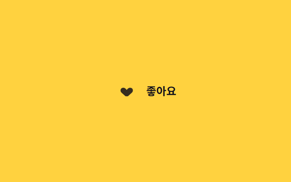
Ngay khi check, tám chấm nhỏ quanh trái tim toả ra theo góc tính từ custom property --i rồi biến mất dần qua translate và opacity.
Dùng choNút reaction mạng xã hội, cú thích đầu tiên khi onboarding app
--i 커스텀 속성translate+opacity스태거
<main class="stage">
  <label class="burst is-demo">
    <input type="checkbox" class="burst__input">
    <span class="burst__icon" aria-hidden="true">
      <span class="burst__heart"></span>
      <span class="burst__dot" style="--i:0"></span>
      <span class="burst__dot" style="--i:1"></span>
      <span class="burst__dot" style="--i:2"></span>
      <span class="burst__dot" style="--i:3"></span>
      <span class="burst__dot" style="--i:4"></span>
      <span class="burst__dot" style="--i:5"></span>
      <span class="burst__dot" style="--i:6"></span>
      <span class="burst__dot" style="--i:7"></span>
    </span>
    <span class="burst__label">Thích</span>
  </label>
</main>
@use "../../../../site/static/demo-tokens" as *;
// ── 변수 3개 ──────────────────────────────────────────
$duration: $dur-enter; // 파티클이 퍼지는 시간
$easing: $ease-out; // 퍼질 때는 빠르게 시작해 느려진다
$color: $subject-ink; // 파티클·하트 색 (노랑 무대라 잉크색)
// ── 데모 무대 ──────────────────────────────────────────
@include stage($stage-yellow);
.burst {
display: inline-flex;
align-items: center;
gap: clamp(8px, 2.6vw, 12px);
cursor: pointer;
-webkit-tap-highlight-color: transparent;
&__input { position: absolute; opacity: 0; width: 1px; height: 1px; }
&__icon { position: relative; width: 40px; height: 36px; flex: none; }
&__heart {
position: absolute; inset: 8px;
background: $color;
clip-path: path("M12 22 2 13C-1 10 0 5 4 4 7 3 10 5 12 8 14 5 17 3 20 4 24 5 25 10 22 13Z");
transform: scale(.5);
opacity: .5;
transition: transform $duration $easing, opacity $duration $easing;
}
// 물리 파티클 — 좌표·스케일·페이드는 JS 적분(rAF)이 매 프레임 transform 에 쓴다 (keyframes 아님)
&__dot {
position: absolute; top: 50%; left: 50%; width: 5px; height: 5px; margin: -2.5px 0 0 -2.5px;
border-radius: 50%;
background: $color;
opacity: 0;
will-change: transform, opacity;
}
&__label { font-weight: 600; font-size: clamp(15px, 4.2vw, 18px); line-height: 1; font-family: inherit; color: $subject-ink; }
&__input:checked ~ &__icon &__heart { transform: scale(1); opacity: 1; }
// 파티클 발사는 JS 물리가 담당 — 체크 시 keyframes 는 더 이상 쓰지 않는다
&.is-demo &__icon &__heart { animation: burst-heart-loop $dur-loop $easing infinite; }
}
@keyframes burst-heart-loop {
0%, 20% { transform: scale(.5); opacity: .5; }
35%, 80% { transform: scale(1); opacity: 1; }
100% { transform: scale(.5); opacity: .5; }
}
// ── 접근성 ──────────────────────────────────────────
@media (prefers-reduced-motion: reduce) {
.burst__heart { transition: opacity 1ms; }
.burst__dot { display: none; } // 파티클 버스트는 꺼짐 — 기본 상태 전환만
.burst.is-demo .burst__icon .burst__heart { animation: none !important; }
}html, body {
margin: 0;
overflow: hidden;
}
.stage {
box-sizing: border-box;
min-height: 100vh;
display: grid;
place-items: center;
margin: 0;
background: #ffd23f;
font-family: -apple-system, "Segoe UI", "Noto Sans KR", sans-serif;
padding: clamp(8px, 4vw, 24px);
}
.burst {
display: inline-flex;
align-items: center;
gap: clamp(8px, 2.6vw, 12px);
cursor: pointer;
-webkit-tap-highlight-color: transparent;
}
.burst__input {
position: absolute;
opacity: 0;
width: 1px;
height: 1px;
}
.burst__icon {
position: relative;
width: 40px;
height: 36px;
flex: none;
}
.burst__heart {
position: absolute;
inset: 8px;
background: #17141a;
clip-path: path("M12 22 2 13C-1 10 0 5 4 4 7 3 10 5 12 8 14 5 17 3 20 4 24 5 25 10 22 13Z");
transform: scale(0.5);
opacity: 0.5;
transition: transform 600ms ease-out, opacity 600ms ease-out;
}
.burst__dot {
position: absolute;
top: 50%;
left: 50%;
width: 5px;
height: 5px;
margin: -2.5px 0 0 -2.5px;
border-radius: 50%;
background: #17141a;
opacity: 0;
will-change: transform, opacity;
}
.burst__label {
font-weight: 600;
font-size: clamp(15px, 4.2vw, 18px);
line-height: 1;
font-family: inherit;
color: #17141a;
}
.burst__input:checked ~ .burst__icon .burst__heart {
transform: scale(1);
opacity: 1;
}
.burst.is-demo .burst__icon .burst__heart {
animation: burst-heart-loop 2s ease-out infinite;
}
@keyframes burst-heart-loop {
0%, 20% {
transform: scale(0.5);
opacity: 0.5;
}
35%, 80% {
transform: scale(1);
opacity: 1;
}
100% {
transform: scale(0.5);
opacity: 0.5;
}
}
@media (prefers-reduced-motion: reduce) {
.burst__heart {
transition: opacity 1ms;
}
.burst__dot {
display: none;
}
.burst.is-demo .burst__icon .burst__heart {
animation: none !important;
}
}// 질량-감쇠 물리 버스트 — 기존 45° 고정 링 keyframes 를 JS 적분으로 바꿔치기했다 (레이아웃·색 불변).
// 각 파티클은 초기 속도(방향·크기 랜덤)와 개별 질량 m(0.7~1.6)을 갖고 매 프레임 준암시 오일러 적분으로
// 감쇠(-k/m·v — 무거울수록 덜 감속해 관성으로 더 멀리 간다)와 중력 g(질량 무관)을 받아 흩어졌다 멈춘다.
// 좌표는 requestAnimationFrame 안에서 계산해 transform 에 쓴다 — 타이밍·거리를 keyframes 에 박지 않는다.
(function () {
var icon = document.querySelector('.burst__icon'); if (!icon) return;
var dots = [].slice.call(icon.querySelectorAll('.burst__dot'));
var reduce = matchMedia('(prefers-reduced-motion: reduce)').matches;
var alive = false, raf = 0, last = 0;
function fire() {
if (reduce || !dots.length) return;
var now = performance.now();
for (var i = 0; i < dots.length; i++) {
var m = .7 + Math.random() * .9; // 개별 질량 0.7~1.6
var ang = (i / dots.length) * Math.PI * 2 + (Math.random() - .5) * .55; // 45° 뼈대 + 지터
var v0 = (150 + Math.random() * 130) * m; // 무거울수록 세게 — 질량이 관성
dots[i]._p = { x: 0, y: 0, vx: Math.cos(ang) * v0, vy: Math.sin(ang) * v0,
m: m, k: 4.2, g: 260, s: .35 + m * .45,
born: now + i * 20, life: 620 + Math.random() * 380 }; // 순차 분사(20ms) + 수명 랜덤
}
if (!alive) { alive = true; last = now; raf = requestAnimationFrame(step); }
}
function step(t) {
var dt = Math.min((t - last) / 1000, .05); last = t; // 탭 복귀 시 폭주 방지 클램프
var any = false;
for (var i = 0; i < dots.length; i++) {
var el = dots[i], p = el._p; if (!p) continue;
var age = t - p.born;
if (age < 0) { any = true; continue; } // 방출 전 지연
if (age >= p.life) { el.style.opacity = '0'; el._p = null; continue; } // 수명 끝 → 그 자리에 정지
p.vx += (-p.k / p.m * p.vx) * dt; // 감쇠 가속도 = -k/m·v
p.vy += (p.g - p.k / p.m * p.vy) * dt; // 중력 가속도 = g
p.x += p.vx * dt; p.y += p.vy * dt;
var o = age / p.life; // 수명 후반 40%에서 페이드아웃
el.style.opacity = o < .6 ? '1' : (1 - (o - .6) / .4).toFixed(3);
el.style.transform = 'translate(' + p.x.toFixed(1) + 'px,' + p.y.toFixed(1) + 'px) scale(' + p.s.toFixed(3) + ')';
any = true;
}
if (any) raf = requestAnimationFrame(step); else alive = false; // 전부 정지하면 루프 종료
}
// 트리거 1: 실제 클릭 — 체크되는 순간 발사
var w = document.querySelector('.burst'), inp = w && w.querySelector('.burst__input');
if (inp) {
inp.addEventListener('change', function () { w.classList.remove('is-demo'); if (inp.checked) fire(); });
inp.addEventListener('pointerdown', function () { w.classList.remove('is-demo'); });
}
// 트리거 2: 데모 루프 — CSS Trái tim 루프(2s 의 35% ≈ 660ms)에 맞춰 발사
function demoShot() { if (w && w.classList.contains('is-demo')) setTimeout(fire, 660); }
setInterval(demoShot, 2000);
demoShot();
})();import { useCallback, useEffect, useRef, useState } from "react";
import type { ChangeEvent, CSSProperties } from "react";
import styles from "./ParticleBurst.module.scss";
export type ParticleBurstProps = {
/** 파티클이 퍼지는 시간 (기본 600ms) */
duration?: number;
easing?: string;
color?: string;
onChange?: (liked: boolean) => void;
};
type Vars = CSSProperties & { "--duration"?: string; "--easing"?: string; "--color"?: string };
type DotVars = CSSProperties & { "--i"?: number };
/** 파티클 1개의 물성 — 질량·감쇠·중력으로 흩어졌다 멈춘다 */
type Particle = {
x: number; y: number; vx: number; vy: number;
m: number; k: number; g: number; s: number;
born: number; life: number;
};
const DOTS = Array.from({ length: 8 }, (_, i) => i);
/** 질량-감쇠 물리 초기 상태. 감쇠 가속도 = -k/m·v (무거울수록 덜 감속해 관성으로 더 멀리), 중력 = g (질량 무관). */
function spawn(now: number, i: number, n: number): Particle {
const m = 0.7 + Math.random() * 0.9; // 개별 질량 0.7~1.6
const ang = (i / n) * Math.PI * 2 + (Math.random() - 0.5) * 0.55; // 45° 뼈대 + 지터
const v0 = (150 + Math.random() * 130) * m; // 무거울수록 세게 — 질량이 관성
return {
x: 0, y: 0,
vx: Math.cos(ang) * v0, vy: Math.sin(ang) * v0,
m, k: 4.2, g: 260, s: 0.35 + m * 0.45,
born: now + i * 20, life: 620 + Math.random() * 380, // 순차 분사 + 수명 랜덤
};
}
export default function ParticleBurst({ duration = 600, easing = "ease-out", color = "#17141a", onChange }: ParticleBurstProps) {
const [liked, setLiked] = useState(false);
const [burstKey, setBurstKey] = useState(0);
const iconRef = useRef<HTMLSpanElement>(null);
const vars: Vars = { "--duration": `${duration}ms`, "--easing": easing, "--color": color };
const fire = useCallback(() => setBurstKey((k) => k + 1), []);
// 준암시 오일러 적분 루프 — rAF 안에서 좌표를 계산해 transform 에 쓴다 (keyframes 하드코딩 아님)
useEffect(() => {
if (!burstKey) return;
if (window.matchMedia("(prefers-reduced-motion: reduce)").matches) return;
const icon = iconRef.current;
if (!icon) return;
const els = Array.from(icon.querySelectorAll<HTMLElement>(`.${styles.dot}`));
if (!els.length) return;
const now = performance.now();
const ps: (Particle | null)[] = els.map((_, i) => spawn(now, i, els.length));
let raf = 0, last = now;
const step = (t: number) => {
const dt = Math.min((t - last) / 1000, 0.05); // 탭 복귀 시 폭주 방지 클램프
last = t;
let any = false;
for (let i = 0; i < els.length; i++) {
const el = els[i], p = ps[i]; if (!p) continue;
const age = t - p.born;
if (age < 0) { any = true; continue; } // 방출 전 지연
if (age >= p.life) { el.style.opacity = "0"; ps[i] = null; continue; } // 수명 끝 → 정지
p.vx += (-p.k / p.m * p.vx) * dt; // 감쇠 = -k/m·v
p.vy += (p.g - p.k / p.m * p.vy) * dt; // 중력 + 감쇠
p.x += p.vx * dt; p.y += p.vy * dt;
const o = age / p.life;
el.style.opacity = o < 0.6 ? "1" : (1 - (o - 0.6) / 0.4).toFixed(3);
el.style.transform = `translate(${p.x.toFixed(1)}px,${p.y.toFixed(1)}px) scale(${p.s.toFixed(3)})`;
any = true;
}
if (any) raf = requestAnimationFrame(step); // 전부 정지하면 루프 종료
};
raf = requestAnimationFrame(step);
return () => cancelAnimationFrame(raf);
}, [burstKey]);
const handle = (checked: boolean) => {
setLiked(checked);
if (checked) fire(); // 다시 좋아요를 눌러도 파티클이 재생되게
onChange?.(checked);
};
return (
<label className={styles.burst} style={vars}>
<input type="checkbox" className={styles.input} checked={liked} onChange={(e: ChangeEvent<HTMLInputElement>) => handle(e.target.checked)} />
<span className={styles.icon} aria-hidden="true" ref={iconRef}>
<span className={`${styles.heart} ${liked ? styles.isLiked : ""}`} />
{DOTS.map((i) => (
<span key={`${burstKey}-${i}`} className={styles.dot} style={{ "--i": i } as DotVars} />
))}
</span>
<span className={styles.label}>좋아요</span>
</label>
);
}02 Pháo hoa hạt nhỏ — Diện tích đo được 1.614% · khung hình chuyển động 18/23Nguyên tác GODRICH · SCSS và React nằm trong tệp zip · 9 CSS Heart Like Animations — dán 1 dòng là chạy
Bài viết chứa demo này
 9 CSS Heart Like Animations — dán 1 dòng là chạyChín css heart like animation cho nút thích, đánh giá sao và các nút phản hồi kiểu vỗ tay, bookmark, emoji được gom vào Xem tất cả demo trong bài này