06Đếm vỗ tay
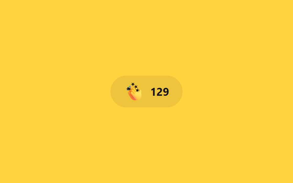
Nút cộng số mỗi lần bấm, icon nảy nhẹ bằng scale ngay khi chạm, còn chữ +1 trôi lên bằng translateY rồi mờ dần qua opacity.
Dùng choNút vỗ tay kiểu Medium, widget phản hồi bài viết
반복 클릭translateY+opacityJS 카운트
<main class="stage">
  <button class="clap is-demo" type="button" aria-label="Vỗ tay">
    <span class="clap__icon" aria-hidden="true">👏</span>
    <span class="clap__plus" aria-hidden="true">+1</span>
    <span class="clap__count"><span aria-live="polite">128</span></span>
    <span class="clap__fx" aria-hidden="true"><span class="clap__spark"></span><span class="clap__spark"></span><span class="clap__spark"></span><span class="clap__spark"></span><span class="clap__spark"></span></span>
  </button>
</main>
@use "../../../../site/static/demo-tokens" as *;
// ── 변수 3개 ──────────────────────────────────────────
$duration: $dur-quick; // 아이콘이 튀는 시간
$easing: $ease-pop; // 튕기는 이징
$color: $subject-ink; // 숫자 강조색 (노랑 무대)
// ── 데모 무대 ──────────────────────────────────────────
@include stage($stage-yellow);
.clap {
position: relative;
display: inline-flex;
align-items: center;
gap: clamp(8px, 2.6vw, 10px);
border: 0;
border-radius: $r-pill;
padding: clamp(10px, 3.6vw, 14px) clamp(18px, 5.4vw, 22px);
font-weight: 700; font-size: clamp(15px, 4.2vw, 18px); line-height: 1; font-family: inherit;
color: $color;
background: rgba(23, 20, 26, .08);
cursor: pointer;
-webkit-tap-highlight-color: transparent;
&__icon { font-size: clamp(20px, 5.6vw, 24px); display: inline-block; transform: scale(1) rotate(0deg); }
&__plus {
position: absolute; top: -2px; left: 34px;
font-weight: 700; font-size: 13px; line-height: 1; font-family: inherit; color: $color;
opacity: 0; transform: translateY(0);
pointer-events: none;
}
&__count { font-variant-numeric: tabular-nums; }
// 한 겹: 물리 스파크 파티클(미니 별) — fire 직전 JS 가 아이콘 중심으로 원점을 옮긴다. 좌표·페이드는 JS 가 계산한다.
&__fx { position: absolute; top: 50%; left: 0; pointer-events: none; }
&__spark {
position: absolute; top: 50%; left: 50%;
width: 10px; height: 10px; margin: -5px 0 0 -5px;
background: $color;
clip-path: polygon(50% 0%, 61% 35%, 98% 35%, 68% 57%, 79% 91%, 50% 70%, 21% 91%, 32% 57%, 2% 35%, 39% 35%);
opacity: 0;
pointer-events: none;
will-change: transform, opacity;
}
&.is-clap &__icon { animation: clap-bounce $duration $easing; }
&.is-clap &__plus { animation: clap-plus $duration $easing; }
&.is-demo &__icon { animation: clap-bounce-loop $dur-loop $easing infinite; }
&.is-demo &__plus { animation: clap-plus-loop $dur-loop $easing infinite; }
}
@keyframes clap-bounce {
0% { transform: scale(1) rotate(0deg); }
40% { transform: scale(1.3) rotate(-12deg); }
100% { transform: scale(1) rotate(0deg); }
}
@keyframes clap-plus {
0% { opacity: 1; transform: translateY(0); }
100% { opacity: 0; transform: translateY(-16px); }
}
@keyframes clap-bounce-loop {
0%, 60% { transform: scale(1) rotate(0deg); }
75% { transform: scale(1.3) rotate(-12deg); }
100% { transform: scale(1) rotate(0deg); }
}
@keyframes clap-plus-loop {
0%, 60% { opacity: 0; transform: translateY(0); }
70% { opacity: 1; transform: translateY(0); }
100% { opacity: 0; transform: translateY(-16px); }
}
// ── 접근성 ──────────────────────────────────────────
@media (prefers-reduced-motion: reduce) {
.clap.is-clap .clap__icon,
.clap.is-clap .clap__plus,
.clap.is-demo .clap__icon,
.clap.is-demo .clap__plus { animation: none !important; opacity: 0; transform: none; }
.clap__spark { display: none; } // 물리 파티클도 함께 숨긴다
}html, body {
margin: 0;
overflow: hidden;
}
.stage {
box-sizing: border-box;
min-height: 100vh;
display: grid;
place-items: center;
margin: 0;
background: #ffd23f;
font-family: -apple-system, "Segoe UI", "Noto Sans KR", sans-serif;
padding: clamp(8px, 4vw, 24px);
}
.clap {
position: relative;
display: inline-flex;
align-items: center;
gap: clamp(8px, 2.6vw, 10px);
border: 0;
border-radius: 999px;
padding: clamp(10px, 3.6vw, 14px) clamp(18px, 5.4vw, 22px);
font-weight: 700;
font-size: clamp(15px, 4.2vw, 18px);
line-height: 1;
font-family: inherit;
color: #17141a;
background: rgba(23, 20, 26, 0.08);
cursor: pointer;
-webkit-tap-highlight-color: transparent;
}
.clap__icon {
font-size: clamp(20px, 5.6vw, 24px);
display: inline-block;
transform: scale(1) rotate(0deg);
}
.clap__plus {
position: absolute;
top: -2px;
left: 34px;
font-weight: 700;
font-size: 13px;
line-height: 1;
font-family: inherit;
color: #17141a;
opacity: 0;
transform: translateY(0);
pointer-events: none;
}
.clap__count {
font-variant-numeric: tabular-nums;
}
.clap__fx {
position: absolute;
top: 50%;
left: 0;
pointer-events: none;
}
.clap__spark {
position: absolute;
top: 50%;
left: 50%;
width: 10px;
height: 10px;
margin: -5px 0 0 -5px;
background: #17141a;
clip-path: polygon(50% 0%, 61% 35%, 98% 35%, 68% 57%, 79% 91%, 50% 70%, 21% 91%, 32% 57%, 2% 35%, 39% 35%);
opacity: 0;
pointer-events: none;
will-change: transform, opacity;
}
.clap.is-clap .clap__icon {
animation: clap-bounce 220ms cubic-bezier(0.2, 1.4, 0.4, 1);
}
.clap.is-clap .clap__plus {
animation: clap-plus 220ms cubic-bezier(0.2, 1.4, 0.4, 1);
}
.clap.is-demo .clap__icon {
animation: clap-bounce-loop 2s cubic-bezier(0.2, 1.4, 0.4, 1) infinite;
}
.clap.is-demo .clap__plus {
animation: clap-plus-loop 2s cubic-bezier(0.2, 1.4, 0.4, 1) infinite;
}
@keyframes clap-bounce {
0% {
transform: scale(1) rotate(0deg);
}
40% {
transform: scale(1.3) rotate(-12deg);
}
100% {
transform: scale(1) rotate(0deg);
}
}
@keyframes clap-plus {
0% {
opacity: 1;
transform: translateY(0);
}
100% {
opacity: 0;
transform: translateY(-16px);
}
}
@keyframes clap-bounce-loop {
0%, 60% {
transform: scale(1) rotate(0deg);
}
75% {
transform: scale(1.3) rotate(-12deg);
}
100% {
transform: scale(1) rotate(0deg);
}
}
@keyframes clap-plus-loop {
0%, 60% {
opacity: 0;
transform: translateY(0);
}
70% {
opacity: 1;
transform: translateY(0);
}
100% {
opacity: 0;
transform: translateY(-16px);
}
}
@media (prefers-reduced-motion: reduce) {
.clap.is-clap .clap__icon,
.clap.is-clap .clap__plus,
.clap.is-demo .clap__icon,
.clap.is-demo .clap__plus {
animation: none !important;
opacity: 0;
transform: none;
}
.clap__spark {
display: none;
}
}// 누를 때마다 카운트가 1 오르고 아이콘이 튄다. .is-demo 인 동안은 타이머가 대신 누른다.
// 한 겹: 박수마다 질량-감쇠 물리 스파크 버스트 — 미니 별이 아이콘 중심에서 흩어진다 (Vỗ tay 리듬에 맞춰 빠르고 짧게).
// 각 파티클은 초기 속도(위쪽 좁은 부채꼴·크기 랜덤)와 개별 질량을 갖고, 매 프레임 준암시 오일러 적분으로
// 감쇠(-k/m·v — 질량이 클수록 덜 감속)와 중력(질량 무관)을 받아 흩어졌다 멈춘다 (keyframes 아님).
var b = document.querySelector(".clap"), n = b.querySelector(".clap__count span");
var fx = b.querySelector(".clap__fx"), icon = b.querySelector(".clap__icon");
var sparks = [].slice.call(fx.querySelectorAll(".clap__spark"));
var reduce = matchMedia('(prefers-reduced-motion: reduce)').matches;
var alive = false, raf = 0, last = 0;
function fire() {
if (reduce || !sparks.length) return;
fx.style.left = (icon.offsetLeft + icon.offsetWidth / 2) + "px"; // 아이콘 중심으로 발사 원점 이동
var now = performance.now();
for (var i = 0; i < sparks.length; i++) {
var m = .6 + Math.random() * .6; // 개별 질량 0.6~1.2
var ang = -Math.PI / 2 + (Math.random() - .5) * 2.4; // 위쪽 좁은 부채꼴 ±69°
var v0 = (100 + Math.random() * 70) * (1.15 - m * .2); // 무거울수록 느게 출발
sparks[i]._p = { x: 0, y: 0, vx: Math.cos(ang) * v0, vy: Math.sin(ang) * v0,
m: m, k: 3.8, g: 320, rot: (Math.random() - .5) * 40, spin: (Math.random() - .5) * 840,
s: .4 + m * .3, born: now + i * 18, life: 550 + Math.random() * 300 };
}
if (!alive) { alive = true; last = now; raf = requestAnimationFrame(step); }
}
function step(t) {
var dt = Math.min((t - last) / 1000, .05); last = t; // 탭 복귀 시 폭주 방지 클램프
var any = false;
for (var i = 0; i < sparks.length; i++) {
var el = sparks[i], p = el._p; if (!p) continue;
var age = t - p.born;
if (age < 0) { any = true; continue; } // 방출 전 지연(순차 분사)
if (age >= p.life) { el.style.opacity = '0'; el._p = null; continue; } // 수명 끝 → 정지
p.vx += (-p.k / p.m * p.vx) * dt; // 감쇠 가속도 = -k/m·v
p.vy += (p.g - p.k / p.m * p.vy) * dt; // 중력 가속도 = g (질량 무관)
p.x += p.vx * dt; p.y += p.vy * dt; p.rot += p.spin * dt;
var o = age / p.life; // 수명 후반 45%에서 페이드아웃
el.style.opacity = o < .55 ? '1' : (1 - (o - .55) / .45).toFixed(3);
el.style.transform = 'translate(' + p.x.toFixed(1) + 'px,' + p.y.toFixed(1) + 'px) rotate(' + p.rot.toFixed(1) + 'deg) scale(' + p.s.toFixed(3) + ')';
any = true;
}
if (any) raf = requestAnimationFrame(step); else alive = false; // 전부 정지하면 루프 종료
}
function clap() {
n.textContent = String(Number(n.textContent) + 1);
b.classList.remove("is-clap"); void b.offsetWidth; b.classList.add("is-clap");
fire(); // 실제 클릭·데모 루프 둘 다 박수마다 발사
}
b.addEventListener("pointerdown", function () { b.classList.remove("is-demo"); clap(); });
var demoClap = function () { if (!b.classList.contains("is-demo")) return; clap(); };
setInterval(demoClap, 900);
setTimeout(demoClap, 100); // 첫 사이클부터 녹화 창 안에 잡힌다import { useEffect, useRef, useState } from "react";
import type { CSSProperties } from "react";
import styles from "./ClapCount.module.scss";
export type ClapCountProps = {
duration?: number;
easing?: string;
color?: string;
baseCount?: number;
};
type Vars = CSSProperties & { "--duration"?: string; "--easing"?: string; "--color"?: string };
/** 파티클 1개의 물성 — 질량·감쇠·중력으로 흩어졌다 멈춘다 */
type Particle = {
x: number; y: number; vx: number; vy: number;
m: number; k: number; g: number; s: number;
rot: number; spin: number;
born: number; life: number;
};
const SPARKS = [0, 1, 2, 3, 4];
/** 질량-감쇠 물리 초기 상태. 감쇠 가속도 = -k/m·v (무거울수록 덜 감속), 중력 = g (질량 무관). 박수 리듬에 맞춰 빠르고 짧게. */
function spawn(now: number, i: number): Particle {
const m = 0.6 + Math.random() * 0.6; // 개별 질량 0.6~1.2
const ang = -Math.PI / 2 + (Math.random() - 0.5) * 2.4; // 위쪽 좁은 부채꼴 ±69°
const v0 = (100 + Math.random() * 70) * (1.15 - m * 0.2); // 무거울수록 느게 출발
return {
x: 0, y: 0,
vx: Math.cos(ang) * v0, vy: Math.sin(ang) * v0,
m, k: 3.8, g: 320, s: 0.4 + m * 0.3,
rot: (Math.random() - 0.5) * 40, spin: (Math.random() - 0.5) * 840,
born: now + i * 18, life: 550 + Math.random() * 300, // 순차 분사 + 수명 랜덤
};
}
export default function ClapCount({ duration = 220, easing = "cubic-bezier(.2,1.4,.4,1)", color = "#17141a", baseCount = 128 }: ClapCountProps) {
const [count, setCount] = useState(baseCount);
const [claps, setClaps] = useState(0); // 카운트 증가 펄스이자 파티클 burstKey 를 겸한다
const btnRef = useRef<HTMLButtonElement>(null);
const vars: Vars = { "--duration": `${duration}ms`, "--easing": easing, "--color": color };
const clap = () => { setCount((c) => c + 1); setClaps((k) => k + 1); };
// 준암시 오일러 적분 루프 — rAF 안에서 좌표를 계산해 transform 에 쓴다 (keyframes 하드코딩 아님)
useEffect(() => {
if (!claps) return;
if (window.matchMedia("(prefers-reduced-motion: reduce)").matches) return;
const btn = btnRef.current;
if (!btn) return;
const icon = btn.querySelector<HTMLElement>(`.${styles.icon}`);
const fx = btn.querySelector<HTMLElement>(`.${styles.fx}`);
if (!icon || !fx) return;
fx.style.left = `${icon.offsetLeft + icon.offsetWidth / 2}px`; // 아이콘 중심으로 발사 원점 이동
const els = Array.from(fx.querySelectorAll<HTMLElement>(`.${styles.spark}`));
if (!els.length) return;
const now = performance.now();
const ps: (Particle | null)[] = els.map((_, i) => spawn(now, i));
let raf = 0, last = now;
const step = (t: number) => {
const dt = Math.min((t - last) / 1000, 0.05); // 탭 복귀 시 폭주 방지 클램프
last = t;
let any = false;
for (let i = 0; i < els.length; i++) {
const el = els[i], p = ps[i]; if (!p) continue;
const age = t - p.born;
if (age < 0) { any = true; continue; } // 방출 전 지연
if (age >= p.life) { el.style.opacity = "0"; ps[i] = null; continue; } // 수명 끝 → 정지
p.vx += (-p.k / p.m * p.vx) * dt; // 감쇠 = -k/m·v
p.vy += (p.g - p.k / p.m * p.vy) * dt; // 중력 + 감쇠
p.x += p.vx * dt; p.y += p.vy * dt; p.rot += p.spin * dt;
const o = age / p.life;
el.style.opacity = o < 0.55 ? "1" : (1 - (o - 0.55) / 0.45).toFixed(3);
el.style.transform = `translate(${p.x.toFixed(1)}px,${p.y.toFixed(1)}px) rotate(${p.rot.toFixed(1)}deg) scale(${p.s.toFixed(3)})`;
any = true;
}
if (any) raf = requestAnimationFrame(step); // 전부 정지하면 루프 종료
};
raf = requestAnimationFrame(step);
return () => cancelAnimationFrame(raf);
}, [claps]);
return (
<button type="button" className={styles.clap} style={vars} onClick={clap} aria-label="박수" ref={btnRef}>
<span key={claps} className={styles.icon} aria-hidden="true">👏</span>
{claps > 0 && <span key={`plus-${claps}`} className={styles.plus} aria-hidden="true">+1</span>}
<span className={styles.count}>{count}</span>
{claps > 0 && (
<span key={`fx-${claps}`} className={styles.fx} aria-hidden="true">
{SPARKS.map((i) => (
<span key={`${claps}-${i}`} className={styles.spark} />
))}
</span>
)}
</button>
);
}06 Đếm vỗ tay — Diện tích đo được 0.886% · khung hình chuyển động 23/23Nguyên tác GODRICH · SCSS và React nằm trong tệp zip · 9 CSS Heart Like Animations — dán 1 dòng là chạy
Bài viết chứa demo này
 9 CSS Heart Like Animations — dán 1 dòng là chạyChín css heart like animation cho nút thích, đánh giá sao và các nút phản hồi kiểu vỗ tay, bookmark, emoji được gom vào Xem tất cả demo trong bài này