01Tiêu đề vào lần lượt
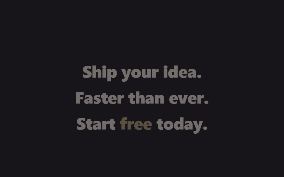
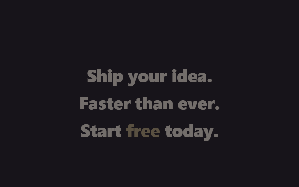
Ba dòng tiêu đề hero mỗi dòng một @keyframes riêng với nhịp vào lệch nhau chút ít, nên chỉ với opacity và translateY đã dựng được cảnh xuất hiện tuần tự.
Dùng choTiêu đề hero trang landing SaaS, màn hình đầu giới thiệu sản phẩm
@keyframesopacity · translateYstagger delay
<main class="stage is-demo">
  <h1 class="hero">
    <span class="hero__line hero__line--1">Ship your idea.</span>
    <span class="hero__line hero__line--2">Faster than ever.</span>
    <span class="hero__line hero__line--3">Start <em>free</em> today.</span>
  </h1>
</main>
@use "../../../../site/static/demo-tokens" as *;
// ── 변수 3개 ──────────────────────────────────────────
$duration: $dur-loop; // 2s — 3줄이 순차 등장하는 한 바퀴
$easing: $ease-spring;
$color: $subject-cream;
@include stage($stage-ink);
.hero {
margin: 0;
box-sizing: border-box;
max-width: clamp(220px, 78vw, 360px);
text-align: center;
display: grid;
gap: $sp-2;
}
.hero__line {
display: block;
font-weight: 800;
font-size: clamp(18px, 6vw, 28px);
line-height: 1.28;
font-family: inherit;
color: $color;
letter-spacing: -0.01em;
opacity: 0;
transform: translateY($sp-6);
}
.hero__line--3 em { font-style: normal; color: #beab7c; }
.stage.is-demo .hero__line--1 { animation: line-in-1 $duration $easing infinite; }
.stage.is-demo .hero__line--2 { animation: line-in-2 $duration $easing infinite; }
.stage.is-demo .hero__line--3 { animation: line-in-3 $duration $easing infinite; }
@keyframes line-in-1 {
0% { opacity: 0; transform: translateY($sp-6); }
10% { opacity: 1; transform: translateY(0); }
85% { opacity: 1; transform: translateY(0); }
100% { opacity: 0; transform: translateY($sp-6); }
}
@keyframes line-in-2 {
0%, 10% { opacity: 0; transform: translateY($sp-6); }
20% { opacity: 1; transform: translateY(0); }
85% { opacity: 1; transform: translateY(0); }
100% { opacity: 0; transform: translateY($sp-6); }
}
@keyframes line-in-3 {
0%, 20% { opacity: 0; transform: translateY($sp-6); }
30% { opacity: 1; transform: translateY(0); }
85% { opacity: 1; transform: translateY(0); }
100% { opacity: 0; transform: translateY($sp-6); }
}
@media (prefers-reduced-motion: reduce) {
.stage.is-demo .hero__line--1,
.stage.is-demo .hero__line--2,
.stage.is-demo .hero__line--3 {
animation: none;
opacity: 1;
transform: none;
}
}html, body {
margin: 0;
overflow: hidden;
}
.stage {
box-sizing: border-box;
min-height: 100vh;
display: grid;
place-items: center;
margin: 0;
background: #17141a;
font-family: -apple-system, "Segoe UI", "Noto Sans KR", sans-serif;
padding: clamp(8px, 4vw, 24px);
}
.hero {
margin: 0;
box-sizing: border-box;
max-width: clamp(220px, 78vw, 360px);
text-align: center;
display: grid;
gap: 8px;
}
.hero__line {
display: block;
font-weight: 800;
font-size: clamp(18px, 6vw, 28px);
line-height: 1.28;
font-family: inherit;
color: #fff7e6;
letter-spacing: -0.01em;
opacity: 0;
transform: translateY(24px);
}
.hero__line--3 em {
font-style: normal;
color: #beab7c;
}
.stage.is-demo .hero__line--1 {
animation: line-in-1 2s cubic-bezier(0.2, 0.8, 0.2, 1) infinite;
}
.stage.is-demo .hero__line--2 {
animation: line-in-2 2s cubic-bezier(0.2, 0.8, 0.2, 1) infinite;
}
.stage.is-demo .hero__line--3 {
animation: line-in-3 2s cubic-bezier(0.2, 0.8, 0.2, 1) infinite;
}
@keyframes line-in-1 {
0% {
opacity: 0;
transform: translateY(24px);
}
10% {
opacity: 1;
transform: translateY(0);
}
85% {
opacity: 1;
transform: translateY(0);
}
100% {
opacity: 0;
transform: translateY(24px);
}
}
@keyframes line-in-2 {
0%, 10% {
opacity: 0;
transform: translateY(24px);
}
20% {
opacity: 1;
transform: translateY(0);
}
85% {
opacity: 1;
transform: translateY(0);
}
100% {
opacity: 0;
transform: translateY(24px);
}
}
@keyframes line-in-3 {
0%, 20% {
opacity: 0;
transform: translateY(24px);
}
30% {
opacity: 1;
transform: translateY(0);
}
85% {
opacity: 1;
transform: translateY(0);
}
100% {
opacity: 0;
transform: translateY(24px);
}
}
@media (prefers-reduced-motion: reduce) {
.stage.is-demo .hero__line--1,
.stage.is-demo .hero__line--2,
.stage.is-demo .hero__line--3 {
animation: none;
opacity: 1;
transform: none;
}
}import type { CSSProperties } from "react";
import styles from "./HeadlineStaggerIn.module.scss";
export type HeadlineStaggerInProps = {
lines?: [string, string, string];
duration?: number;
easing?: string;
color?: string;
};
type Vars = CSSProperties & { "--duration"?: string; "--easing"?: string; "--color"?: string };
export default function HeadlineStaggerIn({
lines = ["Ship your idea.", "Faster than ever.", "Start free today."],
duration = 2000,
easing = "cubic-bezier(.2,.8,.2,1)",
color = "#fff7e6",
}: HeadlineStaggerInProps) {
const vars: Vars = { "--duration": `${duration}ms`, "--easing": easing, "--color": color };
return (
<h1 className={styles.hero} style={vars}>
<span className={`${styles.line} ${styles.line1}`}>{lines[0]}</span>
<span className={`${styles.line} ${styles.line2}`}>{lines[1]}</span>
<span className={`${styles.line} ${styles.line3}`}>{lines[2]}</span>
</h1>
);
}01 Tiêu đề vào lần lượt — Diện tích đo được 13.299% · khung hình chuyển động 10/23Nguyên tác GODRICH · SCSS và React nằm trong tệp zip · 9 hero section css animation — không cần JS
Bài viết chứa demo này
 9 hero section css animation — không cần JSHero section là màn hình lớn đập vào mắt đầu tiên khi bạn vừa vào một trang web, nơi đặt tiêu đề cỡ đại và nút bấm dựng Xem tất cả demo trong bài này