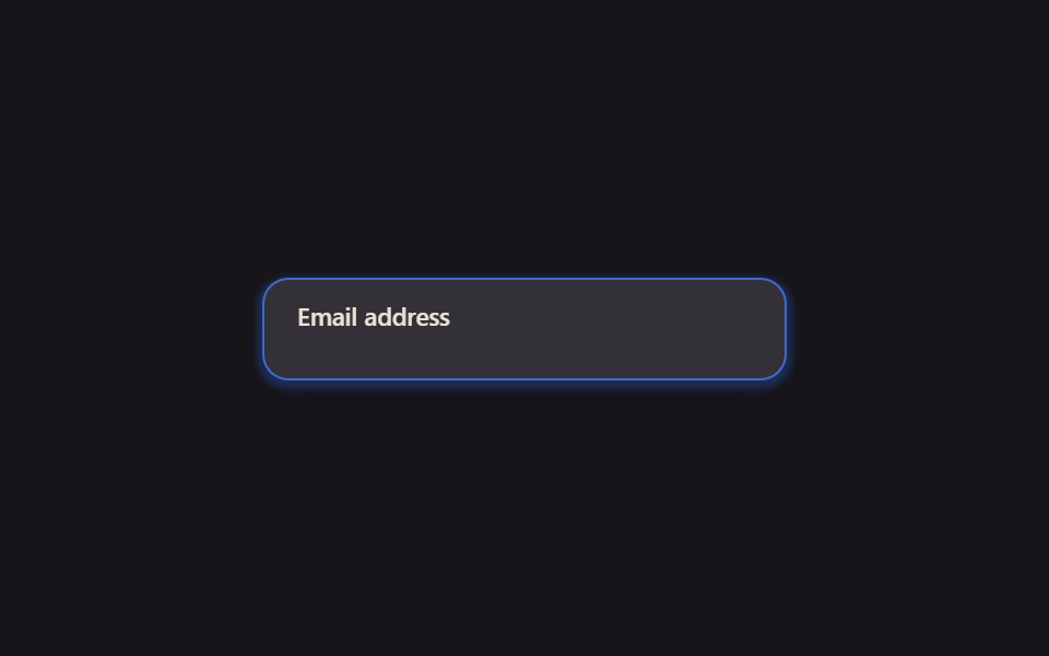
05Placeholder trượt
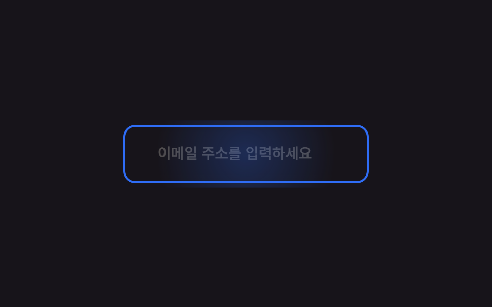
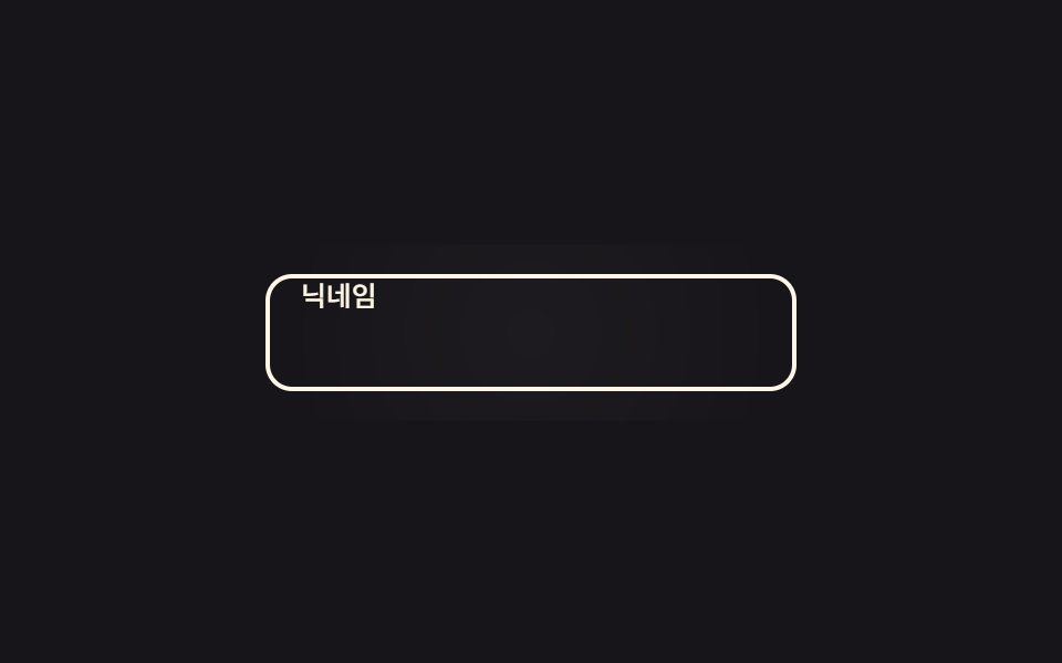
Thuộc tính placeholder thật để trống, một dòng chữ giả chồng lên trượt sang bên và mờ dần khi input được focus hoặc đã có giá trị.
Dùng choÔ nhập email hoặc địa chỉ, trường có gợi ý dài
:placeholder-showntranslate opacity220ms
<main class="stage">
  <div class="ps is-demo">
    <input id="ps-email" class="ps__input" type="email" placeholder=" " autocomplete="email">
    <span class="ps__ghost" aria-hidden="true">Nhập địa chỉ email</span>
    <span class="ps__bloom" aria-hidden="true"></span>
  </div>
</main>
@use "../../../../site/static/demo-tokens" as *;
// ── 변수 4개 ──────────────────────────────────────────
$duration: $dur-quick; // 가짜 플레이스홀더가 밀려나는 시간
$easing: cubic-bezier(.3, 1.6, .4, 1); // 스프링 오버슛 — 밀려나는 거리가 목표 10px 을 지나 13px 까지 뻗었다가 돌아온다
$color: $subject-blue; // 포커스 시 테두리 색
@include stage($stage-ink);
.ps { position: relative; width: min(240px, 82vw); }
.ps__input {
box-sizing: border-box;
width: 100%;
border: 2px solid rgba($subject-cream, .35);
border-radius: $r-control;
padding: $sp-4 $sp-4;
font-weight: 500;
font-size: clamp(14px, 4vw, 16px);
line-height: 1;
font-family: inherit;
color: $subject-cream;
background: transparent;
&:focus { outline: none; border-color: $color; }
}
// 포커스 순간 입력칸 중심에서 번지는 radial 글로우 확산 한 겹
.ps__bloom {
position: absolute;
inset: -6px;
border-radius: calc(#{$r-control} + 6px);
background: radial-gradient(circle, rgba($color, .3) 0%, rgba($color, 0) 70%);
opacity: 0;
pointer-events: none;
}
.ps__input:focus ~ .ps__bloom { animation: ps-bloom $dur-base $ease-out; }
@keyframes ps-bloom {
0% { opacity: 0; transform: scale(.65); }
40% { opacity: 1; transform: scale(1); }
100% { opacity: 0; transform: scale(1.22); }
}
// 진짜 placeholder 는 빈 칸(" ") 이고, 보이는 문구는 이 span 이 대신 맡는다
.ps__ghost {
position: absolute;
left: $sp-4; top: 50%;
transform: translate(0, -50%);
color: rgba($subject-cream, .55);
font-weight: 500;
font-size: clamp(13px, 3.8vw, 15px);
line-height: 1;
font-family: inherit;
pointer-events: none;
transition: transform $dur-base $easing, opacity $duration $ease-out;
}
// 실사용: 포커스거나 값이 있으면(:not(:placeholder-shown)) 옆으로 밀리며 사라진다
.ps__input:focus ~ .ps__ghost,
.ps__input:not(:placeholder-shown) ~ .ps__ghost {
transform: translate(13px, -50%) scale(.94);
opacity: 0;
}
@media (prefers-reduced-motion: reduce) {
.ps__ghost { transition: none; }
.ps__input:focus ~ .ps__bloom { animation: none; }
}html, body {
margin: 0;
overflow: hidden;
}
.stage {
box-sizing: border-box;
min-height: 100vh;
display: grid;
place-items: center;
margin: 0;
background: #17141a;
font-family: -apple-system, "Segoe UI", "Noto Sans KR", sans-serif;
padding: clamp(8px, 4vw, 24px);
}
.ps {
position: relative;
width: min(240px, 82vw);
}
.ps__input {
box-sizing: border-box;
width: 100%;
border: 2px solid rgba(255, 247, 230, 0.35);
border-radius: 12px;
padding: 16px 16px;
font-weight: 500;
font-size: clamp(14px, 4vw, 16px);
line-height: 1;
font-family: inherit;
color: #fff7e6;
background: transparent;
}
.ps__input:focus {
outline: none;
border-color: #2f6df6;
}
.ps__bloom {
position: absolute;
inset: -6px;
border-radius: calc(12px + 6px);
background: radial-gradient(circle, rgba(47, 109, 246, 0.3) 0%, rgba(47, 109, 246, 0) 70%);
opacity: 0;
pointer-events: none;
}
.ps__input:focus ~ .ps__bloom {
animation: ps-bloom 300ms ease-out;
}
@keyframes ps-bloom {
0% {
opacity: 0;
transform: scale(0.65);
}
40% {
opacity: 1;
transform: scale(1);
}
100% {
opacity: 0;
transform: scale(1.22);
}
}
.ps__ghost {
position: absolute;
left: 16px;
top: 50%;
transform: translate(0, -50%);
color: rgba(255, 247, 230, 0.55);
font-weight: 500;
font-size: clamp(13px, 3.8vw, 15px);
line-height: 1;
font-family: inherit;
pointer-events: none;
transition: transform 300ms cubic-bezier(0.3, 1.6, 0.4, 1), opacity 220ms ease-out;
}
.ps__input:focus ~ .ps__ghost,
.ps__input:not(:placeholder-shown) ~ .ps__ghost {
transform: translate(13px, -50%) scale(0.94);
opacity: 0;
}
@media (prefers-reduced-motion: reduce) {
.ps__ghost {
transition: none;
}
.ps__input:focus ~ .ps__bloom {
animation: none;
}
}// .is-demo 자동 재생: 진짜 focus 를 오가며 :focus·:placeholder-shown 을 그대로 탄다 (3줄)
var el = document.querySelector('.is-demo .ps__input');
var t = function () { document.activeElement === el ? el.blur() : el.focus({ preventScroll: true }); }; // preventScroll — iframe 안 포커스가 홈 그리드의 부모 스크롤을 끌어당기지 않게 (사용자 2026-09-10 실측)
t(); setInterval(t, 400);import { useState } from "react";
import type { CSSProperties, ChangeEvent } from "react";
import styles from "./PlaceholderSlide.module.scss";
export type PlaceholderSlideProps = {
ghost?: string;
type?: string;
duration?: number;
easing?: string;
color?: string;
};
type Vars = CSSProperties & { "--duration"?: string; "--easing"?: string; "--color"?: string };
export default function PlaceholderSlide({
ghost = "Enter your email address",
type = "email",
duration = 220,
easing = "ease-out",
color = "#2f6df6",
}: PlaceholderSlideProps) {
const [value, setValue] = useState("");
const vars: Vars = { "--duration": `${duration}ms`, "--easing": easing, "--color": color };
return (
<div className={styles.ps} style={vars}>
<input
className={styles.input}
type={type}
placeholder=" "
value={value}
onChange={(e: ChangeEvent<HTMLInputElement>) => setValue(e.target.value)}
/>
<span className={styles.ghost} aria-hidden="true">{ghost}</span>
<span className={styles.bloom} aria-hidden="true" />
</div>
);
}05 Placeholder trượt — Diện tích đo được 7.516% · khung hình chuyển động 9/23Nguyên tác GODRICH · SCSS và React nằm trong tệp zip · 9 CSS Input Focus Animation — dán 1 dòng là chạy
Bài viết chứa demo này
 9 CSS Input Focus Animation — dán 1 dòng là chạyCSS input focus animation là các hiệu ứng dùng thẳng trạng thái trình duyệt đã có sẵn — :focus, :focus-within, :placehol Xem tất cả demo trong bài này