07Select tùy biến mở ra
Thay cho select gốc, một button cùng danh sách được dựng riêng, lúc mở danh sách giãn ra qua scaleY còn chevron xoay 180 độ.
Dùng choChọn theme hoặc tiêu chí sắp xếp, dropdown cần khớp thiết kế riêng
aria-expandedscaleY220ms
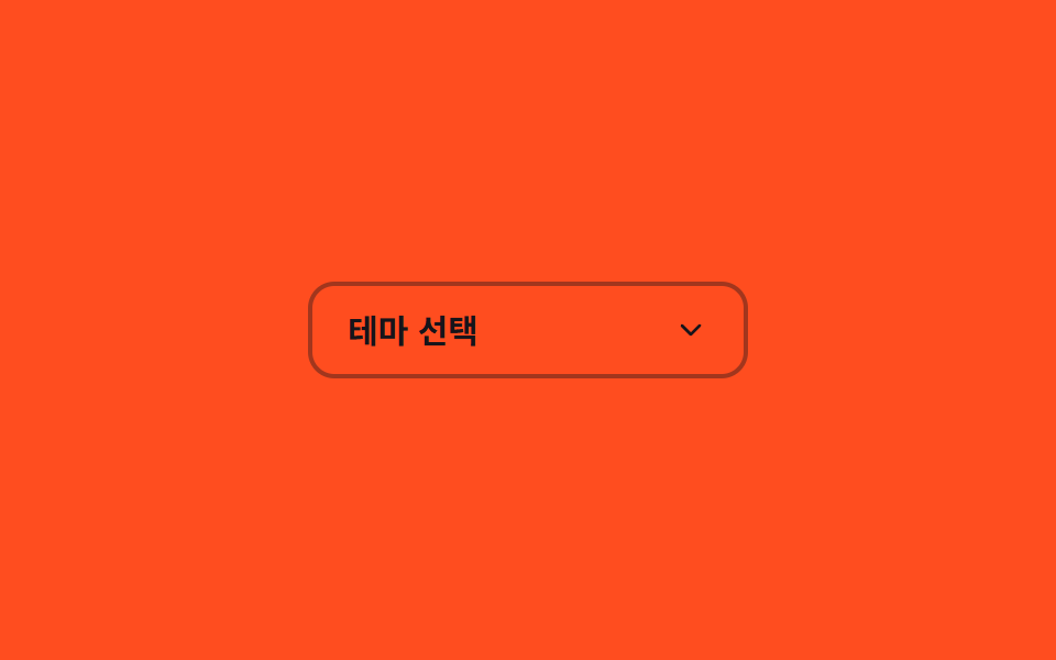
<main class="stage">
  <div class="cs is-demo">
    <button type="button" class="cs__btn" aria-haspopup="listbox" aria-expanded="false" id="cs-btn">
      <span class="cs__value">Chọn theme</span>
      <svg class="cs__chevron" viewBox="0 0 24 24" aria-hidden="true"><polyline points="6 9 12 15 18 9"/></svg>
    </button>
    <ul class="cs__list" role="listbox" aria-labelledby="cs-btn">
      <li role="option" class="cs__opt">Sáng</li>
      <li role="option" class="cs__opt">Tối</li>
      <li role="option" class="cs__opt">Hệ thống</li>
    </ul>
    <span class="cs__bloom" aria-hidden="true"></span>
  </div>
</main>
@use "../../../../site/static/demo-tokens" as *;
// ── 변수 3개 ──────────────────────────────────────────
$duration: $dur-base; // 열리고 닫히는 시간
$easing: cubic-bezier(.3, 1.5, .4, 1); // 스프링 오버슛 — 목록 scaleY 가 1 을 지나 1.06 까지 뻗었다가 감아 들어간다
$color: $subject-ink; // 셰브론 색 — 주황 무대 위 전경은 잉크(크림은 3.11:1 미달)
@include stage($stage-orange);
.cs { position: relative; width: min(200px, 78vw); }
.cs__btn {
display: flex; align-items: center; justify-content: space-between;
width: 100%;
border: 2px solid rgba($subject-ink, .4);
border-radius: $r-control;
padding: $sp-3 $sp-4;
font-weight: 600;
font-size: clamp(13px, 3.8vw, 15px);
line-height: 1;
font-family: inherit;
color: $subject-ink; // 주황 면 위 크림 글자는 3.11:1 — 잉크로 5.50:1
background: transparent;
cursor: pointer;
}
.cs__chevron {
width: 16px; height: 16px;
fill: none; stroke: $color; stroke-width: 2;
stroke-linecap: round; stroke-linejoin: round;
transform: rotate(0deg);
transition: transform $duration $easing;
}
.cs.is-open .cs__chevron { transform: rotate(180deg); }
.cs__list {
position: absolute;
left: 0; right: 0; top: calc(100% + $sp-2);
margin: 0; padding: $sp-2;
list-style: none;
border-radius: $r-control;
background: $subject-cream;
box-shadow: $shadow-raised;
transform: scaleY(0);
transform-origin: top; // 규칙8: 버튼 아래변에서 펼침
opacity: 0;
pointer-events: none;
transition: transform $duration $easing, opacity $duration $easing;
}
.cs.is-open .cs__list { transform: scaleY(1); opacity: 1; pointer-events: auto; }
// 목록이 열리는 순간 버튼 중심에서 아래로 번지는 radial 글로우 확산 한 겹
.cs__bloom {
position: absolute;
left: 0; right: 0; top: calc(100% + $sp-2);
height: 48px;
background: radial-gradient(ellipse 70% 100% at 50% 0%, rgba($subject-cream, .35) 0%, rgba($subject-cream, 0) 70%);
opacity: 0;
pointer-events: none;
}
.cs.is-open .cs__bloom { animation: cs-bloom $dur-base $ease-out; }
@keyframes cs-bloom {
0% { opacity: 0; transform: scaleY(.5); }
40% { opacity: 1; transform: scaleY(1); }
100% { opacity: 0; transform: scaleY(1.1); }
}
.cs__opt {
padding: $sp-2 $sp-3;
border-radius: $r-sm;
font-weight: 500;
font-size: clamp(13px, 3.6vw, 14px);
line-height: 1;
font-family: inherit;
color: $subject-orange-deep; // 크림 면 위 주황 글자는 3.11:1 — deep 으로 5.04:1
&:hover { background: rgba($stage-orange, .08); }
}
@media (prefers-reduced-motion: reduce) {
.cs__chevron, .cs__list { transition: none; }
.cs.is-open .cs__bloom { animation: none; }
}html, body {
margin: 0;
overflow: hidden;
}
.stage {
box-sizing: border-box;
min-height: 100vh;
display: grid;
place-items: center;
margin: 0;
background: #ff4d1f;
font-family: -apple-system, "Segoe UI", "Noto Sans KR", sans-serif;
padding: clamp(8px, 4vw, 24px);
}
.cs {
position: relative;
width: min(200px, 78vw);
}
.cs__btn {
display: flex;
align-items: center;
justify-content: space-between;
width: 100%;
border: 2px solid rgba(23, 20, 26, 0.4);
border-radius: 12px;
padding: 12px 16px;
font-weight: 600;
font-size: clamp(13px, 3.8vw, 15px);
line-height: 1;
font-family: inherit;
color: #17141a;
background: transparent;
cursor: pointer;
}
.cs__chevron {
width: 16px;
height: 16px;
fill: none;
stroke: #17141a;
stroke-width: 2;
stroke-linecap: round;
stroke-linejoin: round;
transform: rotate(0deg);
transition: transform 300ms cubic-bezier(0.3, 1.5, 0.4, 1);
}
.cs.is-open .cs__chevron {
transform: rotate(180deg);
}
.cs__list {
position: absolute;
left: 0;
right: 0;
top: calc(100% + 8px);
margin: 0;
padding: 8px;
list-style: none;
border-radius: 12px;
background: #fff7e6;
box-shadow: 0 14px 24px rgba(23, 20, 26, 0.32);
transform: scaleY(0);
transform-origin: top;
opacity: 0;
pointer-events: none;
transition: transform 300ms cubic-bezier(0.3, 1.5, 0.4, 1), opacity 300ms cubic-bezier(0.3, 1.5, 0.4, 1);
}
.cs.is-open .cs__list {
transform: scaleY(1);
opacity: 1;
pointer-events: auto;
}
.cs__bloom {
position: absolute;
left: 0;
right: 0;
top: calc(100% + 8px);
height: 48px;
background: radial-gradient(ellipse 70% 100% at 50% 0%, rgba(255, 247, 230, 0.35) 0%, rgba(255, 247, 230, 0) 70%);
opacity: 0;
pointer-events: none;
}
.cs.is-open .cs__bloom {
animation: cs-bloom 300ms ease-out;
}
@keyframes cs-bloom {
0% {
opacity: 0;
transform: scaleY(0.5);
}
40% {
opacity: 1;
transform: scaleY(1);
}
100% {
opacity: 0;
transform: scaleY(1.1);
}
}
.cs__opt {
padding: 8px 12px;
border-radius: 8px;
font-weight: 500;
font-size: clamp(13px, 3.6vw, 14px);
line-height: 1;
font-family: inherit;
color: #c93000;
}
.cs__opt:hover {
background: rgba(255, 77, 31, 0.08);
}
@media (prefers-reduced-motion: reduce) {
.cs__chevron, .cs__list {
transition: none;
}
.cs.is-open .cs__bloom {
animation: none;
}
}// 실사용: 버튼 클릭으로 연다·닫는다. 데모(.is-demo)는 같은 클래스를 주기적으로 토글 (5줄)
var cs = document.querySelector('.cs');
var btn = cs.querySelector('.cs__btn');
var toggle = function () { cs.classList.toggle('is-open'); btn.setAttribute('aria-expanded', cs.classList.contains('is-open')); };
btn.addEventListener('click', toggle);
if (cs.classList.contains('is-demo')) setInterval(toggle, 500);import { useState } from "react";
import type { CSSProperties } from "react";
import styles from "./CustomSelectOpen.module.scss";
export type CustomSelectOpenProps = {
id?: string;
label?: string;
options?: string[];
duration?: number;
easing?: string;
color?: string;
};
type Vars = CSSProperties & { "--duration"?: string; "--easing"?: string; "--color"?: string };
export default function CustomSelectOpen({
id = "cs-btn",
label = "Choose theme",
options = ["Light", "Dark", "System"],
duration = 220,
easing = "cubic-bezier(.3,1.5,.4,1)",
color = "#17141a",
}: CustomSelectOpenProps) {
const [open, setOpen] = useState(false);
const vars: Vars = { "--duration": `${duration}ms`, "--easing": easing, "--color": color };
return (
<div className={open ? `${styles.cs} ${styles.open}` : styles.cs} style={vars}>
<button
type="button"
id={id}
className={styles.btn}
aria-haspopup="listbox"
aria-expanded={open}
onClick={() => setOpen((v) => !v)}
>
<span>{label}</span>
<svg className={styles.chevron} viewBox="0 0 24 24" aria-hidden="true"><polyline points="6 9 12 15 18 9" /></svg>
</button>
<ul className={styles.list} role="listbox" aria-labelledby={id}>
{options.map((opt) => (
<li key={opt} role="option" className={styles.opt}>{opt}</li>
))}
</ul>
<span className={styles.bloom} aria-hidden="true" />
</div>
);
}07 Select tùy biến mở ra — Diện tích đo được 18.322% · khung hình chuyển động 16/23Nguyên tác GODRICH · SCSS và React nằm trong tệp zip · 9 CSS Input Focus Animation — dán 1 dòng là chạy
Bài viết chứa demo này
 9 CSS Input Focus Animation — dán 1 dòng là chạyCSS input focus animation là các hiệu ứng dùng thẳng trạng thái trình duyệt đã có sẵn — :focus, :focus-within, :placehol Xem tất cả demo trong bài này