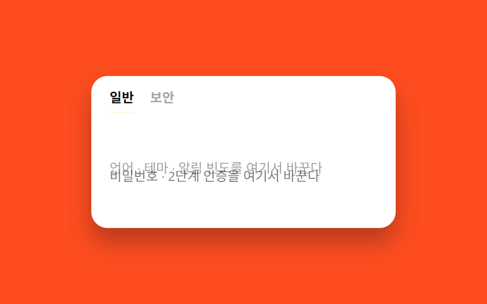
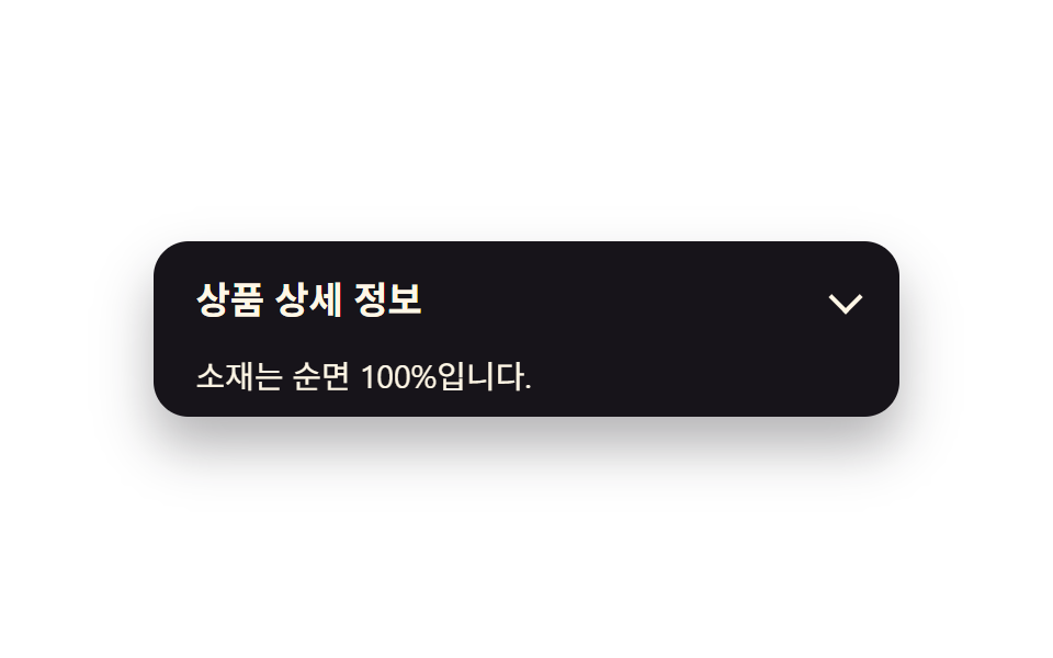
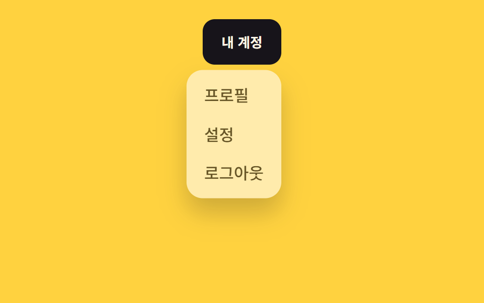
01Fade + phóng to
Hiện ra từ giữa màn hình với hiệu ứng phóng to nhẹ, đóng thì ngược lại.
Dùng choModal xác nhận, thông báo cơ bản
200ms0.9→1페이드만

<main class="stage is-demo">
  <button class="trigger" type="button">Thanh toán</button>
  <div class="overlay"></div>
  <div class="modal" role="dialog" aria-modal="true" aria-labelledby="t1">
    <h2 id="t1">Hoàn tất thanh toán?</h2>
    <p>Sau khi thẻ được duyệt, bạn không thể hủy.</p>
    <button class="modal__close" type="button">Xác nhận</button>
  </div>
</main>
@use "../../../../site/static/demo-tokens" as *;
// ── 변수 3개. 변형은 이것만 바꾼다 ──────────────────────────
$duration: $dur-quick; // 열리는 시간 (실제 클릭)
$easing: $ease-spring; // 처음 빠르고 끝은 부드럽게
$color: $subject-blue; // 강조색(버튼·포커스)
@include stage($stage-ink);
.stage { position: relative; }
.trigger {
border: 0; border-radius: $r-pill;
padding: clamp(10px, 3.4vmin, 14px) clamp(20px, 7vmin, 30px);
font-weight: 600;
font-size: clamp(13px, 4vmin, 16px);
line-height: 1;
font-family: inherit;
color: $stage-ink; background: $subject-cream;
cursor: pointer; -webkit-tap-highlight-color: transparent;
transition: filter $dur-instant;
&:hover, &:focus-visible { filter: brightness(.94); }
}
.overlay {
position: fixed; inset: 0;
background: rgba($stage-ink, .55);
opacity: 0; pointer-events: none;
transition: opacity $duration $easing;
}
.modal {
position: fixed; left: 50%; top: 50%;
transform: translate(-50%, -50%) scale(.92);
opacity: 0; pointer-events: none;
width: min(78vw, 300px);
padding: clamp(12px, 4.5vmin, 22px);
border-radius: $r-card; background: $stage-paper; color: $stage-ink;
box-shadow: $shadow-raised;
transition: opacity $duration $easing, transform $duration $easing;
h2 { margin: 0 0 6px; font-size: clamp(13px, 4.4vmin, 18px); }
p { margin: 0 0 14px; font-size: clamp(10px, 3.2vmin, 13px); color: rgba($stage-ink, .65); }
}
.modal__close {
border: 0; border-radius: $r-control; background: $color; color: $stage-paper;
padding: clamp(7px, 2.6vmin, 9px) clamp(14px, 4.6vmin, 18px);
font-weight: 600;
font-size: clamp(11px, 3.4vmin, 13px);
line-height: 1;
font-family: inherit;
cursor: pointer;
}
// 실제 조작 상태
.stage.is-open .overlay { opacity: 1; pointer-events: auto; }
.stage.is-open .modal { opacity: 1; transform: translate(-50%, -50%) scale(1); pointer-events: auto; }
// 데모: 2초 안에 열림→닫힘 반복 (실측 2026-09-09 편 001 관례: 루프 전용 keyframes 는 $dur-loop 로 고정)
.stage.is-demo .overlay { animation: overlay-loop $dur-loop ease-in-out infinite; }
.stage.is-demo .modal { animation: modal-loop $dur-loop $easing infinite; }
@keyframes overlay-loop {
0% { opacity: 0; }
15% { opacity: 1; }
70% { opacity: 1; }
85% { opacity: 0; }
100% { opacity: 0; }
}
@keyframes modal-loop {
0% { opacity: 0; transform: translate(-50%, -50%) scale(.92); }
15% { opacity: 1; transform: translate(-50%, -50%) scale(1); }
70% { opacity: 1; transform: translate(-50%, -50%) scale(1); }
85% { opacity: 0; transform: translate(-50%, -50%) scale(.92); }
100% { opacity: 0; transform: translate(-50%, -50%) scale(.92); }
}
@media (prefers-reduced-motion: reduce) {
.stage.is-demo .overlay, .stage.is-demo .modal { animation: none; }
.overlay, .modal { transition-duration: 1ms; }
}html, body {
margin: 0;
overflow: hidden;
}
.stage {
box-sizing: border-box;
min-height: 100vh;
display: grid;
place-items: center;
margin: 0;
background: #17141a;
font-family: -apple-system, "Segoe UI", "Noto Sans KR", sans-serif;
padding: clamp(8px, 4vw, 24px);
}
.stage {
position: relative;
}
.trigger {
border: 0;
border-radius: 999px;
padding: clamp(10px, 3.4vmin, 14px) clamp(20px, 7vmin, 30px);
font-weight: 600;
font-size: clamp(13px, 4vmin, 16px);
line-height: 1;
font-family: inherit;
color: #17141a;
background: #fff7e6;
cursor: pointer;
-webkit-tap-highlight-color: transparent;
transition: filter 140ms;
}
.trigger:hover, .trigger:focus-visible {
filter: brightness(0.94);
}
.overlay {
position: fixed;
inset: 0;
background: rgba(23, 20, 26, 0.55);
opacity: 0;
pointer-events: none;
transition: opacity 220ms cubic-bezier(0.2, 0.8, 0.2, 1);
}
.modal {
position: fixed;
left: 50%;
top: 50%;
transform: translate(-50%, -50%) scale(0.92);
opacity: 0;
pointer-events: none;
width: min(78vw, 300px);
padding: clamp(12px, 4.5vmin, 22px);
border-radius: 16px;
background: #ffffff;
color: #17141a;
box-shadow: 0 14px 24px rgba(23, 20, 26, 0.32);
transition: opacity 220ms cubic-bezier(0.2, 0.8, 0.2, 1), transform 220ms cubic-bezier(0.2, 0.8, 0.2, 1);
}
.modal h2 {
margin: 0 0 6px;
font-size: clamp(13px, 4.4vmin, 18px);
}
.modal p {
margin: 0 0 14px;
font-size: clamp(10px, 3.2vmin, 13px);
color: rgba(23, 20, 26, 0.65);
}
.modal__close {
border: 0;
border-radius: 12px;
background: #2f6df6;
color: #ffffff;
padding: clamp(7px, 2.6vmin, 9px) clamp(14px, 4.6vmin, 18px);
font-weight: 600;
font-size: clamp(11px, 3.4vmin, 13px);
line-height: 1;
font-family: inherit;
cursor: pointer;
}
.stage.is-open .overlay {
opacity: 1;
pointer-events: auto;
}
.stage.is-open .modal {
opacity: 1;
transform: translate(-50%, -50%) scale(1);
pointer-events: auto;
}
.stage.is-demo .overlay {
animation: overlay-loop 2s ease-in-out infinite;
}
.stage.is-demo .modal {
animation: modal-loop 2s cubic-bezier(0.2, 0.8, 0.2, 1) infinite;
}
@keyframes overlay-loop {
0% {
opacity: 0;
}
15% {
opacity: 1;
}
70% {
opacity: 1;
}
85% {
opacity: 0;
}
100% {
opacity: 0;
}
}
@keyframes modal-loop {
0% {
opacity: 0;
transform: translate(-50%, -50%) scale(0.92);
}
15% {
opacity: 1;
transform: translate(-50%, -50%) scale(1);
}
70% {
opacity: 1;
transform: translate(-50%, -50%) scale(1);
}
85% {
opacity: 0;
transform: translate(-50%, -50%) scale(0.92);
}
100% {
opacity: 0;
transform: translate(-50%, -50%) scale(0.92);
}
}
@media (prefers-reduced-motion: reduce) {
.stage.is-demo .overlay, .stage.is-demo .modal {
animation: none;
}
.overlay, .modal {
transition-duration: 1ms;
}
}// 실제 클릭: 트리거로 열고 오버레이·Xác nhận·ESC 로 닫는다. 데모(.is-demo)는 자동 반복하다가 실제 조작이 오면 멈춘다.
(function () {
var stage = document.querySelector('.stage');
var trigger = document.querySelector('.trigger');
var overlay = document.querySelector('.overlay');
var close = document.querySelector('.modal__close');
function open() { stage.classList.remove('is-demo'); stage.classList.add('is-open'); }
function shut() { stage.classList.remove('is-open'); }
trigger.addEventListener('click', open);
overlay.addEventListener('click', shut);
close.addEventListener('click', shut);
document.addEventListener('keydown', function (e) { if (e.key === 'Escape') shut(); });
})();import { useState } from "react";
import type { CSSProperties } from "react";
import styles from "./ModalFadeScale.module.scss";
export type ModalFadeScaleProps = {
triggerLabel: string;
title: string;
description: string;
confirmLabel: string;
/** 열리는 시간 (기본 220ms) */
duration?: number;
/** CSS easing */
easing?: string;
/** 강조색 */
color?: string;
};
type Vars = CSSProperties & { "--duration"?: string; "--easing"?: string; "--color"?: string };
export default function ModalFadeScale({
triggerLabel,
title,
description,
confirmLabel,
duration = 220,
easing = "cubic-bezier(.2,.8,.2,1)",
color = "#2f6df6",
}: ModalFadeScaleProps) {
const [open, setOpen] = useState(false);
const vars: Vars = { "--duration": `${duration}ms`, "--easing": easing, "--color": color };
return (
<div className={styles.stage} style={vars}>
<button type="button" className={styles.trigger} onClick={() => setOpen(true)}>
{triggerLabel}
</button>
<div
className={open ? `${styles.overlay} ${styles.isOpen}` : styles.overlay}
onClick={() => setOpen(false)}
/>
<div
className={open ? `${styles.modal} ${styles.isOpen}` : styles.modal}
role="dialog"
aria-modal="true"
>
<h2>{title}</h2>
<p>{description}</p>
<button type="button" className={styles.confirm} onClick={() => setOpen(false)}>
{confirmLabel}
</button>
</div>
</div>
);
}01 Fade + phóng to — Diện tích đo được 24.692% · khung hình chuyển động 7/23Nguyên tác GODRICH · SCSS và React nằm trong tệp zip · 9 hiệu ứng css modal animation gọn nhẹ
Bài viết chứa demo này
 9 hiệu ứng css modal animation gọn nhẹMột css modal animation là chuyển động khi hộp thoại xuất hiện và biến mất, thay vì bật thẳng từ ẩn sang hiện. Chín kiểu Xem tất cả demo trong bài này