9 hiệu ứng css modal animation gọn nhẹ
Một css modal animation là chuyển động khi hộp thoại xuất hiện và biến mất, thay vì bật thẳng từ ẩn sang hiện.
 01 modal-fade-scale
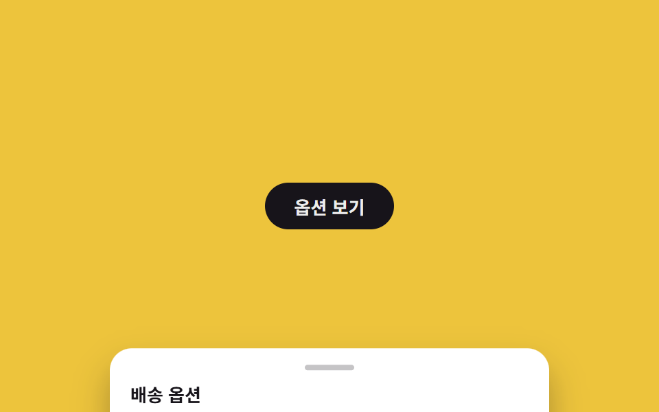 02 bottom-sheet
 03 side-drawer
 04 backdrop-blur
 05 native-dialog
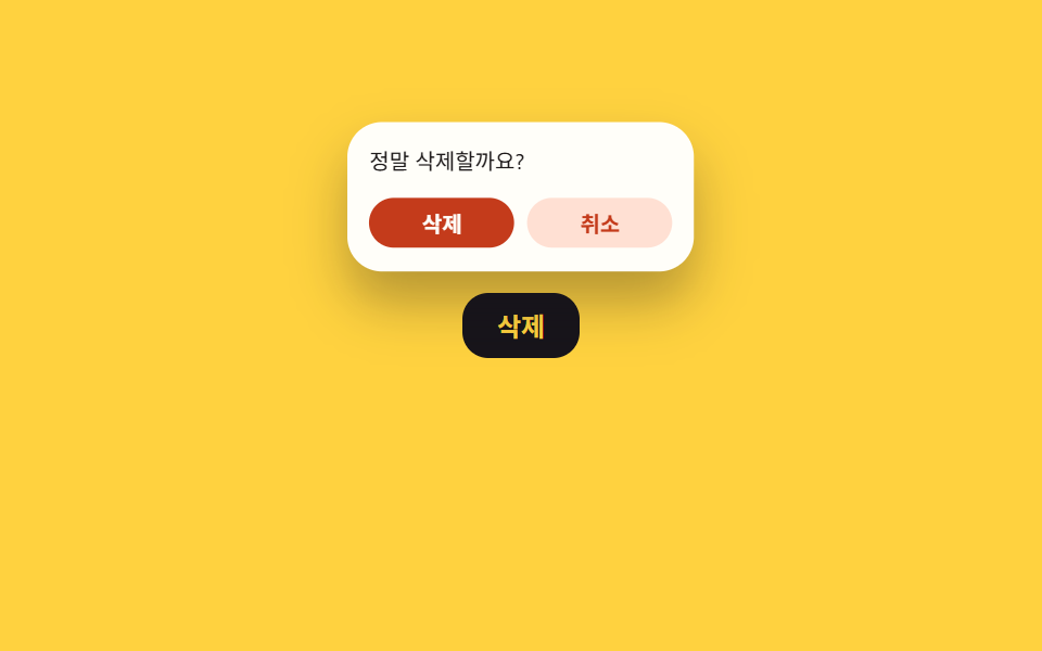 06 popover-confirm
 07 fullscreen-takeover
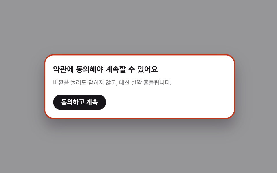 08 modal-shake-outside
 09 stacked-modals
Tự chạy · bấm ô để tới mục đó · cả 9 trong một zip
- 01 Fade + phóng to
- 02 Bottom sheet
- 03 Drawer bên cạnh
- 04 Làm mờ nền
- 05 Dialog gốc
- 06 Popover xác nhận
- 07 Nút mở rộng toàn màn hình
- 08 Rung khi nhấn ra ngoài
- 09 Modal xếp chồng
Chín ô phía trên tự mở rồi tự đóng, lặp lại mỗi 2 giây bên trong một iframe không cuộn được và quá ngắn để chứa một tương tác thật — bạn xem chuyển động chứ không bấm gì cả, vì nút trigger trong khung xem trước này chưa được gắn sự kiện. Từ 01 đến 04 là bốn biến thể của cùng một tấm panel căn giữa hoặc dính mép, khác nhau ở vị trí và ở cách lớp nền phía sau xử lý. 05 và 06 giao việc cho trình duyệt: một cái animate <dialog> gốc, một cái dùng Popover API gắn vào nút anchor, thay vì tự dựng div overlay từ đầu. 07 đến 09 thêm một phần chuyển động thứ hai — một thumbnail phóng to thành modal, một cú rung thay cho việc đóng, và một dialog thứ hai đẩy dialog đầu lùi ra sau.
01Fade + phóng to
Bạn thấy gì
Modal căn giữa mờ dần hiện ra trong lúc phóng to từ 0.92 lên 1 trong khoảng 200ms, rồi chạy ngược khi đóng — không trượt, không đổi màu, chỉ opacity và scale đi cùng nhau.
<main class="stage is-demo">
  <button class="trigger" type="button">Thanh toán</button>
  <div class="overlay"></div>
  <div class="modal" role="dialog" aria-modal="true" aria-labelledby="t1">
    <h2 id="t1">Hoàn tất thanh toán?</h2>
    <p>Sau khi thẻ được duyệt, bạn không thể hủy.</p>
    <button class="modal__close" type="button">Xác nhận</button>
  </div>
</main>
@use "../../../../site/static/demo-tokens" as *;
// ── 변수 3개. 변형은 이것만 바꾼다 ──────────────────────────
$duration: $dur-quick; // 열리는 시간 (실제 클릭)
$easing: $ease-spring; // 처음 빠르고 끝은 부드럽게
$color: $subject-blue; // 강조색(버튼·포커스)
@include stage($stage-ink);
.stage { position: relative; }
.trigger {
border: 0; border-radius: $r-pill;
padding: clamp(10px, 3.4vmin, 14px) clamp(20px, 7vmin, 30px);
font-weight: 600;
font-size: clamp(13px, 4vmin, 16px);
line-height: 1;
font-family: inherit;
color: $stage-ink; background: $subject-cream;
cursor: pointer; -webkit-tap-highlight-color: transparent;
transition: filter $dur-instant;
&:hover, &:focus-visible { filter: brightness(.94); }
}
.overlay {
position: fixed; inset: 0;
background: rgba($stage-ink, .55);
opacity: 0; pointer-events: none;
transition: opacity $duration $easing;
}
.modal {
position: fixed; left: 50%; top: 50%;
transform: translate(-50%, -50%) scale(.92);
opacity: 0; pointer-events: none;
width: min(78vw, 300px);
padding: clamp(12px, 4.5vmin, 22px);
border-radius: $r-card; background: $stage-paper; color: $stage-ink;
box-shadow: $shadow-raised;
transition: opacity $duration $easing, transform $duration $easing;
h2 { margin: 0 0 6px; font-size: clamp(13px, 4.4vmin, 18px); }
p { margin: 0 0 14px; font-size: clamp(10px, 3.2vmin, 13px); color: rgba($stage-ink, .65); }
}
.modal__close {
border: 0; border-radius: $r-control; background: $color; color: $stage-paper;
padding: clamp(7px, 2.6vmin, 9px) clamp(14px, 4.6vmin, 18px);
font-weight: 600;
font-size: clamp(11px, 3.4vmin, 13px);
line-height: 1;
font-family: inherit;
cursor: pointer;
}
// 실제 조작 상태
.stage.is-open .overlay { opacity: 1; pointer-events: auto; }
.stage.is-open .modal { opacity: 1; transform: translate(-50%, -50%) scale(1); pointer-events: auto; }
// 데모: 2초 안에 열림→닫힘 반복 (실측 2026-09-09 편 001 관례: 루프 전용 keyframes 는 $dur-loop 로 고정)
.stage.is-demo .overlay { animation: overlay-loop $dur-loop ease-in-out infinite; }
.stage.is-demo .modal { animation: modal-loop $dur-loop $easing infinite; }
@keyframes overlay-loop {
0% { opacity: 0; }
15% { opacity: 1; }
70% { opacity: 1; }
85% { opacity: 0; }
100% { opacity: 0; }
}
@keyframes modal-loop {
0% { opacity: 0; transform: translate(-50%, -50%) scale(.92); }
15% { opacity: 1; transform: translate(-50%, -50%) scale(1); }
70% { opacity: 1; transform: translate(-50%, -50%) scale(1); }
85% { opacity: 0; transform: translate(-50%, -50%) scale(.92); }
100% { opacity: 0; transform: translate(-50%, -50%) scale(.92); }
}
@media (prefers-reduced-motion: reduce) {
.stage.is-demo .overlay, .stage.is-demo .modal { animation: none; }
.overlay, .modal { transition-duration: 1ms; }
}html, body {
margin: 0;
overflow: hidden;
}
.stage {
box-sizing: border-box;
min-height: 100vh;
display: grid;
place-items: center;
margin: 0;
background: #17141a;
font-family: -apple-system, "Segoe UI", "Noto Sans KR", sans-serif;
padding: clamp(8px, 4vw, 24px);
}
.stage {
position: relative;
}
.trigger {
border: 0;
border-radius: 999px;
padding: clamp(10px, 3.4vmin, 14px) clamp(20px, 7vmin, 30px);
font-weight: 600;
font-size: clamp(13px, 4vmin, 16px);
line-height: 1;
font-family: inherit;
color: #17141a;
background: #fff7e6;
cursor: pointer;
-webkit-tap-highlight-color: transparent;
transition: filter 140ms;
}
.trigger:hover, .trigger:focus-visible {
filter: brightness(0.94);
}
.overlay {
position: fixed;
inset: 0;
background: rgba(23, 20, 26, 0.55);
opacity: 0;
pointer-events: none;
transition: opacity 220ms cubic-bezier(0.2, 0.8, 0.2, 1);
}
.modal {
position: fixed;
left: 50%;
top: 50%;
transform: translate(-50%, -50%) scale(0.92);
opacity: 0;
pointer-events: none;
width: min(78vw, 300px);
padding: clamp(12px, 4.5vmin, 22px);
border-radius: 16px;
background: #ffffff;
color: #17141a;
box-shadow: 0 14px 24px rgba(23, 20, 26, 0.32);
transition: opacity 220ms cubic-bezier(0.2, 0.8, 0.2, 1), transform 220ms cubic-bezier(0.2, 0.8, 0.2, 1);
}
.modal h2 {
margin: 0 0 6px;
font-size: clamp(13px, 4.4vmin, 18px);
}
.modal p {
margin: 0 0 14px;
font-size: clamp(10px, 3.2vmin, 13px);
color: rgba(23, 20, 26, 0.65);
}
.modal__close {
border: 0;
border-radius: 12px;
background: #2f6df6;
color: #ffffff;
padding: clamp(7px, 2.6vmin, 9px) clamp(14px, 4.6vmin, 18px);
font-weight: 600;
font-size: clamp(11px, 3.4vmin, 13px);
line-height: 1;
font-family: inherit;
cursor: pointer;
}
.stage.is-open .overlay {
opacity: 1;
pointer-events: auto;
}
.stage.is-open .modal {
opacity: 1;
transform: translate(-50%, -50%) scale(1);
pointer-events: auto;
}
.stage.is-demo .overlay {
animation: overlay-loop 2s ease-in-out infinite;
}
.stage.is-demo .modal {
animation: modal-loop 2s cubic-bezier(0.2, 0.8, 0.2, 1) infinite;
}
@keyframes overlay-loop {
0% {
opacity: 0;
}
15% {
opacity: 1;
}
70% {
opacity: 1;
}
85% {
opacity: 0;
}
100% {
opacity: 0;
}
}
@keyframes modal-loop {
0% {
opacity: 0;
transform: translate(-50%, -50%) scale(0.92);
}
15% {
opacity: 1;
transform: translate(-50%, -50%) scale(1);
}
70% {
opacity: 1;
transform: translate(-50%, -50%) scale(1);
}
85% {
opacity: 0;
transform: translate(-50%, -50%) scale(0.92);
}
100% {
opacity: 0;
transform: translate(-50%, -50%) scale(0.92);
}
}
@media (prefers-reduced-motion: reduce) {
.stage.is-demo .overlay, .stage.is-demo .modal {
animation: none;
}
.overlay, .modal {
transition-duration: 1ms;
}
}// 실제 클릭: 트리거로 열고 오버레이·Xác nhận·ESC 로 닫는다. 데모(.is-demo)는 자동 반복하다가 실제 조작이 오면 멈춘다.
(function () {
var stage = document.querySelector('.stage');
var trigger = document.querySelector('.trigger');
var overlay = document.querySelector('.overlay');
var close = document.querySelector('.modal__close');
function open() { stage.classList.remove('is-demo'); stage.classList.add('is-open'); }
function shut() { stage.classList.remove('is-open'); }
trigger.addEventListener('click', open);
overlay.addEventListener('click', shut);
close.addEventListener('click', shut);
document.addEventListener('keydown', function (e) { if (e.key === 'Escape') shut(); });
})();import { useState } from "react";
import type { CSSProperties } from "react";
import styles from "./ModalFadeScale.module.scss";
export type ModalFadeScaleProps = {
triggerLabel: string;
title: string;
description: string;
confirmLabel: string;
/** 열리는 시간 (기본 220ms) */
duration?: number;
/** CSS easing */
easing?: string;
/** 강조색 */
color?: string;
};
type Vars = CSSProperties & { "--duration"?: string; "--easing"?: string; "--color"?: string };
export default function ModalFadeScale({
triggerLabel,
title,
description,
confirmLabel,
duration = 220,
easing = "cubic-bezier(.2,.8,.2,1)",
color = "#2f6df6",
}: ModalFadeScaleProps) {
const [open, setOpen] = useState(false);
const vars: Vars = { "--duration": `${duration}ms`, "--easing": easing, "--color": color };
return (
<div className={styles.stage} style={vars}>
<button type="button" className={styles.trigger} onClick={() => setOpen(true)}>
{triggerLabel}
</button>
<div
className={open ? `${styles.overlay} ${styles.isOpen}` : styles.overlay}
onClick={() => setOpen(false)}
/>
<div
className={open ? `${styles.modal} ${styles.isOpen}` : styles.modal}
role="dialog"
aria-modal="true"
>
<h2>{title}</h2>
<p>{description}</p>
<button type="button" className={styles.confirm} onClick={() => setOpen(false)}>
{confirmLabel}
</button>
</div>
</div>
);
}01 · Fade + phóng to — Diện tích đo được 24.692% · khung hình chuyển động 7/23Nguyên tác GODRICH · SCSS và React nằm trong tệp zip · Xem mật khẩu
Dùng ở đâu
Đây là lựa chọn an toàn nhất cho modal xác nhận và cảnh báo cơ bản, kiểu modal mà nút thanh toán mở ra ngay trước khi trừ tiền thẻ.
.overlay {
  position: fixed; inset: 0;
  opacity: 0; pointer-events: none;
  transition: opacity $duration $easing;
}

.modal {
  position: fixed; left: 50%; top: 50%;
  transform: translate(-50%, -50%) scale(.92);
  opacity: 0; pointer-events: none;
  transition: opacity $duration $easing, transform $duration $easing;
}

.stage.is-open .overlay { opacity: 1; pointer-events: auto; }
.stage.is-open .modal {
  opacity: 1;
  transform: translate(-50%, -50%) scale(1);
  pointer-events: auto;
}
02Bottom sheet
Chuyện gì diễn ra trên màn hình
Một tấm sheet trượt lên từ mép dưới màn hình và dừng lại vừa khít với chiều cao nội dung thay vì phủ kín cả màn hình, kèm một thanh handle nhỏ phía trên tiêu đề để báo đây là sheet chứ không phải modal thường.
<main class="stage is-demo">
  <button class="trigger" type="button">Xem tùy chọn</button>
  <div class="overlay"></div>
  <div class="sheet" role="dialog" aria-modal="true" aria-labelledby="t2">
    <div class="sheet__handle"></div>
    <h2 id="t2">Tùy chọn giao hàng</h2>
    <p>Chọn giao trong ngày, hôm sau hoặc tiêu chuẩn.</p>
    <button class="sheet__close" type="button">Đóng</button>
  </div>
</main>
@use "../../../../site/static/demo-tokens" as *;
// ── 변수 3개 ──────────────────────────────────────────
$duration: $dur-base; // 시트가 올라오는 시간
$easing: $ease-out; // 관성 없이 딱 멈춘다
$color: $subject-ink; // 강조색(손잡이·버튼)
@include stage($stage-yellow);
.stage { position: relative; }
.trigger {
border: 0; border-radius: $r-pill;
padding: clamp(10px, 3.4vmin, 14px) clamp(20px, 7vmin, 30px);
font-weight: 600;
font-size: clamp(13px, 4vmin, 16px);
line-height: 1;
font-family: inherit;
color: $stage-paper; background: $subject-ink;
cursor: pointer; -webkit-tap-highlight-color: transparent;
}
.overlay {
position: fixed; inset: 0;
background: rgba($stage-ink, .5);
opacity: 0; pointer-events: none;
transition: opacity $duration $easing;
}
.sheet {
position: fixed; left: 50%; bottom: 0; top: auto;
transform: translate(-50%, 100%);
width: min(94vw, 320px);
max-height: 62%;
box-sizing: border-box;
padding: clamp(10px, 4vmin, 18px) clamp(14px, 5vmin, 22px);
border-radius: $r-card $r-card 0 0;
background: $stage-paper; color: $stage-ink;
box-shadow: $shadow-raised;
pointer-events: none;
transition: transform $duration $easing;
h2 { margin: 8px 0 4px; font-size: clamp(13px, 4.2vmin, 17px); }
p { margin: 0 0 10px; font-size: clamp(10px, 3.2vmin, 13px); color: rgba($stage-ink, .65); }
}
.sheet__handle {
width: 36px; height: 4px; margin: 0 auto;
border-radius: $r-pill; background: rgba($stage-ink, .25);
}
.sheet__close {
border: 0; border-radius: $r-control; background: $color; color: $stage-paper;
padding: clamp(7px, 2.6vmin, 9px) clamp(14px, 4.6vmin, 18px);
font-weight: 600;
font-size: clamp(11px, 3.4vmin, 13px);
line-height: 1;
font-family: inherit;
cursor: pointer;
}
.stage.is-open .overlay { opacity: 1; pointer-events: auto; }
.stage.is-open .sheet { transform: translate(-50%, 0); pointer-events: auto; }
.stage.is-demo .overlay { animation: overlay-loop $dur-loop ease-in-out infinite; }
.stage.is-demo .sheet { animation: sheet-loop $dur-loop $easing infinite; }
@keyframes overlay-loop {
0% { opacity: 0; }
15% { opacity: 1; }
70% { opacity: 1; }
85% { opacity: 0; }
100% { opacity: 0; }
}
@keyframes sheet-loop {
0% { transform: translate(-50%, 100%); }
15% { transform: translate(-50%, 0); }
70% { transform: translate(-50%, 0); }
85% { transform: translate(-50%, 100%); }
100% { transform: translate(-50%, 100%); }
}
@media (prefers-reduced-motion: reduce) {
.stage.is-demo .overlay, .stage.is-demo .sheet { animation: none; }
.overlay, .sheet { transition-duration: 1ms; }
}html, body {
margin: 0;
overflow: hidden;
}
.stage {
box-sizing: border-box;
min-height: 100vh;
display: grid;
place-items: center;
margin: 0;
background: #ffd23f;
font-family: -apple-system, "Segoe UI", "Noto Sans KR", sans-serif;
padding: clamp(8px, 4vw, 24px);
}
.stage {
position: relative;
}
.trigger {
border: 0;
border-radius: 999px;
padding: clamp(10px, 3.4vmin, 14px) clamp(20px, 7vmin, 30px);
font-weight: 600;
font-size: clamp(13px, 4vmin, 16px);
line-height: 1;
font-family: inherit;
color: #ffffff;
background: #17141a;
cursor: pointer;
-webkit-tap-highlight-color: transparent;
}
.overlay {
position: fixed;
inset: 0;
background: rgba(23, 20, 26, 0.5);
opacity: 0;
pointer-events: none;
transition: opacity 300ms ease-out;
}
.sheet {
position: fixed;
left: 50%;
bottom: 0;
top: auto;
transform: translate(-50%, 100%);
width: min(94vw, 320px);
max-height: 62%;
box-sizing: border-box;
padding: clamp(10px, 4vmin, 18px) clamp(14px, 5vmin, 22px);
border-radius: 16px 16px 0 0;
background: #ffffff;
color: #17141a;
box-shadow: 0 14px 24px rgba(23, 20, 26, 0.32);
pointer-events: none;
transition: transform 300ms ease-out;
}
.sheet h2 {
margin: 8px 0 4px;
font-size: clamp(13px, 4.2vmin, 17px);
}
.sheet p {
margin: 0 0 10px;
font-size: clamp(10px, 3.2vmin, 13px);
color: rgba(23, 20, 26, 0.65);
}
.sheet__handle {
width: 36px;
height: 4px;
margin: 0 auto;
border-radius: 999px;
background: rgba(23, 20, 26, 0.25);
}
.sheet__close {
border: 0;
border-radius: 12px;
background: #17141a;
color: #ffffff;
padding: clamp(7px, 2.6vmin, 9px) clamp(14px, 4.6vmin, 18px);
font-weight: 600;
font-size: clamp(11px, 3.4vmin, 13px);
line-height: 1;
font-family: inherit;
cursor: pointer;
}
.stage.is-open .overlay {
opacity: 1;
pointer-events: auto;
}
.stage.is-open .sheet {
transform: translate(-50%, 0);
pointer-events: auto;
}
.stage.is-demo .overlay {
animation: overlay-loop 2s ease-in-out infinite;
}
.stage.is-demo .sheet {
animation: sheet-loop 2s ease-out infinite;
}
@keyframes overlay-loop {
0% {
opacity: 0;
}
15% {
opacity: 1;
}
70% {
opacity: 1;
}
85% {
opacity: 0;
}
100% {
opacity: 0;
}
}
@keyframes sheet-loop {
0% {
transform: translate(-50%, 100%);
}
15% {
transform: translate(-50%, 0);
}
70% {
transform: translate(-50%, 0);
}
85% {
transform: translate(-50%, 100%);
}
100% {
transform: translate(-50%, 100%);
}
}
@media (prefers-reduced-motion: reduce) {
.stage.is-demo .overlay, .stage.is-demo .sheet {
animation: none;
}
.overlay, .sheet {
transition-duration: 1ms;
}
}(function () {
var stage = document.querySelector('.stage');
var trigger = document.querySelector('.trigger');
var overlay = document.querySelector('.overlay');
var close = document.querySelector('.sheet__close');
function open() { stage.classList.remove('is-demo'); stage.classList.add('is-open'); }
function shut() { stage.classList.remove('is-open'); }
trigger.addEventListener('click', open);
overlay.addEventListener('click', shut);
close.addEventListener('click', shut);
document.addEventListener('keydown', function (e) { if (e.key === 'Escape') shut(); });
})();import { useState } from "react";
import type { CSSProperties } from "react";
import styles from "./BottomSheet.module.scss";
export type BottomSheetProps = {
triggerLabel: string;
title: string;
description: string;
closeLabel: string;
/** 시트가 올라오는 시간 (기본 300ms) */
duration?: number;
easing?: string;
color?: string;
};
type Vars = CSSProperties & { "--duration"?: string; "--easing"?: string; "--color"?: string };
export default function BottomSheet({
triggerLabel,
title,
description,
closeLabel,
duration = 300,
easing = "ease-out",
color = "#17141a",
}: BottomSheetProps) {
const [open, setOpen] = useState(false);
const vars: Vars = { "--duration": `${duration}ms`, "--easing": easing, "--color": color };
return (
<div className={styles.stage} style={vars}>
<button type="button" className={styles.trigger} onClick={() => setOpen(true)}>
{triggerLabel}
</button>
<div
className={open ? `${styles.overlay} ${styles.isOpen}` : styles.overlay}
onClick={() => setOpen(false)}
/>
<div
className={open ? `${styles.sheet} ${styles.isOpen}` : styles.sheet}
role="dialog"
aria-modal="true"
>
<div className={styles.handle} />
<h2>{title}</h2>
<p>{description}</p>
<button type="button" className={styles.close} onClick={() => setOpen(false)}>
{closeLabel}
</button>
</div>
</div>
);
}02 · Bottom sheet — Diện tích đo được 98.256% · khung hình chuyển động 9/23Nguyên tác GODRICH · SCSS và React nằm trong tệp zip · Xem mật khẩu
Chỗ dùng
Thanh handle đó quan trọng nhất trên màn hình hẹp kiểu mobile, đúng nơi kiểu sheet này được dựng ra, vì ở đó một modal đầy đủ sẽ trông quá cồng kềnh.
.sheet {
  position: fixed; left: 50%; bottom: 0; top: auto;
  transform: translate(-50%, 100%);
  max-height: 62%;
  border-radius: $r-card $r-card 0 0;
  transition: transform $duration $easing;
}

.sheet__handle {
  width: 36px; height: 4px;
  margin: 0 auto;
  border-radius: $r-pill;
  background: rgba($stage-ink, .25);
}

.stage.is-open .sheet { transform: translate(-50%, 0); }
03Drawer bên cạnh
Chuyển động thế nào
Một panel rộng khoảng 260px trượt vào từ mép phải với easing kiểu lò xo hơi vọt qua rồi mới ổn định, thay vì dừng khựng ngay khi chạm vị trí cuối.
<main class="stage is-demo">
  <button class="trigger" type="button">Giỏ hàng</button>
  <div class="overlay"></div>
  <div class="drawer" role="dialog" aria-modal="true" aria-labelledby="t3">
    <h2 id="t3">Giỏ hàng (2)</h2>
    <p>Tổng cộng 48.000₫. Phí giao hàng ở màn hình sau.</p>
    <button class="drawer__close" type="button">Đóng</button>
  </div>
</main>
@use "../../../../site/static/demo-tokens" as *;
// ── 변수 3개 ──────────────────────────────────────────
$duration: $dur-enter; // 패널이 밀려 들어오는 시간
$easing: $ease-spring; // 끝에서 살짝 튕긴다
$color: $subject-cream; // 강조색(버튼)
@include stage($stage-orange);
.stage { position: relative; }
.trigger {
border: 0; border-radius: $r-pill;
padding: clamp(10px, 3.4vmin, 14px) clamp(20px, 7vmin, 30px);
font-weight: 600;
font-size: clamp(13px, 4vmin, 16px);
line-height: 1;
font-family: inherit;
color: $stage-orange; background: $subject-cream;
cursor: pointer; -webkit-tap-highlight-color: transparent;
}
.overlay {
position: fixed; inset: 0;
background: rgba($stage-ink, .5);
opacity: 0; pointer-events: none;
transition: opacity $duration $easing;
}
.drawer {
position: fixed; right: 0; top: 0; bottom: 0; left: auto;
transform: translateX(100%);
width: min(78vw, 260px);
box-sizing: border-box;
padding: clamp(14px, 5vmin, 24px);
background: $stage-paper; color: $stage-ink;
box-shadow: $shadow-raised;
pointer-events: none;
transition: transform $duration $easing;
h2 { margin: 0 0 6px; font-size: clamp(13px, 4.2vmin, 17px); }
p { margin: 0 0 14px; font-size: clamp(10px, 3.2vmin, 13px); color: rgba($stage-ink, .65); }
}
.drawer__close {
border: 0; border-radius: $r-control; background: $stage-orange; color: $color;
padding: clamp(7px, 2.6vmin, 9px) clamp(14px, 4.6vmin, 18px);
font-weight: 600;
font-size: clamp(11px, 3.4vmin, 13px);
line-height: 1;
font-family: inherit;
cursor: pointer;
}
.stage.is-open .overlay { opacity: 1; pointer-events: auto; }
.stage.is-open .drawer { transform: translateX(0); pointer-events: auto; }
.stage.is-demo .overlay { animation: overlay-loop $dur-loop ease-in-out infinite; }
.stage.is-demo .drawer { animation: drawer-loop $dur-loop $easing infinite; }
@keyframes overlay-loop {
0% { opacity: 0; }
15% { opacity: 1; }
70% { opacity: 1; }
85% { opacity: 0; }
100% { opacity: 0; }
}
@keyframes drawer-loop {
0% { transform: translateX(100%); }
15% { transform: translateX(0); }
70% { transform: translateX(0); }
85% { transform: translateX(100%); }
100% { transform: translateX(100%); }
}
@media (prefers-reduced-motion: reduce) {
.stage.is-demo .overlay, .stage.is-demo .drawer { animation: none; }
.overlay, .drawer { transition-duration: 1ms; }
}html, body {
margin: 0;
overflow: hidden;
}
.stage {
box-sizing: border-box;
min-height: 100vh;
display: grid;
place-items: center;
margin: 0;
background: #ff4d1f;
font-family: -apple-system, "Segoe UI", "Noto Sans KR", sans-serif;
padding: clamp(8px, 4vw, 24px);
}
.stage {
position: relative;
}
.trigger {
border: 0;
border-radius: 999px;
padding: clamp(10px, 3.4vmin, 14px) clamp(20px, 7vmin, 30px);
font-weight: 600;
font-size: clamp(13px, 4vmin, 16px);
line-height: 1;
font-family: inherit;
color: #ff4d1f;
background: #fff7e6;
cursor: pointer;
-webkit-tap-highlight-color: transparent;
}
.overlay {
position: fixed;
inset: 0;
background: rgba(23, 20, 26, 0.5);
opacity: 0;
pointer-events: none;
transition: opacity 600ms cubic-bezier(0.2, 0.8, 0.2, 1);
}
.drawer {
position: fixed;
right: 0;
top: 0;
bottom: 0;
left: auto;
transform: translateX(100%);
width: min(78vw, 260px);
box-sizing: border-box;
padding: clamp(14px, 5vmin, 24px);
background: #ffffff;
color: #17141a;
box-shadow: 0 14px 24px rgba(23, 20, 26, 0.32);
pointer-events: none;
transition: transform 600ms cubic-bezier(0.2, 0.8, 0.2, 1);
}
.drawer h2 {
margin: 0 0 6px;
font-size: clamp(13px, 4.2vmin, 17px);
}
.drawer p {
margin: 0 0 14px;
font-size: clamp(10px, 3.2vmin, 13px);
color: rgba(23, 20, 26, 0.65);
}
.drawer__close {
border: 0;
border-radius: 12px;
background: #ff4d1f;
color: #fff7e6;
padding: clamp(7px, 2.6vmin, 9px) clamp(14px, 4.6vmin, 18px);
font-weight: 600;
font-size: clamp(11px, 3.4vmin, 13px);
line-height: 1;
font-family: inherit;
cursor: pointer;
}
.stage.is-open .overlay {
opacity: 1;
pointer-events: auto;
}
.stage.is-open .drawer {
transform: translateX(0);
pointer-events: auto;
}
.stage.is-demo .overlay {
animation: overlay-loop 2s ease-in-out infinite;
}
.stage.is-demo .drawer {
animation: drawer-loop 2s cubic-bezier(0.2, 0.8, 0.2, 1) infinite;
}
@keyframes overlay-loop {
0% {
opacity: 0;
}
15% {
opacity: 1;
}
70% {
opacity: 1;
}
85% {
opacity: 0;
}
100% {
opacity: 0;
}
}
@keyframes drawer-loop {
0% {
transform: translateX(100%);
}
15% {
transform: translateX(0);
}
70% {
transform: translateX(0);
}
85% {
transform: translateX(100%);
}
100% {
transform: translateX(100%);
}
}
@media (prefers-reduced-motion: reduce) {
.stage.is-demo .overlay, .stage.is-demo .drawer {
animation: none;
}
.overlay, .drawer {
transition-duration: 1ms;
}
}(function () {
var stage = document.querySelector('.stage');
var trigger = document.querySelector('.trigger');
var overlay = document.querySelector('.overlay');
var close = document.querySelector('.drawer__close');
function open() { stage.classList.remove('is-demo'); stage.classList.add('is-open'); }
function shut() { stage.classList.remove('is-open'); }
trigger.addEventListener('click', open);
overlay.addEventListener('click', shut);
close.addEventListener('click', shut);
document.addEventListener('keydown', function (e) { if (e.key === 'Escape') shut(); });
})();import { useState } from "react";
import type { CSSProperties } from "react";
import styles from "./SideDrawer.module.scss";
export type SideDrawerProps = {
triggerLabel: string;
title: string;
description: string;
closeLabel: string;
/** 패널이 밀려 들어오는 시간 (기본 600ms) */
duration?: number;
easing?: string;
color?: string;
};
type Vars = CSSProperties & { "--duration"?: string; "--easing"?: string; "--color"?: string };
export default function SideDrawer({
triggerLabel,
title,
description,
closeLabel,
duration = 600,
easing = "cubic-bezier(.2,.8,.2,1)",
color = "#fff7e6",
}: SideDrawerProps) {
const [open, setOpen] = useState(false);
const vars: Vars = { "--duration": `${duration}ms`, "--easing": easing, "--color": color };
return (
<div className={styles.stage} style={vars}>
<button type="button" className={styles.trigger} onClick={() => setOpen(true)}>
{triggerLabel}
</button>
<div
className={open ? `${styles.overlay} ${styles.isOpen}` : styles.overlay}
onClick={() => setOpen(false)}
/>
<div
className={open ? `${styles.drawer} ${styles.isOpen}` : styles.drawer}
role="dialog"
aria-modal="true"
>
<h2>{title}</h2>
<p>{description}</p>
<button type="button" className={styles.close} onClick={() => setOpen(false)}>
{closeLabel}
</button>
</div>
</div>
);
}03 · Drawer bên cạnh — Diện tích đo được 100.0% · khung hình chuyển động 9/23Nguyên tác GODRICH · SCSS và React nằm trong tệp zip · Xem mật khẩu
Dùng khi nào
Nó gợi cảm giác giỏ hàng hoặc panel cài đặt hơn là một câu hỏi xác nhận, vì drawer ngầm ý còn nhiều thứ để xem tiếp chứ không chỉ một quyết định có-hoặc-không.
.drawer {
  position: fixed; right: 0; top: 0; bottom: 0; left: auto;
  transform: translateX(100%);
  width: min(78vw, 260px);
  transition: transform $duration $easing;
}

.stage.is-open .overlay { opacity: 1; pointer-events: auto; }
.stage.is-open .drawer {
  transform: translateX(0);
  pointer-events: auto;
}
04Làm mờ nền
Bạn thấy gì
Trang phía sau modal mờ dần từ 0 lên 8px cùng nhịp với việc modal tự fade, nên hai hiệu ứng trông như một chuyển động duy nhất thay vì hai thứ chạy tách rời nhau.
<main class="stage is-demo">
  <div class="page">
    <div class="page__line page__line--a"></div>
    <div class="page__line page__line--b"></div>
    <div class="page__line page__line--c"></div>
    <button class="trigger" type="button">Xác nhận thanh toán</button>
  </div>
  <div class="overlay"></div>
  <div class="modal" role="dialog" aria-modal="true" aria-labelledby="t4">
    <h2 id="t4">Thanh toán 67.000₫?</h2>
    <p>Hãy kiểm tra kỹ trong lúc màn hình phía sau đang mờ đi.</p>
    <button class="modal__close" type="button">Thanh toán</button>
  </div>
</main>
@use "../../../../site/static/demo-tokens" as *;
// ── 변수 3개 ──────────────────────────────────────────
$duration: $dur-enter; // 배경이 흐려지는 시간
$easing: $ease-out;
$color: $subject-blue; // 강조색(버튼)
@include stage($stage-paper);
.stage { position: relative; }
// 뒤 화면 흉내 — 단색 배경만으로는 blur 가 보이지 않아 가짜 콘텐츠를 둔다
.page {
position: absolute; inset: 0; display: grid; place-items: center; gap: clamp(8px, 3vmin, 14px);
}
.page__line {
height: clamp(8px, 3vmin, 12px); border-radius: $r-control; background: rgba($stage-ink, .12);
&--a { width: 55%; } &--b { width: 40%; } &--c { width: 62%; }
}
.trigger {
border: 0; border-radius: $r-pill; margin-top: clamp(8px, 3vmin, 14px);
padding: clamp(10px, 3.4vmin, 14px) clamp(20px, 7vmin, 30px);
font-weight: 600;
font-size: clamp(13px, 4vmin, 16px);
line-height: 1;
font-family: inherit;
color: $stage-paper; background: $color;
cursor: pointer; -webkit-tap-highlight-color: transparent;
}
.overlay {
position: fixed; inset: 0;
background: rgba($stage-ink, .28);
backdrop-filter: blur(0px);
opacity: 0; pointer-events: none;
transition: opacity $duration $easing, backdrop-filter $duration $easing;
}
.modal {
position: fixed; left: 50%; top: 50%;
transform: translate(-50%, -50%) scale(.94);
opacity: 0; pointer-events: none;
width: min(78vw, 300px);
padding: clamp(12px, 4.5vmin, 22px);
border-radius: $r-card; background: $stage-paper; color: $stage-ink;
box-shadow: $shadow-raised;
transition: opacity $duration $easing, transform $duration $easing;
h2 { margin: 0 0 6px; font-size: clamp(13px, 4.4vmin, 18px); }
p { margin: 0 0 14px; font-size: clamp(10px, 3.2vmin, 13px); color: rgba($stage-ink, .65); }
}
.modal__close {
border: 0; border-radius: $r-control; background: $color; color: $stage-paper;
padding: clamp(7px, 2.6vmin, 9px) clamp(14px, 4.6vmin, 18px);
font-weight: 600;
font-size: clamp(11px, 3.4vmin, 13px);
line-height: 1;
font-family: inherit;
cursor: pointer;
}
.stage.is-open .overlay { opacity: 1; backdrop-filter: blur(8px); pointer-events: auto; }
.stage.is-open .modal { opacity: 1; transform: translate(-50%, -50%) scale(1); pointer-events: auto; }
.stage.is-demo .overlay { animation: overlay-loop $dur-loop ease-in-out infinite; }
.stage.is-demo .modal { animation: modal-loop $dur-loop $easing infinite; }
@keyframes overlay-loop {
0% { opacity: 0; backdrop-filter: blur(0px); }
15% { opacity: 1; backdrop-filter: blur(8px); }
70% { opacity: 1; backdrop-filter: blur(8px); }
85% { opacity: 0; backdrop-filter: blur(0px); }
100% { opacity: 0; backdrop-filter: blur(0px); }
}
@keyframes modal-loop {
0% { opacity: 0; transform: translate(-50%, -50%) scale(.94); }
15% { opacity: 1; transform: translate(-50%, -50%) scale(1); }
70% { opacity: 1; transform: translate(-50%, -50%) scale(1); }
85% { opacity: 0; transform: translate(-50%, -50%) scale(.94); }
100% { opacity: 0; transform: translate(-50%, -50%) scale(.94); }
}
@media (prefers-reduced-motion: reduce) {
.stage.is-demo .overlay, .stage.is-demo .modal { animation: none; }
.overlay, .modal { transition-duration: 1ms; }
}html, body {
margin: 0;
overflow: hidden;
}
.stage {
box-sizing: border-box;
min-height: 100vh;
display: grid;
place-items: center;
margin: 0;
background: #ffffff;
font-family: -apple-system, "Segoe UI", "Noto Sans KR", sans-serif;
padding: clamp(8px, 4vw, 24px);
}
.stage {
position: relative;
}
.page {
position: absolute;
inset: 0;
display: grid;
place-items: center;
gap: clamp(8px, 3vmin, 14px);
}
.page__line {
height: clamp(8px, 3vmin, 12px);
border-radius: 12px;
background: rgba(23, 20, 26, 0.12);
}
.page__line--a {
width: 55%;
}
.page__line--b {
width: 40%;
}
.page__line--c {
width: 62%;
}
.trigger {
border: 0;
border-radius: 999px;
margin-top: clamp(8px, 3vmin, 14px);
padding: clamp(10px, 3.4vmin, 14px) clamp(20px, 7vmin, 30px);
font-weight: 600;
font-size: clamp(13px, 4vmin, 16px);
line-height: 1;
font-family: inherit;
color: #ffffff;
background: #2f6df6;
cursor: pointer;
-webkit-tap-highlight-color: transparent;
}
.overlay {
position: fixed;
inset: 0;
background: rgba(23, 20, 26, 0.28);
backdrop-filter: blur(0px);
opacity: 0;
pointer-events: none;
transition: opacity 600ms ease-out, backdrop-filter 600ms ease-out;
}
.modal {
position: fixed;
left: 50%;
top: 50%;
transform: translate(-50%, -50%) scale(0.94);
opacity: 0;
pointer-events: none;
width: min(78vw, 300px);
padding: clamp(12px, 4.5vmin, 22px);
border-radius: 16px;
background: #ffffff;
color: #17141a;
box-shadow: 0 14px 24px rgba(23, 20, 26, 0.32);
transition: opacity 600ms ease-out, transform 600ms ease-out;
}
.modal h2 {
margin: 0 0 6px;
font-size: clamp(13px, 4.4vmin, 18px);
}
.modal p {
margin: 0 0 14px;
font-size: clamp(10px, 3.2vmin, 13px);
color: rgba(23, 20, 26, 0.65);
}
.modal__close {
border: 0;
border-radius: 12px;
background: #2f6df6;
color: #ffffff;
padding: clamp(7px, 2.6vmin, 9px) clamp(14px, 4.6vmin, 18px);
font-weight: 600;
font-size: clamp(11px, 3.4vmin, 13px);
line-height: 1;
font-family: inherit;
cursor: pointer;
}
.stage.is-open .overlay {
opacity: 1;
backdrop-filter: blur(8px);
pointer-events: auto;
}
.stage.is-open .modal {
opacity: 1;
transform: translate(-50%, -50%) scale(1);
pointer-events: auto;
}
.stage.is-demo .overlay {
animation: overlay-loop 2s ease-in-out infinite;
}
.stage.is-demo .modal {
animation: modal-loop 2s ease-out infinite;
}
@keyframes overlay-loop {
0% {
opacity: 0;
backdrop-filter: blur(0px);
}
15% {
opacity: 1;
backdrop-filter: blur(8px);
}
70% {
opacity: 1;
backdrop-filter: blur(8px);
}
85% {
opacity: 0;
backdrop-filter: blur(0px);
}
100% {
opacity: 0;
backdrop-filter: blur(0px);
}
}
@keyframes modal-loop {
0% {
opacity: 0;
transform: translate(-50%, -50%) scale(0.94);
}
15% {
opacity: 1;
transform: translate(-50%, -50%) scale(1);
}
70% {
opacity: 1;
transform: translate(-50%, -50%) scale(1);
}
85% {
opacity: 0;
transform: translate(-50%, -50%) scale(0.94);
}
100% {
opacity: 0;
transform: translate(-50%, -50%) scale(0.94);
}
}
@media (prefers-reduced-motion: reduce) {
.stage.is-demo .overlay, .stage.is-demo .modal {
animation: none;
}
.overlay, .modal {
transition-duration: 1ms;
}
}(function () {
var stage = document.querySelector('.stage');
var trigger = document.querySelector('.trigger');
var overlay = document.querySelector('.overlay');
var close = document.querySelector('.modal__close');
function open() { stage.classList.remove('is-demo'); stage.classList.add('is-open'); }
function shut() { stage.classList.remove('is-open'); }
trigger.addEventListener('click', open);
overlay.addEventListener('click', shut);
close.addEventListener('click', shut);
document.addEventListener('keydown', function (e) { if (e.key === 'Escape') shut(); });
})();import { useState } from "react";
import type { CSSProperties } from "react";
import styles from "./BackdropBlurModal.module.scss";
export type BackdropBlurModalProps = {
triggerLabel: string;
title: string;
description: string;
confirmLabel: string;
/** 배경이 흐려지는 시간 (기본 600ms) */
duration?: number;
easing?: string;
color?: string;
};
type Vars = CSSProperties & { "--duration"?: string; "--easing"?: string; "--color"?: string };
export default function BackdropBlurModal({
triggerLabel,
title,
description,
confirmLabel,
duration = 600,
easing = "ease-out",
color = "#2f6df6",
}: BackdropBlurModalProps) {
const [open, setOpen] = useState(false);
const vars: Vars = { "--duration": `${duration}ms`, "--easing": easing, "--color": color };
return (
<div className={styles.stage} style={vars}>
<div className={styles.page}>
<div className={`${styles.line} ${styles.lineA}`} />
<div className={`${styles.line} ${styles.lineB}`} />
<button type="button" className={styles.trigger} onClick={() => setOpen(true)}>
{triggerLabel}
</button>
</div>
<div
className={open ? `${styles.overlay} ${styles.isOpen}` : styles.overlay}
onClick={() => setOpen(false)}
/>
<div
className={open ? `${styles.modal} ${styles.isOpen}` : styles.modal}
role="dialog"
aria-modal="true"
>
<h2>{title}</h2>
<p>{description}</p>
<button type="button" className={styles.confirm} onClick={() => setOpen(false)}>
{confirmLabel}
</button>
</div>
</div>
);
}04 · Làm mờ nền — Diện tích đo được 100.0% · khung hình chuyển động 8/23Nguyên tác GODRICH · SCSS và React nằm trong tệp zip · Xem mật khẩu
Dùng ở đâu
Kiểu này hợp với màn hình thanh toán và các xác nhận quan trọng khác, nơi làm mờ nền kéo sự chú ý mạnh hơn hẳn so với chỉ làm tối nền.
.overlay {
  background: rgba($stage-ink, .28);
  backdrop-filter: blur(0px);
  opacity: 0; pointer-events: none;
  transition: opacity $duration $easing,
              backdrop-filter $duration $easing;
}

.modal {
  transform: translate(-50%, -50%) scale(.94);
  opacity: 0; pointer-events: none;
  transition: opacity $duration $easing, transform $duration $easing;
}

.stage.is-open .overlay { opacity: 1; backdrop-filter: blur(8px); }
.stage.is-open .modal {
  opacity: 1;
  transform: translate(-50%, -50%) scale(1);
}
05Dialog gốc
Chuyện gì diễn ra trên màn hình
<dialog> mở và đóng bằng một transition thật thay vì bật ngay lập tức, vì @starting-style định nghĩa khung hình "trước đó" cho những thuộc tính mà trình duyệt vốn chuyển trong đúng một nhịp. transition-behavior: allow-discrete giữ display và thuộc tính overlay của dialog nằm trong transition đó thay vì chuyển ngay khi showModal() chạy.
<main class="stage">
  <button class="trigger" type="button">Mở lại</button>
  <div class="overlay is-demo"></div>
  <dialog class="modal is-demo" open aria-labelledby="t5">
    <h2 id="t5">Lưu thay đổi?</h2>
    <p>Thẻ dialog tự động khóa focus khi mở và đóng.</p>
    <button class="modal__close" type="button">Đóng</button>
  </dialog>
</main>
@use "../../../../site/static/demo-tokens" as *;
// ── 변수 3개 ──────────────────────────────────────────
$duration: $dur-base; // 대화상자가 뜨는 시간
$easing: $ease-out;
$color: $subject-cream; // 강조색(버튼)
@include stage($stage-ink);
.stage { position: relative; }
.trigger {
border: 0; border-radius: $r-pill;
padding: clamp(10px, 3.4vmin, 14px) clamp(20px, 7vmin, 30px);
font-weight: 600;
font-size: clamp(13px, 4vmin, 16px);
line-height: 1;
font-family: inherit;
color: $stage-ink; background: $color;
cursor: pointer; -webkit-tap-highlight-color: transparent;
}
.overlay {
position: fixed; inset: 0;
background: rgba($stage-ink, .55);
opacity: 0; pointer-events: none;
}
// 진짜 showModal() 로 열렸을 때만 브라우저가 만드는 배경 — 우리 overlay 와 겹치지 않게 투명하게 둔다
dialog.modal::backdrop { background: transparent; }
dialog.modal {
border: 0; margin: auto;
position: fixed; inset: 0;
width: min(78vw, 300px); height: fit-content;
padding: clamp(12px, 4.5vmin, 22px);
border-radius: $r-card; background: $stage-paper; color: $stage-ink;
box-shadow: $shadow-raised;
opacity: 0; transform: scale(.92) translateY(10px);
h2 { margin: 0 0 6px; font-size: clamp(13px, 4.4vmin, 18px); }
p { margin: 0 0 14px; font-size: clamp(10px, 3.2vmin, 13px); color: rgba($stage-ink, .65); }
// 실제 open 전환: display·overlay 가 discrete 라 @starting-style 없이는 즉시 나타난다
transition: opacity $duration $easing, transform $duration $easing,
overlay $duration allow-discrete, display $duration allow-discrete;
&[open] { opacity: 1; transform: none; }
@starting-style { &[open] { opacity: 0; transform: scale(.92) translateY(10px); } }
}
.modal__close {
border: 0; border-radius: $r-control; background: $subject-blue; color: $stage-paper;
padding: clamp(7px, 2.6vmin, 9px) clamp(14px, 4.6vmin, 18px);
font-weight: 600;
font-size: clamp(11px, 3.4vmin, 13px);
line-height: 1;
font-family: inherit;
cursor: pointer;
}
// 데모: open 속성은 그대로 두고 keyframes 로만 접었다 편다
.overlay.is-demo { animation: overlay-loop $dur-loop ease-in-out infinite; }
dialog.modal.is-demo { animation: dialog-loop $dur-loop $easing infinite; }
@keyframes overlay-loop {
0% { opacity: 0; }
15% { opacity: 1; }
70% { opacity: 1; }
85% { opacity: 0; }
100% { opacity: 0; }
}
@keyframes dialog-loop {
0% { opacity: 0; transform: scale(.92) translateY(10px); }
15% { opacity: 1; transform: scale(1) translateY(0); }
70% { opacity: 1; transform: scale(1) translateY(0); }
85% { opacity: 0; transform: scale(.92) translateY(10px); }
100% { opacity: 0; transform: scale(.92) translateY(10px); }
}
@media (prefers-reduced-motion: reduce) {
.overlay.is-demo, dialog.modal.is-demo { animation: none; }
dialog.modal { transition-duration: 1ms; }
}html, body {
margin: 0;
overflow: hidden;
}
.stage {
box-sizing: border-box;
min-height: 100vh;
display: grid;
place-items: center;
margin: 0;
background: #17141a;
font-family: -apple-system, "Segoe UI", "Noto Sans KR", sans-serif;
padding: clamp(8px, 4vw, 24px);
}
.stage {
position: relative;
}
.trigger {
border: 0;
border-radius: 999px;
padding: clamp(10px, 3.4vmin, 14px) clamp(20px, 7vmin, 30px);
font-weight: 600;
font-size: clamp(13px, 4vmin, 16px);
line-height: 1;
font-family: inherit;
color: #17141a;
background: #fff7e6;
cursor: pointer;
-webkit-tap-highlight-color: transparent;
}
.overlay {
position: fixed;
inset: 0;
background: rgba(23, 20, 26, 0.55);
opacity: 0;
pointer-events: none;
}
dialog.modal::backdrop {
background: transparent;
}
dialog.modal {
border: 0;
margin: auto;
position: fixed;
inset: 0;
width: min(78vw, 300px);
height: fit-content;
padding: clamp(12px, 4.5vmin, 22px);
border-radius: 16px;
background: #ffffff;
color: #17141a;
box-shadow: 0 14px 24px rgba(23, 20, 26, 0.32);
opacity: 0;
transform: scale(0.92) translateY(10px);
}
dialog.modal h2 {
margin: 0 0 6px;
font-size: clamp(13px, 4.4vmin, 18px);
}
dialog.modal p {
margin: 0 0 14px;
font-size: clamp(10px, 3.2vmin, 13px);
color: rgba(23, 20, 26, 0.65);
}
dialog.modal {
transition: opacity 300ms ease-out, transform 300ms ease-out, overlay 300ms allow-discrete, display 300ms allow-discrete;
}
dialog.modal[open] {
opacity: 1;
transform: none;
}
@starting-style {
dialog.modal[open] {
opacity: 0;
transform: scale(0.92) translateY(10px);
}
}
.modal__close {
border: 0;
border-radius: 12px;
background: #2f6df6;
color: #ffffff;
padding: clamp(7px, 2.6vmin, 9px) clamp(14px, 4.6vmin, 18px);
font-weight: 600;
font-size: clamp(11px, 3.4vmin, 13px);
line-height: 1;
font-family: inherit;
cursor: pointer;
}
.overlay.is-demo {
animation: overlay-loop 2s ease-in-out infinite;
}
dialog.modal.is-demo {
animation: dialog-loop 2s ease-out infinite;
}
@keyframes overlay-loop {
0% {
opacity: 0;
}
15% {
opacity: 1;
}
70% {
opacity: 1;
}
85% {
opacity: 0;
}
100% {
opacity: 0;
}
}
@keyframes dialog-loop {
0% {
opacity: 0;
transform: scale(0.92) translateY(10px);
}
15% {
opacity: 1;
transform: scale(1) translateY(0);
}
70% {
opacity: 1;
transform: scale(1) translateY(0);
}
85% {
opacity: 0;
transform: scale(0.92) translateY(10px);
}
100% {
opacity: 0;
transform: scale(0.92) translateY(10px);
}
}
@media (prefers-reduced-motion: reduce) {
.overlay.is-demo, dialog.modal.is-demo {
animation: none;
}
dialog.modal {
transition-duration: 1ms;
}
}// 데모는 open 속성이 그대로 켜진 <dialog> 를 keyframes 로 접었다 편다.
// 실제 클릭은 진짜 close()/showModal() 을 불러 top layer·::backdrop·포커스 트랩까지 켠다.
(function () {
var stage = document.querySelector('.stage');
var overlay = document.querySelector('.overlay');
var dialog = document.querySelector('.modal');
var trigger = document.querySelector('.trigger');
var close = document.querySelector('.modal__close');
function stopDemo() { stage.classList.add('is-real'); overlay.classList.remove('is-demo'); dialog.classList.remove('is-demo'); }
close.addEventListener('click', function () { stopDemo(); dialog.close(); });
trigger.addEventListener('click', function () { stopDemo(); dialog.showModal(); });
dialog.addEventListener('cancel', function () { stopDemo(); });
})();import { useEffect, useRef, useState } from "react";
import type { CSSProperties } from "react";
import styles from "./NativeDialog.module.scss";
export type NativeDialogProps = {
triggerLabel: string;
title: string;
description: string;
closeLabel: string;
/** 대화상자가 뜨는 시간 (기본 300ms) */
duration?: number;
easing?: string;
color?: string;
};
type Vars = CSSProperties & { "--duration"?: string; "--easing"?: string; "--color"?: string };
export default function NativeDialog({
triggerLabel,
title,
description,
closeLabel,
duration = 300,
easing = "ease-out",
color = "#fff7e6",
}: NativeDialogProps) {
const ref = useRef<HTMLDialogElement>(null);
const [open, setOpen] = useState(false);
const vars: Vars = { "--duration": `${duration}ms`, "--easing": easing, "--color": color };
useEffect(() => {
const el = ref.current;
if (!el) return;
if (open && !el.open) el.showModal();
if (!open && el.open) el.close();
}, [open]);
return (
<div className={styles.stage} style={vars}>
<button type="button" className={styles.trigger} onClick={() => setOpen(true)}>
{triggerLabel}
</button>
<dialog
ref={ref}
className={styles.modal}
onCancel={() => setOpen(false)}
onClose={() => setOpen(false)}
>
<h2>{title}</h2>
<p>{description}</p>
<button type="button" className={styles.close} onClick={() => setOpen(false)}>
{closeLabel}
</button>
</dialog>
</div>
);
}05 · Dialog gốc — Diện tích đo được 25.228% · khung hình chuyển động 8/23Nguyên tác GODRICH · SCSS và React nằm trong tệp zip · Xem mật khẩu
Chỗ dùng
dialog.modal {
  opacity: 0;
  transform: scale(.92) translateY(10px);
  transition: opacity $duration $easing,
              transform $duration $easing,
              overlay $duration allow-discrete,
              display $duration allow-discrete;

  &[open] { opacity: 1; transform: none; }

  @starting-style {
    &[open] { opacity: 0; transform: scale(.92) translateY(10px); }
  }
}
06Popover xác nhận
Chuyển động thế nào
Một ô xác nhận nhỏ hiện ngay phía trên nút delete của nó, được đặt vào top layer khi Popover API gắn nó vào, không có mũi tên chỉ ngược lại nút trigger.
<main class="stage">
  <div class="anchor is-demo">
    <button class="trigger" type="button" aria-label="Xóa">Xóa</button>
    <div class="confirm" role="dialog" aria-label="Xác nhận xóa">
      <p>Bạn chắc chắn muốn xóa?</p>
      <div class="confirm__row">
        <button class="confirm__yes" type="button">Xóa</button>
        <button class="confirm__no" type="button">Hủy</button>
      </div>
    </div>
  </div>
</main>
@use "../../../../site/static/demo-tokens" as *;
// ── 변수 3개 ──────────────────────────────────────────
$duration: $dur-quick; // 뜨는 시간
$easing: $ease-pop; // 살짝 튀며 나타난다
$color: $subject-ink; // 강조색(버튼)
@include stage($stage-yellow);
.anchor { position: relative; display: inline-block; }
.trigger {
border: 0; border-radius: $r-control;
padding: clamp(9px, 3vmin, 12px) clamp(16px, 5.4vmin, 22px);
font-weight: 600;
font-size: clamp(12px, 3.6vmin, 15px);
line-height: 1;
font-family: inherit;
color: $stage-yellow; background: $color;
cursor: pointer; -webkit-tap-highlight-color: transparent;
}
// popover 속성이 없을 때(데모 기본값)는 평범한 상자로 그린다 — 화살표 없이, 버튼 바로 위
.confirm {
position: absolute; left: 50%; bottom: calc(100% + 10px);
transform: translateX(-50%) translateY(6px) scale(.92);
opacity: 0; pointer-events: none;
width: clamp(140px, 46vmin, 190px);
padding: clamp(10px, 3.4vmin, 14px);
border-radius: $r-card; background: $stage-paper; color: $stage-ink;
box-shadow: $shadow-raised;
transition: opacity $duration $easing, transform $duration $easing;
margin: 0; border: 0;
p { margin: 0 0 10px; font-size: clamp(10px, 3.2vmin, 12px); }
}
// 진짜 Popover API 로 켜졌을 때는 top layer 위에서 같은 자리에 뜨게 좌표만 다시 잡는다
.confirm:popover-open {
position: fixed; inset: auto;
opacity: 1; transform: translateX(-50%) translateY(0) scale(1);
}
.confirm__row { display: flex; gap: clamp(6px, 2vmin, 8px); }
.confirm__yes, .confirm__no {
flex: 1; border: 0; border-radius: $r-control;
padding: clamp(6px, 2.2vmin, 8px) 0;
font-weight: 600;
font-size: clamp(10px, 3vmin, 12px);
line-height: 1;
font-family: inherit;
cursor: pointer;
}
.confirm__yes { background: $error; color: $stage-paper; }
.confirm__no { background: $error-soft; color: $error; }
.anchor.is-demo .confirm { animation: confirm-loop $dur-loop $easing infinite; }
@keyframes confirm-loop {
0% { opacity: 0; transform: translateX(-50%) translateY(6px) scale(.92); }
15% { opacity: 1; transform: translateX(-50%) translateY(0) scale(1); }
70% { opacity: 1; transform: translateX(-50%) translateY(0) scale(1); }
85% { opacity: 0; transform: translateX(-50%) translateY(6px) scale(.92); }
100% { opacity: 0; transform: translateX(-50%) translateY(6px) scale(.92); }
}
@media (prefers-reduced-motion: reduce) {
.anchor.is-demo .confirm { animation: none; }
.confirm { transition-duration: 1ms; }
}html, body {
margin: 0;
overflow: hidden;
}
.stage {
box-sizing: border-box;
min-height: 100vh;
display: grid;
place-items: center;
margin: 0;
background: #ffd23f;
font-family: -apple-system, "Segoe UI", "Noto Sans KR", sans-serif;
padding: clamp(8px, 4vw, 24px);
}
.anchor {
position: relative;
display: inline-block;
}
.trigger {
border: 0;
border-radius: 12px;
padding: clamp(9px, 3vmin, 12px) clamp(16px, 5.4vmin, 22px);
font-weight: 600;
font-size: clamp(12px, 3.6vmin, 15px);
line-height: 1;
font-family: inherit;
color: #ffd23f;
background: #17141a;
cursor: pointer;
-webkit-tap-highlight-color: transparent;
}
.confirm {
position: absolute;
left: 50%;
bottom: calc(100% + 10px);
transform: translateX(-50%) translateY(6px) scale(0.92);
opacity: 0;
pointer-events: none;
width: clamp(140px, 46vmin, 190px);
padding: clamp(10px, 3.4vmin, 14px);
border-radius: 16px;
background: #ffffff;
color: #17141a;
box-shadow: 0 14px 24px rgba(23, 20, 26, 0.32);
transition: opacity 220ms cubic-bezier(0.2, 1.4, 0.4, 1), transform 220ms cubic-bezier(0.2, 1.4, 0.4, 1);
margin: 0;
border: 0;
}
.confirm p {
margin: 0 0 10px;
font-size: clamp(10px, 3.2vmin, 12px);
}
.confirm:popover-open {
position: fixed;
inset: auto;
opacity: 1;
transform: translateX(-50%) translateY(0) scale(1);
}
.confirm__row {
display: flex;
gap: clamp(6px, 2vmin, 8px);
}
.confirm__yes, .confirm__no {
flex: 1;
border: 0;
border-radius: 12px;
padding: clamp(6px, 2.2vmin, 8px) 0;
font-weight: 600;
font-size: clamp(10px, 3vmin, 12px);
line-height: 1;
font-family: inherit;
cursor: pointer;
}
.confirm__yes {
background: #c2361a;
color: #ffffff;
}
.confirm__no {
background: #ffe0d8;
color: #c2361a;
}
.anchor.is-demo .confirm {
animation: confirm-loop 2s cubic-bezier(0.2, 1.4, 0.4, 1) infinite;
}
@keyframes confirm-loop {
0% {
opacity: 0;
transform: translateX(-50%) translateY(6px) scale(0.92);
}
15% {
opacity: 1;
transform: translateX(-50%) translateY(0) scale(1);
}
70% {
opacity: 1;
transform: translateX(-50%) translateY(0) scale(1);
}
85% {
opacity: 0;
transform: translateX(-50%) translateY(6px) scale(0.92);
}
100% {
opacity: 0;
transform: translateX(-50%) translateY(6px) scale(0.92);
}
}
@media (prefers-reduced-motion: reduce) {
.anchor.is-demo .confirm {
animation: none;
}
.confirm {
transition-duration: 1ms;
}
}// 데모는 anchor 에 .is-demo 를 걸어 keyframes 로 반복. 실제 클릭은 진짜 Popover API 로 전환한다.
(function () {
var anchor = document.querySelector('.anchor');
var trigger = document.querySelector('.trigger');
var confirm = document.querySelector('.confirm');
var yes = document.querySelector('.confirm__yes');
var no = document.querySelector('.confirm__no');
function stopDemo() { anchor.classList.remove('is-demo'); }
function show() {
stopDemo();
if (!confirm.hasAttribute('popover')) confirm.setAttribute('popover', 'manual');
confirm.showPopover();
}
function hide() { if (confirm.hasAttribute('popover')) confirm.hidePopover(); }
trigger.addEventListener('click', show);
no.addEventListener('click', hide);
yes.addEventListener('click', hide);
})();import { useRef, useState } from "react";
import type { CSSProperties } from "react";
import styles from "./PopoverConfirm.module.scss";
export type PopoverConfirmProps = {
triggerLabel: string;
question: string;
confirmLabel: string;
cancelLabel: string;
onConfirm?: () => void;
/** 뜨는 시간 (기본 220ms) */
duration?: number;
easing?: string;
color?: string;
};
type Vars = CSSProperties & { "--duration"?: string; "--easing"?: string; "--color"?: string };
export default function PopoverConfirm({
triggerLabel,
question,
confirmLabel,
cancelLabel,
onConfirm,
duration = 220,
easing = "cubic-bezier(.2,1.4,.4,1)",
color = "#17141a",
}: PopoverConfirmProps) {
const ref = useRef<HTMLDivElement>(null);
const [open, setOpen] = useState(false);
const vars: Vars = { "--duration": `${duration}ms`, "--easing": easing, "--color": color };
function show() {
const el = ref.current as (HTMLDivElement & { showPopover?: () => void }) | null;
if (el) {
if (!el.hasAttribute("popover")) el.setAttribute("popover", "manual");
el.showPopover?.();
}
setOpen(true);
}
function hide() {
const el = ref.current as (HTMLDivElement & { hidePopover?: () => void }) | null;
el?.hidePopover?.();
setOpen(false);
}
return (
<div className={styles.anchor} style={vars}>
<button type="button" className={styles.trigger} onClick={show}>
{triggerLabel}
</button>
<div ref={ref} className={open ? `${styles.confirm} ${styles.isOpen}` : styles.confirm}>
<p>{question}</p>
<div className={styles.row}>
<button
type="button"
className={styles.yes}
onClick={() => {
onConfirm?.();
hide();
}}
>
{confirmLabel}
</button>
<button type="button" className={styles.no} onClick={hide}>
{cancelLabel}
</button>
</div>
</div>
</div>
);
}06 · Popover xác nhận — Diện tích đo được 10.85% · khung hình chuyển động 6/23Nguyên tác GODRICH · SCSS và React nằm trong tệp zip · Xem mật khẩu
Dùng khi nào
Nó thay thế một modal đầy đủ trong các xác nhận ít rủi ro như xóa một dòng, nơi cả một overlay sẽ là quá nhiều nghi thức cho một câu hỏi có-hoặc-không.
.confirm {
  position: absolute;
  left: 50%; bottom: calc(100% + 10px);
  transform: translateX(-50%) translateY(6px) scale(.92);
  opacity: 0;
  transition: opacity $duration $easing,
              transform $duration $easing;
}

.confirm:popover-open {
  position: fixed;
  inset: auto;
  opacity: 1;
  transform: translateX(-50%) translateY(0) scale(1);
}
07Nút mở rộng toàn màn hình
Bạn thấy gì
Thumbnail vừa được nhấn phóng to thành modal toàn màn hình trong khoảng 420ms mà chiều rộng và chiều cao của nó chưa từng thay đổi — toàn bộ hiệu ứng chỉ là một transform: scale chạy ngược từ góc bị thu nhỏ đến kích thước đầy đủ.
<main class="stage is-demo">
  <button class="thumb" type="button" aria-label="Xem ảnh cỡ lớn">
    <span class="thumb__caption">Golden Retriever · 2026</span>
    <span class="thumb__close" aria-hidden="true">×</span>
  </button>
</main>
@use "../../../../site/static/demo-tokens" as *;
// ── 변수 3개 ──────────────────────────────────────────
$duration: $dur-enter; // 커지는 시간
$easing: $ease-spring;
$color: $subject-cream; // 강조색(캡션·닫기)
@include stage($stage-orange);
// 실제로는 width/height 를 바꾸지 않는다. inset:0 인 상자를 transform: scale 로만 줄여
// "작은 썸네일" 처럼 보이게 한다 — 커질 때도 레이아웃 재계산이 없다
.thumb {
position: fixed; inset: 0; margin: 0; padding: 0; border: 0;
border-radius: $r-card; overflow: hidden; cursor: pointer;
background: linear-gradient(160deg, $subject-cream, $stage-paper);
box-shadow: $shadow-raised;
transform: translate(-30%, 20%) scale(.3);
transform-origin: 20% 75%; // 규칙8: 썸네일 자리 앵커 확대
transition: transform $duration $easing, border-radius $duration $easing;
-webkit-tap-highlight-color: transparent;
}
.thumb__caption {
position: absolute; left: clamp(10px, 3vmin, 16px); bottom: clamp(10px, 3vmin, 16px);
font-weight: 600;
font-size: clamp(11px, 3.4vmin, 14px);
line-height: 1;
font-family: inherit;
color: $stage-ink;
opacity: 0; transition: opacity $duration $easing;
}
.thumb__close {
position: absolute; right: clamp(10px, 3vmin, 16px); top: clamp(10px, 3vmin, 16px);
width: clamp(20px, 6vmin, 26px); height: clamp(20px, 6vmin, 26px);
display: grid; place-items: center; border-radius: 50%;
background: rgba($stage-ink, .55); color: $color; font-size: clamp(13px, 3.8vmin, 16px);
opacity: 0; transition: opacity $duration $easing;
}
.stage.is-open .thumb {
transform: translate(0, 0) scale(1);
border-radius: 0;
}
.stage.is-open .thumb__caption,
.stage.is-open .thumb__close { opacity: 1; }
.stage.is-demo .thumb { animation: thumb-loop $dur-loop $easing infinite; }
.stage.is-demo .thumb__caption,
.stage.is-demo .thumb__close { animation: fade-loop $dur-loop ease-in-out infinite; }
@keyframes thumb-loop {
0% { transform: translate(-30%, 20%) scale(.3); border-radius: $r-card; }
20% { transform: translate(0, 0) scale(1); border-radius: 0; }
65% { transform: translate(0, 0) scale(1); border-radius: 0; }
85% { transform: translate(-30%, 20%) scale(.3); border-radius: $r-card; }
100% { transform: translate(-30%, 20%) scale(.3); border-radius: $r-card; }
}
@keyframes fade-loop {
0% { opacity: 0; }
20% { opacity: 1; }
65% { opacity: 1; }
85% { opacity: 0; }
100% { opacity: 0; }
}
@media (prefers-reduced-motion: reduce) {
.stage.is-demo .thumb,
.stage.is-demo .thumb__caption,
.stage.is-demo .thumb__close { animation: none; }
.thumb, .thumb__caption, .thumb__close { transition-duration: 1ms; }
}html, body {
margin: 0;
overflow: hidden;
}
.stage {
box-sizing: border-box;
min-height: 100vh;
display: grid;
place-items: center;
margin: 0;
background: #ff4d1f;
font-family: -apple-system, "Segoe UI", "Noto Sans KR", sans-serif;
padding: clamp(8px, 4vw, 24px);
}
.thumb {
position: fixed;
inset: 0;
margin: 0;
padding: 0;
border: 0;
border-radius: 16px;
overflow: hidden;
cursor: pointer;
background: linear-gradient(160deg, #fff7e6, #ffffff);
box-shadow: 0 14px 24px rgba(23, 20, 26, 0.32);
transform: translate(-30%, 20%) scale(0.3);
transform-origin: 20% 75%;
transition: transform 600ms cubic-bezier(0.2, 0.8, 0.2, 1), border-radius 600ms cubic-bezier(0.2, 0.8, 0.2, 1);
-webkit-tap-highlight-color: transparent;
}
.thumb__caption {
position: absolute;
left: clamp(10px, 3vmin, 16px);
bottom: clamp(10px, 3vmin, 16px);
font-weight: 600;
font-size: clamp(11px, 3.4vmin, 14px);
line-height: 1;
font-family: inherit;
color: #17141a;
opacity: 0;
transition: opacity 600ms cubic-bezier(0.2, 0.8, 0.2, 1);
}
.thumb__close {
position: absolute;
right: clamp(10px, 3vmin, 16px);
top: clamp(10px, 3vmin, 16px);
width: clamp(20px, 6vmin, 26px);
height: clamp(20px, 6vmin, 26px);
display: grid;
place-items: center;
border-radius: 50%;
background: rgba(23, 20, 26, 0.55);
color: #fff7e6;
font-size: clamp(13px, 3.8vmin, 16px);
opacity: 0;
transition: opacity 600ms cubic-bezier(0.2, 0.8, 0.2, 1);
}
.stage.is-open .thumb {
transform: translate(0, 0) scale(1);
border-radius: 0;
}
.stage.is-open .thumb__caption,
.stage.is-open .thumb__close {
opacity: 1;
}
.stage.is-demo .thumb {
animation: thumb-loop 2s cubic-bezier(0.2, 0.8, 0.2, 1) infinite;
}
.stage.is-demo .thumb__caption,
.stage.is-demo .thumb__close {
animation: fade-loop 2s ease-in-out infinite;
}
@keyframes thumb-loop {
0% {
transform: translate(-30%, 20%) scale(0.3);
border-radius: 16px;
}
20% {
transform: translate(0, 0) scale(1);
border-radius: 0;
}
65% {
transform: translate(0, 0) scale(1);
border-radius: 0;
}
85% {
transform: translate(-30%, 20%) scale(0.3);
border-radius: 16px;
}
100% {
transform: translate(-30%, 20%) scale(0.3);
border-radius: 16px;
}
}
@keyframes fade-loop {
0% {
opacity: 0;
}
20% {
opacity: 1;
}
65% {
opacity: 1;
}
85% {
opacity: 0;
}
100% {
opacity: 0;
}
}
@media (prefers-reduced-motion: reduce) {
.stage.is-demo .thumb,
.stage.is-demo .thumb__caption,
.stage.is-demo .thumb__close {
animation: none;
}
.thumb, .thumb__caption, .thumb__close {
transition-duration: 1ms;
}
}(function () {
var stage = document.querySelector('.stage');
var thumb = document.querySelector('.thumb');
var isOpen = false;
thumb.addEventListener('click', function () {
stage.classList.remove('is-demo');
isOpen = !isOpen;
stage.classList.toggle('is-open', isOpen);
});
document.addEventListener('keydown', function (e) {
if (e.key === 'Escape' && isOpen) { isOpen = false; stage.classList.remove('is-open'); }
});
})();import { useState } from "react";
import type { CSSProperties } from "react";
import styles from "./FullscreenTakeover.module.scss";
export type FullscreenTakeoverProps = {
caption: string;
/** 커지는 시간 (기본 600ms) */
duration?: number;
easing?: string;
color?: string;
};
type Vars = CSSProperties & { "--duration"?: string; "--easing"?: string; "--color"?: string };
export default function FullscreenTakeover({
caption,
duration = 600,
easing = "cubic-bezier(.2,.8,.2,1)",
color = "#fff7e6",
}: FullscreenTakeoverProps) {
const [open, setOpen] = useState(false);
const vars: Vars = { "--duration": `${duration}ms`, "--easing": easing, "--color": color };
return (
<div className={styles.stage} style={vars}>
<button
type="button"
className={open ? `${styles.thumb} ${styles.isOpen}` : styles.thumb}
aria-label={caption}
onClick={() => setOpen((v) => !v)}
>
<span className={styles.caption}>{caption}</span>
<span className={styles.close} aria-hidden="true">×</span>
</button>
</div>
);
}07 · Nút mở rộng toàn màn hình — Diện tích đo được 96.809% · khung hình chuyển động 11/23Nguyên tác GODRICH · SCSS và React nằm trong tệp zip · Xem mật khẩu
Dùng ở đâu
Caption và nút đóng chỉ mờ dần hiện ra sau khi việc phóng to đó xong, nên ô gallery vẫn giữ dáng thumbnail sạch sẽ cho đến khi nó thật sự mở.
.thumb {
  position: fixed; inset: 0;
  border-radius: $r-card;
  transform: translate(-30%, 20%) scale(.3);
  transform-origin: 20% 75%;
  transition: transform $duration $easing,
              border-radius $duration $easing;
}

.stage.is-open .thumb {
  transform: translate(0, 0) scale(1);
  border-radius: 0;
}

.thumb__caption, .thumb__close {
  opacity: 0;
  transition: opacity $duration $easing;
}
.stage.is-open .thumb__caption,
.stage.is-open .thumb__close { opacity: 1; }
08Rung khi nhấn ra ngoài
Chuyện gì diễn ra trên màn hình
Nhấn ra ngoài một modal bắt buộc không đóng nó lại — viền của modal chớp đỏ và cả khối rung ngang hai lần rồi trở về màu viền bình thường.
<main class="stage is-demo">
  <div class="overlay"></div>
  <div class="modal" role="dialog" aria-modal="true" aria-labelledby="t8">
    <h2 id="t8">Bạn cần đồng ý điều khoản để tiếp tục</h2>
    <p>Nhấn ra ngoài sẽ không đóng, mà chỉ rung nhẹ.</p>
    <button class="modal__accept" type="button">Đồng ý và tiếp tục</button>
  </div>
</main>
@use "../../../../site/static/demo-tokens" as *;
// ── 변수 3개 ──────────────────────────────────────────
$duration: $dur-base; // 흔들림 지속 시간
$easing: $ease-spring; // 실제 흔들림엔 별도 cubic-bezier 를 쓴다(아래)
$color: $subject-ink; // 강조색(버튼)
@include stage($stage-paper);
.stage { position: relative; }
// 닫을 수 없는 모달이라 열린 채로 고정. 오버레이는 어둡게만 유지한다
.overlay {
position: fixed; inset: 0;
background: rgba($stage-ink, .45);
}
.modal {
position: fixed; left: 50%; top: 50%;
transform: translate(-50%, -50%);
width: min(80vw, 300px);
padding: clamp(12px, 4.5vmin, 22px);
border-radius: $r-card; background: $stage-paper; color: $stage-ink;
border: 2px solid rgba($stage-ink, .12);
box-shadow: $shadow-raised;
h2 { margin: 0 0 6px; font-size: clamp(13px, 4.2vmin, 17px); }
p { margin: 0 0 14px; font-size: clamp(10px, 3.2vmin, 13px); color: rgba($stage-ink, .65); }
}
.modal__accept {
border: 0; border-radius: $r-control; background: $color; color: $stage-paper;
padding: clamp(7px, 2.6vmin, 9px) clamp(14px, 4.6vmin, 18px);
font-weight: 600;
font-size: clamp(11px, 3.4vmin, 13px);
line-height: 1;
font-family: inherit;
cursor: pointer;
}
.modal.is-shaking {
  animation: shake $duration cubic-bezier(.36, .07, .19, .97) both;
  border-color: $error;
}

@keyframes shake {
  10%, 90% { transform: translate(calc(-50% - 3px), -50%); }
  20%, 80% { transform: translate(calc(-50% + 4px), -50%); border-color: $error; }
  30%, 70% { transform: translate(calc(-50% - 4px), -50%); }
  40%, 60% { transform: translate(calc(-50% + 3px), -50%); }
  50%      { transform: translate(calc(-50% - 3px), -50%); border-color: $error; }
}
// 데모: 2초마다 두 번씩 흔든다
.stage.is-demo .modal { animation: shake-loop $dur-loop cubic-bezier(.36, .07, .19, .97) infinite; }
@keyframes shake-loop {
0%, 40%, 100% { transform: translate(-50%, -50%); border-color: rgba($stage-ink, .12); }
44% { transform: translate(calc(-50% - 4px), -50%); border-color: $error; }
48% { transform: translate(calc(-50% + 4px), -50%); }
52% { transform: translate(calc(-50% - 4px), -50%); border-color: $error; }
56% { transform: translate(calc(-50% + 3px), -50%); }
60% { transform: translate(-50%, -50%); border-color: rgba($stage-ink, .12); }
}
@media (prefers-reduced-motion: reduce) {
.stage.is-demo .modal, .modal.is-shaking { animation: none; }
.modal.is-shaking { border-color: $error; }
}html, body {
margin: 0;
overflow: hidden;
}
.stage {
box-sizing: border-box;
min-height: 100vh;
display: grid;
place-items: center;
margin: 0;
background: #ffffff;
font-family: -apple-system, "Segoe UI", "Noto Sans KR", sans-serif;
padding: clamp(8px, 4vw, 24px);
}
.stage {
position: relative;
}
.overlay {
position: fixed;
inset: 0;
background: rgba(23, 20, 26, 0.45);
}
.modal {
position: fixed;
left: 50%;
top: 50%;
transform: translate(-50%, -50%);
width: min(80vw, 300px);
padding: clamp(12px, 4.5vmin, 22px);
border-radius: 16px;
background: #ffffff;
color: #17141a;
border: 2px solid rgba(23, 20, 26, 0.12);
box-shadow: 0 14px 24px rgba(23, 20, 26, 0.32);
}
.modal h2 {
margin: 0 0 6px;
font-size: clamp(13px, 4.2vmin, 17px);
}
.modal p {
margin: 0 0 14px;
font-size: clamp(10px, 3.2vmin, 13px);
color: rgba(23, 20, 26, 0.65);
}
.modal__accept {
border: 0;
border-radius: 12px;
background: #17141a;
color: #ffffff;
padding: clamp(7px, 2.6vmin, 9px) clamp(14px, 4.6vmin, 18px);
font-weight: 600;
font-size: clamp(11px, 3.4vmin, 13px);
line-height: 1;
font-family: inherit;
cursor: pointer;
}
.modal.is-shaking {
animation: shake 300ms cubic-bezier(0.36, 0.07, 0.19, 0.97) both;
border-color: #c2361a;
}
@keyframes shake {
10%, 90% {
transform: translate(calc(-50% - 3px), -50%);
}
20%, 80% {
transform: translate(calc(-50% + 4px), -50%);
border-color: #c2361a;
}
30%, 70% {
transform: translate(calc(-50% - 4px), -50%);
}
40%, 60% {
transform: translate(calc(-50% + 3px), -50%);
}
50% {
transform: translate(calc(-50% - 3px), -50%);
border-color: #c2361a;
}
}
.stage.is-demo .modal {
animation: shake-loop 2s cubic-bezier(0.36, 0.07, 0.19, 0.97) infinite;
}
@keyframes shake-loop {
0%, 40%, 100% {
transform: translate(-50%, -50%);
border-color: rgba(23, 20, 26, 0.12);
}
44% {
transform: translate(calc(-50% - 4px), -50%);
border-color: #c2361a;
}
48% {
transform: translate(calc(-50% + 4px), -50%);
}
52% {
transform: translate(calc(-50% - 4px), -50%);
border-color: #c2361a;
}
56% {
transform: translate(calc(-50% + 3px), -50%);
}
60% {
transform: translate(-50%, -50%);
border-color: rgba(23, 20, 26, 0.12);
}
}
@media (prefers-reduced-motion: reduce) {
.stage.is-demo .modal, .modal.is-shaking {
animation: none;
}
.modal.is-shaking {
border-color: #c2361a;
}
}// 실제 클릭: 바깥(overlay)을 누르면 닫히는 대신 흔들린다.
(function () {
var stage = document.querySelector('.stage');
var overlay = document.querySelector('.overlay');
var modal = document.querySelector('.modal');
overlay.addEventListener('click', function () {
stage.classList.remove('is-demo');
modal.classList.remove('is-shaking');
void modal.offsetWidth;
modal.classList.add('is-shaking');
});
modal.addEventListener('animationend', function (e) {
if (e.animationName === 'shake') modal.classList.remove('is-shaking');
});
})();import { useState } from "react";
import type { CSSProperties } from "react";
import styles from "./ShakeOutsideModal.module.scss";
export type ShakeOutsideModalProps = {
title: string;
description: string;
acceptLabel: string;
onAccept?: () => void;
/** 흔들림 지속 시간 (기본 300ms) */
duration?: number;
easing?: string;
color?: string;
};
type Vars = CSSProperties & { "--duration"?: string; "--easing"?: string; "--color"?: string };
export default function ShakeOutsideModal({
title,
description,
acceptLabel,
onAccept,
duration = 300,
easing = "cubic-bezier(.36,.07,.19,.97)",
color = "#17141a",
}: ShakeOutsideModalProps) {
const [shakeKey, setShakeKey] = useState(0);
const vars: Vars = { "--duration": `${duration}ms`, "--easing": easing, "--color": color };
return (
<div className={styles.stage} style={vars}>
<div className={styles.overlay} onClick={() => setShakeKey((k) => k + 1)} />
<div
key={shakeKey}
className={shakeKey ? `${styles.modal} ${styles.isShaking}` : styles.modal}
role="dialog"
aria-modal="true"
>
<h2>{title}</h2>
<p>{description}</p>
<button type="button" className={styles.accept} onClick={onAccept}>
{acceptLabel}
</button>
</div>
</div>
);
}08 · Rung khi nhấn ra ngoài — Diện tích đo được 5.663% · khung hình chuyển động 6/23Nguyên tác GODRICH · SCSS và React nằm trong tệp zip · Xem mật khẩu
Chỗ dùng
Kiểu này được dựng cho màn hình đồng ý điều khoản và các trường bắt buộc, nơi tương tác phải nói "bạn không thể bỏ qua cái này" mà không cần thêm chữ nào bật ra để nói điều đó bằng lời.
.modal.is-shaking {
animation: shake $duration cubic-bezier(.36, .07, .19, .97) both;
border-color: $error;
}
@keyframes shake {
10%, 90% { transform: translate(calc(-50% - 3px), -50%); }
20%, 80% { transform: translate(calc(-50% + 4px), -50%); border-color: $error; }
30%, 70% { transform: translate(calc(-50% - 4px), -50%); }
40%, 60% { transform: translate(calc(-50% + 3px), -50%); }
50% { transform: translate(calc(-50% - 3px), -50%); border-color: $error; }
}
09Modal xếp chồng
Chuyển động thế nào
Mở modal thứ hai không ẩn modal thứ nhất đi — nó đẩy modal đầu lùi ra sau 16px, thu nhỏ về 0.95, và giảm opacity xuống 0.55, để màn hình đầu vẫn hiện diện như bối cảnh nằm phía sau modal thứ hai.
<main class="stage is-demo">
  <div class="overlay"></div>
  <div class="modal modal--1" role="dialog" aria-modal="true" aria-labelledby="t9a">
    <h2 id="t9a">Nhập địa chỉ giao hàng</h2>
    <p>Nhập địa chỉ rồi tìm mã bưu điện.</p>
    <button class="modal__next" type="button">Tìm mã bưu điện</button>
  </div>
  <div class="modal modal--2" role="dialog" aria-modal="true" aria-labelledby="t9b">
    <h2 id="t9b">Tìm mã bưu điện</h2>
    <p>Tìm theo tên đường sẽ nhanh hơn.</p>
    <button class="modal__back" type="button">Chọn địa chỉ này</button>
  </div>
</main>
@use "../../../../site/static/demo-tokens" as *;
// ── 변수 3개 ──────────────────────────────────────────
$duration: $dur-enter; // 두 번째 모달이 뜨는 시간
$easing: $ease-spring;
$color: $subject-blue; // 강조색(버튼)
@include stage($stage-ink);
.stage { position: relative; }
.overlay {
position: fixed; inset: 0;
background: rgba($stage-ink, .35);
transition: background $duration $easing;
}
.modal {
position: fixed; left: 50%; top: 50%;
width: min(78vw, 300px);
padding: clamp(12px, 4.5vmin, 22px);
border-radius: $r-card; background: $stage-paper; color: $stage-ink;
box-shadow: $shadow-raised;
h2 { margin: 0 0 6px; font-size: clamp(13px, 4.2vmin, 17px); }
p { margin: 0 0 14px; font-size: clamp(10px, 3.2vmin, 13px); color: rgba($stage-ink, .65); }
}
.modal__next, .modal__back {
border: 0; border-radius: $r-control; background: $color; color: $stage-paper;
padding: clamp(7px, 2.6vmin, 9px) clamp(14px, 4.6vmin, 18px);
font-weight: 600;
font-size: clamp(11px, 3.4vmin, 13px);
line-height: 1;
font-family: inherit;
cursor: pointer;
}
// 1번 모달: 평소엔 정면, 2번이 열리면 뒤로 물러나 작아진다
.modal--1 {
transform: translate(-50%, -50%);
transition: transform $duration $easing, opacity $duration $easing;
}
// 2번 모달: 평소엔 숨어 있다가 열리면 앞으로
.modal--2 {
transform: translate(-50%, -50%) translateY(10px) scale(.9);
opacity: 0; pointer-events: none;
transition: transform $duration $easing, opacity $duration $easing;
}
.stage.is-stacked .overlay { background: rgba($stage-ink, .6); }
.stage.is-stacked .modal--1 { transform: translate(-50%, calc(-50% - 16px)) scale(.95); opacity: .55; }
.stage.is-stacked .modal--2 { transform: translate(-50%, -50%) translateY(0) scale(1); opacity: 1; pointer-events: auto; }
.stage.is-demo .overlay { animation: overlay-loop $dur-loop ease-in-out infinite; }
.stage.is-demo .modal--1 { animation: back-loop $dur-loop $easing infinite; }
.stage.is-demo .modal--2 { animation: front-loop $dur-loop $easing infinite; }
@keyframes overlay-loop {
0%, 40% { background: rgba($stage-ink, .35); }
55%, 80% { background: rgba($stage-ink, .6); }
95%, 100% { background: rgba($stage-ink, .35); }
}
@keyframes back-loop {
0%, 40% { transform: translate(-50%, -50%) scale(1); opacity: 1; }
55%, 80% { transform: translate(-50%, calc(-50% - 16px)) scale(.95); opacity: .55; }
95%, 100% { transform: translate(-50%, -50%) scale(1); opacity: 1; }
}
@keyframes front-loop {
0%, 40% { transform: translate(-50%, -50%) translateY(10px) scale(.9); opacity: 0; }
55%, 80% { transform: translate(-50%, -50%) translateY(0) scale(1); opacity: 1; }
95%, 100% { transform: translate(-50%, -50%) translateY(10px) scale(.9); opacity: 0; }
}
@media (prefers-reduced-motion: reduce) {
.stage.is-demo .overlay, .stage.is-demo .modal--1, .stage.is-demo .modal--2 { animation: none; }
.overlay, .modal--1, .modal--2 { transition-duration: 1ms; }
}html, body {
margin: 0;
overflow: hidden;
}
.stage {
box-sizing: border-box;
min-height: 100vh;
display: grid;
place-items: center;
margin: 0;
background: #17141a;
font-family: -apple-system, "Segoe UI", "Noto Sans KR", sans-serif;
padding: clamp(8px, 4vw, 24px);
}
.stage {
position: relative;
}
.overlay {
position: fixed;
inset: 0;
background: rgba(23, 20, 26, 0.35);
transition: background 600ms cubic-bezier(0.2, 0.8, 0.2, 1);
}
.modal {
position: fixed;
left: 50%;
top: 50%;
width: min(78vw, 300px);
padding: clamp(12px, 4.5vmin, 22px);
border-radius: 16px;
background: #ffffff;
color: #17141a;
box-shadow: 0 14px 24px rgba(23, 20, 26, 0.32);
}
.modal h2 {
margin: 0 0 6px;
font-size: clamp(13px, 4.2vmin, 17px);
}
.modal p {
margin: 0 0 14px;
font-size: clamp(10px, 3.2vmin, 13px);
color: rgba(23, 20, 26, 0.65);
}
.modal__next, .modal__back {
border: 0;
border-radius: 12px;
background: #2f6df6;
color: #ffffff;
padding: clamp(7px, 2.6vmin, 9px) clamp(14px, 4.6vmin, 18px);
font-weight: 600;
font-size: clamp(11px, 3.4vmin, 13px);
line-height: 1;
font-family: inherit;
cursor: pointer;
}
.modal--1 {
transform: translate(-50%, -50%);
transition: transform 600ms cubic-bezier(0.2, 0.8, 0.2, 1), opacity 600ms cubic-bezier(0.2, 0.8, 0.2, 1);
}
.modal--2 {
transform: translate(-50%, -50%) translateY(10px) scale(0.9);
opacity: 0;
pointer-events: none;
transition: transform 600ms cubic-bezier(0.2, 0.8, 0.2, 1), opacity 600ms cubic-bezier(0.2, 0.8, 0.2, 1);
}
.stage.is-stacked .overlay {
background: rgba(23, 20, 26, 0.6);
}
.stage.is-stacked .modal--1 {
transform: translate(-50%, calc(-50% - 16px)) scale(0.95);
opacity: 0.55;
}
.stage.is-stacked .modal--2 {
transform: translate(-50%, -50%) translateY(0) scale(1);
opacity: 1;
pointer-events: auto;
}
.stage.is-demo .overlay {
animation: overlay-loop 2s ease-in-out infinite;
}
.stage.is-demo .modal--1 {
animation: back-loop 2s cubic-bezier(0.2, 0.8, 0.2, 1) infinite;
}
.stage.is-demo .modal--2 {
animation: front-loop 2s cubic-bezier(0.2, 0.8, 0.2, 1) infinite;
}
@keyframes overlay-loop {
0%, 40% {
background: rgba(23, 20, 26, 0.35);
}
55%, 80% {
background: rgba(23, 20, 26, 0.6);
}
95%, 100% {
background: rgba(23, 20, 26, 0.35);
}
}
@keyframes back-loop {
0%, 40% {
transform: translate(-50%, -50%) scale(1);
opacity: 1;
}
55%, 80% {
transform: translate(-50%, calc(-50% - 16px)) scale(0.95);
opacity: 0.55;
}
95%, 100% {
transform: translate(-50%, -50%) scale(1);
opacity: 1;
}
}
@keyframes front-loop {
0%, 40% {
transform: translate(-50%, -50%) translateY(10px) scale(0.9);
opacity: 0;
}
55%, 80% {
transform: translate(-50%, -50%) translateY(0) scale(1);
opacity: 1;
}
95%, 100% {
transform: translate(-50%, -50%) translateY(10px) scale(0.9);
opacity: 0;
}
}
@media (prefers-reduced-motion: reduce) {
.stage.is-demo .overlay, .stage.is-demo .modal--1, .stage.is-demo .modal--2 {
animation: none;
}
.overlay, .modal--1, .modal--2 {
transition-duration: 1ms;
}
}(function () {
var stage = document.querySelector('.stage');
var next = document.querySelector('.modal__next');
var back = document.querySelector('.modal__back');
next.addEventListener('click', function () { stage.classList.remove('is-demo'); stage.classList.add('is-stacked'); });
back.addEventListener('click', function () { stage.classList.remove('is-stacked'); });
})();import { useState } from "react";
import type { CSSProperties } from "react";
import styles from "./StackedModals.module.scss";
export type StackedModalsProps = {
firstTitle: string;
firstDescription: string;
nextLabel: string;
secondTitle: string;
secondDescription: string;
backLabel: string;
/** 두 번째 모달이 뜨는 시간 (기본 600ms) */
duration?: number;
easing?: string;
color?: string;
};
type Vars = CSSProperties & { "--duration"?: string; "--easing"?: string; "--color"?: string };
export default function StackedModals({
firstTitle,
firstDescription,
nextLabel,
secondTitle,
secondDescription,
backLabel,
duration = 600,
easing = "cubic-bezier(.2,.8,.2,1)",
color = "#2f6df6",
}: StackedModalsProps) {
const [stacked, setStacked] = useState(false);
const vars: Vars = { "--duration": `${duration}ms`, "--easing": easing, "--color": color };
return (
<div className={styles.stage} style={vars}>
<div className={stacked ? `${styles.overlay} ${styles.isStacked}` : styles.overlay} />
<div className={stacked ? `${styles.modal} ${styles.back}` : styles.modal}>
<h2>{firstTitle}</h2>
<p>{firstDescription}</p>
<button type="button" className={styles.next} onClick={() => setStacked(true)}>
{nextLabel}
</button>
</div>
<div className={stacked ? `${styles.modal2} ${styles.isOpen}` : styles.modal2}>
<h2>{secondTitle}</h2>
<p>{secondDescription}</p>
<button type="button" className={styles.back2} onClick={() => setStacked(false)}>
{backLabel}
</button>
</div>
</div>
);
}09 · Modal xếp chồng — Diện tích đo được 28.221% · khung hình chuyển động 8/23Nguyên tác GODRICH · SCSS và React nằm trong tệp zip · Xem mật khẩu
Dùng khi nào
Kiểu này được dựng cho quy trình nhiều bước như một form địa chỉ rồi tới một ô tra mã bưu điện, nơi mất hẳn màn hình đầu sẽ khiến người dùng quên mất mình đang điền gì.
.modal--1 {
  transform: translate(-50%, -50%);
  transition: transform $duration $easing,
              opacity $duration $easing;
}

.modal--2 {
  transform: translate(-50%, -50%) translateY(10px) scale(.9);
  opacity: 0;
  transition: transform $duration $easing,
              opacity $duration $easing;
}

.stage.is-stacked .modal--1 {
  transform: translate(-50%, calc(-50% - 16px)) scale(.95);
  opacity: .55;
}
.stage.is-stacked .modal--2 {
  transform: translate(-50%, -50%) translateY(0) scale(1);
  opacity: 1;
}
Chỗ dễ hỏng ở đâu? — hai cái bẫy
@starting-style và khung hình trước đó
Mục 05 chỉ animate được vì hai thứ phối hợp với nhau: @starting-style định nghĩa khung hình "trước đó" cho những thuộc tính mà trình duyệt vốn chuyển ngay trong một nhịp, và allow-discrete đặt trên display cùng overlay để giữ chúng nằm trong transition thay vì chuyển ngay khi showModal() chạy. Bỏ một trong hai thứ, dialog vẫn mở — nó chỉ bật thẳng vào vị trí không có animation nào cả, vì display và thuộc tính overlay ở top layer mặc định là discrete và bỏ qua mọi transition trừ khi được khai báo rõ để áp dụng cho chúng. Mức hỗ trợ trình duyệt đủ mới để đáng lưu ý ở đây: <dialog> chạy được từ Chrome 37, Safari 15.4, Firefox 98, theo trang dialog trên MDN, còn @starting-style cần Chrome 117, Safari 17.5, hoặc Firefox 129, theo trang @starting-style trên MDN — một Firefox cũ hơn vẫn mở được dialog, chỉ là bỏ qua hiệu ứng fade.
Class is-demo nằm trong markup
Cái bẫy thứ hai nằm trong markup của demo, không phải trong CSS: mỗi ô trong lưới chạy bằng một class .is-demo và một bộ keyframes lặp chỉ để tự động animate bản xem trước, hoàn toàn tách biệt với .is-open, [open], :popover-open đúng nghĩa mà một cú click thật sẽ kích hoạt. Copy nguyên các rule .is-demo thẳng vào bản build thật thì modal vẫn cứ lặp mỗi 2 giây bất kể người dùng làm gì, vì những keyframes đó không lắng nghe tương tác thật nào cả — mật khẩu của kho lưu trữ là udnptj2b nếu bạn muốn thấy tận mắt vòng lặp demo dừng ở đâu và hành vi thật bắt đầu ở đâu thay vì đoán chỉ từ SCSS.
Khoảng cách phiên bản của Popover API
Mục 06 dùng Popover API cũng có khoảng cách phiên bản riêng: Chrome hỗ trợ tính năng này từ 114, Safari từ 17, Firefox theo sau từ 125, theo hướng dẫn Popover API trên MDN, và ô xác nhận chỉ có được vị trí top layer cùng style :popover-open một khi thuộc tính popover thật sự nằm trên phần tử — trong demo này nó được gắn bằng JavaScript ngay lần click đầu tiên thay vì có sẵn trong markup từ đầu.
Khả năng tiếp cận
Mức giảm chuyển động theo từng mục
Không mục nào trong chín mục giảm chuyển động theo cùng một cách, vì "giảm" mang nghĩa khác nhau tùy đó là một cú rung hay một hiệu ứng mờ dần. Từ 01 đến 04 bỏ hẳn transition lúc xuất hiện và chỉ còn trạng thái đóng hoặc mở, không scale, không trượt, không mờ nào chạy nữa. Transform thumbnail-thành-toàn-màn-hình của 07 cũng rút gọn thành một cú chuyển tức thì, caption và nút đóng hiện ra ngay chứ không còn mờ dần sau một nhịp. 08 đổi hẳn hành vi thay vì chỉ đổi tốc độ: keyframes rung biến mất, viền chuyển thẳng sang đỏ, nên modal vẫn báo rõ ràng là nó từ chối đóng mà không cần chuyển động nào làm việc đó. 09 vẫn đổi scale và opacity khi modal thứ hai mở ra, chỉ là trong 1ms thay vì theo easing lò xo, nên việc xếp chồng vẫn rõ ràng dù không có animation. Hướng dẫn về prefers-reduced-motion trên MDN có số liệu hỗ trợ trình duyệt mới nhất.
Các kiểu popup và overlay khác của trang này nằm trong chuyên mục CSS, và trang giới thiệu nói rõ vì sao mỗi bài ở đây đều đi kèm một demo chạy thật thay vì chỉ một ảnh chụp màn hình.
FAQ
Dialog gốc có thay thế được cả chín kiểu này không?
Phần lớn là có, với bất cứ thứ gì vốn đã hành xử như một hộp thoại thật. <dialog> kèm showModal() cho sẵn focus trap, đóng bằng Escape, và một ::backdrop, những thứ mà 01 đến 04 phải tự tay dựng bằng một div thường cộng một trình lắng nghe keydown. Nó không giúp gì cho thanh handle của 02, transform thumbnail của 07, hay việc xếp chồng dialog thứ hai của 09, vì đó đều là lựa chọn bố cục mà <dialog> không có ý kiến gì cả.
Vì sao 05 kết hợp transition với @starting-style thay vì dùng keyframes thường?
Một animation @keyframes lặp theo vòng, như cái đang chạy trong bản xem trước lưới, không thể phản ứng với một lần gọi showModal() hay close() thật vì nó không biết khi nào những sự kiện đó xảy ra. Một transition trên [open] thì biết, nhưng display và thuộc tính overlay của trình duyệt là discrete, nên nếu thiếu @starting-style cùng allow-discrete, trình duyệt chỉ đổi chúng ở rìa transition thay vì animate xuyên suốt. Keyframes và transition ở đây giải quyết hai bài toán khác nhau — lặp theo hẹn giờ so với phản ứng với một thay đổi trạng thái thật.
Chín kiểu này có chạy được với Tailwind hay trong một dự án React không?
Có — toàn bộ chuyển động nằm trong transition, custom property, và một khối @starting-style, không thứ nào xung đột với class tiện ích của Tailwind hay tên class riêng của một component. Thư mục react/ trong zip bọc mỗi kiểu vào một component nhận đúng ba biến số đó dưới dạng props, nên đổi framework không có nghĩa là phải viết lại animation.
Có thể bạn cũng thích
 Nút bấm9 hiệu ứng css button animation copy-paste
 Chuyển cảnh9 hiệu ứng css page transition animation không JS
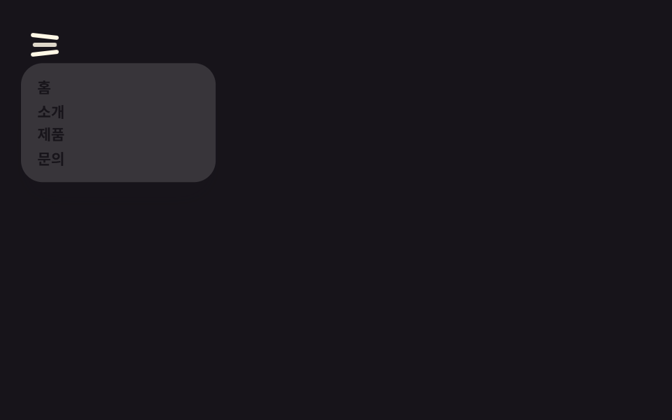 Chuyển cảnh9 hiệu ứng css hamburger menu animation không JS
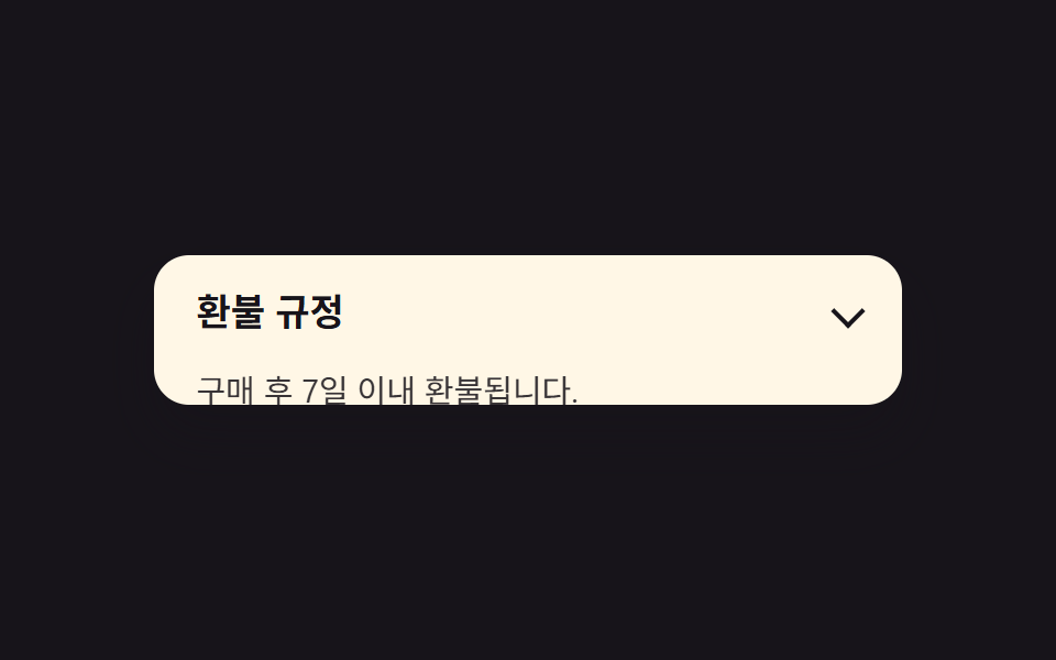 Chuyển cảnh9 hiệu ứng css accordion animation không JS
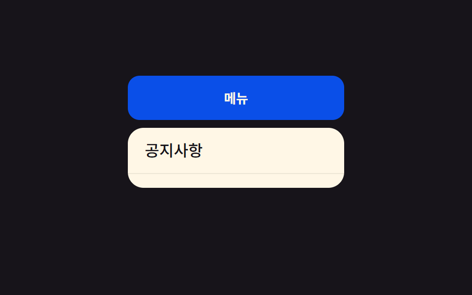 Chuyển cảnh9 css dropdown menu animation — không JS, chỉ CSS
 Chuyển cảnh9 CSS Toast Notification — không cần JS
 Chuyển cảnh9 hiệu ứng CSS Sidebar Animation - JS tối thiểu
 Chuyển cảnh9 CSS Tab Switch Animations — gần như chỉ CSS
 Loading9 hiệu ứng css skeleton loading copy-paste
 Giao diện lựa chọn9 Segmented Control UI — dán là chạy