9 hiệu ứng css accordion animation không JS
Css accordion animation là hiệu ứng chuyển chiều cao nội dung từ 0 sang auto, dựng bằng interpolate-size và calc-size() của CSS thay vì JavaScript.
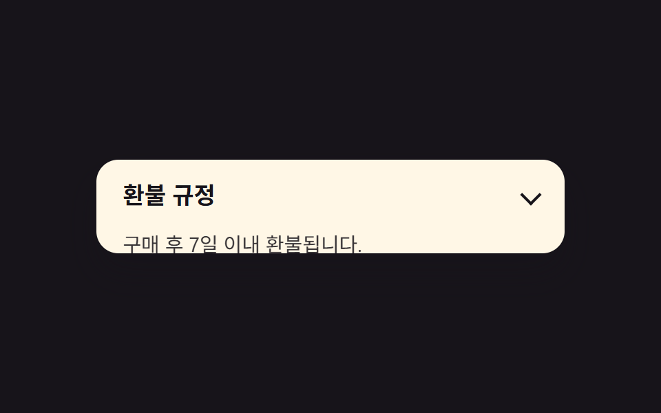 01 accordion-height-auto-interpolate
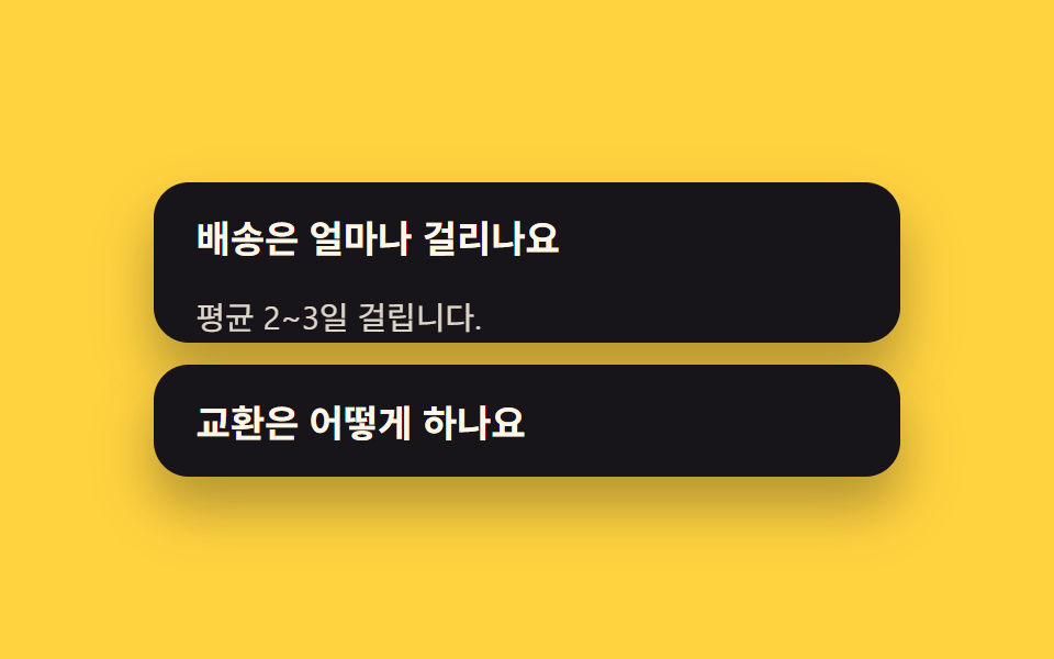 02 accordion-exclusive-open
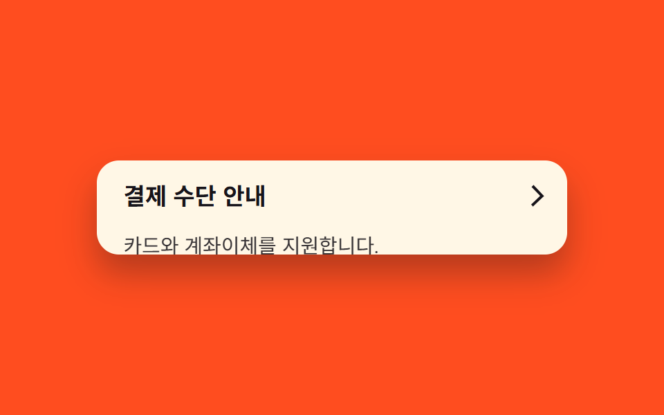 03 accordion-chevron-rotate
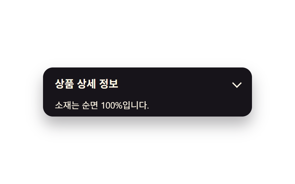 04 accordion-fade-slide-content
 05 accordion-border-highlight-open
 06 accordion-nested-accordion
 07 accordion-calc-size-fallback
 08 accordion-elastic-bounce-open
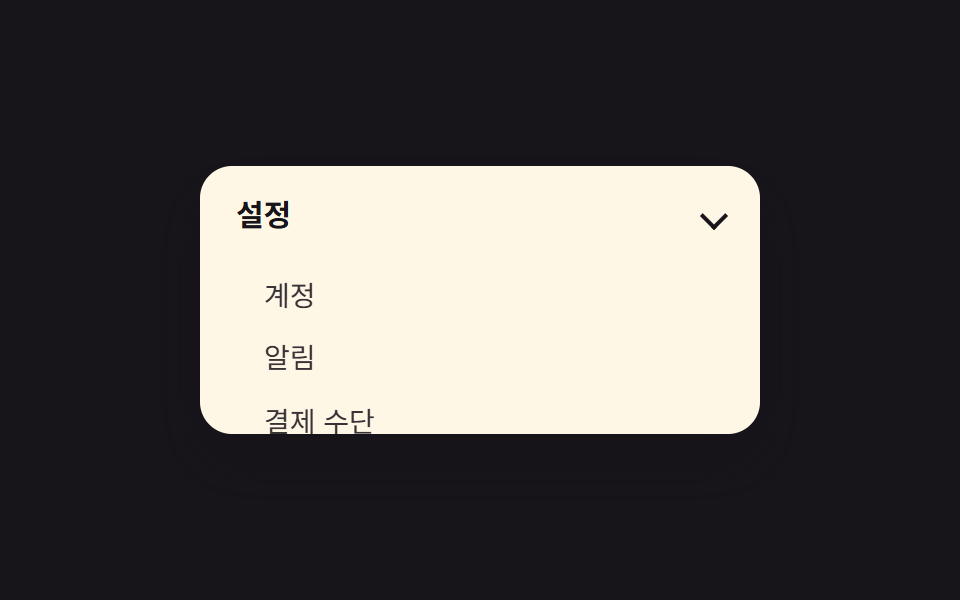 09 accordion-sidebar-nav-reuse
Tự chạy · bấm ô để tới mục đó · cả 9 trong một zip
- 01 Chuyển height:auto với interpolate-size
- 02 Chỉ mở một mục nhờ thuộc tính name
- 03 Xoay icon mũi tên
- 04 Nội dung fade + trượt
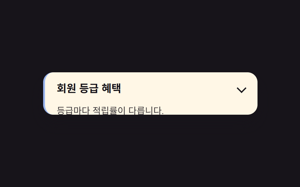
- 05 Viền nhấn mạnh mục đang mở
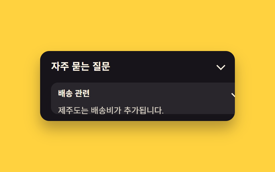
- 06 Accordion lồng nhau
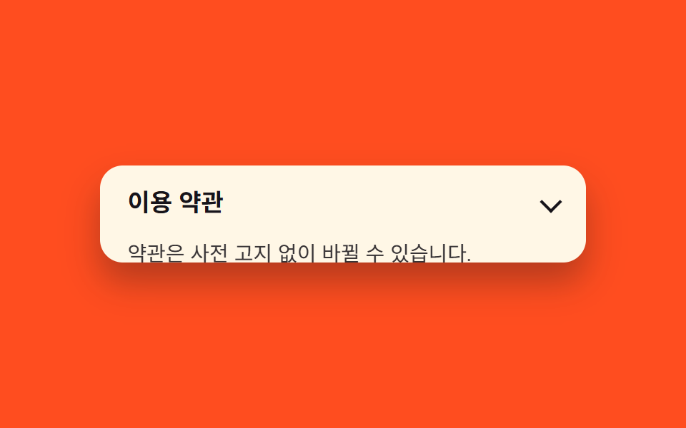
- 07 Fallback calc-size()
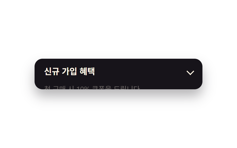
- 08 Mở với hiệu ứng đàn hồi
- 09 Tái dùng làm menu sidebar
Thứ tự chín mục đi theo mức độ bạn cần can thiệp vào hành vi mặc định của accordion. Từ 01 đến 05 vẫn là một khối đóng/mở đơn, chỉ khác ở phần trang trí — chiều cao, icon, nội dung bên trong, viền. 06 và 09 đổi cấu trúc: một cái lồng bên trong cái kia, hoặc cả khối biến thành menu sidebar. 07 quay lại vấn đề gốc — trình duyệt cũ xử lý sao khi chưa hỗ trợ calc-size() — còn 08 thêm một chút vật lý giả vào lúc mở. Ở lưới phía trên, mỗi ô tự mở ra rồi đóng lại theo một vòng lặp cố định; bạn chỉ xem chuyển động chạy, chưa cần bấm gì cả.
01Chuyển height:auto với interpolate-size
Bạn thấy gì
Mục đang đóng cao 0, và khi bạn mở nó, interpolate-size: allow-keywords cho phép height chuyển thẳng từ 0 sang calc-size(auto, size) bằng một transition CSS bình thường, không cần đo chiều cao bằng JavaScript trước khi chạy animation.
<main class="stage">
  <section class="accordion">
    <button class="accordion__header" type="button" aria-expanded="false">
      <span class="accordion__title">Chính sách hoàn tiền</span>
      <span class="accordion__chevron" aria-hidden="true"></span>
    </button>
    <div class="accordion__panel is-demo">
      <p class="accordion__body">Được hoàn tiền trong vòng 7 ngày kể từ khi mua.</p>
    </div>
  </section>
</main>
@use "../../../../site/static/demo-tokens" as *;
$duration: $dur-base; // 열리는 데 걸리는 시간
$easing: $ease-spring; // 전환 곡선
$color: $subject-blue; // 강조 색
@include stage($stage-ink);
.accordion {
width: clamp(220px, 78vw, 340px);
background: $subject-cream;
border-radius: $r-card;
box-shadow: $shadow-raised;
overflow: hidden;
font-family: inherit;
}
.accordion__header {
display: flex;
align-items: center;
justify-content: space-between;
gap: 12px;
width: 100%;
border: 0;
background: none;
padding: clamp(12px, 3vw, 18px) clamp(14px, 4vw, 20px);
cursor: pointer;
color: $subject-ink;
font-weight: 600;
font-size: clamp(14px, 3.6vw, 17px);
line-height: 1.3;
font-family: inherit;
text-align: left;
}
.accordion__chevron {
flex: none;
width: 9px;
height: 9px;
border-right: 2px solid currentColor;
border-bottom: 2px solid currentColor;
transform: rotate(45deg);
}
.accordion__body {
margin: 0;
padding: 0 clamp(14px, 4vw, 20px) clamp(12px, 3vw, 18px);
color: $subject-ink;
opacity: .86;
font-weight: 400;
font-size: clamp(12px, 3.2vw, 14.5px);
line-height: 1.5;
font-family: inherit;
}
.accordion__panel {
height: 0;
overflow: hidden;
interpolate-size: allow-keywords;
}
// 실사용: 클릭하면 열림 상태(.is-open)가 붙고 목표 높이까지 전환된다
.accordion.is-open .accordion__panel {
height: calc-size(auto, size);
transition: height $duration $easing;
}
@supports not (height: calc-size(auto, size)) {
.accordion.is-open .accordion__panel { height: auto; }
}
// 데모: 2초 주기로 스스로 열고 닫힌다. WAAPI 시계로 재생 위치를 잡으려면
// transition 이 아니라 keyframes 여야 한다 (blog-demo 측정 규칙)
.accordion__panel.is-demo {
animation: accordion-loop $dur-loop $easing infinite;
}
@keyframes accordion-loop {
0%, 8% { height: 0; }
42%, 58% { height: calc-size(auto, size); }
92%, 100% { height: 0; }
}
@supports not (height: calc-size(auto, size)) {
@keyframes accordion-loop {
0%, 8% { height: 0; }
42%, 58% { height: 220px; }
92%, 100% { height: 0; }
}
}
@media (prefers-reduced-motion: reduce) {
.accordion__panel,
.accordion__panel.is-demo,
.accordion__chevron,
.accordion__body,
.accordion.is-open .accordion__panel {
animation: none !important;
transition: none !important;
}
.accordion__panel.is-demo { height: auto; }
}html, body {
margin: 0;
overflow: hidden;
}
.stage {
box-sizing: border-box;
min-height: 100vh;
display: grid;
place-items: center;
margin: 0;
background: #17141a;
font-family: -apple-system, "Segoe UI", "Noto Sans KR", sans-serif;
padding: clamp(8px, 4vw, 24px);
}
.accordion {
width: clamp(220px, 78vw, 340px);
background: #fff7e6;
border-radius: 16px;
box-shadow: 0 14px 24px rgba(23, 20, 26, 0.32);
overflow: hidden;
font-family: inherit;
}
.accordion__header {
display: flex;
align-items: center;
justify-content: space-between;
gap: 12px;
width: 100%;
border: 0;
background: none;
padding: clamp(12px, 3vw, 18px) clamp(14px, 4vw, 20px);
cursor: pointer;
color: #17141a;
font-weight: 600;
font-size: clamp(14px, 3.6vw, 17px);
line-height: 1.3;
font-family: inherit;
text-align: left;
}
.accordion__chevron {
flex: none;
width: 9px;
height: 9px;
border-right: 2px solid currentColor;
border-bottom: 2px solid currentColor;
transform: rotate(45deg);
}
.accordion__body {
margin: 0;
padding: 0 clamp(14px, 4vw, 20px) clamp(12px, 3vw, 18px);
color: #17141a;
opacity: 0.86;
font-weight: 400;
font-size: clamp(12px, 3.2vw, 14.5px);
line-height: 1.5;
font-family: inherit;
}
.accordion__panel {
height: 0;
overflow: hidden;
interpolate-size: allow-keywords;
}
.accordion.is-open .accordion__panel {
height: calc-size(auto, size);
transition: height 300ms cubic-bezier(0.2, 0.8, 0.2, 1);
}
@supports not (height: calc-size(auto, size)) {
.accordion.is-open .accordion__panel {
height: auto;
}
}
.accordion__panel.is-demo {
animation: accordion-loop 2s cubic-bezier(0.2, 0.8, 0.2, 1) infinite;
}
@keyframes accordion-loop {
0%, 8% {
height: 0;
}
42%, 58% {
height: calc-size(auto, size);
}
92%, 100% {
height: 0;
}
}
@supports not (height: calc-size(auto, size)) {
@keyframes accordion-loop {
0%, 8% {
height: 0;
}
42%, 58% {
height: 220px;
}
92%, 100% {
height: 0;
}
}
}
@media (prefers-reduced-motion: reduce) {
.accordion__panel,
.accordion__panel.is-demo,
.accordion__chevron,
.accordion__body,
.accordion.is-open .accordion__panel {
animation: none !important;
transition: none !important;
}
.accordion__panel.is-demo {
height: auto;
}
}(function () {
document.querySelectorAll('.accordion').forEach(function (acc) {
var header = acc.querySelector('.accordion__header');
var panel = acc.querySelector('.accordion__panel');
header.addEventListener('click', function () {
panel.classList.remove('is-demo');
var open = acc.classList.toggle('is-open');
header.setAttribute('aria-expanded', String(open));
});
});
})();import { useState } from "react";
import type { CSSProperties, ReactNode } from "react";
import styles from "./AccordionHeightAuto.module.scss";
export type AccordionHeightAutoProps = {
/** 헤더에 보이는 제목 */
header?: ReactNode;
/** 열렸을 때 보이는 본문 */
children?: ReactNode;
/** height:auto 전환 시간 (기본 300ms) */
duration?: number;
/** CSS easing */
easing?: string;
/** 강조 색 */
color?: string;
defaultOpen?: boolean;
};
type Vars = CSSProperties & { "--duration"?: string; "--easing"?: string; "--color"?: string };
export default function AccordionHeightAuto({
header = "Refund policy",
children = "Refunds within 7 days of purchase.",
duration = 300,
easing = "cubic-bezier(.2,.8,.2,1)",
color = "#2f6df6",
defaultOpen = false,
}: AccordionHeightAutoProps) {
const [open, setOpen] = useState(defaultOpen);
const vars: Vars = { "--duration": `${duration}ms`, "--easing": easing, "--color": color };
return (
<section className={styles.accordion} style={vars}>
<button
type="button"
className={styles.header}
aria-expanded={open}
onClick={() => setOpen((v) => !v)}
>
<span>{header}</span>
<span className={`${styles.chevron} ${open ? styles.chevronOpen : ""}`} aria-hidden="true" />
</button>
<div className={`${styles.panel} ${open ? styles.panelOpen : ""}`}>
<p className={styles.body}>{children}</p>
</div>
</section>
);
}01 · Chuyển height:auto với interpolate-size — Diện tích đo được 11.691% · khung hình chuyển động 17/23Nguyên tác GODRICH · SCSS và React nằm trong tệp zip · Xem mật khẩu
Dùng ở đâu
Dùng cho danh sách FAQ, chi tiết điều khoản, hoặc phần hướng dẫn trong form, những nơi bạn không biết trước nội dung dài bao nhiêu.
.accordion__panel {
  height: 0;
  overflow: hidden;
  interpolate-size: allow-keywords;
}
.accordion.is-open .accordion__panel {
  height: calc-size(auto, size);
  transition: height $duration $easing;
}
@supports not (height: calc-size(auto, size)) {
  .accordion.is-open .accordion__panel { height: auto; }
}
02Chỉ mở một mục nhờ thuộc tính name
Chuyện gì diễn ra trên màn hình
Cách gọn nhất để chỉ giữ một mục accordion mở tại một thời điểm là gom nhiều thẻ <details> vào cùng một name. Trình duyệt tự đóng mục cũ khi bạn mở mục mới mà không cần một dòng JavaScript nào (tính đến 9/2026 chạy trên Chrome 120+, Safari 17.2+, Firefox 130+ — xem name trên MDN).
<main class="stage">
  <section class="accordion-group">
    <div class="accordion accordion--a">
      <div class="accordion__header" role="button" tabindex="0" aria-expanded="false">
        <span class="accordion__title">Giao hàng mất bao lâu</span>
        <span class="accordion__chevron" aria-hidden="true"></span>
      </div>
      <div class="accordion__panel is-demo-a">
        <p class="accordion__body">Thường mất 2-3 ngày.</p>
      </div>
    </div>
    <div class="accordion accordion--b">
      <div class="accordion__header" role="button" tabindex="0" aria-expanded="false">
        <span class="accordion__title">Đổi hàng thế nào</span>
        <span class="accordion__chevron" aria-hidden="true"></span>
      </div>
      <div class="accordion__panel is-demo-b">
        <p class="accordion__body">Đăng ký đổi hàng tại trang cá nhân.</p>
      </div>
    </div>
  </section>
</main>
@use "../../../../site/static/demo-tokens" as *;
$duration: $dur-quick;
$easing: $ease-out;
$color: $subject-cream;
@include stage($stage-yellow);
.accordion-group {
width: clamp(220px, 78vw, 340px);
display: flex;
flex-direction: column;
gap: 10px;
}
.accordion {
width: clamp(220px, 78vw, 340px);
background: $subject-ink;
border-radius: $r-card;
box-shadow: $shadow-raised;
overflow: hidden;
font-family: inherit;
}
.accordion__header {
display: flex;
align-items: center;
justify-content: space-between;
gap: 12px;
width: 100%;
border: 0;
background: none;
padding: clamp(12px, 3vw, 18px) clamp(14px, 4vw, 20px);
cursor: pointer;
color: $subject-cream;
font-weight: 600;
font-size: clamp(14px, 3.6vw, 17px);
line-height: 1.3;
font-family: inherit;
text-align: left;
}
.accordion__chevron {
flex: none;
width: 9px;
height: 9px;
border-right: 2px solid currentColor;
border-bottom: 2px solid currentColor;
transform: rotate(45deg);
}
.accordion__body {
margin: 0;
padding: 0 clamp(14px, 4vw, 20px) clamp(12px, 3vw, 18px);
color: $subject-cream;
opacity: .86;
font-weight: 400;
font-size: clamp(12px, 3.2vw, 14.5px);
line-height: 1.5;
font-family: inherit;
}
.accordion__panel {
height: 0;
overflow: hidden;
interpolate-size: allow-keywords;
}
.accordion.is-open .accordion__panel {
height: calc-size(auto, size);
transition: height $duration $easing;
}
@supports not (height: calc-size(auto, size)) {
.accordion.is-open .accordion__panel { height: auto; }
}
// 데모: name 속성처럼 하나가 열리는 동안 나머지는 닫혀 있다 (2초 주기, 위상만 반대)
.accordion__panel.is-demo-a { animation: accordion-loop-a $dur-loop $easing infinite; }
.accordion__panel.is-demo-b { animation: accordion-loop-b $dur-loop $easing infinite; }
@keyframes accordion-loop-a {
0%, 4% { height: 0; }
20%, 46% { height: calc-size(auto, size); }
62%, 100% { height: 0; }
}
@keyframes accordion-loop-b {
0%, 54% { height: 0; }
70%, 96% { height: calc-size(auto, size); }
100% { height: 0; }
}
@supports not (height: calc-size(auto, size)) {
@keyframes accordion-loop-a { 0%, 4% { height: 0; } 20%, 46% { height: 160px; } 62%, 100% { height: 0; } }
@keyframes accordion-loop-b { 0%, 54% { height: 0; } 70%, 96% { height: 160px; } 100% { height: 0; } }
}
@media (prefers-reduced-motion: reduce) {
.accordion__panel,
.accordion__panel.is-demo,
.accordion__chevron,
.accordion__body,
.accordion.is-open .accordion__panel {
animation: none !important;
transition: none !important;
}
.accordion__panel.is-demo { height: auto; }
}html, body {
margin: 0;
overflow: hidden;
}
.stage {
box-sizing: border-box;
min-height: 100vh;
display: grid;
place-items: center;
margin: 0;
background: #ffd23f;
font-family: -apple-system, "Segoe UI", "Noto Sans KR", sans-serif;
padding: clamp(8px, 4vw, 24px);
}
.accordion-group {
width: clamp(220px, 78vw, 340px);
display: flex;
flex-direction: column;
gap: 10px;
}
.accordion {
width: clamp(220px, 78vw, 340px);
background: #17141a;
border-radius: 16px;
box-shadow: 0 14px 24px rgba(23, 20, 26, 0.32);
overflow: hidden;
font-family: inherit;
}
.accordion__header {
display: flex;
align-items: center;
justify-content: space-between;
gap: 12px;
width: 100%;
border: 0;
background: none;
padding: clamp(12px, 3vw, 18px) clamp(14px, 4vw, 20px);
cursor: pointer;
color: #fff7e6;
font-weight: 600;
font-size: clamp(14px, 3.6vw, 17px);
line-height: 1.3;
font-family: inherit;
text-align: left;
}
.accordion__chevron {
flex: none;
width: 9px;
height: 9px;
border-right: 2px solid currentColor;
border-bottom: 2px solid currentColor;
transform: rotate(45deg);
}
.accordion__body {
margin: 0;
padding: 0 clamp(14px, 4vw, 20px) clamp(12px, 3vw, 18px);
color: #fff7e6;
opacity: 0.86;
font-weight: 400;
font-size: clamp(12px, 3.2vw, 14.5px);
line-height: 1.5;
font-family: inherit;
}
.accordion__panel {
height: 0;
overflow: hidden;
interpolate-size: allow-keywords;
}
.accordion.is-open .accordion__panel {
height: calc-size(auto, size);
transition: height 220ms ease-out;
}
@supports not (height: calc-size(auto, size)) {
.accordion.is-open .accordion__panel {
height: auto;
}
}
.accordion__panel.is-demo-a {
animation: accordion-loop-a 2s ease-out infinite;
}
.accordion__panel.is-demo-b {
animation: accordion-loop-b 2s ease-out infinite;
}
@keyframes accordion-loop-a {
0%, 4% {
height: 0;
}
20%, 46% {
height: calc-size(auto, size);
}
62%, 100% {
height: 0;
}
}
@keyframes accordion-loop-b {
0%, 54% {
height: 0;
}
70%, 96% {
height: calc-size(auto, size);
}
100% {
height: 0;
}
}
@supports not (height: calc-size(auto, size)) {
@keyframes accordion-loop-a {
0%, 4% {
height: 0;
}
20%, 46% {
height: 160px;
}
62%, 100% {
height: 0;
}
}
@keyframes accordion-loop-b {
0%, 54% {
height: 0;
}
70%, 96% {
height: 160px;
}
100% {
height: 0;
}
}
}
@media (prefers-reduced-motion: reduce) {
.accordion__panel,
.accordion__panel.is-demo,
.accordion__chevron,
.accordion__body,
.accordion.is-open .accordion__panel {
animation: none !important;
transition: none !important;
}
.accordion__panel.is-demo {
height: auto;
}
}(function () {
var group = document.querySelector('.accordion-group');
var accs = Array.prototype.slice.call(group.querySelectorAll('.accordion'));
accs.forEach(function (acc) {
var header = acc.querySelector('.accordion__header');
var panel = acc.querySelector('.accordion__panel');
header.addEventListener('click', function () {
panel.classList.remove('is-demo-a', 'is-demo-b');
var willOpen = !acc.classList.contains('is-open');
accs.forEach(function (other) {
other.classList.remove('is-open');
other.querySelector('.accordion__header').setAttribute('aria-expanded', 'false');
other.querySelector('.accordion__panel').classList.remove('is-demo-a', 'is-demo-b');
});
if (willOpen) {
acc.classList.add('is-open');
header.setAttribute('aria-expanded', 'true');
}
});
});
})();import { useState } from "react";
import type { CSSProperties, ReactNode } from "react";
import styles from "./AccordionExclusiveOpen.module.scss";
export type AccordionExclusiveOpenProps = {
/** 헤더에 보이는 제목 */
header?: ReactNode;
/** 열렸을 때 보이는 본문 */
children?: ReactNode;
/** height:auto 전환 시간 (기본 300ms) */
duration?: number;
/** CSS easing */
easing?: string;
/** 강조 색 */
color?: string;
defaultOpen?: boolean;
};
type Vars = CSSProperties & { "--duration"?: string; "--easing"?: string; "--color"?: string };
export default function AccordionExclusiveOpen({
header = "How long does shipping take?",
children = "Usually 2-3 days.",
duration = 300,
easing = "cubic-bezier(.2,.8,.2,1)",
color = "#17141a",
defaultOpen = false,
}: AccordionExclusiveOpenProps) {
const [open, setOpen] = useState(defaultOpen);
const vars: Vars = { "--duration": `${duration}ms`, "--easing": easing, "--color": color };
return (
<section className={styles.accordion} style={vars}>
<button
type="button"
className={styles.header}
aria-expanded={open}
onClick={() => setOpen((v) => !v)}
>
<span>{header}</span>
<span className={`${styles.chevron} ${open ? styles.chevronOpen : ""}`} aria-hidden="true" />
</button>
<div className={`${styles.panel} ${open ? styles.panelOpen : ""}`}>
<p className={styles.body}>{children}</p>
</div>
</section>
);
}02 · Chỉ mở một mục nhờ thuộc tính name — Diện tích đo được 32.087% · khung hình chuyển động 11/23Nguyên tác GODRICH · SCSS và React nằm trong tệp zip · Xem mật khẩu
Chỗ dùng
Bản demo dưới vẫn dùng cùng cơ chế calc-size() cho chiều cao, chỉ thêm một lớp JS mỏng đóng mục còn lại khi bạn mở mục này, vì cần giữ đúng nhịp lặp 2 giây lúc xem trước trong lưới.
header.addEventListener('click', function () {
  panel.classList.remove('is-demo-a', 'is-demo-b');
  var willOpen = !acc.classList.contains('is-open');
  accs.forEach(function (other) {
    other.classList.remove('is-open');
    other.querySelector('.accordion__header')
      .setAttribute('aria-expanded', 'false');
  });
  if (willOpen) {
    acc.classList.add('is-open');
    header.setAttribute('aria-expanded', 'true');
  }
});
03Xoay icon mũi tên
Chuyển động thế nào
Chevron ở góc phải header xoay từ 45 độ sang -135 độ khi mục mở ra, cùng nhịp với panel, nên bạn biết trạng thái mà không cần đọc chữ.
<main class="stage">
  <section class="accordion">
    <button class="accordion__header" type="button" aria-expanded="false">
      <span class="accordion__title">Hướng dẫn phương thức thanh toán</span>
      <span class="accordion__chevron is-demo" aria-hidden="true"></span>
    </button>
    <div class="accordion__panel is-demo">
      <p class="accordion__body">Hỗ trợ thẻ và chuyển khoản ngân hàng.</p>
    </div>
  </section>
</main>
@use "../../../../site/static/demo-tokens" as *;
$duration: $dur-base;
$easing: $ease-spring;
$color: $subject-ink;
@include stage($stage-orange);
.accordion {
width: clamp(220px, 78vw, 340px);
background: $subject-cream;
border-radius: $r-card;
box-shadow: $shadow-raised;
overflow: hidden;
font-family: inherit;
}
.accordion__header {
display: flex;
align-items: center;
justify-content: space-between;
gap: 12px;
width: 100%;
border: 0;
background: none;
padding: clamp(12px, 3vw, 18px) clamp(14px, 4vw, 20px);
cursor: pointer;
color: $subject-ink;
font-weight: 600;
font-size: clamp(14px, 3.6vw, 17px);
line-height: 1.3;
font-family: inherit;
text-align: left;
}
.accordion__chevron {
flex: none;
width: 9px;
height: 9px;
border-right: 2px solid currentColor;
border-bottom: 2px solid currentColor;
transform: rotate(45deg);
}
.accordion__body {
margin: 0;
padding: 0 clamp(14px, 4vw, 20px) clamp(12px, 3vw, 18px);
color: $subject-ink;
opacity: .86;
font-weight: 400;
font-size: clamp(12px, 3.2vw, 14.5px);
line-height: 1.5;
font-family: inherit;
}
.accordion__panel {
height: 0;
overflow: hidden;
interpolate-size: allow-keywords;
}
// 실사용: 클릭하면 열림 상태(.is-open)가 붙고 목표 높이까지 전환된다
.accordion.is-open .accordion__panel {
height: calc-size(auto, size);
transition: height $duration $easing;
}
@supports not (height: calc-size(auto, size)) {
.accordion.is-open .accordion__panel { height: auto; }
}
// 데모: 2초 주기로 스스로 열고 닫힌다. WAAPI 시계로 재생 위치를 잡으려면
// transition 이 아니라 keyframes 여야 한다 (blog-demo 측정 규칙)
.accordion__panel.is-demo {
animation: accordion-loop $dur-loop $easing infinite;
}
@keyframes accordion-loop {
0%, 8% { height: 0; }
42%, 58% { height: calc-size(auto, size); }
92%, 100% { height: 0; }
}
@supports not (height: calc-size(auto, size)) {
@keyframes accordion-loop {
0%, 8% { height: 0; }
42%, 58% { height: 220px; }
92%, 100% { height: 0; }
}
}
// 화살표가 패널과 같은 리듬으로 180도 돈다
.accordion__chevron.is-demo {
animation: chevron-loop $dur-loop $easing infinite;
}
@keyframes chevron-loop {
0%, 8% { transform: rotate(45deg); }
42%, 58% { transform: rotate(-135deg); }
92%, 100% { transform: rotate(45deg); }
}
@media (prefers-reduced-motion: reduce) {
.accordion__panel,
.accordion__panel.is-demo,
.accordion__chevron,
.accordion__body,
.accordion.is-open .accordion__panel {
animation: none !important;
transition: none !important;
}
.accordion__panel.is-demo { height: auto; }
}html, body {
margin: 0;
overflow: hidden;
}
.stage {
box-sizing: border-box;
min-height: 100vh;
display: grid;
place-items: center;
margin: 0;
background: #ff4d1f;
font-family: -apple-system, "Segoe UI", "Noto Sans KR", sans-serif;
padding: clamp(8px, 4vw, 24px);
}
.accordion {
width: clamp(220px, 78vw, 340px);
background: #fff7e6;
border-radius: 16px;
box-shadow: 0 14px 24px rgba(23, 20, 26, 0.32);
overflow: hidden;
font-family: inherit;
}
.accordion__header {
display: flex;
align-items: center;
justify-content: space-between;
gap: 12px;
width: 100%;
border: 0;
background: none;
padding: clamp(12px, 3vw, 18px) clamp(14px, 4vw, 20px);
cursor: pointer;
color: #17141a;
font-weight: 600;
font-size: clamp(14px, 3.6vw, 17px);
line-height: 1.3;
font-family: inherit;
text-align: left;
}
.accordion__chevron {
flex: none;
width: 9px;
height: 9px;
border-right: 2px solid currentColor;
border-bottom: 2px solid currentColor;
transform: rotate(45deg);
}
.accordion__body {
margin: 0;
padding: 0 clamp(14px, 4vw, 20px) clamp(12px, 3vw, 18px);
color: #17141a;
opacity: 0.86;
font-weight: 400;
font-size: clamp(12px, 3.2vw, 14.5px);
line-height: 1.5;
font-family: inherit;
}
.accordion__panel {
height: 0;
overflow: hidden;
interpolate-size: allow-keywords;
}
.accordion.is-open .accordion__panel {
height: calc-size(auto, size);
transition: height 300ms cubic-bezier(0.2, 0.8, 0.2, 1);
}
@supports not (height: calc-size(auto, size)) {
.accordion.is-open .accordion__panel {
height: auto;
}
}
.accordion__panel.is-demo {
animation: accordion-loop 2s cubic-bezier(0.2, 0.8, 0.2, 1) infinite;
}
@keyframes accordion-loop {
0%, 8% {
height: 0;
}
42%, 58% {
height: calc-size(auto, size);
}
92%, 100% {
height: 0;
}
}
@supports not (height: calc-size(auto, size)) {
@keyframes accordion-loop {
0%, 8% {
height: 0;
}
42%, 58% {
height: 220px;
}
92%, 100% {
height: 0;
}
}
}
.accordion__chevron.is-demo {
animation: chevron-loop 2s cubic-bezier(0.2, 0.8, 0.2, 1) infinite;
}
@keyframes chevron-loop {
0%, 8% {
transform: rotate(45deg);
}
42%, 58% {
transform: rotate(-135deg);
}
92%, 100% {
transform: rotate(45deg);
}
}
@media (prefers-reduced-motion: reduce) {
.accordion__panel,
.accordion__panel.is-demo,
.accordion__chevron,
.accordion__body,
.accordion.is-open .accordion__panel {
animation: none !important;
transition: none !important;
}
.accordion__panel.is-demo {
height: auto;
}
}(function () {
var acc = document.querySelector('.accordion');
var header = acc.querySelector('.accordion__header');
var panel = acc.querySelector('.accordion__panel');
var chevron = acc.querySelector('.accordion__chevron');
header.addEventListener('click', function () {
panel.classList.remove('is-demo');
chevron.classList.remove('is-demo');
var open = acc.classList.toggle('is-open');
header.setAttribute('aria-expanded', String(open));
chevron.style.transform = open ? 'rotate(-135deg)' : 'rotate(45deg)';
});
})();import { useState } from "react";
import type { CSSProperties, ReactNode } from "react";
import styles from "./AccordionChevronRotate.module.scss";
export type AccordionChevronRotateProps = {
/** 헤더에 보이는 제목 */
header?: ReactNode;
/** 열렸을 때 보이는 본문 */
children?: ReactNode;
/** height:auto 전환 시간 (기본 300ms) */
duration?: number;
/** CSS easing */
easing?: string;
/** 강조 색 */
color?: string;
defaultOpen?: boolean;
};
type Vars = CSSProperties & { "--duration"?: string; "--easing"?: string; "--color"?: string };
export default function AccordionChevronRotate({
header = "Payment methods",
children = "We accept cards and bank transfer.",
duration = 300,
easing = "cubic-bezier(.2,.8,.2,1)",
color = "#17141a",
defaultOpen = false,
}: AccordionChevronRotateProps) {
const [open, setOpen] = useState(defaultOpen);
const vars: Vars = { "--duration": `${duration}ms`, "--easing": easing, "--color": color };
return (
<section className={styles.accordion} style={vars}>
<button
type="button"
className={styles.header}
aria-expanded={open}
onClick={() => setOpen((v) => !v)}
>
<span>{header}</span>
<span className={`${styles.chevron} ${open ? styles.chevronOpen : ""}`} aria-hidden="true" />
</button>
<div className={`${styles.panel} ${open ? styles.panelOpen : ""}`}>
<p className={styles.body}>{children}</p>
</div>
</section>
);
}03 · Xoay icon mũi tên — Diện tích đo được 18.795% · khung hình chuyển động 19/23Nguyên tác GODRICH · SCSS và React nằm trong tệp zip · Xem mật khẩu
Dùng khi nào
Dùng cho header accordion và menu dropdown, nơi cần một tín hiệu thị giác nhanh hơn màu chữ.
.accordion__chevron {
  flex: none;
  width: 9px;
  height: 9px;
  border-right: 2px solid currentColor;
  border-bottom: 2px solid currentColor;
  transform: rotate(45deg);
}
.accordion__chevron.is-demo {
  animation: chevron-loop $dur-loop $easing infinite;
}
@keyframes chevron-loop {
  0%, 8%    { transform: rotate(45deg); }
  42%, 58%  { transform: rotate(-135deg); }
  92%, 100% { transform: rotate(45deg); }
}
04Nội dung fade + trượt
Bạn thấy gì
Ngay khi panel mở ra, đoạn nội dung bên trong fade in trong lúc trượt xuống 8px từ phía trên, nên nội dung như rơi vào đúng chỗ thay vì bật ra đột ngột.
<main class="stage">
  <section class="accordion">
    <button class="accordion__header" type="button" aria-expanded="false">
      <span class="accordion__title">Thông tin chi tiết sản phẩm</span>
      <span class="accordion__chevron" aria-hidden="true"></span>
    </button>
    <div class="accordion__panel is-demo">
      <p class="accordion__body is-demo">Chất liệu 100% cotton.</p>
    </div>
  </section>
</main>
@use "../../../../site/static/demo-tokens" as *;
$duration: $dur-enter;
$easing: $ease-out;
$color: $subject-blue;
@include stage($stage-paper);
.accordion {
width: clamp(220px, 78vw, 340px);
background: $subject-ink;
border-radius: $r-card;
box-shadow: $shadow-raised;
overflow: hidden;
font-family: inherit;
}
.accordion__header {
display: flex;
align-items: center;
justify-content: space-between;
gap: 12px;
width: 100%;
border: 0;
background: none;
padding: clamp(12px, 3vw, 18px) clamp(14px, 4vw, 20px);
cursor: pointer;
color: $subject-cream;
font-weight: 600;
font-size: clamp(14px, 3.6vw, 17px);
line-height: 1.3;
font-family: inherit;
text-align: left;
}
.accordion__chevron {
flex: none;
width: 9px;
height: 9px;
border-right: 2px solid currentColor;
border-bottom: 2px solid currentColor;
transform: rotate(45deg);
}
.accordion__body {
margin: 0;
padding: 0 clamp(14px, 4vw, 20px) clamp(12px, 3vw, 18px);
color: $subject-cream;
opacity: .86;
font-weight: 400;
font-size: clamp(12px, 3.2vw, 14.5px);
line-height: 1.5;
font-family: inherit;
}
.accordion__panel {
height: 0;
overflow: hidden;
interpolate-size: allow-keywords;
}
// 실사용: 클릭하면 열림 상태(.is-open)가 붙고 목표 높이까지 전환된다
.accordion.is-open .accordion__panel {
height: calc-size(auto, size);
transition: height $duration $easing;
}
@supports not (height: calc-size(auto, size)) {
.accordion.is-open .accordion__panel { height: auto; }
}
// 데모: 2초 주기로 스스로 열고 닫힌다. WAAPI 시계로 재생 위치를 잡으려면
// transition 이 아니라 keyframes 여야 한다 (blog-demo 측정 규칙)
.accordion__panel.is-demo {
animation: accordion-loop $dur-loop $easing infinite;
}
@keyframes accordion-loop {
0%, 8% { height: 0; }
42%, 58% { height: calc-size(auto, size); }
92%, 100% { height: 0; }
}
@supports not (height: calc-size(auto, size)) {
@keyframes accordion-loop {
0%, 8% { height: 0; }
42%, 58% { height: 220px; }
92%, 100% { height: 0; }
}
}
// 본문이 살짝 위에서 내려오며 페이드인 (패널이 열리는 구간과 같은 리듬)
.accordion__body.is-demo {
  animation: content-loop $dur-loop $easing infinite;
}
@keyframes content-loop {
  0%, 8%    { opacity: 0; transform: translateY(-8px); }
  30%, 70%  { opacity: 1; transform: translateY(0); }
  92%, 100% { opacity: 0; transform: translateY(-8px); }
}
@media (prefers-reduced-motion: reduce) {
.accordion__panel,
.accordion__panel.is-demo,
.accordion__chevron,
.accordion__body,
.accordion.is-open .accordion__panel {
animation: none !important;
transition: none !important;
}
.accordion__panel.is-demo { height: auto; }
}html, body {
margin: 0;
overflow: hidden;
}
.stage {
box-sizing: border-box;
min-height: 100vh;
display: grid;
place-items: center;
margin: 0;
background: #ffffff;
font-family: -apple-system, "Segoe UI", "Noto Sans KR", sans-serif;
padding: clamp(8px, 4vw, 24px);
}
.accordion {
width: clamp(220px, 78vw, 340px);
background: #17141a;
border-radius: 16px;
box-shadow: 0 14px 24px rgba(23, 20, 26, 0.32);
overflow: hidden;
font-family: inherit;
}
.accordion__header {
display: flex;
align-items: center;
justify-content: space-between;
gap: 12px;
width: 100%;
border: 0;
background: none;
padding: clamp(12px, 3vw, 18px) clamp(14px, 4vw, 20px);
cursor: pointer;
color: #fff7e6;
font-weight: 600;
font-size: clamp(14px, 3.6vw, 17px);
line-height: 1.3;
font-family: inherit;
text-align: left;
}
.accordion__chevron {
flex: none;
width: 9px;
height: 9px;
border-right: 2px solid currentColor;
border-bottom: 2px solid currentColor;
transform: rotate(45deg);
}
.accordion__body {
margin: 0;
padding: 0 clamp(14px, 4vw, 20px) clamp(12px, 3vw, 18px);
color: #fff7e6;
opacity: 0.86;
font-weight: 400;
font-size: clamp(12px, 3.2vw, 14.5px);
line-height: 1.5;
font-family: inherit;
}
.accordion__panel {
height: 0;
overflow: hidden;
interpolate-size: allow-keywords;
}
.accordion.is-open .accordion__panel {
height: calc-size(auto, size);
transition: height 600ms ease-out;
}
@supports not (height: calc-size(auto, size)) {
.accordion.is-open .accordion__panel {
height: auto;
}
}
.accordion__panel.is-demo {
animation: accordion-loop 2s ease-out infinite;
}
@keyframes accordion-loop {
0%, 8% {
height: 0;
}
42%, 58% {
height: calc-size(auto, size);
}
92%, 100% {
height: 0;
}
}
@supports not (height: calc-size(auto, size)) {
@keyframes accordion-loop {
0%, 8% {
height: 0;
}
42%, 58% {
height: 220px;
}
92%, 100% {
height: 0;
}
}
}
.accordion__body.is-demo {
animation: content-loop 2s ease-out infinite;
}
@keyframes content-loop {
0%, 8% {
opacity: 0;
transform: translateY(-8px);
}
30%, 70% {
opacity: 1;
transform: translateY(0);
}
92%, 100% {
opacity: 0;
transform: translateY(-8px);
}
}
@media (prefers-reduced-motion: reduce) {
.accordion__panel,
.accordion__panel.is-demo,
.accordion__chevron,
.accordion__body,
.accordion.is-open .accordion__panel {
animation: none !important;
transition: none !important;
}
.accordion__panel.is-demo {
height: auto;
}
}(function () {
document.querySelectorAll('.accordion').forEach(function (acc) {
var header = acc.querySelector('.accordion__header');
var panel = acc.querySelector('.accordion__panel');
header.addEventListener('click', function () {
panel.classList.remove('is-demo');
var open = acc.classList.toggle('is-open');
header.setAttribute('aria-expanded', String(open));
});
});
})();import { useState } from "react";
import type { CSSProperties, ReactNode } from "react";
import styles from "./AccordionFadeSlideContent.module.scss";
export type AccordionFadeSlideContentProps = {
/** 헤더에 보이는 제목 */
header?: ReactNode;
/** 열렸을 때 보이는 본문 */
children?: ReactNode;
/** height:auto 전환 시간 (기본 300ms) */
duration?: number;
/** CSS easing */
easing?: string;
/** 강조 색 */
color?: string;
defaultOpen?: boolean;
};
type Vars = CSSProperties & { "--duration"?: string; "--easing"?: string; "--color"?: string };
export default function AccordionFadeSlideContent({
header = "Product details",
children = "Made of 100% cotton.",
duration = 300,
easing = "cubic-bezier(.2,.8,.2,1)",
color = "#2f6df6",
defaultOpen = false,
}: AccordionFadeSlideContentProps) {
const [open, setOpen] = useState(defaultOpen);
const vars: Vars = { "--duration": `${duration}ms`, "--easing": easing, "--color": color };
return (
<section className={styles.accordion} style={vars}>
<button
type="button"
className={styles.header}
aria-expanded={open}
onClick={() => setOpen((v) => !v)}
>
<span>{header}</span>
<span className={`${styles.chevron} ${open ? styles.chevronOpen : ""}`} aria-hidden="true" />
</button>
<div className={`${styles.panel} ${open ? styles.panelOpen : ""}`}>
<p className={styles.body}>{children}</p>
</div>
</section>
);
}04 · Nội dung fade + trượt — Diện tích đo được 18.717% · khung hình chuyển động 19/23Nguyên tác GODRICH · SCSS và React nằm trong tệp zip · Xem mật khẩu
Dùng ở đâu
Hợp cho mô tả chi tiết sản phẩm hoặc phần mở rộng tùy chọn.
.accordion__body.is-demo {
animation: content-loop $dur-loop $easing infinite;
}
@keyframes content-loop {
0%, 8% { opacity: 0; transform: translateY(-8px); }
30%, 70% { opacity: 1; transform: translateY(0); }
92%, 100% { opacity: 0; transform: translateY(-8px); }
}
05Viền nhấn mạnh mục đang mở
Chuyện gì diễn ra trên màn hình
Trong lúc mục đang mở, viền trái dày 3px và nền của cả khối accordion đổi màu theo đúng nhịp với panel, giúp mục đang chọn nổi bật giữa những mục còn đóng.
<main class="stage">
  <section class="accordion is-demo-border">
    <button class="accordion__header" type="button" aria-expanded="false">
      <span class="accordion__title">Ưu đãi theo hạng thành viên</span>
      <span class="accordion__chevron" aria-hidden="true"></span>
    </button>
    <div class="accordion__panel is-demo">
      <p class="accordion__body">Tỷ lệ tích điểm khác nhau theo từng hạng.</p>
    </div>
  </section>
</main>
@use "../../../../site/static/demo-tokens" as *;
$duration: $dur-base;
$easing: $ease-spring;
$color: $subject-blue;
@include stage($stage-ink);
.accordion {
width: clamp(220px, 78vw, 340px);
background: $subject-cream;
border-radius: $r-card;
border-left: 3px solid transparent;
box-shadow: $shadow-raised;
overflow: hidden;
font-family: inherit;
}
.accordion__header {
display: flex;
align-items: center;
justify-content: space-between;
gap: 12px;
width: 100%;
border: 0;
background: none;
padding: clamp(12px, 3vw, 18px) clamp(14px, 4vw, 20px);
cursor: pointer;
color: $subject-ink;
font-weight: 600;
font-size: clamp(14px, 3.6vw, 17px);
line-height: 1.3;
font-family: inherit;
text-align: left;
}
.accordion__chevron {
flex: none; width: 9px; height: 9px;
border-right: 2px solid currentColor;
border-bottom: 2px solid currentColor;
transform: rotate(45deg);
}
.accordion__body {
margin: 0;
padding: 0 clamp(14px, 4vw, 20px) clamp(12px, 3vw, 18px);
color: $subject-ink;
opacity: .86;
font-weight: 400;
font-size: clamp(12px, 3.2vw, 14.5px);
line-height: 1.5;
font-family: inherit;
}
.accordion__panel {
height: 0;
overflow: hidden;
interpolate-size: allow-keywords;
}
// 실사용: 클릭하면 열림 상태(.is-open)가 붙고 목표 높이까지 전환된다
.accordion.is-open .accordion__panel {
height: calc-size(auto, size);
transition: height $duration $easing;
}
@supports not (height: calc-size(auto, size)) {
.accordion.is-open .accordion__panel { height: auto; }
}
// 데모: 2초 주기로 스스로 열고 닫힌다. WAAPI 시계로 재생 위치를 잡으려면
// transition 이 아니라 keyframes 여야 한다 (blog-demo 측정 규칙)
.accordion__panel.is-demo {
animation: accordion-loop $dur-loop $easing infinite;
}
@keyframes accordion-loop {
0%, 8% { height: 0; }
42%, 58% { height: calc-size(auto, size); }
92%, 100% { height: 0; }
}
@supports not (height: calc-size(auto, size)) {
@keyframes accordion-loop {
0%, 8% { height: 0; }
42%, 58% { height: 220px; }
92%, 100% { height: 0; }
}
}
// 열려 있는 동안만 왼쪽 테두리와 배경이 강조된다 (패널과 같은 리듬)
.accordion.is-demo-border {
animation: border-loop $dur-loop $easing infinite;
}
@keyframes border-loop {
0%, 8% { border-left-color: transparent; background: $subject-cream; }
42%, 58% { border-left-color: $color; background: $subject-cream; }
92%, 100% { border-left-color: transparent; background: $subject-cream; }
}
@media (prefers-reduced-motion: reduce) {
.accordion__panel,
.accordion__panel.is-demo,
.accordion__chevron,
.accordion__body,
.accordion.is-open .accordion__panel {
animation: none !important;
transition: none !important;
}
.accordion__panel.is-demo { height: auto; }
}html, body {
margin: 0;
overflow: hidden;
}
.stage {
box-sizing: border-box;
min-height: 100vh;
display: grid;
place-items: center;
margin: 0;
background: #17141a;
font-family: -apple-system, "Segoe UI", "Noto Sans KR", sans-serif;
padding: clamp(8px, 4vw, 24px);
}
.accordion {
width: clamp(220px, 78vw, 340px);
background: #fff7e6;
border-radius: 16px;
border-left: 3px solid transparent;
box-shadow: 0 14px 24px rgba(23, 20, 26, 0.32);
overflow: hidden;
font-family: inherit;
}
.accordion__header {
display: flex;
align-items: center;
justify-content: space-between;
gap: 12px;
width: 100%;
border: 0;
background: none;
padding: clamp(12px, 3vw, 18px) clamp(14px, 4vw, 20px);
cursor: pointer;
color: #17141a;
font-weight: 600;
font-size: clamp(14px, 3.6vw, 17px);
line-height: 1.3;
font-family: inherit;
text-align: left;
}
.accordion__chevron {
flex: none;
width: 9px;
height: 9px;
border-right: 2px solid currentColor;
border-bottom: 2px solid currentColor;
transform: rotate(45deg);
}
.accordion__body {
margin: 0;
padding: 0 clamp(14px, 4vw, 20px) clamp(12px, 3vw, 18px);
color: #17141a;
opacity: 0.86;
font-weight: 400;
font-size: clamp(12px, 3.2vw, 14.5px);
line-height: 1.5;
font-family: inherit;
}
.accordion__panel {
height: 0;
overflow: hidden;
interpolate-size: allow-keywords;
}
.accordion.is-open .accordion__panel {
height: calc-size(auto, size);
transition: height 300ms cubic-bezier(0.2, 0.8, 0.2, 1);
}
@supports not (height: calc-size(auto, size)) {
.accordion.is-open .accordion__panel {
height: auto;
}
}
.accordion__panel.is-demo {
animation: accordion-loop 2s cubic-bezier(0.2, 0.8, 0.2, 1) infinite;
}
@keyframes accordion-loop {
0%, 8% {
height: 0;
}
42%, 58% {
height: calc-size(auto, size);
}
92%, 100% {
height: 0;
}
}
@supports not (height: calc-size(auto, size)) {
@keyframes accordion-loop {
0%, 8% {
height: 0;
}
42%, 58% {
height: 220px;
}
92%, 100% {
height: 0;
}
}
}
.accordion.is-demo-border {
animation: border-loop 2s cubic-bezier(0.2, 0.8, 0.2, 1) infinite;
}
@keyframes border-loop {
0%, 8% {
border-left-color: transparent;
background: #fff7e6;
}
42%, 58% {
border-left-color: #2f6df6;
background: #fff7e6;
}
92%, 100% {
border-left-color: transparent;
background: #fff7e6;
}
}
@media (prefers-reduced-motion: reduce) {
.accordion__panel,
.accordion__panel.is-demo,
.accordion__chevron,
.accordion__body,
.accordion.is-open .accordion__panel {
animation: none !important;
transition: none !important;
}
.accordion__panel.is-demo {
height: auto;
}
}(function () {
var acc = document.querySelector('.accordion');
var header = acc.querySelector('.accordion__header');
var panel = acc.querySelector('.accordion__panel');
header.addEventListener('click', function () {
panel.classList.remove('is-demo');
acc.classList.remove('is-demo-border');
var open = acc.classList.toggle('is-open');
header.setAttribute('aria-expanded', String(open));
});
})();import { useState } from "react";
import type { CSSProperties, ReactNode } from "react";
import styles from "./AccordionBorderHighlight.module.scss";
export type AccordionBorderHighlightProps = {
/** 헤더에 보이는 제목 */
header?: ReactNode;
/** 열렸을 때 보이는 본문 */
children?: ReactNode;
/** height:auto 전환 시간 (기본 300ms) */
duration?: number;
/** CSS easing */
easing?: string;
/** 강조 색 */
color?: string;
defaultOpen?: boolean;
};
type Vars = CSSProperties & { "--duration"?: string; "--easing"?: string; "--color"?: string };
export default function AccordionBorderHighlight({
header = "Membership tier perks",
children = "Points rates vary by tier.",
duration = 300,
easing = "cubic-bezier(.2,.8,.2,1)",
color = "#2f6df6",
defaultOpen = false,
}: AccordionBorderHighlightProps) {
const [open, setOpen] = useState(defaultOpen);
const vars: Vars = { "--duration": `${duration}ms`, "--easing": easing, "--color": color };
return (
<section className={styles.accordion} style={vars}>
<button
type="button"
className={styles.header}
aria-expanded={open}
onClick={() => setOpen((v) => !v)}
>
<span>{header}</span>
<span className={`${styles.chevron} ${open ? styles.chevronOpen : ""}`} aria-hidden="true" />
</button>
<div className={`${styles.panel} ${open ? styles.panelOpen : ""}`}>
<p className={styles.body}>{children}</p>
</div>
</section>
);
}05 · Viền nhấn mạnh mục đang mở — Diện tích đo được 12.473% · khung hình chuyển động 17/23Nguyên tác GODRICH · SCSS và React nằm trong tệp zip · Xem mật khẩu
Chỗ dùng
Hợp cho danh sách cài đặt hoặc bất cứ chỗ nào cần đánh dấu section đang xem.
.accordion {
  border-left: 3px solid transparent;
}
.accordion.is-demo-border {
  animation: border-loop $dur-loop $easing infinite;
}
@keyframes border-loop {
  0%, 8%    { border-left-color: transparent; background: $subject-cream; }
  42%, 58%  { border-left-color: $color; background: $subject-cream; }
  92%, 100% { border-left-color: transparent; background: $subject-cream; }
}
06Accordion lồng nhau
Chuyển động thế nào
Một accordion nhỏ hơn nằm ngay trong nội dung của mục cha, và nó tự mở đóng độc lập với mục cha nhờ lặp lại đúng cấu trúc .accordion ở cấp trong, chỉ đổi tên biến thể.
<main class="stage">
  <section class="accordion">
    <button class="accordion__header" type="button" aria-expanded="false">
      <span class="accordion__title">Câu hỏi thường gặp</span>
      <span class="accordion__chevron" aria-hidden="true"></span>
    </button>
    <div class="accordion__panel is-demo">
      <div class="accordion accordion--inner">
        <button class="accordion__header accordion__header--inner" type="button" aria-expanded="false">
          <span class="accordion__title">Về việc giao hàng</span>
          <span class="accordion__chevron" aria-hidden="true"></span>
        </button>
        <div class="accordion__panel accordion__panel--inner is-demo-inner">
          <p class="accordion__body">Đảo Jeju sẽ tính thêm phí giao hàng.</p>
        </div>
      </div>
    </div>
  </section>
</main>
@use "../../../../site/static/demo-tokens" as *;
$duration: $dur-quick;
$easing: $ease-out;
$color: $subject-cream;
@include stage($stage-yellow);
.accordion {
width: clamp(220px, 78vw, 340px);
background: $subject-ink;
border-radius: $r-card;
box-shadow: $shadow-raised;
overflow: hidden;
font-family: inherit;
}
.accordion__header {
display: flex;
align-items: center;
justify-content: space-between;
gap: 12px;
width: 100%;
border: 0;
background: none;
padding: clamp(12px, 3vw, 18px) clamp(14px, 4vw, 20px);
cursor: pointer;
color: $subject-cream;
font-weight: 600;
font-size: clamp(14px, 3.6vw, 17px);
line-height: 1.3;
font-family: inherit;
text-align: left;
}
.accordion__chevron {
flex: none;
width: 9px;
height: 9px;
border-right: 2px solid currentColor;
border-bottom: 2px solid currentColor;
transform: rotate(45deg);
}
.accordion__body {
margin: 0;
padding: 0 clamp(14px, 4vw, 20px) clamp(12px, 3vw, 18px);
color: $subject-cream;
opacity: .86;
font-weight: 400;
font-size: clamp(12px, 3.2vw, 14.5px);
line-height: 1.5;
font-family: inherit;
}
.accordion__panel {
height: 0;
overflow: hidden;
interpolate-size: allow-keywords;
}
// 실사용: 클릭하면 열림 상태(.is-open)가 붙고 목표 높이까지 전환된다
.accordion.is-open .accordion__panel {
height: calc-size(auto, size);
transition: height $duration $easing;
}
@supports not (height: calc-size(auto, size)) {
.accordion.is-open .accordion__panel { height: auto; }
}
// 데모: 2초 주기로 스스로 열고 닫힌다. WAAPI 시계로 재생 위치를 잡으려면
// transition 이 아니라 keyframes 여야 한다 (blog-demo 측정 규칙)
.accordion__panel.is-demo {
animation: accordion-loop $dur-loop $easing infinite;
}
@keyframes accordion-loop {
0%, 8% { height: 0; }
42%, 58% { height: calc-size(auto, size); }
92%, 100% { height: 0; }
}
@supports not (height: calc-size(auto, size)) {
@keyframes accordion-loop {
0%, 8% { height: 0; }
42%, 58% { height: 220px; }
92%, 100% { height: 0; }
}
}
.accordion--inner {
margin: 4px clamp(14px, 4vw, 20px) 12px;
background: rgba(255, 255, 255, .08);
border-radius: $r-control;
}
.accordion__header--inner {
padding: 10px 12px;
font-weight: 600;
font-size: clamp(12px, 3vw, 14px);
line-height: 1.3;
font-family: inherit;
}
.accordion__panel--inner {
height: 0;
overflow: hidden;
interpolate-size: allow-keywords;
}
.accordion__panel--inner .accordion__body {
padding: 0 12px 10px;
}
// 안쪽 아코디언은 바깥이 열려 있는 구간(8%~58%) 안에서 더 짧게 열린다
.accordion__panel--inner.is-demo-inner {
animation: accordion-loop-inner $dur-loop $easing infinite;
}
@keyframes accordion-loop-inner {
0%, 20% { height: 0; }
32%, 46% { height: calc-size(auto, size); }
58%, 100% { height: 0; }
}
@supports not (height: calc-size(auto, size)) {
@keyframes accordion-loop-inner { 0%, 20% { height: 0; } 32%, 46% { height: 90px; } 58%, 100% { height: 0; } }
}
@media (prefers-reduced-motion: reduce) {
.accordion__panel,
.accordion__panel.is-demo,
.accordion__chevron,
.accordion__body,
.accordion.is-open .accordion__panel {
animation: none !important;
transition: none !important;
}
.accordion__panel.is-demo { height: auto; }
}html, body {
margin: 0;
overflow: hidden;
}
.stage {
box-sizing: border-box;
min-height: 100vh;
display: grid;
place-items: center;
margin: 0;
background: #ffd23f;
font-family: -apple-system, "Segoe UI", "Noto Sans KR", sans-serif;
padding: clamp(8px, 4vw, 24px);
}
.accordion {
width: clamp(220px, 78vw, 340px);
background: #17141a;
border-radius: 16px;
box-shadow: 0 14px 24px rgba(23, 20, 26, 0.32);
overflow: hidden;
font-family: inherit;
}
.accordion__header {
display: flex;
align-items: center;
justify-content: space-between;
gap: 12px;
width: 100%;
border: 0;
background: none;
padding: clamp(12px, 3vw, 18px) clamp(14px, 4vw, 20px);
cursor: pointer;
color: #fff7e6;
font-weight: 600;
font-size: clamp(14px, 3.6vw, 17px);
line-height: 1.3;
font-family: inherit;
text-align: left;
}
.accordion__chevron {
flex: none;
width: 9px;
height: 9px;
border-right: 2px solid currentColor;
border-bottom: 2px solid currentColor;
transform: rotate(45deg);
}
.accordion__body {
margin: 0;
padding: 0 clamp(14px, 4vw, 20px) clamp(12px, 3vw, 18px);
color: #fff7e6;
opacity: 0.86;
font-weight: 400;
font-size: clamp(12px, 3.2vw, 14.5px);
line-height: 1.5;
font-family: inherit;
}
.accordion__panel {
height: 0;
overflow: hidden;
interpolate-size: allow-keywords;
}
.accordion.is-open .accordion__panel {
height: calc-size(auto, size);
transition: height 220ms ease-out;
}
@supports not (height: calc-size(auto, size)) {
.accordion.is-open .accordion__panel {
height: auto;
}
}
.accordion__panel.is-demo {
animation: accordion-loop 2s ease-out infinite;
}
@keyframes accordion-loop {
0%, 8% {
height: 0;
}
42%, 58% {
height: calc-size(auto, size);
}
92%, 100% {
height: 0;
}
}
@supports not (height: calc-size(auto, size)) {
@keyframes accordion-loop {
0%, 8% {
height: 0;
}
42%, 58% {
height: 220px;
}
92%, 100% {
height: 0;
}
}
}
.accordion--inner {
margin: 4px clamp(14px, 4vw, 20px) 12px;
background: rgba(255, 255, 255, 0.08);
border-radius: 12px;
}
.accordion__header--inner {
padding: 10px 12px;
font-weight: 600;
font-size: clamp(12px, 3vw, 14px);
line-height: 1.3;
font-family: inherit;
}
.accordion__panel--inner {
height: 0;
overflow: hidden;
interpolate-size: allow-keywords;
}
.accordion__panel--inner .accordion__body {
padding: 0 12px 10px;
}
.accordion__panel--inner.is-demo-inner {
animation: accordion-loop-inner 2s ease-out infinite;
}
@keyframes accordion-loop-inner {
0%, 20% {
height: 0;
}
32%, 46% {
height: calc-size(auto, size);
}
58%, 100% {
height: 0;
}
}
@supports not (height: calc-size(auto, size)) {
@keyframes accordion-loop-inner {
0%, 20% {
height: 0;
}
32%, 46% {
height: 90px;
}
58%, 100% {
height: 0;
}
}
}
@media (prefers-reduced-motion: reduce) {
.accordion__panel,
.accordion__panel.is-demo,
.accordion__chevron,
.accordion__body,
.accordion.is-open .accordion__panel {
animation: none !important;
transition: none !important;
}
.accordion__panel.is-demo {
height: auto;
}
}(function () {
document.querySelectorAll('.accordion').forEach(function (acc) {
var header = acc.querySelector(':scope > .accordion__header');
var panel = acc.querySelector(':scope > .accordion__panel');
header.addEventListener('click', function () {
panel.classList.remove('is-demo', 'is-demo-inner');
var open = acc.classList.toggle('is-open');
header.setAttribute('aria-expanded', String(open));
});
});
})();import { useState } from "react";
import type { CSSProperties, ReactNode } from "react";
import styles from "./AccordionNestedAccordion.module.scss";
export type AccordionNestedAccordionProps = {
/** 헤더에 보이는 제목 */
header?: ReactNode;
/** 열렸을 때 보이는 본문 */
children?: ReactNode;
/** height:auto 전환 시간 (기본 300ms) */
duration?: number;
/** CSS easing */
easing?: string;
/** 강조 색 */
color?: string;
defaultOpen?: boolean;
};
type Vars = CSSProperties & { "--duration"?: string; "--easing"?: string; "--color"?: string };
export default function AccordionNestedAccordion({
header = "Frequently asked questions",
children = "About shipping: Jeju Island has an extra fee.",
duration = 300,
easing = "cubic-bezier(.2,.8,.2,1)",
color = "#17141a",
defaultOpen = false,
}: AccordionNestedAccordionProps) {
const [open, setOpen] = useState(defaultOpen);
const vars: Vars = { "--duration": `${duration}ms`, "--easing": easing, "--color": color };
return (
<section className={styles.accordion} style={vars}>
<button
type="button"
className={styles.header}
aria-expanded={open}
onClick={() => setOpen((v) => !v)}
>
<span>{header}</span>
<span className={`${styles.chevron} ${open ? styles.chevronOpen : ""}`} aria-hidden="true" />
</button>
<div className={`${styles.panel} ${open ? styles.panelOpen : ""}`}>
<p className={styles.body}>{children}</p>
</div>
</section>
);
}06 · Accordion lồng nhau — Diện tích đo được 37.072% · khung hình chuyển động 20/23Nguyên tác GODRICH · SCSS và React nằm trong tệp zip · Xem mật khẩu
Dùng khi nào
Hợp cho FAQ nhiều cấp hoặc menu dạng cây danh mục.
.accordion--inner {
  margin: 4px clamp(14px, 4vw, 20px) 12px;
  background: rgba(255, 255, 255, .08);
  border-radius: $r-control;
}
.accordion__panel--inner {
  height: 0;
  overflow: hidden;
  interpolate-size: allow-keywords;
}
.accordion__panel--inner.is-demo-inner {
  animation: accordion-loop-inner $dur-loop $easing infinite;
}
@keyframes accordion-loop-inner {
  0%, 20%   { height: 0; }
  32%, 46%  { height: calc-size(auto, size); }
  58%, 100% { height: 0; }
}
07Fallback calc-size()
Bạn thấy gì
Rule dùng calc-size(auto, size) chạy trước, nhưng nếu trình duyệt chưa hiểu nó, khối @supports not phía dưới thay bằng một chiều cao cố định theo pixel ở đúng cùng mốc phần trăm của vòng lặp, nên chuyển động trông gần như giống hệt dù công nghệ khác nhau.
<main class="stage">
  <section class="accordion">
    <button class="accordion__header" type="button" aria-expanded="false">
      <span class="accordion__title">Điều khoản sử dụng</span>
      <span class="accordion__chevron" aria-hidden="true"></span>
    </button>
    <div class="accordion__panel is-demo">
      <p class="accordion__body">Điều khoản có thể thay đổi mà không cần báo trước.</p>
    </div>
  </section>
</main>
@use "../../../../site/static/demo-tokens" as *;
$duration: $dur-base;
$easing: $ease-spring;
$color: $subject-ink;
@include stage($stage-orange);
.accordion {
width: clamp(220px, 78vw, 340px);
background: $subject-cream;
border-radius: $r-card;
box-shadow: $shadow-raised;
overflow: hidden;
font-family: inherit;
}
.accordion__header {
display: flex;
align-items: center;
justify-content: space-between;
gap: 12px;
width: 100%;
border: 0;
background: none;
padding: clamp(12px, 3vw, 18px) clamp(14px, 4vw, 20px);
cursor: pointer;
color: $subject-ink;
font-weight: 600;
font-size: clamp(14px, 3.6vw, 17px);
line-height: 1.3;
font-family: inherit;
text-align: left;
}
.accordion__chevron {
flex: none;
width: 9px;
height: 9px;
border-right: 2px solid currentColor;
border-bottom: 2px solid currentColor;
transform: rotate(45deg);
}
.accordion__body {
margin: 0;
padding: 0 clamp(14px, 4vw, 20px) clamp(12px, 3vw, 18px);
color: $subject-ink;
opacity: .86;
font-weight: 400;
font-size: clamp(12px, 3.2vw, 14.5px);
line-height: 1.5;
font-family: inherit;
}
// calc-size() 를 모르면 이 규칙이 이긴다 (같은 클래스, 고정 높이로 대체)
.accordion__panel {
height: 0;
overflow: hidden;
interpolate-size: allow-keywords;
}
// 실사용: 클릭하면 열림 상태(.is-open)가 붙고 목표 높이까지 전환된다
.accordion.is-open .accordion__panel {
height: calc-size(auto, size);
transition: height $duration $easing;
}
@supports not (height: calc-size(auto, size)) {
.accordion.is-open .accordion__panel { height: auto; }
}
// 데모: 2초 주기로 스스로 열고 닫힌다. WAAPI 시계로 재생 위치를 잡으려면
// transition 이 아니라 keyframes 여야 한다 (blog-demo 측정 규칙)
.accordion__panel.is-demo {
animation: accordion-loop $dur-loop $easing infinite;
}
@keyframes accordion-loop {
0%, 8% { height: 0; }
42%, 58% { height: calc-size(auto, size); }
92%, 100% { height: 0; }
}
@supports not (height: calc-size(auto, size)) {
@keyframes accordion-loop {
0%, 8% { height: 0; }
42%, 58% { height: 220px; }
92%, 100% { height: 0; }
}
}
@media (prefers-reduced-motion: reduce) {
.accordion__panel,
.accordion__panel.is-demo,
.accordion__chevron,
.accordion__body,
.accordion.is-open .accordion__panel {
animation: none !important;
transition: none !important;
}
.accordion__panel.is-demo { height: auto; }
}html, body {
margin: 0;
overflow: hidden;
}
.stage {
box-sizing: border-box;
min-height: 100vh;
display: grid;
place-items: center;
margin: 0;
background: #ff4d1f;
font-family: -apple-system, "Segoe UI", "Noto Sans KR", sans-serif;
padding: clamp(8px, 4vw, 24px);
}
.accordion {
width: clamp(220px, 78vw, 340px);
background: #fff7e6;
border-radius: 16px;
box-shadow: 0 14px 24px rgba(23, 20, 26, 0.32);
overflow: hidden;
font-family: inherit;
}
.accordion__header {
display: flex;
align-items: center;
justify-content: space-between;
gap: 12px;
width: 100%;
border: 0;
background: none;
padding: clamp(12px, 3vw, 18px) clamp(14px, 4vw, 20px);
cursor: pointer;
color: #17141a;
font-weight: 600;
font-size: clamp(14px, 3.6vw, 17px);
line-height: 1.3;
font-family: inherit;
text-align: left;
}
.accordion__chevron {
flex: none;
width: 9px;
height: 9px;
border-right: 2px solid currentColor;
border-bottom: 2px solid currentColor;
transform: rotate(45deg);
}
.accordion__body {
margin: 0;
padding: 0 clamp(14px, 4vw, 20px) clamp(12px, 3vw, 18px);
color: #17141a;
opacity: 0.86;
font-weight: 400;
font-size: clamp(12px, 3.2vw, 14.5px);
line-height: 1.5;
font-family: inherit;
}
.accordion__panel {
height: 0;
overflow: hidden;
interpolate-size: allow-keywords;
}
.accordion.is-open .accordion__panel {
height: calc-size(auto, size);
transition: height 300ms cubic-bezier(0.2, 0.8, 0.2, 1);
}
@supports not (height: calc-size(auto, size)) {
.accordion.is-open .accordion__panel {
height: auto;
}
}
.accordion__panel.is-demo {
animation: accordion-loop 2s cubic-bezier(0.2, 0.8, 0.2, 1) infinite;
}
@keyframes accordion-loop {
0%, 8% {
height: 0;
}
42%, 58% {
height: calc-size(auto, size);
}
92%, 100% {
height: 0;
}
}
@supports not (height: calc-size(auto, size)) {
@keyframes accordion-loop {
0%, 8% {
height: 0;
}
42%, 58% {
height: 220px;
}
92%, 100% {
height: 0;
}
}
}
@media (prefers-reduced-motion: reduce) {
.accordion__panel,
.accordion__panel.is-demo,
.accordion__chevron,
.accordion__body,
.accordion.is-open .accordion__panel {
animation: none !important;
transition: none !important;
}
.accordion__panel.is-demo {
height: auto;
}
}(function () {
document.querySelectorAll('.accordion').forEach(function (acc) {
var header = acc.querySelector('.accordion__header');
var panel = acc.querySelector('.accordion__panel');
header.addEventListener('click', function () {
panel.classList.remove('is-demo');
var open = acc.classList.toggle('is-open');
header.setAttribute('aria-expanded', String(open));
});
});
})();import { useState } from "react";
import type { CSSProperties, ReactNode } from "react";
import styles from "./AccordionCalcSizeFallback.module.scss";
export type AccordionCalcSizeFallbackProps = {
/** 헤더에 보이는 제목 */
header?: ReactNode;
/** 열렸을 때 보이는 본문 */
children?: ReactNode;
/** height:auto 전환 시간 (기본 300ms) */
duration?: number;
/** CSS easing */
easing?: string;
/** 강조 색 */
color?: string;
defaultOpen?: boolean;
};
type Vars = CSSProperties & { "--duration"?: string; "--easing"?: string; "--color"?: string };
export default function AccordionCalcSizeFallback({
header = "Terms of service",
children = "Terms may change without prior notice.",
duration = 300,
easing = "cubic-bezier(.2,.8,.2,1)",
color = "#17141a",
defaultOpen = false,
}: AccordionCalcSizeFallbackProps) {
const [open, setOpen] = useState(defaultOpen);
const vars: Vars = { "--duration": `${duration}ms`, "--easing": easing, "--color": color };
return (
<section className={styles.accordion} style={vars}>
<button
type="button"
className={styles.header}
aria-expanded={open}
onClick={() => setOpen((v) => !v)}
>
<span>{header}</span>
<span className={`${styles.chevron} ${open ? styles.chevronOpen : ""}`} aria-hidden="true" />
</button>
<div className={`${styles.panel} ${open ? styles.panelOpen : ""}`}>
<p className={styles.body}>{children}</p>
</div>
</section>
);
}07 · Fallback calc-size() — Diện tích đo được 18.438% · khung hình chuyển động 17/23Nguyên tác GODRICH · SCSS và React nằm trong tệp zip · Xem mật khẩu
Dùng ở đâu
Hợp cho form cần chạy ổn định trên trình duyệt cũ.
.accordion__panel {
  height: 0;
  overflow: hidden;
  interpolate-size: allow-keywords;
}
.accordion.is-open .accordion__panel {
  height: calc-size(auto, size);
  transition: height $duration $easing;
}
@supports not (height: calc-size(auto, size)) {
  .accordion.is-open .accordion__panel { height: auto; }
}
.accordion__panel.is-demo {
  animation: accordion-loop $dur-loop $easing infinite;
}
@supports not (height: calc-size(auto, size)) {
  @keyframes accordion-loop {
    0%, 8%   { height: 0; }
    42%, 58% { height: 220px; }
    92%, 100% { height: 0; }
  }
}
08Mở với hiệu ứng đàn hồi
Chuyện gì diễn ra trên màn hình
Khi panel mở, nội dung bên trong phóng to nhẹ lên 106% rồi co lại đúng 100%, tạo một nhịp nảy trước khi ổn định mà không cần bất kỳ thư viện spring animation nào, chỉ CSS thuần.
<main class="stage">
  <section class="accordion">
    <button class="accordion__header" type="button" aria-expanded="false">
      <span class="accordion__title">Ưu đãi thành viên mới</span>
      <span class="accordion__chevron" aria-hidden="true"></span>
    </button>
    <div class="accordion__panel is-demo">
      <p class="accordion__body is-demo">Tặng mã giảm 10% cho lần mua đầu tiên.</p>
    </div>
  </section>
</main>
@use "../../../../site/static/demo-tokens" as *;
$duration: $dur-enter;
$easing: $ease-pop; // 튕기는 느낌의 오버슈트 곡선
$color: $subject-blue;
@include stage($stage-paper);
.accordion {
width: clamp(220px, 78vw, 340px);
background: $subject-ink;
border-radius: $r-card;
box-shadow: $shadow-raised;
overflow: hidden;
font-family: inherit;
}
.accordion__header {
display: flex;
align-items: center;
justify-content: space-between;
gap: 12px;
width: 100%;
border: 0;
background: none;
padding: clamp(12px, 3vw, 18px) clamp(14px, 4vw, 20px);
cursor: pointer;
color: $subject-cream;
font-weight: 600;
font-size: clamp(14px, 3.6vw, 17px);
line-height: 1.3;
font-family: inherit;
text-align: left;
}
.accordion__chevron {
flex: none;
width: 9px;
height: 9px;
border-right: 2px solid currentColor;
border-bottom: 2px solid currentColor;
transform: rotate(45deg);
}
.accordion__body {
margin: 0;
padding: 0 clamp(14px, 4vw, 20px) clamp(12px, 3vw, 18px);
color: $subject-cream;
opacity: .86;
font-weight: 400;
font-size: clamp(12px, 3.2vw, 14.5px);
line-height: 1.5;
font-family: inherit;
}
.accordion__panel {
height: 0;
overflow: hidden;
interpolate-size: allow-keywords;
}
.accordion.is-open .accordion__panel {
height: calc-size(auto, size);
transition: height $duration $easing;
}
@supports not (height: calc-size(auto, size)) {
.accordion.is-open .accordion__panel { height: auto; }
}
// 데모: 열릴 때 안쪽 카드가 살짝 커졌다가($ease-pop) 자리를 잡는다
.accordion__panel.is-demo {
animation: accordion-loop $dur-loop $easing infinite;
}
@keyframes accordion-loop {
0%, 8% { height: 0; }
42%, 58% { height: calc-size(auto, size); }
92%, 100% { height: 0; }
}
@supports not (height: calc-size(auto, size)) {
@keyframes accordion-loop { 0%, 8% { height: 0; } 42%, 58% { height: 220px; } 92%, 100% { height: 0; } }
}
.accordion__body.is-demo {
transform-origin: top center; // 규칙8: 헤더 아래 변 붙어 펼침 팝
animation: bounce-loop $dur-loop $easing infinite;
}
@keyframes bounce-loop {
0%, 8% { transform: scale(1); opacity: 0; }
36% { transform: scale(1.06); opacity: 1; }
50%, 58% { transform: scale(1); opacity: 1; }
92%, 100% { transform: scale(1); opacity: 0; }
}
@media (prefers-reduced-motion: reduce) {
.accordion__panel,
.accordion__panel.is-demo,
.accordion__chevron,
.accordion__body,
.accordion.is-open .accordion__panel {
animation: none !important;
transition: none !important;
}
.accordion__panel.is-demo { height: auto; }
}html, body {
margin: 0;
overflow: hidden;
}
.stage {
box-sizing: border-box;
min-height: 100vh;
display: grid;
place-items: center;
margin: 0;
background: #ffffff;
font-family: -apple-system, "Segoe UI", "Noto Sans KR", sans-serif;
padding: clamp(8px, 4vw, 24px);
}
.accordion {
width: clamp(220px, 78vw, 340px);
background: #17141a;
border-radius: 16px;
box-shadow: 0 14px 24px rgba(23, 20, 26, 0.32);
overflow: hidden;
font-family: inherit;
}
.accordion__header {
display: flex;
align-items: center;
justify-content: space-between;
gap: 12px;
width: 100%;
border: 0;
background: none;
padding: clamp(12px, 3vw, 18px) clamp(14px, 4vw, 20px);
cursor: pointer;
color: #fff7e6;
font-weight: 600;
font-size: clamp(14px, 3.6vw, 17px);
line-height: 1.3;
font-family: inherit;
text-align: left;
}
.accordion__chevron {
flex: none;
width: 9px;
height: 9px;
border-right: 2px solid currentColor;
border-bottom: 2px solid currentColor;
transform: rotate(45deg);
}
.accordion__body {
margin: 0;
padding: 0 clamp(14px, 4vw, 20px) clamp(12px, 3vw, 18px);
color: #fff7e6;
opacity: 0.86;
font-weight: 400;
font-size: clamp(12px, 3.2vw, 14.5px);
line-height: 1.5;
font-family: inherit;
}
.accordion__panel {
height: 0;
overflow: hidden;
interpolate-size: allow-keywords;
}
.accordion.is-open .accordion__panel {
height: calc-size(auto, size);
transition: height 600ms cubic-bezier(0.2, 1.4, 0.4, 1);
}
@supports not (height: calc-size(auto, size)) {
.accordion.is-open .accordion__panel {
height: auto;
}
}
.accordion__panel.is-demo {
animation: accordion-loop 2s cubic-bezier(0.2, 1.4, 0.4, 1) infinite;
}
@keyframes accordion-loop {
0%, 8% {
height: 0;
}
42%, 58% {
height: calc-size(auto, size);
}
92%, 100% {
height: 0;
}
}
@supports not (height: calc-size(auto, size)) {
@keyframes accordion-loop {
0%, 8% {
height: 0;
}
42%, 58% {
height: 220px;
}
92%, 100% {
height: 0;
}
}
}
.accordion__body.is-demo {
transform-origin: top center;
animation: bounce-loop 2s cubic-bezier(0.2, 1.4, 0.4, 1) infinite;
}
@keyframes bounce-loop {
0%, 8% {
transform: scale(1);
opacity: 0;
}
36% {
transform: scale(1.06);
opacity: 1;
}
50%, 58% {
transform: scale(1);
opacity: 1;
}
92%, 100% {
transform: scale(1);
opacity: 0;
}
}
@media (prefers-reduced-motion: reduce) {
.accordion__panel,
.accordion__panel.is-demo,
.accordion__chevron,
.accordion__body,
.accordion.is-open .accordion__panel {
animation: none !important;
transition: none !important;
}
.accordion__panel.is-demo {
height: auto;
}
}(function () {
document.querySelectorAll('.accordion').forEach(function (acc) {
var header = acc.querySelector('.accordion__header');
var panel = acc.querySelector('.accordion__panel');
header.addEventListener('click', function () {
panel.classList.remove('is-demo');
var open = acc.classList.toggle('is-open');
header.setAttribute('aria-expanded', String(open));
});
});
})();import { useState } from "react";
import type { CSSProperties, ReactNode } from "react";
import styles from "./AccordionElasticBounce.module.scss";
export type AccordionElasticBounceProps = {
/** 헤더에 보이는 제목 */
header?: ReactNode;
/** 열렸을 때 보이는 본문 */
children?: ReactNode;
/** height:auto 전환 시간 (기본 300ms) */
duration?: number;
/** CSS easing */
easing?: string;
/** 강조 색 */
color?: string;
defaultOpen?: boolean;
};
type Vars = CSSProperties & { "--duration"?: string; "--easing"?: string; "--color"?: string };
export default function AccordionElasticBounce({
header = "New member perks",
children = "Get a 10% coupon on your first purchase.",
duration = 300,
easing = "cubic-bezier(.2,.8,.2,1)",
color = "#2f6df6",
defaultOpen = false,
}: AccordionElasticBounceProps) {
const [open, setOpen] = useState(defaultOpen);
const vars: Vars = { "--duration": `${duration}ms`, "--easing": easing, "--color": color };
return (
<section className={styles.accordion} style={vars}>
<button
type="button"
className={styles.header}
aria-expanded={open}
onClick={() => setOpen((v) => !v)}
>
<span>{header}</span>
<span className={`${styles.chevron} ${open ? styles.chevronOpen : ""}`} aria-hidden="true" />
</button>
<div className={`${styles.panel} ${open ? styles.panelOpen : ""}`}>
<p className={styles.body}>{children}</p>
</div>
</section>
);
}08 · Mở với hiệu ứng đàn hồi — Diện tích đo được 19.022% · khung hình chuyển động 15/23Nguyên tác GODRICH · SCSS và React nằm trong tệp zip · Xem mật khẩu
Chỗ dùng
Hợp cho accordion khuyến mãi hoặc card onboarding cần một điểm nhấn lúc mở ra.
.accordion__body.is-demo {
  transform-origin: top center;
  animation: bounce-loop $dur-loop $easing infinite;
}
@keyframes bounce-loop {
  0%, 8%    { transform: scale(1); opacity: 0; }
  36%        { transform: scale(1.06); opacity: 1; }
  50%, 58%  { transform: scale(1); opacity: 1; }
  92%, 100% { transform: scale(1); opacity: 0; }
}
09Tái dùng làm menu sidebar
Chuyển động thế nào
Cùng cấu trúc header rồi panel cao 0 chuyển sang calc-size(auto, size) đó, khi đặt trong một <nav> sidebar sẽ trở thành mục menu thu gọn cho các mục con, không cần viết lại animation riêng.
<main class="stage">
  <nav class="accordion sidebar">
    <button class="accordion__header" type="button" aria-expanded="false">
      <span class="accordion__title">Cài đặt</span>
      <span class="accordion__chevron" aria-hidden="true"></span>
    </button>
    <ul class="sidebar__list is-demo">
      <li>Tài khoản</li>
      <li>Thông báo</li>
      <li>Phương thức thanh toán</li>
    </ul>
  </nav>
</main>
@use "../../../../site/static/demo-tokens" as *;
$duration: $dur-quick;
$easing: $ease-out;
$color: $subject-blue;
@include stage($stage-ink);
.accordion.sidebar {
width: clamp(200px, 70vw, 280px);
background: $subject-cream;
border-radius: $r-card;
box-shadow: $shadow-raised;
overflow: hidden;
font-family: inherit;
}
.accordion__header {
display: flex;
align-items: center;
justify-content: space-between;
gap: 12px;
width: 100%;
border: 0;
background: none;
padding: clamp(12px, 3vw, 16px) clamp(14px, 4vw, 18px);
cursor: pointer;
color: $subject-ink;
font-weight: 600;
font-size: clamp(13px, 3.4vw, 15px);
line-height: 1.3;
font-family: inherit;
text-align: left;
}
.accordion__chevron {
flex: none; width: 8px; height: 8px;
border-right: 2px solid currentColor;
border-bottom: 2px solid currentColor;
transform: rotate(45deg);
}
.sidebar__list {
list-style: none;
margin: 0;
padding: 0 clamp(14px, 4vw, 18px) 10px clamp(26px, 8vw, 32px);
height: 0;
overflow: hidden;
interpolate-size: allow-keywords;
}
.sidebar__list li {
padding: 6px 0;
color: $subject-ink;
opacity: .86;
font-weight: 400;
font-size: clamp(12px, 3.2vw, 14px);
line-height: 1.4;
font-family: inherit;
}
.sidebar__list.is-demo {
animation: accordion-loop $dur-loop $easing infinite;
}
@keyframes accordion-loop {
0%, 8% { height: 0; }
42%, 58% { height: calc-size(auto, size); }
92%, 100% { height: 0; }
}
@supports not (height: calc-size(auto, size)) {
@keyframes accordion-loop { 0%, 8% { height: 0; } 42%, 58% { height: 130px; } 92%, 100% { height: 0; } }
}
@media (prefers-reduced-motion: reduce) {
.accordion__panel,
.accordion__panel.is-demo,
.accordion__chevron,
.accordion__body,
.accordion.is-open .accordion__panel {
animation: none !important;
transition: none !important;
}
.accordion__panel.is-demo { height: auto; }
}html, body {
margin: 0;
overflow: hidden;
}
.stage {
box-sizing: border-box;
min-height: 100vh;
display: grid;
place-items: center;
margin: 0;
background: #17141a;
font-family: -apple-system, "Segoe UI", "Noto Sans KR", sans-serif;
padding: clamp(8px, 4vw, 24px);
}
.accordion.sidebar {
width: clamp(200px, 70vw, 280px);
background: #fff7e6;
border-radius: 16px;
box-shadow: 0 14px 24px rgba(23, 20, 26, 0.32);
overflow: hidden;
font-family: inherit;
}
.accordion__header {
display: flex;
align-items: center;
justify-content: space-between;
gap: 12px;
width: 100%;
border: 0;
background: none;
padding: clamp(12px, 3vw, 16px) clamp(14px, 4vw, 18px);
cursor: pointer;
color: #17141a;
font-weight: 600;
font-size: clamp(13px, 3.4vw, 15px);
line-height: 1.3;
font-family: inherit;
text-align: left;
}
.accordion__chevron {
flex: none;
width: 8px;
height: 8px;
border-right: 2px solid currentColor;
border-bottom: 2px solid currentColor;
transform: rotate(45deg);
}
.sidebar__list {
list-style: none;
margin: 0;
padding: 0 clamp(14px, 4vw, 18px) 10px clamp(26px, 8vw, 32px);
height: 0;
overflow: hidden;
interpolate-size: allow-keywords;
}
.sidebar__list li {
padding: 6px 0;
color: #17141a;
opacity: 0.86;
font-weight: 400;
font-size: clamp(12px, 3.2vw, 14px);
line-height: 1.4;
font-family: inherit;
}
.sidebar__list.is-demo {
animation: accordion-loop 2s ease-out infinite;
}
@keyframes accordion-loop {
0%, 8% {
height: 0;
}
42%, 58% {
height: calc-size(auto, size);
}
92%, 100% {
height: 0;
}
}
@supports not (height: calc-size(auto, size)) {
@keyframes accordion-loop {
0%, 8% {
height: 0;
}
42%, 58% {
height: 130px;
}
92%, 100% {
height: 0;
}
}
}
@media (prefers-reduced-motion: reduce) {
.accordion__panel,
.accordion__panel.is-demo,
.accordion__chevron,
.accordion__body,
.accordion.is-open .accordion__panel {
animation: none !important;
transition: none !important;
}
.accordion__panel.is-demo {
height: auto;
}
}(function () {
var nav = document.querySelector('.sidebar');
var header = nav.querySelector('.accordion__header');
var list = nav.querySelector('.sidebar__list');
header.addEventListener('click', function () {
list.classList.remove('is-demo');
var open = nav.classList.toggle('is-open');
header.setAttribute('aria-expanded', String(open));
list.style.height = open ? 'calc-size(auto, size)' : '0';
});
})();import { useState } from "react";
import type { CSSProperties, ReactNode } from "react";
import styles from "./AccordionSidebarNav.module.scss";
export type AccordionSidebarNavProps = {
/** 헤더에 보이는 제목 */
header?: ReactNode;
/** 열렸을 때 보이는 본문 */
children?: ReactNode;
/** height:auto 전환 시간 (기본 300ms) */
duration?: number;
/** CSS easing */
easing?: string;
/** 강조 색 */
color?: string;
defaultOpen?: boolean;
};
type Vars = CSSProperties & { "--duration"?: string; "--easing"?: string; "--color"?: string };
export default function AccordionSidebarNav({
header = "Settings",
children = "Account, Notifications, Payment method.",
duration = 300,
easing = "cubic-bezier(.2,.8,.2,1)",
color = "#2f6df6",
defaultOpen = false,
}: AccordionSidebarNavProps) {
const [open, setOpen] = useState(defaultOpen);
const vars: Vars = { "--duration": `${duration}ms`, "--easing": easing, "--color": color };
return (
<section className={styles.accordion} style={vars}>
<button
type="button"
className={styles.header}
aria-expanded={open}
onClick={() => setOpen((v) => !v)}
>
<span>{header}</span>
<span className={`${styles.chevron} ${open ? styles.chevronOpen : ""}`} aria-hidden="true" />
</button>
<div className={`${styles.panel} ${open ? styles.panelOpen : ""}`}>
<p className={styles.body}>{children}</p>
</div>
</section>
);
}09 · Tái dùng làm menu sidebar — Diện tích đo được 20.065% · khung hình chuyển động 18/23Nguyên tác GODRICH · SCSS và React nằm trong tệp zip · Xem mật khẩu
Dùng khi nào
Hợp cho sidebar dashboard hoặc mục lục tài liệu dài.
.sidebar__list {
  list-style: none;
  margin: 0;
  padding: 0 clamp(14px, 4vw, 18px) 10px clamp(26px, 8vw, 32px);
  height: 0;
  overflow: hidden;
  interpolate-size: allow-keywords;
}
.sidebar__list.is-demo {
  animation: accordion-loop $dur-loop $easing infinite;
}
Chỗ dễ hỏng ở đâu? — cái bẫy
interpolate-size và calc-size
Cả chín demo đều dựa vào interpolate-size và calc-size() để height chuyển từ 0 sang auto bằng một transition CSS thuần, và đây chính là chỗ dễ hỏng nhất: tính đến 9/2026, cặp thuộc tính này mới chạy ổn định trên Chrome bản 129 trở lên, xem bảng hỗ trợ ở calc-size() trên MDN. Vì vậy mỗi mục đều đi kèm một khối @supports not (height: calc-size(auto, size)) trả về chiều cao cố định theo pixel ở đúng mốc phần trăm cũ, để trình duyệt chưa hỗ trợ vẫn mở đóng được, chỉ bớt mượt một chút thôi.
Lưới xem trước và vòng lặp is-demo
Cái bẫy thứ hai nằm ngay ở lưới xem trước phía trên: khung đó là một iframe cố định 480×300, nên mỗi ô tự chuyển sang một vòng lặp .is-demo dài 2 giây thay vì chờ bạn bấm thật. Bạn đang xem chuyển động lặp lại ở đây thôi, chưa phải tương tác thật; muốn tự bấm mở đóng và nghe đúng độ trễ 300ms hay 600ms như chip ghi, hãy mở riêng file vanilla trong tab của bạn.
Nếu bạn không muốn đọc thêm lý thuyết mà chỉ cần mở file ra xem ngay, mật khẩu của zip là 34fn5mpm, gõ đúng ký tự là vào được.
Khả năng tiếp cận
Chiều cao cuối khi giảm chuyển động
Chín demo đều tắt animation khi prefers-reduced-motion: reduce, nhưng trạng thái mở không biến mất — panel chỉ nhảy thẳng tới chiều cao cuối cùng thay vì chuyển động dần, xem chi tiết mức hỗ trợ ở prefers-reduced-motion trên MDN. Mục 03 giữ nguyên chevron ở góc đã xoay xong, mục 04 và 08 bỏ hẳn bước fade/bounce và hiện luôn nội dung ở trạng thái cuối, còn mục 05 vẫn giữ viền và nền đã đổi màu vì đó là thông tin trạng thái, không phải trang trí đơn thuần.
@media (prefers-reduced-motion: reduce) {
  .accordion__panel,
  .accordion__chevron,
  .accordion__body,
  .accordion.is-open .accordion__panel {
    animation: none !important;
    transition: none !important;
  }
  .accordion__panel.is-demo { height: auto; }
}
Bạn có thể xem các hiệu ứng CSS khác trong chuyên mục CSS, còn trang giới thiệu giải thích rõ site này bán gì và vì sao file lại có mật khẩu.
FAQ
Css accordion animation có cần JavaScript không?
Không bắt buộc cho phần chuyển động. Cả chín demo đều chạy chiều cao bằng CSS thuần qua interpolate-size và calc-size(); JavaScript chỉ dùng để thêm hoặc bỏ class is-open khi bạn click. Thư mục react/ trong zip bọc đúng cùng đoạn SCSS vào component, không đổi engine chuyển động.
interpolate-size và calc-size() khác gì cách đo chiều cao bằng JavaScript kiểu cũ?
Cách cũ phải đọc scrollHeight bằng JS rồi gán vào style trước khi animate. interpolate-size: allow-keywords báo cho engine CSS biết auto là một giá trị có thể nội suy được, nên calc-size(auto, size) chuyển thẳng từ 0 sang chiều cao thật mà bạn không cần đo trước bằng tay.
Có thể chỉ giữ một mục accordion mở tại một thời điểm mà không dùng JavaScript không?
Có, bằng cách gom các thẻ <details> lại cùng một name, trình duyệt tự đóng mục cũ khi bạn mở mục mới. Mục 02 ở trên dùng đúng cơ chế đóng loại trừ đó, chỉ thêm JS để giữ đúng nhịp lặp 2 giây cho phần xem trước trong lưới.
Có thể bạn cũng thích
 Chuyển cảnh9 hiệu ứng css modal animation gọn nhẹ
 Chuyển cảnh9 hiệu ứng css page transition animation không JS
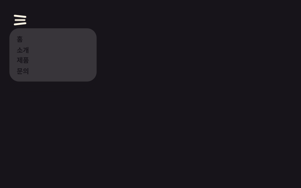 Chuyển cảnh9 hiệu ứng css hamburger menu animation không JS
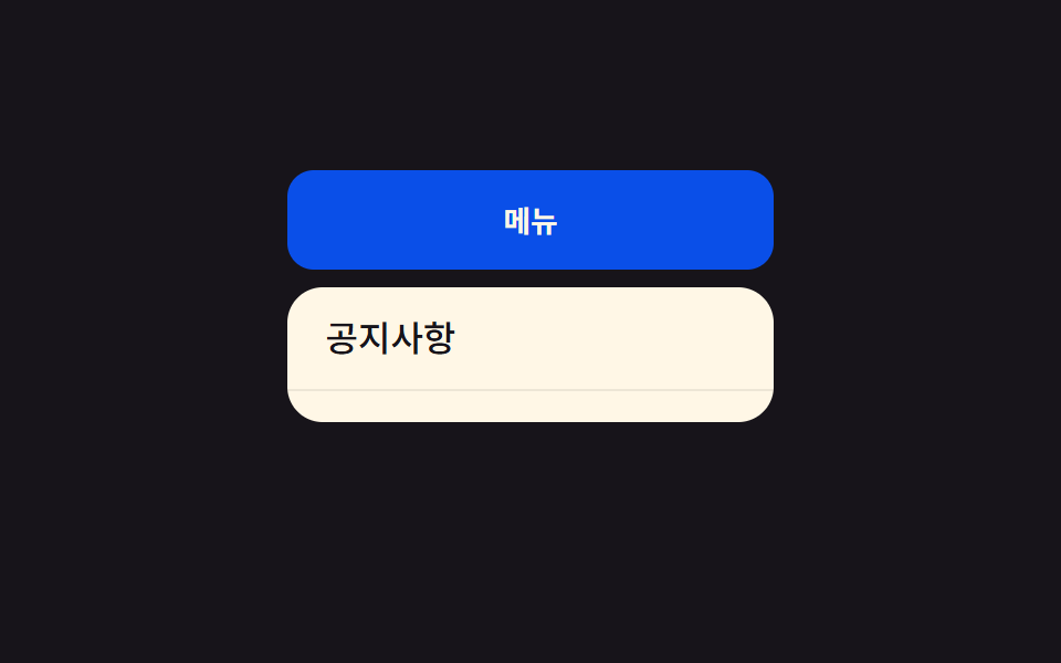 Chuyển cảnh9 css dropdown menu animation — không JS, chỉ CSS
 Chuyển cảnh9 CSS Toast Notification — không cần JS
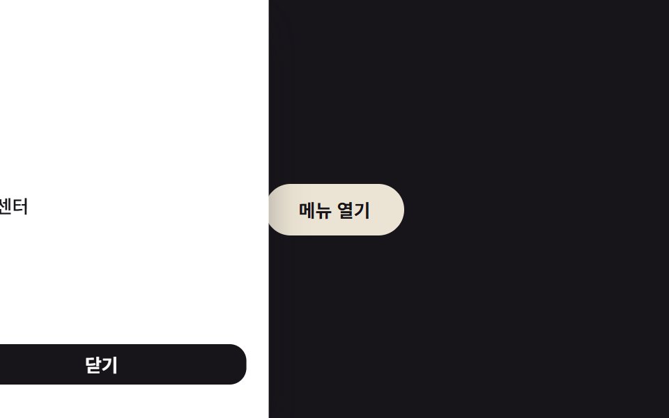 Chuyển cảnh9 hiệu ứng CSS Sidebar Animation - JS tối thiểu
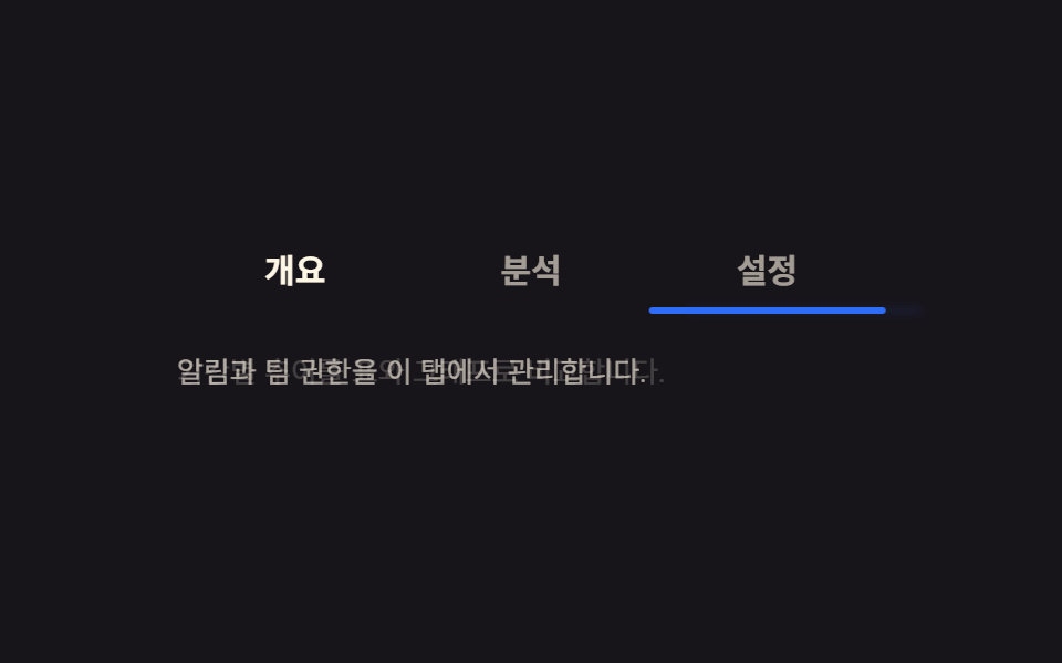 Chuyển cảnh9 CSS Tab Switch Animations — gần như chỉ CSS
 Phản hồi9 CSS Toggle Switches — dán 1 dòng là chạy
 Phản hồi9 CSS Checkbox Radio — dán 1 dòng là chạy
 Nút bấm9 hiệu ứng css button animation copy-paste